Compare commits
206 Commits
ci/vitest
...
fix/field-
| Author | SHA1 | Date | |
|---|---|---|---|
|
96ddc79788 | ||
|
|
e45ce23cd7 | ||
|
|
f17f36b62a | ||
|
|
802c4006b1 | ||
|
|
dc1b9bd8d6 | ||
|
|
05b03b2dcd | ||
|
|
120735c55c | ||
|
|
16ad7a671f | ||
|
|
31ae27b67d | ||
|
|
8217842bb3 | ||
|
|
2e09da8a8c | ||
|
|
5d6c29f3df | ||
|
|
df4af70fb9 | ||
|
|
90e1843795 | ||
|
|
5ee36fced3 | ||
|
|
f306785eb2 | ||
|
|
6a6ef8f786 | ||
|
|
a865a902d5 | ||
|
|
878763b36d | ||
|
|
3c29015887 | ||
|
|
9631060383 | ||
|
|
5cfb1daaae | ||
|
|
9278eec2b6 | ||
|
|
a3ef5eee7b | ||
|
|
f95d6ba94a | ||
|
|
6ada450531 | ||
|
|
9004205b84 | ||
|
|
6757f7d459 | ||
|
|
2ae26d33e3 | ||
|
|
5043a8a43f | ||
|
|
6848cf43ed | ||
|
|
2e0595b170 | ||
|
|
43b40f0b00 | ||
|
|
c9584a932a | ||
|
|
69fac593ca | ||
|
|
415fbf1341 | ||
|
|
cc13ae77fb | ||
|
|
afcc970e36 | ||
|
|
6b051bd59e | ||
|
|
082c4f0d71 | ||
|
|
0252681313 | ||
|
|
690e99f2f9 | ||
|
|
04a8083658 | ||
|
|
ab564d3731 | ||
|
|
26711a7a55 | ||
|
|
142c504a46 | ||
|
|
9b6cdd0cd1 | ||
|
|
dc6d79e76e | ||
|
|
c850bd4b28 | ||
|
|
d20dc5806b | ||
|
|
fd96a9afe3 | ||
|
|
1af7d8745c | ||
|
|
04733f0db1 | ||
|
|
a49f7824ad | ||
|
|
d265c26049 | ||
|
|
e46ad67c3b | ||
|
|
f4596fc82b | ||
|
|
4fc6956617 | ||
|
|
e0df0d67ca | ||
|
|
8d5d2d1d37 | ||
|
|
21eec876c4 | ||
|
|
a8d6f3f543 | ||
|
|
83bd0e2e4c | ||
|
|
4c96028e87 | ||
|
|
225c24da99 | ||
|
|
d8f4f06b58 | ||
|
|
bdb96ddbcc | ||
|
|
686e48d171 | ||
|
|
ae1542be26 | ||
|
|
34a0d006cf | ||
|
|
a78bc6c65e | ||
|
|
36e50dd6a6 | ||
|
|
6a262ab809 | ||
|
|
3349a4c5e5 | ||
|
|
81c1e47747 | ||
|
|
5318d24601 | ||
|
|
d9ff2e08dc | ||
|
|
c0dc0cca37 | ||
|
|
7321f9f3d5 | ||
|
|
17e7ee2315 | ||
|
|
9701fc6970 | ||
|
|
ac97bfdc47 | ||
|
|
81188fc8bb | ||
|
|
7a21b44bbf | ||
|
|
b09275419a | ||
|
|
4d7587d26a | ||
|
|
a5443a1c6c | ||
|
|
08fb159943 | ||
|
|
ab53ababc8 | ||
|
|
b774f557be | ||
|
|
7fc6227310 | ||
|
|
827c75a3d2 | ||
|
|
5991a2e60f | ||
|
|
ef7191b39a | ||
|
|
c7f21fc2e2 | ||
|
|
a83a430a3a | ||
|
|
df827c0fdd | ||
|
|
398b6096f2 | ||
|
|
eadce5ea57 | ||
|
|
f629709797 | ||
|
|
d772b2b7eb | ||
|
|
22c4dee5a0 | ||
|
|
c1abd16a7f | ||
|
|
d2127335b9 | ||
|
|
1525cc6e3a | ||
|
|
53aea622f9 | ||
|
|
422e8e3620 | ||
|
|
556b8ed393 | ||
|
|
0ce7c666d2 | ||
|
|
fd52de6d8f | ||
|
|
1e247f8509 | ||
|
|
1a9fba5f00 | ||
|
|
4a15b866e0 | ||
|
|
5ba477b810 | ||
|
|
8d245283b3 | ||
|
|
09d6c60e96 | ||
|
|
5e4e27460e | ||
|
|
be84ad7bfa | ||
|
|
3ea1d393fd | ||
|
|
b44aadee65 | ||
|
|
ba228dd0f3 | ||
|
|
c7b3204439 | ||
|
|
d68a1eaafb | ||
|
|
1f4790a314 | ||
|
|
47e8158d1e | ||
|
|
1cade17440 | ||
|
|
5997aa1c69 | ||
|
|
f2fab39d67 | ||
|
|
e97c43eec3 | ||
|
|
38477184e0 | ||
|
|
daf314caea | ||
|
|
3d5b9f031f | ||
|
|
6dcf817c22 | ||
|
|
766b67f0be | ||
|
|
4e57054bb7 | ||
|
|
d6d9edc304 | ||
|
|
b14935ce28 | ||
|
|
2e58a4ad27 | ||
|
|
d9e0cd360b | ||
|
|
abb51b98eb | ||
|
|
b2042c5754 | ||
|
|
38f34551a2 | ||
|
|
951c38e587 | ||
|
|
7928ecaee7 | ||
|
|
2ae7d8e5d4 | ||
|
|
d38ca839cb | ||
|
|
c65802233c | ||
|
|
018c1933b0 | ||
|
|
510968f65d | ||
|
|
a000e4a505 | ||
|
|
bd7f70545a | ||
|
|
b0ebd92a1e | ||
|
|
76e44024cc | ||
|
|
f3f36d8010 | ||
|
|
ee3c2cc16f | ||
|
|
b6de432ab2 | ||
|
|
950f8ce80a | ||
|
|
c3eb272d3c | ||
|
|
be87ba0ecd | ||
|
|
c4b31c079f | ||
|
|
07e86c0f20 | ||
|
|
182eaa3433 | ||
|
|
943798a784 | ||
|
|
6e19e8288f | ||
|
|
35df899547 | ||
|
|
5188a9b2a0 | ||
|
|
c5b1cd600b | ||
|
|
313b4ba535 | ||
|
|
cdaebcc79c | ||
|
|
5b4730d13c | ||
|
|
6dac4c5777 | ||
|
|
f5a955d906 | ||
|
|
885e96636d | ||
|
|
7a59e7da46 | ||
|
|
039b489cb8 | ||
|
|
16c6abeee4 | ||
|
|
5d6064a419 | ||
|
|
270ac10fb4 | ||
|
|
eb69885a89 | ||
|
|
8671e856ed | ||
|
|
ef7242cd85 | ||
|
|
fe010b9373 | ||
|
|
63bca12f87 | ||
|
|
6af6e44683 | ||
|
|
363a24cea5 | ||
|
|
6f5a1e3cf7 | ||
|
|
c01b4bfb79 | ||
|
|
2111a860f7 | ||
|
|
68a5f5ca2f | ||
|
|
fabe5411f4 | ||
|
|
7a4d53afbf | ||
|
|
3218b0dcb6 | ||
|
|
0be1a1d880 | ||
|
|
466ea292b9 | ||
|
|
3278f450c7 | ||
|
|
67db04c660 | ||
|
|
da518f53e8 | ||
|
|
78b6d51e58 | ||
|
|
181fc410bf | ||
|
|
29c5bcdc18 | ||
|
|
37d1f2d04b | ||
|
|
a46609ef6b | ||
|
|
cf8c0ae959 | ||
|
|
bb0c8a8c62 | ||
|
|
fad4ee6282 | ||
|
|
6b4842d44d |
24
.github/workflows/dispatch-event.yml
vendored
Normal file
24
.github/workflows/dispatch-event.yml
vendored
Normal file
@@ -0,0 +1,24 @@
|
||||
name: dispatch-event
|
||||
|
||||
on:
|
||||
workflow_dispatch:
|
||||
|
||||
env:
|
||||
PAYLOAD_PUSH_MAIN_EVENT: payload-push-main-event
|
||||
|
||||
jobs:
|
||||
repository-dispatch:
|
||||
name: Repository dispatch
|
||||
runs-on: ubuntu-latest
|
||||
steps:
|
||||
- uses: actions/checkout@v4
|
||||
|
||||
- name: Dispatch event
|
||||
if: ${{ github.event_name == 'workflow_dispatch' }}
|
||||
uses: peter-evans/repository-dispatch@v3
|
||||
with:
|
||||
token: ${{ secrets.PAYLOAD_REPOSITORY_DISPATCH }}
|
||||
repository: ${{ secrets.REMOTE_REPOSITORY }}
|
||||
event-type: ${{ env.PAYLOAD_PUSH_MAIN_EVENT }}
|
||||
client-payload: '{"event": {"head_commit": {"id": "${{ env.GITHUB_SHA }}"}}}' # mocked for testing
|
||||
# client-payload: '{"event": ${{ toJson(github.event) }}}'
|
||||
19
.github/workflows/main.yml
vendored
19
.github/workflows/main.yml
vendored
@@ -278,9 +278,9 @@ jobs:
|
||||
suite:
|
||||
- _community
|
||||
- access-control
|
||||
- admin__e2e__1
|
||||
- admin__e2e__2
|
||||
- admin__e2e__3
|
||||
- admin__e2e__general
|
||||
- admin__e2e__list-view
|
||||
- admin__e2e__document-view
|
||||
- admin-root
|
||||
- auth
|
||||
- auth-basic
|
||||
@@ -289,6 +289,7 @@ jobs:
|
||||
- fields-relationship
|
||||
- fields__collections__Array
|
||||
- fields__collections__Blocks
|
||||
- fields__collections__Checkbox
|
||||
- fields__collections__Collapsible
|
||||
- fields__collections__ConditionalLogic
|
||||
- fields__collections__CustomID
|
||||
@@ -366,18 +367,6 @@ jobs:
|
||||
if: steps.cache-playwright-browsers.outputs.cache-hit == 'true'
|
||||
run: pnpm exec playwright install-deps chromium
|
||||
|
||||
- name: E2E Tests
|
||||
uses: nick-fields/retry@v3
|
||||
with:
|
||||
retry_on: any
|
||||
max_attempts: 5
|
||||
timeout_minutes: 20
|
||||
command: PLAYWRIGHT_JSON_OUTPUT_NAME=results_${{ matrix.suite }}.json pnpm test:e2e:prod:ci ${{ matrix.suite }}
|
||||
on_retry_command: pnpm clean:build && pnpm install --no-frozen-lockfile && pnpm build:all
|
||||
env:
|
||||
PLAYWRIGHT_JSON_OUTPUT_NAME: results_${{ matrix.suite }}.json
|
||||
NEXT_TELEMETRY_DISABLED: 1
|
||||
|
||||
- uses: actions/upload-artifact@v4
|
||||
if: always()
|
||||
with:
|
||||
|
||||
1
.gitignore
vendored
1
.gitignore
vendored
@@ -317,3 +317,4 @@ test/databaseAdapter.js
|
||||
/filename-compound-index
|
||||
/media-with-relation-preview
|
||||
/media-without-relation-preview
|
||||
/media-without-cache-tags
|
||||
|
||||
@@ -1,6 +1,6 @@
|
||||
MIT License
|
||||
|
||||
Copyright (c) 2018-2024 Payload CMS, Inc. <info@payloadcms.com>
|
||||
Copyright (c) 2018-2025 Payload CMS, Inc. <info@payloadcms.com>
|
||||
|
||||
Permission is hereby granted, free of charge, to any person obtaining
|
||||
a copy of this software and associated documentation files (the
|
||||
|
||||
@@ -96,7 +96,11 @@ If you want to add contributions to this repository, please follow the instructi
|
||||
|
||||
The [Examples Directory](./examples) is a great resource for learning how to setup Payload in a variety of different ways, but you can also find great examples in our blog and throughout our social media.
|
||||
|
||||
If you'd like to run the examples, you can either copy them to a folder outside this repo or run them directly by (1) navigating to the example's subfolder (`cd examples/your-example-folder`) and (2) using the `--ignore-workspace` flag to bypass workspace restrictions (e.g., `pnpm --ignore-workspace install` or `pnpm --ignore-workspace dev`).
|
||||
If you'd like to run the examples, you can use `create-payload-app` to create a project from one:
|
||||
|
||||
```sh
|
||||
npx create-payload-app --example example_name
|
||||
```
|
||||
|
||||
You can see more examples at:
|
||||
|
||||
|
||||
@@ -122,7 +122,7 @@ export const CollectionWithReadAccess: CollectionConfig = {
|
||||
```
|
||||
|
||||
<Banner type="success">
|
||||
<strong>Tip:</strong>
|
||||
**Tip:**
|
||||
Return a [Query](../queries/overview) to limit the Documents to only those that match the constraint. This can be helpful to restrict users' access to specific Documents. [More details](../queries/overview).
|
||||
</Banner>
|
||||
|
||||
@@ -176,7 +176,7 @@ export const CollectionWithUpdateAccess: CollectionConfig = {
|
||||
```
|
||||
|
||||
<Banner type="success">
|
||||
<strong>Tip:</strong>
|
||||
**Tip:**
|
||||
Return a [Query](../queries/overview) to limit the Documents to only those that match the constraint. This can be helpful to restrict users' access to specific Documents. [More details](../queries/overview).
|
||||
</Banner>
|
||||
|
||||
@@ -252,10 +252,10 @@ export const canDeleteCustomer: Access = async ({ req, id }) => {
|
||||
|
||||
The following arguments are provided to the `delete` function:
|
||||
|
||||
| Option | Description |
|
||||
| --------- | --------------------------------------------------------------------------------------------------- |
|
||||
| Option | Description |
|
||||
| --------- | ------------------------------------------------------------------------------------------------------------------------------------------------------ |
|
||||
| **`req`** | The [Request](https://developer.mozilla.org/en-US/docs/Web/API/Request) object with additional `user` property, which is the currently logged in user. |
|
||||
| **`id`** | `id` of document requested to delete.
|
||||
| **`id`** | `id` of document requested to delete. |
|
||||
|
||||
### Admin
|
||||
|
||||
@@ -286,7 +286,7 @@ The following arguments are provided to the `admin` function:
|
||||
|
||||
### Unlock
|
||||
|
||||
Determines which users can [unlock](/docs/authentication/operations#unlock) other users who may be blocked from authenticating successfully due to [failing too many login attempts](/docs/authentication/overview#options).
|
||||
Determines which users can [unlock](/docs/authentication/operations#unlock) other users who may be blocked from authenticating successfully due to [failing too many login attempts](/docs/authentication/overview#config-options).
|
||||
|
||||
To add Unlock Access Control to a Collection, use the `unlock` property in the [Collection Config](../configuration/collections):
|
||||
|
||||
|
||||
@@ -6,7 +6,7 @@ desc: Field-level Access Control is specified within a field's config, and allow
|
||||
keywords: fields, access control, permissions, documentation, Content Management System, cms, headless, javascript, node, react, nextjs
|
||||
---
|
||||
|
||||
Field Access Control is [Access Control](../overview) used to restrict access to specific [Fields](../fields/overview) within a Document.
|
||||
Field Access Control is [Access Control](../access-control/overview) used to restrict access to specific [Fields](../fields/overview) within a Document.
|
||||
|
||||
To add Access Control to a Field, use the `access` property in your [Field Config](../fields/overview):
|
||||
|
||||
@@ -22,7 +22,7 @@ export const FieldWithAccessControl: Field = {
|
||||
```
|
||||
|
||||
<Banner type="warning">
|
||||
<strong>Note:</strong>
|
||||
**Note:**
|
||||
Field Access Controls does not support returning [Query](../queries/overview) constraints like [Collection Access Control](./collections) does.
|
||||
</Banner>
|
||||
|
||||
|
||||
@@ -6,7 +6,7 @@ desc: Global-level Access Control is specified within each Global's `access` pro
|
||||
keywords: globals, access control, permissions, documentation, Content Management System, cms, headless, javascript, node, react, nextjs
|
||||
---
|
||||
|
||||
Global Access Control is [Access Control](../overview) used to restrict access to [Global](../configuration/globals) Documents, as well as what they can and cannot see within the [Admin Panel](../admin/overview) as it relates to that Global.
|
||||
Global Access Control is [Access Control](../access-control/overview) used to restrict access to [Global](../configuration/globals) Documents, as well as what they can and cannot see within the [Admin Panel](../admin/overview) as it relates to that Global.
|
||||
|
||||
To add Access Control to a Global, use the `access` property in your [Global Config](../configuration/globals):
|
||||
|
||||
|
||||
@@ -29,7 +29,7 @@ There are three main types of Access Control in Payload:
|
||||
|
||||
## Default Access Control
|
||||
|
||||
Payload provides default Access Control so that your data is secured behind [Authentication](../authentication) without additional configuration. To do this, Payload sets a default function that simply checks if a user is present on the request. You can override this default behavior by defining your own Access Control functions as needed.
|
||||
Payload provides default Access Control so that your data is secured behind [Authentication](../authentication/overview) without additional configuration. To do this, Payload sets a default function that simply checks if a user is present on the request. You can override this default behavior by defining your own Access Control functions as needed.
|
||||
|
||||
Here is the default Access Control that Payload provides:
|
||||
|
||||
@@ -42,7 +42,7 @@ const defaultPayloadAccess = ({ req: { user } }) => {
|
||||
```
|
||||
|
||||
<Banner type="warning">
|
||||
<strong>Important:</strong>
|
||||
**Important:**
|
||||
In the [Local API](../local-api/overview), all Access Control is _skipped_ by default. This allows your server to have full control over your application. To opt back in, you can set the `overrideAccess` option to `false` in your requests.
|
||||
</Banner>
|
||||
|
||||
@@ -53,8 +53,27 @@ The Admin Panel responds dynamically to your changes to Access Control. For exam
|
||||
To accomplish this, Payload exposes the [Access Operation](../authentication/operations#access). Upon login, Payload executes each Access Control function at the top level, across all Collections, Globals, and Fields, and returns a response that contains a reflection of what the currently authenticated user can do within your application.
|
||||
|
||||
<Banner type="warning">
|
||||
<strong>Important:</strong>
|
||||
**Important:**
|
||||
When your access control functions are executed via the [Access Operation](../authentication/operations#access), the `id` and `data` arguments will be `undefined`. This is because Payload is executing your functions without referencing a specific Document.
|
||||
</Banner>
|
||||
|
||||
If you use `id` or `data` within your access control functions, make sure to check that they are defined first. If they are not, then you can assume that your Access Control is being executed via the Access Operation to determine solely what the user can do within the Admin Panel.
|
||||
|
||||
|
||||
## Locale Specific Access Control
|
||||
|
||||
To implement locale-specific access control, you can use the `req.locale` argument in your access control functions. This argument allows you to evaluate the current locale of the request and determine access permissions accordingly.
|
||||
|
||||
Here is an example:
|
||||
|
||||
```ts
|
||||
const access = ({ req }) => {
|
||||
// Grant access if the locale is 'en'
|
||||
if (req.locale === 'en') {
|
||||
return true;
|
||||
}
|
||||
|
||||
// Deny access for all other locales
|
||||
return false;
|
||||
}
|
||||
```
|
||||
|
||||
@@ -65,21 +65,21 @@ export const MyCollection: SanitizedCollectionConfig = {
|
||||
|
||||
The following options are available:
|
||||
|
||||
| Path | Description |
|
||||
| -------------------------- | ---------------------------------------------------------------------------------------------------------------------- |
|
||||
| **`beforeList`** | An array of components to inject _before_ the built-in List View |
|
||||
| **`beforeListTable`** | An array of components to inject _before_ the built-in List View's table |
|
||||
| **`afterList`** | An array of components to inject _after_ the built-in List View |
|
||||
| **`afterListTable`** | An array of components to inject _after_ the built-in List View's table
|
||||
| **`Description`** | A component to render below the Collection label in the List View. An alternative to the `admin.description` property. |
|
||||
| **`edit.SaveButton`** | Replace the default Save Button with a Custom Component. [Drafts](../versions/drafts) must be disabled. |
|
||||
| Path | Description |
|
||||
| -------------------------- | ------------------------------------------------------------------------------------------------------------------------------------------ |
|
||||
| **`beforeList`** | An array of components to inject _before_ the built-in List View |
|
||||
| **`beforeListTable`** | An array of components to inject _before_ the built-in List View's table |
|
||||
| **`afterList`** | An array of components to inject _after_ the built-in List View |
|
||||
| **`afterListTable`** | An array of components to inject _after_ the built-in List View's table |
|
||||
| **`Description`** | A component to render below the Collection label in the List View. An alternative to the `admin.description` property. |
|
||||
| **`edit.SaveButton`** | Replace the default Save Button with a Custom Component. [Drafts](../versions/drafts) must be disabled. |
|
||||
| **`edit.SaveDraftButton`** | Replace the default Save Draft Button with a Custom Component. [Drafts](../versions/drafts) must be enabled and autosave must be disabled. |
|
||||
| **`edit.PublishButton`** | Replace the default Publish Button with a Custom Component. [Drafts](../versions/drafts) must be enabled. |
|
||||
| **`edit.PreviewButton`** | Replace the default Preview Button with a Custom Component. [Preview](#preview) must be enabled. |
|
||||
| **`views`** | Override or create new views within the Admin Panel. [More details](./views). |
|
||||
| **`edit.PreviewButton`** | Replace the default Preview Button with a Custom Component. [Preview](#preview) must be enabled. |
|
||||
| **`views`** | Override or create new views within the Admin Panel. [More details](./views). |
|
||||
|
||||
<Banner type="success">
|
||||
<strong>Note:</strong>
|
||||
**Note:**
|
||||
For details on how to build Custom Components, see [Building Custom Components](./components#building-custom-components).
|
||||
</Banner>
|
||||
|
||||
@@ -124,7 +124,7 @@ preview: (doc, { req }) => `${req.protocol}//${req.host}/${doc.slug}` // highlig
|
||||
```
|
||||
|
||||
<Banner type="success">
|
||||
<strong>Note:</strong>
|
||||
**Note:**
|
||||
For fully working example of this, check of the official [Draft Preview Example](https://github.com/payloadcms/payload/tree/main/examples/draft-preview) in the [Examples Directory](https://github.com/payloadcms/payload/tree/main/examples).
|
||||
</Banner>
|
||||
|
||||
@@ -177,6 +177,6 @@ export const Posts: CollectionConfig = {
|
||||
```
|
||||
|
||||
<Banner type="warning">
|
||||
<strong>Tip:</strong>
|
||||
**Tip:**
|
||||
If you are adding `listSearchableFields`, make sure you index each of these fields so your admin queries can remain performant.
|
||||
</Banner>
|
||||
|
||||
@@ -11,7 +11,7 @@ The Payload [Admin Panel](./overview) is designed to be as minimal and straightf
|
||||
All Custom Components in Payload are [React Server Components](https://react.dev/reference/rsc/server-components) by default. This enables the use of the [Local API](../local-api/overview) directly on the front-end. Custom Components are available for nearly every part of the Admin Panel for extreme granularity and control.
|
||||
|
||||
<Banner type="success">
|
||||
<strong>Note:</strong>
|
||||
**Note:**
|
||||
Client Components continue to be fully supported. To use Client Components in your app, simply include the `use client` directive. Payload will automatically detect and remove all default, [non-serializable props](https://react.dev/reference/rsc/use-client#serializable-types) before rendering your component. [More details](#client-components).
|
||||
</Banner>
|
||||
|
||||
@@ -46,7 +46,7 @@ const config = buildConfig({
|
||||
```
|
||||
|
||||
<Banner type="success">
|
||||
<strong>Note:</strong>
|
||||
**Note:**
|
||||
All Custom Components can be either Server Components or Client Components, depending on the presence of the `use client` directive at the top of the file.
|
||||
</Banner>
|
||||
|
||||
@@ -127,7 +127,7 @@ The Import Map is automatically regenerated at startup and whenever Hot Module R
|
||||
|
||||
If needed, custom items can be appended onto the Import Map. This is mostly only relevant for plugin authors who need to add a custom import that is not referenced in a known location.
|
||||
|
||||
To add a custom import to the Import Map, use the `admin.dependencies` property in your [Payload Config](../getting-started/overview):
|
||||
To add a custom import to the Import Map, use the `admin.dependencies` property in your [Payload Config](../configuration/overview):
|
||||
|
||||
```ts
|
||||
import { buildConfig } from 'payload'
|
||||
@@ -184,7 +184,7 @@ Each Custom Component receives the following props by default:
|
||||
| `i18n` | The [i18n](../configuration/i18n) object. |
|
||||
|
||||
<Banner type="warning">
|
||||
<strong>Reminder:</strong>
|
||||
**Reminder:**
|
||||
All Custom Components also receive various other props that are specific component being rendered. See [Root Components](#root-components), [Collection Components](./collections#custom-components), [Global Components](./globals#custom-components), or [Field Components](./fields#custom-components) for a complete list of all default props per component.
|
||||
</Banner>
|
||||
|
||||
@@ -243,7 +243,7 @@ export const MyClientComponent: React.FC = () => {
|
||||
```
|
||||
|
||||
<Banner type="warning">
|
||||
<strong>Reminder:</strong>
|
||||
**Reminder:**
|
||||
Client Components cannot be passed [non-serializable props](https://react.dev/reference/rsc/use-client#serializable-types). If you are rendering your Client Component _from within_ a Server Component, ensure that its props are serializable.
|
||||
</Banner>
|
||||
|
||||
@@ -455,7 +455,7 @@ Payload also exports its [SCSS](https://sass-lang.com) library for reuse which i
|
||||
```
|
||||
|
||||
<Banner type="success">
|
||||
<strong>Note:</strong>
|
||||
**Note:**
|
||||
You can also drill into Payload's own component styles, or easily apply global, app-wide CSS. More on that [here](./customizing-css).
|
||||
</Banner>
|
||||
|
||||
@@ -464,7 +464,7 @@ Payload also exports its [SCSS](https://sass-lang.com) library for reuse which i
|
||||
|
||||
Root Components are those that effect the [Admin Panel](./overview) generally, such as the logo or the main nav.
|
||||
|
||||
To override Root Components, use the `admin.components` property in your [Payload Config](../getting-started/overview):
|
||||
To override Root Components, use the `admin.components` property in your [Payload Config](../configuration/overview):
|
||||
|
||||
```ts
|
||||
import { buildConfig } from 'payload'
|
||||
@@ -503,7 +503,7 @@ The following options are available:
|
||||
| **`views`** | Override or create new views within the Admin Panel. [More details](./views). |
|
||||
|
||||
<Banner type="success">
|
||||
<strong>Note:</strong>
|
||||
**Note:**
|
||||
You can also use set [Collection Components](./collections#custom-components) and [Global Components](./globals#custom-components) in their respective configs.
|
||||
</Banner>
|
||||
|
||||
@@ -546,5 +546,5 @@ export const useMyCustomContext = () => useContext(MyCustomContext)
|
||||
```
|
||||
|
||||
<Banner type="warning">
|
||||
<strong>Reminder:</strong>React Context exists only within Client Components. This means they must include the `use client` directive at the top of their files and cannot contain server-only code. To use a Server Component here, simply _wrap_ your Client Component with it.
|
||||
**Reminder:**React Context exists only within Client Components. This means they must include the `use client` directive at the top of their files and cannot contain server-only code. To use a Server Component here, simply _wrap_ your Client Component with it.
|
||||
</Banner>
|
||||
|
||||
@@ -29,7 +29,7 @@ Here is an example of how you might target the Dashboard View and change the bac
|
||||
```
|
||||
|
||||
<Banner type="warning">
|
||||
<strong>Note:</strong>
|
||||
**Note:**
|
||||
If you are building [Custom Components](./components), it is best to import your own stylesheets directly into your components, rather than using the global stylesheet. You can continue to use the [CSS library](#css-library) as needed.
|
||||
</Banner>
|
||||
|
||||
@@ -77,7 +77,7 @@ The following variables are defined and can be overridden:
|
||||
For an up-to-date, comprehensive list of all available variables, please refer to the [Source Code](https://github.com/payloadcms/payload/blob/main/packages/ui/src/scss).
|
||||
|
||||
<Banner type="warning">
|
||||
<strong>Warning:</strong>
|
||||
**Warning:**
|
||||
If you're overriding colors or theme elevations, make sure to consider how [your changes will affect dark mode](#dark-mode).
|
||||
</Banner>
|
||||
|
||||
|
||||
@@ -11,7 +11,7 @@ keywords:
|
||||
For example, your app might need to render a specific interface that Payload does not inherently support, such as a color picker. To do this, you could replace the default [Text Field](../fields/text) input with your own user-friendly component that formats the data into a valid color value.
|
||||
|
||||
<Banner type="success">
|
||||
<strong>Tip:</strong>
|
||||
**Tip:**
|
||||
Don't see a built-in field type that you need? Build it! Using a combination of [Field Validations](../fields/overview#validation)
|
||||
and [Custom Components](./components), you can override the entirety of how a component functions within the [Admin Panel](./overview) to effectively create your own field type.
|
||||
</Banner>
|
||||
@@ -87,7 +87,7 @@ export const MyCollectionConfig: SanitizedCollectionConfig = {
|
||||
```
|
||||
|
||||
<Banner type="warning">
|
||||
<strong>Reminder:</strong>
|
||||
**Reminder:**
|
||||
To replace the Field Description with a [Custom Component](./components), use the `admin.components.Description` property. [More details](#description).
|
||||
</Banner>
|
||||
|
||||
@@ -122,7 +122,7 @@ All Description Functions receive the following arguments:
|
||||
| **`t`** | The `t` function used to internationalize the Admin Panel. [More details](../configuration/i18n) |
|
||||
|
||||
<Banner type="info">
|
||||
<strong>Note:</strong>
|
||||
**Note:**
|
||||
If you need to subscribe to live updates within your form, use a Description Component instead. [More details](#description).
|
||||
</Banner>
|
||||
|
||||
@@ -242,31 +242,31 @@ _For details on how to build Custom Components, see [Building Custom Components]
|
||||
|
||||
All Field Components receive the following props by default:
|
||||
|
||||
| Property | Description |
|
||||
| ---------------- | -------------------------------------------------------------------------------------------------------------------------------------------------------------------------------------------------------------------------------- |
|
||||
| **`docPreferences`** | An object that contains the [Preferences](./preferences) for the document.
|
||||
| **`field`** | In Client Components, this is the sanitized Client Field Config. In Server Components, this is the original Field Config. Server Components will also receive the sanitized field config through the`clientField` prop (see below). |
|
||||
| **`locale`** | The locale of the field. [More details](../configuration/localization). |
|
||||
| **`readOnly`** | A boolean value that represents if the field is read-only or not. |
|
||||
| **`user`** | The currently authenticated user. [More details](../authentication/overview). |
|
||||
| **`validate`** | A function that can be used to validate the field. |
|
||||
| **`path`** | A string representing the direct, dynamic path to the field at runtime, i.e. `myGroup.myArray.0.myField`. |
|
||||
| **`schemaPath`** | A string representing the direct, static path to the [Field Config](../fields/overview), i.e. `posts.myGroup.myArray.myField`. |
|
||||
| **`indexPath`** | A hyphen-notated string representing the path to the field _within the nearest named ancestor field_, i.e. `0-0` |
|
||||
| Property | Description |
|
||||
| -------------------- | ----------------------------------------------------------------------------------------------------------------------------------------------------------------------------------------------------------------------------------- |
|
||||
| **`docPreferences`** | An object that contains the [Preferences](./preferences) for the document. |
|
||||
| **`field`** | In Client Components, this is the sanitized Client Field Config. In Server Components, this is the original Field Config. Server Components will also receive the sanitized field config through the`clientField` prop (see below). |
|
||||
| **`locale`** | The locale of the field. [More details](../configuration/localization). |
|
||||
| **`readOnly`** | A boolean value that represents if the field is read-only or not. |
|
||||
| **`user`** | The currently authenticated user. [More details](../authentication/overview). |
|
||||
| **`validate`** | A function that can be used to validate the field. |
|
||||
| **`path`** | A string representing the direct, dynamic path to the field at runtime, i.e. `myGroup.myArray.0.myField`. |
|
||||
| **`schemaPath`** | A string representing the direct, static path to the [Field Config](../fields/overview), i.e. `posts.myGroup.myArray.myField`. |
|
||||
| **`indexPath`** | A hyphen-notated string representing the path to the field _within the nearest named ancestor field_, i.e. `0-0` |
|
||||
|
||||
In addition to the above props, all Server Components will also receive the following props:
|
||||
|
||||
| Property | Description |
|
||||
| ---------------- | -------------------------------------------------------------------------------------------------------------------------------------------------------------------------------------------------------------------------------- |
|
||||
| **`clientField`** | The serializable Client Field Config. |
|
||||
| **`field`** | The Field Config. [More details](../fields/overview). |
|
||||
| **`data`** | The current document being edited. |
|
||||
| **`i18n`** | The [i18n](../configuration/i18n) object.
|
||||
| **`payload`** | The [Payload](../local-api/overview) class. |
|
||||
| **`permissions`** | The field permissions based on the currently authenticated user. |
|
||||
| **`siblingData`** | The data of the field's siblings. |
|
||||
| **`user`** | The currently authenticated user. [More details](../authentication/overview). |
|
||||
| **`value`** | The value of the field at render-time. |
|
||||
| Property | Description |
|
||||
| ----------------- | ----------------------------------------------------------------------------- |
|
||||
| **`clientField`** | The serializable Client Field Config. |
|
||||
| **`field`** | The Field Config. [More details](../fields/overview). |
|
||||
| **`data`** | The current document being edited. |
|
||||
| **`i18n`** | The [i18n](../configuration/i18n) object. |
|
||||
| **`payload`** | The [Payload](../local-api/overview) class. |
|
||||
| **`permissions`** | The field permissions based on the currently authenticated user. |
|
||||
| **`siblingData`** | The data of the field's siblings. |
|
||||
| **`user`** | The currently authenticated user. [More details](../authentication/overview). |
|
||||
| **`value`** | The value of the field at render-time. |
|
||||
|
||||
#### Sending and receiving values from the form
|
||||
|
||||
@@ -399,7 +399,7 @@ import type {
|
||||
|
||||
### Description
|
||||
|
||||
Alternatively to the [Description Property](#the-description-property), you can also use a [Custom Component](./components) as the Field Description. This can be useful when you need to provide more complex feedback to the user, such as rendering dynamic field values or other interactive elements.
|
||||
Alternatively to the [Description Property](#field-descriptions), you can also use a [Custom Component](./components) as the Field Description. This can be useful when you need to provide more complex feedback to the user, such as rendering dynamic field values or other interactive elements.
|
||||
|
||||
To add a Description Component to a field, use the `admin.components.Description` property in your [Field Config](../fields/overview):
|
||||
|
||||
|
||||
@@ -65,7 +65,7 @@ The following options are available:
|
||||
| **`views`** | Override or create new views within the Admin Panel. [More details](./views). |
|
||||
|
||||
<Banner type="success">
|
||||
<strong>Note:</strong>
|
||||
**Note:**
|
||||
For details on how to build Custom Components, see [Building Custom Components](./components#building-custom-components).
|
||||
</Banner>
|
||||
|
||||
@@ -102,6 +102,6 @@ The preview function receives two arguments:
|
||||
| **`ctx`** | An object containing `locale` and `token` properties. The `token` is the currently logged-in user's JWT. |
|
||||
|
||||
<Banner type="success">
|
||||
<strong>Note:</strong>
|
||||
**Note:**
|
||||
For fully working example of this, check of the official [Draft Preview Example](https://github.com/payloadcms/payload/tree/main/examples/draft-preview) in the [Examples Directory](https://github.com/payloadcms/payload/tree/main/examples).
|
||||
</Banner>
|
||||
|
||||
@@ -9,7 +9,7 @@ keywords: admin, components, custom, documentation, Content Management System, c
|
||||
Payload provides a variety of powerful [React Hooks](https://react.dev/reference/react-dom/hooks) that can be used within your own [Custom Components](./components), such as [Custom Fields](./fields). With them, you can interface with Payload itself to build just about any type of complex customization you can think of.
|
||||
|
||||
<Banner type="warning">
|
||||
<strong>Reminder:</strong>
|
||||
**Reminder:**
|
||||
All Custom Components are [React Server Components](https://react.dev/reference/rsc/server-components) by default. Hooks, on the other hand, are only available in client-side environments. To use hooks, [ensure your component is a client component](./components#client-components).
|
||||
</Banner>
|
||||
|
||||
@@ -78,7 +78,7 @@ type FieldType<T> = {
|
||||
There are times when a custom field component needs to have access to data from other fields, and you have a few options to do so. The `useFormFields` hook is a powerful and highly performant way to retrieve a form's field state, as well as to retrieve the `dispatchFields` method, which can be helpful for setting other fields' form states from anywhere within a form.
|
||||
|
||||
<Banner type="success">
|
||||
<strong>This hook is great for retrieving only certain fields from form state</strong> because it
|
||||
**This hook is great for retrieving only certain fields from form state** because it
|
||||
ensures that it will only cause a rerender when the items that you ask for change.
|
||||
</Banner>
|
||||
|
||||
@@ -150,15 +150,15 @@ You can send the following actions to the `dispatchFields` function.
|
||||
| **`REPLACE_STATE`** | Completely replaces form state |
|
||||
| **`UPDATE`** | Update any property of a specific field's state |
|
||||
|
||||
To see types for each action supported within the `dispatchFields` hook, check out the Form types [here](https://github.com/payloadcms/payload/blob/main/packages/payload/src/admin/components/forms/Form/types.ts).
|
||||
To see types for each action supported within the `dispatchFields` hook, check out the Form types [here](https://github.com/payloadcms/payload/blob/main/packages/ui/src/forms/Form/types.ts).
|
||||
|
||||
## useForm
|
||||
|
||||
The `useForm` hook can be used to interact with the form itself, and sends back many methods that can be used to reactively fetch form state without causing rerenders within your components each time a field is changed. This is useful if you have action-based callbacks that your components fire, and need to interact with form state _based on a user action_.
|
||||
|
||||
<Banner type="warning">
|
||||
<strong>Warning:</strong>
|
||||
<br />
|
||||
**Warning:**
|
||||
|
||||
This hook is optimized to avoid causing rerenders when fields change, and as such, its `fields`
|
||||
property will be out of date. You should only leverage this hook if you need to perform actions
|
||||
against the form in response to your users' actions. Do not rely on its returned "fields" as being
|
||||
@@ -176,7 +176,7 @@ The `useForm` hook returns an object with the following properties:
|
||||
rows={[
|
||||
[
|
||||
{
|
||||
value: <strong><code>fields</code></strong>,
|
||||
value: "**`fields`**",
|
||||
},
|
||||
{
|
||||
value: "Deprecated. This property cannot be relied on as up-to-date.",
|
||||
@@ -187,7 +187,7 @@ The `useForm` hook returns an object with the following properties:
|
||||
],
|
||||
[
|
||||
{
|
||||
value: <strong><code>submit</code></strong>,
|
||||
value: "**`submit`**",
|
||||
},
|
||||
{
|
||||
value: "Method to trigger the form to submit",
|
||||
@@ -198,7 +198,7 @@ The `useForm` hook returns an object with the following properties:
|
||||
],
|
||||
[
|
||||
{
|
||||
value: <strong><code>dispatchFields</code></strong>,
|
||||
value: "**`dispatchFields`**",
|
||||
},
|
||||
{
|
||||
value: "Dispatch actions to the form field state",
|
||||
@@ -209,7 +209,7 @@ The `useForm` hook returns an object with the following properties:
|
||||
],
|
||||
[
|
||||
{
|
||||
value: <strong><code>validateForm</code></strong>,
|
||||
value: "**`validateForm`**",
|
||||
},
|
||||
{
|
||||
value: "Trigger a validation of the form state",
|
||||
@@ -220,10 +220,10 @@ The `useForm` hook returns an object with the following properties:
|
||||
],
|
||||
[
|
||||
{
|
||||
value: <strong><code>createFormData</code></strong>,
|
||||
value: "**`createFormData`**",
|
||||
},
|
||||
{
|
||||
value: <>Create a <code>multipart/form-data</code> object from the current form's state</>,
|
||||
value: "Create a `multipart/form-data` object from the current form's state",
|
||||
},
|
||||
{
|
||||
value: ''
|
||||
@@ -231,7 +231,7 @@ The `useForm` hook returns an object with the following properties:
|
||||
],
|
||||
[
|
||||
{
|
||||
value: <strong><code>disabled</code></strong>,
|
||||
value: "**`disabled`**",
|
||||
},
|
||||
{
|
||||
value: "Boolean denoting whether or not the form is disabled",
|
||||
@@ -242,7 +242,7 @@ The `useForm` hook returns an object with the following properties:
|
||||
],
|
||||
[
|
||||
{
|
||||
value: <strong><code>getFields</code></strong>,
|
||||
value: "**`getFields`**",
|
||||
},
|
||||
{
|
||||
value: 'Gets all fields from state',
|
||||
@@ -253,7 +253,7 @@ The `useForm` hook returns an object with the following properties:
|
||||
],
|
||||
[
|
||||
{
|
||||
value: <strong><code>getField</code></strong>,
|
||||
value: "**`getField`**",
|
||||
},
|
||||
{
|
||||
value: 'Gets a single field from state by path',
|
||||
@@ -264,7 +264,7 @@ The `useForm` hook returns an object with the following properties:
|
||||
],
|
||||
[
|
||||
{
|
||||
value: <strong><code>getData</code></strong>,
|
||||
value: "**`getData`**",
|
||||
},
|
||||
{
|
||||
value: 'Returns the data stored in the form',
|
||||
@@ -275,7 +275,7 @@ The `useForm` hook returns an object with the following properties:
|
||||
],
|
||||
[
|
||||
{
|
||||
value: <strong><code>getSiblingData</code></strong>,
|
||||
value: "**`getSiblingData`**",
|
||||
},
|
||||
{
|
||||
value: 'Returns form sibling data for the given field path',
|
||||
@@ -286,10 +286,10 @@ The `useForm` hook returns an object with the following properties:
|
||||
],
|
||||
[
|
||||
{
|
||||
value: <strong><code>setModified</code></strong>,
|
||||
value: "**`setModified`**",
|
||||
},
|
||||
{
|
||||
value: <>Set the form\'s <code>modified</code> state</>,
|
||||
value: "Set the form\'s `modified` state",
|
||||
},
|
||||
{
|
||||
value: '',
|
||||
@@ -297,10 +297,10 @@ The `useForm` hook returns an object with the following properties:
|
||||
],
|
||||
[
|
||||
{
|
||||
value: <strong><code>setProcessing</code></strong>,
|
||||
value: "**`setProcessing`**",
|
||||
},
|
||||
{
|
||||
value: <>Set the form\'s <code>processing</code> state</>,
|
||||
value: "Set the form\'s `processing` state",
|
||||
},
|
||||
{
|
||||
value: '',
|
||||
@@ -308,10 +308,10 @@ The `useForm` hook returns an object with the following properties:
|
||||
],
|
||||
[
|
||||
{
|
||||
value: <strong><code>setSubmitted</code></strong>,
|
||||
value: "**`setSubmitted`**",
|
||||
},
|
||||
{
|
||||
value: <>Set the form\'s <code>submitted</code> state</>,
|
||||
value: "Set the form\'s `submitted` state",
|
||||
},
|
||||
{
|
||||
value: '',
|
||||
@@ -319,7 +319,7 @@ The `useForm` hook returns an object with the following properties:
|
||||
],
|
||||
[
|
||||
{
|
||||
value: <strong><code>formRef</code></strong>,
|
||||
value: "**`formRef`**",
|
||||
},
|
||||
{
|
||||
value: 'The ref from the form HTML element',
|
||||
@@ -330,7 +330,7 @@ The `useForm` hook returns an object with the following properties:
|
||||
],
|
||||
[
|
||||
{
|
||||
value: <strong><code>reset</code></strong>,
|
||||
value: "**`reset`**",
|
||||
},
|
||||
{
|
||||
value: 'Method to reset the form to its initial state',
|
||||
@@ -341,7 +341,7 @@ The `useForm` hook returns an object with the following properties:
|
||||
],
|
||||
[
|
||||
{
|
||||
value: <strong><code>addFieldRow</code></strong>,
|
||||
value: "**`addFieldRow`**",
|
||||
},
|
||||
{
|
||||
value: "Method to add a row on an array or block field",
|
||||
@@ -350,8 +350,7 @@ The `useForm` hook returns an object with the following properties:
|
||||
drawerTitle: 'addFieldRow',
|
||||
drawerDescription: 'A useful method to programmatically add a row to an array or block field.',
|
||||
drawerSlug: 'addFieldRow',
|
||||
drawerContent: (
|
||||
<>
|
||||
drawerContent: `
|
||||
<TableWithDrawers
|
||||
columns={[
|
||||
'Prop',
|
||||
@@ -360,7 +359,7 @@ The `useForm` hook returns an object with the following properties:
|
||||
rows={[
|
||||
[
|
||||
{
|
||||
value: <strong><code>path</code></strong>,
|
||||
value: "**\\\`path\\\`**",
|
||||
},
|
||||
{
|
||||
value: "The path to the array or block field",
|
||||
@@ -368,7 +367,7 @@ The `useForm` hook returns an object with the following properties:
|
||||
],
|
||||
[
|
||||
{
|
||||
value: <strong><code>rowIndex</code></strong>,
|
||||
value: "**\\\`rowIndex\\\`**",
|
||||
},
|
||||
{
|
||||
value: "The index of the row to add. If omitted, the row will be added to the end of the array.",
|
||||
@@ -376,7 +375,7 @@ The `useForm` hook returns an object with the following properties:
|
||||
],
|
||||
[
|
||||
{
|
||||
value: <strong><code>data</code></strong>,
|
||||
value: "**\\\`data\\\`**",
|
||||
},
|
||||
{
|
||||
value: "The data to add to the row",
|
||||
@@ -385,14 +384,9 @@ The `useForm` hook returns an object with the following properties:
|
||||
]}
|
||||
/>
|
||||
|
||||
{' '}
|
||||
|
||||
<br />
|
||||
|
||||
{' '}
|
||||
|
||||
<pre>
|
||||
{`import { useForm } from "payload/components/forms";
|
||||
\`\`\`tsx
|
||||
import { useForm } from "payload/components/forms";
|
||||
|
||||
export const CustomArrayManager = () => {
|
||||
const { addFieldRow } = useForm()
|
||||
@@ -403,24 +397,30 @@ export const CustomArrayManager = () => {
|
||||
onClick={() => {
|
||||
addFieldRow({
|
||||
path: "arrayField",
|
||||
rowIndex: 0,
|
||||
data: {
|
||||
textField: "text",
|
||||
// blockType: "yourBlockSlug",
|
||||
// ^ if managing a block array, you need to specify the block type
|
||||
schemaPath: "arrayField",
|
||||
rowIndex: 0, // optionally specify the index to add the row at
|
||||
subFieldState: {
|
||||
textField: {
|
||||
initialValue: 'New row text',
|
||||
valid: true,
|
||||
value: 'New row text',
|
||||
},
|
||||
},
|
||||
// blockType: "yourBlockSlug",
|
||||
// ^ if managing a block array, you need to specify the block type
|
||||
})
|
||||
}}
|
||||
>
|
||||
Add Row
|
||||
</button>
|
||||
)
|
||||
}`}
|
||||
</pre>
|
||||
}
|
||||
\`\`\`
|
||||
|
||||
<p>An example config to go along with the Custom Component</p>
|
||||
<pre>
|
||||
{`const ExampleCollection = {
|
||||
An example config to go along with the Custom Component
|
||||
|
||||
\`\`\`tsx
|
||||
const ExampleCollection = {
|
||||
slug: "example-collection",
|
||||
fields: [
|
||||
{
|
||||
@@ -443,15 +443,14 @@ export const CustomArrayManager = () => {
|
||||
},
|
||||
},
|
||||
],
|
||||
}`}
|
||||
</pre>
|
||||
</>
|
||||
)
|
||||
}
|
||||
\`\`\`
|
||||
`
|
||||
}
|
||||
],
|
||||
[
|
||||
{
|
||||
value: <strong><code>removeFieldRow</code></strong>,
|
||||
value: "**`removeFieldRow`**",
|
||||
},
|
||||
{
|
||||
value: "Method to remove a row from an array or block field",
|
||||
@@ -460,8 +459,7 @@ export const CustomArrayManager = () => {
|
||||
drawerTitle: 'removeFieldRow',
|
||||
drawerDescription: 'A useful method to programmatically remove a row from an array or block field.',
|
||||
drawerSlug: 'removeFieldRow',
|
||||
drawerContent: (
|
||||
<>
|
||||
drawerContent: `
|
||||
<TableWithDrawers
|
||||
columns={[
|
||||
'Prop',
|
||||
@@ -470,7 +468,7 @@ export const CustomArrayManager = () => {
|
||||
rows={[
|
||||
[
|
||||
{
|
||||
value: <strong><code>path</code></strong>,
|
||||
value: "**\\\`path\\\`**",
|
||||
},
|
||||
{
|
||||
value: "The path to the array or block field",
|
||||
@@ -478,7 +476,7 @@ export const CustomArrayManager = () => {
|
||||
],
|
||||
[
|
||||
{
|
||||
value: <strong><code>rowIndex</code></strong>,
|
||||
value: "**\\\`rowIndex\\\`**",
|
||||
},
|
||||
{
|
||||
value: "The index of the row to remove",
|
||||
@@ -487,14 +485,10 @@ export const CustomArrayManager = () => {
|
||||
]}
|
||||
/>
|
||||
|
||||
{' '}
|
||||
|
||||
<br />
|
||||
|
||||
{' '}
|
||||
|
||||
<pre>
|
||||
{`import { useForm } from "payload/components/forms";
|
||||
\`\`\`tsx
|
||||
import { useForm } from "payload/components/forms";
|
||||
|
||||
export const CustomArrayManager = () => {
|
||||
const { removeFieldRow } = useForm()
|
||||
@@ -512,12 +506,13 @@ export const CustomArrayManager = () => {
|
||||
Remove Row
|
||||
</button>
|
||||
)
|
||||
}`}
|
||||
</pre>
|
||||
}
|
||||
\`\`\`
|
||||
|
||||
<p>An example config to go along with the Custom Component</p>
|
||||
<pre>
|
||||
{`const ExampleCollection = {
|
||||
An example config to go along with the Custom Component
|
||||
|
||||
\`\`\`tsx
|
||||
const ExampleCollection = {
|
||||
slug: "example-collection",
|
||||
fields: [
|
||||
{
|
||||
@@ -540,15 +535,14 @@ export const CustomArrayManager = () => {
|
||||
},
|
||||
},
|
||||
],
|
||||
}`}
|
||||
</pre>
|
||||
</>
|
||||
)
|
||||
}
|
||||
\`\`\`
|
||||
`
|
||||
}
|
||||
],
|
||||
[
|
||||
{
|
||||
value: <strong><code>replaceFieldRow</code></strong>,
|
||||
value: "**`replaceFieldRow`**",
|
||||
},
|
||||
{
|
||||
value: "Method to replace a row from an array or block field",
|
||||
@@ -557,8 +551,7 @@ export const CustomArrayManager = () => {
|
||||
drawerTitle: 'replaceFieldRow',
|
||||
drawerDescription: 'A useful method to programmatically replace a row from an array or block field.',
|
||||
drawerSlug: 'replaceFieldRow',
|
||||
drawerContent: (
|
||||
<>
|
||||
drawerContent: `
|
||||
<TableWithDrawers
|
||||
columns={[
|
||||
'Prop',
|
||||
@@ -567,7 +560,7 @@ export const CustomArrayManager = () => {
|
||||
rows={[
|
||||
[
|
||||
{
|
||||
value: <strong><code>path</code></strong>,
|
||||
value: "**\\\`path\\\`**",
|
||||
},
|
||||
{
|
||||
value: "The path to the array or block field",
|
||||
@@ -575,7 +568,7 @@ export const CustomArrayManager = () => {
|
||||
],
|
||||
[
|
||||
{
|
||||
value: <strong><code>rowIndex</code></strong>,
|
||||
value: "**\\\`rowIndex\\\`**",
|
||||
},
|
||||
{
|
||||
value: "The index of the row to replace",
|
||||
@@ -583,7 +576,7 @@ export const CustomArrayManager = () => {
|
||||
],
|
||||
[
|
||||
{
|
||||
value: <strong><code>data</code></strong>,
|
||||
value: "**\\\`data\\\`**",
|
||||
},
|
||||
{
|
||||
value: "The data to replace within the row",
|
||||
@@ -592,14 +585,11 @@ export const CustomArrayManager = () => {
|
||||
]}
|
||||
/>
|
||||
|
||||
{' '}
|
||||
|
||||
<br />
|
||||
|
||||
{' '}
|
||||
|
||||
<pre>
|
||||
{`import { useForm } from "payload/components/forms";
|
||||
\`\`\`tsx
|
||||
import { useForm } from "payload/components/forms";
|
||||
|
||||
export const CustomArrayManager = () => {
|
||||
const { replaceFieldRow } = useForm()
|
||||
@@ -610,24 +600,30 @@ export const CustomArrayManager = () => {
|
||||
onClick={() => {
|
||||
replaceFieldRow({
|
||||
path: "arrayField",
|
||||
rowIndex: 0,
|
||||
data: {
|
||||
textField: "updated text",
|
||||
// blockType: "yourBlockSlug",
|
||||
// ^ if managing a block array, you need to specify the block type
|
||||
schemaPath: "arrayField",
|
||||
rowIndex: 0, // optionally specify the index to add the row at
|
||||
subFieldState: {
|
||||
textField: {
|
||||
initialValue: 'Updated text',
|
||||
valid: true,
|
||||
value: 'Upddated text',
|
||||
},
|
||||
},
|
||||
// blockType: "yourBlockSlug",
|
||||
// ^ if managing a block array, you need to specify the block type
|
||||
})
|
||||
}}
|
||||
>
|
||||
Replace Row
|
||||
</button>
|
||||
)
|
||||
}`}
|
||||
</pre>
|
||||
}
|
||||
\`\`\`
|
||||
|
||||
<p>An example config to go along with the Custom Component</p>
|
||||
<pre>
|
||||
{`const ExampleCollection = {
|
||||
An example config to go along with the Custom Component
|
||||
|
||||
\`\`\`tsx
|
||||
const ExampleCollection = {
|
||||
slug: "example-collection",
|
||||
fields: [
|
||||
{
|
||||
@@ -650,10 +646,9 @@ export const CustomArrayManager = () => {
|
||||
},
|
||||
},
|
||||
],
|
||||
}`}
|
||||
</pre>
|
||||
</>
|
||||
)
|
||||
}
|
||||
\`\`\`
|
||||
`
|
||||
}
|
||||
],
|
||||
]}
|
||||
@@ -694,20 +689,25 @@ const CustomComponent: React.FC = () => {
|
||||
|
||||
## useDocumentInfo
|
||||
|
||||
The `useDocumentInfo` hook provides lots of information about the document currently being edited, including the following:
|
||||
The `useDocumentInfo` hook provides information about the current document being edited, including the following:
|
||||
|
||||
| Property | Description |
|
||||
| ------------------------- | ------------------------------------------------------------------------------------------------------------------ |
|
||||
| **`collection`** | If the doc is a collection, its Collection Config will be returned |
|
||||
| **`global`** | If the doc is a global, its Global Config will be returned |
|
||||
| **`currentEditor`** | The user currently editing the document. |
|
||||
| **`docConfig`** | Either the Collection or Global config of the document, depending on what is being edited. |
|
||||
| **`documentIsLocked`** | Whether the document is currently locked by another user. |
|
||||
| **`id`** | If the doc is a collection, its ID will be returned |
|
||||
| **`preferencesKey`** | The `preferences` key to use when interacting with document-level user preferences |
|
||||
| **`versions`** | Versions of the current doc |
|
||||
| **`unpublishedVersions`** | Unpublished versions of the current doc |
|
||||
| **`publishedDoc`** | The currently published version of the doc being edited |
|
||||
| **`getVersions`** | Method to trigger the retrieval of document versions |
|
||||
| **`docPermissions`** | The current documents permissions. Collection document permissions fallback when no id is present (i.e. on create) |
|
||||
| **`getDocPermissions`** | Method to trigger the retrieval of document level permissions |
|
||||
| **`getDocPermissions`** | Method to retrieve document-level user preferences. |
|
||||
| **`getDocPreferences`** | Method to retrieve document-level user preferences. |
|
||||
| **`hasPublishedDoc`** | Whether the document has a published version. |
|
||||
| **`incrementVersionCount`** | Method to increment the version count of the document. |
|
||||
| **`preferencesKey`** | The `preferences` key to use when interacting with document-level user preferences. |
|
||||
| **`versions`** | Versions of the current doc. |
|
||||
| **`unpublishedVersions`** | Unpublished versions of the current doc. |
|
||||
| **`publishedDoc`** | The currently published version of the doc being edited. |
|
||||
| **`getVersions`** | Method to retrieve document versions. |
|
||||
| **`docPermissions`** | The current documents permissions. Collection document permissions fallback when no id is present (i.e. on create). |
|
||||
| **`versionCount`** | The current version count of the document. |
|
||||
|
||||
**Example:**
|
||||
|
||||
@@ -733,6 +733,37 @@ const LinkFromCategoryToPosts: React.FC = () => {
|
||||
}
|
||||
```
|
||||
|
||||
## useListQuery
|
||||
|
||||
The `useListQuery` hook is used to subscribe to the data, current query, and other properties used within the List View. You can use this hook within any Custom Component rendered within the List View.
|
||||
|
||||
```tsx
|
||||
'use client'
|
||||
import { useListQuery } from '@payloadcms/ui'
|
||||
|
||||
const MyComponent: React.FC = () => {
|
||||
// highlight-start
|
||||
const { data, query } = useListQuery()
|
||||
// highlight-end
|
||||
|
||||
// ...
|
||||
}
|
||||
```
|
||||
|
||||
The `useListQuery` hook returns an object with the following properties:
|
||||
|
||||
| Property | Description |
|
||||
| ----------------- | --------------------------------------------------------------------------------------------- |
|
||||
| **`data`** | The data that is being displayed in the List View. |
|
||||
| **`defaultLimit`**| The default limit of items to display in the List View. |
|
||||
| **`defaultSort`** | The default sort order of items in the List View. |
|
||||
| **`handlePageChange`** | A method to handle page changes in the List View. |
|
||||
| **`handlePerPageChange`** | A method to handle per page changes in the List View. |
|
||||
| **`handleSearchChange`** | A method to handle search changes in the List View. |
|
||||
| **`handleSortChange`** | A method to handle sort changes in the List View. |
|
||||
| **`handleWhereChange`** | A method to handle where changes in the List View. |
|
||||
| **`query`** | The current query that is being used to fetch the data in the List View. |
|
||||
|
||||
## useLocale
|
||||
|
||||
In any Custom Component you can get the selected locale object with the `useLocale` hook. `useLocale` gives you the full locale object, consisting of a `label`, `rtl`(right-to-left) property, and then `code`. Here is a simple example:
|
||||
|
||||
@@ -20,13 +20,13 @@ When a user starts editing a document, Payload locks it for that user. If anothe
|
||||
|
||||
The lock will automatically expire after a set period of inactivity, configurable using the `duration` property in the `lockDocuments` configuration, after which others can resume editing.
|
||||
|
||||
<Banner type="info"> <strong>Note:</strong> If your application does not require document locking, you can disable this feature for any collection or global by setting the <code>lockDocuments</code> property to <code>false</code>. </Banner>
|
||||
<Banner type="info"> **Note:** If your application does not require document locking, you can disable this feature for any collection or global by setting the `lockDocuments` property to `false`. </Banner>
|
||||
|
||||
### Config Options
|
||||
|
||||
The `lockDocuments` property exists on both the Collection Config and the Global Config. Document locking is enabled by default, but you can customize the lock duration or turn off the feature for any collection or global.
|
||||
|
||||
Here’s an example configuration for document locking:
|
||||
Here's an example configuration for document locking:
|
||||
|
||||
```ts
|
||||
import type { CollectionConfig } from 'payload'
|
||||
|
||||
@@ -57,7 +57,7 @@ The following options are available for Root Metadata:
|
||||
| **`titleSuffix`** | `string` | A suffix to append to the end of the title of every page. Defaults to "- Payload". |
|
||||
|
||||
<Banner type="success">
|
||||
<strong>Reminder:</strong>
|
||||
**Reminder:**
|
||||
These are the _root-level_ options for the Admin Panel. You can also customize [Collection Metadata](./collections), [Global Metadata](./globals), and [Document Metadata](./documents) in their respective configs.
|
||||
</Banner>
|
||||
|
||||
|
||||
@@ -10,7 +10,7 @@ Payload dynamically generates a beautiful, [fully type-safe](../typescript/overv
|
||||
|
||||
The Admin Panel is designed to [white-label your brand](https://payloadcms.com/blog/white-label-admin-ui). You can endlessly customize and extend the Admin UI by swapping in your own [Custom Components](./components)—everything from simple field labels to entire views can be modified or replaced to perfectly tailor the interface for your editors.
|
||||
|
||||
The Admin Panel is written in [TypeScript](https://www.typescriptlang.org) and built with [React](https://react.dev) using the [Next.js App Router](https://nextjs.org/docs/app). It supports [React Server Components](https://react.dev/reference/rsc/server-components), enabling the use of the [Local API](/docs/local-api/overview) on the front-end. You can install Payload into any [existing Next.js app in just one line](../getting-started/installation) and [deploy it anywhere](../production).
|
||||
The Admin Panel is written in [TypeScript](https://www.typescriptlang.org) and built with [React](https://react.dev) using the [Next.js App Router](https://nextjs.org/docs/app). It supports [React Server Components](https://react.dev/reference/rsc/server-components), enabling the use of the [Local API](/docs/local-api/overview) on the front-end. You can install Payload into any [existing Next.js app in just one line](../getting-started/installation) and [deploy it anywhere](../production/deployment).
|
||||
|
||||
<Banner type="success">
|
||||
The Payload Admin Panel is designed to be as minimal and straightforward as possible to allow easy customization and control. [Learn more](./components).
|
||||
@@ -56,8 +56,8 @@ As shown above, all Payload routes are nested within the `(payload)` route group
|
||||
The `admin` directory contains all the _pages_ related to the interface itself, whereas the `api` and `graphql` directories contains all the _routes_ related to the [REST API](../rest-api/overview) and [GraphQL API](../graphql/overview). All admin routes are [easily configurable](#customizing-routes) to meet your application's exact requirements.
|
||||
|
||||
<Banner type="warning">
|
||||
<strong>Note:</strong>
|
||||
If you don't use the [REST API](../rest/overview) or [GraphQL API](../graphql/overview), you can delete the [Next.js files corresponding to those routes](../admin/overview#project-structure), however, the overhead of this API is completely constrained to these endpoints, and will not slow down or affect Payload outside of the endpoints.
|
||||
**Note:**
|
||||
If you don't intend to use the Admin Panel, [REST API](../rest/overview), or [GraphQL API](../graphql/overview), you can opt-out by simply deleting their corresponding directories within your Next.js app. The overhead, however, is completely constrained to these routes, and will not slow down or affect Payload outside when not in use.
|
||||
</Banner>
|
||||
|
||||
Finally, the `custom.scss` file is where you can add or override globally-oriented styles in the Admin Panel, such as modify the color palette. Customizing the look and feel through CSS alone is a powerful feature of the Admin Panel, [more on that here](./customizing-css).
|
||||
@@ -94,7 +94,6 @@ The following options are available:
|
||||
| **`components`** | Component overrides that affect the entirety of the Admin Panel. [More details](./components). |
|
||||
| **`custom`** | Any custom properties you wish to pass to the Admin Panel. |
|
||||
| **`dateFormat`** | The date format that will be used for all dates within the Admin Panel. Any valid [date-fns](https://date-fns.org/) format pattern can be used. |
|
||||
| **`disable`** | If set to `true`, the entire Admin Panel will be disabled. |
|
||||
| **`livePreview`** | Enable real-time editing for instant visual feedback of your front-end application. [More details](../live-preview/overview). |
|
||||
| **`meta`** | Base metadata to use for the Admin Panel. [More details](./metadata). |
|
||||
| **`routes`** | Replace built-in Admin Panel routes with your own custom routes. [More details](#customizing-routes). |
|
||||
@@ -103,7 +102,7 @@ The following options are available:
|
||||
| **`user`** | The `slug` of the Collection that you want to allow to login to the Admin Panel. [More details](#the-admin-user-collection). |
|
||||
|
||||
<Banner type="success">
|
||||
<strong>Reminder:</strong>
|
||||
**Reminder:**
|
||||
These are the _root-level_ options for the Admin Panel. You can also customize [Collection Admin Options](./collections) and [Global Admin Options](./globals) through their respective `admin` keys.
|
||||
</Banner>
|
||||
|
||||
@@ -123,8 +122,8 @@ const config = buildConfig({
|
||||
```
|
||||
|
||||
<Banner type="warning">
|
||||
<strong>Important:</strong>
|
||||
<br />
|
||||
**Important:**
|
||||
|
||||
The Admin Panel can only be used by a single auth-enabled Collection. To enable authentication for a Collection, simply set `auth: true` in the Collection's configuration. See [Authentication](../authentication/overview) for more information.
|
||||
</Banner>
|
||||
|
||||
@@ -177,7 +176,7 @@ The following options are available:
|
||||
| `graphQLPlayground` | `/graphql-playground` | The GraphQL Playground. |
|
||||
|
||||
<Banner type="success">
|
||||
<strong>Tip:</strong>
|
||||
**Tip:**
|
||||
You can easily add _new_ routes to the Admin Panel through [Custom Endpoints](../rest-api/overview#custom-endpoints) and [Custom Views](./views).
|
||||
</Banner>
|
||||
|
||||
@@ -195,7 +194,7 @@ app/
|
||||
```
|
||||
|
||||
<Banner type="warning">
|
||||
<strong>Note:</strong>
|
||||
**Note:**
|
||||
If you set Root-level Routes _before_ auto-generating the Admin Panel via `create-payload-app`, your [Project Structure](#project-structure) will already be set up correctly.
|
||||
</Banner>
|
||||
|
||||
@@ -232,7 +231,7 @@ The following options are available:
|
||||
| `unauthorized` | `/unauthorized` | The unauthorized page. |
|
||||
|
||||
<Banner type="success">
|
||||
<strong>Note:</strong>
|
||||
**Note:**
|
||||
You can also swap out entire _views_ out for your own, using the `admin.views` property of the Payload Config. See [Custom Views](./views) for more information.
|
||||
</Banner>
|
||||
|
||||
|
||||
@@ -16,8 +16,8 @@ Out of the box, Payload handles the persistence of your users' preferences in a
|
||||
1. The last-known state of the `Nav` component, etc.
|
||||
|
||||
<Banner type="warning">
|
||||
<strong>Important:</strong>
|
||||
<br />
|
||||
**Important:**
|
||||
|
||||
All preferences are stored on an individual user basis. Payload automatically recognizes the user
|
||||
that is reading or setting a preference via all provided authentication methods.
|
||||
</Banner>
|
||||
|
||||
@@ -21,7 +21,7 @@ To swap in your own Custom View, first consult the list of available components,
|
||||
|
||||
Root Views are the main views of the [Admin Panel](./overview). These are views that are scoped directly under the `/admin` route, such as the Dashboard or Account views.
|
||||
|
||||
To swap Root Views with your own, or to [create entirely new ones](#adding-new-root-views), use the `admin.components.views` property of your root [Payload Config](../configuration/overview):
|
||||
To swap Root Views with your own, or to [create entirely new ones](#adding-new-views), use the `admin.components.views` property of your root [Payload Config](../configuration/overview):
|
||||
|
||||
```ts
|
||||
import { buildConfig } from 'payload'
|
||||
@@ -68,7 +68,7 @@ export const MyCustomView: React.FC<AdminViewProps> = ({
|
||||
>
|
||||
<Gutter>
|
||||
<h1>Custom Default Root View</h1>
|
||||
<br />
|
||||
|
||||
<p>This view uses the Default Template.</p>
|
||||
</Gutter>
|
||||
</DefaultTemplate>
|
||||
@@ -89,14 +89,14 @@ For more granular control, pass a configuration object instead. Payload exposes
|
||||
|
||||
| Property | Description |
|
||||
| ------------------ | ------------------------------------------------------------------------------------------------------------------------------------------------------------------------------------------ |
|
||||
| **`Component`** \* | Pass in the component path that should be rendered when a user navigates to this route. |
|
||||
| **`path`** \* | Any valid URL path or array of paths that [`path-to-regexp`](https://www.npmjs.com/package/path-to-regex) understands. |
|
||||
| **`Component`** * | Pass in the component path that should be rendered when a user navigates to this route. |
|
||||
| **`path`** * | Any valid URL path or array of paths that [`path-to-regexp`](https://www.npmjs.com/package/path-to-regex) understands. |
|
||||
| **`exact`** | Boolean. When true, will only match if the path matches the `usePathname()` exactly. |
|
||||
| **`strict`** | When true, a path that has a trailing slash will only match a `location.pathname` with a trailing slash. This has no effect when there are additional URL segments in the pathname. |
|
||||
| **`sensitive`** | When true, will match if the path is case sensitive.|
|
||||
| **`meta`** | Page metadata overrides to apply to this view within the Admin Panel. [More details](./metadata). |
|
||||
|
||||
_\* An asterisk denotes that a property is required._
|
||||
_* An asterisk denotes that a property is required._
|
||||
|
||||
### Adding New Views
|
||||
|
||||
@@ -125,8 +125,8 @@ const config = buildConfig({
|
||||
The above example shows how to add a new [Root View](#root-views), but the pattern is the same for [Collection Views](#collection-views), [Global Views](#global-views), and [Document Views](#document-views). For help on how to build your own Custom Views, see [Building Custom Views](#building-custom-views).
|
||||
|
||||
<Banner type="warning">
|
||||
<strong>Note:</strong>
|
||||
<br />
|
||||
**Note:**
|
||||
|
||||
Routes are cascading, so unless explicitly given the `exact` property, they will
|
||||
match on URLs that simply _start_ with the route's path. This is helpful when creating catch-all
|
||||
routes in your application. Alternatively, define your nested route _before_ your parent
|
||||
@@ -134,8 +134,8 @@ The above example shows how to add a new [Root View](#root-views), but the patte
|
||||
</Banner>
|
||||
|
||||
<Banner type="warning">
|
||||
<strong>Custom views are public</strong>
|
||||
<br />
|
||||
**Custom views are public**
|
||||
|
||||
Custom views are public by default. If your view requires a user to be logged in or to have certain access rights, you should handle that within your view component yourself.
|
||||
</Banner>
|
||||
|
||||
@@ -178,7 +178,7 @@ export const MyCollectionConfig: SanitizedCollectionConfig = {
|
||||
_For details on how to build Custom Views, including all available props, see [Building Custom Views](#building-custom-views)._
|
||||
|
||||
<Banner type="warning">
|
||||
<strong>Note:</strong>
|
||||
**Note:**
|
||||
The `root` property will replace the _entire_ Edit View, including the title, tabs, etc., _as well as all nested [Document Views](#document-views)_, such as the API, Live Preview, and Version views. To replace only the Edit View precisely, use the `edit.default` key instead.
|
||||
</Banner>
|
||||
|
||||
@@ -190,7 +190,7 @@ The following options are available:
|
||||
| **`list`** | The List View is used to show a list of documents for any given Collection. |
|
||||
|
||||
<Banner type="success">
|
||||
<strong>Note:</strong>
|
||||
**Note:**
|
||||
You can also add _new_ Collection Views to the config by adding a new key to the `views` object with at least a `path` and `Component` property. See [Adding New Views](#adding-new-views) for more information.
|
||||
</Banner>
|
||||
|
||||
@@ -229,7 +229,7 @@ export const MyGlobalConfig: SanitizedGlobalConfig = {
|
||||
_For details on how to build Custom Views, including all available props, see [Building Custom Views](#building-custom-views)._
|
||||
|
||||
<Banner type="warning">
|
||||
<strong>Note:</strong>
|
||||
**Note:**
|
||||
The `root` property will replace the _entire_ Edit View, including the title, tabs, etc., _as well as all nested [Document Views](#document-views)_, such as the API, Live Preview, and Version views. To replace only the Edit View precisely, use the `edit.default` key instead.
|
||||
</Banner>
|
||||
|
||||
@@ -240,7 +240,7 @@ The following options are available:
|
||||
| **`edit`** | The Edit View is used to edit a single document for any given Global. [More details](#document-views). |
|
||||
|
||||
<Banner type="success">
|
||||
<strong>Note:</strong>
|
||||
**Note:**
|
||||
You can also add _new_ Global Views to the config by adding a new key to the `views` object with at least a `path` and `Component` property. See [Adding New Views](#adding-new-views) for more information.
|
||||
</Banner>
|
||||
|
||||
@@ -248,7 +248,7 @@ The following options are available:
|
||||
|
||||
Document Views are views that are scoped under the `/collections/:collectionSlug/:id` or the `/globals/:globalSlug` route, such as the Edit View or the API View. All Document Views keep their overall structure across navigation changes, such as their title and tabs, and replace only the content below.
|
||||
|
||||
To swap out Document Views with your own, or to [create entirely new ones](#adding-new-document-views), use the `admin.components.views.Edit[key]` property in your [Collection Config](../collections/overview) or [Global Config](../configuration/globals):
|
||||
To swap out Document Views with your own, or to [create entirely new ones](#adding-new-views), use the `admin.components.views.Edit[key]` property in your [Collection Config](../collections/overview) or [Global Config](../configuration/globals):
|
||||
|
||||
```ts
|
||||
import type { SanitizedCollectionConfig } from 'payload'
|
||||
@@ -272,20 +272,20 @@ export const MyCollectionOrGlobalConfig: SanitizedCollectionConfig = {
|
||||
_For details on how to build Custom Views, including all available props, see [Building Custom Views](#building-custom-views)._
|
||||
|
||||
<Banner type="warning">
|
||||
<strong>Note:</strong>
|
||||
**Note:**
|
||||
If you need to replace the _entire_ Edit View, including _all_ nested Document Views, use the `root` key. See [Custom Collection Views](#collection-views) or [Custom Global Views](#global-views) for more information.
|
||||
</Banner>
|
||||
|
||||
The following options are available:
|
||||
|
||||
| Property | Description |
|
||||
| ----------------- | --------------------------------------------------------------------------------------------------------------------------- |
|
||||
| **`root`** | The Root View overrides all other nested views and routes. No document controls or tabs are rendered when this key is set. |
|
||||
| **`default`** | The Default View is the primary view in which your document is edited. It is rendered within the "Edit" tab. |
|
||||
| **`versions`** | The Versions View is used to navigate the version history of a single document. It is rendered within the "Versions" tab. [More details](../versions). |
|
||||
| **`version`** | The Version View is used to edit a single version of a document. It is rendered within the "Version" tab. [More details](../versions). |
|
||||
| **`api`** | The API View is used to display the REST API JSON response for a given document. It is rendered within the "API" tab. |
|
||||
| **`livePreview`** | The LivePreview view is used to display the Live Preview interface. It is rendered within the "Live Preview" tab. [More details](../live-preview). |
|
||||
| Property | Description |
|
||||
| ----------------- | --------------------------------------------------------------------------------------------------------------------------------------------------------------- |
|
||||
| **`root`** | The Root View overrides all other nested views and routes. No document controls or tabs are rendered when this key is set. |
|
||||
| **`default`** | The Default View is the primary view in which your document is edited. It is rendered within the "Edit" tab. |
|
||||
| **`versions`** | The Versions View is used to navigate the version history of a single document. It is rendered within the "Versions" tab. [More details](../versions/overview). |
|
||||
| **`version`** | The Version View is used to edit a single version of a document. It is rendered within the "Version" tab. [More details](../versions/overview). |
|
||||
| **`api`** | The API View is used to display the REST API JSON response for a given document. It is rendered within the "API" tab. |
|
||||
| **`livePreview`** | The LivePreview view is used to display the Live Preview interface. It is rendered within the "Live Preview" tab. [More details](../live-preview/overview). |
|
||||
|
||||
### Document Tabs
|
||||
|
||||
@@ -325,7 +325,7 @@ export const MyCollection: SanitizedCollectionConfig = {
|
||||
```
|
||||
|
||||
<Banner type="warning">
|
||||
<strong>Note:</strong>
|
||||
**Note:**
|
||||
This applies to _both_ Collections _and_ Globals.
|
||||
</Banner>
|
||||
|
||||
@@ -354,22 +354,22 @@ export const MyCollectionConfig: SanitizedCollectionConfig = {
|
||||
|
||||
Your Custom Views will be provided with the following props:
|
||||
|
||||
| Prop | Description |
|
||||
| ------------------------- | -------------------------------------------------------------------------------------------------------------------------------------- |
|
||||
| **`initPageResult`** | An object containing `req`, `payload`, `permissions`, etc. |
|
||||
| **`clientConfig`** | The Client Config object. [More details](../components#accessing-the-payload-config). |
|
||||
| **`importMap`** | The import map object. |
|
||||
| **`params`** | An object containing the [Dynamic Route Parameters](https://nextjs.org/docs/app/building-your-application/routing/dynamic-routes). |
|
||||
| **`searchParams`** | An object containing the [Search Parameters](https://developer.mozilla.org/docs/Learn/Common_questions/What_is_a_URL#parameters). |
|
||||
| **`doc`** | The document being edited. Only available in Document Views. [More details](#document-views). |
|
||||
| Prop | Description |
|
||||
| ------------------------- | ---------------------------------------------------------------------------------------------------------------------------------- |
|
||||
| **`initPageResult`** | An object containing `req`, `payload`, `permissions`, etc. |
|
||||
| **`clientConfig`** | The Client Config object. [More details](../admin/components#accessing-the-payload-config). |
|
||||
| **`importMap`** | The import map object. |
|
||||
| **`params`** | An object containing the [Dynamic Route Parameters](https://nextjs.org/docs/app/building-your-application/routing/dynamic-routes). |
|
||||
| **`searchParams`** | An object containing the [Search Parameters](https://developer.mozilla.org/docs/Learn/Common_questions/What_is_a_URL#parameters). |
|
||||
| **`doc`** | The document being edited. Only available in Document Views. [More details](#document-views). |
|
||||
|
||||
<Banner type="success">
|
||||
<strong>Reminder:</strong>
|
||||
**Reminder:**
|
||||
All [Custom Server Components](./components) receive `payload` and `i18n` by default. See [Building Custom Components](./components#building-custom-components) for more details.
|
||||
</Banner>
|
||||
|
||||
<Banner type="warning">
|
||||
<strong>Important:</strong>
|
||||
**Important:**
|
||||
It's up to you to secure your custom views. If your view requires a user to be logged in or to
|
||||
have certain access rights, you should handle that within your view component yourself.
|
||||
</Banner>
|
||||
|
||||
@@ -14,8 +14,8 @@ For example, if you have a third-party service or external app that needs to be
|
||||
1. Generate a non-expiring API key for that user to request with.
|
||||
|
||||
<Banner type="success">
|
||||
<strong>Tip:</strong>
|
||||
<br/>
|
||||
**Tip:**
|
||||
|
||||
This is particularly useful as you can create a "user" that reflects an integration with a specific external service and assign a "role" or specific access only needed by that service/integration.
|
||||
</Banner>
|
||||
|
||||
@@ -39,9 +39,9 @@ User API keys are encrypted within the database, meaning that if your database i
|
||||
your API keys will not be.
|
||||
|
||||
<Banner type="warning">
|
||||
<strong>Important:</strong>
|
||||
**Important:**
|
||||
If you change your `PAYLOAD_SECRET`, you will need to regenerate your API keys.
|
||||
<br />
|
||||
|
||||
The secret key is used to encrypt the API keys, so if you change the secret, existing API keys will
|
||||
no longer be valid.
|
||||
</Banner>
|
||||
|
||||
@@ -9,7 +9,7 @@ keywords: authentication, config, configuration, documentation, Content Manageme
|
||||
Payload offers the ability to [Authenticate](./overview) via HTTP-only cookies. These can be read from the responses of `login`, `logout`, `refresh`, and `me` auth operations.
|
||||
|
||||
<Banner type="success">
|
||||
<strong>Tip:</strong>
|
||||
**Tip:**
|
||||
You can access the logged-in user from within [Access Control](../access-control/overview) and [Hooks](../hooks/overview) through the `req.user` argument. [More details](./token-data).
|
||||
</Banner>
|
||||
|
||||
@@ -34,7 +34,7 @@ const pages = await response.json()
|
||||
For more about including cookies in requests from your app to your Payload API, [read the MDN docs](https://developer.mozilla.org/en-US/docs/Web/API/Fetch_API/Using_Fetch#Sending_a_request_with_credentials_included).
|
||||
|
||||
<Banner type="success">
|
||||
<strong>Tip:</strong>
|
||||
**Tip:**
|
||||
To make sure you have a Payload cookie set properly in your browser after logging in, you can use
|
||||
the browsers Developer Tools > Application > Cookies > [your-domain-here]. The Developer tools
|
||||
will still show HTTP-only cookies.
|
||||
@@ -44,7 +44,7 @@ For more about including cookies in requests from your app to your Payload API,
|
||||
|
||||
CSRF (cross-site request forgery) attacks are common and dangerous. By using an HTTP-only cookie, Payload removes many XSS vulnerabilities, however, CSRF attacks can still be possible.
|
||||
|
||||
For example, let's say you have a popular app `https://payload-finances.com` that allows users to manage finances, send and receive money. As Payload is using HTTP-only cookies, that means that browsers automatically will include cookies when sending requests to your domain - <strong>no matter what page created the request</strong>.
|
||||
For example, let's say you have a popular app `https://payload-finances.com` that allows users to manage finances, send and receive money. As Payload is using HTTP-only cookies, that means that browsers automatically will include cookies when sending requests to your domain - **no matter what page created the request**.
|
||||
|
||||
So, if a user of `https://payload-finances.com` is logged in and is browsing around on the internet, they might stumble onto a page with malicious intent. Let's look at an example:
|
||||
|
||||
@@ -126,6 +126,6 @@ If you're configuring [cors](../production/preventing-abuse#cross-origin-resourc
|
||||
|
||||
|
||||
<Banner type="success">
|
||||
<strong>Good to know:</strong>
|
||||
Setting up <code>secure: true</code> will not work if you're developing on <code>http://localhost</code> or any non-https domain. For local development you should conditionally set this to <code>false</code> based on the environment.
|
||||
**Good to know:**
|
||||
Setting up `secure: true` will not work if you're developing on `http://localhost` or any non-https domain. For local development you should conditionally set this to `false` based on the environment.
|
||||
</Banner>
|
||||
|
||||
@@ -19,15 +19,15 @@ A strategy is made up of the following:
|
||||
|
||||
| Parameter | Description |
|
||||
| --------------------------- | ------------------------------------------------------------------------- |
|
||||
| **`name`** \* | The name of your strategy |
|
||||
| **`authenticate`** \* | A function that takes in the parameters below and returns a user or null. |
|
||||
| **`name`** * | The name of your strategy |
|
||||
| **`authenticate`** * | A function that takes in the parameters below and returns a user or null. |
|
||||
|
||||
The `authenticate` function is passed the following arguments:
|
||||
|
||||
| Argument | Description |
|
||||
| ------------------- | ------------------------------------------------------------------------------------------------- |
|
||||
| **`headers`** \* | The headers on the incoming request. Useful for retrieving identifiable information on a request. |
|
||||
| **`payload`** \* | The Payload class. Useful for authenticating the identifiable information against Payload. |
|
||||
| **`headers`** * | The headers on the incoming request. Useful for retrieving identifiable information on a request. |
|
||||
| **`payload`** * | The Payload class. Useful for authenticating the identifiable information against Payload. |
|
||||
| **`isGraphQL`** | Whether or not the request was made from a GraphQL endpoint. Default is `false`. |
|
||||
|
||||
|
||||
|
||||
@@ -26,15 +26,15 @@ export const Customers: CollectionConfig = {
|
||||
```
|
||||
|
||||
<Banner type="info">
|
||||
<strong>Tip:</strong>
|
||||
Verification emails are fully customizable. [More details](#generateEmailHTML).
|
||||
**Tip:**
|
||||
Verification emails are fully customizable. [More details](#generateemailhtml).
|
||||
</Banner>
|
||||
|
||||
The following options are available:
|
||||
|
||||
| Option | Description |
|
||||
|----------------------|-------------------------------------------------------------------------------------------------------------------------------------------------------------------------------------------------------------------------------------|
|
||||
| **`generateEmailHTML`** | Allows for overriding the HTML within emails that are sent to users indicating how to validate their account. [More details](#generateemailhtml). |
|
||||
| Option | Description |
|
||||
| -------------------------- | ----------------------------------------------------------------------------------------------------------------------------------------------------- |
|
||||
| **`generateEmailHTML`** | Allows for overriding the HTML within emails that are sent to users indicating how to validate their account. [More details](#generateemailhtml). |
|
||||
| **`generateEmailSubject`** | Allows for overriding the subject of the email that is sent to users indicating how to validate their account. [More details](#generateemailsubject). |
|
||||
|
||||
#### generateEmailHTML
|
||||
@@ -62,7 +62,7 @@ export const Customers: CollectionConfig = {
|
||||
```
|
||||
|
||||
<Banner type="warning">
|
||||
<strong>Important:</strong>
|
||||
**Important:**
|
||||
If you specify a different URL to send your users to for email verification, such as a page on the
|
||||
frontend of your app or similar, you need to handle making the call to the Payload REST or GraphQL
|
||||
verification operation yourself on your frontend, using the token that was provided for you.
|
||||
@@ -152,7 +152,7 @@ export const Customers: CollectionConfig = {
|
||||
```
|
||||
|
||||
<Banner type="warning">
|
||||
<strong>Important:</strong>
|
||||
**Important:**
|
||||
If you specify a different URL to send your users to for resetting their password, such as a page
|
||||
on the frontend of your app or similar, you need to handle making the call to the Payload REST or
|
||||
GraphQL reset-password operation yourself on your frontend, using the token that was provided for
|
||||
@@ -160,7 +160,7 @@ export const Customers: CollectionConfig = {
|
||||
</Banner>
|
||||
|
||||
<Banner type="success">
|
||||
<strong>Tip:</strong>
|
||||
**Tip:**
|
||||
HTML templating can be used to create custom email templates, inline CSS automatically, and more.
|
||||
You can make a reusable function that standardizes all email sent from Payload, which makes
|
||||
sending custom emails more DRY. Payload doesn't ship with an HTML templating engine, so you are
|
||||
|
||||
@@ -9,7 +9,7 @@ keywords: authentication, config, configuration, documentation, Content Manageme
|
||||
Payload offers the ability to [Authenticate](./overview) via JSON Web Tokens (JWT). These can be read from the responses of `login`, `logout`, `refresh`, and `me` auth operations.
|
||||
|
||||
<Banner type="success">
|
||||
<strong>Tip:</strong>
|
||||
**Tip:**
|
||||
You can access the logged-in user from within [Access Control](../access-control/overview) and [Hooks](../hooks/overview) through the `req.user` argument. [More details](./token-data).
|
||||
</Banner>
|
||||
|
||||
|
||||
@@ -269,6 +269,10 @@ const result = await payload.verifyEmail({
|
||||
})
|
||||
```
|
||||
|
||||
**Note:** the token you need to pass to the `verifyEmail` function is unique to verification and is not the same as the token that you can retrieve from the `forgotPassword` operation. It can be found on the user document, as a hidden `_verificationToken` field. If you'd like to retrieve this token, you can use the Local API's `find` or `findByID` methods, setting `showHiddenFields: true`.
|
||||
|
||||
**Note:** if you do not have a `config.serverURL` set, Payload will attempt to create one for you if the user was created via REST or GraphQL by looking at the incoming `req`. But this is not supported if you are creating the user via the Local API's `payload.create()` method. If this applies to you, and you do not have a `serverURL` set, you may want to override your `verify.generateEmailHTML` function to provide a full URL to link the user to a proper verification page.
|
||||
|
||||
## Unlock
|
||||
|
||||
If a user locks themselves out and you wish to deliberately unlock them, you can utilize the Unlock operation. The [Admin Panel](../admin/overview) features an Unlock control automatically for all collections that feature max login attempts, but you can programmatically unlock users as well by using the Unlock operation.
|
||||
@@ -344,9 +348,11 @@ const token = await payload.forgotPassword({
|
||||
})
|
||||
```
|
||||
|
||||
**Note:** if you do not have a `config.serverURL` set, Payload will attempt to create one for you if the `forgot-password` operation was triggered via REST or GraphQL by looking at the incoming `req`. But this is not supported if you are calling `payload.forgotPassword()` via the Local API. If you do not have a `serverURL` set, you may want to override your `auth.forgotPassword.generateEmailHTML` function to provide a full URL to link the user to a proper reset-password page.
|
||||
|
||||
<Banner type="success">
|
||||
<strong>Tip:</strong>
|
||||
<br />
|
||||
**Tip:**
|
||||
|
||||
You can stop the reset-password email from being sent via using the local API. This is helpful if
|
||||
you need to create user accounts programmatically, but not set their password for them. This
|
||||
effectively generates a reset password token which you can then use to send to a page you create,
|
||||
|
||||
@@ -41,7 +41,7 @@ _Admin Panel screenshot depicting an Admins Collection with Auth enabled_
|
||||
Any [Collection](../configuration/collections) can opt-in to supporting Authentication. Once enabled, each Document that is created within the Collection can be thought of as a "user". This enables a complete authentication workflow on your Collection, such as logging in and out, resetting their password, and more.
|
||||
|
||||
<Banner type="warning">
|
||||
<strong>Note:</strong>
|
||||
**Note:**
|
||||
By default, Payload provides an auth-enabled `User` Collection which is used to access the Admin Panel. [More details](../admin/overview#the-admin-user-collection).
|
||||
</Banner>
|
||||
|
||||
@@ -65,12 +65,12 @@ export const Admins: CollectionConfig = {
|
||||
```
|
||||
|
||||
<Banner type="info">
|
||||
<strong>Tip:</strong>
|
||||
**Tip:**
|
||||
For default auth behavior, set `auth: true`. This is a good starting point for most applications.
|
||||
</Banner>
|
||||
|
||||
<Banner type="warning">
|
||||
<strong>Note:</strong>
|
||||
**Note:**
|
||||
Auth-enabled Collections with be automatically injected with the `hash`, `salt`, and `email` fields. [More details](../fields/overview#field-names).
|
||||
</Banner>
|
||||
|
||||
@@ -153,7 +153,7 @@ export default buildConfig({
|
||||
```
|
||||
|
||||
<Banner type="warning">
|
||||
<strong>Warning:</strong>
|
||||
**Warning:**
|
||||
The recommended way to use this feature is behind an [Environment Variable](../configuration/environment-vars). This will ensure it is _disabled_ in production.
|
||||
</Banner>
|
||||
|
||||
@@ -182,7 +182,7 @@ Each of these strategies can work together or independently. You can also create
|
||||
|
||||
### HTTP-Only Cookies
|
||||
|
||||
[HTTP-only cookies](https://developer.mozilla.org/en-US/docs/Web/HTTP/Cookies) are a highly secure method of storing identifiable data on a user's device so that Payload can automatically recognize a returning user until their cookie expires. They are totally protected from common XSS attacks and <strong>cannot be read by JavaScript in the browser</strong>, unlike JWT's. [More details](./cookies).
|
||||
[HTTP-only cookies](https://developer.mozilla.org/en-US/docs/Web/HTTP/Cookies) are a highly secure method of storing identifiable data on a user's device so that Payload can automatically recognize a returning user until their cookie expires. They are totally protected from common XSS attacks and **cannot be read by JavaScript in the browser**, unlike JWT's. [More details](./cookies).
|
||||
|
||||
### JSON Web Tokens
|
||||
|
||||
|
||||
@@ -70,8 +70,8 @@ export const Users: CollectionConfig = {
|
||||
```
|
||||
|
||||
<Banner type="success">
|
||||
<strong>Tip:</strong>
|
||||
<br/>
|
||||
**Tip:**
|
||||
|
||||
If you wish to use a different key other than the field `name`, you can define `saveToJWT` as a string.
|
||||
</Banner>
|
||||
|
||||
|
||||
@@ -54,7 +54,7 @@ Any of the features in Payload Cloud that require environment variables will aut
|
||||
Payment methods can be set per project and can be updated any time. You can use team’s default payment method, or add a new one. Modify your payment methods in your Project settings / Team settings.
|
||||
|
||||
<Banner type="success">
|
||||
<strong>Note:</strong> All Payload Cloud teams that deploy a project require a card on file. This
|
||||
**Note:** All Payload Cloud teams that deploy a project require a card on file. This
|
||||
helps us prevent fraud and abuse on our platform. If you select a plan with a free trial, you will
|
||||
not be charged until your trial period is over. We’ll remind you 7 days before your trial ends and
|
||||
you can cancel anytime.
|
||||
|
||||
@@ -31,7 +31,7 @@ Next, select your `GitHub Scope`. If you belong to multiple organizations, they
|
||||
After selecting your scope, create a unique `repository name` and select whether you want your repository to be public or private on GitHub.
|
||||
|
||||
<Banner type="warning">
|
||||
<strong>Note:</strong> Public repositories can be accessed by anyone online, while private
|
||||
**Note:** Public repositories can be accessed by anyone online, while private
|
||||
repositories grant access only to you and anyone you explicitly authorize.
|
||||
</Banner>
|
||||
|
||||
@@ -45,7 +45,7 @@ Payload Cloud works for any Node.js + MongoDB app. From the New Project page, se
|
||||
_Creating a new project from an existing repository._
|
||||
|
||||
<Banner type="warning">
|
||||
<strong>Note:</strong> In order to make use of the features of Payload Cloud in your own codebase,
|
||||
**Note:** In order to make use of the features of Payload Cloud in your own codebase,
|
||||
you will need to add the [Cloud Plugin](https://github.com/payloadcms/payload/tree/main/packages/payload-cloud) to your
|
||||
Payload app.
|
||||
</Banner>
|
||||
|
||||
@@ -26,7 +26,7 @@ export default buildConfig({
|
||||
```
|
||||
|
||||
<Banner type="success">
|
||||
<strong>Tip:</strong>
|
||||
**Tip:**
|
||||
If your Collection is only ever meant to contain a single Document, consider using a [Global](./globals) instead.
|
||||
</Banner>
|
||||
|
||||
@@ -51,7 +51,7 @@ export const Posts: CollectionConfig = {
|
||||
```
|
||||
|
||||
<Banner type="success">
|
||||
<strong>Reminder:</strong>
|
||||
**Reminder:**
|
||||
For more complex examples, see the [Templates](https://github.com/payloadcms/payload/tree/main/templates) and [Examples](https://github.com/payloadcms/payload/tree/main/examples) directories in the Payload repository.
|
||||
</Banner>
|
||||
|
||||
@@ -67,19 +67,19 @@ The following options are available:
|
||||
| **`defaultSort`** | Pass a top-level field to sort by default in the Collection List View. Prefix the name of the field with a minus symbol ("-") to sort in descending order. Multiple fields can be specified by using a string array. |
|
||||
| **`dbName`** | Custom table or Collection name depending on the Database Adapter. Auto-generated from slug if not defined. |
|
||||
| **`endpoints`** | Add custom routes to the REST API. Set to `false` to disable routes. [More details](../rest-api/overview#custom-endpoints). |
|
||||
| **`fields`** \* | Array of field types that will determine the structure and functionality of the data stored within this Collection. [More details](../fields/overview). |
|
||||
| **`graphQL`** | An object with `singularName` and `pluralName` strings used in schema generation. Auto-generated from slug if not defined. Set to `false` to disable GraphQL. |
|
||||
| **`fields`** * | Array of field types that will determine the structure and functionality of the data stored within this Collection. [More details](../fields/overview). |
|
||||
| **`graphQL`** | Manage GraphQL-related properties for this collection. [More](#graphql) |
|
||||
| **`hooks`** | Entry point for Hooks. [More details](../hooks/overview#collection-hooks). |
|
||||
| **`labels`** | Singular and plural labels for use in identifying this Collection throughout Payload. Auto-generated from slug if not defined. |
|
||||
| **`lockDocuments`** | Enables or disables document locking. By default, document locking is enabled. Set to an object to configure, or set to `false` to disable locking. [More details](../admin/locked-documents). |
|
||||
| **`slug`** \* | Unique, URL-friendly string that will act as an identifier for this Collection. |
|
||||
| **`slug`** * | Unique, URL-friendly string that will act as an identifier for this Collection. |
|
||||
| **`timestamps`** | Set to false to disable documents' automatically generated `createdAt` and `updatedAt` timestamps. |
|
||||
| **`typescript`** | An object with property `interface` as the text used in schema generation. Auto-generated from slug if not defined. |
|
||||
| **`upload`** | Specify options if you would like this Collection to support file uploads. For more, consult the [Uploads](../upload/overview) documentation. |
|
||||
| **`versions`** | Set to true to enable default options, or configure with object properties. [More details](../versions/overview#collection-config). |
|
||||
| **`defaultPopulate`** | Specify which fields to select when this Collection is populated from another document. [More Details](../queries/select#defaultpopulate-collection-config-property). |
|
||||
| **`defaultPopulate`** | Specify which fields to select when this Collection is populated from another document. [More Details](../queries/select#defaultpopulate-collection-config-property). |
|
||||
|
||||
_\* An asterisk denotes that a property is required._
|
||||
_* An asterisk denotes that a property is required._
|
||||
|
||||
### Fields
|
||||
|
||||
@@ -97,6 +97,19 @@ Fields define the schema of the Documents within a Collection. To learn more, go
|
||||
|
||||
You can customize the way that the [Admin Panel](../admin/overview) behaves on a Collection-by-Collection basis. To learn more, go to the [Collection Admin Options](../admin/collections) documentation.
|
||||
|
||||
## GraphQL
|
||||
|
||||
You can completely disable GraphQL for this collection by passing `graphQL: false` to your collection config. This will completely disable all queries, mutations, and types from appearing in your GraphQL schema.
|
||||
|
||||
You can also pass an object to the collection's `graphQL` property, which allows you to define the following properties:
|
||||
|
||||
| Option | Description |
|
||||
| ---------------------- | ----------------------------------------------------------------------------------- |
|
||||
| **`singularName`** | Override the "singular" name that will be used in GraphQL schema generation. |
|
||||
| **`pluralName`** | Override the "plural" name that will be used in GraphQL schema generation. |
|
||||
| **`disableQueries`** | Disable all GraphQL queries that correspond to this collection by passing `true`. |
|
||||
| **`disableMutations`** | Disable all GraphQL mutations that correspond to this collection by passing `true`. |
|
||||
|
||||
## TypeScript
|
||||
|
||||
You can import types from Payload to help make writing your Collection configs easier and type-safe. There are two main types that represent the Collection Config, `CollectionConfig` and `SanitizeCollectionConfig`.
|
||||
|
||||
@@ -45,7 +45,7 @@ For security and safety reasons, the [Admin Panel](../admin/overview) does **not
|
||||
If you are building a [Custom Component](../admin/components) and need to access Environment Variables from the client-side, you can do so by prefixing them with `NEXT_PUBLIC_`.
|
||||
|
||||
<Banner type="warning">
|
||||
<strong>Important:</strong>
|
||||
**Important:**
|
||||
Be careful about what variables you provide to your client-side code. Analyze every single one to make sure that you're not accidentally leaking sensitive information. Only ever include keys that are safe for the public to read in plain text.
|
||||
</Banner>
|
||||
|
||||
@@ -95,7 +95,7 @@ export default buildConfig({
|
||||
```
|
||||
|
||||
<Banner type="warning">
|
||||
<strong>Tip:</strong>
|
||||
**Tip:**
|
||||
Be sure that `dotenv` can find your `.env` file. By default, it will look for a file named `.env` in the root of your project. If you need to specify a different file, pass the path into the config options.
|
||||
</Banner>
|
||||
|
||||
|
||||
@@ -24,7 +24,7 @@ export default buildConfig({
|
||||
```
|
||||
|
||||
<Banner type="success">
|
||||
<strong>Tip:</strong>
|
||||
**Tip:**
|
||||
If you have more than one Global that share the same structure, consider using a [Collection](../configuration/collections) instead.
|
||||
</Banner>
|
||||
|
||||
@@ -59,7 +59,7 @@ export const Nav: GlobalConfig = {
|
||||
```
|
||||
|
||||
<Banner type="success">
|
||||
<strong>Reminder:</strong>
|
||||
**Reminder:**
|
||||
For more complex examples, see the [Templates](https://github.com/payloadcms/payload/tree/main/templates) and [Examples](https://github.com/payloadcms/payload/tree/main/examples) directories in the Payload repository.
|
||||
</Banner>
|
||||
|
||||
@@ -73,16 +73,16 @@ The following options are available:
|
||||
| **`dbName`** | Custom table or collection name for this Global depending on the Database Adapter. Auto-generated from slug if not defined. |
|
||||
| **`description`** | Text or React component to display below the Global header to give editors more information. |
|
||||
| **`endpoints`** | Add custom routes to the REST API. [More details](../rest-api/overview#custom-endpoints). |
|
||||
| **`fields`** \* | Array of field types that will determine the structure and functionality of the data stored within this Global. [More details](../fields/overview). |
|
||||
| **`graphQL.name`** | Text used in schema generation. Auto-generated from slug if not defined. |
|
||||
| **`fields`** * | Array of field types that will determine the structure and functionality of the data stored within this Global. [More details](../fields/overview). |
|
||||
| **`graphQL`** | Manage GraphQL-related properties related to this global. [More details](#graphql) |
|
||||
| **`hooks`** | Entry point for Hooks. [More details](../hooks/overview#global-hooks). |
|
||||
| **`label`** | Text for the name in the Admin Panel or an object with keys for each language. Auto-generated from slug if not defined. |
|
||||
| **`lockDocuments`** | Enables or disables document locking. By default, document locking is enabled. Set to an object to configure, or set to `false` to disable locking. [More details](../admin/locked-documents). |
|
||||
| **`slug`** \* | Unique, URL-friendly string that will act as an identifier for this Global. |
|
||||
| **`slug`** * | Unique, URL-friendly string that will act as an identifier for this Global. |
|
||||
| **`typescript`** | An object with property `interface` as the text used in schema generation. Auto-generated from slug if not defined. |
|
||||
| **`versions`** | Set to true to enable default options, or configure with object properties. [More details](../versions/overview#globals-config). |
|
||||
|
||||
_\* An asterisk denotes that a property is required._
|
||||
_* An asterisk denotes that a property is required._
|
||||
|
||||
### Fields
|
||||
|
||||
@@ -100,6 +100,18 @@ Fields define the schema of the Global. To learn more, go to the [Fields](../fie
|
||||
|
||||
You can customize the way that the [Admin Panel](../admin/overview) behaves on a Global-by-Global basis. To learn more, go to the [Global Admin Options](../admin/globals) documentation.
|
||||
|
||||
## GraphQL
|
||||
|
||||
You can completely disable GraphQL for this global by passing `graphQL: false` to your global config. This will completely disable all queries, mutations, and types from appearing in your GraphQL schema.
|
||||
|
||||
You can also pass an object to the global's `graphQL` property, which allows you to define the following properties:
|
||||
|
||||
| Option | Description |
|
||||
| ---------------------- | ----------------------------------------------------------------------------------- |
|
||||
| **`name`** | Override the name that will be used in GraphQL schema generation. |
|
||||
| **`disableQueries`** | Disable all GraphQL queries that correspond to this global by passing `true`. |
|
||||
| **`disableMutations`** | Disable all GraphQL mutations that correspond to this global by passing `true`. |
|
||||
|
||||
## TypeScript
|
||||
|
||||
You can import types from Payload to help make writing your Global configs easier and type-safe. There are two main types that represent the Global Config, `GlobalConfig` and `SanitizeGlobalConfig`.
|
||||
|
||||
@@ -24,7 +24,7 @@ export default buildConfig({
|
||||
```
|
||||
|
||||
<Banner type="success">
|
||||
<strong>Note:</strong>
|
||||
**Note:**
|
||||
If there is a language that Payload does not yet support, we accept [code contributions](https://github.com/payloadcms/payload/blob/main/CONTRIBUTING.md).
|
||||
</Banner>
|
||||
|
||||
@@ -75,7 +75,7 @@ export default buildConfig({
|
||||
```
|
||||
|
||||
<Banner type="warning">
|
||||
<strong>Tip:</strong>
|
||||
**Tip:**
|
||||
It's best to only support the languages that you need so that the bundled JavaScript is kept to a minimum for your project.
|
||||
</Banner>
|
||||
|
||||
|
||||
@@ -71,7 +71,7 @@ export default buildConfig({
|
||||
```
|
||||
|
||||
<Banner type="success">
|
||||
<strong>Tip:</strong>
|
||||
**Tip:**
|
||||
Localization works very well alongside [I18n](/docs/configuration/i18n).
|
||||
</Banner>
|
||||
|
||||
@@ -93,12 +93,12 @@ The locale codes do not need to be in any specific format. It's up to you to def
|
||||
|
||||
| Option | Description |
|
||||
| -------------------- | ------------------------------------------------------------------------------------------------------------------------------ |
|
||||
| **`code`** \* | Unique code to identify the language throughout the APIs for `locale` and `fallbackLocale` |
|
||||
| **`code`** * | Unique code to identify the language throughout the APIs for `locale` and `fallbackLocale` |
|
||||
| **`label`** | A string to use for the selector when choosing a language, or an object keyed on the i18n keys for different languages in use. |
|
||||
| **`rtl`** | A boolean that when true will make the admin UI display in Right-To-Left. |
|
||||
| **`fallbackLocale`** | The code for this language to fallback to when properties of a document are not present. |
|
||||
|
||||
_\* An asterisk denotes that a property is required._
|
||||
_* An asterisk denotes that a property is required._
|
||||
|
||||
## Field Localization
|
||||
|
||||
@@ -121,7 +121,7 @@ With the above configuration, the `title` field will now be saved in the databas
|
||||
All field types with a `name` property support the `localized` property—even the more complex field types like `array`s and `block`s.
|
||||
|
||||
<Banner type="info">
|
||||
<strong>Note:</strong>
|
||||
**Note:**
|
||||
Enabling Localization for field types that support nested fields will automatically create
|
||||
localized "sets" of all fields contained within the field. For example, if you have a page layout
|
||||
using a blocks field type, you have the choice of either localizing the full layout, by enabling
|
||||
@@ -129,7 +129,7 @@ All field types with a `name` property support the `localized` property—even t
|
||||
</Banner>
|
||||
|
||||
<Banner type="warning">
|
||||
<strong>Important:</strong>
|
||||
**Important:**
|
||||
When converting an existing field to or from `localized: true` the data structure in the document
|
||||
will change for this field and so existing data for this field will be lost. Before changing the
|
||||
Localization setting on fields with existing data, you may need to consider a field migration
|
||||
@@ -205,8 +205,8 @@ const posts = await payload.find({
|
||||
```
|
||||
|
||||
<Banner type="success">
|
||||
<strong>Tip:</strong>
|
||||
**Tip:**
|
||||
The REST and Local APIs can return all Localization data in one request by passing 'all' or '*' as
|
||||
the <strong>locale</strong> parameter. The response will be structured so that field values come
|
||||
the **locale** parameter. The response will be structured so that field values come
|
||||
back as the full objects keyed for each locale instead of the single, translated value.
|
||||
</Banner>
|
||||
|
||||
@@ -23,7 +23,7 @@ export default buildConfig({
|
||||
The Payload Config is strongly typed and ties directly into Payload's TypeScript codebase. This means your IDE (such as VSCode) will provide helpful information like type-ahead suggestions while you write your config.
|
||||
|
||||
<Banner type="success">
|
||||
<strong>Tip:</strong>
|
||||
**Tip:**
|
||||
The location of your Payload Config can be customized. [More details](#customizing--automating-config-location-detection).
|
||||
</Banner>
|
||||
|
||||
@@ -57,56 +57,55 @@ export default buildConfig({
|
||||
```
|
||||
|
||||
<Banner type="success">
|
||||
<strong>Note:</strong>
|
||||
**Note:**
|
||||
For more complex examples, see the [Templates](https://github.com/payloadcms/payload/tree/main/templates) and [Examples](https://github.com/payloadcms/payload/tree/main/examples) directories in the Payload repository.
|
||||
</Banner>
|
||||
|
||||
The following options are available:
|
||||
|
||||
| Option | Description |
|
||||
|----------------------------|------------------------------------------------------------------------------------------------------------------------------------------------------------------------------------------------|
|
||||
| **`admin`** | The configuration options for the Admin Panel, including Custom Components, Live Preview, etc. [More details](../admin/overview#admin-options). |
|
||||
| **`bin`** | Register custom bin scripts for Payload to execute. |
|
||||
| **`editor`** | The Rich Text Editor which will be used by `richText` fields. [More details](../rich-text/overview). |
|
||||
| **`db`** \* | The Database Adapter which will be used by Payload. [More details](../database/overview). |
|
||||
| **`serverURL`** | A string used to define the absolute URL of your app. This includes the protocol, for example `https://example.com`. No paths allowed, only protocol, domain and (optionally) port. |
|
||||
| **`collections`** | An array of Collections for Payload to manage. [More details](./collections). |
|
||||
| **`compatibility`** | Compatibility flags for earlier versions of Payload. [More details](#compatibility-flags). |
|
||||
| **`globals`** | An array of Globals for Payload to manage. [More details](./globals). |
|
||||
| **`cors`** | Cross-origin resource sharing (CORS) is a mechanism that accept incoming requests from given domains. You can also customize the `Access-Control-Allow-Headers` header. [More details](#cors). |
|
||||
| **`localization`** | Opt-in to translate your content into multiple locales. [More details](./localization). |
|
||||
| **`logger`** | Logger options, logger options with a destination stream, or an instantiated logger instance. [More details](https://getpino.io/#/docs/api?id=options). |
|
||||
| **`loggingLevels`** | An object to override the level to use in the logger for Payload's errors. |
|
||||
| **`graphQL`** | Manage GraphQL-specific functionality, including custom queries and mutations, query complexity limits, etc. [More details](../graphql/overview#graphql-options). |
|
||||
| **`cookiePrefix`** | A string that will be prefixed to all cookies that Payload sets. |
|
||||
| **`csrf`** | A whitelist array of URLs to allow Payload to accept cookies from. [More details](../authentication/cookies#csrf-attacks). |
|
||||
| **`defaultDepth`** | If a user does not specify `depth` while requesting a resource, this depth will be used. [More details](../queries/depth). |
|
||||
| **`defaultMaxTextLength`** | The maximum allowed string length to be permitted application-wide. Helps to prevent malicious public document creation. |
|
||||
| **`maxDepth`** | The maximum allowed depth to be permitted application-wide. This setting helps prevent against malicious queries. Defaults to `10`. [More details](../queries/depth). |
|
||||
| **`indexSortableFields`** | Automatically index all sortable top-level fields in the database to improve sort performance and add database compatibility for Azure Cosmos and similar. |
|
||||
| **`upload`** | Base Payload upload configuration. [More details](../upload/overview#payload-wide-upload-options). |
|
||||
| **`routes`** | Control the routing structure that Payload binds itself to. [More details](../admin/overview#root-level-routes). |
|
||||
| **`email`** | Configure the Email Adapter for Payload to use. [More details](../email/overview). |
|
||||
| **`debug`** | Enable to expose more detailed error information. |
|
||||
| **`telemetry`** | Disable Payload telemetry by passing `false`. [More details](#telemetry). |
|
||||
| **`rateLimit`** | Control IP-based rate limiting for all Payload resources. Used to prevent DDoS attacks, etc. [More details](../production/preventing-abuse#rate-limiting-requests). |
|
||||
| **`hooks`** | An array of Root Hooks. [More details](../hooks/overview). |
|
||||
| **`plugins`** | An array of Plugins. [More details](../plugins/overview). |
|
||||
| **`endpoints`** | An array of Custom Endpoints added to the Payload router. [More details](../rest-api/overview#custom-endpoints). |
|
||||
| **`custom`** | Extension point for adding custom data (e.g. for plugins). |
|
||||
| **`i18n`** | Internationalization configuration. Pass all i18n languages you'd like the admin UI to support. Defaults to English-only. [More details](./i18n). |
|
||||
| **`secret`** \* | A secure, unguessable string that Payload will use for any encryption workflows - for example, password salt / hashing. |
|
||||
| **`sharp`** | If you would like Payload to offer cropping, focal point selection, and automatic media resizing, install and pass the Sharp module to the config here. |
|
||||
| **`typescript`** | Configure TypeScript settings here. [More details](#typescript). |
|
||||
| Option | Description |
|
||||
| -------------------------- | ---------------------------------------------------------------------------------------------------------------------------------------------------------------------------------------------------------------------------- |
|
||||
| **`admin`** | The configuration options for the Admin Panel, including Custom Components, Live Preview, etc. [More details](../admin/overview#admin-options). |
|
||||
| **`bin`** | Register custom bin scripts for Payload to execute. |
|
||||
| **`editor`** | The Rich Text Editor which will be used by `richText` fields. [More details](../rich-text/overview). |
|
||||
| **`db`** * | The Database Adapter which will be used by Payload. [More details](../database/overview). |
|
||||
| **`serverURL`** | A string used to define the absolute URL of your app. This includes the protocol, for example `https://example.com`. No paths allowed, only protocol, domain and (optionally) port. |
|
||||
| **`collections`** | An array of Collections for Payload to manage. [More details](./collections). |
|
||||
| **`compatibility`** | Compatibility flags for earlier versions of Payload. [More details](#compatibility-flags). |
|
||||
| **`globals`** | An array of Globals for Payload to manage. [More details](./globals). |
|
||||
| **`cors`** | Cross-origin resource sharing (CORS) is a mechanism that accept incoming requests from given domains. You can also customize the `Access-Control-Allow-Headers` header. [More details](#cross-origin-resource-sharing-cors). |
|
||||
| **`localization`** | Opt-in to translate your content into multiple locales. [More details](./localization). |
|
||||
| **`logger`** | Logger options, logger options with a destination stream, or an instantiated logger instance. [More details](https://getpino.io/#/docs/api?id=options). |
|
||||
| **`loggingLevels`** | An object to override the level to use in the logger for Payload's errors. |
|
||||
| **`graphQL`** | Manage GraphQL-specific functionality, including custom queries and mutations, query complexity limits, etc. [More details](../graphql/overview#graphql-options). |
|
||||
| **`cookiePrefix`** | A string that will be prefixed to all cookies that Payload sets. |
|
||||
| **`csrf`** | A whitelist array of URLs to allow Payload to accept cookies from. [More details](../authentication/cookies#csrf-attacks). |
|
||||
| **`defaultDepth`** | If a user does not specify `depth` while requesting a resource, this depth will be used. [More details](../queries/depth). |
|
||||
| **`defaultMaxTextLength`** | The maximum allowed string length to be permitted application-wide. Helps to prevent malicious public document creation. |
|
||||
| **`maxDepth`** | The maximum allowed depth to be permitted application-wide. This setting helps prevent against malicious queries. Defaults to `10`. [More details](../queries/depth). |
|
||||
| **`indexSortableFields`** | Automatically index all sortable top-level fields in the database to improve sort performance and add database compatibility for Azure Cosmos and similar. |
|
||||
| **`upload`** | Base Payload upload configuration. [More details](../upload/overview#payload-wide-upload-options). |
|
||||
| **`routes`** | Control the routing structure that Payload binds itself to. [More details](../admin/overview#root-level-routes). |
|
||||
| **`email`** | Configure the Email Adapter for Payload to use. [More details](../email/overview). |
|
||||
| **`debug`** | Enable to expose more detailed error information. |
|
||||
| **`telemetry`** | Disable Payload telemetry by passing `false`. [More details](#telemetry). |
|
||||
| **`rateLimit`** | Control IP-based rate limiting for all Payload resources. Used to prevent DDoS attacks, etc. [More details](../production/preventing-abuse#rate-limiting-requests). |
|
||||
| **`hooks`** | An array of Root Hooks. [More details](../hooks/overview). |
|
||||
| **`plugins`** | An array of Plugins. [More details](../plugins/overview). |
|
||||
| **`endpoints`** | An array of Custom Endpoints added to the Payload router. [More details](../rest-api/overview#custom-endpoints). |
|
||||
| **`custom`** | Extension point for adding custom data (e.g. for plugins). |
|
||||
| **`i18n`** | Internationalization configuration. Pass all i18n languages you'd like the admin UI to support. Defaults to English-only. [More details](./i18n). |
|
||||
| **`secret`** * | A secure, unguessable string that Payload will use for any encryption workflows - for example, password salt / hashing. |
|
||||
| **`sharp`** | If you would like Payload to offer cropping, focal point selection, and automatic media resizing, install and pass the Sharp module to the config here. |
|
||||
| **`typescript`** | Configure TypeScript settings here. [More details](#typescript). |
|
||||
|
||||
_\* An asterisk denotes that a property is required._
|
||||
_* An asterisk denotes that a property is required._
|
||||
|
||||
<Banner type="warning">
|
||||
<strong>Note:</strong>
|
||||
**Note:**
|
||||
Some properties are removed from the client-side bundle. [More details](../admin/components#accessing-the-payload-config).
|
||||
</Banner>
|
||||
|
||||
|
||||
### Typescript Config
|
||||
|
||||
Payload exposes a variety of TypeScript settings that you can leverage. These settings are used to auto-generate TypeScript interfaces for your [Collections](../configuration/collections) and [Globals](../configuration/globals), and to ensure that Payload uses your [Generated Types](../typescript/overview) for all [Local API](../local-api/overview) methods.
|
||||
@@ -140,10 +139,10 @@ For Payload command-line scripts, we need to be able to locate your Payload Conf
|
||||
1. The `compilerOptions` in your `tsconfig`*
|
||||
1. The `dist` directory*
|
||||
|
||||
_\* Config location detection is different between development and production environments. See below for more details._
|
||||
_* Config location detection is different between development and production environments. See below for more details._
|
||||
|
||||
<Banner type="warning">
|
||||
<strong>Important:</strong>
|
||||
**Important:**
|
||||
Ensure your `tsconfig.json` is properly configured for Payload to auto-detect your config location. If if does not exist, or does not specify the proper `compilerOptions`, Payload will default to the current working directory.
|
||||
</Banner>
|
||||
|
||||
@@ -195,7 +194,7 @@ To use a custom config location, set the `PAYLOAD_CONFIG_PATH` environment varia
|
||||
```
|
||||
|
||||
<Banner type="info">
|
||||
<strong>Tip:</strong>
|
||||
**Tip:**
|
||||
`PAYLOAD_CONFIG_PATH` can be either an absolute path, or path relative to your current working directory.
|
||||
</Banner>
|
||||
|
||||
@@ -205,7 +204,7 @@ Payload collects **completely anonymous** telemetry data about general usage. Th
|
||||
|
||||
For more information about what we track, take a look at our [privacy policy](/privacy).
|
||||
|
||||
## Cross-origin resource sharing (CORS)
|
||||
## Cross-origin resource sharing (CORS)#cors
|
||||
|
||||
Cross-origin resource sharing (CORS) can be configured with either a whitelist array of URLS to allow CORS requests from, a wildcard string (`*`) to accept incoming requests from any domain, or a object with the following properties:
|
||||
|
||||
|
||||
@@ -189,7 +189,7 @@ You can disable this setting and solely use migrations to manage your local deve
|
||||
|
||||
For this reason, we suggest that you leave `push` as its default setting and treat your local dev database as a sandbox.
|
||||
|
||||
For more information about push mode and prototyping in development, [click here](./postgres#prototyping-in-dev-mode).
|
||||
For more information about push mode and prototyping in development, [click here](./postgres#prototyping-in-development-mode).
|
||||
|
||||
The typical workflow in Payload is to build out your Payload configs, install plugins, and make progress in development mode - allowing Drizzle to push your changes to your local database for you. Once you're finished, you can create a migration.
|
||||
|
||||
|
||||
@@ -31,7 +31,7 @@ export default buildConfig({
|
||||
```
|
||||
|
||||
<Banner type="warning">
|
||||
<strong>Reminder:</strong>
|
||||
**Reminder:**
|
||||
The Database Adapter is an external dependency and must be installed in your project separately from Payload. You can find the installation instructions for each Database Adapter in their respective documentation.
|
||||
</Banner>
|
||||
|
||||
|
||||
@@ -51,15 +51,15 @@ export default buildConfig({
|
||||
```
|
||||
|
||||
<Banner type="info">
|
||||
<strong>Note:</strong>
|
||||
If when using `vercelPostgresAdapter` your `process.env.POSTGRES_URL` or `pool.connectionString` points to a local database (e.g hostname has `localhost` or `127.0.0.1`) we use the `pg` module for pooling instead of `@vercel/postgres`. This is because `@vercel/postgres` doesn't work with local databases, if you want to disable that behavior, you can pass `forceUseVercelPostgres: true` to adapter's 'args and follow [Vercel guide](https://vercel.com/docs/storage/vercel-postgres/local-development#option-2:-local-postgres-instance-with-docker) for a Docker Neon DB setup.
|
||||
**Note:**
|
||||
If you're using `vercelPostgresAdapter` your `process.env.POSTGRES_URL` or `pool.connectionString` points to a local database (e.g hostname has `localhost` or `127.0.0.1`) we use the `pg` module for pooling instead of `@vercel/postgres`. This is because `@vercel/postgres` doesn't work with local databases, if you want to disable that behavior, you can pass `forceUseVercelPostgres: true` to adapter's 'args and follow [Vercel guide](https://vercel.com/docs/storage/vercel-postgres/local-development#option-2:-local-postgres-instance-with-docker) for a Docker Neon DB setup.
|
||||
</Banner>
|
||||
|
||||
## Options
|
||||
|
||||
| Option | Description |
|
||||
| --------------------------- | -------------------------------------------------------------------------------------------------------------------------------------------------------------------------------- |
|
||||
| `pool` \* | [Pool connection options](https://orm.drizzle.team/docs/quick-postgresql/node-postgres) that will be passed to Drizzle and `node-postgres` or to `@vercel/postgres` |
|
||||
| `pool` * | [Pool connection options](https://orm.drizzle.team/docs/quick-postgresql/node-postgres) that will be passed to Drizzle and `node-postgres` or to `@vercel/postgres` |
|
||||
| `push` | Disable Drizzle's [`db push`](https://orm.drizzle.team/kit-docs/overview#prototyping-with-db-push) in development mode. By default, `push` is enabled for development mode only. |
|
||||
| `migrationDir` | Customize the directory that migrations are stored. |
|
||||
| `schemaName` (experimental) | A string for the postgres schema to use, defaults to 'public'. |
|
||||
@@ -260,24 +260,26 @@ postgresAdapter({
|
||||
beforeSchemaInit: [
|
||||
({ schema, adapter }) => {
|
||||
// Add a new table
|
||||
schema.rawTables.myTable = {
|
||||
adapter.rawTables.myTable = {
|
||||
name: 'my_table',
|
||||
columns: [{
|
||||
name: 'my_id',
|
||||
type: 'serial',
|
||||
primaryKey: true
|
||||
}],
|
||||
columns: {
|
||||
my_id: {
|
||||
name: 'my_id',
|
||||
type: 'serial',
|
||||
primaryKey: true
|
||||
}
|
||||
}
|
||||
}
|
||||
|
||||
// Add a new column to generated by Payload table:
|
||||
schema.rawTables.posts.columns.customColumn = {
|
||||
adapter.rawTables.posts.columns.customColumn = {
|
||||
name: 'custom_column',
|
||||
// Note that Payload SQL doesn't support everything that Drizzle does.
|
||||
type: 'integer',
|
||||
notNull: true
|
||||
}
|
||||
// Add a new index to generated by Payload table:
|
||||
schema.rawTables.posts.indexes.customColumnIdx = {
|
||||
adapter.rawTables.posts.indexes.customColumnIdx = {
|
||||
name: 'custom_column_idx',
|
||||
unique: true,
|
||||
on: ['custom_column']
|
||||
|
||||
@@ -36,7 +36,7 @@ export default buildConfig({
|
||||
|
||||
| Option | Description |
|
||||
| -------------------------- | -------------------------------------------------------------------------------------------------------------------------------------------------------------------------------- |
|
||||
| `client` \* | [Client connection options](https://orm.drizzle.team/docs/get-started-sqlite#turso) that will be passed to `createClient` from `@libsql/client`. |
|
||||
| `client` * | [Client connection options](https://orm.drizzle.team/docs/get-started-sqlite#turso) that will be passed to `createClient` from `@libsql/client`. |
|
||||
| `push` | Disable Drizzle's [`db push`](https://orm.drizzle.team/kit-docs/overview#prototyping-with-db-push) in development mode. By default, `push` is enabled for development mode only. |
|
||||
| `migrationDir` | Customize the directory that migrations are stored. |
|
||||
| `logger` | The instance of the logger to be passed to drizzle. By default Payload's will be used. |
|
||||
@@ -172,7 +172,7 @@ sqliteAdapter({
|
||||
})
|
||||
```
|
||||
|
||||
Make sure Payload doesn't overlap table names with its collections. For example, if you already have a collection with slug "users", you should either change the slug or `dbName` to change the table name for this collection.
|
||||
Make sure Payload doesn't overlap table names with its collections. For example, if you already have a collection with slug "users", you should either change the slug or `dbName` to change the table name for this collection.
|
||||
|
||||
|
||||
### afterSchemaInit
|
||||
@@ -237,24 +237,26 @@ sqliteAdapter({
|
||||
beforeSchemaInit: [
|
||||
({ schema, adapter }) => {
|
||||
// Add a new table
|
||||
schema.rawTables.myTable = {
|
||||
adapter.rawTables.myTable = {
|
||||
name: 'my_table',
|
||||
columns: [{
|
||||
name: 'my_id',
|
||||
type: 'integer',
|
||||
primaryKey: true
|
||||
}],
|
||||
columns: {
|
||||
my_id: {
|
||||
name: 'my_id',
|
||||
type: 'integer',
|
||||
primaryKey: true
|
||||
}
|
||||
}
|
||||
}
|
||||
|
||||
// Add a new column to generated by Payload table:
|
||||
schema.rawTables.posts.columns.customColumn = {
|
||||
adapter.rawTables.posts.columns.customColumn = {
|
||||
name: 'custom_column',
|
||||
// Note that Payload SQL doesn't support everything that Drizzle does.
|
||||
type: 'integer',
|
||||
notNull: true
|
||||
}
|
||||
// Add a new index to generated by Payload table:
|
||||
schema.rawTables.posts.indexes.customColumnIdx = {
|
||||
adapter.rawTables.posts.indexes.customColumnIdx = {
|
||||
name: 'custom_column_idx',
|
||||
unique: true,
|
||||
on: ['custom_column']
|
||||
|
||||
@@ -11,14 +11,14 @@ Database transactions allow your application to make a series of database change
|
||||
By default, Payload will use transactions for all data changing operations, as long as it is supported by the configured database. Database changes are contained within all Payload operations and any errors thrown will result in all changes being rolled back without being committed. When transactions are not supported by the database, Payload will continue to operate as expected without them.
|
||||
|
||||
<Banner type="info">
|
||||
<strong>Note:</strong>
|
||||
<br />
|
||||
**Note:**
|
||||
|
||||
MongoDB requires a connection to a replicaset in order to make use of transactions.
|
||||
</Banner>
|
||||
|
||||
<Banner type="info">
|
||||
<strong>Note:</strong>
|
||||
<br />
|
||||
**Note:**
|
||||
|
||||
Transactions in SQLite are disabled by default. You need to pass `transactionOptions: {}` to enable them.
|
||||
</Banner>
|
||||
|
||||
|
||||
@@ -24,8 +24,8 @@ An email adapter will require at least the following fields:
|
||||
|
||||
| Option | Description |
|
||||
| --------------------------- | -------------------------------------------------------------------------------- |
|
||||
| **`defaultFromName`** \* | The name part of the From field that will be seen on the delivered email |
|
||||
| **`defaultFromAddress`** \* | The email address part of the From field that will be used when delivering email |
|
||||
| **`defaultFromName`** * | The name part of the From field that will be seen on the delivered email |
|
||||
| **`defaultFromAddress`** * | The email address part of the From field that will be used when delivering email |
|
||||
|
||||
|
||||
### Official Email Adapters
|
||||
|
||||
@@ -16,7 +16,12 @@ Payload provides a vast array of examples to help you get started with your proj
|
||||
- [Live Preview](https://github.com/payloadcms/payload/tree/main/examples/live-preview)
|
||||
- [Multi-tenant](https://github.com/payloadcms/payload/tree/main/examples/multi-tenant)
|
||||
- [Tailwind / Shadcn-ui](https://github.com/payloadcms/payload/tree/main/examples/tailwind-shadcn-ui)
|
||||
- [Tests](https://github.com/payloadcms/payload/tree/main/examples/testing)
|
||||
- [White-label Admin UI](https://github.com/payloadcms/payload/tree/main/examples/whitelabel)
|
||||
|
||||
If you'd like to run the examples, you can use `create-payload-app` to create a project from one:
|
||||
|
||||
```sh
|
||||
npx create-payload-app --example example_name
|
||||
```
|
||||
|
||||
We are adding new examples every day, so if your particular use case is not demonstrated in any existing example, please feel free to start a new [Discussion](https://github.com/payloadcms/payload/discussions) or open a new [PR](https://github.com/payloadcms/payload/pulls) to add it yourself.
|
||||
|
||||
@@ -41,9 +41,9 @@ export const MyArrayField: Field = {
|
||||
|
||||
| Option | Description |
|
||||
| ---------------------- | ---------------------------------------------------------------------------------------------------------------------------------------------------------------------------------------------------------------------------------------------------------------------------------- |
|
||||
| **`name`** \* | To be used as the property name when stored and retrieved from the database. [More](/docs/fields/overview#field-names) |
|
||||
| **`name`** * | To be used as the property name when stored and retrieved from the database. [More](/docs/fields/overview#field-names) |
|
||||
| **`label`** | Text used as the heading in the [Admin Panel](../admin/overview) or an object with keys for each language. Auto-generated from name if not defined. |
|
||||
| **`fields`** \* | Array of field types to correspond to each row of the Array. |
|
||||
| **`fields`** * | Array of field types to correspond to each row of the Array. |
|
||||
| **`validate`** | Provide a custom validation function that will be executed on both the [Admin Panel](../admin/overview) and the backend. [More](/docs/fields/overview#validation) |
|
||||
| **`minRows`** | A number for the fewest allowed items during validation when a value is present. |
|
||||
| **`maxRows`** | A number for the most allowed items during validation when a value is present. |
|
||||
@@ -62,7 +62,7 @@ export const MyArrayField: Field = {
|
||||
| **`typescriptSchema`** | Override field type generation with providing a JSON schema |
|
||||
| **`virtual`** | Provide `true` to disable field in the database. See [Virtual Fields](https://payloadcms.com/blog/learn-how-virtual-fields-can-help-solve-common-cms-challenges) |
|
||||
|
||||
_\* An asterisk denotes that a property is required._
|
||||
_* An asterisk denotes that a property is required._
|
||||
|
||||
## Admin Options
|
||||
|
||||
|
||||
@@ -6,7 +6,7 @@ desc: The Blocks Field is a great layout build and can be used to construct any
|
||||
keywords: blocks, fields, config, configuration, documentation, Content Management System, cms, headless, javascript, node, react, nextjs
|
||||
---
|
||||
|
||||
The Blocks Field is <strong>incredibly powerful</strong>, storing an array of objects based on the fields that your define, where each item in the array is a "block" with its own unique schema.
|
||||
The Blocks Field is **incredibly powerful** storing an array of objects based on the fields that your define, where each item in the array is a "block" with its own unique schema.
|
||||
|
||||
Blocks are a great way to create a flexible content model that can be used to build a wide variety of content types, including:
|
||||
|
||||
@@ -41,9 +41,9 @@ export const MyBlocksField: Field = {
|
||||
|
||||
| Option | Description |
|
||||
| ---------------------- | ---------------------------------------------------------------------------------------------------------------------------------------------------------------------------------------------------------------------------------------------------------------------------------- |
|
||||
| **`name`** \* | To be used as the property name when stored and retrieved from the database. [More](/docs/fields/overview#field-names) |
|
||||
| **`name`** * | To be used as the property name when stored and retrieved from the database. [More](/docs/fields/overview#field-names) |
|
||||
| **`label`** | Text used as the heading in the Admin Panel or an object with keys for each language. Auto-generated from name if not defined. |
|
||||
| **`blocks`** \* | Array of [block configs](/docs/fields/blocks#block-configs) to be made available to this field. |
|
||||
| **`blocks`** * | Array of [block configs](/docs/fields/blocks#block-configs) to be made available to this field. |
|
||||
| **`validate`** | Provide a custom validation function that will be executed on both the Admin Panel and the backend. [More](/docs/fields/overview#validation) |
|
||||
| **`minRows`** | A number for the fewest allowed items during validation when a value is present. |
|
||||
| **`maxRows`** | A number for the most allowed items during validation when a value is present. |
|
||||
@@ -60,7 +60,7 @@ export const MyBlocksField: Field = {
|
||||
| **`typescriptSchema`** | Override field type generation with providing a JSON schema |
|
||||
| **`virtual`** | Provide `true` to disable field in the database. See [Virtual Fields](https://payloadcms.com/blog/learn-how-virtual-fields-can-help-solve-common-cms-challenges) |
|
||||
|
||||
_\* An asterisk denotes that a property is required._
|
||||
_* An asterisk denotes that a property is required._
|
||||
|
||||
## Admin Options
|
||||
|
||||
@@ -86,7 +86,7 @@ The Blocks Field inherits all of the default options from the base [Field Admin
|
||||
|
||||
#### Customizing the way your block is rendered in Lexical
|
||||
|
||||
If you're using this block within the [Lexical editor](/docs/lexical/overview), you can also customize how the block is rendered in the Lexical editor itself by specifying custom components.
|
||||
If you're using this block within the [Lexical editor](/docs/rich-text/overview), you can also customize how the block is rendered in the Lexical editor itself by specifying custom components.
|
||||
|
||||
- `admin.components.Label` - pass a custom React component here to customize the way that the label is rendered for this block
|
||||
- `admin.components.Block` - pass a component here to completely override the way the block is rendered in Lexical with your own component
|
||||
@@ -96,28 +96,28 @@ This is super handy if you'd like to present your editors with a very deliberate
|
||||
For example, if you have a `gallery` block, you might want to actually render the gallery of images directly in your Lexical block. With the `admin.components.Block` property, you can do exactly that!
|
||||
|
||||
<Banner type="success">
|
||||
<strong>Tip:</strong><br/>
|
||||
**Tip:**
|
||||
If you customize the way your block is rendered in Lexical, you can import utility components to easily edit / remove your block - so that you don't have to build all of this yourself.
|
||||
</Banner>
|
||||
|
||||
To import these utility components for one of your custom blocks, you can import the following:
|
||||
|
||||
```ts
|
||||
import {
|
||||
import {
|
||||
// Edit block buttons (choose the one that corresponds to your usage)
|
||||
// When clicked, this will open a drawer with your block's fields
|
||||
// so your editors can edit them
|
||||
InlineBlockEditButton,
|
||||
BlockEditButton,
|
||||
|
||||
// Buttons that will remove this block from Lexical
|
||||
// Buttons that will remove this block from Lexical
|
||||
// (choose the one that corresponds to your usage)
|
||||
InlineBlockRemoveButton,
|
||||
BlockRemoveButton,
|
||||
|
||||
// The label that should be rendered for an inline block
|
||||
InlineBlockLabel,
|
||||
|
||||
|
||||
// The default "container" that is rendered for an inline block
|
||||
// if you want to re-use it
|
||||
InlineBlockContainer,
|
||||
@@ -125,7 +125,7 @@ import {
|
||||
// The default "collapsible" UI that is rendered for a regular block
|
||||
// if you want to re-use it
|
||||
BlockCollapsible,
|
||||
|
||||
|
||||
} from '@payloadcms/richtext-lexical/client'
|
||||
```
|
||||
|
||||
@@ -134,8 +134,7 @@ import {
|
||||
Blocks are defined as separate configs of their own.
|
||||
|
||||
<Banner type="success">
|
||||
<strong>Tip:</strong>
|
||||
<br />
|
||||
**Tip:**
|
||||
Best practice is to define each block config in its own file, and then import them into your
|
||||
Blocks field as necessary. This way each block config can be easily shared between fields. For
|
||||
instance, using the "layout builder" example, you might want to feature a few of the same blocks
|
||||
@@ -145,14 +144,14 @@ Blocks are defined as separate configs of their own.
|
||||
|
||||
| Option | Description |
|
||||
| -------------------------- | ----------------------------------------------------------------------------------------------------------------------------------------------------------------------------------- |
|
||||
| **`slug`** \* | Identifier for this block type. Will be saved on each block as the `blockType` property. |
|
||||
| **`fields`** \* | Array of fields to be stored in this block. |
|
||||
| **`slug`** * | Identifier for this block type. Will be saved on each block as the `blockType` property. |
|
||||
| **`fields`** * | Array of fields to be stored in this block. |
|
||||
| **`labels`** | Customize the block labels that appear in the Admin dashboard. Auto-generated from slug if not defined. |
|
||||
| **`imageURL`** | Provide a custom image thumbnail to help editors identify this block in the Admin UI. |
|
||||
| **`imageAltText`** | Customize this block's image thumbnail alt text. |
|
||||
| **`interfaceName`** | Create a top level, reusable [Typescript interface](/docs/typescript/generating-types#custom-field-interfaces) & [GraphQL type](/docs/graphql/graphql-schema#custom-field-schemas). |
|
||||
| **`graphQL.singularName`** | Text to use for the GraphQL schema name. Auto-generated from slug if not defined. NOTE: this is set for deprecation, prefer `interfaceName`. |
|
||||
| **`dbName`** | Custom table name for this block type when using SQL Database Adapter ([Postgres](/docs/database/postgres)). Auto-generated from slug if not defined.
|
||||
| **`dbName`** | Custom table name for this block type when using SQL Database Adapter ([Postgres](/docs/database/postgres)). Auto-generated from slug if not defined. |
|
||||
| **`custom`** | Extension point for adding custom data (e.g. for plugins) |
|
||||
|
||||
### Auto-generated data per block
|
||||
|
||||
@@ -30,7 +30,7 @@ export const MyCheckboxField: Field = {
|
||||
|
||||
| Option | Description |
|
||||
| ---------------------- | --------------------------------------------------------------------------------------------------------------------------------------------------------------------------- |
|
||||
| **`name`** \* | To be used as the property name when stored and retrieved from the database. [More](/docs/fields/overview#field-names) |
|
||||
| **`name`** * | To be used as the property name when stored and retrieved from the database. [More](/docs/fields/overview#field-names) |
|
||||
| **`label`** | Text used as a field label in the Admin Panel or an object with keys for each language. |
|
||||
| **`validate`** | Provide a custom validation function that will be executed on both the Admin Panel and the backend. [More](/docs/fields/overview#validation) |
|
||||
| **`index`** | Build an [index](/docs/database/overview) for this field to produce faster queries. Set this field to `true` if your users will perform queries on this field's data often. |
|
||||
@@ -46,7 +46,7 @@ export const MyCheckboxField: Field = {
|
||||
| **`typescriptSchema`** | Override field type generation with providing a JSON schema |
|
||||
| **`virtual`** | Provide `true` to disable field in the database. See [Virtual Fields](https://payloadcms.com/blog/learn-how-virtual-fields-can-help-solve-common-cms-challenges) |
|
||||
|
||||
_\* An asterisk denotes that a property is required._
|
||||
_* An asterisk denotes that a property is required._
|
||||
|
||||
## Example
|
||||
|
||||
|
||||
@@ -31,10 +31,10 @@ export const MyBlocksField: Field = {
|
||||
|
||||
| Option | Description |
|
||||
| ---------------------- | --------------------------------------------------------------------------------------------------------------------------------------------------------------------------- |
|
||||
| **`name`** \* | To be used as the property name when stored and retrieved from the database. [More](/docs/fields/overview#field-names) |
|
||||
| **`name`** * | To be used as the property name when stored and retrieved from the database. [More](/docs/fields/overview#field-names) |
|
||||
| **`label`** | Text used as a field label in the Admin Panel or an object with keys for each language. |
|
||||
| **`unique`** | Enforce that each entry in the Collection has a unique value for this field. |
|
||||
| **`index`** | Build an [index](/docs/database#overview) for this field to produce faster queries. Set this field to `true` if your users will perform queries on this field's data often. |
|
||||
| **`index`** | Build an [index](/docs/database/overview) for this field to produce faster queries. Set this field to `true` if your users will perform queries on this field's data often. |
|
||||
| **`minLength`** | Used by the default validation function to ensure values are of a minimum character length. |
|
||||
| **`maxLength`** | Used by the default validation function to ensure values are of a maximum character length. |
|
||||
| **`validate`** | Provide a custom validation function that will be executed on both the Admin Panel and the backend. [More](/docs/fields/overview#validation) |
|
||||
@@ -50,7 +50,7 @@ export const MyBlocksField: Field = {
|
||||
| **`typescriptSchema`** | Override field type generation with providing a JSON schema |
|
||||
| **`virtual`** | Provide `true` to disable field in the database. See [Virtual Fields](https://payloadcms.com/blog/learn-how-virtual-fields-can-help-solve-common-cms-challenges) |
|
||||
|
||||
_\* An asterisk denotes that a property is required._
|
||||
_* An asterisk denotes that a property is required._
|
||||
|
||||
## Admin Options
|
||||
|
||||
|
||||
@@ -35,12 +35,12 @@ export const MyCollapsibleField: Field = {
|
||||
|
||||
| Option | Description |
|
||||
| --------------- | ---------------------------------------------------------------------------------------------------------------------------------------------------------------------------- |
|
||||
| **`label`** \* | A label to render within the header of the collapsible component. This can be a string, function or react component. Function/components receive `({ data, path })` as args. |
|
||||
| **`fields`** \* | Array of field types to nest within this Collapsible. |
|
||||
| **`label`** * | A label to render within the header of the collapsible component. This can be a string, function or react component. Function/components receive `({ data, path })` as args. |
|
||||
| **`fields`** * | Array of field types to nest within this Collapsible. |
|
||||
| **`admin`** | Admin-specific configuration. [More details](#admin-options). |
|
||||
| **`custom`** | Extension point for adding custom data (e.g. for plugins) |
|
||||
|
||||
_\* An asterisk denotes that a property is required._
|
||||
_* An asterisk denotes that a property is required._
|
||||
|
||||
## Admin Options
|
||||
|
||||
|
||||
@@ -30,7 +30,7 @@ export const MyDateField: Field = {
|
||||
|
||||
| Option | Description |
|
||||
| ---------------------- | --------------------------------------------------------------------------------------------------------------------------------------------------------------------------- |
|
||||
| **`name`** \* | To be used as the property name when stored and retrieved from the database. [More](/docs/fields/overview#field-names) |
|
||||
| **`name`** * | To be used as the property name when stored and retrieved from the database. [More](/docs/fields/overview#field-names) |
|
||||
| **`label`** | Text used as a field label in the Admin Panel or an object with keys for each language. |
|
||||
| **`index`** | Build an [index](/docs/database/overview) for this field to produce faster queries. Set this field to `true` if your users will perform queries on this field's data often. |
|
||||
| **`validate`** | Provide a custom validation function that will be executed on both the Admin Panel and the backend. [More](/docs/fields/overview#validation) |
|
||||
@@ -46,7 +46,7 @@ export const MyDateField: Field = {
|
||||
| **`typescriptSchema`** | Override field type generation with providing a JSON schema |
|
||||
| **`virtual`** | Provide `true` to disable field in the database. See [Virtual Fields](https://payloadcms.com/blog/learn-how-virtual-fields-can-help-solve-common-cms-challenges) |
|
||||
|
||||
_\* An asterisk denotes that a property is required._
|
||||
_* An asterisk denotes that a property is required._
|
||||
|
||||
## Admin Options
|
||||
|
||||
@@ -70,23 +70,23 @@ The Date Field inherits all of the default options from the base [Field Admin Co
|
||||
| **`placeholder`** | Placeholder text for the field. |
|
||||
| **`date`** | Pass options to customize date field appearance. |
|
||||
| **`date.displayFormat`** | Format date to be shown in field **cell**. |
|
||||
| **`date.pickerAppearance`** \* | Determines the appearance of the datepicker: `dayAndTime` `timeOnly` `dayOnly` `monthOnly`. |
|
||||
| **`date.monthsToShow`** \* | Number of months to display max is 2. Defaults to 1. |
|
||||
| **`date.minDate`** \* | Min date value to allow. |
|
||||
| **`date.maxDate`** \* | Max date value to allow. |
|
||||
| **`date.minTime`** \* | Min time value to allow. |
|
||||
| **`date.maxTime`** \* | Max date value to allow. |
|
||||
| **`date.overrides`** \* | Pass any valid props directly to the [react-datepicker](https://github.com/Hacker0x01/react-datepicker/blob/master/docs/datepicker.md) |
|
||||
| **`date.timeIntervals`** \* | Time intervals to display. Defaults to 30 minutes. |
|
||||
| **`date.timeFormat`** \* | Determines time format. Defaults to `'h:mm aa'`. |
|
||||
| **`date.pickerAppearance`** * | Determines the appearance of the datepicker: `dayAndTime` `timeOnly` `dayOnly` `monthOnly`. |
|
||||
| **`date.monthsToShow`** * | Number of months to display max is 2. Defaults to 1. |
|
||||
| **`date.minDate`** * | Min date value to allow. |
|
||||
| **`date.maxDate`** * | Max date value to allow. |
|
||||
| **`date.minTime`** * | Min time value to allow. |
|
||||
| **`date.maxTime`** * | Max date value to allow. |
|
||||
| **`date.overrides`** * | Pass any valid props directly to the [react-datepicker](https://github.com/Hacker0x01/react-datepicker/blob/master/docs/datepicker.md) |
|
||||
| **`date.timeIntervals`** * | Time intervals to display. Defaults to 30 minutes. |
|
||||
| **`date.timeFormat`** * | Determines time format. Defaults to `'h:mm aa'`. |
|
||||
|
||||
_\* This property is passed directly to [react-datepicker](https://github.com/Hacker0x01/react-datepicker/blob/master/docs/datepicker.md). ._
|
||||
_* This property is passed directly to [react-datepicker](https://github.com/Hacker0x01/react-datepicker/blob/master/docs/datepicker.md)._
|
||||
|
||||
### Display Format and Picker Appearance
|
||||
|
||||
These properties only affect how the date is displayed in the UI. The full date is always stored in the format `YYYY-MM-DDTHH:mm:ss.SSSZ` (e.g. `1999-01-01T8:00:00.000+05:00`).
|
||||
|
||||
`displayFormat` determines how the date is presented in the field **cell**, you can pass any valid (unicode date format)[https://date-fns.org/v4.1.0/docs/format].
|
||||
`displayFormat` determines how the date is presented in the field **cell**, you can pass any valid [unicode date format](https://date-fns.org/v4.1.0/docs/format).
|
||||
|
||||
`pickerAppearance` sets the appearance of the **react datepicker**, the options available are `dayAndTime`, `dayOnly`, `timeOnly`, and `monthOnly`. By default, the datepicker will display `dayOnly`.
|
||||
|
||||
|
||||
@@ -30,7 +30,7 @@ export const MyEmailField: Field = {
|
||||
|
||||
| Option | Description |
|
||||
| ---------------------- | --------------------------------------------------------------------------------------------------------------------------------------------------------------------------- |
|
||||
| **`name`** \* | To be used as the property name when stored and retrieved from the database. [More](/docs/fields/overview#field-names) |
|
||||
| **`name`** * | To be used as the property name when stored and retrieved from the database. [More](/docs/fields/overview#field-names) |
|
||||
| **`label`** | Text used as a field label in the Admin Panel or an object with keys for each language. |
|
||||
| **`unique`** | Enforce that each entry in the Collection has a unique value for this field. |
|
||||
| **`index`** | Build an [index](/docs/database/overview) for this field to produce faster queries. Set this field to `true` if your users will perform queries on this field's data often. |
|
||||
@@ -47,7 +47,7 @@ export const MyEmailField: Field = {
|
||||
| **`typescriptSchema`** | Override field type generation with providing a JSON schema |
|
||||
| **`virtual`** | Provide `true` to disable field in the database. See [Virtual Fields](https://payloadcms.com/blog/learn-how-virtual-fields-can-help-solve-common-cms-challenges) |
|
||||
|
||||
_\* An asterisk denotes that a property is required._
|
||||
_* An asterisk denotes that a property is required._
|
||||
|
||||
## Admin Options
|
||||
|
||||
|
||||
@@ -35,8 +35,8 @@ export const MyGroupField: Field = {
|
||||
|
||||
| Option | Description |
|
||||
| ---------------------- | ---------------------------------------------------------------------------------------------------------------------------------------------------------------------------------------------------------------------------------------------------------------------------------- |
|
||||
| **`name`** \* | To be used as the property name when stored and retrieved from the database. [More](/docs/fields/overview#field-names) |
|
||||
| **`fields`** \* | Array of field types to nest within this Group. |
|
||||
| **`name`** * | To be used as the property name when stored and retrieved from the database. [More](/docs/fields/overview#field-names) |
|
||||
| **`fields`** * | Array of field types to nest within this Group. |
|
||||
| **`label`** | Used as a heading in the Admin Panel and to name the generated GraphQL type. |
|
||||
| **`validate`** | Provide a custom validation function that will be executed on both the Admin Panel and the backend. [More](/docs/fields/overview#validation) |
|
||||
| **`saveToJWT`** | If this field is top-level and nested in a config supporting [Authentication](/docs/authentication/overview), include its data in the user JWT. |
|
||||
@@ -51,7 +51,7 @@ export const MyGroupField: Field = {
|
||||
| **`typescriptSchema`** | Override field type generation with providing a JSON schema |
|
||||
| **`virtual`** | Provide `true` to disable field in the database. See [Virtual Fields](https://payloadcms.com/blog/learn-how-virtual-fields-can-help-solve-common-cms-challenges) |
|
||||
|
||||
_\* An asterisk denotes that a property is required._
|
||||
_* An asterisk denotes that a property is required._
|
||||
|
||||
## Admin Options
|
||||
|
||||
|
||||
@@ -15,7 +15,7 @@ APIs.
|
||||
|
||||
The Join field is useful in scenarios including:
|
||||
|
||||
- To surface `Order`s for a given `Product`
|
||||
- To surface `Orders` for a given `Product`
|
||||
- To view and edit `Posts` belonging to a `Category`
|
||||
- To work with any bi-directional relationship data
|
||||
- Displaying where a document or upload is used in other documents
|
||||
@@ -59,7 +59,7 @@ are related to the Category are populated for you. This is extremely powerful an
|
||||
of relationship types in an easy manner.
|
||||
|
||||
<Banner type="success">
|
||||
The Join field is extremely performant and does not add additional query overhead to your API responses until you add depth of 1 or above. It works in all database adapters. In MongoDB, we use <strong>aggregations</strong> to automatically join in related documents, and in relational databases, we use joins.
|
||||
The Join field is extremely performant and does not add additional query overhead to your API responses until you add depth of 1 or above. It works in all database adapters. In MongoDB, we use **aggregations** to automatically join in related documents, and in relational databases, we use joins.
|
||||
</Banner>
|
||||
|
||||
### Schema advice
|
||||
@@ -123,9 +123,9 @@ powerful Admin UI.
|
||||
|
||||
| Option | Description |
|
||||
|------------------------|------------------------------------------------------------------------------------------------------------------------------------------------------------------------------------------------|
|
||||
| **`name`** \* | To be used as the property name when retrieved from the database. [More](/docs/fields/overview#field-names) |
|
||||
| **`collection`** \* | The `slug`s having the relationship field. |
|
||||
| **`on`** \* | The name of the relationship or upload field that relates to the collection document. Use dot notation for nested paths, like 'myGroup.relationName'. |
|
||||
| **`name`** * | To be used as the property name when retrieved from the database. [More](/docs/fields/overview#field-names) |
|
||||
| **`collection`** * | The `slug`s having the relationship field. |
|
||||
| **`on`** * | The name of the relationship or upload field that relates to the collection document. Use dot notation for nested paths, like 'myGroup.relationName'. |
|
||||
| **`where`** | A `Where` query to hide related documents from appearing. Will be merged with any `where` specified in the request. |
|
||||
| **`maxDepth`** | Default is 1, Sets a maximum population depth for this field, regardless of the remaining depth when this field is reached. [Max Depth](/docs/getting-started/concepts#field-level-max-depth). |
|
||||
| **`label`** | Text used as a field label in the Admin Panel or an object with keys for each language. |
|
||||
@@ -138,7 +138,7 @@ powerful Admin UI.
|
||||
| **`typescriptSchema`** | Override field type generation with providing a JSON schema. |
|
||||
| **`graphQL`** | Custom graphQL configuration for the field. [More details](/docs/graphql/overview#field-complexity) |
|
||||
|
||||
_\* An asterisk denotes that a property is required._
|
||||
_* An asterisk denotes that a property is required._
|
||||
|
||||
|
||||
## Admin Config Options
|
||||
|
||||
@@ -31,7 +31,7 @@ export const MyJSONField: Field = {
|
||||
|
||||
| Option | Description |
|
||||
| ---------------------- | --------------------------------------------------------------------------------------------------------------------------------------------------------------------------- |
|
||||
| **`name`** \* | To be used as the property name when stored and retrieved from the database. [More](/docs/fields/overview#field-names) |
|
||||
| **`name`** * | To be used as the property name when stored and retrieved from the database. [More](/docs/fields/overview#field-names) |
|
||||
| **`label`** | Text used as a field label in the Admin Panel or an object with keys for each language. |
|
||||
| **`unique`** | Enforce that each entry in the Collection has a unique value for this field. |
|
||||
| **`index`** | Build an [index](/docs/database/overview) for this field to produce faster queries. Set this field to `true` if your users will perform queries on this field's data often. |
|
||||
@@ -49,7 +49,7 @@ export const MyJSONField: Field = {
|
||||
| **`typescriptSchema`** | Override field type generation with providing a JSON schema |
|
||||
| **`virtual`** | Provide `true` to disable field in the database. See [Virtual Fields](https://payloadcms.com/blog/learn-how-virtual-fields-can-help-solve-common-cms-challenges) |
|
||||
|
||||
_\* An asterisk denotes that a property is required._
|
||||
_* An asterisk denotes that a property is required._
|
||||
|
||||
## Admin Options
|
||||
|
||||
|
||||
@@ -30,7 +30,7 @@ export const MyNumberField: Field = {
|
||||
|
||||
| Option | Description |
|
||||
| ---------------------- | --------------------------------------------------------------------------------------------------------------------------------------------------------------------------- |
|
||||
| **`name`** \* | To be used as the property name when stored and retrieved from the database. [More](/docs/fields/overview#field-names) |
|
||||
| **`name`** * | To be used as the property name when stored and retrieved from the database. [More](/docs/fields/overview#field-names) |
|
||||
| **`label`** | Text used as a field label in the Admin Panel or an object with keys for each language. |
|
||||
| **`min`** | Minimum value accepted. Used in the default `validation` function. |
|
||||
| **`max`** | Maximum value accepted. Used in the default `validation` function. |
|
||||
@@ -52,7 +52,7 @@ export const MyNumberField: Field = {
|
||||
| **`typescriptSchema`** | Override field type generation with providing a JSON schema |
|
||||
| **`virtual`** | Provide `true` to disable field in the database. See [Virtual Fields](https://payloadcms.com/blog/learn-how-virtual-fields-can-help-solve-common-cms-challenges) |
|
||||
|
||||
_\* An asterisk denotes that a property is required._
|
||||
_* An asterisk denotes that a property is required._
|
||||
|
||||
## Admin Options
|
||||
|
||||
|
||||
@@ -50,7 +50,7 @@ export const Page: CollectionConfig = {
|
||||
```
|
||||
|
||||
<Banner type="warning">
|
||||
<strong>Reminder:</strong>
|
||||
**Reminder:**
|
||||
Each field is an object with at least the `type` property. This matches the field to its corresponding Field Type. [More details](#field-options).
|
||||
</Banner>
|
||||
|
||||
@@ -99,7 +99,7 @@ Here are the available Presentational Fields:
|
||||
- [UI](/docs/fields/ui) - blank field for custom UI components
|
||||
|
||||
<Banner type="warning">
|
||||
<strong>Tip:</strong>
|
||||
**Tip:**
|
||||
Don't see a Field Type that fits your needs? You can build your own using a [Custom Field Component](../admin/fields#field).
|
||||
</Banner>
|
||||
|
||||
@@ -235,7 +235,7 @@ export const myField: Field = {
|
||||
```
|
||||
|
||||
<Banner type="success">
|
||||
<strong>Tip:</strong>
|
||||
**Tip:**
|
||||
You can use async `defaultValue` functions to fill fields with data from API requests or Local API using `req.payload`.
|
||||
</Banner>
|
||||
|
||||
@@ -378,7 +378,7 @@ export const MyCollection: CollectionConfig = {
|
||||
```
|
||||
|
||||
<Banner type="warning">
|
||||
<strong>Reminder:</strong>
|
||||
**Reminder:**
|
||||
The Custom ID Fields can only be of type [`Number`](./number) or [`Text`](./text).
|
||||
|
||||
Custom ID fields with type `text` must not contain `/` or `.` characters.
|
||||
|
||||
@@ -27,7 +27,7 @@ export const MyPointField: Field = {
|
||||
```
|
||||
|
||||
<Banner type="warning">
|
||||
<strong>Important:</strong>
|
||||
**Important:**
|
||||
The Point Field currently is not supported in SQLite.
|
||||
</Banner>
|
||||
|
||||
@@ -35,7 +35,7 @@ export const MyPointField: Field = {
|
||||
|
||||
| Option | Description |
|
||||
| ---------------------- | ----------------------------------------------------------------------------------------------------------------------------------------------------------------------------------------- |
|
||||
| **`name`** \* | To be used as the property name when stored and retrieved from the database. [More](/docs/fields/overview#field-names) |
|
||||
| **`name`** * | To be used as the property name when stored and retrieved from the database. [More](/docs/fields/overview#field-names) |
|
||||
| **`label`** | Used as a field label in the Admin Panel and to name the generated GraphQL type. |
|
||||
| **`unique`** | Enforce that each entry in the Collection has a unique value for this field. |
|
||||
| **`index`** | Build an [index](/docs/database/overview) for this field to produce faster queries. To support location queries, point index defaults to `2dsphere`, to disable the index set to `false`. |
|
||||
@@ -52,7 +52,7 @@ export const MyPointField: Field = {
|
||||
| **`typescriptSchema`** | Override field type generation with providing a JSON schema |
|
||||
| **`virtual`** | Provide `true` to disable field in the database. See [Virtual Fields](https://payloadcms.com/blog/learn-how-virtual-fields-can-help-solve-common-cms-challenges) |
|
||||
|
||||
_\* An asterisk denotes that a property is required._
|
||||
_* An asterisk denotes that a property is required._
|
||||
|
||||
## Example
|
||||
|
||||
|
||||
@@ -35,8 +35,8 @@ export const MyRadioField: Field = {
|
||||
|
||||
| Option | Description |
|
||||
| ---------------------- | --------------------------------------------------------------------------------------------------------------------------------------------------------------------------- |
|
||||
| **`name`** \* | To be used as the property name when stored and retrieved from the database. [More](/docs/fields/overview#field-names) |
|
||||
| **`options`** \* | Array of options to allow the field to store. Can either be an array of strings, or an array of objects containing an `label` string and a `value` string. |
|
||||
| **`name`** * | To be used as the property name when stored and retrieved from the database. [More](/docs/fields/overview#field-names) |
|
||||
| **`options`** * | Array of options to allow the field to store. Can either be an array of strings, or an array of objects containing an `label` string and a `value` string. |
|
||||
| **`label`** | Text used as a field label in the Admin Panel or an object with keys for each language. |
|
||||
| **`validate`** | Provide a custom validation function that will be executed on both the Admin Panel and the backend. [More](/docs/fields/overview#validation) |
|
||||
| **`index`** | Build an [index](/docs/database/overview) for this field to produce faster queries. Set this field to `true` if your users will perform queries on this field's data often. |
|
||||
@@ -53,11 +53,11 @@ export const MyRadioField: Field = {
|
||||
| **`typescriptSchema`** | Override field type generation with providing a JSON schema |
|
||||
| **`virtual`** | Provide `true` to disable field in the database. See [Virtual Fields](https://payloadcms.com/blog/learn-how-virtual-fields-can-help-solve-common-cms-challenges) |
|
||||
|
||||
_\* An asterisk denotes that a property is required._
|
||||
_* An asterisk denotes that a property is required._
|
||||
|
||||
<Banner type="warning">
|
||||
<strong>Important:</strong>
|
||||
<br />
|
||||
**Important:**
|
||||
|
||||
Option values should be strings that do not contain hyphens or special characters due to GraphQL
|
||||
enumeration naming constraints. Underscores are allowed. If you determine you need your option
|
||||
values to be non-strings or contain special characters, they will be formatted accordingly before
|
||||
|
||||
@@ -39,13 +39,13 @@ export const MyRelationshipField: Field = {
|
||||
|
||||
| Option | Description |
|
||||
| ---------------------- | ------------------------------------------------------------------------------------------------------------------------------------------------------------------------------- |
|
||||
| **`name`** \* | To be used as the property name when stored and retrieved from the database. [More](/docs/fields/overview#field-names) |
|
||||
| **`relationTo`** \* | Provide one or many collection `slug`s to be able to assign relationships to. |
|
||||
| **`name`** * | To be used as the property name when stored and retrieved from the database. [More](/docs/fields/overview#field-names) |
|
||||
| **`relationTo`** * | Provide one or many collection `slug`s to be able to assign relationships to. |
|
||||
| **`filterOptions`** | A query to filter which options appear in the UI and validate against. [More](#filtering-relationship-options). |
|
||||
| **`hasMany`** | Boolean when, if set to `true`, allows this field to have many relations instead of only one. |
|
||||
| **`minRows`** | A number for the fewest allowed items during validation when a value is present. Used with `hasMany`. |
|
||||
| **`maxRows`** | A number for the most allowed items during validation when a value is present. Used with `hasMany`. |
|
||||
| **`maxDepth`** | Sets a maximum population depth for this field, regardless of the remaining depth when this field is reached. [Max Depth](/docs/getting-started/concepts#field-level-max-depth) |
|
||||
| **`maxDepth`** | Sets a maximum population depth for this field, regardless of the remaining depth when this field is reached. [Max Depth](/docs/queries/depth#max-depth) |
|
||||
| **`label`** | Text used as a field label in the Admin Panel or an object with keys for each language. |
|
||||
| **`unique`** | Enforce that each entry in the Collection has a unique value for this field. |
|
||||
| **`validate`** | Provide a custom validation function that will be executed on both the Admin Panel and the backend. [More](/docs/fields/overview#validation) |
|
||||
@@ -63,10 +63,10 @@ export const MyRelationshipField: Field = {
|
||||
| **`virtual`** | Provide `true` to disable field in the database. See [Virtual Fields](https://payloadcms.com/blog/learn-how-virtual-fields-can-help-solve-common-cms-challenges) |
|
||||
| **`graphQL`** | Custom graphQL configuration for the field. [More details](/docs/graphql/overview#field-complexity) |
|
||||
|
||||
_\* An asterisk denotes that a property is required._
|
||||
_* An asterisk denotes that a property is required._
|
||||
|
||||
<Banner type="success">
|
||||
<strong>Tip:</strong>
|
||||
**Tip:**
|
||||
The [Depth](../queries/depth) parameter can be used to automatically populate related documents that are returned by the API.
|
||||
</Banner>
|
||||
|
||||
@@ -87,12 +87,12 @@ export const MyRelationshipField: Field = {
|
||||
|
||||
The Relationship Field inherits all of the default options from the base [Field Admin Config](../admin/fields#admin-options), plus the following additional options:
|
||||
|
||||
| Property | Description |
|
||||
| ------------------------------ | ---------------------------------------------------------------------------------------------------------------------------------------- |
|
||||
| Property | Description |
|
||||
| ------------------------------ | ------------------------------------------------------------------------------------------------------------------------------------------- |
|
||||
| **`isSortable`** | Set to `true` if you'd like this field to be sortable within the Admin UI using drag and drop (only works when `hasMany` is set to `true`). |
|
||||
| **`allowCreate`** | Set to `false` if you'd like to disable the ability to create new documents from within the relationship field. |
|
||||
| **`allowEdit`** | Set to `false` if you'd like to disable the ability to edit documents from within the relationship field. |
|
||||
| **`sortOptions`** | Define a default sorting order for the options within a Relationship field's dropdown. [More](#sortOptions) |
|
||||
| **`allowEdit`** | Set to `false` if you'd like to disable the ability to edit documents from within the relationship field. |
|
||||
| **`sortOptions`** | Define a default sorting order for the options within a Relationship field's dropdown. [More](#sort-options) |
|
||||
|
||||
### Sort Options
|
||||
|
||||
@@ -120,15 +120,9 @@ Example:
|
||||
|
||||
```ts
|
||||
sortOptions: {
|
||||
"pages"
|
||||
:
|
||||
"fieldName1",
|
||||
"posts"
|
||||
:
|
||||
"-fieldName2",
|
||||
"categories"
|
||||
:
|
||||
"fieldName3"
|
||||
"pages": "fieldName1",
|
||||
"posts": "-fieldName2",
|
||||
"categories": "fieldName3"
|
||||
}
|
||||
```
|
||||
|
||||
@@ -156,6 +150,7 @@ called with an argument object with the following properties:
|
||||
| `siblingData` | An object containing document data that is scoped to only fields within the same parent of this field |
|
||||
| `id` | The `id` of the current document being edited. `id` is `undefined` during the `create` operation |
|
||||
| `user` | An object containing the currently authenticated user |
|
||||
| `req` | The Payload Request, which contains references to `payload`, `user`, `locale`, and more. |
|
||||
|
||||
## Example
|
||||
|
||||
@@ -191,12 +186,12 @@ export const ExampleCollection: CollectionConfig = {
|
||||
You can learn more about writing queries [here](/docs/queries/overview).
|
||||
|
||||
<Banner type="warning">
|
||||
<strong>Note:</strong>
|
||||
<br />
|
||||
When a relationship field has both <strong>filterOptions</strong> and a custom{' '}
|
||||
<strong>validate</strong> function, the api will not validate <strong>filterOptions</strong>{' '}
|
||||
unless you call the default relationship field validation function imported from{' '}
|
||||
<strong>payload/shared</strong> in your validate function.
|
||||
**Note:**
|
||||
|
||||
When a relationship field has both **filterOptions** and a custom
|
||||
**validate** function, the api will not validate **filterOptions**
|
||||
unless you call the default relationship field validation function imported from
|
||||
**payload/shared** in your validate function.
|
||||
</Banner>
|
||||
|
||||
## Bi-directional relationships
|
||||
@@ -219,9 +214,7 @@ of collection.
|
||||
```ts
|
||||
{
|
||||
slug: 'example-collection',
|
||||
fields
|
||||
:
|
||||
[
|
||||
fields: [
|
||||
{
|
||||
name: 'owner', // required
|
||||
type: 'relationship', // required
|
||||
@@ -253,9 +246,7 @@ tells Payload which Collections are valid to reference.
|
||||
```ts
|
||||
{
|
||||
slug: 'example-collection',
|
||||
fields
|
||||
:
|
||||
[
|
||||
fields: [
|
||||
{
|
||||
name: 'owner', // required
|
||||
type: 'relationship', // required
|
||||
@@ -294,9 +285,7 @@ The `hasMany` tells Payload that there may be more than one collection saved to
|
||||
```ts
|
||||
{
|
||||
slug: 'example-collection',
|
||||
fields
|
||||
:
|
||||
[
|
||||
fields: [
|
||||
{
|
||||
name: 'owners', // required
|
||||
type: 'relationship', // required
|
||||
@@ -324,9 +313,7 @@ When querying documents, the format does not change for arrays:
|
||||
```ts
|
||||
{
|
||||
slug: 'example-collection',
|
||||
fields
|
||||
:
|
||||
[
|
||||
fields: [
|
||||
{
|
||||
name: 'owners', // required
|
||||
type: 'relationship', // required
|
||||
@@ -381,8 +368,8 @@ However, you **cannot** query on any field values within the related document.
|
||||
Since we are referencing multiple collections, the field you are querying on may not exist and break the query.
|
||||
|
||||
<Banner type="warning">
|
||||
<strong>Note:</strong>
|
||||
<br />
|
||||
You <strong>cannot</strong> query on a field within a polymorphic relationship as you would with a
|
||||
**Note:**
|
||||
|
||||
You **cannot** query on a field within a polymorphic relationship as you would with a
|
||||
non-polymorphic relationship.
|
||||
</Banner>
|
||||
|
||||
@@ -1,51 +1,44 @@
|
||||
---
|
||||
title: Rich Text Field
|
||||
description: The Rich Text field allows dynamic content to be written through the Admin Panel. Learn how to use Rich Text fields, see examples and options.
|
||||
keywords: rich text, fields, config, configuration, documentation, Content Management System, cms, headless, javascript, node, react, nextjs
|
||||
label: Rich Text
|
||||
order: 140
|
||||
desc: The Rich Text field allows dynamic content to be written through the Admin Panel. Learn how to use Rich Text fields, see examples and options.
|
||||
keywords: rich text, fields, config, configuration, documentation, Content Management System, cms, headless, javascript, node, react, nextjs
|
||||
title: Rich Text Field
|
||||
---
|
||||
|
||||
The Rich Text Field lets editors write and format dynamic content in a familiar interface.
|
||||
The content is saved as JSON in the database and can be converted to HTML or any other format needed.
|
||||
The Rich Text Field lets editors write and format dynamic content in a familiar interface. The content is saved as JSON in the database and can be converted to HTML or any other format needed.
|
||||
|
||||
Consistent with Payload's goal of making you learn as little of Payload as possible, customizing
|
||||
and using the Rich Text Editor does not involve learning how to develop for a Payload rich text editor.
|
||||
Instead, you can invest your time and effort into learning the underlying open-source tools that will allow
|
||||
you to apply your learnings elsewhere as well.
|
||||
Consistent with Payload's goal of making you learn as little of Payload as possible, customizing and using the Rich Text Editor does not involve learning how to develop for a Payload rich text editor.
|
||||
|
||||
<LightDarkImage
|
||||
srcLight="https://payloadcms.com/images/docs/fields/richtext.png"
|
||||
srcDark="https://payloadcms.com/images/docs/fields/richtext-dark.png"
|
||||
alt="Shows a Rich Text field in the Payload Admin Panel"
|
||||
caption="Admin Panel screenshot of a Rich Text field"
|
||||
/>
|
||||
Instead, you can invest your time and effort into learning the underlying open-source tools that will allow you to apply your learnings elsewhere as well.
|
||||
|
||||
<LightDarkImage alt="Shows a Rich Text field in the Payload Admin Panel" caption="Admin Panel screenshot of a Rich Text field" srcDark="https://payloadcms.com/images/docs/fields/richtext-dark.png" srcLight="https://payloadcms.com/images/docs/fields/richtext.png"/>
|
||||
|
||||
## Config Options
|
||||
|
||||
| Option | Description |
|
||||
| ---------------------- | ---------------------------------------------------------------------------------------------------------------------------------------------------------------- |
|
||||
| **`name`** \* | To be used as the property name when stored and retrieved from the database. [More](/docs/fields/overview#field-names) |
|
||||
| **`label`** | Text used as a field label in the Admin Panel or an object with keys for each language. |
|
||||
| **`validate`** | Provide a custom validation function that will be executed on both the Admin Panel and the backend. [More](/docs/fields/overview#validation) |
|
||||
| **`saveToJWT`** | If this field is top-level and nested in a config supporting [Authentication](/docs/authentication/overview), include its data in the user JWT. |
|
||||
| **`hooks`** | Provide Field Hooks to control logic for this field. [More details](../hooks/fields). |
|
||||
| **`access`** | Provide Field Access Control to denote what users can see and do with this field's data. [More details](../access-control/fields). |
|
||||
| **`hidden`** | Restrict this field's visibility from all APIs entirely. Will still be saved to the database, but will not appear in any API or the Admin Panel. |
|
||||
| **`defaultValue`** | Provide data to be used for this field's default value. [More](/docs/fields/overview#default-values) |
|
||||
| **`localized`** | Enable localization for this field. Requires [localization to be enabled](/docs/configuration/localization) in the Base config. |
|
||||
| **`required`** | Require this field to have a value. |
|
||||
| **`admin`** | Admin-specific configuration. [More details](#admin-options). |
|
||||
| **`editor`** | Customize or override the rich text editor. [More details](/docs/rich-text/overview). |
|
||||
| **`custom`** | Extension point for adding custom data (e.g. for plugins) |
|
||||
| **`typescriptSchema`** | Override field type generation with providing a JSON schema |
|
||||
| **`virtual`** | Provide `true` to disable field in the database. See [Virtual Fields](https://payloadcms.com/blog/learn-how-virtual-fields-can-help-solve-common-cms-challenges) |
|
||||
| Option | Description |
|
||||
| --- | --- |
|
||||
| **`name`** * | To be used as the property name when stored and retrieved from the database. [More](../fields/overview#field-names) |
|
||||
| **`label`** | Text used as a field label in the Admin Panel or an object with keys for each language. |
|
||||
| **`validate`** | Provide a custom validation function that will be executed on both the Admin Panel and the backend. [More](../fields/overview#validation) |
|
||||
| **`saveToJWT`** | If this field is top-level and nested in a config supporting [Authentication](../authentication/overview), include its data in the user JWT. |
|
||||
| **`hooks`** | Provide Field Hooks to control logic for this field. [More details](../hooks/fields). |
|
||||
| **`access`** | Provide Field Access Control to denote what users can see and do with this field's data. [More details](../access-control/fields). |
|
||||
| **`hidden`** | Restrict this field's visibility from all APIs entirely. Will still be saved to the database, but will not appear in any API or the Admin Panel. |
|
||||
| **`defaultValue`** | Provide data to be used for this field's default value. [More](../fields/overview#default-values) |
|
||||
| **`localized`** | Enable localization for this field. Requires [localization to be enabled](../configuration/localization) in the Base config. |
|
||||
| **`required`** | Require this field to have a value. |
|
||||
| **`admin`** | Admin-specific configuration. [More details](#admin-options). |
|
||||
| **`editor`** | Customize or override the rich text editor. [More details](../rich-text/overview). |
|
||||
| **`custom`** | Extension point for adding custom data (e.g. for plugins) |
|
||||
| **`typescriptSchema`** | Override field type generation with providing a JSON schema |
|
||||
| **`virtual`** | Provide `true` to disable field in the database. See [Virtual Fields](https://payloadcms.com/blog/learn-how-virtual-fields-can-help-solve-common-cms-challenges) |
|
||||
|
||||
_\* An asterisk denotes that a property is required._
|
||||
** An asterisk denotes that a property is required.*
|
||||
|
||||
## Admin Options
|
||||
|
||||
The customize the appearance and behavior of the Rich Text Field in the [Admin Panel](../admin/overview), you can use the `admin` option:
|
||||
To customize the appearance and behavior of the Rich Text Field in the [Admin Panel](../admin/overview), you can use the `admin` option. The Rich Text Field inherits all the default options from the base [Field Admin Config](../admin/fields#admin-options).
|
||||
|
||||
```ts
|
||||
import type { Field } from 'payload'
|
||||
@@ -58,15 +51,9 @@ export const MyRichTextField: Field = {
|
||||
}
|
||||
```
|
||||
|
||||
The Rich Text Field inherits all of the default options from the base [Field Admin Config](../admin/fields#admin-options), plus the following additional options:
|
||||
|
||||
| Property | Description |
|
||||
| ------------------------------ | -------------------------------------------------------------------------------------------------------------------------------------- |
|
||||
| **`placeholder`** | Set this property to define a placeholder string for the field. |
|
||||
| **`hideGutter`** | Set this property to `true` to hide this field's gutter within the Admin Panel. |
|
||||
| **`rtl`** | Override the default text direction of the Admin Panel for this field. Set to `true` to force right-to-left text direction. |
|
||||
Further customization can be done with editor-specific options.
|
||||
|
||||
## Editor-specific Options
|
||||
|
||||
For a ton more editor-specific options, including how to build custom rich text elements directly into your editor,
|
||||
take a look at the [rich text editor documentation](/docs/rich-text/overview).
|
||||
take a look at the [rich text editor documentation](../rich-text/overview).
|
||||
@@ -35,11 +35,11 @@ export const MyRowField: Field = {
|
||||
|
||||
| Option | Description |
|
||||
| --------------- | -------------------------------------------------------------------------------------------------------------------------------------------------------------------------- |
|
||||
| **`fields`** \* | Array of field types to nest within this Row. |
|
||||
| **`fields`** * | Array of field types to nest within this Row. |
|
||||
| **`admin`** | Admin-specific configuration excluding `description`, `readOnly`, and `hidden`. [More details](../admin/fields#admin-options). |
|
||||
| **`custom`** | Extension point for adding custom data (e.g. for plugins) |
|
||||
|
||||
_\* An asterisk denotes that a property is required._
|
||||
_* An asterisk denotes that a property is required._
|
||||
|
||||
## Example
|
||||
|
||||
|
||||
@@ -35,8 +35,8 @@ export const MySelectField: Field = {
|
||||
|
||||
| Option | Description |
|
||||
| ---------------------- | -------------------------------------------------------------------------------------------------------------------------------------------------------------------------------------------- |
|
||||
| **`name`** \* | To be used as the property name when stored and retrieved from the database. [More](/docs/fields/overview#field-names) |
|
||||
| **`options`** \* | Array of options to allow the field to store. Can either be an array of strings, or an array of objects containing a `label` string and a `value` string. |
|
||||
| **`name`** * | To be used as the property name when stored and retrieved from the database. [More](/docs/fields/overview#field-names) |
|
||||
| **`options`** * | Array of options to allow the field to store. Can either be an array of strings, or an array of objects containing a `label` string and a `value` string. |
|
||||
| **`hasMany`** | Boolean when, if set to `true`, allows this field to have many selections instead of only one. |
|
||||
| **`label`** | Text used as a field label in the Admin Panel or an object with keys for each language. |
|
||||
| **`unique`** | Enforce that each entry in the Collection has a unique value for this field. |
|
||||
@@ -56,10 +56,10 @@ export const MySelectField: Field = {
|
||||
| **`typescriptSchema`** | Override field type generation with providing a JSON schema |
|
||||
| **`virtual`** | Provide `true` to disable field in the database. See [Virtual Fields](https://payloadcms.com/blog/learn-how-virtual-fields-can-help-solve-common-cms-challenges) |
|
||||
|
||||
_\* An asterisk denotes that a property is required._
|
||||
_* An asterisk denotes that a property is required._
|
||||
|
||||
<Banner type="warning">
|
||||
<strong>Important:</strong>
|
||||
**Important:**
|
||||
Option values should be strings that do not contain hyphens or special characters due to GraphQL
|
||||
enumeration naming constraints. Underscores are allowed. If you determine you need your option
|
||||
values to be non-strings or contain special characters, they will be formatted accordingly before
|
||||
@@ -204,4 +204,4 @@ If you are looking to create a dynamic select field, the following tutorial will
|
||||
drawerTitle="How to Create a Custom Select Field: A Step-by-Step Guide"
|
||||
/>
|
||||
|
||||
If you want to learn more about custom components check out the [Admin > Custom Component](/docs/admin/components#field) docs.
|
||||
If you want to learn more about custom components check out the [Admin > Custom Component](/docs/admin/fields) docs.
|
||||
|
||||
@@ -35,7 +35,7 @@ export const MyTabsField: Field = {
|
||||
|
||||
| Option | Description |
|
||||
| ------------- | ------------------------------------------------------------------------------------------------------------------------ |
|
||||
| **`tabs`** \* | Array of tabs to render within this Tabs field. |
|
||||
| **`tabs`** * | Array of tabs to render within this Tabs field. |
|
||||
| **`admin`** | Admin-specific configuration. [More details](../admin/fields#admin-options). |
|
||||
| **`custom`** | Extension point for adding custom data (e.g. for plugins) |
|
||||
|
||||
@@ -47,12 +47,12 @@ Each tab must have either a `name` or `label` and the required `fields` array. Y
|
||||
| ------------------- | ------------------------------------------------------------------------------------------------------------------------------------------------------------------------------------------------------------ |
|
||||
| **`name`** | Groups field data into an object when stored and retrieved from the database. [More](/docs/fields/overview#field-names) |
|
||||
| **`label`** | The label to render on the tab itself. Required when name is undefined, defaults to name converted to words. |
|
||||
| **`fields`** \* | The fields to render within this tab. |
|
||||
| **`fields`** * | The fields to render within this tab. |
|
||||
| **`description`** | Optionally render a description within this tab to describe the contents of the tab itself. |
|
||||
| **`interfaceName`** | Create a top level, reusable [Typescript interface](/docs/typescript/generating-types#custom-field-interfaces) & [GraphQL type](/docs/graphql/graphql-schema#custom-field-schemas). (`name` must be present) |
|
||||
| **`virtual`** | Provide `true` to disable field in the database (`name` must be present). See [Virtual Fields](https://payloadcms.com/blog/learn-how-virtual-fields-can-help-solve-common-cms-challenges) |
|
||||
|
||||
_\* An asterisk denotes that a property is required._
|
||||
_* An asterisk denotes that a property is required._
|
||||
|
||||
## Example
|
||||
|
||||
|
||||
@@ -30,7 +30,7 @@ export const MyTextField: Field = {
|
||||
|
||||
| Option | Description |
|
||||
| ---------------------- | --------------------------------------------------------------------------------------------------------------------------------------------------------------------------- |
|
||||
| **`name`** \* | To be used as the property name when stored and retrieved from the database. [More](/docs/fields/overview#field-names) |
|
||||
| **`name`** * | To be used as the property name when stored and retrieved from the database. [More](/docs/fields/overview#field-names) |
|
||||
| **`label`** | Text used as a field label in the Admin Panel or an object with keys for each language. |
|
||||
| **`unique`** | Enforce that each entry in the Collection has a unique value for this field. |
|
||||
| **`minLength`** | Used by the default validation function to ensure values are of a minimum character length. |
|
||||
@@ -52,7 +52,7 @@ export const MyTextField: Field = {
|
||||
| **`typescriptSchema`** | Override field type generation with providing a JSON schema |
|
||||
| **`virtual`** | Provide `true` to disable field in the database. See [Virtual Fields](https://payloadcms.com/blog/learn-how-virtual-fields-can-help-solve-common-cms-challenges) |
|
||||
|
||||
_\* An asterisk denotes that a property is required._
|
||||
_* An asterisk denotes that a property is required._
|
||||
|
||||
## Admin Options
|
||||
|
||||
|
||||
@@ -30,7 +30,7 @@ export const MyTextareaField: Field = {
|
||||
|
||||
| Option | Description |
|
||||
| ---------------------- | --------------------------------------------------------------------------------------------------------------------------------------------------------------------------- |
|
||||
| **`name`** \* | To be used as the property name when stored and retrieved from the database. [More](/docs/fields/overview#field-names) |
|
||||
| **`name`** * | To be used as the property name when stored and retrieved from the database. [More](/docs/fields/overview#field-names) |
|
||||
| **`label`** | Text used as a field label in the Admin Panel or an object with keys for each language. |
|
||||
| **`unique`** | Enforce that each entry in the Collection has a unique value for this field. |
|
||||
| **`minLength`** | Used by the default validation function to ensure values are of a minimum character length. |
|
||||
@@ -49,7 +49,7 @@ export const MyTextareaField: Field = {
|
||||
| **`typescriptSchema`** | Override field type generation with providing a JSON schema |
|
||||
| **`virtual`** | Provide `true` to disable field in the database. See [Virtual Fields](https://payloadcms.com/blog/learn-how-virtual-fields-can-help-solve-common-cms-challenges) |
|
||||
|
||||
_\* An asterisk denotes that a property is required._
|
||||
_* An asterisk denotes that a property is required._
|
||||
|
||||
## Admin Options
|
||||
|
||||
|
||||
@@ -30,14 +30,14 @@ export const MyUIField: Field = {
|
||||
|
||||
| Option | Description |
|
||||
| ------------------------------- | ------------------------------------------------------------------------------------------------------------------- |
|
||||
| **`name`** \* | A unique identifier for this field. |
|
||||
| **`name`** * | A unique identifier for this field. |
|
||||
| **`label`** | Human-readable label for this UI field. |
|
||||
| **`admin.components.Field`** \* | React component to be rendered for this field within the Edit View. [More](../admin/components/#field) |
|
||||
| **`admin.components.Cell`** | React component to be rendered as a Cell within collection List views. [More](../admin/components/#field) |
|
||||
| **`admin.components.Field`** * | React component to be rendered for this field within the Edit View. [More](../admin/fields#field) |
|
||||
| **`admin.components.Cell`** | React component to be rendered as a Cell within collection List views. [More](../admin/fields#cell) |
|
||||
| **`admin.disableListColumn`** | Set `disableListColumn` to `true` to prevent the UI field from appearing in the list view column selector. |
|
||||
| **`custom`** | Extension point for adding custom data (e.g. for plugins) |
|
||||
|
||||
_\* An asterisk denotes that a property is required._
|
||||
_* An asterisk denotes that a property is required._
|
||||
|
||||
## Example
|
||||
|
||||
|
||||
@@ -37,7 +37,7 @@ export const MyUploadField: Field = {
|
||||
```
|
||||
|
||||
<Banner type="warning">
|
||||
<strong>Important:</strong>
|
||||
**Important:**
|
||||
To use the Upload Field, you must have a [Collection](../configuration/collections) configured to allow [Uploads](../upload/overview).
|
||||
</Banner>
|
||||
|
||||
@@ -45,8 +45,8 @@ export const MyUploadField: Field = {
|
||||
|
||||
| Option | Description |
|
||||
|------------------------|-----------------------------------------------------------------------------------------------------------------------------------------------------------------------------|
|
||||
| **`name`** \* | To be used as the property name when stored and retrieved from the database. [More](/docs/fields/overview#field-names) |
|
||||
| **`relationTo`** \* | Provide a single collection `slug` to allow this field to accept a relation to. <strong>Note: the related collection must be configured to support Uploads.</strong> |
|
||||
| **`name`** * | To be used as the property name when stored and retrieved from the database. [More](/docs/fields/overview#field-names) |
|
||||
| **`relationTo`** * | Provide a single collection `slug` to allow this field to accept a relation to. **Note: the related collection must be configured to support Uploads.** |
|
||||
| **`filterOptions`** | A query to filter which options appear in the UI and validate against. [More](#filtering-upload-options). |
|
||||
| **`hasMany`** | Boolean which, if set to true, allows this field to have many relations instead of only one. |
|
||||
| **`minRows`** | A number for the fewest allowed items during validation when a value is present. Used with hasMany. |
|
||||
@@ -70,7 +70,7 @@ export const MyUploadField: Field = {
|
||||
| **`virtual`** | Provide `true` to disable field in the database. See [Virtual Fields](https://payloadcms.com/blog/learn-how-virtual-fields-can-help-solve-common-cms-challenges) |
|
||||
| **`graphQL`** | Custom graphQL configuration for the field. [More details](/docs/graphql/overview#field-complexity) |
|
||||
|
||||
_\* An asterisk denotes that a property is required._
|
||||
_* An asterisk denotes that a property is required._
|
||||
|
||||
## Example
|
||||
|
||||
@@ -108,6 +108,7 @@ called with an argument object with the following properties:
|
||||
| `siblingData` | An object containing document data that is scoped to only fields within the same parent of this field |
|
||||
| `id` | The `id` of the current document being edited. `id` is `undefined` during the `create` operation |
|
||||
| `user` | An object containing the currently authenticated user |
|
||||
| `req` | The Payload Request, which contains references to `payload`, `user`, `locale`, and more. |
|
||||
|
||||
### Example#filter-options-example
|
||||
|
||||
@@ -125,12 +126,12 @@ const uploadField = {
|
||||
You can learn more about writing queries [here](/docs/queries/overview).
|
||||
|
||||
<Banner type="warning">
|
||||
<strong>Note:</strong>
|
||||
<br />
|
||||
When an upload field has both <strong>filterOptions</strong> and a custom{' '}
|
||||
<strong>validate</strong> function, the api will not validate <strong>filterOptions</strong>{' '}
|
||||
unless you call the default upload field validation function imported from{' '}
|
||||
<strong>payload/shared</strong> in your validate function.
|
||||
**Note:**
|
||||
|
||||
When an upload field has both **filterOptions** and a custom
|
||||
**validate** function, the api will not validate **filterOptions**
|
||||
unless you call the default upload field validation function imported from
|
||||
**payload/shared** in your validate function.
|
||||
</Banner>
|
||||
|
||||
## Bi-directional relationships
|
||||
|
||||
@@ -53,7 +53,7 @@ Everything Payload does (create, read, update, delete, login, logout, etc.) is e
|
||||
- [GraphQL](#graphql) - A full GraphQL API with a GraphQL Playground
|
||||
|
||||
<Banner type="success">
|
||||
<strong>Note:</strong>
|
||||
**Note:**
|
||||
All of these APIs share the exact same query language. [More details](../queries/overview).
|
||||
</Banner>
|
||||
|
||||
@@ -127,7 +127,7 @@ You can use any GraphQL client with Payload's GraphQL endpoint. Here are a few p
|
||||
Payload is abstracted into a set of dedicated packages to keep the core `payload` package as lightweight as possible. This allows you to only install the parts of Payload based on your unique project requirements.
|
||||
|
||||
<Banner type="warning">
|
||||
<strong>Important:</strong>
|
||||
**Important:**
|
||||
Version numbers of all official Payload packages are always published in sync. You should make sure that you always use matching versions for all official Payload packages.
|
||||
</Banner>
|
||||
|
||||
@@ -166,6 +166,6 @@ You can choose which Database Adapter you'd like to use for your project, and no
|
||||
Payload's Rich Text functionality is abstracted into separate packages and if you want to enable Rich Text in your project, you'll need to install one of these packages. We recommend Lexical for all new projects, and this is where Payload will focus its efforts on from this point, but Slate is still supported if you have already built with it.
|
||||
|
||||
<Banner type="info">
|
||||
<strong>Note:</strong>
|
||||
**Note:**
|
||||
Rich Text is entirely optional and you may not need it for your project.
|
||||
</Banner>
|
||||
|
||||
@@ -15,7 +15,7 @@ Payload requires the following software:
|
||||
- Any [compatible database](/docs/database/overview) (MongoDB, Postgres or SQLite)
|
||||
|
||||
<Banner type="warning">
|
||||
<strong>Important:</strong>
|
||||
**Important:**
|
||||
Before proceeding any further, please ensure that you have the above requirements met.
|
||||
</Banner>
|
||||
|
||||
@@ -36,7 +36,7 @@ Adding Payload to an existing Next.js app is super straightforward. You can eith
|
||||
If you don't have a Next.js app already, but you still want to start a project from a blank Next.js app, you can create a new Next.js app using `npx create-next-app` - and then just follow the steps below to install Payload.
|
||||
|
||||
<Banner type="info">
|
||||
<strong>Note:</strong> Next.js version 15 or higher is required for Payload.
|
||||
**Note:** Next.js version 15 or higher is required for Payload.
|
||||
</Banner>
|
||||
|
||||
#### 1. Install the relevant packages
|
||||
@@ -48,7 +48,7 @@ pnpm i payload @payloadcms/next @payloadcms/richtext-lexical sharp graphql
|
||||
```
|
||||
|
||||
<Banner type="warning">
|
||||
<strong>Note:</strong>
|
||||
**Note:**
|
||||
Swap out `pnpm` for your package manager. If you are using npm, you might need to install using legacy peer deps: `npm i --legacy-peer-deps`.
|
||||
</Banner>
|
||||
|
||||
@@ -67,7 +67,7 @@ To install a Database Adapter, you can run **one** of the following commands:
|
||||
```
|
||||
|
||||
<Banner type="success">
|
||||
<strong>Note:</strong>
|
||||
**Note:**
|
||||
New [Database Adapters](/docs/database/overview) are becoming available every day. Check the docs for the most up-to-date list of what's available.
|
||||
</Banner>
|
||||
|
||||
@@ -116,7 +116,7 @@ export default withPayload(nextConfig) // highlight-line
|
||||
```
|
||||
|
||||
<Banner type="warning">
|
||||
<strong>Important:</strong>
|
||||
**Important:**
|
||||
Payload is a fully ESM project, and that means the `withPayload` function is an ECMAScript module.
|
||||
</Banner>
|
||||
|
||||
|
||||
@@ -65,8 +65,8 @@ The above example outputs all your definitions to a file relative from your payl
|
||||
### Adding an npm script
|
||||
|
||||
<Banner type="warning">
|
||||
<strong>Important</strong>
|
||||
<br />
|
||||
**Important**
|
||||
|
||||
Payload needs to be able to find your config to generate your GraphQL schema.
|
||||
</Banner>
|
||||
|
||||
|
||||
@@ -43,8 +43,8 @@ export const PublicUser: CollectionConfig = {
|
||||
|
||||
**Payload will automatically open up the following queries:**
|
||||
|
||||
| Query Name | Operation |
|
||||
| ------------------ | ------------------- |
|
||||
| Query Name | Operation |
|
||||
| ------------------- | ------------------- |
|
||||
| `PublicUser` | `findByID` |
|
||||
| `PublicUsers` | `find` |
|
||||
| `countPublicUsers` | `count` |
|
||||
@@ -116,8 +116,8 @@ GraphQL Playground is enabled by default for development purposes, but disabled
|
||||
You can even log in using the `login[collection-singular-label-here]` mutation to use the Playground as an authenticated user.
|
||||
|
||||
<Banner type="success">
|
||||
<strong>Tip:</strong>
|
||||
<br />
|
||||
**Tip:**
|
||||
|
||||
To see more regarding how the above queries and mutations are used, visit your GraphQL playground
|
||||
(by default at
|
||||
[`${SERVER_URL}/api/graphql-playground`](http://localhost:3000/api/graphql-playground))
|
||||
@@ -153,7 +153,7 @@ const NoProductionIntrospection: GraphQL.ValidationRule = (context) => ({
|
||||
{ nodes: [node] }
|
||||
)
|
||||
);
|
||||
}
|
||||
}
|
||||
}
|
||||
}
|
||||
})
|
||||
|
||||
@@ -22,7 +22,7 @@ export const CollectionWithHooks: CollectionConfig = {
|
||||
```
|
||||
|
||||
<Banner type="info">
|
||||
<strong>Tip:</strong>
|
||||
**Tip:**
|
||||
You can also set hooks on the field-level to isolate hook logic to specific fields. [More details](./fields).
|
||||
</Banner>
|
||||
|
||||
@@ -91,9 +91,9 @@ The following arguments are provided to the `beforeOperation` hook:
|
||||
|
||||
### beforeValidate
|
||||
|
||||
Runs before the `create` and `update` operations. This hook allows you to add or format data before the incoming data is validated server-side.
|
||||
Runs during the `create` and `update` operations. This hook allows you to add or format data before the incoming data is validated server-side.
|
||||
|
||||
Please do note that this does not run before the client-side validation. If you added a `validate` function, this would be the lifecycle:
|
||||
Please do note that this does not run before client-side validation. If you render a custom field component in your front-end and provide it with a `validate` function, the order that validations will run in is:
|
||||
|
||||
1. `validate` runs on the client
|
||||
2. if successful, `beforeValidate` runs on the server
|
||||
@@ -186,13 +186,13 @@ const beforeReadHook: CollectionBeforeReadHook = async ({
|
||||
|
||||
The following arguments are provided to the `beforeRead` hook:
|
||||
|
||||
| Option | Description |
|
||||
| ------------------------ | --------------------------------------------------------------------------------------------------------------------------------------------------------------------------------------------------------------------- |
|
||||
| **`collection`** | The [Collection](../configuration/collections) in which this Hook is running against. |
|
||||
| **`context`** | Custom context passed between hooks. [More details](./context). |
|
||||
| **`doc`** | The resulting Document after changes are applied. |
|
||||
| **`query`** | The [Query](../queries/overview) of the request.
|
||||
| **`req`** | The [Web Request](https://developer.mozilla.org/en-US/docs/Web/API/Request) object. This is mocked for [Local API](../local-api/overview) operations. |
|
||||
| Option | Description |
|
||||
| ---------------- | ----------------------------------------------------------------------------------------------------------------------------------------------------- |
|
||||
| **`collection`** | The [Collection](../configuration/collections) in which this Hook is running against. |
|
||||
| **`context`** | Custom context passed between hooks. [More details](./context). |
|
||||
| **`doc`** | The resulting Document after changes are applied. |
|
||||
| **`query`** | The [Query](../queries/overview) of the request. |
|
||||
| **`req`** | The [Web Request](https://developer.mozilla.org/en-US/docs/Web/API/Request) object. This is mocked for [Local API](../local-api/overview) operations. |
|
||||
|
||||
### afterRead
|
||||
|
||||
@@ -210,13 +210,13 @@ const afterReadHook: CollectionAfterReadHook = async ({
|
||||
|
||||
The following arguments are provided to the `afterRead` hook:
|
||||
|
||||
| Option | Description |
|
||||
| ------------------------ | --------------------------------------------------------------------------------------------------------------------------------------------------------------------------------------------------------------------- |
|
||||
| **`collection`** | The [Collection](../configuration/collections) in which this Hook is running against. |
|
||||
| **`context`** | Custom context passed between hooks. [More details](./context). |
|
||||
| **`doc`** | The resulting Document after changes are applied. |
|
||||
| **`query`** | The [Query](../queries/overview) of the request.
|
||||
| **`req`** | The [Web Request](https://developer.mozilla.org/en-US/docs/Web/API/Request) object. This is mocked for [Local API](../local-api/overview) operations. |
|
||||
| Option | Description |
|
||||
| ---------------- | ----------------------------------------------------------------------------------------------------------------------------------------------------- |
|
||||
| **`collection`** | The [Collection](../configuration/collections) in which this Hook is running against. |
|
||||
| **`context`** | Custom context passed between hooks. [More details](./context). |
|
||||
| **`doc`** | The resulting Document after changes are applied. |
|
||||
| **`query`** | The [Query](../queries/overview) of the request. |
|
||||
| **`req`** | The [Web Request](https://developer.mozilla.org/en-US/docs/Web/API/Request) object. This is mocked for [Local API](../local-api/overview) operations. |
|
||||
|
||||
### beforeDelete
|
||||
|
||||
|
||||
@@ -72,8 +72,8 @@ const Customer: CollectionConfig = {
|
||||
slug: 'customers',
|
||||
hooks: {
|
||||
afterChange: [
|
||||
async ({ doc }) => {
|
||||
await payload.update({
|
||||
async ({ doc, req }) => {
|
||||
await req.payload.update({
|
||||
// DANGER: updating the same slug as the collection in an afterChange will create an infinite loop!
|
||||
collection: 'customers',
|
||||
id: doc.id,
|
||||
@@ -101,12 +101,12 @@ const MyCollection: CollectionConfig = {
|
||||
slug: 'slug',
|
||||
hooks: {
|
||||
afterChange: [
|
||||
async ({ context, doc }) => {
|
||||
async ({ context, doc, req }) => {
|
||||
// return if flag was previously set
|
||||
if (context.triggerAfterChange === false) {
|
||||
return
|
||||
}
|
||||
await payload.update({
|
||||
await req.payload.update({
|
||||
collection: contextHooksSlug,
|
||||
id: doc.id,
|
||||
data: {
|
||||
|
||||
@@ -26,7 +26,7 @@ export const FieldWithHooks: Field = {
|
||||
All Field Hooks accept an array of synchronous or asynchronous functions. These functions can optionally modify the return value of the field before the operation continues. All Field Hooks are formatted to accept the same arguments, although some arguments may be `undefined` based the specific hook type.
|
||||
|
||||
<Banner type="warning">
|
||||
<strong>Important:</strong>
|
||||
**Important:**
|
||||
Due to GraphQL's typed nature, changing the type of data that you return from a field will produce errors in the [GraphQL API](../graphql/overview). If you need to change the shape or type of data, consider [Collection Hooks](./collections) or [Global Hooks](./hooks) instead.
|
||||
</Banner>
|
||||
|
||||
@@ -74,13 +74,19 @@ The following arguments are provided to all Field Hooks:
|
||||
| **`value`** | The value of the [Field](../fields/overview). |
|
||||
|
||||
<Banner type="success">
|
||||
<strong>Tip:</strong>
|
||||
**Tip:**
|
||||
It's a good idea to conditionally scope your logic based on which operation is executing. For example, if you are writing a `beforeChange` hook, you may want to perform different logic based on if the current `operation` is `create` or `update`.
|
||||
</Banner>
|
||||
|
||||
### beforeValidate
|
||||
|
||||
Runs before the `update` operation. This hook allows you to pre-process or format field data before it undergoes validation.
|
||||
Runs during the `create` and `update` operations. This hook allows you to add or format data before the incoming data is validated server-side.
|
||||
|
||||
Please do note that this does not run before client-side validation. If you render a custom field component in your front-end and provide it with a `validate` function, the order that validations will run in is:
|
||||
|
||||
1. `validate` runs on the client
|
||||
2. if successful, `beforeValidate` runs on the server
|
||||
3. `validate` runs on the server
|
||||
|
||||
```ts
|
||||
import type { Field } from 'payload'
|
||||
|
||||
@@ -22,7 +22,7 @@ export const GlobalWithHooks: GlobalConfig = {
|
||||
```
|
||||
|
||||
<Banner type="info">
|
||||
<strong>Tip:</strong>
|
||||
**Tip:**
|
||||
You can also set hooks on the field-level to isolate hook logic to specific fields. [More details](./fields).
|
||||
</Banner>
|
||||
|
||||
@@ -49,7 +49,13 @@ const GlobalWithHooks: GlobalConfig = {
|
||||
|
||||
### beforeValidate
|
||||
|
||||
Runs before the `update` operation. This hook allows you to add or format data before the incoming data is validated.
|
||||
Runs during the `update` operation. This hook allows you to add or format data before the incoming data is validated server-side.
|
||||
|
||||
Please do note that this does not run before client-side validation. If you render a custom field component in your front-end and provide it with a `validate` function, the order that validations will run in is:
|
||||
|
||||
1. `validate` runs on the client
|
||||
2. if successful, `beforeValidate` runs on the server
|
||||
3. `validate` runs on the server
|
||||
|
||||
```ts
|
||||
import type { GlobalBeforeValidateHook } from 'payload'
|
||||
@@ -163,14 +169,14 @@ const afterReadHook: GlobalAfterReadHook = async ({
|
||||
|
||||
The following arguments are provided to the `beforeRead` hook:
|
||||
|
||||
| Option | Description |
|
||||
| ------------------------ | --------------------------------------------------------------------------------------------------------------------------------------------------------------------------------------------------------------------- |
|
||||
| **`global`** | The [Global](../configuration/globals) in which this Hook is running against. |
|
||||
| **`context`** | Custom context passed between hooks. [More details](./context). |
|
||||
| **`findMany`** | Boolean to denote if this hook is running against finding one, or finding many (useful in versions). |
|
||||
| **`doc`** | The resulting Document after changes are applied. |
|
||||
| **`query`** | The [Query](../queries/overview) of the request.
|
||||
| **`req`** | The [Web Request](https://developer.mozilla.org/en-US/docs/Web/API/Request) object. This is mocked for [Local API](../local-api/overview) operations. |
|
||||
| Option | Description |
|
||||
| -------------- | ----------------------------------------------------------------------------------------------------------------------------------------------------- |
|
||||
| **`global`** | The [Global](../configuration/globals) in which this Hook is running against. |
|
||||
| **`context`** | Custom context passed between hooks. [More details](./context). |
|
||||
| **`findMany`** | Boolean to denote if this hook is running against finding one, or finding many (useful in versions). |
|
||||
| **`doc`** | The resulting Document after changes are applied. |
|
||||
| **`query`** | The [Query](../queries/overview) of the request. |
|
||||
| **`req`** | The [Web Request](https://developer.mozilla.org/en-US/docs/Web/API/Request) object. This is mocked for [Local API](../local-api/overview) operations. |
|
||||
|
||||
## TypeScript
|
||||
|
||||
|
||||
@@ -26,7 +26,7 @@ There are four main types of Hooks in Payload:
|
||||
- [Field Hooks](/docs/hooks/fields)
|
||||
|
||||
<Banner type="warning">
|
||||
<strong>Reminder:</strong>
|
||||
**Reminder:**
|
||||
Payload also ships a set of _React_ hooks that you can use in your frontend application. Although they share a common name, these are very different things and should not be confused. [More details](../admin/hooks).
|
||||
</Banner>
|
||||
|
||||
@@ -34,7 +34,7 @@ There are four main types of Hooks in Payload:
|
||||
|
||||
Root Hooks are not associated with any specific Collection, Global, or Field. They are useful for globally-oriented side effects, such as when an error occurs at the application level.
|
||||
|
||||
To add Root Hooks, use the `hooks` property in your [Payload Config](/docs/configuration/config):
|
||||
To add Root Hooks, use the `hooks` property in your [Payload Config](/docs/configuration/overview):
|
||||
|
||||
```ts
|
||||
import { buildConfig } from 'payload'
|
||||
|
||||
@@ -9,7 +9,7 @@ keywords: jobs queue, application framework, typescript, node, react, nextjs
|
||||
Now that we have covered Tasks and Workflows, we can tie them together with a concept called a Job.
|
||||
|
||||
<Banner type="default">
|
||||
Whereas you define Workflows and Tasks, which control your business logic, a <strong>Job</strong> is an individual instance of either a Task or a Workflow which contains many tasks.
|
||||
Whereas you define Workflows and Tasks, which control your business logic, a **Job** is an individual instance of either a Task or a Workflow which contains many tasks.
|
||||
</Banner>
|
||||
|
||||
For example, let's say we have a Workflow or Task that describes the logic to sync information from Payload to a third-party system. This is how you'd declare how to sync that info, but it wouldn't do anything on its own. In order to run that task or workflow, you'd create a Job that references the corresponding Task or Workflow.
|
||||
|
||||
@@ -9,7 +9,7 @@ keywords: jobs queue, application framework, typescript, node, react, nextjs
|
||||
Queues are the final aspect of Payload's Jobs Queue and deal with how to _run your jobs_. Up to this point, all we've covered is how to queue up jobs to run, but so far, we aren't actually running any jobs.
|
||||
|
||||
<Banner type="default">
|
||||
A <strong>Queue</strong> is a grouping of jobs that should be executed in order of when they were added.
|
||||
A **Queue** is a grouping of jobs that should be executed in order of when they were added.
|
||||
</Banner>
|
||||
|
||||
When you go to run jobs, Payload will query for any jobs that are added to the queue and then run them. By default, all queued jobs are added to the `default` queue.
|
||||
@@ -25,7 +25,33 @@ Then, you could configure two different runner strategies:
|
||||
|
||||
## Executing jobs
|
||||
|
||||
As mentioned above, you can queue jobs, but the jobs won't run unless a worker picks up your jobs and runs them. This can be done in two ways:
|
||||
As mentioned above, you can queue jobs, but the jobs won't run unless a worker picks up your jobs and runs them. This can be done in four ways:
|
||||
|
||||
#### Cron jobs
|
||||
|
||||
You can use the jobs.autoRun property to configure cron jobs:
|
||||
|
||||
```ts
|
||||
export default buildConfig({
|
||||
// Other configurations...
|
||||
jobs: {
|
||||
tasks: [
|
||||
// your tasks here
|
||||
],
|
||||
// autoRun can optionally be a function that receives payload as an argument
|
||||
autoRun: [
|
||||
{
|
||||
cron: '0 * * * *', // every hour at minute 0
|
||||
limit: 100, // limit jobs to process each run
|
||||
queue: 'hourly', // name of the queue
|
||||
},
|
||||
// add as many cron jobs as you want
|
||||
],
|
||||
},
|
||||
})
|
||||
```
|
||||
|
||||
<Banner type="warning">autoRun is intended for use with a dedicated server that is always running, and should not be used on serverless platforms like Vercel.</Banner>
|
||||
|
||||
#### Endpoint
|
||||
|
||||
|
||||
@@ -7,7 +7,7 @@ keywords: jobs queue, application framework, typescript, node, react, nextjs
|
||||
---
|
||||
|
||||
<Banner type="default">
|
||||
A <strong>"Task"</strong> is a function definition that performs business logic and whose input and output are both strongly typed.
|
||||
A **"Task"** is a function definition that performs business logic and whose input and output are both strongly typed.
|
||||
</Banner>
|
||||
|
||||
You can register Tasks on the Payload config, and then create [Jobs](/docs/jobs-queue/jobs) or [Workflows](/docs/jobs-queue/workflows) that use them. Think of Tasks like tidy, isolated "functions that do one specific thing".
|
||||
@@ -203,3 +203,49 @@ export default buildConfig({
|
||||
}
|
||||
})
|
||||
```
|
||||
|
||||
## Nested tasks
|
||||
|
||||
You can run sub-tasks within an existing task, by using the `tasks` or `ìnlineTask` arguments passed to the task `handler` function:
|
||||
|
||||
|
||||
```ts
|
||||
export default buildConfig({
|
||||
// ...
|
||||
jobs: {
|
||||
// It is recommended to set `addParentToTaskLog` to `true` when using nested tasks, so that the parent task is included in the task log
|
||||
// This allows for better observability and debugging of the task execution
|
||||
addParentToTaskLog: true,
|
||||
tasks: [
|
||||
{
|
||||
slug: 'parentTask',
|
||||
inputSchema: [
|
||||
{
|
||||
name: 'text',
|
||||
type: 'text'
|
||||
},
|
||||
],
|
||||
handler: async ({ input, req, tasks, inlineTask }) => {
|
||||
|
||||
await inlineTask('Sub Task 1', {
|
||||
task: () => {
|
||||
// Do something
|
||||
return {
|
||||
output: {},
|
||||
}
|
||||
},
|
||||
})
|
||||
|
||||
await tasks.CreateSimple('Sub Task 2', {
|
||||
input: { message: 'hello' },
|
||||
})
|
||||
|
||||
return {
|
||||
output: {},
|
||||
}
|
||||
}
|
||||
} as TaskConfig<'parentTask'>,
|
||||
]
|
||||
}
|
||||
})
|
||||
```
|
||||
|
||||
@@ -7,7 +7,7 @@ keywords: jobs queue, application framework, typescript, node, react, nextjs
|
||||
---
|
||||
|
||||
<Banner type="default">
|
||||
A <strong>"Workflow"</strong> is an optional way to <em>combine multiple tasks together</em> in a way that can be gracefully retried from the point of failure.
|
||||
A **"Workflow"** is an optional way to *combine multiple tasks together* in a way that can be gracefully retried from the point of failure.
|
||||
</Banner>
|
||||
|
||||
They're most helpful when you have multiple tasks in a row, and you want to configure each task to be able to be retried if they fail.
|
||||
|
||||
@@ -18,12 +18,12 @@ By default, all hooks accept the following args:
|
||||
|
||||
| Path | Description |
|
||||
| ------------------ | -------------------------------------------------------------------------------------- |
|
||||
| **`serverURL`** \* | The URL of your Payload server. |
|
||||
| **`serverURL`** * | The URL of your Payload server. |
|
||||
| **`initialData`** | The initial data of the document. The live data will be merged in as changes are made. |
|
||||
| **`depth`** | The depth of the relationships to fetch. Defaults to `0`. |
|
||||
| **`apiRoute`** | The path of your API route as defined in `routes.api`. Defaults to `/api`. |
|
||||
|
||||
_\* An asterisk denotes that a property is required._
|
||||
_* An asterisk denotes that a property is required._
|
||||
|
||||
And return the following values:
|
||||
|
||||
@@ -89,7 +89,7 @@ export const PageClient: React.FC<{
|
||||
```
|
||||
|
||||
<Banner type="warning">
|
||||
<strong>Reminder:</strong>
|
||||
**Reminder:**
|
||||
If you are using [React Server Components](https://react.dev/reference/rsc/server-components), we strongly suggest setting up [server-side Live Preview](./server) instead.
|
||||
</Banner>
|
||||
|
||||
@@ -151,8 +151,8 @@ The `subscribe` function takes the following args:
|
||||
|
||||
| Path | Description |
|
||||
| ------------------ | ------------------------------------------------------------------------------------------- |
|
||||
| **`callback`** \* | A callback function that is called with `data` every time a change is made to the document. |
|
||||
| **`serverURL`** \* | The URL of your Payload server. |
|
||||
| **`callback`** * | A callback function that is called with `data` every time a change is made to the document. |
|
||||
| **`serverURL`** * | The URL of your Payload server. |
|
||||
| **`initialData`** | The initial data of the document. The live data will be merged in as changes are made. |
|
||||
| **`depth`** | The depth of the relationships to fetch. Defaults to `0`. |
|
||||
|
||||
@@ -239,7 +239,7 @@ export const useLivePreview = <T extends any>(props: {
|
||||
|
||||
## Example
|
||||
|
||||
For a working demonstration of this, check out the official [Live Preview Example](https://github.com/payloadcms/payload/tree/main/examples/live-preview/payload). There you will find examples of various front-end frameworks and how to integrate each one of them, including:
|
||||
For a working demonstration of this, check out the official [Live Preview Example](https://github.com/payloadcms/payload/tree/main/examples/live-preview). There you will find examples of various front-end frameworks and how to integrate each one of them, including:
|
||||
|
||||
- [Next.js App Router](https://github.com/payloadcms/payload/tree/main/examples/live-preview/next-app)
|
||||
- [Next.js Pages Router](https://github.com/payloadcms/payload/tree/main/examples/live-preview/next-pages)
|
||||
|
||||
@@ -29,8 +29,8 @@ const config = buildConfig({
|
||||
})
|
||||
```
|
||||
<Banner type="warning">
|
||||
<strong>Reminder:</strong>
|
||||
Alternatively, you can define the <code>admin.livePreview</code> property on individual [Collection Admin Configs](../admin/collections) and [Global Admin Configs](../admin/globals). Settings defined here will be merged into the top-level as overrides.
|
||||
**Reminder:**
|
||||
Alternatively, you can define the `admin.livePreview` property on individual [Collection Admin Configs](../admin/collections) and [Global Admin Configs](../admin/globals). Settings defined here will be merged into the top-level as overrides.
|
||||
</Banner>
|
||||
|
||||
{/* IMAGE OF LIVE PREVIEW HERE */}
|
||||
@@ -43,12 +43,12 @@ The following options are available:
|
||||
|
||||
| Path | Description |
|
||||
| ----------------- | ----------------------------------------------------------------------------------------------------------------------------------------------------- |
|
||||
| **`url`** \* | String, or function that returns a string, pointing to your front-end application. This value is used as the iframe `src`. [More details](#url). |
|
||||
| **`url`** * | String, or function that returns a string, pointing to your front-end application. This value is used as the iframe `src`. [More details](#url). |
|
||||
| **`breakpoints`** | Array of breakpoints to be used as “device sizes” in the preview window. Each item appears as an option in the toolbar. [More details](#breakpoints). |
|
||||
| **`collections`** | Array of collection slugs to enable Live Preview on. |
|
||||
| **`globals`** | Array of global slugs to enable Live Preview on. |
|
||||
|
||||
_\* An asterisk denotes that a property is required._
|
||||
_* An asterisk denotes that a property is required._
|
||||
|
||||
### URL
|
||||
|
||||
@@ -150,14 +150,12 @@ The following options are available for each breakpoint:
|
||||
|
||||
| Path | Description |
|
||||
| --------------- | --------------------------------------------------------------------------- |
|
||||
| **`label`** \* | The label to display in the drop-down. This is what the user will see. |
|
||||
| **`name`** \* | The name of the breakpoint. |
|
||||
| **`width`** \* | The width of the breakpoint. This is used to set the width of the iframe. |
|
||||
| **`height`** \* | The height of the breakpoint. This is used to set the height of the iframe. |
|
||||
| **`label`** * | The label to display in the drop-down. This is what the user will see. |
|
||||
| **`name`** * | The name of the breakpoint. |
|
||||
| **`width`** * | The width of the breakpoint. This is used to set the width of the iframe. |
|
||||
| **`height`** * | The height of the breakpoint. This is used to set the height of the iframe. |
|
||||
|
||||
_\* An asterisk denotes that a property is required._
|
||||
|
||||
{/* IMAGE OF TOOLBAR HERE */}
|
||||
_* An asterisk denotes that a property is required._
|
||||
|
||||
The "Responsive" option is always available in the drop-down and requires no additional configuration. This is the default breakpoint that will be used on initial load. This option styles the iframe with a width and height of `100%` so that it fills the screen at its maximum size and automatically resizes as the window changes size.
|
||||
|
||||
@@ -167,4 +165,4 @@ If you prefer to freely resize the Live Preview without the use of breakpoints,
|
||||
|
||||
## Example
|
||||
|
||||
For a working demonstration of this, check out the official [Live Preview Example](https://github.com/payloadcms/payload/tree/main/examples/live-preview/payload).
|
||||
For a working demonstration of this, check out the official [Live Preview Example](https://github.com/payloadcms/payload/tree/main/examples/live-preview).
|
||||
|
||||
@@ -160,7 +160,7 @@ export const RefreshRouteOnSave: React.FC<{
|
||||
|
||||
## Example
|
||||
|
||||
For a working demonstration of this, check out the official [Live Preview Example](https://github.com/payloadcms/payload/tree/main/examples/live-preview/payload). There you will find a fully working example of how to implement Live Preview in your Next.js App Router application.
|
||||
For a working demonstration of this, check out the official [Live Preview Example](https://github.com/payloadcms/payload/tree/main/examples/live-preview). There you will find a fully working example of how to implement Live Preview in your Next.js App Router application.
|
||||
|
||||
## Troubleshooting
|
||||
|
||||
|
||||
@@ -9,8 +9,8 @@ keywords: local api, config, configuration, documentation, Content Management Sy
|
||||
Payload can be used completely outside of Next.js which is helpful in cases like running scripts, using Payload in a separate backend service, or using Payload's Local API to fetch your data directly from your database in other frontend frameworks like SvelteKit, Remix, Nuxt, and similar.
|
||||
|
||||
<Banner>
|
||||
<strong>Note:</strong>
|
||||
<br/>
|
||||
**Note:**
|
||||
|
||||
Payload and all of its official packages are fully ESM. If you want to use Payload within your own projects, make sure you are writing your scripts in ESM format or dynamically importing the Payload Config.
|
||||
</Banner>
|
||||
|
||||
|
||||
@@ -9,8 +9,8 @@ keywords: local api, config, configuration, documentation, Content Management Sy
|
||||
The Payload Local API gives you the ability to execute the same operations that are available through REST and GraphQL within Node, directly on your server. Here, you don't need to deal with server latency or network speed whatsoever and can interact directly with your database.
|
||||
|
||||
<Banner type="success">
|
||||
<strong>Tip:</strong>
|
||||
<br />
|
||||
**Tip:**
|
||||
|
||||
The Local API is incredibly powerful when used in React Server Components and other similar server-side contexts. With other headless CMS, you need to request your data from third-party servers via an HTTP layer, which can add significant loading time to your server-rendered pages. With Payload, you don't have to leave your server to gather the data you need. It can be incredibly fast and is definitely a game changer.
|
||||
</Banner>
|
||||
|
||||
@@ -27,7 +27,7 @@ You can gain access to the currently running `payload` object via two ways:
|
||||
|
||||
#### Accessing from args or `req`
|
||||
|
||||
In most places within Payload itself, you can access `payload` directly from the arguments of [Hooks](../hooks/overview), [Access Control](../access-control/overview), [Validation](../fields/overview#validations) functions, and similar. This is the simplest way to access Payload in most cases. Most config functions take the `req` (Request) object, which has Payload bound to it (`req.payload`).
|
||||
In most places within Payload itself, you can access `payload` directly from the arguments of [Hooks](../hooks/overview), [Access Control](../access-control/overview), [Validation](../fields/overview#validation) functions, and similar. This is the simplest way to access Payload in most cases. Most config functions take the `req` (Request) object, which has Payload bound to it (`req.payload`).
|
||||
|
||||
Example:
|
||||
|
||||
@@ -92,8 +92,8 @@ const post = await payload.find({
|
||||
```
|
||||
|
||||
<Banner type="warning">
|
||||
<strong>Note:</strong>
|
||||
<br />
|
||||
**Note:**
|
||||
|
||||
By default, all access control checks are disabled in the Local API, but you can re-enable them if
|
||||
you'd like, as well as pass a specific user to run the operation with.
|
||||
</Banner>
|
||||
|
||||
@@ -56,7 +56,7 @@ The initialization process goes in the following order:
|
||||
|
||||
## Plugin Template
|
||||
|
||||
In the [Payload Plugin Template](https://github.com/payloadcms/payload-plugin-template), you will see a common file structure that is used across plugins:
|
||||
In the [Payload Plugin Template](https://github.com/payloadcms/payload/tree/main/templates/plugin), you will see a common file structure that is used across plugins:
|
||||
|
||||
1. `/` root folder - general configuration
|
||||
2. `/src` folder - everything related to the plugin
|
||||
|
||||
@@ -248,7 +248,7 @@ formBuilderPlugin({
|
||||
Each field represents a form input. To override default settings pass either a boolean value or a partial [Payload Block](https://payloadcms.com/docs/fields/blocks) _keyed to the block's slug_. See [Field Overrides](#field-overrides) for more details on how to do this.
|
||||
|
||||
<Banner type="info">
|
||||
<strong>Note:</strong>
|
||||
**Note:**
|
||||
"Fields" here is in reference to the _fields to build forms with_, not to be confused with the _fields
|
||||
of a collection_ which are set via `formOverrides.fields`.
|
||||
</Banner>
|
||||
@@ -458,13 +458,13 @@ Below are some common troubleshooting tips. To help other developers, please con
|
||||
|
||||

|
||||
|
||||
<br />
|
||||
|
||||
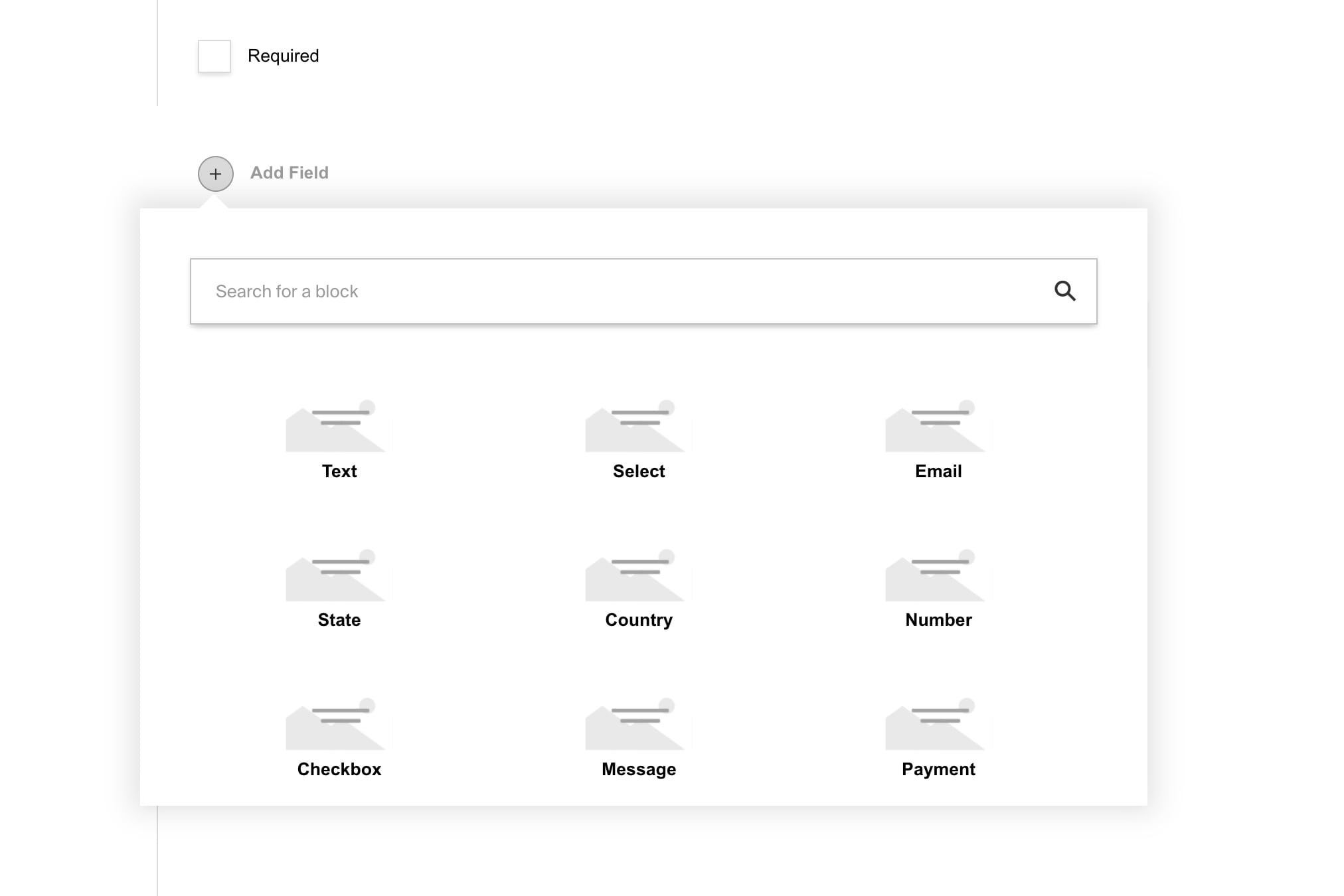
|
||||
<br />
|
||||
|
||||
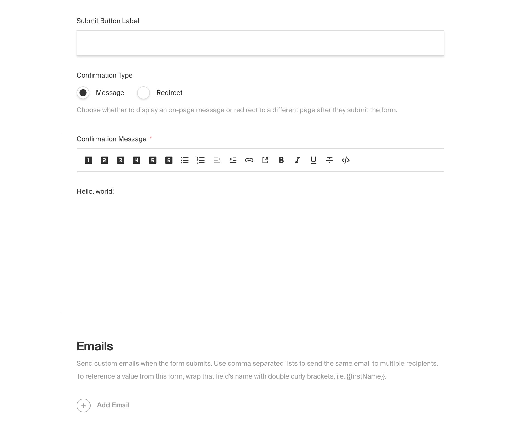
|
||||
<br />
|
||||
|
||||
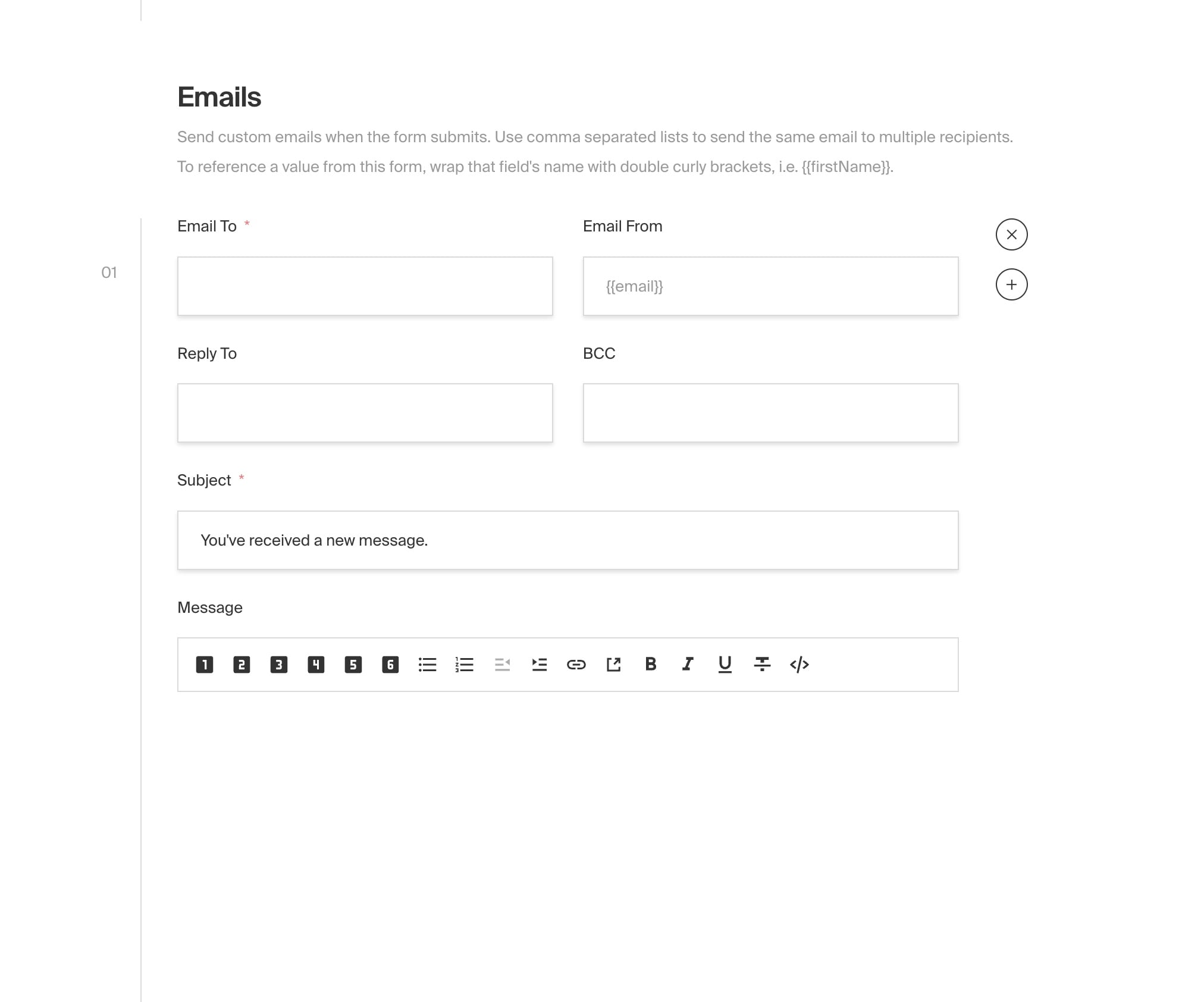
|
||||
<br />
|
||||
|
||||
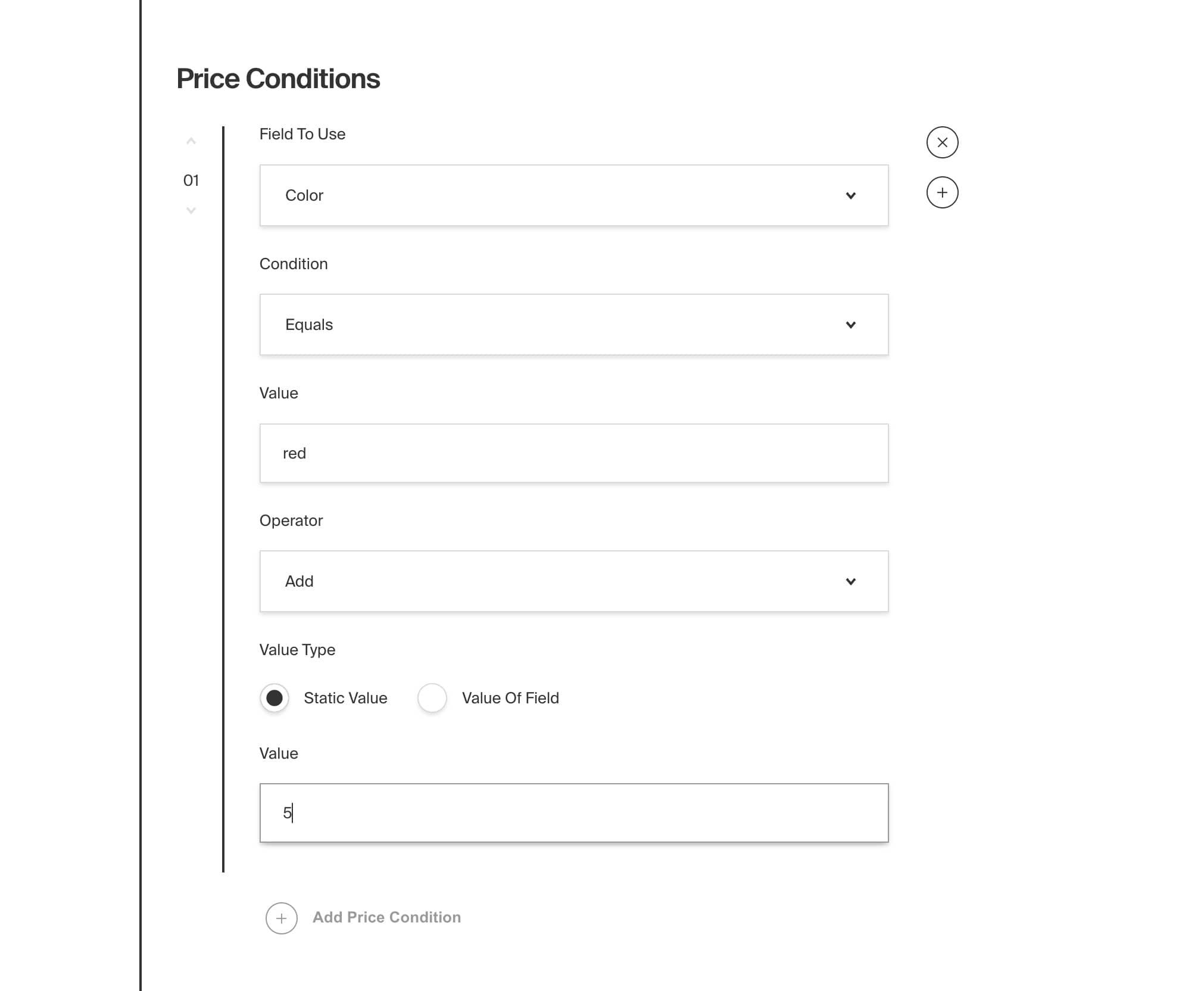
|
||||
<br />
|
||||
|
||||
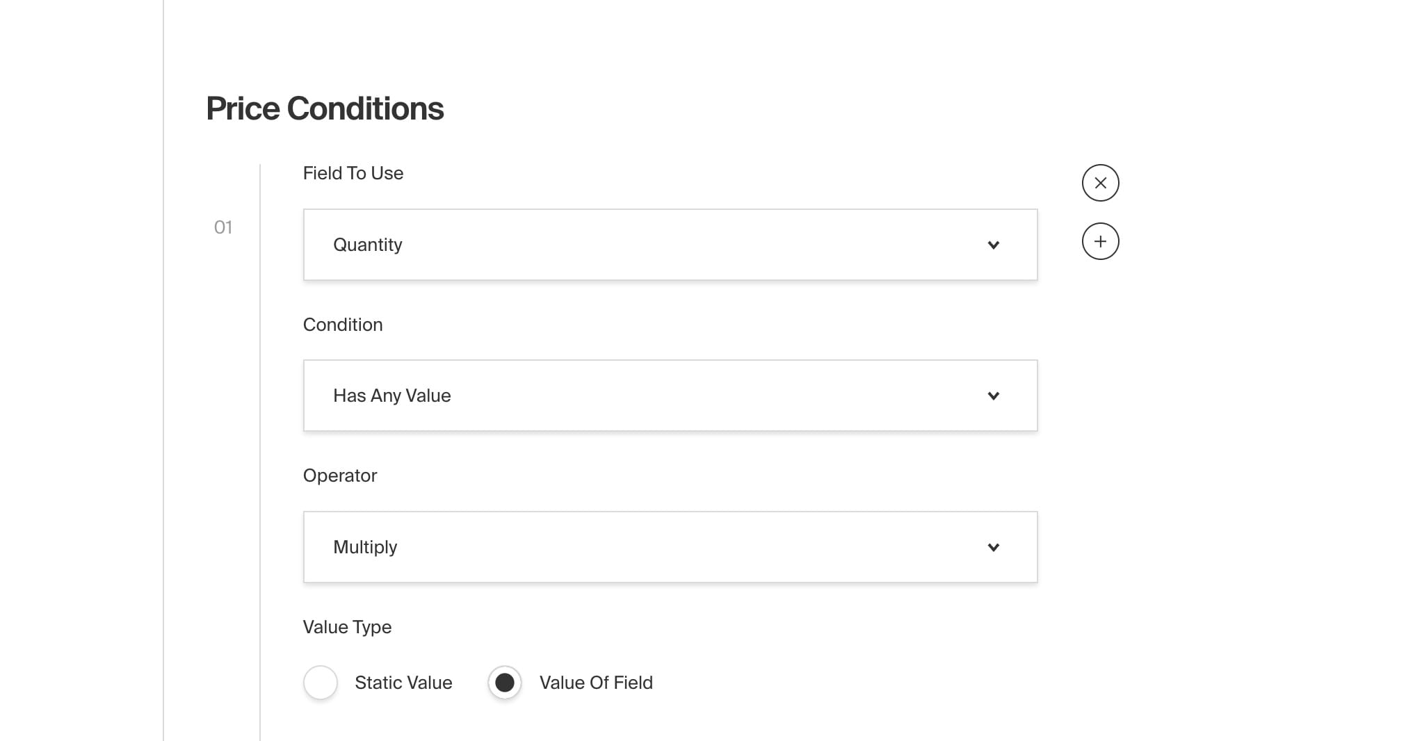
|
||||
|
||||
@@ -163,8 +163,8 @@ When defined, the `breadcrumbs` field will not be provided for you, and instead,
|
||||
own `breadcrumbs` field to each collection manually. Set this property to the `name` of your custom field.
|
||||
|
||||
<Banner type="info">
|
||||
<strong>Note:</strong>
|
||||
<br />
|
||||
**Note:**
|
||||
|
||||
If you opt out of automatically being provided a `parent` or `breadcrumbs` field, you need to make
|
||||
sure that both fields are placed at the top-level of your document. They cannot exist within any
|
||||
nested data structures like a `group`, `array`, or `blocks`.
|
||||
@@ -215,8 +215,8 @@ const examplePageConfig: CollectionConfig = {
|
||||
```
|
||||
|
||||
<Banner type="warning">
|
||||
<strong>Note:</strong>
|
||||
<br />
|
||||
**Note:**
|
||||
|
||||
If overriding the `name` of either `breadcrumbs` or `parent` fields, you must specify the
|
||||
`breadcrumbsFieldSlug` or `parentFieldSlug` respectively.
|
||||
</Banner>
|
||||
|
||||
@@ -147,6 +147,6 @@ export const addLastModified: Plugin = (incomingConfig: Config): Config => {
|
||||
```
|
||||
|
||||
<Banner type="success">
|
||||
<strong>Reminder:</strong>
|
||||
**Reminder:**
|
||||
See [how to build your own plugin](./build-your-own) for a more in-depth explication on how create your own Payload Plugin.
|
||||
</Banner>
|
||||
|
||||
@@ -1,26 +1,21 @@
|
||||
---
|
||||
title: SEO Plugin
|
||||
description: Manage SEO metadata from your Payload admin
|
||||
keywords: plugins, seo, meta, search, engine, ranking, google
|
||||
label: SEO
|
||||
order: 30
|
||||
desc: Manage SEO metadata from your Payload admin
|
||||
keywords: plugins, seo, meta, search, engine, ranking, google
|
||||
title: SEO Plugin
|
||||
---
|
||||
|
||||
[](https://www.npmjs.com/package/@payloadcms/plugin-seo)
|
||||

|
||||
|
||||
This plugin allows you to easily manage SEO metadata for your application from within your [Admin Panel](../admin/overview). When enabled on your [Collections](../configuration/collections) and [Globals](../configuration/globals), it adds a new `meta` field group containing `title`, `description`, and `image` by default. Your front-end application can then use this data to render meta tags however your application requires. For example, you would inject a `title` tag into the `<head>` of your page using `meta.title` as its content.
|
||||
|
||||
As users are editing documents within the Admin Panel, they have the option to "auto-generate" these fields. When clicked, this plugin will execute your own custom functions that re-generate the title, description, and image. This way you can build your own SEO writing assistance directly into your application. For example, you could append your site name onto the page title, or use the document's excerpt field as the description, or even integrate with some third-party API to generate the image using AI.
|
||||
|
||||
To help you visualize what your page might look like in a search engine, a preview is rendered on page just beneath the meta fields. This preview is updated in real-time as you edit your metadata. There are also visual indicators to help you write effective meta, such as a character counter for the title and description fields. You can even inject your own custom fields into the `meta` field group as your application requires, like `og:title` or `json-ld`. If you've ever used something like Yoast SEO, this plugin might feel very familiar.
|
||||
To help you visualize what your page might look like in a search engine, a preview is rendered on the page just beneath the meta fields. This preview is updated in real-time as you edit your metadata. There are also visual indicators to help you write effective meta, such as a character counter for the title and description fields. You can even inject your own custom fields into the `meta` field group as your application requires, like `og:title` or `json-ld`. If you've ever used something like Yoast SEO, this plugin might feel very familiar.
|
||||
|
||||
<Banner type="info">
|
||||
This plugin is completely open-source and the [source code can be found
|
||||
here](https://github.com/payloadcms/payload/tree/main/packages/plugin-seo). If you need help,
|
||||
check out our [Community Help](https://payloadcms.com/community-help). If you think you've found a
|
||||
bug, please [open a new
|
||||
issue](https://github.com/payloadcms/payload/issues/new?assignees=&labels=plugin%3A%20seo&template=bug_report.md&title=plugin-seo%3A)
|
||||
with as much detail as possible.
|
||||
This plugin is completely open-source and the [source code can be found here](https://github.com/payloadcms/payload/tree/main/packages/plugin-seo). If you need help, check out our [Community Help](https://payloadcms.com/community-help). If you think you've found a bug, please [open a new issue](https://github.com/payloadcms/payload/issues/new?assignees=&labels=plugin%3A%20seo&template=bug_report.md&title=plugin-seo%3A) with as much detail as possible.
|
||||
</Banner>
|
||||
|
||||
## Core features
|
||||
@@ -42,7 +37,7 @@ Install the plugin using any JavaScript package manager like [pnpm](https://pnpm
|
||||
|
||||
## Basic Usage
|
||||
|
||||
In the `plugins` array of your [Payload Config](https://payloadcms.com/docs/configuration/overview), call the plugin with [options](#options):
|
||||
In the `plugins` array of your [Payload Config](../configuration/overview), call the plugin with [options](#options):
|
||||
|
||||
```ts
|
||||
import { buildConfig } from 'payload';
|
||||
@@ -113,17 +108,15 @@ Set the `uploadsCollection` to your application's upload-enabled collection slug
|
||||
|
||||
##### `tabbedUI`
|
||||
|
||||
When the `tabbedUI` property is `true`, it appends an `SEO` tab onto your config using Payload's [Tabs Field](https://payloadcms.com/docs/fields/tabs). If your collection is not already tab-enabled, meaning the first field in your config is not of type `tabs`, then one will be created for you called `Content`. Defaults to `false`.
|
||||
When the `tabbedUI` property is `true`, it appends an `SEO` tab onto your config using Payload's [Tabs Field](../fields/tabs). If your collection is not already tab-enabled, meaning the first field in your config is not of type `tabs`, then one will be created for you called `Content`. Defaults to `false`.
|
||||
|
||||
<Banner type="info">
|
||||
If you wish to continue to use top-level or sidebar fields with `tabbedUI`, you must not let the
|
||||
default `Content` tab get created for you (see the note above). Instead, you must define the first
|
||||
field of your config with type `tabs` and place all other fields adjacent to this one.
|
||||
If you wish to continue to use top-level or sidebar fields with `tabbedUI`, you must not let the default `Content` tab get created for you (see the note above). Instead, you must define the first field of your config with type `tabs` and place all other fields adjacent to this one.
|
||||
</Banner>
|
||||
|
||||
##### `generateTitle`
|
||||
|
||||
A function that allows you to return any meta title, including from document's content.
|
||||
A function that allows you to return any meta title, including from the document's content.
|
||||
|
||||
```ts
|
||||
// payload.config.ts
|
||||
@@ -137,29 +130,29 @@ A function that allows you to return any meta title, including from document's c
|
||||
|
||||
All "generate" functions receive the following arguments:
|
||||
|
||||
| Argument | Description |
|
||||
| Argument | Description |
|
||||
| --- | --- |
|
||||
| **`collectionConfig`** | The configuration of the collection. |
|
||||
| **`collectionSlug`** | The slug of the collection. |
|
||||
| **`doc`** | The data of the current document. |
|
||||
| **`docPermissions`** | The permissions of the document. |
|
||||
| **`globalConfig`** | The configuration of the global. |
|
||||
| **`globalSlug`** | The slug of the global. |
|
||||
| **`hasPublishPermission`** | Whether the user has permission to publish the document. |
|
||||
| **`hasSavePermission`** | Whether the user has permission to save the document. |
|
||||
| **`id`** | The ID of the document. |
|
||||
| **`initialData`** | The initial data of the document. |
|
||||
| **`initialState`** | The initial state of the document. |
|
||||
| **`locale`** | The locale of the document. |
|
||||
| **`preferencesKey`** | The preferences key of the document. |
|
||||
| **`publishedDoc`** | The published document. |
|
||||
| **`req`** | The Payload request object containing `user`, `payload`, `i18n`, etc. |
|
||||
| **`title`** | The title of the document. |
|
||||
| **`versionsCount`** | The number of versions of the document. |
|
||||
|
||||
##### `generateDescription`
|
||||
|
||||
A function that allows you to return any meta description, including from document's content.
|
||||
A function that allows you to return any meta description, including from the document's content.
|
||||
|
||||
```ts
|
||||
// payload.config.ts
|
||||
@@ -175,7 +168,7 @@ For a full list of arguments, see the [`generateTitle`](#generatetitle) function
|
||||
|
||||
##### `generateImage`
|
||||
|
||||
A function that allows you to return any meta image, including from document's content.
|
||||
A function that allows you to return any meta image, including from the document's content.
|
||||
|
||||
```ts
|
||||
// payload.config.ts
|
||||
@@ -225,8 +218,7 @@ Rename the meta group interface name that is generated for TypeScript and GraphQ
|
||||
There is the option to directly import any of the fields from the plugin so that you can include them anywhere as needed.
|
||||
|
||||
<Banner type="info">
|
||||
You will still need to configure the plugin in the Payload Config in order to configure the generation functions.
|
||||
Since these fields are imported and used directly, they don't have access to the plugin config so they may need additional arguments to work the same way.
|
||||
You will still need to configure the plugin in the Payload Config in order to configure the generation functions. Since these fields are imported and used directly, they don't have access to the plugin config so they may need additional arguments to work the same way.
|
||||
</Banner>
|
||||
|
||||
```ts
|
||||
@@ -269,7 +261,7 @@ OverviewField({
|
||||
```
|
||||
|
||||
<Banner type="info">
|
||||
Tip: You can override the length rules by changing the minLength and maxLength props on the fields. In the case of the OverviewField you can use `titleOverrides` and `descriptionOverrides` to override the length rules.
|
||||
Tip: You can override the length rules by changing the minLength and maxLength props on the fields. In the case of the OverviewField you can use `titleOverrides` and `descriptionOverrides` to override the length rules.
|
||||
</Banner>
|
||||
|
||||
## TypeScript
|
||||
@@ -303,4 +295,4 @@ The [Templates Directory](https://github.com/payloadcms/payload/tree/main/templa
|
||||
|
||||
## Screenshots
|
||||
|
||||
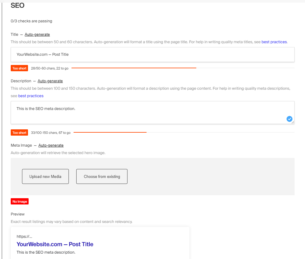
|
||||

|
||||
@@ -65,14 +65,14 @@ export default config
|
||||
|
||||
| Option | Type | Default | Description |
|
||||
| ------------------------------ | ------------------ | ----------- | ------------------------------------------------------------------------------------------------------------------------ |
|
||||
| `stripeSecretKey` \* | string | `undefined` | Your Stripe secret key |
|
||||
| `stripeSecretKey` * | string | `undefined` | Your Stripe secret key |
|
||||
| `stripeWebhooksEndpointSecret` | string | `undefined` | Your Stripe webhook endpoint secret |
|
||||
| `rest` | boolean | `false` | When `true`, opens the `/api/stripe/rest` endpoint |
|
||||
| `webhooks` | object \| function | `undefined` | Either a function to handle all webhooks events, or an object of Stripe webhook handlers, keyed to the name of the event |
|
||||
| `webhooks` | object or function | `undefined` | Either a function to handle all webhooks events, or an object of Stripe webhook handlers, keyed to the name of the event |
|
||||
| `sync` | array | `undefined` | An array of sync configs |
|
||||
| `logs` | boolean | `false` | When `true`, logs sync events to the console as they happen |
|
||||
|
||||
_\* An asterisk denotes that a property is required._
|
||||
_* An asterisk denotes that a property is required._
|
||||
|
||||
## Endpoints
|
||||
|
||||
@@ -109,15 +109,15 @@ const res = await fetch(`/api/stripe/rest`, {
|
||||
If you need to proxy the API server-side, use the [stripeProxy](#node) function.
|
||||
|
||||
<Banner type="info">
|
||||
<strong>Note:</strong>
|
||||
<br />
|
||||
**Note:**
|
||||
|
||||
The `/api` part of these routes may be different based on the settings defined in your Payload
|
||||
config.
|
||||
</Banner>
|
||||
|
||||
<Banner type="warning">
|
||||
<strong>Warning:</strong>
|
||||
<br />
|
||||
**Warning:**
|
||||
|
||||
Opening the REST proxy endpoint in production is a potential security risk. Authenticated users will have open access to the Stripe REST API. In production, open your own endpoint and use the [stripeProxy](#node) function to proxy the Stripe API server-side.
|
||||
</Banner>
|
||||
|
||||
@@ -232,8 +232,8 @@ export const MyFunction = async () => {
|
||||
This option will setup a basic sync between Payload collections and Stripe resources for you automatically. It will create all the necessary hooks and webhooks handlers, so the only thing you have to do is map your Payload fields to their corresponding Stripe properties. As documents are created, updated, and deleted from either Stripe or Payload, the changes are reflected on either side.
|
||||
|
||||
<Banner type="info">
|
||||
<strong>Note:</strong>
|
||||
<br />
|
||||
**Note:**
|
||||
|
||||
If you wish to enable a _two-way_ sync, be sure to setup [`webhooks`](#webhooks) and pass the
|
||||
`stripeWebhooksEndpointSecret` through your config.
|
||||
</Banner>
|
||||
@@ -268,8 +268,8 @@ export default config
|
||||
```
|
||||
|
||||
<Banner type="warning">
|
||||
<strong>Note:</strong>
|
||||
<br />
|
||||
**Note:**
|
||||
|
||||
Due to limitations in the Stripe API, this currently only works with top-level fields. This is
|
||||
because every Stripe object is a separate entity, making it difficult to abstract into a simple
|
||||
reusable library. In the future, we may find a pattern around this. But for now, cases like that
|
||||
|
||||
@@ -8,7 +8,7 @@ keywords: deployment, production, config, configuration, documentation, Content
|
||||
|
||||
<Banner type="success">
|
||||
So you've developed a Payload app, it's fully tested, and running great locally. Now it's time to
|
||||
launch. <strong>Awesome! Great work!</strong> Now, what's next?
|
||||
launch. **Awesome! Great work!** Now, what's next?
|
||||
</Banner>
|
||||
|
||||
There are many ways to deploy Payload to a production environment. When evaluating how you will deploy Payload, you need
|
||||
@@ -55,17 +55,17 @@ Because _**you**_ are in complete control of who can do what with your data, you
|
||||
wield that power responsibly before deploying to Production.
|
||||
|
||||
<Banner type="error">
|
||||
<strong>
|
||||
**
|
||||
By default, all Access Control functions require that a user is successfully logged in to
|
||||
Payload to create, read, update, or delete data.
|
||||
</strong>
|
||||
**
|
||||
But, if you allow public user registration, for example, you will want to make sure that your
|
||||
access control functions are more strict - permitting
|
||||
{' '}
|
||||
<strong>
|
||||
|
||||
**
|
||||
only appropriate users
|
||||
</strong>
|
||||
{' '}
|
||||
**
|
||||
|
||||
to perform appropriate actions.
|
||||
</Banner>
|
||||
|
||||
@@ -133,9 +133,9 @@ perpetually.
|
||||
- Many other more traditional web hosts
|
||||
|
||||
<Banner type="error">
|
||||
<strong>Warning:</strong>
|
||||
<br />
|
||||
If you rely on Payload's <strong>Upload</strong> functionality, make sure you either use a host
|
||||
**Warning:**
|
||||
|
||||
If you rely on Payload's **Upload** functionality, make sure you either use a host
|
||||
with a persistent filesystem or have an integration with a third-party file host like Amazon S3.
|
||||
</Banner>
|
||||
|
||||
|
||||
@@ -34,7 +34,7 @@ But with a `depth` of `1`, the response might look like this:
|
||||
```
|
||||
|
||||
<Banner type="warning">
|
||||
<strong>Important:</strong>
|
||||
**Important:**
|
||||
Depth has no effect in the [GraphQL API](../graphql/overview), because there, depth is based on the shape of your queries.
|
||||
</Banner>
|
||||
|
||||
@@ -56,7 +56,7 @@ const getPosts = async (payload: Payload) => {
|
||||
```
|
||||
|
||||
<Banner type="info">
|
||||
<strong>Reminder:</strong>
|
||||
**Reminder:**
|
||||
This is the same for [Globals](../configuration/globals) using the `findGlobal` operation.
|
||||
</Banner>
|
||||
|
||||
@@ -71,7 +71,7 @@ fetch('https://localhost:3000/api/posts?depth=2') // highlight-line
|
||||
```
|
||||
|
||||
<Banner type="info">
|
||||
<strong>Reminder:</strong>
|
||||
**Reminder:**
|
||||
This is the same for [Globals](../configuration/globals) using the `/api/globals` endpoint.
|
||||
</Banner>
|
||||
|
||||
|
||||
@@ -31,7 +31,7 @@ const query: Where = {
|
||||
_The exact query syntax will depend on the API you are using, but the concepts are the same across all APIs. [More details](#writing-queries)._
|
||||
|
||||
<Banner>
|
||||
<strong>Tip:</strong>
|
||||
**Tip:**
|
||||
You can also use queries within [Access Control](../access-control/overview) functions.
|
||||
</Banner>
|
||||
|
||||
@@ -58,7 +58,7 @@ The following operators are available for use in queries:
|
||||
| `intersects` | For [Point Fields](../fields/point) to filter documents based on whether points intersect with the given area defined in GeoJSON. [Example](../fields/point#querying-intersects) |
|
||||
|
||||
<Banner type="success">
|
||||
<strong>Tip:</strong>
|
||||
**Tip:**
|
||||
If you know your users will be querying on certain fields a lot, add `index: true` to the Field Config. This will speed up searches using that field immensely.
|
||||
</Banner>
|
||||
|
||||
|
||||
@@ -10,18 +10,18 @@ All collection `find` queries are paginated automatically. Responses are returne
|
||||
|
||||
**`Find` response properties:**
|
||||
|
||||
| Property | Description |
|
||||
| ------------- | --------------------------------------------------------- |
|
||||
| docs | Array of documents in the collection |
|
||||
| totalDocs | Total available documents within the collection |
|
||||
| limit | Limit query parameter - defaults to `10` |
|
||||
| totalPages | Total pages available, based upon the `limit` queried for |
|
||||
| page | Current page number |
|
||||
| pagingCounter | `number` of the first doc on the current page |
|
||||
| hasPrevPage | `true/false` if previous page exists |
|
||||
| hasNextPage | `true/false` if next page exists |
|
||||
| prevPage | `number` of previous page, `null` if it doesn't exist |
|
||||
| nextPage | `number` of next page, `null` if it doesn't exist |
|
||||
| Property | Description |
|
||||
| --------------- | --------------------------------------------------------- |
|
||||
| `docs` | Array of documents in the collection |
|
||||
| `totalDocs` | Total available documents within the collection |
|
||||
| `limit` | Limit query parameter - defaults to `10` |
|
||||
| `totalPages` | Total pages available, based upon the `limit` queried for |
|
||||
| `page` | Current page number |
|
||||
| `pagingCounter` | `number` of the first doc on the current page |
|
||||
| `hasPrevPage` | `true/false` if previous page exists |
|
||||
| `hasNextPage` | `true/false` if next page exists |
|
||||
| `prevPage` | `number` of previous page, `null` if it doesn't exist |
|
||||
| `nextPage` | `number` of next page, `null` if it doesn't exist |
|
||||
|
||||
**Example response:**
|
||||
|
||||
|
||||
@@ -54,7 +54,7 @@ const getPosts = async (payload: Payload) => {
|
||||
|
||||
|
||||
<Banner type="warning">
|
||||
<strong>Important:</strong>
|
||||
**Important:**
|
||||
To perform querying with `select` efficiently, Payload implements your `select` query on the database level. Because of that, your `beforeRead` and `afterRead` hooks may not receive the full `doc`.
|
||||
</Banner>
|
||||
|
||||
@@ -100,7 +100,7 @@ const getPosts = async () => {
|
||||
```
|
||||
|
||||
<Banner type="info">
|
||||
<strong>Reminder:</strong>
|
||||
**Reminder:**
|
||||
This is the same for [Globals](../configuration/globals) using the `/api/globals` endpoint.
|
||||
</Banner>
|
||||
|
||||
@@ -137,6 +137,11 @@ export const Pages: CollectionConfig<'pages'> = {
|
||||
}
|
||||
```
|
||||
|
||||
<Banner type="warning">
|
||||
<strong>Important:</strong>
|
||||
When using `defaultPopulate` on a collection with [Uploads](/docs/fields/upload) enabled and you want to select the `url` field, it is important to specify `filename: true` as well, otherwise Payload will not be able to construct the correct file URL, instead returning `url: null`.
|
||||
</Banner>
|
||||
|
||||
## populate
|
||||
|
||||
Setting `defaultPopulate` will enforce that each time Payload performs a "population" of a related document, only the fields specified will be queried and returned. However, you can override `defaultPopulate` with the `populate` property in the Local and REST API:
|
||||
|
||||
@@ -11,7 +11,7 @@ Documents in Payload can be easily sorted by a specific [Field](../fields/overvi
|
||||
Because sorting is handled by the database, the field cannot be a [Virtual Field](https://payloadcms.com/blog/learn-how-virtual-fields-can-help-solve-common-cms-challenges). It must be stored in the database to be searchable.
|
||||
|
||||
<Banner type="success">
|
||||
<strong>Tip:</strong>
|
||||
**Tip:**
|
||||
For performance reasons, it is recommended to enable `index: true` for the fields that will be sorted upon. [More details](../fields/overview).
|
||||
</Banner>
|
||||
|
||||
|
||||
@@ -50,29 +50,16 @@ Note: Collection slugs must be formatted in kebab-case
|
||||
updatedAt: "2023-04-27T11:27:32.419Z",
|
||||
},
|
||||
},
|
||||
drawerContent: (
|
||||
<>
|
||||
<h6>Additional <code>find</code> query parameters</h6>
|
||||
The <code>find</code> endpoint supports the following additional query parameters:
|
||||
<ul>
|
||||
<li>
|
||||
<a href="/docs/queries/overview#sort">sort</a> - sort by field
|
||||
</li>
|
||||
<li>
|
||||
<a href="/docs/queries/overview">where</a> - pass a where query to constrain returned
|
||||
documents
|
||||
</li>
|
||||
<li>
|
||||
<a href="/docs/queries/pagination#pagination-controls">limit</a> - limit the returned
|
||||
documents to a certain number
|
||||
</li>
|
||||
<li>
|
||||
<a href="/docs/queries/pagination#pagination-controls">page</a> - get a specific page of
|
||||
documents
|
||||
</li>
|
||||
</ul>
|
||||
</>
|
||||
),
|
||||
drawerContent: `
|
||||
#### Additional \`find\` query parameters
|
||||
|
||||
The \`find\` endpoint supports the following additional query parameters:
|
||||
|
||||
- [sort](/docs/queries/overview#sort) - sort by field
|
||||
- [where](/docs/queries/overview) - pass a where query to constrain returned documents
|
||||
- [limit](/docs/queries/pagination#pagination-controls) - limit the returned documents to a certain number
|
||||
- [page](/docs/queries/pagination#pagination-controls) - get a specific page of documents
|
||||
`
|
||||
},
|
||||
},
|
||||
{
|
||||
@@ -659,7 +646,7 @@ export const Orders: CollectionConfig = {
|
||||
```
|
||||
|
||||
<Banner>
|
||||
<strong>Note:</strong>
|
||||
**Note:**
|
||||
**req** will have the **payload** object and can be used inside your endpoint handlers for making calls like req.payload.find() that will make use of [Access Control](../access-control/overview) and [Hooks](../hooks/overview).
|
||||
</Banner>
|
||||
|
||||
|
||||
@@ -10,12 +10,154 @@ Before you begin building custom features for Lexical, it is crucial to familiar
|
||||
|
||||
Lexical features are designed to be modular, meaning each piece of functionality is encapsulated within just two specific interfaces: one for server-side code and one for client-side code.
|
||||
|
||||
By convention, these are named feature.server.ts for server-side functionality and feature.client.ts for client-side functionality. The primary functionality is housed within feature.server.ts, which users will import into their projects. The client-side feature, although defined separately, is integrated and rendered server-side through the server feature. That way, we still maintain a clear boundary between server and client code, while also centralizing the code needed for a feature in basically one place. This approach is beneficial for managing all the bits and pieces which make up your feature as a whole, such as toolbar entries, buttons, or new nodes, allowing each feature to be neatly contained and managed independently.
|
||||
By convention, these are named `feature.server.ts` for server-side functionality and `feature.client.ts` for client-side functionality. The primary functionality is housed within `feature.server.ts`, which users will import into their projects. The client-side feature, although defined separately, is integrated and rendered server-side through the server feature.
|
||||
|
||||
That way, we still maintain a clear boundary between server and client code, while also centralizing the code needed for a feature in basically one place. This approach is beneficial for managing all the bits and pieces which make up your feature as a whole, such as toolbar entries, buttons, or new nodes, allowing each feature to be neatly contained and managed independently.
|
||||
|
||||
<Banner type="warning">
|
||||
**Important:**
|
||||
Do not import directly from core lexical packages - this may break in minor Payload version bumps.
|
||||
|
||||
Instead, import the re-exported versions from `@payloadcms/richtext-lexical`. For example, change `import { $insertNodeToNearestRoot } from '@lexical/utils'` to `import { $insertNodeToNearestRoot } from '@payloadcms/richtext-lexical/lexical/utils'`
|
||||
</Banner>
|
||||
|
||||
## Do I need a custom feature?
|
||||
|
||||
Before you start building a custom feature, consider whether you can achieve your desired functionality using the existing `BlocksFeature`. The `BlocksFeature` is a powerful feature that allows you to create custom blocks with a variety of options, including custom React components, markdown converters, and more. If you can achieve your desired functionality using the `BlocksFeature`, it is recommended to use it instead of building a custom feature.
|
||||
|
||||
Using the BlocksFeature, you can add both inline blocks (= can be inserted into a paragraph, in between text) and block blocks (= take up the whole line) to the editor. If you simply want to bring custom react components into the editor, this is the way to go.
|
||||
|
||||
### Example: Code Field Block with language picker
|
||||
|
||||
This example demonstrates how to create a custom code field block with a language picker using the `BlocksFeature`. Make sure to manually install `@payloadcms/ui`first.
|
||||
|
||||
Field config:
|
||||
|
||||
```ts
|
||||
import {
|
||||
BlocksFeature,
|
||||
lexicalEditor,
|
||||
} from '@payloadcms/richtext-lexical'
|
||||
|
||||
export const languages = {
|
||||
ts: 'TypeScript',
|
||||
plaintext: 'Plain Text',
|
||||
tsx: 'TSX',
|
||||
js: 'JavaScript',
|
||||
jsx: 'JSX',
|
||||
}
|
||||
|
||||
// ...
|
||||
{
|
||||
name: 'richText',
|
||||
type: 'richText',
|
||||
editor: lexicalEditor({
|
||||
features: ({ defaultFeatures }) => [
|
||||
...defaultFeatures,
|
||||
BlocksFeature({
|
||||
blocks: [
|
||||
{
|
||||
slug: 'Code',
|
||||
fields: [
|
||||
{
|
||||
type: 'select',
|
||||
name: 'language',
|
||||
options: Object.entries(languages).map(([key, value]) => ({
|
||||
label: value,
|
||||
value: key,
|
||||
})),
|
||||
defaultValue: 'ts',
|
||||
},
|
||||
{
|
||||
admin: {
|
||||
components: {
|
||||
Field: './path/to/CodeComponent#Code',
|
||||
},
|
||||
},
|
||||
name: 'code',
|
||||
type: 'code',
|
||||
},
|
||||
],
|
||||
}
|
||||
],
|
||||
inlineBlocks: [],
|
||||
}),
|
||||
],
|
||||
}),
|
||||
},
|
||||
```
|
||||
|
||||
CodeComponent.tsx:
|
||||
|
||||
```tsx
|
||||
'use client'
|
||||
|
||||
import type { CodeFieldClient, CodeFieldClientProps } from 'payload'
|
||||
|
||||
import { CodeField, useFormFields } from '@payloadcms/ui'
|
||||
import React, { useMemo } from 'react'
|
||||
|
||||
import { languages } from './yourFieldConfig'
|
||||
|
||||
const languageKeyToMonacoLanguageMap = {
|
||||
plaintext: 'plaintext',
|
||||
ts: 'typescript',
|
||||
tsx: 'typescript',
|
||||
}
|
||||
|
||||
export const Code: React.FC<CodeFieldClientProps> = ({
|
||||
autoComplete,
|
||||
field,
|
||||
forceRender,
|
||||
path,
|
||||
permissions,
|
||||
readOnly,
|
||||
renderedBlocks,
|
||||
schemaPath,
|
||||
validate,
|
||||
}) => {
|
||||
const languageField = useFormFields(([fields]) => fields['language'])
|
||||
|
||||
const language: string =
|
||||
(languageField?.value as string) || (languageField.initialValue as string) || 'typescript'
|
||||
|
||||
const label = languages[language as keyof typeof languages]
|
||||
|
||||
const props: CodeFieldClient = useMemo<CodeFieldClient>(
|
||||
() => ({
|
||||
...field,
|
||||
type: 'code',
|
||||
admin: {
|
||||
...field.admin,
|
||||
label,
|
||||
language: languageKeyToMonacoLanguageMap[language] || language,
|
||||
},
|
||||
}),
|
||||
[field, language, label],
|
||||
)
|
||||
|
||||
const key = `${field.name}-${language}-${label}`
|
||||
|
||||
return (
|
||||
<CodeField
|
||||
autoComplete={autoComplete}
|
||||
field={props}
|
||||
forceRender={forceRender}
|
||||
key={key}
|
||||
path={path}
|
||||
permissions={permissions}
|
||||
readOnly={readOnly}
|
||||
renderedBlocks={renderedBlocks}
|
||||
schemaPath={schemaPath}
|
||||
validate={validate}
|
||||
/>
|
||||
)
|
||||
}
|
||||
```
|
||||
|
||||
## Server Feature
|
||||
|
||||
To start building new features, you should start with the server feature, which is the entry-point.
|
||||
Custom Blocks are not enough? To start building a custom feature, you should start with the server feature, which is the entry-point.
|
||||
|
||||
**Example myFeature/feature.server.ts:**
|
||||
|
||||
@@ -49,8 +191,7 @@ import { lexicalEditor } from '@payloadcms/richtext-lexical';
|
||||
},
|
||||
```
|
||||
|
||||
By default, this server feature does nothing - you haven't added any functionality yet. Depending on what you want your
|
||||
feature to do, the ServerFeature type exposes various properties you can set to inject custom functionality into the lexical editor.
|
||||
By default, this server feature does nothing - you haven't added any functionality yet. Depending on what you want your feature to do, the ServerFeature type exposes various properties you can set to inject custom functionality into the lexical editor.
|
||||
|
||||
### i18n
|
||||
|
||||
@@ -266,6 +407,22 @@ export const MyClientFeature = createClientFeature({
|
||||
|
||||
Explore the APIs available through ClientFeature to add the specific functionality you need. Remember, do not import directly from `'@payloadcms/richtext-lexical'` when working on the client-side, as it will cause errors with webpack or turbopack. Instead, use `'@payloadcms/richtext-lexical/client'` for all client-side imports. Type-imports are excluded from this rule and can always be imported.
|
||||
|
||||
### Adding a client feature to the server feature
|
||||
|
||||
Inside of your server feature, you can provide an [import path](/docs/admin/components#component-paths) to the client feature like this:
|
||||
|
||||
```ts
|
||||
import { createServerFeature } from '@payloadcms/richtext-lexical';
|
||||
|
||||
export const MyFeature = createServerFeature({
|
||||
feature: {
|
||||
ClientFeature: './path/to/feature.client#MyClientFeature',
|
||||
},
|
||||
key: 'myFeature',
|
||||
dependenciesPriority: ['otherFeature'],
|
||||
})
|
||||
```
|
||||
|
||||
### Nodes#client-feature-nodes
|
||||
|
||||
Add nodes to the `nodes` array in **both** your client & server feature. On the server side, nodes are utilized for backend operations like HTML conversion in a headless editor. On the client side, these nodes are integral to how content is displayed and managed in the editor, influencing how they are rendered, behave, and saved in the database.
|
||||
|
||||
@@ -380,9 +380,9 @@ Functions prefixed with a `$` can only be run inside an `editor.update()` or `ed
|
||||
This has been taken from the [lexical serialization & deserialization docs](https://lexical.dev/docs/concepts/serialization#html---lexical).
|
||||
|
||||
<Banner type="success">
|
||||
<strong>Note:</strong>
|
||||
<br />
|
||||
Using the <code>discrete: true</code> flag ensures instant updates to the editor state. If
|
||||
**Note:**
|
||||
|
||||
Using the `discrete: true` flag ensures instant updates to the editor state. If
|
||||
immediate reading of the updated state isn't necessary, you can omit the flag.
|
||||
</Banner>
|
||||
|
||||
|
||||
@@ -1,17 +1,13 @@
|
||||
---
|
||||
title: Rich Text Editor
|
||||
description: The Payload editor, based on Lexical, allows for great customization with unparalleled ease.
|
||||
keywords: lexical, rich text, editor, headless cms
|
||||
label: Overview
|
||||
order: 10
|
||||
desc: The Payload editor, based on Lexical, allows for great customization with unparalleled ease.
|
||||
keywords: lexical, rich text, editor, headless cms
|
||||
title: Rich Text Editor
|
||||
---
|
||||
|
||||
<Banner type="warning">
|
||||
|
||||
The Payload editor is based on Lexical, Meta's rich text editor. The previous default editor was
|
||||
based on Slate and is still supported. You can read [its documentation](/docs/rich-text/slate),
|
||||
or the optional [migration guide](/docs/rich-text/migration) to migrate from Slate to Lexical (recommended).
|
||||
|
||||
<Banner type="success">
|
||||
The Payload editor is based on Lexical, Meta's rich text editor. The previous default editor was based on Slate and is still supported. You can read [its documentation](../rich-text/slate), or the optional [migration guide](../rich-text/migration) to migrate from Slate to Lexical (recommended).
|
||||
</Banner>
|
||||
|
||||
One of Payload's goals is to build the best rich text editor experience that we possibly can. We want to combine the beauty and polish of the Medium editing experience with the strength and features of the Notion editor - all in one place.
|
||||
@@ -21,14 +17,14 @@ Classically, we've used SlateJS to work toward this goal, but building custom el
|
||||
Lexical is extremely impressive and trivializes a lot of the hard parts of building new elements into a rich text editor. It has a few distinct advantages over Slate, including the following:
|
||||
|
||||
1. A "/" menu, which allows editors to easily add new elements while never leaving their keyboard
|
||||
1. A "hover" toolbar that pops up if you select text
|
||||
1. It supports Payload blocks natively, directly within your rich text editor
|
||||
1. Custom elements, called "features", are much easier to build in Lexical vs. Slate
|
||||
2. A "hover" toolbar that pops up if you select text
|
||||
3. It supports Payload blocks natively, directly within your rich text editor
|
||||
4. Custom elements, called "features", are much easier to build in Lexical vs. Slate
|
||||
|
||||
To use the Lexical editor, first you need to install it:
|
||||
|
||||
```
|
||||
npm install @payloadcms/richtext-lexical
|
||||
```bash
|
||||
pnpm install @payloadcms/richtext-lexical
|
||||
```
|
||||
|
||||
Once you have it installed, you can pass it to your top-level Payload Config as follows:
|
||||
@@ -138,55 +134,53 @@ import { CallToAction } from '../blocks/CallToAction'
|
||||
|
||||
`features` can be both an array of features, or a function returning an array of features. The function provides the following props:
|
||||
|
||||
|
||||
| Prop | Description |
|
||||
|-----------------------|--------------------------------------------------------------------------------------------------------------------------------------------------------------------------------------------------------------------------------------------------------|
|
||||
| **`defaultFeatures`** | This opinionated array contains all "recommended" default features. You can see which features are included in the default features in the table below. |
|
||||
| **`rootFeatures`** | This array contains all features that are enabled in the root richText editor (the one defined in the payload.config.ts). If this field is the root richText editor, or if the root richText editor is not a lexical editor, this array will be empty. |
|
||||
|
||||
| Prop | Description |
|
||||
| --- | --- |
|
||||
| **`defaultFeatures`** | This opinionated array contains all "recommended" default features. You can see which features are included in the default features in the table below. |
|
||||
| **`rootFeatures`** | This array contains all features that are enabled in the root richText editor (the one defined in the payload.config.ts). If this field is the root richText editor, or if the root richText editor is not a lexical editor, this array will be empty. |
|
||||
|
||||
## Features overview
|
||||
|
||||
Here's an overview of all the included features:
|
||||
|
||||
| Feature Name | Included by default | Description |
|
||||
|---------------------------------|---------------------|----------------------------------------------------------------------------------------------------------------------------------------------------------------------------------------|
|
||||
| **`BoldTextFeature`** | Yes | Handles the bold text format |
|
||||
| **`ItalicTextFeature`** | Yes | Handles the italic text format |
|
||||
| **`UnderlineTextFeature`** | Yes | Handles the underline text format |
|
||||
| **`StrikethroughTextFeature`** | Yes | Handles the strikethrough text format |
|
||||
| **`SubscriptTextFeature`** | Yes | Handles the subscript text format |
|
||||
| **`SuperscriptTextFeature`** | Yes | Handles the superscript text format |
|
||||
| **`InlineCodeTextFeature`** | Yes | Handles the inline-code text format |
|
||||
| **`ParagraphFeature`** | Yes | Handles paragraphs. Since they are already a key feature of lexical itself, this Feature mainly handles the Slash and Add-Block menu entries for paragraphs |
|
||||
| **`HeadingFeature`** | Yes | Adds Heading Nodes (by default, H1 - H6, but that can be customized) |
|
||||
| **`AlignFeature`** | Yes | Allows you to align text left, centered and right |
|
||||
| **`IndentFeature`** | Yes | Allows you to indent text with the tab key |
|
||||
| **`UnorderedListFeature`** | Yes | Adds unordered lists (ul) |
|
||||
| **`OrderedListFeature`** | Yes | Adds ordered lists (ol) |
|
||||
| **`CheckListFeature`** | Yes | Adds checklists |
|
||||
| **`LinkFeature`** | Yes | Allows you to create internal and external links |
|
||||
| **`RelationshipFeature`** | Yes | Allows you to create block-level (not inline) relationships to other documents |
|
||||
| **`BlockQuoteFeature`** | Yes | Allows you to create block-level quotes |
|
||||
| **`UploadFeature`** | Yes | Allows you to create block-level upload nodes - this supports all kinds of uploads, not just images |
|
||||
| **`HorizontalRuleFeature`** | Yes | Horizontal rules / separators. Basically displays an `<hr>` element |
|
||||
| **`InlineToolbarFeature`** | Yes | The inline toolbar is the floating toolbar which appears when you select text. This toolbar only contains actions relevant for selected text |
|
||||
| **`FixedToolbarFeature`** | No | This classic toolbar is pinned to the top and always visible. Both inline and fixed toolbars can be enabled at the same time. |
|
||||
| **`BlocksFeature`** | No | Allows you to use Payload's [Blocks Field](/docs/fields/blocks) directly inside your editor. In the feature props, you can specify the allowed blocks - just like in the Blocks field. |
|
||||
| **`TreeViewFeature`** | No | Adds a debug box under the editor, which allows you to see the current editor state live, the dom, as well as time travel. Very useful for debugging |
|
||||
| **`EXPERIMENTAL_TableFeature`** | No | Adds support for tables. This feature may be removed or receive breaking changes in the future - even within a stable lexical release, without needing a major release. |
|
||||
| Feature Name | Included by default | Description |
|
||||
| --- | --- | --- |
|
||||
| **`BoldTextFeature`** | Yes | Handles the bold text format |
|
||||
| **`ItalicTextFeature`** | Yes | Handles the italic text format |
|
||||
| **`UnderlineTextFeature`** | Yes | Handles the underline text format |
|
||||
| **`StrikethroughTextFeature`** | Yes | Handles the strikethrough text format |
|
||||
| **`SubscriptTextFeature`** | Yes | Handles the subscript text format |
|
||||
| **`SuperscriptTextFeature`** | Yes | Handles the superscript text format |
|
||||
| **`InlineCodeTextFeature`** | Yes | Handles the inline-code text format |
|
||||
| **`ParagraphFeature`** | Yes | Handles paragraphs. Since they are already a key feature of lexical itself, this Feature mainly handles the Slash and Add-Block menu entries for paragraphs |
|
||||
| **`HeadingFeature`** | Yes | Adds Heading Nodes (by default, H1 - H6, but that can be customized) |
|
||||
| **`AlignFeature`** | Yes | Allows you to align text left, centered and right |
|
||||
| **`IndentFeature`** | Yes | Allows you to indent text with the tab key |
|
||||
| **`UnorderedListFeature`** | Yes | Adds unordered lists (ul) |
|
||||
| **`OrderedListFeature`** | Yes | Adds ordered lists (ol) |
|
||||
| **`CheckListFeature`** | Yes | Adds checklists |
|
||||
| **`LinkFeature`** | Yes | Allows you to create internal and external links |
|
||||
| **`RelationshipFeature`** | Yes | Allows you to create block-level (not inline) relationships to other documents |
|
||||
| **`BlockQuoteFeature`** | Yes | Allows you to create block-level quotes |
|
||||
| **`UploadFeature`** | Yes | Allows you to create block-level upload nodes - this supports all kinds of uploads, not just images |
|
||||
| **`HorizontalRuleFeature`** | Yes | Horizontal rules / separators. Basically displays an `<hr>` element |
|
||||
| **`InlineToolbarFeature`** | Yes | The inline toolbar is the floating toolbar which appears when you select text. This toolbar only contains actions relevant for selected text |
|
||||
| **`FixedToolbarFeature`** | No | This classic toolbar is pinned to the top and always visible. Both inline and fixed toolbars can be enabled at the same time. |
|
||||
| **`BlocksFeature`** | No | Allows you to use Payload's [Blocks Field](../fields/blocks) directly inside your editor. In the feature props, you can specify the allowed blocks - just like in the Blocks field. |
|
||||
| **`TreeViewFeature`** | No | Adds a debug box under the editor, which allows you to see the current editor state live, the dom, as well as time travel. Very useful for debugging |
|
||||
| **`EXPERIMENTAL_TableFeature`** | No | Adds support for tables. This feature may be removed or receive breaking changes in the future - even within a stable lexical release, without needing a major release. |
|
||||
|
||||
Notice how even the toolbars are features? That's how extensible our lexical editor is - you could theoretically create your own toolbar if you wanted to!
|
||||
|
||||
## Creating your own, custom Feature
|
||||
|
||||
You can find more information about creating your own feature in our [building custom feature docs](/docs/rich-text/building-custom-features).
|
||||
You can find more information about creating your own feature in our [building custom feature docs](../rich-text/building-custom-features).
|
||||
|
||||
## TypeScript
|
||||
|
||||
Every single piece of saved data is 100% fully-typed within lexical. It provides a type for every single node, which can be imported from `@payloadcms/richtext-lexical` - each type is prefixed with `Serialized`, e.g. `SerializedUploadNode`.
|
||||
Every single piece of saved data is 100% fully typed within lexical. It provides a type for every single node, which can be imported from `@payloadcms/richtext-lexical` - each type is prefixed with `Serialized`, e.g., `SerializedUploadNode`.
|
||||
|
||||
In order to fully type the entire editor JSON, you can use our `TypedEditorState` helper type, which accepts a union of all possible node types as a generic. The reason we do not provide a type which already contains all possible node types is because the possible node types depend on which features you have enabled in your editor. Here is an example:
|
||||
To fully type the entire editor JSON, you can use our `TypedEditorState` helper type, which accepts a union of all possible node types as a generic. We don't provide a type that already contains all possible node types because they depend on which features you have enabled in your editor. Here is an example:
|
||||
|
||||
```ts
|
||||
import type {
|
||||
@@ -289,12 +283,59 @@ const editorState: DefaultTypedEditorState = {
|
||||
}
|
||||
```
|
||||
|
||||
Just like `TypedEditorState`, the `DefaultTypedEditorState` also accepts an optional node type union as a generic. Here, this would **add** the specified node types to the default ones. Example: `DefaultTypedEditorState<SerializedBlockNode | YourCustomSerializedNode>`.
|
||||
Just like `TypedEditorState`, the `DefaultTypedEditorState` also accepts an optional node type union as a generic. Here, this would **add** the specified node types to the default ones. Example:
|
||||
|
||||
This is a type-safe representation of the editor state. Looking at the auto-suggestions of `type` it will show you all the possible node types you can use.
|
||||
```ts
|
||||
DefaultTypedEditorState<SerializedBlockNode | YourCustomSerializedNode>
|
||||
```
|
||||
|
||||
Make sure to only use types exported from `@payloadcms/richtext-lexical`, not from the lexical core packages. We only have control over types we export and can guarantee that those are correct, even though lexical core may export types with identical names.
|
||||
This is a type-safe representation of the editor state. If you look at the auto suggestions of a node's `type` property, you will see all the possible node types you can use.
|
||||
|
||||
Make sure to only use types exported from `@payloadcms/richtext-lexical`, not from the lexical core packages. We only have control over the types we export and can make sure they're correct, even though the lexical core may export types with identical names.
|
||||
|
||||
### Automatic type generation
|
||||
|
||||
Lexical does not generate the accurate type definitions for your richText fields for you yet - this will be improved in the future. Currently, it only outputs the rough shape of the editor JSON which you can enhance using type assertions.
|
||||
Lexical does not generate accurate type definitions for your richText fields for you yet - this will be improved in the future. Currently, it only outputs the rough shape of the editor JSON, which you can enhance using type assertions.
|
||||
|
||||
## Admin customization
|
||||
|
||||
The Rich Text Field editor configuration has an `admin` property with the following options:
|
||||
|
||||
| Property | Description |
|
||||
| --- | --- |
|
||||
| **`placeholder`** | Set this property to define a placeholder string for the field. |
|
||||
| **`hideGutter`** | Set this property to `true` to hide this field's gutter within the Admin Panel. |
|
||||
| **`hideInsertParagraphAtEnd`** | Set this property to `true` to hide the "+" button that appears at the end of the editor |
|
||||
|
||||
|
||||
### Disable the gutter
|
||||
|
||||
You can disable the gutter (the vertical line padding between the editor and the left edge of the screen) by setting the `hideGutter` prop to `true`:
|
||||
|
||||
```ts
|
||||
{
|
||||
name: 'richText',
|
||||
type: 'richText',
|
||||
editor: lexicalEditor({
|
||||
admin: {
|
||||
hideGutter: true
|
||||
},
|
||||
}),
|
||||
}
|
||||
```
|
||||
|
||||
### Customize the placeholder
|
||||
|
||||
You can customize the placeholder (the text that appears in the editor when it's empty) by setting the `placeholder` prop:
|
||||
|
||||
```ts
|
||||
{
|
||||
name: 'richText',
|
||||
type: 'richText',
|
||||
editor: lexicalEditor({
|
||||
admin: {
|
||||
placeholder: 'Type your content here...'
|
||||
},
|
||||
}),
|
||||
}
|
||||
```
|
||||
|
||||
Some files were not shown because too many files have changed in this diff Show More
Reference in New Issue
Block a user