Compare commits
320 Commits
fix/postgr
...
fix/#5822-
| Author | SHA1 | Date | |
|---|---|---|---|
|
e905e33cce | ||
|
|
3845873f0c | ||
|
|
89581a8b44 | ||
|
|
08fea01d7e | ||
|
|
2bc8666bff | ||
|
|
8ea87afd24 | ||
|
|
89ae5bbd22 | ||
|
|
c1c12bc60d | ||
|
|
5a76d6db8b | ||
|
|
2db80213b7 | ||
|
|
6c99326d59 | ||
|
|
a467ce94f7 | ||
|
|
f46ea01df0 | ||
|
|
b4bc7dae11 | ||
|
|
1038e1c228 | ||
|
|
bd5f5a2d4b | ||
|
|
376a651561 | ||
|
|
0a2ecf8a4a | ||
|
|
40a8a3f715 | ||
|
|
441d00a4fd | ||
|
|
fb72d19d6c | ||
|
|
cd9df738c1 | ||
|
|
b7acfe5605 | ||
|
|
c2022f60df | ||
|
|
aa84385642 | ||
|
|
46924f6745 | ||
|
|
1cf7d4db32 | ||
|
|
f39701401e | ||
|
|
b6d85f6efc | ||
|
|
187813ef63 | ||
|
|
ad5e8444ba | ||
|
|
16c1d949cd | ||
|
|
6a3386c3a0 | ||
|
|
674ef3dc9c | ||
|
|
4583f5785b | ||
|
|
e57432a471 | ||
|
|
93bdc0e98d | ||
|
|
4a8d3a0b73 | ||
|
|
ca5f330376 | ||
|
|
3be3687120 | ||
|
|
d4d410141c | ||
|
|
2a2ab53189 | ||
|
|
98ff746ba3 | ||
|
|
dfa6b0843f | ||
|
|
eb2f7631f7 | ||
|
|
955b845725 | ||
|
|
25d368a7db | ||
|
|
0711f880ff | ||
|
|
fd7d500be1 | ||
|
|
9ab057d6d2 | ||
|
|
5b9e3d7c4a | ||
|
|
e73be969f2 | ||
|
|
cce1397fb7 | ||
|
|
d05a03395b | ||
|
|
2285624632 | ||
|
|
ef21182eac | ||
|
|
368dd2c167 | ||
|
|
8f346dfb62 | ||
|
|
559c0646fa | ||
|
|
75a3040029 | ||
|
|
2daefb2a81 | ||
|
|
9cdcf20c95 | ||
|
|
37e2da012b | ||
|
|
07f3f273cd | ||
|
|
0017c67f74 | ||
|
|
0a42281de3 | ||
|
|
69a42fa428 | ||
|
|
8c2779c02a | ||
|
|
06da53379a | ||
|
|
4404a3c85c | ||
|
|
11b53c2862 | ||
|
|
8e232e680e | ||
|
|
70957b0d22 | ||
|
|
4375a33706 | ||
|
|
51056769e5 | ||
|
|
abf6e9aa6b | ||
|
|
5ffc5a1248 | ||
|
|
ed73dedd14 | ||
|
|
6b7ec6cbf2 | ||
|
|
35eb16bbec | ||
|
|
f47d6cb23c | ||
|
|
c34aa86da1 | ||
|
|
ae8a5a9cb8 | ||
|
|
d8d5a44895 | ||
|
|
377a478fc2 | ||
|
|
0b2be54011 | ||
|
|
cae423fd6b | ||
|
|
d63bc5c20c | ||
|
|
1a9c63bf26 | ||
|
|
f01fc584ed | ||
|
|
cd1a2147be | ||
|
|
2920a5d0a8 | ||
|
|
ccbaee43cc | ||
|
|
3a0ca12881 | ||
|
|
9096b746d3 | ||
|
|
fce545bed6 | ||
|
|
2396a70e45 | ||
|
|
776e3f7069 | ||
|
|
314488e55a | ||
|
|
effba3e45b | ||
|
|
7f753fb3b5 | ||
|
|
e782d99429 | ||
|
|
b0e933886e | ||
|
|
9b850e0a01 | ||
|
|
e036d4efab | ||
|
|
8f977b9548 | ||
|
|
733370655f | ||
|
|
238b69278b | ||
|
|
39868426b6 | ||
|
|
d66b3486c4 | ||
|
|
ead7d953f3 | ||
|
|
ac1820dca6 | ||
|
|
a9cafa4fce | ||
|
|
d9e11b6fab | ||
|
|
c3661595cc | ||
|
|
8773e3a7e5 | ||
|
|
6ba619f6f4 | ||
|
|
62b13329fd | ||
|
|
d01fb804a4 | ||
|
|
285835f23a | ||
|
|
b5ac0bd365 | ||
|
|
aef2a52cea | ||
|
|
bc98567f41 | ||
|
|
317bc070e4 | ||
|
|
5a994d9739 | ||
|
|
3ddc2a0e83 | ||
|
|
2c4da93b28 | ||
|
|
cf50eabbab | ||
|
|
bf374a23ab | ||
|
|
223d726280 | ||
|
|
a680e687b5 | ||
|
|
b7d5a6a2a2 | ||
|
|
040893ff22 | ||
|
|
cedd916816 | ||
|
|
45871489d0 | ||
|
|
35a5d0cb3c | ||
|
|
47ee40a3f4 | ||
|
|
25968d43c2 | ||
|
|
9e76c8f4e3 | ||
|
|
3b3b1cecc5 | ||
|
|
6862b43261 | ||
|
|
a3e1856bde | ||
|
|
6612bd1c98 | ||
|
|
ce2ae9561d | ||
|
|
1a03e9ace5 | ||
|
|
e7159c033e | ||
|
|
628749573e | ||
|
|
0920c8a2f0 | ||
|
|
680ed1dec8 | ||
|
|
ddc3ab534e | ||
|
|
7c35e8865c | ||
|
|
8f6cedf67a | ||
|
|
7bb2e3be76 | ||
|
|
78db50a497 | ||
|
|
f36bf5e4e3 | ||
|
|
d10792452f | ||
|
|
c500ac83b2 | ||
|
|
082650c0e2 | ||
|
|
11de4b037d | ||
|
|
0162560996 | ||
|
|
ed0820f6c8 | ||
|
|
e148243260 | ||
|
|
8e56328e63 | ||
|
|
019677b7e6 | ||
|
|
0d31021c25 | ||
|
|
8e9ed2ebe3 | ||
|
|
763a34f19b | ||
|
|
be0462db56 | ||
|
|
6e55a2e52d | ||
|
|
4e127054ca | ||
|
|
27510bb963 | ||
|
|
de45e6094b | ||
|
|
74159de1ec | ||
|
|
ba92d864bb | ||
|
|
0fb14cfebe | ||
|
|
2ada6fc58d | ||
|
|
cb3355b30f | ||
|
|
10c6ffafc3 | ||
|
|
6512d5ce69 | ||
|
|
57fcc9148e | ||
|
|
36f4f23463 | ||
|
|
7b7dc71845 | ||
|
|
ba513d5a97 | ||
|
|
a26d03190e | ||
|
|
9f525621c8 | ||
|
|
7309d474ee | ||
|
|
45e86832c2 | ||
|
|
1bd91b23ca | ||
|
|
ac34380eb8 | ||
|
|
17707852e0 | ||
|
|
8b95218577 | ||
|
|
a79d23c631 | ||
|
|
52c81ad525 | ||
|
|
8ec836737e | ||
|
|
e4a90294ea | ||
|
|
7c8d562f03 | ||
|
|
11c3a65e63 | ||
|
|
8dd5e4dc24 | ||
|
|
9bd9e7a986 | ||
|
|
66e00f8172 | ||
|
|
b95e25e937 | ||
|
|
5722c530a1 | ||
|
|
267c23616d | ||
|
|
19f8cbcf76 | ||
|
|
aee3ee21d1 | ||
|
|
ff82bb5661 | ||
|
|
8a78134b72 | ||
|
|
1dbb29e847 | ||
|
|
2077da8665 | ||
|
|
b2751f75d5 | ||
|
|
1afd221795 | ||
|
|
aeb4df894a | ||
|
|
f91c19e1fd | ||
|
|
bcd277eaaa | ||
|
|
da35afbd8f | ||
|
|
cafc13a7d5 | ||
|
|
2b6bff3c1d | ||
|
|
95f499d2bd | ||
|
|
6659fd1b97 | ||
|
|
45b02d8827 | ||
|
|
59cde0dbb3 | ||
|
|
1aece399f7 | ||
|
|
c3589ded08 | ||
|
|
c7fbd76dae | ||
|
|
6b9c796218 | ||
|
|
5cb49c3307 | ||
|
|
f41bb05c70 | ||
|
|
c68189788c | ||
|
|
e603c83f55 | ||
|
|
edfa85bcd5 | ||
|
|
b86d4c647f | ||
|
|
4884f0d297 | ||
|
|
f1db24e303 | ||
|
|
7f15147286 | ||
|
|
e0a6db7f97 | ||
|
|
0d7d3e5c92 | ||
|
|
8b49402e4c | ||
|
|
347464250e | ||
|
|
aa02801c3d | ||
|
|
a3ee07f693 | ||
|
|
511908a964 | ||
|
|
425576be25 | ||
|
|
92f458dad2 | ||
|
|
043a91d719 | ||
|
|
54e2d7fb38 | ||
|
|
321e97f9fe | ||
|
|
4e0dfd410d | ||
|
|
8506385ef9 | ||
|
|
e74952902e | ||
|
|
4a51f4d2c1 | ||
|
|
2c283bcc08 | ||
|
|
a2e9bcd333 | ||
|
|
33d53121a2 | ||
|
|
e0b201c810 | ||
|
|
a8000f644f | ||
|
|
7d0e909a30 | ||
|
|
b2662eeb1f | ||
|
|
0b274dd67e | ||
|
|
2ddd50edc4 | ||
|
|
0287acb8f0 | ||
|
|
10c94b3665 | ||
|
|
ea48ca377e | ||
|
|
6f5d86ed84 | ||
|
|
c383f391e3 | ||
|
|
8a91a7adbb | ||
|
|
96181d91a6 | ||
|
|
eff5129a5f | ||
|
|
38e5adc462 | ||
|
|
ff4ea1eecc | ||
|
|
dbfd1beed5 | ||
|
|
4b6774463e | ||
|
|
cb14b97a6e | ||
|
|
18bc4b708c | ||
|
|
6d951e6987 | ||
|
|
365660764d | ||
|
|
8b91af8a5b | ||
|
|
b4092f59ae | ||
|
|
7a768144ea | ||
|
|
3839eb5ab0 | ||
|
|
fd02bee0fe | ||
|
|
42222cd2f6 | ||
|
|
e3222f2ac3 | ||
|
|
35f961fecb | ||
|
|
85bfca79ef | ||
|
|
661a4a099d | ||
|
|
72c0534008 | ||
|
|
78579ed2bd | ||
|
|
7bcb4ba1cc | ||
|
|
6b45cf3197 | ||
|
|
73d0b209d7 | ||
|
|
c93752bdbb | ||
|
|
7a4dd5890e | ||
|
|
60ee55fcaa | ||
|
|
1fe9790d0d | ||
|
|
3c0853a675 | ||
|
|
2b941b7e2c | ||
|
|
db772a058c | ||
|
|
0bfbf9c750 | ||
|
|
5c7647f45b | ||
|
|
6c952875e8 | ||
|
|
af7e12aa2f | ||
|
|
bcc506b423 | ||
|
|
3d7c8277d7 | ||
|
|
a8a2dc2347 | ||
|
|
6c74b0326b | ||
|
|
f51af92491 | ||
|
|
77528a1e7d | ||
|
|
ba8b8e8330 | ||
|
|
23f9a32a99 | ||
|
|
0190eb8b28 | ||
|
|
f482fdcfd5 | ||
|
|
ed4766188d | ||
|
|
e682cb1b04 | ||
|
|
36fda30c61 | ||
|
|
fa7cc376d1 | ||
|
|
a20cf70105 | ||
|
|
0886e4e972 | ||
|
|
550a40d6a2 | ||
|
|
261f6dc20d | ||
|
|
1a20390454 |
@@ -1,14 +0,0 @@
|
||||
.tmp
|
||||
**/.git
|
||||
**/.hg
|
||||
**/.pnp.*
|
||||
**/.svn
|
||||
**/.yarn/**
|
||||
**/build
|
||||
**/dist/**
|
||||
**/node_modules
|
||||
**/temp
|
||||
playwright.config.ts
|
||||
jest.config.js
|
||||
test/live-preview/next-app
|
||||
tsconfig.tsbuildinfo
|
||||
@@ -1,66 +0,0 @@
|
||||
/** @type {import('eslint').Linter.Config} */
|
||||
module.exports = {
|
||||
extends: ['@payloadcms'],
|
||||
ignorePatterns: ['README.md', 'packages/**/*.spec.ts'],
|
||||
overrides: [
|
||||
{
|
||||
files: ['packages/**'],
|
||||
plugins: ['payload'],
|
||||
rules: {
|
||||
'payload/no-jsx-import-statements': 'warn',
|
||||
'payload/no-relative-monorepo-imports': 'error',
|
||||
'payload/no-imports-from-exports-dir': 'error',
|
||||
},
|
||||
},
|
||||
{
|
||||
files: ['scripts/**'],
|
||||
rules: {
|
||||
'@typescript-eslint/no-unused-vars': 'off',
|
||||
'no-console': 'off',
|
||||
'perfectionist/sort-object-types': 'off',
|
||||
'perfectionist/sort-objects': 'off',
|
||||
},
|
||||
},
|
||||
{
|
||||
extends: ['plugin:@typescript-eslint/disable-type-checked'],
|
||||
files: ['*.js', '*.cjs', '*.json', '*.md', '*.yml', '*.yaml'],
|
||||
},
|
||||
{
|
||||
files: ['packages/eslint-config-payload/**'],
|
||||
rules: {
|
||||
'perfectionist/sort-objects': 'off',
|
||||
},
|
||||
},
|
||||
{
|
||||
files: ['package.json', 'tsconfig.json'],
|
||||
rules: {
|
||||
'perfectionist/sort-array-includes': 'off',
|
||||
'perfectionist/sort-astro-attributes': 'off',
|
||||
'perfectionist/sort-classes': 'off',
|
||||
'perfectionist/sort-enums': 'off',
|
||||
'perfectionist/sort-exports': 'off',
|
||||
'perfectionist/sort-imports': 'off',
|
||||
'perfectionist/sort-interfaces': 'off',
|
||||
'perfectionist/sort-jsx-props': 'off',
|
||||
'perfectionist/sort-keys': 'off',
|
||||
'perfectionist/sort-maps': 'off',
|
||||
'perfectionist/sort-named-exports': 'off',
|
||||
'perfectionist/sort-named-imports': 'off',
|
||||
'perfectionist/sort-object-types': 'off',
|
||||
'perfectionist/sort-objects': 'off',
|
||||
'perfectionist/sort-svelte-attributes': 'off',
|
||||
'perfectionist/sort-union-types': 'off',
|
||||
'perfectionist/sort-vue-attributes': 'off',
|
||||
},
|
||||
},
|
||||
],
|
||||
parserOptions: {
|
||||
project: ['./tsconfig.json'],
|
||||
tsconfigRootDir: __dirname,
|
||||
EXPERIMENTAL_useSourceOfProjectReferenceRedirect: true,
|
||||
EXPERIMENTAL_useProjectService: true,
|
||||
sourceType: 'module',
|
||||
ecmaVersion: 'latest',
|
||||
},
|
||||
root: true,
|
||||
}
|
||||
50
.github/workflows/label-author.yml
vendored
Normal file
50
.github/workflows/label-author.yml
vendored
Normal file
@@ -0,0 +1,50 @@
|
||||
name: label-author
|
||||
|
||||
on:
|
||||
pull_request:
|
||||
types: [opened]
|
||||
issues:
|
||||
types: [opened]
|
||||
|
||||
permissions:
|
||||
contents: read
|
||||
pull-requests: write
|
||||
issues: write
|
||||
|
||||
jobs:
|
||||
debug-context:
|
||||
runs-on: ubuntu-latest
|
||||
steps:
|
||||
- name: View context attributes
|
||||
uses: actions/github-script@v7
|
||||
with:
|
||||
script: console.log(context)
|
||||
|
||||
label-created-by:
|
||||
name: Label pr/issue on opening
|
||||
runs-on: ubuntu-latest
|
||||
steps:
|
||||
- name: Tag with 'created-by'
|
||||
uses: actions/github-script@v7
|
||||
if: github.event.action == 'opened'
|
||||
with:
|
||||
github-token: ${{ secrets.GITHUB_TOKEN }}
|
||||
script: |
|
||||
const type = context.payload.pull_request ? 'pull_request' : 'issue';
|
||||
const association = context.payload[type].author_association;
|
||||
let label = ''
|
||||
if (association === 'MEMBER' || association === 'OWNER') {
|
||||
label = 'created-by: Payload team';
|
||||
} else if (association === 'CONTRIBUTOR') {
|
||||
label = 'created-by: Contributor';
|
||||
}
|
||||
|
||||
if (!label) return;
|
||||
|
||||
github.rest.issues.addLabels({
|
||||
issue_number: context.issue.number,
|
||||
owner: context.repo.owner,
|
||||
repo: context.repo.repo,
|
||||
labels: [label],
|
||||
});
|
||||
console.log('Added created-by: Payload team label');
|
||||
50
.github/workflows/main.yml
vendored
50
.github/workflows/main.yml
vendored
@@ -56,7 +56,8 @@ jobs:
|
||||
echo "templates: ${{ steps.filter.outputs.templates }}"
|
||||
|
||||
lint:
|
||||
if: github.event_name == 'pull_request'
|
||||
if: >
|
||||
github.event_name == 'pull_request' && !contains(github.event.pull_request.title, 'no-lint') && !contains(github.event.pull_request.title, 'skip-lint')
|
||||
runs-on: ubuntu-latest
|
||||
steps:
|
||||
- uses: actions/checkout@v4
|
||||
@@ -289,7 +290,8 @@ jobs:
|
||||
suite:
|
||||
- _community
|
||||
- access-control
|
||||
- admin
|
||||
- admin__e2e__1
|
||||
- admin__e2e__2
|
||||
- auth
|
||||
- field-error-states
|
||||
- fields-relationship
|
||||
@@ -298,7 +300,14 @@ jobs:
|
||||
- fields__collections__Array
|
||||
- fields__collections__Relationship
|
||||
- fields__collections__RichText
|
||||
- fields__collections__Lexical
|
||||
- fields__collections__Lexical__e2e__main
|
||||
- fields__collections__Lexical__e2e__blocks
|
||||
- fields__collections__Date
|
||||
- fields__collections__Number
|
||||
- fields__collections__Point
|
||||
- fields__collections__Tabs
|
||||
- fields__collections__Text
|
||||
- fields__collections__Upload
|
||||
- live-preview
|
||||
- localization
|
||||
- i18n
|
||||
@@ -419,8 +428,8 @@ jobs:
|
||||
cd templates/blank-3.0
|
||||
cp .env.example .env
|
||||
ls -la
|
||||
pnpm add ./*.tgz
|
||||
pnpm install --ignore-workspace
|
||||
pnpm add ./*.tgz --ignore-workspace
|
||||
pnpm install --ignore-workspace --no-frozen-lockfile
|
||||
cat package.json
|
||||
pnpm run build
|
||||
|
||||
@@ -492,6 +501,37 @@ jobs:
|
||||
yarn build
|
||||
yarn generate:types
|
||||
|
||||
generated-templates:
|
||||
needs: build
|
||||
if: false # Needs to pull in tgz files from build
|
||||
runs-on: ubuntu-latest
|
||||
|
||||
steps:
|
||||
# https://github.com/actions/virtual-environments/issues/1187
|
||||
- name: tune linux network
|
||||
run: sudo ethtool -K eth0 tx off rx off
|
||||
|
||||
- name: Setup Node@${{ env.NODE_VERSION }}
|
||||
uses: actions/setup-node@v4
|
||||
with:
|
||||
node-version: ${{ env.NODE_VERSION }}
|
||||
|
||||
- name: Install pnpm
|
||||
uses: pnpm/action-setup@v3
|
||||
with:
|
||||
version: ${{ env.PNPM_VERSION }}
|
||||
run_install: false
|
||||
|
||||
- name: Restore build
|
||||
uses: actions/cache@v4
|
||||
timeout-minutes: 10
|
||||
with:
|
||||
path: ./*
|
||||
key: ${{ github.sha }}-${{ github.run_number }}
|
||||
|
||||
- name: Build all generated templates
|
||||
run: pnpm tsx ./scripts/build-generated-templates.ts
|
||||
|
||||
all-green:
|
||||
name: All Green
|
||||
if: always()
|
||||
|
||||
5
.gitignore
vendored
5
.gitignore
vendored
@@ -12,6 +12,11 @@ test-results
|
||||
.localstack
|
||||
.turbo
|
||||
|
||||
meta_client.json
|
||||
meta_server.json
|
||||
meta_index.json
|
||||
meta_shared.json
|
||||
|
||||
.turbo
|
||||
|
||||
# Ignore test directory media folder/files
|
||||
|
||||
@@ -1,4 +1 @@
|
||||
#!/usr/bin/env sh
|
||||
. "$(dirname -- "$0")/_/husky.sh"
|
||||
|
||||
pnpm run lint-staged --quiet
|
||||
|
||||
1
.idea/payload.iml
generated
1
.idea/payload.iml
generated
@@ -74,6 +74,7 @@
|
||||
<excludeFolder url="file://$MODULE_DIR$/packages/translations/dist" />
|
||||
<excludeFolder url="file://$MODULE_DIR$/packages/ui/.swc" />
|
||||
<excludeFolder url="file://$MODULE_DIR$/packages/ui/.turbo" />
|
||||
<excludeFolder url="file://$MODULE_DIR$/packages/ui/dist" />
|
||||
</content>
|
||||
<orderEntry type="inheritedJdk" />
|
||||
<orderEntry type="sourceFolder" forTests="false" />
|
||||
|
||||
9
.idea/runConfigurations/_template__of_JavaScriptTestRunnerJest.xml
generated
Normal file
9
.idea/runConfigurations/_template__of_JavaScriptTestRunnerJest.xml
generated
Normal file
@@ -0,0 +1,9 @@
|
||||
<component name="ProjectRunConfigurationManager">
|
||||
<configuration default="true" type="JavaScriptTestRunnerJest">
|
||||
<node-interpreter value="project" />
|
||||
<node-options value="--experimental-vm-modules --no-deprecation" />
|
||||
<envs />
|
||||
<scope-kind value="ALL" />
|
||||
<method v="2" />
|
||||
</configuration>
|
||||
</component>
|
||||
9
.swcrc
9
.swcrc
@@ -7,6 +7,15 @@
|
||||
"syntax": "typescript",
|
||||
"tsx": true,
|
||||
"dts": true
|
||||
},
|
||||
"transform": {
|
||||
"react": {
|
||||
"runtime": "automatic",
|
||||
"pragmaFrag": "React.Fragment",
|
||||
"throwIfNamespace": true,
|
||||
"development": false,
|
||||
"useBuiltins": true
|
||||
}
|
||||
}
|
||||
},
|
||||
"module": {
|
||||
|
||||
7
.vscode/launch.json
vendored
7
.vscode/launch.json
vendored
@@ -111,6 +111,13 @@
|
||||
"request": "launch",
|
||||
"type": "node-terminal"
|
||||
},
|
||||
{
|
||||
"command": "node --no-deprecation test/dev.js field-error-states",
|
||||
"cwd": "${workspaceFolder}",
|
||||
"name": "Run Dev Field Error States",
|
||||
"request": "launch",
|
||||
"type": "node-terminal"
|
||||
},
|
||||
{
|
||||
"command": "pnpm run test:int live-preview",
|
||||
"cwd": "${workspaceFolder}",
|
||||
|
||||
6
.vscode/settings.json
vendored
6
.vscode/settings.json
vendored
@@ -41,5 +41,9 @@
|
||||
"source.fixAll.eslint": "explicit"
|
||||
}
|
||||
},
|
||||
"files.insertFinalNewline": true
|
||||
"files.insertFinalNewline": true,
|
||||
"jestrunner.jestCommand": "pnpm exec cross-env NODE_OPTIONS=\"--experimental-vm-modules --no-deprecation\" node 'node_modules/jest/bin/jest.js'",
|
||||
"jestrunner.debugOptions": {
|
||||
"runtimeArgs": ["--experimental-vm-modules", "--no-deprecation"]
|
||||
}
|
||||
}
|
||||
|
||||
@@ -1,6 +1,7 @@
|
||||
/* THIS FILE WAS GENERATED AUTOMATICALLY BY PAYLOAD. */
|
||||
import configPromise from '@payload-config'
|
||||
import { RootLayout } from '@payloadcms/next/layouts'
|
||||
// import '@payloadcms/ui/styles.css' // Uncomment this line if `@payloadcms/ui` in `tsconfig.json` points to `/ui/dist` instead of `/ui/src`
|
||||
/* DO NOT MODIFY IT BECAUSE IT COULD BE REWRITTEN AT ANY TIME. */
|
||||
import React from 'react'
|
||||
|
||||
|
||||
@@ -3,7 +3,7 @@ title: Collection Access Control
|
||||
label: Collections
|
||||
order: 20
|
||||
desc: With Collection-level Access Control you can define which users can create, read, update or delete Collections.
|
||||
keywords: collections, access control, permissions, documentation, Content Management System, cms, headless, javascript, node, react, express
|
||||
keywords: collections, access control, permissions, documentation, Content Management System, cms, headless, javascript, node, react, nextjs
|
||||
---
|
||||
|
||||
You can define Collection-level Access Control within each Collection's `access` property. All Access Control functions accept one `args` argument.
|
||||
@@ -23,13 +23,13 @@ If a Collection supports [`Authentication`](/docs/authentication/overview), the
|
||||
|
||||
| Function | Allows/Denies Access |
|
||||
| ----------------------- | -------------------------------------------------------------- |
|
||||
| **[`admin`](#admin)** | Used to restrict access to the Payload Admin panel |
|
||||
| **[`admin`](#admin)** | Used to restrict access to the [Admin Panel](../admin/overview) |
|
||||
| **[`unlock`](#unlock)** | Used to restrict which users can access the `unlock` operation |
|
||||
|
||||
**Example Collection config:**
|
||||
|
||||
```ts
|
||||
import { CollectionConfig } from 'payload/types';
|
||||
import type { CollectionConfig } from 'payload';
|
||||
|
||||
export const Posts: CollectionConfig = {
|
||||
slug: "posts",
|
||||
@@ -51,10 +51,10 @@ Returns a boolean which allows/denies access to the `create` request.
|
||||
|
||||
**Available argument properties:**
|
||||
|
||||
| Option | Description |
|
||||
| ---------- | -------------------------------------------------------------------------- |
|
||||
| **`req`** | The Express `request` object containing the currently authenticated `user` |
|
||||
| **`data`** | The data passed to create the document with. |
|
||||
| Option | Description |
|
||||
| ---------- | ---------------------------------------------------------------------------------------------------------------------------- |
|
||||
| **`req`** | The [Request](https://developer.mozilla.org/en-US/docs/Web/API/Request) object containing the currently authenticated `user` |
|
||||
| **`data`** | The data passed to create the document with. |
|
||||
|
||||
**Example:**
|
||||
|
||||
@@ -80,13 +80,13 @@ Read access functions can return a boolean result or optionally return a [query
|
||||
|
||||
| Option | Description |
|
||||
| --------- | -------------------------------------------------------------------------- |
|
||||
| **`req`** | The Express `request` object containing the currently authenticated `user` |
|
||||
| **`req`** | The [Request](https://developer.mozilla.org/en-US/docs/Web/API/Request) object containing the currently authenticated `user` |
|
||||
| **`id`** | `id` of document requested, if within `findByID` |
|
||||
|
||||
**Example:**
|
||||
|
||||
```ts
|
||||
import { Access } from 'payload/config'
|
||||
import type { Access } from 'payload'
|
||||
|
||||
const canReadPage: Access = ({ req: { user } }) => {
|
||||
// allow authenticated users
|
||||
@@ -111,14 +111,14 @@ Update access functions can return a boolean result or optionally return a [quer
|
||||
|
||||
| Option | Description |
|
||||
| ---------- | -------------------------------------------------------------------------- |
|
||||
| **`req`** | The Express `request` object containing the currently authenticated `user` |
|
||||
| **`req`** | The [Request](https://developer.mozilla.org/en-US/docs/Web/API/Request) object containing the currently authenticated `user` |
|
||||
| **`id`** | `id` of document requested to update |
|
||||
| **`data`** | The data passed to update the document with |
|
||||
|
||||
**Example:**
|
||||
|
||||
```ts
|
||||
import { Access } from 'payload/config'
|
||||
import type { Access } from 'payload'
|
||||
|
||||
const canUpdateUser: Access = ({ req: { user }, id }) => {
|
||||
// allow users with a role of 'admin'
|
||||
@@ -138,13 +138,13 @@ Similarly to the Update function, returns a boolean or a [query constraint](/doc
|
||||
|
||||
| Option | Description |
|
||||
| --------- | --------------------------------------------------------------------------------------------------- |
|
||||
| **`req`** | The Express `request` object with additional `user` property, which is the currently logged in user |
|
||||
| **`req`** | The [Request](https://developer.mozilla.org/en-US/docs/Web/API/Request) object with additional `user` property, which is the currently logged in user |
|
||||
| **`id`** | `id` of document requested to delete |
|
||||
|
||||
**Example:**
|
||||
|
||||
```ts
|
||||
import { Access } from 'payload/config'
|
||||
import type { Access } from 'payload'
|
||||
|
||||
const canDeleteCustomer: Access = async ({ req, id }) => {
|
||||
if (!id) {
|
||||
@@ -167,13 +167,13 @@ const canDeleteCustomer: Access = async ({ req, id }) => {
|
||||
|
||||
### Admin
|
||||
|
||||
If the Collection is [used to access the Payload Admin panel](/docs/admin/overview#the-admin-user-collection), the `Admin` Access Control function determines whether or not the currently logged in user can access the admin UI.
|
||||
If the Collection is use to access the [Admin Panel](../admin/overview#the-admin-user-collection), the `Admin` Access Control function determines whether or not the currently logged in user can access the admin UI.
|
||||
|
||||
**Available argument properties:**
|
||||
|
||||
| Option | Description |
|
||||
| --------- | -------------------------------------------------------------------------- |
|
||||
| **`req`** | The Express `request` object containing the currently authenticated `user` |
|
||||
| **`req`** | The [Request](https://developer.mozilla.org/en-US/docs/Web/API/Request) object containing the currently authenticated `user` |
|
||||
|
||||
### Unlock
|
||||
|
||||
@@ -183,4 +183,4 @@ Determines which users can [unlock](/docs/authentication/operations#unlock) othe
|
||||
|
||||
| Option | Description |
|
||||
| --------- | -------------------------------------------------------------------------- |
|
||||
| **`req`** | The Express `request` object containing the currently authenticated `user` |
|
||||
| **`req`** | The [Request](https://developer.mozilla.org/en-US/docs/Web/API/Request) object containing the currently authenticated `user` |
|
||||
|
||||
@@ -3,7 +3,7 @@ title: Field-level Access Control
|
||||
label: Fields
|
||||
order: 30
|
||||
desc: Field-level Access Control is specified within a field's config, and allows you to define which users can create, read or update Fields.
|
||||
keywords: fields, access control, permissions, documentation, Content Management System, cms, headless, javascript, node, react, express
|
||||
keywords: fields, access control, permissions, documentation, Content Management System, cms, headless, javascript, node, react, nextjs
|
||||
---
|
||||
|
||||
Field Access Control is specified with functions inside a field's config. All field-level Controls return a boolean value to allow or deny access for the specified operation. No field-level Access Controls support returning query constraints. All Access Control functions accept one `args` argument.
|
||||
@@ -19,7 +19,7 @@ Field Access Control is specified with functions inside a field's config. All fi
|
||||
**Example Collection config:**
|
||||
|
||||
```ts
|
||||
import { CollectionConfig } from 'payload/types';
|
||||
import { CollectionConfig } from 'payload';
|
||||
|
||||
export const Posts: CollectionConfig = {
|
||||
slug: 'posts',
|
||||
@@ -47,7 +47,7 @@ Returns a boolean which allows or denies the ability to set a field's value when
|
||||
|
||||
| Option | Description |
|
||||
| ----------------- | -------------------------------------------------------------------------- |
|
||||
| **`req`** | The Express `request` object containing the currently authenticated `user` |
|
||||
| **`req`** | The [Request](https://developer.mozilla.org/en-US/docs/Web/API/Request) object containing the currently authenticated `user` |
|
||||
| **`data`** | The full data passed to create the document. |
|
||||
| **`siblingData`** | Immediately adjacent field data passed to create the document. |
|
||||
|
||||
@@ -59,7 +59,7 @@ Returns a boolean which allows or denies the ability to read a field's value. If
|
||||
|
||||
| Option | Description |
|
||||
| ----------------- | -------------------------------------------------------------------------- |
|
||||
| **`req`** | The Express `request` object containing the currently authenticated `user` |
|
||||
| **`req`** | The [Request](https://developer.mozilla.org/en-US/docs/Web/API/Request) object containing the currently authenticated `user` |
|
||||
| **`id`** | `id` of the document being read |
|
||||
| **`doc`** | The full document data. |
|
||||
| **`siblingData`** | Immediately adjacent field data of the document being read. |
|
||||
@@ -74,7 +74,7 @@ If `false` is returned and you attempt to update the field's value, the operatio
|
||||
|
||||
| Option | Description |
|
||||
| ----------------- | -------------------------------------------------------------------------- |
|
||||
| **`req`** | The Express `request` object containing the currently authenticated `user` |
|
||||
| **`req`** | The [Request](https://developer.mozilla.org/en-US/docs/Web/API/Request) object containing the currently authenticated `user` |
|
||||
| **`id`** | `id` of the document being updated |
|
||||
| **`data`** | The full data passed to update the document. |
|
||||
| **`siblingData`** | Immediately adjacent field data passed to update the document with. |
|
||||
|
||||
@@ -3,13 +3,11 @@ title: Globals Access Control
|
||||
label: Globals
|
||||
order: 40
|
||||
desc: Global-level Access Control is specified within each Global's `access` property and allows you to define which users can read or update Globals.
|
||||
keywords: globals, access control, permissions, documentation, Content Management System, cms, headless, javascript, node, react, express
|
||||
keywords: globals, access control, permissions, documentation, Content Management System, cms, headless, javascript, node, react, nextjs
|
||||
---
|
||||
|
||||
You can define Global-level Access Control within each Global's `access` property. All Access Control functions accept one `args` argument.
|
||||
|
||||
\*\*Available argument properties:
|
||||
|
||||
## Available Controls
|
||||
|
||||
| Function | Allows/Denies Access |
|
||||
@@ -20,7 +18,7 @@ You can define Global-level Access Control within each Global's `access` propert
|
||||
**Example Global config:**
|
||||
|
||||
```ts
|
||||
import { GlobalConfig } from 'payload/types'
|
||||
import { GlobalConfig } from 'payload'
|
||||
|
||||
const Header: GlobalConfig = {
|
||||
slug: 'header',
|
||||
@@ -47,7 +45,7 @@ Returns a boolean result or optionally a [query constraint](/docs/queries/overvi
|
||||
|
||||
| Option | Description |
|
||||
| --------- | -------------------------------------------------------------------------- |
|
||||
| **`req`** | The Express `request` object containing the currently authenticated `user` |
|
||||
| **`req`** | The [Request](https://developer.mozilla.org/en-US/docs/Web/API/Request) object containing the currently authenticated `user` |
|
||||
|
||||
### Update
|
||||
|
||||
@@ -57,5 +55,5 @@ Returns a boolean result or optionally a [query constraint](/docs/queries/overvi
|
||||
|
||||
| Option | Description |
|
||||
| ---------- | -------------------------------------------------------------------------- |
|
||||
| **`req`** | The Express `request` object containing the currently authenticated `user` |
|
||||
| **`req`** | The [Request](https://developer.mozilla.org/en-US/docs/Web/API/Request) object containing the currently authenticated `user` |
|
||||
| **`data`** | The data passed to update the global with. |
|
||||
|
||||
@@ -3,7 +3,7 @@ title: Access Control
|
||||
label: Overview
|
||||
order: 10
|
||||
desc: Payload makes it simple to define and manage access control. By declaring roles, you can set permissions and restrict what your users can interact with.
|
||||
keywords: overview, access control, permissions, documentation, Content Management System, cms, headless, javascript, node, react, express
|
||||
keywords: overview, access control, permissions, documentation, Content Management System, cms, headless, javascript, node, react, nextjs
|
||||
---
|
||||
|
||||
Access control within Payload is extremely powerful while remaining easy and intuitive to manage. Declaring who should have access to what documents is no more complex than writing a simple JavaScript function that either returns a `boolean` or a [`query`](/docs/queries/overview) constraint to restrict which documents users can interact with.
|
||||
@@ -19,9 +19,9 @@ Access control within Payload is extremely powerful while remaining easy and int
|
||||
- Restricting a `User` to only be able to see their own `Order`(s), but no others
|
||||
- Allowing `User`s that belong to a certain `Organization` to access only that `Organization`'s `Resource`s
|
||||
|
||||
### Default Settings
|
||||
## Default Settings
|
||||
|
||||
**By default, all Collections and Globals require that a user is logged in to be able to interact in any way.** The default Access Control function evaluates the `user` from the Express `req` and returns `true` if a user is logged in, and `false` if not.
|
||||
**By default, all Collections and Globals require that a user is logged in to be able to interact in any way.** The default Access Control function evaluates the `user` from the `req` and returns `true` if a user is logged in, and `false` if not.
|
||||
|
||||
**Default Access function:**
|
||||
|
||||
@@ -37,13 +37,15 @@ const defaultPayloadAccess = ({ req: { user } }) => {
|
||||
<strong>Note:</strong>
|
||||
<br />
|
||||
In the Local API, all Access Control functions are skipped by default, allowing your server to do
|
||||
whatever it needs. But, you can opt back in by setting the option <strong>
|
||||
whatever it needs. But, you can opt back in by setting the option
|
||||
<strong>
|
||||
overrideAccess
|
||||
</strong>{' '}
|
||||
</strong>
|
||||
{' '}
|
||||
to <strong>false</strong>.
|
||||
</Banner>
|
||||
|
||||
### Access Control Types
|
||||
## Access Control Types
|
||||
|
||||
You can manage access within Payload on three different levels:
|
||||
|
||||
@@ -51,7 +53,7 @@ You can manage access within Payload on three different levels:
|
||||
- [Fields](/docs/access-control/fields)
|
||||
- [Globals](/docs/access-control/globals)
|
||||
|
||||
### When Access Control is Executed
|
||||
## When Access Control is Executed
|
||||
|
||||
<Banner type="success">
|
||||
<strong>Note:</strong>
|
||||
@@ -60,17 +62,17 @@ You can manage access within Payload on three different levels:
|
||||
your access control is executed.
|
||||
</Banner>
|
||||
|
||||
#### As you execute operations
|
||||
### As you execute operations
|
||||
|
||||
When you perform Payload operations like `create`, `read`, `update`, and `delete`, your access control functions will be executed before any changes or operations are completed.
|
||||
|
||||
#### Within the Admin UI
|
||||
### Within the Admin UI
|
||||
|
||||
The Payload Admin UI responds dynamically to the access control that you define. For example, if you restrict editing a `ExampleCollection` to only users that feature a `role` of `admin`, the Payload Admin UI will **hide** the `ExampleCollection` from the Admin UI entirely. This is super powerful and allows you to control who can do what with your Admin UI.
|
||||
|
||||
To accomplish this, Payload ships with an `Access` operation, which is executed when a user logs into the Admin UI. Payload will execute each one of your access control functions, across all collections, globals, and fields, at the top level and return a response that contains a reflection of what the currently authenticated user can do with your application.
|
||||
|
||||
### Argument Availability
|
||||
## Argument Availability
|
||||
|
||||
<Banner type="warning">
|
||||
<strong>Important:</strong>
|
||||
|
||||
@@ -1,54 +0,0 @@
|
||||
---
|
||||
title: Bundlers
|
||||
label: Bundlers
|
||||
order: 60
|
||||
desc: Bundlers are used to bundle the code that serves Payload's Admin Panel.
|
||||
---
|
||||
|
||||
Payload has two official bundlers, the [Webpack Bundler](/docs/admin/webpack) and the [Vite Bundler](/docs/admin/vite). You must install a bundler to use the admin panel.
|
||||
|
||||
##### Install a bundler
|
||||
|
||||
Webpack (recommended):
|
||||
|
||||
```text
|
||||
yarn add @payloadcms/bundler-webpack
|
||||
```
|
||||
|
||||
Vite (beta):
|
||||
|
||||
```text
|
||||
yarn add @payloadcms/bundler-vite
|
||||
```
|
||||
|
||||
##### Configure the bundler
|
||||
|
||||
```ts
|
||||
// payload.config.ts
|
||||
|
||||
import { buildConfig } from 'payload/config'
|
||||
import { webpackBundler } from '@payloadcms/bundler-webpack'
|
||||
// import { viteBundler } from '@payloadcms/bundler-vite'
|
||||
|
||||
export default buildConfig({
|
||||
// highlight-start
|
||||
admin: {
|
||||
bundler: webpackBundler(), // or viteBundler()
|
||||
},
|
||||
// highlight-end
|
||||
})
|
||||
```
|
||||
|
||||
### What are bundlers?
|
||||
|
||||
At their core, a bundler's main goal is to take a bunch of files and turn them into a few optimized files that you ship to the browser. The admin UI has a root `index.html` entry point, and from there the bundler traverses the dependency tree, bundling all of the files that are required from that point on.
|
||||
|
||||
Since the bundled file is sent to the browser, it can't include any server-only code. You will need to remove any server-only code from your admin UI before bundling it. You can learn more about [excluding server code](/docs/admin/excluding-server-code) section.
|
||||
|
||||
<Banner type="warning">
|
||||
<strong>Using environment variables in the admin UI</strong>
|
||||
<br />
|
||||
Bundles should not contain sensitive information. By default, Payload excludes env variables from
|
||||
the bundle. If you need to use env variables in your payload config, you need to prefix them with
|
||||
`PAYLOAD_PUBLIC_` to make them available to the client-side code.
|
||||
</Banner>
|
||||
@@ -3,695 +3,346 @@ title: Swap in your own React components
|
||||
label: Custom Components
|
||||
order: 20
|
||||
desc: Fully customize your Admin Panel by swapping in your own React components. Add fields, remove views, update routes and change functions to sculpt your perfect Dashboard.
|
||||
keywords: admin, components, custom, documentation, Content Management System, cms, headless, javascript, node, react, express
|
||||
keywords: admin, components, custom, documentation, Content Management System, cms, headless, javascript, node, react, nextjs
|
||||
---
|
||||
|
||||
While designing the Payload Admin panel, we determined it should be as minimal and straightforward as possible to allow easy customization and control. There are many times where you may want to completely control how a whole view or a field works. You might even want to add in new views entirely. In order for Payload to support this level of customization without introducing versioning / future-proofing issues, Payload provides for a pattern to supply your own React components via your Payload config.
|
||||
The Payload [Admin Panel](./overview) is designed to be as minimal and straightforward as possible to allow for both easy customization and full control over the UI. In order for Payload to support this level of customization, Payload provides a pattern for you to supply your own React components through your [Payload Config](../configuration/overview).
|
||||
|
||||
To swap in your own React component, first, consult the list of available component overrides below. Determine the scope that corresponds to what you are trying to accomplish, and then author your React component accordingly.
|
||||
All Custom Components in Payload are [React Server Components](https://react.dev/reference/rsc/server-components) by default, with the exception of [Custom Providers](#custom-providers). This enables the use of the [Local API](../local-api) directly on the front-end. Custom Components are available for nearly every part of the Admin Panel for extreme granularity and control.
|
||||
|
||||
<Banner type="success">
|
||||
<strong>Tip:</strong>
|
||||
<br />
|
||||
Custom components will automatically be provided with all props that the default component
|
||||
normally accepts.
|
||||
<strong>Note:</strong>
|
||||
Client Components continue to be fully supported. To use Client Components in your app, simply include the `use client` directive. Payload will automatically detect and remove all default, [non-serializable props](https://react.dev/reference/rsc/use-client#serializable-types) before rendering your component. [More details](#client-components).
|
||||
</Banner>
|
||||
|
||||
### Base Component Overrides
|
||||
There are four main types of Custom Components in Payload:
|
||||
|
||||
You can override a set of admin panel-wide components by providing a component to your base Payload config's `admin.components` property. The following options are available:
|
||||
- [Root Components](#root-components)
|
||||
- [Collection Components](#collection-components)
|
||||
- [Global Components](#global-components)
|
||||
- [Field Components](./fields)
|
||||
|
||||
| Path | Description |
|
||||
| --------------------- | --------------------------------------------------------------------------------------------------------------------------------------------------------------------------------------------------------- |
|
||||
| **`Nav`** | Contains the sidebar / mobile menu in its entirety. |
|
||||
| **`BeforeNavLinks`** | Array of components to inject into the built-in Nav, _before_ the links themselves. |
|
||||
| **`AfterNavLinks`** | Array of components to inject into the built-in Nav, _after_ the links. |
|
||||
| **`BeforeDashboard`** | Array of components to inject into the built-in Dashboard, _before_ the default dashboard contents. |
|
||||
| **`AfterDashboard`** | Array of components to inject into the built-in Dashboard, _after_ the default dashboard contents. [Demo](https://github.com/payloadcms/payload/tree/main/test/admin/components/AfterDashboard/index.tsx) |
|
||||
| **`BeforeLogin`** | Array of components to inject into the built-in Login, _before_ the default login form. |
|
||||
| **`AfterLogin`** | Array of components to inject into the built-in Login, _after_ the default login form. |
|
||||
| **`logout.Button`** | A custom React component. |
|
||||
| **`graphics.Icon`** | Used as a graphic within the `Nav` component. Often represents a condensed version of a full logo. |
|
||||
| **`graphics.Logo`** | The full logo to be used in contexts like the `Login` view. |
|
||||
| **`providers`** | Define your own provider components that will wrap the Payload Admin UI. [More](#custom-providers) |
|
||||
| **`actions`** | Array of custom components to be rendered in the Payload Admin UI header, providing additional interactivity and functionality. |
|
||||
| **`views`** | Override or create new views within the Payload Admin UI. [More](#views) |
|
||||
To swap in your own Custom Component, consult the list of available components. Determine the scope that corresponds to what you are trying to accomplish, then [author your React component(s)](#building-custom-components) accordingly.
|
||||
|
||||
Here is a full example showing how to swap some of these components for your own.
|
||||
## Root Components
|
||||
|
||||
`payload.config.js`
|
||||
Root Components are those that effect the [Admin Panel](./overview) generally, such as the logo or the main nav.
|
||||
|
||||
To override Root Components, use the `admin.components` property in your [Payload Config](../getting-started/overview):
|
||||
|
||||
```ts
|
||||
import { buildConfig } from 'payload/config'
|
||||
import { buildConfig } from 'payload'
|
||||
|
||||
import {
|
||||
MyCustomNav,
|
||||
MyCustomLogo,
|
||||
MyCustomIcon,
|
||||
MyCustomAccount,
|
||||
MyCustomDashboard,
|
||||
MyProvider,
|
||||
MyCustomAdminAction,
|
||||
} from './customComponents'
|
||||
import { MyCustomLogo } from './MyCustomLogo'
|
||||
|
||||
export default buildConfig({
|
||||
// ...
|
||||
admin: {
|
||||
components: {
|
||||
Nav: MyCustomNav,
|
||||
graphics: {
|
||||
Icon: MyCustomIcon,
|
||||
Logo: MyCustomLogo,
|
||||
Logo: MyCustomLogo, // highlight-line
|
||||
},
|
||||
actions: [MyCustomAdminAction],
|
||||
views: {
|
||||
Account: MyCustomAccount,
|
||||
Dashboard: MyCustomDashboard,
|
||||
},
|
||||
providers: [MyProvider],
|
||||
},
|
||||
},
|
||||
})
|
||||
```
|
||||
|
||||
#### Views
|
||||
_For details on how to build Custom Components, see [Building Custom Components](#building-custom-components)._
|
||||
|
||||
You can easily swap entire views with your own by using the `admin.components.views` property. At the root level, Payload renders the following views by default, all of which can be overridden:
|
||||
The following options are available:
|
||||
|
||||
| Property | Description |
|
||||
| --------------- | ----------------------------------------------------------------------------- |
|
||||
| **`Account`** | The Account view is used to show the currently logged in user's Account page. |
|
||||
| **`Dashboard`** | The main landing page of the Admin panel. |
|
||||
| Path | Description |
|
||||
|-----------------------|-------------------------------------------------------------------------------------------------------------------------------------------------------------------------------------------------------------------- |
|
||||
| **`Nav`** | Contains the sidebar / mobile menu in its entirety. |
|
||||
| **`beforeNavLinks`** | An array of Custom Components to inject into the built-in Nav, _before_ the links themselves. |
|
||||
| **`afterNavLinks`** | An array of Custom Components to inject into the built-in Nav, _after_ the links. |
|
||||
| **`beforeDashboard`** | An array of Custom Components to inject into the built-in Dashboard, _before_ the default dashboard contents. |
|
||||
| **`afterDashboard`** | An array of Custom Components to inject into the built-in Dashboard, _after_ the default dashboard contents. |
|
||||
| **`beforeLogin`** | An array of Custom Components to inject into the built-in Login, _before_ the default login form. |
|
||||
| **`afterLogin`** | An array of Custom Components to inject into the built-in Login, _after_ the default login form. |
|
||||
| **`logout.Button`** | The button displayed in the sidebar that logs the user out. |
|
||||
| **`graphics.Icon`** | The simplified logo used in contexts like the the `Nav` component. |
|
||||
| **`graphics.Logo`** | The full logo used in contexts like the `Login` view. |
|
||||
| **`providers`** | Custom [React Context](https://react.dev/learn/scaling-up-with-reducer-and-context) providers that will wrap the entire [Admin Panel](./overview). [More details](#custom-providers). |
|
||||
| **`actions`** | An array of Custom Components to be rendered in the header of the [Admin Panel](./overview), providing additional interactivity and functionality. |
|
||||
| **`views`** | Override or create new views within the [Admin Panel](./overview). [More details](./views). |
|
||||
|
||||
To swap out any of these views, simply pass in your custom component to the `admin.components.views` property of your Payload config. For example:
|
||||
<Banner type="success">
|
||||
<strong>Note:</strong> You can also use the `admin.components` property in your _[Collection](#collection-components) or [Global](#global-components)_.
|
||||
</Banner>
|
||||
|
||||
### Custom Providers
|
||||
|
||||
As you add more and more Custom Components to your [Admin Panel](./overview), you may find it helpful to add additional [React Context](https://react.dev/learn/scaling-up-with-reducer-and-context)(s). Payload allows you to inject your own context providers in your app where you can export your own custom hooks, etc.
|
||||
|
||||
To add a Custom Provider, use the `admin.components.providers` property in your [Payload Config](../getting-started/overview):
|
||||
|
||||
```ts
|
||||
// payload.config.ts
|
||||
{
|
||||
import { buildConfig } from 'payload'
|
||||
|
||||
import { MyProvider } from './MyProvider'
|
||||
|
||||
export default buildConfig({
|
||||
// ...
|
||||
admin: {
|
||||
components: {
|
||||
views: {
|
||||
Account: MyCustomAccountView,
|
||||
Dashboard: MyCustomDashboardView,
|
||||
},
|
||||
providers: [MyProvider], // highlight-line
|
||||
},
|
||||
},
|
||||
}
|
||||
})
|
||||
```
|
||||
|
||||
For more granular control, pass a configuration object instead. Each view corresponds to its own `<Route />` component in [React Router v5](https://v5.reactrouter.com). Payload exposes all of the properties of React Router:
|
||||
Then build your Custom Provider as follows:
|
||||
|
||||
| Property | Description |
|
||||
| ------------------ | ---------------------------------------------------------------------------------------------------------------------------- |
|
||||
| **`Component`** \* | Pass in the component that should be rendered when a user navigates to this route. |
|
||||
| **`path`** \* | React Router `path`. [See the React Router docs](https://v5.reactrouter.com/web/api/Route/path-string-string) for more info. |
|
||||
| **`exact`** | React Router `exact` property. [More](https://v5.reactrouter.com/web/api/Route/exact-bool) |
|
||||
| **`strict`** | React Router `strict` property. [More](https://v5.reactrouter.com/web/api/Route/strict-bool) |
|
||||
| **`sensitive`** | React Router `sensitive` property. [More](https://v5.reactrouter.com/web/api/Route/sensitive-bool) |
|
||||
```tsx
|
||||
'use client'
|
||||
import React, { createContext, useContext } from 'react'
|
||||
|
||||
_\* An asterisk denotes that a property is required._
|
||||
const MyCustomContext = React.createContext(myCustomValue)
|
||||
|
||||
#### Adding new views
|
||||
|
||||
To add a _new_ view to the Admin Panel, simply add another key to the `views` object with at least a `path` and `Component` property. For example:
|
||||
|
||||
```ts
|
||||
// payload.config.ts
|
||||
{
|
||||
// ...
|
||||
admin: {
|
||||
components: {
|
||||
views: {
|
||||
MyCustomView: {
|
||||
Component: MyCustomView,
|
||||
path: '/my-custom-view',
|
||||
},
|
||||
},
|
||||
},
|
||||
},
|
||||
export const MyProvider: React.FC = ({ children }) => {
|
||||
return (
|
||||
<MyCustomContext.Provider value={myCustomValue}>
|
||||
{children}
|
||||
</MyCustomContext.Provider>
|
||||
)
|
||||
}
|
||||
|
||||
export const useMyCustomContext = () => useContext(MyCustomContext)
|
||||
```
|
||||
|
||||
<Banner type="warning">
|
||||
<strong>Note:</strong>
|
||||
<br />
|
||||
Routes are cascading. This means that unless explicitly given the `exact` property, they will
|
||||
match on URLs that simply _start_ with the route's path. This is helpful when creating catch-all
|
||||
routes in your application. Alternatively, you could define your nested route _before_ your parent
|
||||
route.
|
||||
<strong>Reminder:</strong> Custom Providers are by definition Client Components. This means they must include the `use client` directive at the top of their files and cannot use server-only code.
|
||||
</Banner>
|
||||
|
||||
_For more examples regarding how to customize components, look at the following [examples](https://github.com/payloadcms/payload/tree/main/test/admin/components)._
|
||||
## Collection Components
|
||||
|
||||
For help on how to build your own custom view components, see [building a custom view component](#building-a-custom-view-component).
|
||||
Collection Components are those that effect [Collection](../configuration/collections)-specific UI within the [Admin Panel](./overview), such as the save button or the List View.
|
||||
|
||||
### Collections
|
||||
To override Collection Components, use the `admin.components` property in your [Collection Config](../configuration/collections):
|
||||
|
||||
You can override components on a collection-by-collection basis via the `admin.components` property.
|
||||
|
||||
| Path | Description |
|
||||
| -------------------------- | ---------------------------------------------------------------------------------------------------------------------- |
|
||||
| **`BeforeList`** | Array of components to inject _before_ the built-in List view |
|
||||
| **`BeforeListTable`** | Array of components to inject _before_ the built-in List view's table |
|
||||
| **`AfterList`** | Array of components to inject _after_ the built-in List view |
|
||||
| **`AfterListTable`** | Array of components to inject _after_ the built-in List view's table |
|
||||
| **`edit.SaveButton`** | Replace the default `Save` button with a custom component. Drafts must be disabled |
|
||||
| **`edit.SaveDraftButton`** | Replace the default `Save Draft` button with a custom component. Drafts must be enabled and autosave must be disabled. |
|
||||
| **`edit.PublishButton`** | Replace the default `Publish` button with a custom component. Drafts must be enabled. |
|
||||
| **`edit.PreviewButton`** | Replace the default `Preview` button with a custom component. |
|
||||
| **`views`** | Override or create new views within the Payload Admin UI. [More](#collection-views) |
|
||||
|
||||
Here is a full example showing how to swap some of these components for your own:
|
||||
|
||||
`Collection.ts`
|
||||
|
||||
```tsx
|
||||
import * as React from 'react'
|
||||
|
||||
import {
|
||||
CustomSaveButtonProps,
|
||||
CustomSaveDraftButtonProps,
|
||||
CustomPublishButtonProps,
|
||||
CustomPreviewButtonProps,
|
||||
} from 'payload/types'
|
||||
|
||||
export const CustomSaveButton: CustomSaveButtonProps = ({ DefaultButton, label, save }) => {
|
||||
return <DefaultButton label={label} save={save} />
|
||||
}
|
||||
|
||||
export const CustomSaveDraftButton: CustomSaveDraftButtonProps = ({
|
||||
DefaultButton,
|
||||
disabled,
|
||||
label,
|
||||
saveDraft,
|
||||
}) => {
|
||||
return <DefaultButton label={label} disabled={disabled} saveDraft={saveDraft} />
|
||||
}
|
||||
|
||||
export const CustomPublishButton: CustomPublishButtonProps = ({
|
||||
DefaultButton,
|
||||
disabled,
|
||||
label,
|
||||
publish,
|
||||
}) => {
|
||||
return <DefaultButton label={label} disabled={disabled} publish={publish} />
|
||||
}
|
||||
|
||||
export const CustomPreviewButton: CustomPreviewButtonProps = ({
|
||||
DefaultButton,
|
||||
disabled,
|
||||
label,
|
||||
preview,
|
||||
}) => {
|
||||
return <DefaultButton label={label} disabled={disabled} preview={preview} />
|
||||
}
|
||||
```ts
|
||||
import type { SanitizedCollectionConfig } from 'payload'
|
||||
import { CustomSaveButton } from './CustomSaveButton'
|
||||
|
||||
export const MyCollection: SanitizedCollectionConfig = {
|
||||
slug: 'my-collection',
|
||||
admin: {
|
||||
components: {
|
||||
edit: {
|
||||
SaveButton: CustomSaveButton,
|
||||
SaveDraftButton: CustomSaveDraftButton,
|
||||
PublishButton: CustomPublishButton,
|
||||
PreviewButton: CustomPreviewButton,
|
||||
SaveButton: CustomSaveButton, // highlight-line
|
||||
},
|
||||
},
|
||||
},
|
||||
// ...
|
||||
}
|
||||
```
|
||||
|
||||
#### Collection views
|
||||
_For details on how to build Custom Components, see [Building Custom Components](#building-custom-components)._
|
||||
|
||||
To swap out entire views on collections, you can use the `admin.components.views` property on the collection's config. Payload renders the following views by default, all of which can be overridden:
|
||||
The following options are available:
|
||||
|
||||
| Property | Description |
|
||||
| ---------- | ------------------------------------------------------------------------- |
|
||||
| **`Edit`** | The Edit view is used to edit a single document for a given collection. |
|
||||
| **`List`** | The List view is used to show a list of documents for a given collection. |
|
||||
| Path | Description |
|
||||
| -------------------------- | ---------------------------------------------------------------------------------------------------------------------- |
|
||||
| **`beforeList`** | An array of components to inject _before_ the built-in List View |
|
||||
| **`beforeListTable`** | An array of components to inject _before_ the built-in List View's table |
|
||||
| **`afterList`** | An array of components to inject _after_ the built-in List View |
|
||||
| **`afterListTable`** | An array of components to inject _after_ the built-in List View's table |
|
||||
| **`edit.SaveButton`** | Replace the default `Save` button with a Custom Component. Drafts must be disabled |
|
||||
| **`edit.SaveDraftButton`** | Replace the default `Save Draft` button with a Custom Component. Drafts must be enabled and autosave must be disabled. |
|
||||
| **`edit.PublishButton`** | Replace the default `Publish` button with a Custom Component. Drafts must be enabled. |
|
||||
| **`edit.PreviewButton`** | Replace the default `Preview` button with a Custom Component. |
|
||||
| **`views`** | Override or create new views within the [Admin Panel](./overview). [More details](./views). |
|
||||
|
||||
To swap out any of these views, simply pass in your custom component to the `admin.components.views` property of your Payload config. This will replace the entire view, including the page breadcrumbs, title, tabs, etc, _as well as all nested routes_.
|
||||
## Global Components
|
||||
|
||||
Global Components are those that effect [Global](../configuration/globals)-specific UI within the [Admin Panel](./overview), such as the save button or the Edit View.
|
||||
|
||||
To override Global Components, use the `admin.components` property in your [Global Config](../configuration/globals):
|
||||
|
||||
```ts
|
||||
// Collection.ts
|
||||
{
|
||||
// ...
|
||||
import type { SanitizedGlobalConfig } from 'payload'
|
||||
import { CustomSaveButton } from './CustomSaveButton'
|
||||
|
||||
export const MyGlobal: SanitizedGlobalConfig = {
|
||||
slug: 'my-global',
|
||||
admin: {
|
||||
components: {
|
||||
views: {
|
||||
Edit: MyCustomEditView,
|
||||
List: MyCustomListView,
|
||||
elements: {
|
||||
SaveButton: CustomSaveButton, // highlight-line
|
||||
},
|
||||
},
|
||||
},
|
||||
}
|
||||
```
|
||||
|
||||
_For help on how to build your own custom view components, see [building a custom view component](#building-a-custom-view-component)._
|
||||
|
||||
**Customizing Nested Views within 'Edit' in Collections**
|
||||
|
||||
The `Edit` view in collections consists of several nested views, each serving a unique purpose. You can customize these nested views using the `admin.components.views.Edit` property in the collection's configuration. This approach allows you to replace specific nested views while keeping the overall structure of the `Edit` view intact, including the page breadcrumbs, title, tabs, etc.
|
||||
|
||||
Here's an example of how you can customize nested views within the `Edit` view in collections, including the use of the `actions` property:
|
||||
|
||||
```ts
|
||||
// Collection.ts
|
||||
{
|
||||
// ...
|
||||
admin: {
|
||||
components: {
|
||||
views: {
|
||||
Edit: {
|
||||
Default: {
|
||||
Component: MyCustomDefaultTab,
|
||||
actions: [CollectionEditButton], // Custom actions for the default edit view
|
||||
},
|
||||
API: {
|
||||
Component: MyCustomAPIView,
|
||||
actions: [CollectionAPIButton], // Custom actions for API view
|
||||
},
|
||||
LivePreview: {
|
||||
Component: MyCustomLivePreviewView,
|
||||
actions: [CollectionLivePreviewButton], // Custom actions for Live Preview
|
||||
},
|
||||
Version: {
|
||||
Component: MyCustomVersionView,
|
||||
actions: [CollectionVersionButton], // Custom actions for Version view
|
||||
},
|
||||
Versions: {
|
||||
Component: MyCustomVersionsView,
|
||||
actions: [CollectionVersionsButton], // Custom actions for Versions view
|
||||
},
|
||||
},
|
||||
List: {
|
||||
actions: [CollectionListButton],
|
||||
},
|
||||
},
|
||||
},
|
||||
},
|
||||
}
|
||||
```
|
||||
|
||||
**Adding New Tabs to 'Edit' View**
|
||||
_For details on how to build Custom Components, see [Building Custom Components](#building-custom-components)._
|
||||
|
||||
You can also add _new_ tabs to the `Edit` view by adding another key to the `components.views.Edit[key]` object with a `path` and `Component` property. See [Custom Tabs](#custom-tabs) for more information.
|
||||
|
||||
### Globals
|
||||
|
||||
As with Collections, you can override components on a global-by-global basis via the `admin.components` property.
|
||||
The following options are available:
|
||||
|
||||
| Path | Description |
|
||||
| ------------------------------ | ---------------------------------------------------------------------------------------------------------------------- |
|
||||
| **`elements.SaveButton`** | Replace the default `Save` button with a custom component. Drafts must be disabled |
|
||||
| **`elements.SaveDraftButton`** | Replace the default `Save Draft` button with a custom component. Drafts must be enabled and autosave must be disabled. |
|
||||
| **`elements.PublishButton`** | Replace the default `Publish` button with a custom component. Drafts must be enabled. |
|
||||
| **`elements.PreviewButton`** | Replace the default `Preview` button with a custom component. |
|
||||
| **`views`** | Override or create new views within the Payload Admin UI. [More](#global-views) |
|
||||
| **`elements.SaveButton`** | Replace the default `Save` button with a Custom Component. Drafts must be disabled. |
|
||||
| **`elements.SaveDraftButton`** | Replace the default `Save Draft` button with a Custom Component. Drafts must be enabled and autosave must be disabled. |
|
||||
| **`elements.PublishButton`** | Replace the default `Publish` button with a Custom Component. Drafts must be enabled. |
|
||||
| **`elements.PreviewButton`** | Replace the default `Preview` button with a Custom Component. |
|
||||
| **`views`** | Override or create new views within the [Admin Panel](./overview). [More details](./views). |
|
||||
|
||||
#### Global views
|
||||
## Building Custom Components
|
||||
|
||||
To swap out views for globals, you can use the `admin.components.views` property on the global's config. Payload renders the following views by default, all of which can be overridden:
|
||||
All Custom Components in Payload are [React Server Components](https://react.dev/reference/rsc/server-components) by default, with the exception of [Custom Providers](#custom-providers). This enables the use of the [Local API](../local-api) directly on the front-end, among other things.
|
||||
|
||||
| Property | Description |
|
||||
| ---------- | ------------------------------------------------------------------- |
|
||||
| **`Edit`** | The Edit view is used to edit a single document for a given Global. |
|
||||
|
||||
To swap out any of these views, simply pass in your custom component to the `admin.components.views` property of your Payload config. This will replace the entire view, including the page breadcrumbs, title, and tabs, _as well as all nested views_.
|
||||
|
||||
```ts
|
||||
// Global.ts
|
||||
{
|
||||
// ...
|
||||
admin: {
|
||||
components: {
|
||||
views: {
|
||||
Edit: MyCustomEditView,
|
||||
},
|
||||
},
|
||||
},
|
||||
}
|
||||
```
|
||||
|
||||
_For help on how to build your own custom view components, see [building a custom view component](#building-a-custom-view-component)._
|
||||
|
||||
**Customizing Nested Views within 'Edit' in Globals**
|
||||
|
||||
Similar to collections, Globals allow for detailed customization within the `Edit` view. This includes the ability to swap specific nested views while maintaining the overall structure of the `Edit` view. You can use the `admin.components.views.Edit` property in the Globals configuration to achieve this, and this will only replace the nested view, leaving the page breadcrumbs, title, and tabs intact.
|
||||
|
||||
Here's how you can customize nested views within the `Edit` view in Globals, including the use of the `actions` property:
|
||||
|
||||
```ts
|
||||
// Global.ts
|
||||
{
|
||||
// ...
|
||||
admin: {
|
||||
components: {
|
||||
views: {
|
||||
Edit: {
|
||||
Default: {
|
||||
Component: MyCustomGlobalDefaultTab,
|
||||
actions: [GlobalEditButton], // Custom actions for the default edit view
|
||||
},
|
||||
API: {
|
||||
Component: MyCustomGlobalAPIView,
|
||||
actions: [GlobalAPIButton], // Custom actions for API view
|
||||
},
|
||||
LivePreview: {
|
||||
Component: MyCustomGlobalLivePreviewView,
|
||||
actions: [GlobalLivePreviewButton], // Custom actions for Live Preview
|
||||
},
|
||||
Version: {
|
||||
Component: MyCustomGlobalVersionView,
|
||||
actions: [GlobalVersionButton], // Custom actions for Version view
|
||||
},
|
||||
Versions: {
|
||||
Component: MyCustomGlobalVersionsView,
|
||||
actions: [GlobalVersionsButton], // Custom actions for Versions view
|
||||
},
|
||||
},
|
||||
},
|
||||
},
|
||||
},
|
||||
}
|
||||
```
|
||||
|
||||
You can also add _new_ tabs to the `Edit` view by adding another key to the `components.views.Edit[key]` object with a `path` and `Component` property. See [Custom Tabs](#custom-tabs) for more information.
|
||||
|
||||
### Custom Tabs
|
||||
|
||||
You can easily swap individual collection or global edit views. To do this, pass an _object_ to the `admin.components.views.Edit` property of the config. Payload renders the following views by default, all of which can be overridden:
|
||||
|
||||
| Property | Description |
|
||||
| ----------------- | --------------------------------------------------------------------------------------------------------------------------- |
|
||||
| **`Default`** | The Default view is the primary view in which your document is edited. |
|
||||
| **`Versions`** | The Versions view is used to view the version history of a single document. [More details](../versions) |
|
||||
| **`Version`** | The Version view is used to view a single version of a single document for a given collection. [More details](../versions). |
|
||||
| **`API`** | The API view is used to display the REST API JSON response for a given document. |
|
||||
| **`LivePreview`** | The LivePreview view is used to display the Live Preview interface. [More details](../live-preview) |
|
||||
To make building Custom Components as easy as possible, Payload automatically provides common props, such as the [`payload`](../local-api/overview) class and the [`i18n`](../configuration/i18n) object. This means that when building Custom Components within the Admin Panel, you do not have to get these yourself.
|
||||
|
||||
Here is an example:
|
||||
|
||||
```ts
|
||||
// Collection.ts or Global.ts
|
||||
export const MyCollection: SanitizedCollectionConfig = {
|
||||
slug: 'my-collection',
|
||||
admin: {
|
||||
components: {
|
||||
views: {
|
||||
Edit: {
|
||||
// You can also define `components.views.Edit` as a component, this will override _all_ nested views
|
||||
Default: MyCustomDefaultTab,
|
||||
Versions: MyCustomVersionsTab,
|
||||
Version: MyCustomVersionTab,
|
||||
API: MyCustomAPITab,
|
||||
LivePreview: MyCustomLivePreviewTab,
|
||||
},
|
||||
},
|
||||
},
|
||||
},
|
||||
```tsx
|
||||
import React from 'react'
|
||||
|
||||
const MyServerComponent = async ({
|
||||
payload // highlight-line
|
||||
}) => {
|
||||
const page = await payload.findByID({
|
||||
collection: 'pages',
|
||||
id: '123',
|
||||
})
|
||||
|
||||
return (
|
||||
<p>{page.title}</p>
|
||||
)
|
||||
}
|
||||
```
|
||||
|
||||
To add a _new_ tab to the `Edit` view, simply add another key to `components.views.Edit[key]` with at least a `path` and `Component` property. For example:
|
||||
Each Custom Component receives the following props by default:
|
||||
|
||||
```ts
|
||||
// `Collection.ts` or `Global.ts`
|
||||
export const MyCollection: SanitizedCollectionConfig = {
|
||||
slug: 'my-collection',
|
||||
admin: {
|
||||
components: {
|
||||
views: {
|
||||
Edit: {
|
||||
MyCustomTab: {
|
||||
Component: MyCustomTab,
|
||||
path: '/my-custom-tab',
|
||||
// You an swap the entire tab component out for your own
|
||||
Tab: MyCustomTab,
|
||||
},
|
||||
AnotherCustomView: {
|
||||
Component: AnotherCustomView,
|
||||
path: '/another-custom-view',
|
||||
// Or you can use the default tab component and just pass in your own label and href
|
||||
Tab: {
|
||||
label: 'Another Custom View',
|
||||
href: '/another-custom-view',
|
||||
},
|
||||
},
|
||||
},
|
||||
},
|
||||
},
|
||||
},
|
||||
}
|
||||
```
|
||||
| Prop | Description |
|
||||
| ------------------------- | ----------------------------------------------------------------------------------------------------- |
|
||||
| `payload` | The [Payload](../local-api/overview) class. |
|
||||
| `i18n` | The [i18n](../i18n) object. |
|
||||
|
||||
### Building a custom view component
|
||||
|
||||
Your custom view components will be given all the props that a React Router `<Route />` typically would receive, as well as two props from Payload:
|
||||
|
||||
| Prop | Description |
|
||||
| ----------------------- | ---------------------------------------------------------------------------- |
|
||||
| **`user`** | The currently logged in user. Will be `null` if no user is logged in. |
|
||||
| **`canAccessAdmin`** \* | If the currently logged in user is allowed to access the admin panel or not. |
|
||||
|
||||
<Banner type="warning">
|
||||
<strong>Note:</strong>
|
||||
<br />
|
||||
It's up to you to secure your custom views. If your view requires a user to be logged in or to
|
||||
have certain access rights, you should handle that within your view component yourself.
|
||||
</Banner>
|
||||
|
||||
#### Example
|
||||
|
||||
You can find examples of custom views in the [Payload source code `/test/admin/components/views` folder](https://github.com/payloadcms/payload/tree/main/test/admin/components/views). There, you'll find two custom views:
|
||||
|
||||
1. A custom view that uses the `DefaultTemplate`, which is the built-in Payload template that displays the sidebar and "eyebrow nav"
|
||||
1. A custom view that uses the `MinimalTemplate` - which is just a centered template used for things like logging in or out
|
||||
|
||||
To see how to pass in your custom views to create custom views of your own, take a look at the `admin.components.views` property of the [Payload test admin config](https://github.com/payloadcms/payload/blob/main/test/admin/config.ts).
|
||||
|
||||
### Fields
|
||||
|
||||
All Payload fields support the ability to swap in your own React components. So, for example, instead of rendering a default Text input, you might need to render a color picker that provides the editor with a custom color picker interface to restrict the data entered to colors only.
|
||||
Custom Components also receive various other props that are specific to the context in which the Custom Component is being rendered. For example, [Custom Views](./views) receive the `user` prop. For a full list of available props, consult the documentation related to the specific component you are working with.
|
||||
|
||||
<Banner type="success">
|
||||
<strong>Tip:</strong>
|
||||
<br />
|
||||
Don't see a built-in field type that you need? Build it! Using a combination of custom validation
|
||||
and custom components, you can override the entirety of how a component functions within the admin
|
||||
panel and effectively create your own field type.
|
||||
See [Root Components](#root-components), [Collection Components](#collection-components), [Global Components](#global-components), or [Field Components](#custom-field-components) for a complete list of all available components.
|
||||
</Banner>
|
||||
|
||||
**Fields support the following custom components:**
|
||||
### Client Components
|
||||
|
||||
| Component | Description |
|
||||
| ------------ | --------------------------------------------------------------------------------------------------------------------------- |
|
||||
| **`Filter`** | Override the text input that is presented in the `List` view when a user is filtering documents by the customized field. |
|
||||
| **`Cell`** | Used in the `List` view's table to represent a table-based preview of the data stored in the field. [More](#cell-component) |
|
||||
| **`Field`** | Swap out the field itself within all `Edit` views. [More](#field-component) |
|
||||
When [Building Custom Components](#building-custom-components), it's still possible to use client-side code such as `useState` or the `window` object. To do this, simply add the `use client` directive at the top of your file. Payload will automatically detect and remove all default, [non-serializable props](https://react.dev/reference/rsc/use-client#serializable-types) before rendering your component.
|
||||
|
||||
As an alternative to replacing the entire Field component, you may want to keep the majority of the default Field component and only swap components within. This allows you to replace the **`Label`** or **`Error`** within a field component or add additional components inside the field with **`beforeInput`** or **`afterInput`**. **`beforeInput`** and **`afterInput`** are allowed in any fields that don't contain other fields, except [UI](/docs/fields/ui) and [Rich Text](/docs/fields/rich-text).
|
||||
```tsx
|
||||
'use client' // highlight-line
|
||||
import React, { useState } from 'react'
|
||||
|
||||
| Component | Description |
|
||||
| ----------------- | --------------------------------------------------------------------------------------------------------------- |
|
||||
| **`Label`** | Override the default Label in the Field Component. [More](#label-component) |
|
||||
| **`Error`** | Override the default Label in the Field Component. [More](#error-component) |
|
||||
| **`beforeInput`** | An array of elements that will be added before `input`/`textarea` elements. [More](#afterinput-and-beforeinput) |
|
||||
| **`afterInput`** | An array of elements that will be added after `input`/`textarea` elements. [More](#afterinput-and-beforeinput) |
|
||||
export const MyClientComponent: React.FC = () => {
|
||||
const [count, setCount] = useState(0)
|
||||
|
||||
## Cell Component
|
||||
return (
|
||||
<button onClick={() => setCount(count + 1)}>
|
||||
Clicked {count} times
|
||||
</button>
|
||||
)
|
||||
}
|
||||
```
|
||||
|
||||
These are the props that will be passed to your custom Cell to use in your own components.
|
||||
<Banner type="warning">
|
||||
<strong>Reminder:</strong>
|
||||
Client Components cannot be passed [non-serializable props](https://react.dev/reference/rsc/use-client#serializable-types). If you are rendering your Client Component _from within_ a Server Component, ensure that its props are serializable.
|
||||
</Banner>
|
||||
|
||||
| Property | Description |
|
||||
| ---------------- | ----------------------------------------------------------------- |
|
||||
| **`field`** | An object that includes the field configuration. |
|
||||
| **`colIndex`** | A unique number for the column in the list. |
|
||||
| **`collection`** | An object with the config of the collection that the field is in. |
|
||||
| **`cellData`** | The data for the field that the cell represents. |
|
||||
| **`rowData`** | An object with all the field values for the row. |
|
||||
### Accessing the Payload Config
|
||||
|
||||
#### Example
|
||||
From any Server Component, the [Payload Config](../configuration/overview) can be accessed directly from the `payload` prop:
|
||||
|
||||
```tsx
|
||||
import React from 'react'
|
||||
import type { Props } from 'payload/components/views/Cell'
|
||||
import './index.scss'
|
||||
|
||||
const baseClass = 'custom-cell'
|
||||
|
||||
const CustomCell: React.FC<Props> = (props) => {
|
||||
const { field, colIndex, collection, cellData, rowData } = props
|
||||
|
||||
return <span className={baseClass}>{cellData}</span>
|
||||
export default async function MyServerComponent({
|
||||
payload: {
|
||||
config // highlight-line
|
||||
}
|
||||
}) {
|
||||
return (
|
||||
<Link href={config.serverURL}>
|
||||
Go Home
|
||||
</Link>
|
||||
)
|
||||
}
|
||||
```
|
||||
|
||||
## Field Component
|
||||
But, the Payload Config is [non-serializable](https://react.dev/reference/rsc/use-client#serializable-types) by design. It is full of custom validation functions, React components, etc. This means that the Payload Config, in its entirety, cannot be passed directly to Client Components.
|
||||
|
||||
When writing your own custom components you can make use of a number of hooks to set data, get reactive changes to other fields, get the id of the document or interact with a context from a custom provider.
|
||||
|
||||
### Sending and receiving values from the form
|
||||
|
||||
When swapping out the `Field` component, you'll be responsible for sending and receiving the field's `value` from the form itself. To do so, import the `useField` hook as follows:
|
||||
For this reason, Payload creates a Client Config and passes it into the Config Provider. This is a serializable version of the Payload Config that can be accessed from any Client Component via the [`useConfig`](./hooks#useconfig) hook:
|
||||
|
||||
```tsx
|
||||
import { useField } from 'payload/components/forms'
|
||||
import React from 'react'
|
||||
import { useConfig } from '@payloadcms/ui'
|
||||
|
||||
const CustomTextField: React.FC<{ path: string }> = ({ path }) => {
|
||||
// highlight-start
|
||||
const { value, setValue } = useField<string>({ path })
|
||||
// highlight-end
|
||||
export const MyClientComponent: React.FC = () => {
|
||||
const { serverURL } = useConfig() // highlight-line
|
||||
|
||||
return <input onChange={(e) => setValue(e.target.value)} value={value} />
|
||||
return (
|
||||
<Link href={serverURL}>
|
||||
Go Home
|
||||
</Link>
|
||||
)
|
||||
}
|
||||
```
|
||||
|
||||
<Banner type="success">
|
||||
For more information regarding the hooks that are available to you while you build custom
|
||||
components, including the <strong>useField</strong> hook, [click here](/docs/admin/hooks).
|
||||
See [Using Hooks](#using-hooks) for more details.
|
||||
</Banner>
|
||||
|
||||
## Label Component
|
||||
### Using Hooks
|
||||
|
||||
These are the props that will be passed to your custom Label.
|
||||
|
||||
| Property | Description |
|
||||
| -------------- | ---------------------------------------------------------------- |
|
||||
| **`htmlFor`** | Property used to set `for` attribute for label. |
|
||||
| **`label`** | Label value provided in field, it can be used with i18n. |
|
||||
| **`required`** | A boolean value that represents if the field is required or not. |
|
||||
|
||||
#### Example
|
||||
To make it easier to [build your Custom Components](#building-custom-components), you can use [Payload's built-in React Hooks](./hooks) in any Client Component. For example, you might want to interact with one of Payload's many React Contexts:
|
||||
|
||||
```tsx
|
||||
'use client'
|
||||
import React from 'react'
|
||||
import { getTranslation } from '@payloadcms/translations'
|
||||
import { useTranslation } from '@payloadcms/ui/providers/Translation'
|
||||
import { useDocumentInfo } from '@payloadcms/ui'
|
||||
|
||||
export const MyClientComponent: React.FC = () => {
|
||||
const { slug } = useDocumentInfo() // highlight-line
|
||||
|
||||
type Props = {
|
||||
htmlFor?: string
|
||||
label?: Record<string, string> | false | string
|
||||
required?: boolean
|
||||
}
|
||||
|
||||
const CustomLabel: React.FC<Props> = (props) => {
|
||||
const { htmlFor, label, required = false } = props
|
||||
|
||||
const { i18n } = useTranslation()
|
||||
|
||||
if (label) {
|
||||
return (
|
||||
<span>
|
||||
{getTranslation(label, i18n)}
|
||||
{required && <span className="required">*</span>}
|
||||
</span>
|
||||
)
|
||||
}
|
||||
|
||||
return null
|
||||
}
|
||||
```
|
||||
|
||||
## Error Component
|
||||
|
||||
These are the props that will be passed to your custom Error.
|
||||
|
||||
| Property | Description |
|
||||
| --------------- | ------------------------------------------------------------- |
|
||||
| **`message`** | The error message. |
|
||||
| **`showError`** | A boolean value that represents if the error should be shown. |
|
||||
|
||||
#### Example
|
||||
|
||||
```tsx
|
||||
import React from 'react'
|
||||
|
||||
type Props = {
|
||||
message: string
|
||||
showError?: boolean
|
||||
}
|
||||
|
||||
const CustomError: React.FC<Props> = (props) => {
|
||||
const { message, showError } = props
|
||||
|
||||
if (showError) {
|
||||
return <p style={{ color: 'red' }}>{message}</p>
|
||||
} else return null
|
||||
}
|
||||
```
|
||||
|
||||
## afterInput and beforeInput
|
||||
|
||||
With these properties you can add multiple components before and after the input element. For example, you can add an absolutely positioned button to clear the current field value.
|
||||
|
||||
#### Example
|
||||
|
||||
```tsx
|
||||
import React from 'react'
|
||||
import { Field } from 'payload/types'
|
||||
|
||||
import './style.scss'
|
||||
|
||||
const ClearButton: React.FC = () => {
|
||||
return (
|
||||
<button
|
||||
onClick={() => {
|
||||
/* ... */
|
||||
}}
|
||||
>
|
||||
X
|
||||
</button>
|
||||
<p>{`Entity slug: ${slug}`}</p>
|
||||
)
|
||||
}
|
||||
|
||||
const titleField: Field = {
|
||||
name: 'title',
|
||||
type: 'text',
|
||||
admin: {
|
||||
components: {
|
||||
afterInput: [ClearButton],
|
||||
},
|
||||
},
|
||||
}
|
||||
|
||||
export default titleField
|
||||
```
|
||||
|
||||
## Custom providers
|
||||
|
||||
As your admin customizations gets more complex you may want to share state between fields or other components. You can add custom providers to do add your own context to any Payload app for use in other custom components within the admin panel. Within your config add `admin.components.providers`, these can be used to share context or provide other custom functionality. Read the [React context](https://reactjs.org/docs/context.html) docs to learn more.
|
||||
|
||||
<Banner type="warning">
|
||||
<strong>Reminder:</strong> Don't forget to pass the **children** prop through the provider
|
||||
component for the admin UI to show
|
||||
<Banner type="success">
|
||||
See the [Hooks](./hooks) documentation for a full list of available hooks.
|
||||
</Banner>
|
||||
|
||||
### Styling Custom Components
|
||||
### Getting the Current Language
|
||||
|
||||
Payload exports its SCSS variables and mixins for reuse in your own custom components. This is helpful in cases where you might want to style a custom input similarly to Payload's built-ini styling, so it blends more thoroughly into the existing admin UI.
|
||||
All Custom Components can support multiple languages to be consistent with Payload's [Internationalization](../configuration/i18n). To do this, first add your translation resources to the [I18n Config](../configuration/i18n).
|
||||
|
||||
To make use of Payload SCSS variables / mixins to use directly in your own components, you can import them as follows:
|
||||
|
||||
```
|
||||
@import '~payload/scss';
|
||||
```
|
||||
|
||||
### Getting the current language
|
||||
|
||||
When developing custom components you can support multiple languages to be consistent with Payload's i18n support. The best way to do this is to add your translation resources to the [i18n configuration](https://payloadcms.com/docs/configuration/i18n) and import `useTranslation` from `@payloadcms/ui/providers/Translation` in your components.
|
||||
|
||||
For example:
|
||||
From any Server Component, you can translate resources using the `getTranslation` function from `@payloadcms/translations`. All Server Components automatically receive the `i18n` object as a prop by default.
|
||||
|
||||
```tsx
|
||||
import { useTranslation } from '@payloadcms/ui/providers/Translation'
|
||||
import React from 'react'
|
||||
import { getTranslation } from '@payloadcms/translations'
|
||||
|
||||
const CustomComponent: React.FC = () => {
|
||||
// highlight-start
|
||||
const { t, i18n } = useTranslation()
|
||||
// highlight-end
|
||||
export default async function MyServerComponent({ i18n }) {
|
||||
const translatedTitle = getTranslation(myTranslation, i18n) // highlight-line
|
||||
|
||||
return (
|
||||
<p>{translatedTitle}</p>
|
||||
)
|
||||
}
|
||||
```
|
||||
|
||||
The best way to do this within a Client Component is to import the `useTranslation` hook from `@payloadcms/ui`:
|
||||
|
||||
```tsx
|
||||
import React from 'react'
|
||||
import { useTranslation } from '@payloadcms/ui'
|
||||
|
||||
export const MyClientComponent: React.FC = () => {
|
||||
const { t, i18n } = useTranslation() // highlight-line
|
||||
|
||||
return (
|
||||
<ul>
|
||||
@@ -703,23 +354,94 @@ const CustomComponent: React.FC = () => {
|
||||
}
|
||||
```
|
||||
|
||||
### Getting the current locale
|
||||
<Banner type="success">
|
||||
See the [Hooks](./hooks) documentation for a full list of available hooks.
|
||||
</Banner>
|
||||
|
||||
In any custom component you can get the selected locale with `useLocale` hook. `useLocale` returns the full locale object, consisting of a `label`, `rtl`(right-to-left) property, and then `code`. Here is a simple example:
|
||||
### Getting the Current Locale
|
||||
|
||||
All [Custom Views](./views) can support multiple locales to be consistent with Payload's [Localization](../configuration/localization). They automatically receive the `locale` object as a prop by default. This can be used to scope API requests, etc.:
|
||||
|
||||
```tsx
|
||||
import { useLocale } from 'payload/components/utilities'
|
||||
import React from 'react'
|
||||
|
||||
export default async function MyServerComponent({ payload, locale }) {
|
||||
const localizedPage = await payload.findByID({
|
||||
collection: 'pages',
|
||||
id: '123',
|
||||
locale,
|
||||
})
|
||||
|
||||
return (
|
||||
<p>{localizedPage.title}</p>
|
||||
)
|
||||
}
|
||||
```
|
||||
|
||||
The best way to do this within a Client Component is to import the `useLocale` hook from `@payloadcms/ui`:
|
||||
|
||||
```tsx
|
||||
import React from 'react'
|
||||
import { useLocale } from '@payloadcms/ui'
|
||||
|
||||
const Greeting: React.FC = () => {
|
||||
// highlight-start
|
||||
const locale = useLocale()
|
||||
// highlight-end
|
||||
const locale = useLocale() // highlight-line
|
||||
|
||||
const trans = {
|
||||
en: 'Hello',
|
||||
es: 'Hola',
|
||||
}
|
||||
|
||||
return <span> {trans[locale.code]} </span>
|
||||
return (
|
||||
<span>{trans[locale.code]}</span>
|
||||
)
|
||||
}
|
||||
```
|
||||
|
||||
<Banner type="success">
|
||||
See the [Hooks](./hooks) documentation for a full list of available hooks.
|
||||
</Banner>
|
||||
|
||||
### Styling Custom Components
|
||||
|
||||
Payload has a robust [CSS Library](./customizing-css) that you can use to style your Custom Components similarly to Payload's built-in styling. This will ensure that your Custom Components match the existing design system, and so that they automatically adapt to any theme changes that might occur.
|
||||
|
||||
To apply custom styles, simply import your own `.css` or `.scss` file into your Custom Component:
|
||||
|
||||
```tsx
|
||||
import './index.scss'
|
||||
|
||||
export const MyComponent: React.FC = () => {
|
||||
return (
|
||||
<div className="my-component">
|
||||
My Custom Component
|
||||
</div>
|
||||
)
|
||||
}
|
||||
```
|
||||
|
||||
Then to colorize your Custom Component's background, for example, you can use the following CSS:
|
||||
|
||||
```scss
|
||||
.my-component {
|
||||
background-color: var(--theme-elevation-500);
|
||||
}
|
||||
```
|
||||
|
||||
Payload also exports its [SCSS](https://sass-lang.com) library for reuse which includes mixins, etc. To use this, simply import it as follows into your `.scss` file:
|
||||
|
||||
```scss
|
||||
@import '~payload/scss';
|
||||
|
||||
.my-component {
|
||||
@include mid-break {
|
||||
background-color: var(--theme-elevation-900);
|
||||
}
|
||||
}
|
||||
|
||||
```
|
||||
|
||||
<Banner type="success">
|
||||
<strong>Note:</strong>
|
||||
You can also drill into Payload's own component styles, or easily apply global, app-wide CSS. More on that [here](./customizing-css).
|
||||
</Banner>
|
||||
|
||||
@@ -1,51 +1,73 @@
|
||||
---
|
||||
title: Customizing CSS & SCSS
|
||||
label: Customizing CSS
|
||||
order: 40
|
||||
desc: Customize your Payload admin panel further by adding your own CSS or SCSS style sheet to the configuration, powerful theme and design options are waiting for you.
|
||||
keywords: admin, css, scss, documentation, Content Management System, cms, headless, javascript, node, react, express
|
||||
order: 60
|
||||
desc: Customize the Payload Admin Panel further by adding your own CSS or SCSS style sheet to the configuration, powerful theme and design options are waiting for you.
|
||||
keywords: admin, css, scss, documentation, Content Management System, cms, headless, javascript, node, react, nextjs
|
||||
---
|
||||
|
||||
### Adding your own CSS / SCSS
|
||||
Customizing the Payload [Admin Panel](./overview) through CSS alone is one of the easiest and most powerful ways to customize the look and feel of the dashboard. To allow for this level of customization, Payload:
|
||||
|
||||
You can add your own CSS by providing your base Payload config with a path to your own CSS or SCSS. Customize the styling of any part of the Payload dashboard as necessary.
|
||||
1. Exposes a [root-level stylesheet](#global-css) for you to easily to inject custom selectors
|
||||
1. Provides a [CSS library](#css-library) that can be easily overridden or extended
|
||||
1. Uses [BEM naming conventions](http://getbem.com) so that class names are globally accessible
|
||||
|
||||
To do so, provide your base Payload config with a path to your own stylesheet. It can be either a CSS or SCSS file.
|
||||
To customize the CSS within the Admin UI, determine scope and change you'd like to make, and then add your own CSS or SCSS to the configuration as needed.
|
||||
|
||||
**Example in payload.config.js:**
|
||||
## Global CSS
|
||||
|
||||
```ts
|
||||
import { buildConfig } from 'payload/config'
|
||||
import path from 'path'
|
||||
Global CSS refers to the CSS that is applied to the entire [Admin Panel](./overview). This is where you can have a significant impact to the look and feel of the Admin UI through just a few lines of code.
|
||||
|
||||
const config = buildConfig({
|
||||
admin: {
|
||||
css: path.resolve(__dirname, 'relative/path/to/stylesheet.scss'),
|
||||
},
|
||||
})
|
||||
You can add your own global CSS through the root `custom.scss` file of your app. This file is loaded into the root of the Admin Panel and can be used to inject custom selectors or styles however needed.
|
||||
|
||||
Here is an example of how you might target the Dashboard View and change the background color:
|
||||
|
||||
```scss
|
||||
.dashboard {
|
||||
background-color: red; // highlight-line
|
||||
}
|
||||
```
|
||||
|
||||
### Overriding built-in styles
|
||||
|
||||
To make it as easy as possible for you to override our styles, Payload uses [BEM naming conventions](http://getbem.com/) for all CSS within the Admin UI. If you provide your own CSS, you can override any built-in styles easily.
|
||||
|
||||
In addition to adding your own style definitions, you can also override Payload's built-in CSS variables. We use as much as possible behind the scenes, and you can override any of them that you'd like to.
|
||||
|
||||
You can find the built-in Payload CSS variables within [`./src/admin/scss/app.scss`](https://github.com/payloadcms/payload/blob/main/packages/payload/src/admin/scss/app.scss) and [`./src/admin/scss/colors.scss`](https://github.com/payloadcms/payload/blob/main/packages/payload/src/admin/scss/colors.scss). The following variables are defined and can be overridden:
|
||||
|
||||
- Breakpoints
|
||||
- Base color shades (white to black by default)
|
||||
- Success / warning / error color shades
|
||||
- Theme-specific colors (background, input background, text color, etc.)
|
||||
- Elevation colors (used to determine how "bright" something should be when compared to the background)
|
||||
- Fonts
|
||||
- Horizontal gutter
|
||||
|
||||
#### Dark mode
|
||||
|
||||
<Banner type="warning">
|
||||
If you're overriding colors or theme elevations, make sure to consider how your changes will
|
||||
affect dark mode.
|
||||
<strong>Note:</strong>
|
||||
If you are building [Custom Components](./overview), it is best to import your own stylesheets directly into your components, rather than using the global stylesheet. You can continue to use the [CSS library](#css-library) as needed.
|
||||
</Banner>
|
||||
|
||||
By default, Payload automatically overrides all `--theme-elevation`s and inverts all success / warning / error shades to suit dark mode. We also update some base theme variables like `--theme-bg`, `--theme-text`, etc.
|
||||
## Re-using Payload SCSS variables and utilities
|
||||
|
||||
You can re-use Payload's SCSS variables and utilities in your own stylesheets by importing it from the UI package.
|
||||
|
||||
```scss
|
||||
@import '~@payloadcms/ui/scss';
|
||||
```
|
||||
|
||||
## CSS Library
|
||||
|
||||
To make it as easy as possible for you to override default styles, Payload uses [BEM naming conventions](http://getbem.com/) for all CSS within the Admin UI. If you provide your own CSS, you can override any built-in styles easily, including targeting nested components and their various component states.
|
||||
|
||||
You can also override Payload's built-in [CSS Variables](https://developer.mozilla.org/en-US/docs/Web/CSS/Using_CSS_custom_properties). These variables are widely consumed by the Admin Panel, so modifying them has a significant impact on the look and feel of the Admin UI.
|
||||
|
||||
The following variables are defined and can be overridden:
|
||||
|
||||
- [Breakpoints](https://github.com/payloadcms/payload/blob/beta/packages/ui/src/scss/queries.scss)
|
||||
- [Colors](https://github.com/payloadcms/payload/blob/beta/packages/ui/src/scss/colors.scss)
|
||||
- Base color shades (white to black by default)
|
||||
- Success / warning / error color shades
|
||||
- Theme-specific colors (background, input background, text color, etc.)
|
||||
- Elevation colors (used to determine how "bright" something should be when compared to the background)
|
||||
- [Sizing](https://github.com/payloadcms/payload/blob/beta/packages/ui/src/scss/app.scss)
|
||||
- Horizontal gutter
|
||||
- Transition speeds
|
||||
- Font sizes
|
||||
- Etc.
|
||||
|
||||
For an up-to-date, comprehensive list of all available variables, please refer to the [Source Code](https://github.com/payloadcms/payload/blob/main/packages/ui/src/scss).
|
||||
|
||||
<Banner type="warning">
|
||||
<strong>Warning:</strong>
|
||||
If you're overriding colors or theme elevations, make sure to consider how [your changes will affect dark mode](#dark-mode).
|
||||
</Banner>
|
||||
|
||||
#### Dark Mode
|
||||
|
||||
Colors are designed to automatically adapt to theme of the [Admin Panel](./overview). By default, Payload automatically overrides all `--theme-elevation` colors and inverts all success / warning / error shades to suit dark mode. We also update some base theme variables like `--theme-bg`, `--theme-text`, etc.
|
||||
|
||||
@@ -1,27 +0,0 @@
|
||||
---
|
||||
title: Environment Variables in Admin UI
|
||||
label: Environment Variables
|
||||
order: 100
|
||||
desc: NEEDS TO BE WRITTEN
|
||||
---
|
||||
|
||||
## Admin environment vars
|
||||
|
||||
<Banner type="warning">
|
||||
<strong>Important:</strong>
|
||||
<br />
|
||||
Be careful about what variables you provide to your client-side code. Analyze every single one to
|
||||
make sure that you're not accidentally leaking anything that an attacker could exploit. Only keys
|
||||
that are safe for anyone to read in plain text should be provided to your Admin panel.
|
||||
</Banner>
|
||||
|
||||
By default, `env` variables are **not** provided to the Admin panel for security and safety reasons.
|
||||
But, Payload provides you with a way to still provide `env` vars to your frontend code.
|
||||
|
||||
**Payload will automatically supply any present `env` variables that are prefixed with `PAYLOAD_PUBLIC_` directly to the Admin panel.**
|
||||
|
||||
For example, if you've got the following environment variable:
|
||||
|
||||
`PAYLOAD_PUBLIC_STRIPE_PUBLISHABLE_KEY=pk_test_XXXXXXXXXXXXXXXXXX`
|
||||
|
||||
This key will automatically be made available to the Payload bundle and can be referenced in your Admin component code as `process.env.PAYLOAD_PUBLIC_STRIPE_PUBLISHABLE_KEY`.
|
||||
@@ -1,206 +0,0 @@
|
||||
---
|
||||
title: Excluding server-only code from admin UI
|
||||
label: Excluding server code
|
||||
order: 70
|
||||
desc: Learn how to exclude server-only code from the Payload Admin UI bundle
|
||||
---
|
||||
|
||||
Because the Admin Panel browser bundle includes your Payload Config file, files using server-only modules need to be excluded.
|
||||
It's common for your config to rely on server only modules to perform logic in access control functions, hooks, and other contexts.
|
||||
|
||||
Any file that imports a server-only module such as `fs`, `stripe`, `authorizenet`, `nodemailer`, etc. **cannot** be included in the browser bundle.
|
||||
|
||||
#### Example Scenario
|
||||
|
||||
Say we have a collection called `Subscriptions` that has a `beforeChange` hook that creates a Stripe subscription whenever a Subscription document is created in Payload.
|
||||
|
||||
**Collection config**:
|
||||
|
||||
```ts
|
||||
// collections/Subscriptions/index.ts
|
||||
|
||||
import { CollectionConfig } from 'payload/types'
|
||||
import createStripeSubscription from './hooks/createStripeSubscription'
|
||||
|
||||
export const Subscription: CollectionConfig = {
|
||||
slug: 'subscriptions',
|
||||
hooks: {
|
||||
beforeChange: [createStripeSubscription],
|
||||
},
|
||||
fields: [
|
||||
{
|
||||
name: 'stripeSubscriptionID',
|
||||
type: 'text',
|
||||
required: true,
|
||||
},
|
||||
],
|
||||
}
|
||||
```
|
||||
|
||||
**Collection hook**:
|
||||
|
||||
```ts
|
||||
// collections/Subscriptions/hooks/createStripeSubscription.ts
|
||||
|
||||
// highlight-start
|
||||
import Stripe from 'stripe' // <-- server-only module
|
||||
// highlight-end
|
||||
|
||||
const stripe = new Stripe(process.env.STRIPE_SECRET_KEY)
|
||||
|
||||
export const createStripeSubscription = async ({ data, operation }) => {
|
||||
if (operation === 'create') {
|
||||
const dataWithStripeID = { ...data }
|
||||
|
||||
// use Stripe to create a Stripe subscription
|
||||
const subscription = await stripe.subscriptions.create({
|
||||
// Configure the subscription accordingly
|
||||
})
|
||||
|
||||
// Automatically add the Stripe subscription ID
|
||||
// to the data that will be saved to this Subscription doc
|
||||
dataWithStripeID.stripeSubscriptionID = subscription.id
|
||||
|
||||
return dataWithStripeID
|
||||
}
|
||||
|
||||
return data
|
||||
}
|
||||
```
|
||||
|
||||
<Banner type="error">
|
||||
<strong>Warning:</strong>
|
||||
<br />
|
||||
The above code is NOT production-ready and should not be referenced to create Stripe
|
||||
subscriptions. Although creating a beforeChange hook is a completely valid spot to do things like
|
||||
create subscriptions, the code above is incomplete and insecure, meant for explanation purposes
|
||||
only.
|
||||
</Banner>
|
||||
|
||||
**As-is, this collection will prevent your Admin panel from bundling or loading correctly, because Stripe relies on some Node-only packages.**
|
||||
|
||||
#### How to fix this
|
||||
|
||||
You need to make sure that you use `alias`es to tell your bundler to import "safe" files vs. attempting to import any server-side code that you need to get rid of. Depending on your bundler (Webpack, Vite, etc.) the steps involved may be slightly different.
|
||||
|
||||
The basic idea is to create a file that exports an empty object, and then alias import paths of any files that import server-only modules to that empty object file.
|
||||
|
||||
This way when your bundler goes to import a file that contains server-only modules, it will instead import the empty object file, which will not break the browser bundle.
|
||||
|
||||
### Aliasing server-only modules
|
||||
|
||||
To remove files that contain server-only modules from your bundle, you can use an `alias`.
|
||||
|
||||
In the Subscriptions config file above, we are importing the hook like so:
|
||||
|
||||
```ts
|
||||
// collections/Subscriptions/index.ts
|
||||
|
||||
import createStripeSubscription from './hooks/createStripeSubscription'
|
||||
```
|
||||
|
||||
By default the browser bundle will now include all the code from that file and any files down the tree. We know that the file imports `stripe`.
|
||||
|
||||
To fix this, we need to alias the `createStripeSubscription` file to a different file that can safely be included in the browser bundle.
|
||||
|
||||
First, we will create a mock file to replace the server-only file when bundling:
|
||||
|
||||
```js
|
||||
// mocks/modules.js
|
||||
|
||||
export default {}
|
||||
|
||||
/**
|
||||
* NOTE: if you are destructuring an import
|
||||
* the mock file will need to export matching
|
||||
* variables as the destructured object.
|
||||
*
|
||||
* export const namedExport = {}
|
||||
*/
|
||||
```
|
||||
|
||||
Aliasing with [Webpack](/docs/admin/webpack) can be done by:
|
||||
|
||||
```ts
|
||||
// payload.config.ts
|
||||
|
||||
import { buildConfig } from 'payload/config'
|
||||
import { webpackBundler } from '@payloadcms/bundler-webpack'
|
||||
|
||||
import { Subscriptions } from './collections/Subscriptions'
|
||||
|
||||
const mockModulePath = path.resolve(__dirname, 'mocks/emptyObject.js')
|
||||
const fullFilePath = path.resolve(
|
||||
__dirname,
|
||||
'collections/Subscriptions/hooks/createStripeSubscription',
|
||||
)
|
||||
|
||||
export default buildConfig({
|
||||
collections: [Subscriptions],
|
||||
admin: {
|
||||
bundler: webpackBundler(),
|
||||
webpack: (config) => {
|
||||
return {
|
||||
...config,
|
||||
resolve: {
|
||||
...config.resolve,
|
||||
// highlight-start
|
||||
alias: {
|
||||
...config.resolve.alias,
|
||||
[fullFilePath]: mockModulePath,
|
||||
},
|
||||
// highlight-end
|
||||
},
|
||||
}
|
||||
},
|
||||
},
|
||||
})
|
||||
```
|
||||
|
||||
Aliasing with [Vite](/docs/admin/vite) can be done by:
|
||||
|
||||
```ts
|
||||
// payload.config.ts
|
||||
|
||||
import { buildConfig } from 'payload/config'
|
||||
import { viteBundler } from '@payloadcms/bundler-vite'
|
||||
|
||||
import { Subscriptions } from './collections/Subscriptions'
|
||||
|
||||
const mockModulePath = path.resolve(__dirname, 'mocks/emptyObject.js')
|
||||
|
||||
export default buildConfig({
|
||||
collections: [Subscriptions],
|
||||
admin: {
|
||||
bundler: viteBundler(),
|
||||
vite: (incomingViteConfig) => {
|
||||
const existingAliases = incomingViteConfig?.resolve?.alias || {}
|
||||
let aliasArray: { find: string | RegExp; replacement: string }[] = []
|
||||
|
||||
// Pass the existing Vite aliases
|
||||
if (Array.isArray(existingAliases)) {
|
||||
aliasArray = existingAliases
|
||||
} else {
|
||||
aliasArray = Object.values(existingAliases)
|
||||
}
|
||||
|
||||
// highlight-start
|
||||
// Add your own aliases using the find and replacement keys
|
||||
// remember, vite aliases are exact-match only
|
||||
aliasArray.push({
|
||||
find: '../server-only-module',
|
||||
replacement: path.resolve(__dirname, './path/to/browser-safe-module.js'),
|
||||
})
|
||||
// highlight-end
|
||||
|
||||
return {
|
||||
...incomingViteConfig,
|
||||
resolve: {
|
||||
...(incomingViteConfig?.resolve || {}),
|
||||
alias: aliasArray,
|
||||
},
|
||||
}
|
||||
},
|
||||
},
|
||||
})
|
||||
```
|
||||
488
docs/admin/fields.mdx
Normal file
488
docs/admin/fields.mdx
Normal file
@@ -0,0 +1,488 @@
|
||||
---
|
||||
title: Customizing Fields
|
||||
label: Customizing Fields
|
||||
order: 40
|
||||
desc:
|
||||
keywords:
|
||||
---
|
||||
|
||||
[Fields](../fields/overview) within the [Admin Panel](./overview) can be endlessly customized in their appearance and behavior without affecting their underlying data structure. Fields are designed to withstand heavy modification or even complete replacement through the use of [Custom Field Components](#field-components), [Conditional Logic](#conditional-logic), [Custom Validations](../fields/overview#validation), and more.
|
||||
|
||||
For example, your app might need to render a specific interface that Payload does not inherently support, such as a color picker. To do this, you could replace the default [Text Field](../fields/text) input with your own user-friendly component that formats the data into a valid color value.
|
||||
|
||||
<Banner type="success">
|
||||
<strong>Tip:</strong>
|
||||
Don't see a built-in field type that you need? Build it! Using a combination of [Field Validations](../fields/overview#validation)
|
||||
and [Custom Components](./components), you can override the entirety of how a component functions within the [Admin Panel](./overview) to effectively create your own field type.
|
||||
</Banner>
|
||||
|
||||
## Admin Options
|
||||
|
||||
You can customize the appearance and behavior of fields within the [Admin Panel](./overvieW) through the `admin` property of any [Field Config](../fields/overview):
|
||||
|
||||
```ts
|
||||
import type { CollectionConfig } from 'payload'
|
||||
|
||||
export const CollectionConfig: CollectionConfig = {
|
||||
// ...
|
||||
fields: [
|
||||
// ...
|
||||
{
|
||||
name: 'myField',
|
||||
type: 'text',
|
||||
admin: { // highlight-line
|
||||
// ...
|
||||
},
|
||||
}
|
||||
]
|
||||
}
|
||||
```
|
||||
|
||||
The following options are available:
|
||||
|
||||
| Option | Description |
|
||||
| ------------------- | -------------------------------------------------------------------------------------------------------------------------------------------------------------------------------------------------------------------------------- |
|
||||
| **`condition`** | Programmatically show / hide fields based on other fields. [More details](../admin/fields#conditional-logic). |
|
||||
| **`components`** | All Field Components can be swapped out for [Custom Components](../admin/components) that you define. [More details](../admin/fields). |
|
||||
| **`description`** | Helper text to display alongside the field to provide more information for the editor. [More details](../admin/fields#description). |
|
||||
| **`position`** | Specify if the field should be rendered in the sidebar by defining `position: 'sidebar'`. |
|
||||
| **`width`** | Restrict the width of a field. You can pass any string-based value here, be it pixels, percentages, etc. This property is especially useful when fields are nested within a `Row` type where they can be organized horizontally. |
|
||||
| **`style`** | [CSS Properties](https://developer.mozilla.org/en-US/docs/Web/CSS) to inject into the root element of the field. |
|
||||
| **`className`** | Attach a [CSS class attribute](https://developer.mozilla.org/en-US/docs/Web/CSS/Class_selectors) to the root DOM element of a field. |
|
||||
| **`readOnly`** | Setting a field to `readOnly` has no effect on the API whatsoever but disables the admin component's editability to prevent editors from modifying the field's value. |
|
||||
| **`disabled`** | If a field is `disabled`, it is completely omitted from the [Admin Panel](../admin/overview). |
|
||||
| **`disableBulkEdit`** | Set `disableBulkEdit` to `true` to prevent fields from appearing in the select options when making edits for multiple documents. |
|
||||
| **`disableListColumn`** | Set `disableListColumn` to `true` to prevent fields from appearing in the list view column selector. |
|
||||
| **`disableListFilter`** | Set `disableListFilter` to `true` to prevent fields from appearing in the list view filter options. |
|
||||
| **`hidden`** | Will transform the field into a `hidden` input type. Its value will still submit with requests in the Admin Panel, but the field itself will not be visible to editors. |
|
||||
|
||||
## Field Components
|
||||
|
||||
Within the [Admin Panel](./overview), fields are rendered in three distinct places:
|
||||
|
||||
- [Field](#the-field-component) - The actual form field rendered in the Edit View.
|
||||
- [Cell](#the-cell-component) - The table cell component rendered in the List View.
|
||||
- [Filter](#the-filter-component) - The filter component rendered in the List View.
|
||||
|
||||
To easily swap in Field Components with your own, use the `admin.components` property in your [Field Config](../fields/overview):
|
||||
|
||||
```ts
|
||||
import type { CollectionConfig } from 'payload'
|
||||
|
||||
export const CollectionConfig: CollectionConfig = {
|
||||
// ...
|
||||
fields: [
|
||||
// ...
|
||||
{
|
||||
// ...
|
||||
admin: {
|
||||
components: { // highlight-line
|
||||
// ...
|
||||
},
|
||||
},
|
||||
}
|
||||
]
|
||||
}
|
||||
```
|
||||
|
||||
The following options are available:
|
||||
|
||||
| Component | Description |
|
||||
| ---------- | --------------------------------------------------------------------------------------------------------------------------- |
|
||||
| **`Field`** | The form field rendered of the Edit View. [More details](#the-field-component). |
|
||||
| **`Cell`** | The table cell rendered of the List View. [More details](#the-cell-component). |
|
||||
| **`Filter`** | The filter component rendered in the List View. [More details](#the-filter-component). || Component | Description |
|
||||
| **`Label`** | Override the default Label of the Field Component. [More details](#the-label-component). |
|
||||
| **`Error`** | Override the default Error of the Field Component. [More details](#the-error-component). |
|
||||
| **`Description`** | Override the default Description of the Field Component. [More details](#the-description-component). |
|
||||
| **`beforeInput`** | An array of elements that will be added before the input of the Field Component. [More details](#afterinput-and-beforeinput).|
|
||||
| **`afterInput`** | An array of elements that will be added after the input of the Field Component. [More details](#afterinput-and-beforeinput). |
|
||||
|
||||
_\* **`beforeInput`** and **`afterInput`** are only supported in fields that do not contain other fields, such as [`Text`](../fields/text), and [`Textarea`](../fields/textarea)._
|
||||
|
||||
### The Field Component
|
||||
|
||||
The Field Component is the actual form field rendered in the Edit View. This is the input that user's will interact with when editing a document.
|
||||
|
||||
To easily swap in your own Field Component, use the `admin.components.Field` property in your [Field Config](../fields/overview):
|
||||
|
||||
```ts
|
||||
import type { CollectionConfig } from 'payload'
|
||||
|
||||
export const CollectionConfig: CollectionConfig = {
|
||||
// ...
|
||||
fields: [
|
||||
// ...
|
||||
{
|
||||
// ...
|
||||
admin: {
|
||||
components: {
|
||||
Field: MyFieldComponent, // highlight-line
|
||||
},
|
||||
},
|
||||
}
|
||||
]
|
||||
}
|
||||
```
|
||||
|
||||
_For details on how to build Custom Components, see [Building Custom Components](./components#building-custom-components)._
|
||||
|
||||
<Banner type="warning">
|
||||
Instead of replacing the entire Field Component, you can alternately replace or slot-in only specific parts by using the [`Label`](#the-label-component), [`Error`](#the-error-component), [`beforeInput`](#afterinput-and-beforinput), and [`afterInput`](#afterinput-and-beforinput) properties.
|
||||
</Banner>
|
||||
|
||||
All Field Components receive the following props:
|
||||
|
||||
| Property | Description |
|
||||
| ---------------- | -------------------------------------------------------------------------------------------------------------------------------------------------------------------------------------------------------------------------------- |
|
||||
| **`AfterInput`** | The rendered result of the `admin.components.afterInput` property. [More details](#afterinput-and-beforeinput). |
|
||||
| **`BeforeInput`** | The rendered result of the `admin.components.beforeInput` property. [More details](#afterinput-and-beforeinput). |
|
||||
| **`CustomDescription`** | The rendered result of the `admin.components.Description` property. [More details](#the-description-component). |
|
||||
| **`CustomError`** | The rendered result of the `admin.components.Error` property. [More details](#the-error-component). |
|
||||
| **`CustomLabel`** | The rendered result of the `admin.components.Label` property. [More details](#the-label-component).
|
||||
| **`path`** | The static path of the field at render time. [More details](./hooks#usefieldprops). |
|
||||
| **`disabled`** | The `admin.disabled` property defined in the [Field Config](../fields/overview). |
|
||||
| **`required`** | The `admin.required` property defined in the [Field Config](../fields/overview). |
|
||||
| **`className`** | The `admin.className` property defined in the [Field Config](../fields/overview). |
|
||||
| **`style`** | The `admin.style` property defined in the [Field Config](../fields/overview). |
|
||||
| **`custom`** | The `admin.custom` property defined in the [Field Config](../fields/overview).
|
||||
| **`placeholder`** | The `admin.placeholder` property defined in the [Field Config](../fields/overview). |
|
||||
| **`descriptionProps`** | An object that contains the props for the `FieldDescription` component. |
|
||||
| **`labelProps`** | An object that contains the props needed for the `FieldLabel` component. |
|
||||
| **`errorProps`** | An object that contains the props for the `FieldError` component. |
|
||||
| **`docPreferences`** | An object that contains the preferences for the document. |
|
||||
| **`label`** | The label value provided in the field, it can be used with i18n. |
|
||||
| **`locale`** | The locale of the field. [More details](../configuration/localization). |
|
||||
| **`localized`** | A boolean value that represents if the field is localized or not. [More details](../fields/localized). |
|
||||
| **`readOnly`** | A boolean value that represents if the field is read-only or not. |
|
||||
| **`rtl`** | A boolean value that represents if the field should be rendered right-to-left or not. [More details](../configuration/i18n). |
|
||||
| **`user`** | The currently authenticated user. [More details](../authentication/overview). |
|
||||
| **`validate`** | A function that can be used to validate the field. |
|
||||
| **`hasMany`** | If a [`relationship`](../fields/relationship) field, the `hasMany` property defined in the [Field Config](../fields/overview). |
|
||||
| **`maxLength`** | If a [`text`](../fields/text) field, the `maxLength` property defined in the [Field Config](../fields/overview). |
|
||||
| **`minLength`** | If a [`text`](../fields/text) field, the `minLength` property defined in the [Field Config](../fields/overview). |
|
||||
|
||||
<Banner type="success">
|
||||
<strong>Reminder:</strong>
|
||||
All [Custom Server Components](./components) receive the `payload` and `i18n` properties by default. See [Building Custom Components](./components#building-custom-components) for more details.
|
||||
</Banner>
|
||||
|
||||
#### Sending and receiving values from the form
|
||||
|
||||
When swapping out the `Field` component, you are responsible for sending and receiving the field's `value` from the form itself.
|
||||
|
||||
To do so, import the [`useField`](./hooks#usefield) hook from `@payloadcms/ui` and use it to manage the field's value:
|
||||
|
||||
```tsx
|
||||
'use client'
|
||||
import { useField } from '@payloadcms/ui'
|
||||
|
||||
export const CustomTextField: React.FC = () => {
|
||||
const { value, setValue } = useField() // highlight-line
|
||||
|
||||
return (
|
||||
<input
|
||||
onChange={(e) => setValue(e.target.value)}
|
||||
value={value}
|
||||
/>
|
||||
)
|
||||
}
|
||||
```
|
||||
|
||||
<Banner type="success">
|
||||
For a complete list of all available React hooks, see the [Payload React Hooks](./hooks) documentation. For additional help, see [Building Custom Components](./components#building-custom-components).
|
||||
</Banner>
|
||||
|
||||
### The Cell Component
|
||||
|
||||
The Cell Component is rendered in the table of the List View. It represents the value of the field when displayed in a table cell.
|
||||
|
||||
To easily swap in your own Cell Component, use the `admin.components.Cell` property in your [Field Config](../fields/overview):
|
||||
|
||||
```ts
|
||||
import type { Field } from 'payload'
|
||||
|
||||
export const myField: Field = {
|
||||
name: 'myField',
|
||||
type: 'text',
|
||||
admin: {
|
||||
components: {
|
||||
Cell: MyCustomCell, // highlight-line
|
||||
},
|
||||
},
|
||||
}
|
||||
```
|
||||
|
||||
_For details on how to build Custom Components, see [Building Custom Components](./components#building-custom-components)._
|
||||
|
||||
All Cell Components receive the following props:
|
||||
|
||||
| Property | Description |
|
||||
| ---------------- | ----------------------------------------------------------------- |
|
||||
| **`name`** | The name of the field. |
|
||||
| **`className`** | The `admin.className` property defined in the [Field Config](../fields/overview). |
|
||||
| **`fieldType`** | The `type` property defined in the [Field Config](../fields/overview). |
|
||||
| **`schemaPath`** | The path to the field in the schema. Similar to `path`, but without dynamic indices. |
|
||||
| **`isFieldAffectingData`** | A boolean value that represents if the field is affecting the data or not. |
|
||||
| **`label`** | The label value provided in the field, it can be used with i18n. |
|
||||
| **`labels`** | An object that contains the labels for the field. |
|
||||
| **`link`** | A boolean representing whether this cell should be wrapped in a link. |
|
||||
| **`onClick`** | A function that is called when the cell is clicked. |
|
||||
| **`dateDisplayFormat`** | If a [`date`](../fields/date) field, the `admin.dateDisplayFormat` property defined in the [Field Config](../fields/overview). |
|
||||
| **`options`** | If a [`select`](../fields/select) field, this is an array of options defined in the [Field Config](../fields/overview). [More details](../fields/select). |
|
||||
| **`relationTo`** | If a [`relationship`](../fields/relationship). or [`upload`](../fields/upload) field, this is the collection(s) the field is related to. |
|
||||
| **`richTextComponentMap`** | If a [`richText`](../fields/rich-text) field, this is an object that maps the rich text components. [More details](../fields/rich-text). |
|
||||
| **`blocks`** | If a [`blocks`](../fields/blocks) field, this is an array of labels and slugs representing the blocks defined in the [Field Config](../fields/overview). [More details](../fields/blocks). |
|
||||
|
||||
<Banner type="info">
|
||||
<strong>Tip:</strong>
|
||||
Use the [`useTableCell`](./hooks#usetablecell) hook to subscribe to the field's `cellData` and `rowData`.
|
||||
</Banner>
|
||||
|
||||
<Banner type="success">
|
||||
<strong>Reminder:</strong>
|
||||
All [Custom Server Components](./components) receive the `payload` and `i18n` properties by default. See [Building Custom Components](./components#building-custom-components) for more details.
|
||||
</Banner>
|
||||
|
||||
### The Label Component
|
||||
|
||||
The Label Component is rendered anywhere a field needs to be represented by a label. This is typically used in the Edit View, but can also be used in the List View and elsewhere.
|
||||
|
||||
To easily swap in your own Label Component, use the `admin.components.Label` property in your [Field Config](../fields/overview):
|
||||
|
||||
```ts
|
||||
import type { Field } from 'payload'
|
||||
|
||||
export const myField: Field = {
|
||||
name: 'myField',
|
||||
type: 'text',
|
||||
admin: {
|
||||
components: {
|
||||
Label: MyCustomLabel, // highlight-line
|
||||
},
|
||||
},
|
||||
}
|
||||
```
|
||||
|
||||
_For details on how to build Custom Components, see [Building Custom Components](./components#building-custom-components)._
|
||||
|
||||
All Label Components receive the following props:
|
||||
|
||||
| Property | Description |
|
||||
| -------------- | ---------------------------------------------------------------- |
|
||||
| **`label`** | Label value provided in field, it can be used with i18n. |
|
||||
| **`required`** | The `admin.required` property defined in the [Field Config](../fields/overview). |
|
||||
| **`schemaPath`** | The path to the field in the schema. Similar to `path`, but without dynamic indices. |
|
||||
|
||||
<Banner type="success">
|
||||
<strong>Reminder:</strong>
|
||||
All [Custom Server Components](./components) receive the `payload` and `i18n` properties by default. See [Building Custom Components](./components#building-custom-components) for more details.
|
||||
</Banner>
|
||||
|
||||
### The Error Component
|
||||
|
||||
The Error Component is rendered when a field fails validation. It is typically displayed beneath the field input in a visually-compelling style.
|
||||
|
||||
To easily swap in your own Error Component, use the `admin.components.Error` property in your [Field Config](../fields/overview):
|
||||
|
||||
```ts
|
||||
import type { Field } from 'payload'
|
||||
|
||||
export const myField: Field = {
|
||||
name: 'myField',
|
||||
type: 'text',
|
||||
admin: {
|
||||
components: {
|
||||
Error: MyCustomError, // highlight-line
|
||||
},
|
||||
},
|
||||
}
|
||||
```
|
||||
|
||||
_For details on how to build Custom Components, see [Building Custom Components](./components#building-custom-components)._
|
||||
|
||||
All Error Components receive the following props:
|
||||
|
||||
| Property | Description |
|
||||
| --------------- | ------------------------------------------------------------- |
|
||||
| **`path`*** | The static path of the field at render time. [More details](./hooks#usefieldprops). |
|
||||
|
||||
<Banner type="success">
|
||||
<strong>Reminder:</strong>
|
||||
All [Custom Server Components](./components) receive the `payload` and `i18n` properties by default. See [Building Custom Components](./components#building-custom-components) for more details.
|
||||
</Banner>
|
||||
|
||||
### The Description Property
|
||||
|
||||
Field Descriptions are used to provide additional information to the editor about a field, such as special instructions. Their placement varies from field to field, but typically are displayed with subtle style differences beneath the field inputs.
|
||||
|
||||
A description can be configured in three ways:
|
||||
|
||||
- As a string.
|
||||
- As a function which returns a string. [More details](#description-functions).
|
||||
- As a React component. [More details](#the-description-component).
|
||||
|
||||
To easily add a Custom Description to a field, use the `admin.description` property in your [Field Config](../fields/overview):
|
||||
|
||||
```ts
|
||||
import type { SanitizedCollectionConfig } from 'payload'
|
||||
|
||||
export const MyCollectionConfig: SanitizedCollectionConfig = {
|
||||
// ...
|
||||
fields: [
|
||||
// ...
|
||||
{
|
||||
name: 'myField',
|
||||
type: 'text',
|
||||
admin: {
|
||||
description: 'Hello, world!' // highlight-line
|
||||
},
|
||||
},
|
||||
]
|
||||
}
|
||||
```
|
||||
|
||||
<Banner type="warning">
|
||||
<strong>Reminder:</strong>
|
||||
To replace the Field Description with a [Custom Component](./components), use the `admin.components.Description` property. [More details](#the-description-component).
|
||||
</Banner>
|
||||
|
||||
#### Description Functions
|
||||
|
||||
Custom Descriptions can also be defined as a function. Description Functions are executed on the server and can be used to format simple descriptions based on the user's current [Locale](../configuration/localization).
|
||||
|
||||
To easily add a Description Function to a field, set the `admin.description` property to a _function_ in your [Field Config](../fields/overview):
|
||||
|
||||
```ts
|
||||
import type { SanitizedCollectionConfig } from 'payload'
|
||||
|
||||
export const MyCollectionConfig: SanitizedCollectionConfig = {
|
||||
// ...
|
||||
fields: [
|
||||
// ...
|
||||
{
|
||||
name: 'myField',
|
||||
type: 'text',
|
||||
admin: {
|
||||
description: ({ t }) => `${t('Hello, world!')}` // highlight-line
|
||||
},
|
||||
},
|
||||
]
|
||||
}
|
||||
```
|
||||
|
||||
All Description Functions receive the following arguments:
|
||||
|
||||
| Argument | Description |
|
||||
| -------------- | ---------------------------------------------------------------- |
|
||||
| **`t`** | The `t` function used to internationalize the Admin Panel. [More details](../configuration/i18n) |
|
||||
|
||||
### The Description Component
|
||||
|
||||
Alternatively to the [Description Property](#the-description-property), you can also use a [Custom Component](./components) as the Field Description. This can be useful when you need to provide more complex feedback to the user, such as rendering dynamic field values or other interactive elements.
|
||||
|
||||
To easily add a Description Component to a field, use the `admin.components.Description` property in your [Field Config](../fields/overview):
|
||||
|
||||
```ts
|
||||
import type { SanitizedCollectionConfig } from 'payload'
|
||||
import { MyCustomDescription } from './MyCustomDescription'
|
||||
|
||||
export const MyCollectionConfig: SanitizedCollectionConfig = {
|
||||
// ...
|
||||
fields: [
|
||||
// ...
|
||||
{
|
||||
name: 'myField',
|
||||
type: 'text',
|
||||
admin: {
|
||||
components: {
|
||||
Description: MyCustomDescription, // highlight-line
|
||||
}
|
||||
}
|
||||
}
|
||||
]
|
||||
}
|
||||
```
|
||||
|
||||
_For details on how to build a Custom Description, see [Building Custom Components](./components#building-custom-components)._
|
||||
|
||||
All Description Components receive the following props:
|
||||
|
||||
| Property | Description |
|
||||
| -------------- | ---------------------------------------------------------------- |
|
||||
| **`description`** | The `description` property defined in the [Field Config](../fields/overview). |
|
||||
|
||||
<Banner type="success">
|
||||
<strong>Reminder:</strong>
|
||||
All [Custom Server Components](./components) receive the `payload` and `i18n` properties by default. See [Building Custom Components](./components#building-custom-components) for more details.
|
||||
</Banner>
|
||||
|
||||
### afterInput and beforeInput
|
||||
|
||||
With these properties you can add multiple components _before_ and _after_ the input element, as their name suggests. This is useful when you need to render additional elements alongside the field without replacing the entire field component.
|
||||
|
||||
To add components before and after the input element, use the `admin.components.beforeInput` and `admin.components.afterInput` properties in your [Field Config](../fields/overview):
|
||||
|
||||
```ts
|
||||
import type { SanitizedCollectionConfig } from 'payload'
|
||||
|
||||
export const MyCollectionConfig: SanitizedCollectionConfig = {
|
||||
// ...
|
||||
fields: [
|
||||
// ...
|
||||
{
|
||||
name: 'myField',
|
||||
type: 'text',
|
||||
admin: {
|
||||
components: {
|
||||
// highlight-start
|
||||
beforeInput: [MyCustomComponent],
|
||||
afterInput: [MyOtherCustomComponent],
|
||||
// highlight-end
|
||||
}
|
||||
}
|
||||
}
|
||||
]
|
||||
}
|
||||
```
|
||||
|
||||
_For details on how to build Custom Components, see [Building Custom Components](./components#building-custom-components)._
|
||||
|
||||
## Conditional Logic
|
||||
|
||||
You can show and hide fields based on what other fields are doing by utilizing conditional logic on a field by field basis. The `condition` property on a field's admin config accepts a function which takes three arguments:
|
||||
|
||||
- `data` - the entire document's data that is currently being edited
|
||||
- `siblingData` - only the fields that are direct siblings to the field with the condition
|
||||
- `{ user }` - the final argument is an object containing the currently authenticated user
|
||||
|
||||
The `condition` function should return a boolean that will control if the field should be displayed or not.
|
||||
|
||||
**Example:**
|
||||
|
||||
```ts
|
||||
{
|
||||
fields: [
|
||||
{
|
||||
name: 'enableGreeting',
|
||||
type: 'checkbox',
|
||||
defaultValue: false,
|
||||
},
|
||||
{
|
||||
name: 'greeting',
|
||||
type: 'text',
|
||||
admin: {
|
||||
// highlight-start
|
||||
condition: (data, siblingData, { user }) => {
|
||||
if (data.enableGreeting) {
|
||||
return true
|
||||
} else {
|
||||
return false
|
||||
}
|
||||
},
|
||||
// highlight-end
|
||||
},
|
||||
},
|
||||
]
|
||||
}
|
||||
```
|
||||
@@ -1,58 +1,104 @@
|
||||
---
|
||||
title: React Hooks
|
||||
label: React Hooks
|
||||
order: 30
|
||||
order: 50
|
||||
desc: Make use of all of the powerful React hooks that Payload provides.
|
||||
keywords: admin, components, custom, documentation, Content Management System, cms, headless, javascript, node, react, express
|
||||
keywords: admin, components, custom, documentation, Content Management System, cms, headless, javascript, node, react, nextjs
|
||||
---
|
||||
|
||||
Payload provides a variety of powerful hooks that can be used within your own React components. With them, you can interface with Payload itself and build just about any type of complex customization you can think of—directly in familiar React code.
|
||||
Payload provides a variety of powerful [React Hooks](https://react.dev/reference/react-dom/hooks) that can be used within your own [Custom Components](./components), such as [Custom Fields](./fields). With them, you can interface with Payload itself to build just about any type of complex customization you can think of.
|
||||
|
||||
### useField
|
||||
<Banner type="warning">
|
||||
<strong>Reminder:</strong>
|
||||
All Custom Components are [React Server Components](https://react.dev/reference/rsc/server-components) by default. Hooks, on the other hand, are only available in client-side environments. To use hooks, [ensure your component is a client component](./components#client-components).
|
||||
</Banner>
|
||||
|
||||
The `useField` hook is used internally within every applicable Payload field component, and it manages sending and receiving a field's state from its parent form.
|
||||
## useField
|
||||
|
||||
Outside of internal use, its most common use-case is in custom `Field` components. When you build a custom React `Field` component, you'll be responsible for sending and receiving the field's `value` from the form itself. To do so, import the `useField` hook as follows:
|
||||
The `useField` hook is used internally within all field components. It manages sending and receiving a field's state from its parent form. When you build a [Custom Field Component](./fields), you will be responsible for sending and receiving the field's `value` to and from the form yourself.
|
||||
|
||||
To do so, import the `useField` hook as follows:
|
||||
|
||||
```tsx
|
||||
import { useField } from 'payload/components/forms'
|
||||
'use client'
|
||||
import { useField } from '@payloadcms/ui'
|
||||
|
||||
type Props = { path: string }
|
||||
const CustomTextField: React.FC = () => {
|
||||
const { value, setValue, path } = useField() // highlight-line
|
||||
|
||||
const CustomTextField: React.FC<Props> = ({ path }) => {
|
||||
// highlight-start
|
||||
const { value, setValue } = useField<string>({ path })
|
||||
// highlight-end
|
||||
|
||||
return <input onChange={(e) => setValue(e.target.value)} value={value.path} />
|
||||
return (
|
||||
<div>
|
||||
<p>
|
||||
{path}
|
||||
</p>
|
||||
<input
|
||||
onChange={(e) => { setValue(e.target.value) }}
|
||||
value={value}
|
||||
/>
|
||||
</div>
|
||||
)
|
||||
}
|
||||
```
|
||||
|
||||
The `useField` hook accepts an `args` object and sends back information and helpers for you to make use of:
|
||||
The `useField` hook accepts the following arguments:
|
||||
|
||||
| Property | Description |
|
||||
| ----------------- | ----------------------------------------------------------------------------------------------------------------------------------------------------------------------------------------------------------------------------- |
|
||||
| `path` | If you do not provide a `path` or a `name`, this hook will look for one using the [`useFieldProps`](#usefieldprops) hook. |
|
||||
| `validate` | A validation function executed client-side _before_ submitting the form to the server. Different than [Field-level Validation](../fields/overview#validation) which runs strictly on the server. |
|
||||
| `disableFormData` | If `true`, the field will not be included in the form data when the form is submitted. |
|
||||
| `hasRows` | If `true`, the field will be treated as a field with rows. This is useful for fields like `array` and `blocks`. |
|
||||
|
||||
The `useField` hook returns the following object:
|
||||
|
||||
```ts
|
||||
const field = useField<string>({
|
||||
path: 'fieldPathHere', // required
|
||||
validate: myValidateFunc, // optional
|
||||
disableFormData?: false, // if true, the field's data will be ignored
|
||||
condition?: myConditionHere, // optional, used to skip validation if condition fails
|
||||
})
|
||||
|
||||
// Here is what `useField` sends back
|
||||
const {
|
||||
showError, // whether or not the field should show as errored
|
||||
errorMessage, // the error message to show, if showError
|
||||
value, // the current value of the field from the form
|
||||
formSubmitted, // if the form has been submitted
|
||||
formProcessing, // if the form is currently processing
|
||||
setValue, // method to set the field's value in form state
|
||||
initialValue, // the initial value that the field mounted with
|
||||
} = field;
|
||||
|
||||
// The rest of your component goes here
|
||||
type FieldResult<T> = {
|
||||
errorMessage?: string
|
||||
errorPaths?: string[]
|
||||
filterOptions?: FilterOptionsResult
|
||||
formInitializing: boolean
|
||||
formProcessing: boolean
|
||||
formSubmitted: boolean
|
||||
initialValue?: T
|
||||
path: string
|
||||
permissions: FieldPermissions
|
||||
readOnly?: boolean
|
||||
rows?: Row[]
|
||||
schemaPath: string
|
||||
setValue: (val: unknown, disableModifyingForm?: boolean) => voi
|
||||
showError: boolean
|
||||
valid?: boolean
|
||||
value: T
|
||||
}
|
||||
```
|
||||
|
||||
### useFormFields
|
||||
## useFieldProps
|
||||
|
||||
All [Custom Field Components](./fields#the-field-component) are rendered on the server, and as such, only have access to static props at render time. But, some fields can be dynamic, such as when nested in an [`array`](../fields/array) or [`blocks`](../fields/block) field. For example, items can be added, re-ordered, or deleted on-the-fly.
|
||||
|
||||
For this reason, dynamic props like `path` are managed in their own React context, which can be accessed using the `useFieldProps` hook:
|
||||
|
||||
```tsx
|
||||
'use client'
|
||||
import { useFieldProps } from '@payloadcms/ui'
|
||||
|
||||
const CustomTextField: React.FC = () => {
|
||||
const { path } = useFieldProps() // highlight-line
|
||||
|
||||
return (
|
||||
<div>
|
||||
{path}
|
||||
</div>
|
||||
)
|
||||
}
|
||||
```
|
||||
|
||||
<Banner type="success">
|
||||
<strong>Tip:</strong>
|
||||
The [`useField`](#usefield) hook calls the `useFieldProps` hook internally, so you don't need to use both in the same component unless explicitly needed.
|
||||
</Banner>
|
||||
|
||||
## useFormFields
|
||||
|
||||
There are times when a custom field component needs to have access to data from other fields, and you have a few options to do so. The `useFormFields` hook is a powerful and highly performant way to retrieve a form's field state, as well as to retrieve the `dispatchFields` method, which can be helpful for setting other fields' form states from anywhere within a form.
|
||||
|
||||
@@ -66,7 +112,8 @@ Thanks to the awesome package [`use-context-selector`](https://github.com/dai-sh
|
||||
You can pass a Redux-like selector into the hook, which will ensure that you retrieve only the field that you want. The selector takes an argument with type of `[fields: Fields, dispatch: React.Dispatch<Action>]]`.
|
||||
|
||||
```tsx
|
||||
import { useFormFields } from 'payload/components/forms'
|
||||
'use client'
|
||||
import type { useFormFields } from '@payloadcms/ui'
|
||||
|
||||
const MyComponent: React.FC = () => {
|
||||
// Get only the `amount` field state, and only cause a rerender when that field changes
|
||||
@@ -81,14 +128,16 @@ const MyComponent: React.FC = () => {
|
||||
}
|
||||
```
|
||||
|
||||
### useAllFormFields
|
||||
## useAllFormFields
|
||||
|
||||
**To retrieve more than one field**, you can use the `useAllFormFields` hook. Your component will re-render when _any_ field changes, so use this hook only if you absolutely need to. Unlike the `useFormFields` hook, this hook does not accept a "selector", and it always returns an array with type of `[fields: Fields, dispatch: React.Dispatch<Action>]]`.
|
||||
|
||||
You can do lots of powerful stuff by retrieving the full form state, like using built-in helper functions to reduce field state to values only, or to retrieve sibling data by path.
|
||||
|
||||
```tsx
|
||||
import { useAllFormFields, reduceFieldsToValues, getSiblingData } from 'payload/components/forms';
|
||||
'use client'
|
||||
import { useAllFormFields } from '@payloadcms/ui'
|
||||
import { reduceFieldsToValues, getSiblingData } from 'payload/shared'
|
||||
|
||||
const ExampleComponent: React.FC = () => {
|
||||
// the `fields` const will be equal to all fields' state,
|
||||
@@ -109,9 +158,9 @@ const ExampleComponent: React.FC = () => {
|
||||
};
|
||||
```
|
||||
|
||||
##### Updating other fields' values
|
||||
#### Updating other fields' values
|
||||
|
||||
If you are building a custom component, then you should use `setValue` which is returned from the `useField` hook to programmatically set your field's value. But if you're looking to update _another_ field's value, you can use `dispatchFields` returned from `useFormFields`.
|
||||
If you are building a Custom Component, then you should use `setValue` which is returned from the `useField` hook to programmatically set your field's value. But if you're looking to update _another_ field's value, you can use `dispatchFields` returned from `useFormFields`.
|
||||
|
||||
You can send the following actions to the `dispatchFields` function.
|
||||
|
||||
@@ -128,7 +177,7 @@ You can send the following actions to the `dispatchFields` function.
|
||||
|
||||
To see types for each action supported within the `dispatchFields` hook, check out the Form types [here](https://github.com/payloadcms/payload/blob/main/packages/payload/src/admin/components/forms/Form/types.ts).
|
||||
|
||||
### useForm
|
||||
## useForm
|
||||
|
||||
The `useForm` hook can be used to interact with the form itself, and sends back many methods that can be used to reactively fetch form state without causing rerenders within your components each time a field is changed. This is useful if you have action-based callbacks that your components fire, and need to interact with form state _based on a user action_.
|
||||
|
||||
@@ -141,7 +190,7 @@ The `useForm` hook can be used to interact with the form itself, and sends back
|
||||
up-to-date. They will be removed from this hook's response in an upcoming version.
|
||||
</Banner>
|
||||
|
||||
The `useForm` hook returns an object with the following properties: |
|
||||
The `useForm` hook returns an object with the following properties:
|
||||
|
||||
<TableWithDrawers
|
||||
columns={[
|
||||
@@ -394,7 +443,7 @@ export const CustomArrayManager = () => {
|
||||
}`}
|
||||
</pre>
|
||||
|
||||
<p>An example config to go along with the custom component</p>
|
||||
<p>An example config to go along with the Custom Component</p>
|
||||
<pre>
|
||||
{`const ExampleCollection = {
|
||||
slug: "example-collection",
|
||||
@@ -491,7 +540,7 @@ export const CustomArrayManager = () => {
|
||||
}`}
|
||||
</pre>
|
||||
|
||||
<p>An example config to go along with the custom component</p>
|
||||
<p>An example config to go along with the Custom Component</p>
|
||||
<pre>
|
||||
{`const ExampleCollection = {
|
||||
slug: "example-collection",
|
||||
@@ -601,7 +650,7 @@ export const CustomArrayManager = () => {
|
||||
}`}
|
||||
</pre>
|
||||
|
||||
<p>An example config to go along with the custom component</p>
|
||||
<p>An example config to go along with the Custom Component</p>
|
||||
<pre>
|
||||
{`const ExampleCollection = {
|
||||
slug: "example-collection",
|
||||
@@ -635,23 +684,24 @@ export const CustomArrayManager = () => {
|
||||
]}
|
||||
/>
|
||||
|
||||
### useCollapsible
|
||||
## useCollapsible
|
||||
|
||||
The `useCollapsible` hook allows you to control parent collapsibles:
|
||||
|
||||
| Property | Description |
|
||||
| ------------------------- | ------------------------------------------------------------------------------------------------------------ | --- |
|
||||
| **`isCollapsed`** | State of the collapsible. `true` if open, `false` if collapsed |
|
||||
| **`isVisible`** | If nested, determine if the nearest collapsible is visible. `true` if no parent is closed, `false` otherwise |
|
||||
| **`toggle`** | Toggles the state of the nearest collapsible |
|
||||
| **`isWithinCollapsible`** | Determine when you are within another collaspible | |
|
||||
| Property | Description |
|
||||
| ------------------------- | ------------------------------------------------------------------------------------------------------------- |
|
||||
| **`isCollapsed`** | State of the collapsible. `true` if open, `false` if collapsed. |
|
||||
| **`isVisible`** | If nested, determine if the nearest collapsible is visible. `true` if no parent is closed, `false` otherwise. |
|
||||
| **`toggle`** | Toggles the state of the nearest collapsible. |
|
||||
| **`isWithinCollapsible`** | Determine when you are within another collapsible. |
|
||||
|
||||
**Example:**
|
||||
|
||||
```tsx
|
||||
'use client'
|
||||
import React from 'react'
|
||||
|
||||
import { useCollapsible } from 'payload/components/utilities'
|
||||
import { useCollapsible } from '@payloadcms/ui'
|
||||
|
||||
const CustomComponent: React.FC = () => {
|
||||
const { isCollapsed, toggle } = useCollapsible()
|
||||
@@ -667,14 +717,14 @@ const CustomComponent: React.FC = () => {
|
||||
}
|
||||
```
|
||||
|
||||
### useDocumentInfo
|
||||
## useDocumentInfo
|
||||
|
||||
The `useDocumentInfo` hook provides lots of information about the document currently being edited, including the following:
|
||||
|
||||
| Property | Description |
|
||||
| ------------------------- | ------------------------------------------------------------------------------------------------------------------ |
|
||||
| **`collection`** | If the doc is a collection, its collection config will be returned |
|
||||
| **`global`** | If the doc is a global, its global config will be returned |
|
||||
| **`collection`** | If the doc is a collection, its Collection Config will be returned |
|
||||
| **`global`** | If the doc is a global, its Global Config will be returned |
|
||||
| **`id`** | If the doc is a collection, its ID will be returned |
|
||||
| **`preferencesKey`** | The `preferences` key to use when interacting with document-level user preferences |
|
||||
| **`versions`** | Versions of the current doc |
|
||||
@@ -687,7 +737,8 @@ The `useDocumentInfo` hook provides lots of information about the document curre
|
||||
**Example:**
|
||||
|
||||
```tsx
|
||||
import { useDocumentInfo } from 'payload/components/utilities'
|
||||
'use client'
|
||||
import { useDocumentInfo } from '@payloadcms/ui'
|
||||
|
||||
const LinkFromCategoryToPosts: React.FC = () => {
|
||||
// highlight-start
|
||||
@@ -707,12 +758,13 @@ const LinkFromCategoryToPosts: React.FC = () => {
|
||||
}
|
||||
```
|
||||
|
||||
### useLocale
|
||||
## useLocale
|
||||
|
||||
In any custom component you can get the selected locale object with the `useLocale` hook. `useLocale`gives you the full locale object, consisting of a `label`, `rtl`(right-to-left) property, and then `code`. Here is a simple example:
|
||||
In any Custom Component you can get the selected locale object with the `useLocale` hook. `useLocale`gives you the full locale object, consisting of a `label`, `rtl`(right-to-left) property, and then `code`. Here is a simple example:
|
||||
|
||||
```tsx
|
||||
import { useLocale } from 'payload/components/utilities'
|
||||
'use client'
|
||||
import { useLocale } from '@payloadcms/ui'
|
||||
|
||||
const Greeting: React.FC = () => {
|
||||
// highlight-start
|
||||
@@ -728,7 +780,7 @@ const Greeting: React.FC = () => {
|
||||
}
|
||||
```
|
||||
|
||||
### useAuth
|
||||
## useAuth
|
||||
|
||||
Useful to retrieve info about the currently logged in user as well as methods for interacting with it. It sends back an object with the following properties:
|
||||
|
||||
@@ -743,8 +795,9 @@ Useful to retrieve info about the currently logged in user as well as methods fo
|
||||
| **`permissions`** | The permissions of the current user |
|
||||
|
||||
```tsx
|
||||
import { useAuth } from 'payload/components/utilities'
|
||||
import { User } from '../payload-types.ts'
|
||||
'use client'
|
||||
import { useAuth } from '@payloadcms/ui'
|
||||
import type { User } from '../payload-types.ts'
|
||||
|
||||
const Greeting: React.FC = () => {
|
||||
// highlight-start
|
||||
@@ -755,12 +808,13 @@ const Greeting: React.FC = () => {
|
||||
}
|
||||
```
|
||||
|
||||
### useConfig
|
||||
## useConfig
|
||||
|
||||
Used to easily fetch the full Payload config.
|
||||
Used to easily retrieve the Payload [Client Config](./components#accessing-the-payload-config).
|
||||
|
||||
```tsx
|
||||
import { useConfig } from 'payload/components/utilities'
|
||||
'use client'
|
||||
import { useConfig } from '@payloadcms/ui'
|
||||
|
||||
const MyComponent: React.FC = () => {
|
||||
// highlight-start
|
||||
@@ -771,12 +825,13 @@ const MyComponent: React.FC = () => {
|
||||
}
|
||||
```
|
||||
|
||||
### useEditDepth
|
||||
## useEditDepth
|
||||
|
||||
Sends back how many editing levels "deep" the current component is. Edit depth is relevant while adding new documents / editing documents in modal windows and other cases.
|
||||
|
||||
```tsx
|
||||
import { useEditDepth } from 'payload/components/utilities'
|
||||
'use client'
|
||||
import { useEditDepth } from '@payloadcms/ui'
|
||||
|
||||
const MyComponent: React.FC = () => {
|
||||
// highlight-start
|
||||
@@ -787,16 +842,17 @@ const MyComponent: React.FC = () => {
|
||||
}
|
||||
```
|
||||
|
||||
### usePreferences
|
||||
## usePreferences
|
||||
|
||||
Returns methods to set and get user preferences. More info can be found [here](https://payloadcms.com/docs/admin/preferences).
|
||||
|
||||
### useTheme
|
||||
## useTheme
|
||||
|
||||
Returns the currently selected theme (`light`, `dark` or `auto`), a set function to update it and a boolean `autoMode`, used to determine if the theme value should be set automatically based on the user's device preferences.
|
||||
|
||||
```tsx
|
||||
import { useTheme } from 'payload/components/utilities'
|
||||
'use client'
|
||||
import { useTheme } from '@payloadcms/ui'
|
||||
|
||||
const MyComponent: React.FC = () => {
|
||||
// highlight-start
|
||||
@@ -819,12 +875,13 @@ const MyComponent: React.FC = () => {
|
||||
}
|
||||
```
|
||||
|
||||
### useTableColumns
|
||||
## useTableColumns
|
||||
|
||||
Returns methods to manipulate table columns
|
||||
|
||||
```tsx
|
||||
import { useTableColumns } from 'payload/components/hooks'
|
||||
'use client'
|
||||
import { useTableColumns } from '@payloadcms/ui'
|
||||
|
||||
const MyComponent: React.FC = () => {
|
||||
// highlight-start
|
||||
@@ -843,7 +900,28 @@ const MyComponent: React.FC = () => {
|
||||
}
|
||||
```
|
||||
|
||||
### useDocumentEvents
|
||||
## useTableCell
|
||||
|
||||
Similar to [`useFieldProps`](#usefieldprops), all [Custom Cell Components](./fields#the-cell-component) are rendered on the server, and as such, only have access to static props at render time. But, some props need to be dynamic, such as the field value itself.
|
||||
|
||||
For this reason, dynamic props like `cellData` are managed in their own React context, which can be accessed using the `useTableCell` hook.
|
||||
|
||||
```tsx
|
||||
'use client'
|
||||
import { useTableCell } from '@payloadcms/ui'
|
||||
|
||||
const MyComponent: React.FC = () => {
|
||||
const { cellData } = useTableCell() // highlight-line
|
||||
|
||||
return (
|
||||
<div>
|
||||
{cellData}
|
||||
</div>
|
||||
)
|
||||
}
|
||||
```
|
||||
|
||||
## useDocumentEvents
|
||||
|
||||
The `useDocumentEvents` hook provides a way of subscribing to cross-document events, such as updates made to nested documents within a drawer. This hook will report document events that are outside the scope of the document currently being edited. This hook provides the following:
|
||||
|
||||
@@ -855,7 +933,8 @@ The `useDocumentEvents` hook provides a way of subscribing to cross-document eve
|
||||
**Example:**
|
||||
|
||||
```tsx
|
||||
import { useDocumentEvents } from 'payload/components/hooks'
|
||||
'use client'
|
||||
import { useDocumentEvents } from '@payloadcms/ui'
|
||||
|
||||
const ListenForUpdates: React.FC = () => {
|
||||
const { mostRecentUpdate } = useDocumentEvents()
|
||||
|
||||
@@ -2,89 +2,224 @@
|
||||
title: The Admin Panel
|
||||
label: Overview
|
||||
order: 10
|
||||
desc: Manage your data and customize the Admin Panel by swapping in your own React components. Create, modify or remove views, fields, styles and much more.
|
||||
keywords: admin, components, custom, customize, documentation, Content Management System, cms, headless, javascript, node, react, express
|
||||
desc: Manage your data and customize the Payload Admin Panel by swapping in your own React components. Create, modify or remove views, fields, styles and much more.
|
||||
keywords: admin, components, custom, customize, documentation, Content Management System, cms, headless, javascript, node, react, nextjs
|
||||
---
|
||||
|
||||
Payload dynamically generates a beautiful, fully functional React admin panel to manage your data. It's extremely powerful and can be customized / extended upon easily by swapping in your own React components. You can add additional views, modify how built-in views look / work, swap out Payload branding for your client's, build your own field types and much more.
|
||||
Payload dynamically generates a beautiful, [fully type-safe](../typescript/overview) admin panel to manage your users and data. It is highly performant, even with 100+ fields, and is translated in over 30 languages. Within the Admin Panel you can manage content, [render your site](../live-preview/overview), preview drafts, [diff versions](../versions/overview), and so much more.
|
||||
|
||||
The Payload Admin panel can be bundled with our officially supported [Vite](/docs/admin/vite) and [webpack](/docs/admin/webpack) bundlers or you can integrate another bundler following our adapter pattern approach.
|
||||
When bundled, it is code-split, highly performant (even with 100+ fields), and written fully in TypeScript.
|
||||
The Admin Panel is designed to [white-label your brand](https://payloadcms.com/blog/white-label-admin-ui). You can endlessly customize and extend the Admin UI by swapping in your own [Custom Components](./components)—everything from simple field labels to entire views can be modified or replaced to perfectly tailor the interface for your editors.
|
||||
|
||||
The Admin Panel is written in [TypeScript](https://www.typescriptlang.org) and built with [React](https://react.dev) using the [Next.js App Router](https://nextjs.org/docs/app). It supports [React Server Components](https://react.dev/reference/rsc/server-components), enabling the use of the [Local API](/docs/local-api/overview) on the front-end. You can install Payload into any [existing Next.js app in just one line](../getting-started/installation) and [deploy it anywhere](../production).
|
||||
|
||||
<Banner type="success">
|
||||
The Admin panel is meant to be simple enough to give you a starting point but not bring too much
|
||||
complexity, so that you can easily customize it to suit the needs of your application and your
|
||||
editors.
|
||||
The Payload Admin Panel is designed to be as minimal and straightforward as possible to allow easy customization and control. [Learn more](./components).
|
||||
</Banner>
|
||||
|
||||
<LightDarkImage
|
||||
srcLight="https://payloadcms.com/images/docs/admin.jpg"
|
||||
srcDark="https://payloadcms.com/images/docs/admin-dark.jpg"
|
||||
alt="Admin panel with collapsible sidebar"
|
||||
caption="Redesigned admin panel with a collapsible sidebar that's open by default, providing greater extensibility and enhanced horizontal real estate."
|
||||
alt="Admin Panel with collapsible sidebar"
|
||||
caption="Redesigned Admin Panel with a collapsible sidebar that's open by default, providing greater extensibility and enhanced horizontal real estate."
|
||||
/>
|
||||
|
||||
## Project Structure
|
||||
|
||||
The Admin Panel serves as the entire HTTP layer for Payload, providing a full CRUD interface for your app. This means that both the [REST](../rest-api/overview) and [GraphQL](../graphql/overview) APIs are simply [Next.js Routes](https://nextjs.org/docs/app/building-your-application/routing) that exist directly alongside your front-end application.
|
||||
|
||||
Once you [install Payload](../getting-started/installation), the following files and directories will be created in your app:
|
||||
|
||||
```plaintext
|
||||
app/
|
||||
├─ (payload)/
|
||||
├── admin/
|
||||
├─── [[...segments]]/
|
||||
├──── page.tsx
|
||||
├──── not-found.tsx
|
||||
├── api/
|
||||
├─── [...slug]/
|
||||
├──── route.ts
|
||||
├── graphql/
|
||||
├──── route.ts
|
||||
├── graphql-playground/
|
||||
├──── route.ts
|
||||
├── custom.scss
|
||||
├── layout.tsx
|
||||
```
|
||||
|
||||
<Banner type="info">
|
||||
If you are not familiar with Next.js project structure, you can [learn more about it here](https://nextjs.org/docs/getting-started/project-structure).
|
||||
</Banner>
|
||||
|
||||
As shown above, all Payload routes are nested within the `(payload)` route group. This creates a boundary between the Admin Panel and the rest of your application by scoping all layouts and styles. The `layout.tsx` file within this directory, for example, is where Payload manages the `html` tag of the document to set proper [`lang`](https://developer.mozilla.org/en-US/docs/Web/HTML/Global_attributes/lang) and [`dir`](https://developer.mozilla.org/en-US/docs/Web/HTML/Global_attributes/dir) attributes, etc.
|
||||
|
||||
The `admin` directory contains all the _pages_ related to the interface itself, whereas the `api` and `graphql` directories contains all the _routes_ related to the [REST API](../rest-api/overview) and [GraphQL API](../graphql/overview). All admin routes are [easily configurable](#customizing-routes) to meet your application's exact requirements.
|
||||
|
||||
Finally, the `custom.scss` file is where you can add or override globally-oriented styles in the Admin Panel, such as modify the color palette. Customizing the look and feel through CSS alone is a powerful feature of the Admin Panel, [more on that here](./customizing-css).
|
||||
|
||||
All auto-generated files will contain the following comments at the top of each file:
|
||||
|
||||
```tsx
|
||||
/* THIS FILE WAS GENERATED AUTOMATICALLY BY PAYLOAD. */,
|
||||
/* DO NOT MODIFY IT BECAUSE IT COULD BE REWRITTEN AT ANY TIME. */
|
||||
```
|
||||
|
||||
## Admin Options
|
||||
|
||||
All options for the Admin panel are defined in your base Payload config file.
|
||||
All options for the Admin Panel are defined in your [Payload Config](../configuration/overview) under the `admin` property:
|
||||
|
||||
```ts
|
||||
import { buildConfig } from 'payload'
|
||||
|
||||
const config = buildConfig({
|
||||
// ...
|
||||
admin: { // highlight-line
|
||||
// ...
|
||||
},
|
||||
})
|
||||
```
|
||||
|
||||
The following options are available:
|
||||
|
||||
| Option | Description |
|
||||
| ----------------- | --------------------------------------------------------------------------------------------------------------------------------------------------------------------------------------------------------------------------------------------------------------------------- |
|
||||
| `bundler` | The bundler that you would like to use to bundle the admin panel. Officially supported bundlers: [Webpack](/docs/admin/webpack) and [Vite](/docs/admin/vite). |
|
||||
| `user` | The `slug` of a Collection that you want be used to log in to the Admin dashboard. [More](/docs/admin/overview#the-admin-user-collection) |
|
||||
| `buildPath` | Specify an absolute path for where to store the built Admin panel bundle used in production. Defaults to `path.resolve(process.cwd(), 'build')`. |
|
||||
| `meta` | Base meta data to use for the Admin panel. Included properties are `titleSuffix`, `icons`, and `openGraph`. Can be overridden on a per collection or per global basis. |
|
||||
| `disable` | If set to `true`, the entire Admin panel will be disabled. |
|
||||
| `indexHTML` | Optionally replace the entirety of the `index.html` file used by the Admin panel. Reference the [base index.html file](https://github.com/payloadcms/payload/blob/main/packages/payload/src/admin/index.html) to ensure your replacement has the appropriate HTML elements. |
|
||||
| `css` | Absolute path to a stylesheet that you can use to override / customize the Admin panel styling. [More](/docs/admin/customizing-css). |
|
||||
| `scss` | Absolute path to a Sass variables / mixins stylesheet meant to override Payload styles to make for an easy re-skinning of the Admin panel. [More](/docs/admin/customizing-css#overriding-scss-variables). |
|
||||
| `dateFormat` | Global date format that will be used for all dates in the Admin panel. Any valid [date-fns](https://date-fns.org/) format pattern can be used. |
|
||||
| `user` | The `slug` of the Collection that you want to allow to login to the Admin Panel. [More details](#the-admin-user-collection). |
|
||||
| `buildPath` | Specify an absolute path for where to store the built Admin bundle used in production. Defaults to `path.resolve(process.cwd(), 'build')`. |
|
||||
| `meta` | Base metadata to use for the Admin Panel. Included properties are `titleSuffix`, `icons`, and `openGraph`. Can be overridden on a per Collection or per Global basis. |
|
||||
| `disable` | If set to `true`, the entire Admin Panel will be disabled. |
|
||||
| `dateFormat` | The date format that will be used for all dates within the Admin Panel. Any valid [date-fns](https://date-fns.org/) format pattern can be used. |
|
||||
| `avatar` | Set account profile picture. Options: `gravatar`, `default` or a custom React component. |
|
||||
| `autoLogin` | Used to automate admin log-in for dev and demonstration convenience. [More](/docs/authentication/config). |
|
||||
| `livePreview` | Enable real-time editing for instant visual feedback of your front-end application. [More](/docs/live-preview/overview). |
|
||||
| `components` | Component overrides that affect the entirety of the Admin panel. [More](/docs/admin/components) |
|
||||
| `webpack` | Customize the Webpack config that's used to generate the Admin panel. [More](/docs/admin/webpack) |
|
||||
| `vite` | Customize the Vite config that's used to generate the Admin panel. [More](/docs/admin/vite) |
|
||||
| `routes` | Replace built-in Admin Panel routes with your own custom routes. I.e. `{ logout: '/custom-logout', inactivity: 'custom-inactivity' }` |
|
||||
| `autoLogin` | Used to automate admin log-in for dev and demonstration convenience. [More details](../authentication/config). |
|
||||
| `livePreview` | Enable real-time editing for instant visual feedback of your front-end application. [More details](../live-preview/overview). |
|
||||
| `components` | Component overrides that affect the entirety of the Admin Panel. [More details](./components). |
|
||||
| `routes` | Replace built-in Admin Panel routes with your own custom routes. [More details](#customizing-routes). |
|
||||
| `custom` | Any custom properties you wish to pass to the Admin Panel. |
|
||||
|
||||
<Banner type="success">
|
||||
<strong>Reminder:</strong>
|
||||
These are the _root-level_ options for the Admin Panel. You can also customize the admin options for _Collections and Globals_ through their respective `admin` keys.
|
||||
</Banner>
|
||||
|
||||
### The Admin User Collection
|
||||
|
||||
<Banner type="warning">
|
||||
<strong>Important:</strong>
|
||||
<br />
|
||||
The Payload Admin panel can only be used by one Collection that supports
|
||||
[Authentication](/docs/authentication/overview).
|
||||
</Banner>
|
||||
|
||||
To specify which Collection to use to log in to the Admin panel, pass the `admin` options a `user` key equal to the slug of the Collection that you'd like to use.
|
||||
|
||||
`payload.config.js`:
|
||||
To specify which Collection to allow to login to the Admin Panel, pass the `admin.user` key equal to the slug of any auth-enabled Collection:
|
||||
|
||||
```ts
|
||||
import { buildConfig } from 'payload/config'
|
||||
import { buildConfig } from 'payload'
|
||||
|
||||
const config = buildConfig({
|
||||
// ...
|
||||
admin: {
|
||||
user: 'admins', // highlight-line
|
||||
},
|
||||
})
|
||||
```
|
||||
|
||||
By default, if you have not specified a Collection, Payload will automatically provide you with a `User` Collection which will be used to access the Admin panel. You can customize or override the fields and settings of the default `User` Collection by passing your own collection using `users` as its `slug` to Payload. When this is done, Payload will use your provided `User` Collection instead of its default version.
|
||||
<Banner type="warning">
|
||||
<strong>Important:</strong>
|
||||
<br />
|
||||
The Admin Panel can only be used by a single auth-enabled Collection. To enable authentication for a Collection, simply set `auth: true` in the Collection's configuration. See [Authentication](../authentication/overview) for more information.
|
||||
</Banner>
|
||||
|
||||
**Note: you can use whatever Collection you'd like to access the Admin panel as long as the Collection supports Authentication. It doesn't need to be called `users`!**
|
||||
By default, if you have not specified a Collection, Payload will automatically provide a `User` Collection with access to the Admin Panel. You can customize or override the fields and settings of the default `User` Collection by adding your own Collection with `slug: 'users'`. Doing this will force Payload to use your provided `User` Collection instead of its default version.
|
||||
|
||||
For example, you may wish to have two Collections that both support `Authentication`:
|
||||
You can use whatever Collection you'd like to access the Admin Panel as long as the Collection supports [Authentication](/docs/authentication/overview). It doesn't need to be called `users`. For example, you may wish to have two Collections that both support authentication:
|
||||
|
||||
- `admins` - meant to have a higher level of permissions to manage your data and access the Admin panel
|
||||
- `customers` - meant for end users of your app that should not be allowed to log into the Admin panel
|
||||
- `admins` - meant to have a higher level of permissions to manage your data and access the Admin Panel
|
||||
- `customers` - meant for end users of your app that should not be allowed to log into the Admin Panel
|
||||
|
||||
This is totally possible. For the above scenario, by specifying `admin: { user: 'admins' }`, your Payload Admin panel will use `admins`. Any users logged in as `customers` will not be able to log in via the Admin panel.
|
||||
To do this, specify `admin: { user: 'admins' }` in your config. This will provide access to the Admin Panel to only `admins`. Any users authenticated as `customers` will be prevented from accessing the Admin Panel. See [Access Control](/docs/access-control/overview) for full details.
|
||||
|
||||
### Light and dark modes
|
||||
### Role-based Access Control
|
||||
|
||||
Users in the admin panel have access to choosing between light mode and dark mode for their editing experience. The setting is managed while logged into the admin UI within the user account page and will be stored with the browser. By default, the operating system preference is detected and used.
|
||||
It is also possible to allow multiple user types into the Admin Panel with limited permissions. For example, you may wish to have two roles within the `admins` Collection:
|
||||
|
||||
### Restricting user access
|
||||
- `super-admin` - full access to the Admin Panel to perform any action
|
||||
- `editor` - limited access to the Admin Panel to only manage content
|
||||
|
||||
If you would like to restrict which users from a single Collection can access the Admin panel, you can use the `admin` access control function. [Click here](/docs/access-control/overview#admin) to learn more.
|
||||
To do this, add a `roles` or similar field to your auth-enabled Collection, then use the `access.admin` property to grant or deny access based on the value of that field. See [Access Control](/docs/access-control/overview) for full details. For a complete, working example of role-based access control, check out the official [Auth Example](https://github.com/payloadcms/payload/tree/main/examples/auth/payload).
|
||||
|
||||
## Customizing Routes
|
||||
|
||||
You have full control over the routes that Payload binds itself to. This includes both [Root-level Routes](#root-level-routes) such as the [REST API](../rest-api/overview), and [Admin-level Routes](#admin-level-routes) such as the user's account page. You can customize these routes to meet the needs of your application simply by specifying the desired paths in your config.
|
||||
|
||||
### Root-level Routes
|
||||
|
||||
Root-level routes are those that are not behind the `/admin` path, such as the [REST API](../rest-api/overview) and [GraphQL API](../graphql/overview), or the root path of the Admin Panel itself.
|
||||
|
||||
To customize root-level routes, use the `routes` property in your [Payload Config](../configuration/overview):
|
||||
|
||||
```ts
|
||||
import { buildConfig } from 'payload'
|
||||
|
||||
const config = buildConfig({
|
||||
// ...
|
||||
routes: {
|
||||
admin: '/custom-admin-route' // highlight-line
|
||||
}
|
||||
})
|
||||
```
|
||||
|
||||
The following options are available:
|
||||
|
||||
| Option | Default route | Description |
|
||||
| ------------------ | ----------------------- | ------------------------------------- |
|
||||
| `admin` | `/admin` | The Admin Panel itself. |
|
||||
| `api` | `/api` | The [REST API](../rest-api/overview) base path. |
|
||||
| `graphQL` | `/graphql` | The [GraphQL API](../graphql/overview) base path. |
|
||||
| `graphQLPlayground`| `/graphql-playground` | The GraphQL Playground. |
|
||||
|
||||
<Banner type="warning">
|
||||
<strong>Warning:</strong>
|
||||
Changing Root-level Routes _after_ your project was generated will also require you to manually update the corresponding directories in your project. For example, changing `routes.admin` will require you to rename the `(payload)/admin` directory in your project to match the new route. [More details](#project-structure).
|
||||
</Banner>
|
||||
|
||||
<Banner type="success">
|
||||
<strong>Tip:</strong>
|
||||
You can easily add _new_ routes to the Admin Panel through the `endpoints` property of the Payload Config. See [Custom Endpoints](../rest-api/overview#custom-endpoints) for more information.
|
||||
</Banner>
|
||||
|
||||
### Admin-level Routes
|
||||
|
||||
Admin-level routes are those behind the `/admin` path. These are the routes that are part of the Admin Panel itself, such as the user's account page, the login page, etc.
|
||||
|
||||
To customize admin-level routes, use the `admin.routes` property in your [Payload Config](../configuration/overview):
|
||||
|
||||
```ts
|
||||
import { buildConfig } from 'payload'
|
||||
|
||||
const config = buildConfig({
|
||||
// ...
|
||||
admin: {
|
||||
routes: {
|
||||
account: '/my-account' // highlight-line
|
||||
}
|
||||
},
|
||||
})
|
||||
```
|
||||
|
||||
The following options are available:
|
||||
|
||||
| Option | Default route | Description |
|
||||
| ----------------- | ----------------------- | ----------------------------------------------- |
|
||||
| `account` | `/account` | The user's account page. |
|
||||
| `createFirstUser` | `/create-first-user` | The page to create the first user. |
|
||||
| `forgot` | `/forgot` | The password reset page. |
|
||||
| `inactivity` | `/logout-inactivity` | The page to redirect to after inactivity. |
|
||||
| `login` | `/login` | The login page. |
|
||||
| `logout` | `/logout` | The logout page. |
|
||||
| `reset` | `/reset` | The password reset page. |
|
||||
| `unauthorized` | `/unauthorized` | The unauthorized page. |
|
||||
|
||||
<Banner type="success">
|
||||
<strong>Note:</strong>
|
||||
You can also swap out entire _views_ out for your own, using the `admin.views` property of the Payload Config. See [Custom Views](./views) for more information.
|
||||
</Banner>
|
||||
|
||||
## I18n
|
||||
|
||||
The Payload Admin Panel is translated in over [30 languages and counting](https://github.com/payloadcms/payload/tree/beta/packages/translations). Languages are automatically detected based on the user's browser and used by the Admin Panel to display all text in that language. If no language was detected, or if the user's language is not yet supported, English will be chosen. Users can easily specify their language by selecting one from their account page. See [I18n](../configuration/i18n) for more information.
|
||||
|
||||
## Light and Dark Modes
|
||||
|
||||
Users in the Admin Panel have the ability to choose between light mode and dark mode for their editing experience. Users can select their preferred theme from their account page. Once selected, it is saved to their user's preferences and persisted across sessions and devices. If no theme was selected, the Admin Panel will automatically detect the operation system's theme and use that as the default.
|
||||
|
||||
@@ -2,17 +2,18 @@
|
||||
title: Managing User Preferences
|
||||
label: Preferences
|
||||
order: 50
|
||||
desc: Store the preferences of your users as they interact with the Admin panel.
|
||||
keywords: admin, preferences, custom, customize, documentation, Content Management System, cms, headless, javascript, node, react, express
|
||||
desc: Store the preferences of your users as they interact with the Admin Panel.
|
||||
keywords: admin, preferences, custom, customize, documentation, Content Management System, cms, headless, javascript, node, react, nextjs
|
||||
---
|
||||
|
||||
As your users interact with your Admin panel, you might want to store their preferences in a persistent manner, so that when they revisit the Admin panel, they can pick right back up where they left off.
|
||||
As your users interact with the [Admin Panel](./overview), you might want to store their preferences in a persistent manner, so that when they revisit the Admin Panel in a different session or from a different device, they can pick right back up where they left off.
|
||||
|
||||
Out of the box, Payload handles the persistence of your users' preferences in a handful of ways, including:
|
||||
|
||||
1. Collection `List` view active columns, and their order, that users define
|
||||
1. Their last active locale
|
||||
1. The "collapsed" state of blocks, on a document level, as users edit or interact with documents
|
||||
1. Columns in the Collection List View: their active state and order
|
||||
1. The user's last active [Locale](../configuration/localization)
|
||||
1. The "collapsed" state of `blocks`, `array`, and `collapsible` fields
|
||||
1. The last-known state of the `Nav` component, etc.
|
||||
|
||||
<Banner type="warning">
|
||||
<strong>Important:</strong>
|
||||
@@ -21,38 +22,38 @@ Out of the box, Payload handles the persistence of your users' preferences in a
|
||||
that is reading or setting a preference via all provided authentication methods.
|
||||
</Banner>
|
||||
|
||||
### Use cases
|
||||
## Use cases
|
||||
|
||||
This API is used significantly for internal operations of the Admin panel, as mentioned above. But, if you're building your own React components for use in the Admin panel, you can allow users to set their own preferences in correspondence to their usage of your components. For example:
|
||||
This API is used significantly for internal operations of the Admin Panel, as mentioned above. But, if you're building your own React components for use in the Admin Panel, you can allow users to set their own preferences in correspondence to their usage of your components. For example:
|
||||
|
||||
- If you have built a "color picker", you could "remember" the last used colors that the user has set for easy access next time
|
||||
- If you've built a custom `Nav` component, and you've built in an "accordion-style" UI, you might want to store the `collapsed` state of each Nav collapsible item. This way, if an editor returns to the panel, their `Nav` state is persisted automatically
|
||||
- You might want to store `recentlyAccessed` documents to give admin editors an easy shortcut back to their recently accessed documents on the `Dashboard` or similar
|
||||
- Many other use cases exist. Invent your own! Give your editors an intelligent and persistent editing experience.
|
||||
|
||||
### Database
|
||||
## Database
|
||||
|
||||
Payload automatically creates an internally used `payload-preferences` collection that stores user preferences. Each document in the `payload-preferences` collection contains the following shape:
|
||||
Payload automatically creates an internally used `payload-preferences` Collection that stores user preferences. Each document in the `payload-preferences` Collection contains the following shape:
|
||||
|
||||
| Key | Value |
|
||||
| ----------------- | ----------------------------------------------------------------- |
|
||||
| `id` | A unique ID for each preference stored. |
|
||||
| `key` | A unique `key` that corresponds to the preference. |
|
||||
| `user.value` | The ID of the `user` that is storing its preference. |
|
||||
| `user.relationTo` | The `slug` of the collection that the `user` is logged in as. |
|
||||
| `user.relationTo` | The `slug` of the Collection that the `user` is logged in as. |
|
||||
| `value` | The value of the preference. Can be any data shape that you need. |
|
||||
| `createdAt` | A timestamp of when the preference was created. |
|
||||
| `updatedAt` | A timestamp set to the last time the preference was updated. |
|
||||
|
||||
### APIs
|
||||
## APIs
|
||||
|
||||
Preferences are available to both [GraphQL](/docs/graphql/overview#preferences) and [REST](/docs/rest-api/overview#) APIs.
|
||||
|
||||
### Adding or reading Preferences in your own components
|
||||
## Adding or reading Preferences in your own components
|
||||
|
||||
The Payload admin panel offers a `usePreferences` hook. The hook is only meant for use within the admin panel itself. It provides you with two methods:
|
||||
The Payload Admin Panel offers a `usePreferences` hook. The hook is only meant for use within the Admin Panel itself. It provides you with two methods:
|
||||
|
||||
##### `getPreference`
|
||||
#### `getPreference`
|
||||
|
||||
This async method provides an easy way to retrieve a user's preferences by `key`. It will return a promise containing the resulting preference value.
|
||||
|
||||
@@ -60,7 +61,7 @@ This async method provides an easy way to retrieve a user's preferences by `key`
|
||||
|
||||
- `key`: the `key` of your preference to retrieve.
|
||||
|
||||
##### `setPreference`
|
||||
#### `setPreference`
|
||||
|
||||
Also async, this method provides you with an easy way to set a user preference. It returns `void`.
|
||||
|
||||
@@ -71,11 +72,12 @@ Also async, this method provides you with an easy way to set a user preference.
|
||||
|
||||
## Example
|
||||
|
||||
Here is an example for how you can utilize `usePreferences` within your custom Admin panel components. Note - this example is not fully useful and is more just a reference for how to utilize the Preferences API. In this case, we are demonstrating how to set and retrieve a user's last used colors history within a `ColorPicker` or similar type component.
|
||||
Here is an example for how you can utilize `usePreferences` within your custom Admin Panel components. Note - this example is not fully useful and is more just a reference for how to utilize the Preferences API. In this case, we are demonstrating how to set and retrieve a user's last used colors history within a `ColorPicker` or similar type component.
|
||||
|
||||
```
|
||||
```tsx
|
||||
'use client'
|
||||
import React, { Fragment, useState, useEffect, useCallback } from 'react';
|
||||
import { usePreferences } from 'payload/components/preferences';
|
||||
import { usePreferences } from '@payloadcms/ui'
|
||||
|
||||
const lastUsedColorsPreferenceKey = 'last-used-colors';
|
||||
|
||||
|
||||
299
docs/admin/views.mdx
Normal file
299
docs/admin/views.mdx
Normal file
@@ -0,0 +1,299 @@
|
||||
---
|
||||
title: Customizing Views
|
||||
label: Customizing Views
|
||||
order: 30
|
||||
desc:
|
||||
keywords:
|
||||
---
|
||||
|
||||
Views are the individual pages that make up the [Admin Panel](./overview), such as the Dashboard, List, and Edit views. One of the most powerful ways to customize the Admin Panel is to create Custom Views. These are [Custom Components](./components) that can either replace built-in views or can be entirely new.
|
||||
|
||||
Within the Admin Panel, there are four types of views:
|
||||
|
||||
- [Root Views](#root-views)
|
||||
- [Collection Views](#collection-views)
|
||||
- [Global Views](#global-views)
|
||||
- [Document Views](#document-views)
|
||||
|
||||
To swap in your own Custom Views, consult the list of available components. Determine the scope that corresponds to what you are trying to accomplish, then [author your React component(s)](#building-custom-views) accordingly.
|
||||
|
||||
## Root Views
|
||||
|
||||
Root Views are the main views of the [Admin Panel](./overview). These are views that are scoped directly under the `/admin` route, such as the Dashboard or Account views.
|
||||
|
||||
To easily swap Root Views with your own, or to [create entirely new ones](#adding-new-root-views), use the `admin.components.views` property of your root [Payload Config](../configuration/overview):
|
||||
|
||||
```ts
|
||||
import { buildConfig } from 'payload'
|
||||
|
||||
const config = buildConfig({
|
||||
// ...
|
||||
admin: {
|
||||
components: {
|
||||
views: {
|
||||
Dashboard: MyCustomDashboardView, // highlight-line
|
||||
},
|
||||
},
|
||||
},
|
||||
})
|
||||
```
|
||||
|
||||
_For details on how to build Custom Views, see [Building Custom Views](#building-custom-views)._
|
||||
|
||||
The following options are available:
|
||||
|
||||
| Property | Description |
|
||||
| --------------- | ----------------------------------------------------------------------------- |
|
||||
| **`Account`** | The Account view is used to show the currently logged in user's Account page. |
|
||||
| **`Dashboard`** | The main landing page of the [Admin Panel](./overview). |
|
||||
|
||||
For more granular control, pass a configuration object instead. Payload exposes the following properties for each view:
|
||||
|
||||
| Property | Description |
|
||||
| ------------------ | ------------------------------------------------------------------------------------------------------------------------------------------------------------------------------------------ |
|
||||
| **`Component`** \* | Pass in the component that should be rendered when a user navigates to this route. |
|
||||
| **`path`** \* | Any valid URL path or array of paths that [`path-to-regexp`](https://www.npmjs.com/package/path-to-regex) understands. |
|
||||
| **`exact`** | Boolean. When true, will only match if the path matches the `usePathname()` exactly. |
|
||||
| **`strict`** | When true, a path that has a trailing slash will only match a `location.pathname` with a trailing slash. This has no effect when there are additional URL segments in the pathname. |
|
||||
| **`sensitive`** | When true, will match if the path is case sensitive. |
|
||||
|
||||
_\* An asterisk denotes that a property is required._
|
||||
|
||||
### Adding New Views
|
||||
|
||||
To add a _new_ views to the [Admin Panel](./overview), simply add your own key to the `views` object with at least a `path` and `Component` property. For example:
|
||||
|
||||
```ts
|
||||
import { buildConfig } from 'payload'
|
||||
|
||||
const config = buildConfig({
|
||||
// ...
|
||||
admin: {
|
||||
components: {
|
||||
views: {
|
||||
// highlight-start
|
||||
MyCustomView: {
|
||||
// highlight-end
|
||||
Component: MyCustomView,
|
||||
path: '/my-custom-view',
|
||||
},
|
||||
},
|
||||
},
|
||||
},
|
||||
})
|
||||
```
|
||||
|
||||
The above example shows how to add a new [Root View](#root-views), but the pattern is the same for [Collection Views](#collection-views), [Global Views](#global-views), and [Document Views](#document-views). For help on how to build your own Custom Views, see [Building Custom Views](#building-custom-views).
|
||||
|
||||
<Banner type="warning">
|
||||
<strong>Note:</strong>
|
||||
<br />
|
||||
Routes are cascading, so unless explicitly given the `exact` property, they will
|
||||
match on URLs that simply _start_ with the route's path. This is helpful when creating catch-all
|
||||
routes in your application. Alternatively, define your nested route _before_ your parent
|
||||
route.
|
||||
</Banner>
|
||||
|
||||
## Collection Views
|
||||
|
||||
Collection Views are views that are scoped under the `/collections` route, such as the Collection List and Document Edit views.
|
||||
|
||||
To easily swap out Collection Views with your own, or to [create entirely new ones](#adding-new-views), use the `admin.components.views` property of your [Collection Config](../collections/overview):
|
||||
|
||||
```ts
|
||||
import type { SanitizedCollectionConfig } from 'payload'
|
||||
|
||||
export const MyCollectionConfig: SanitizedCollectionConfig = {
|
||||
// ...
|
||||
admin: {
|
||||
components: {
|
||||
views: {
|
||||
Edit: MyCustomEditView, // highlight-line
|
||||
},
|
||||
},
|
||||
},
|
||||
}
|
||||
```
|
||||
|
||||
_For details on how to build Custom Views, see [Building Custom Views](#building-custom-views)._
|
||||
|
||||
<Banner type="warning">
|
||||
<strong>Note:</strong>
|
||||
The `Edit` property will replace the _entire_ Edit View, including the title, tabs, etc., _as well as all nested [Document Views](#document-views)_, such as the API, Live Preview, and Version views. To replace only the Edit View precisely, use the `Edit.Default` key instead.
|
||||
</Banner>
|
||||
|
||||
The following options are available:
|
||||
|
||||
| Property | Description |
|
||||
| ---------- | ----------------------------------------------------------------------------------------------------------------- |
|
||||
| **`Edit`** | The Edit View is used to edit a single document for any given Collection. [More details](#document-views). |
|
||||
| **`List`** | The List View is used to show a list of documents for any given Collection. |
|
||||
|
||||
<Banner type="success">
|
||||
<strong>Note:</strong>
|
||||
You can also add _new_ Collection Views to the config by adding a new key to the `views` object with at least a `path` and `Component` property. See [Adding New Views](#adding-new-views) for more information.
|
||||
</Banner>
|
||||
|
||||
## Global Views
|
||||
|
||||
Global Views are views that are scoped under the `/globals` route, such as the Document Edit View.
|
||||
|
||||
To easily swap out Global Views with your own or [create entirely new ones](#adding-new-views), use the `admin.components.views` property in your [Global Config](../globals/overview):
|
||||
|
||||
```ts
|
||||
import type { SanitizedGlobalConfig } from 'payload'
|
||||
|
||||
export const MyGlobalConfig: SanitizedGlobalConfig = {
|
||||
// ...
|
||||
admin: {
|
||||
components: {
|
||||
views: {
|
||||
Edit: MyCustomEditView, // highlight-line
|
||||
},
|
||||
},
|
||||
},
|
||||
})
|
||||
```
|
||||
|
||||
_For details on how to build Custom Views, see [Building Custom Views](#building-custom-views)._
|
||||
|
||||
<Banner type="warning">
|
||||
<strong>Note:</strong>
|
||||
The `Edit` property will replace the _entire_ Edit View, including the title, tabs, etc., _as well as all nested [Document Views](#document-views)_, such as the API, Live Preview, and Version views. To replace only the Edit View precisely, use the `Edit.Default` key instead.
|
||||
</Banner>
|
||||
|
||||
The following options are available:
|
||||
|
||||
| Property | Description |
|
||||
| ---------- | ------------------------------------------------------------------- |
|
||||
| **`Edit`** | The Edit View is used to edit a single document for any given Global. [More details](#document-views). |
|
||||
|
||||
<Banner type="success">
|
||||
<strong>Note:</strong>
|
||||
You can also add _new_ Global Views to the config by adding a new key to the `views` object with at least a `path` and `Component` property. See [Adding New Views](#adding-new-views) for more information.
|
||||
</Banner>
|
||||
|
||||
## Document Views
|
||||
|
||||
Document Views are views that are scoped under the `/collections/:collectionSlug/:id` or the `/globals/:globalSlug` route, such as the Edit View or the API View. All Document Views keep their overall structure across navigation changes, such as their title and tabs, and replace only the content below.
|
||||
|
||||
To easily swap out Document Views with your own, or to [create entirely new ones](#adding-new-document-views), use the `admin.components.views.Edit[key]` property in your [Collection Config](../collections/overview) or [Global Config](../globals/overview):
|
||||
|
||||
```ts
|
||||
import type { SanitizedCollectionConfig } from 'payload'
|
||||
|
||||
export const MyCollectionOrGlobalConfig: SanitizedCollectionConfig = {
|
||||
// ...
|
||||
admin: {
|
||||
components: {
|
||||
views: {
|
||||
Edit: {
|
||||
API: {
|
||||
Component: MyCustomAPIView, // highlight-line
|
||||
},
|
||||
},
|
||||
},
|
||||
},
|
||||
},
|
||||
})
|
||||
```
|
||||
|
||||
_For details on how to build Custom Views, see [Building Custom Views](#building-custom-views)._
|
||||
|
||||
<Banner type="warning">
|
||||
<strong>Note:</strong>
|
||||
If you need to replace the _entire_ Edit View, including _all_ nested Document Views, use the `Edit` key itself. See [Custom Collection Views](#collection-views) or [Custom Global Views](#global-views) for more information.
|
||||
</Banner>
|
||||
|
||||
The following options are available:
|
||||
|
||||
| Property | Description |
|
||||
| ----------------- | --------------------------------------------------------------------------------------------------------------------------- |
|
||||
| **`Default`** | The Default view is the primary view in which your document is edited. |
|
||||
| **`Versions`** | The Versions view is used to view the version history of a single document. [More details](../versions). |
|
||||
| **`Version`** | The Version view is used to view a single version of a single document for a given collection. [More details](../versions). |
|
||||
| **`API`** | The API view is used to display the REST API JSON response for a given document. |
|
||||
| **`LivePreview`** | The LivePreview view is used to display the Live Preview interface. [More details](../live-preview). |
|
||||
|
||||
### Document Tabs
|
||||
|
||||
Each Document View can be given a new tab in the Edit View, if desired. Tabs are highly configurable, from as simple as changing the label to swapping out the entire component, they can be modified in any way. To add or customize tabs in the Edit View, use the `Component.Tab` key:
|
||||
|
||||
```ts
|
||||
import type { SanitizedCollectionConfig } from 'payload'
|
||||
|
||||
export const MyCollection: SanitizedCollectionConfig = {
|
||||
slug: 'my-collection',
|
||||
admin: {
|
||||
components: {
|
||||
views: {
|
||||
Edit: {
|
||||
MyCustomTab: {
|
||||
Component: MyCustomTab,
|
||||
path: '/my-custom-tab',
|
||||
Tab: MyCustomTab // highlight-line
|
||||
},
|
||||
AnotherCustomView: {
|
||||
Component: AnotherCustomView,
|
||||
path: '/another-custom-view',
|
||||
// highlight-start
|
||||
Tab: {
|
||||
label: 'Another Custom View',
|
||||
href: '/another-custom-view',
|
||||
}
|
||||
// highlight-end
|
||||
},
|
||||
},
|
||||
},
|
||||
},
|
||||
},
|
||||
}
|
||||
```
|
||||
|
||||
<Banner type="warning">
|
||||
<strong>Note:</strong>
|
||||
This applies to _both_ Collections _and_ Globals.
|
||||
</Banner>
|
||||
|
||||
## Building Custom Views
|
||||
|
||||
Custom Views are just [Custom Components](./components) rendered at the page-level. To understand how to build Custom Views, first review the [Building Custom Components](./components#building-custom-components) guide. Once you have a Custom Component ready, you can use it as a Custom View.
|
||||
|
||||
```ts
|
||||
import type { SanitizedCollectionConfig } from 'payload'
|
||||
import { MyCustomView } from './MyCustomView'
|
||||
|
||||
export const MyCollectionConfig: SanitizedCollectionConfig = {
|
||||
// ...
|
||||
admin: {
|
||||
components: {
|
||||
views: {
|
||||
Edit: MyCustomView, // highlight-line
|
||||
},
|
||||
},
|
||||
},
|
||||
}
|
||||
```
|
||||
|
||||
Your Custom Views will be provided with the following props:
|
||||
|
||||
| Prop | Description |
|
||||
| ------------------------- | -------------------------------------------------------------------------------------------------------------------------------------- | |
|
||||
| **`user`** | The currently logged in user. |
|
||||
| **`locale`** | The current [Locale](../configuration/localization) of the [Admin Panel](./overview). |
|
||||
| **`navGroups`** | The grouped navigation items according to `admin.group` in your [Collection Config](../collections/overview) or [Global Config](../globals/overview). |
|
||||
| **`params`** | An object containing the [Dynamic Route Parameters](https://nextjs.org/docs/app/building-your-application/routing/dynamic-routes). |
|
||||
| **`permissions`** | The permissions of the currently logged in user. |
|
||||
| **`searchParams`** | An object containing the [Search Parameters](https://developer.mozilla.org/docs/Learn/Common_questions/What_is_a_URL#parameters). |
|
||||
| **`visibleEntities`** | The current user's visible entities according to your [Access Control](../access-control/overview). |
|
||||
|
||||
<Banner type="success">
|
||||
<strong>Reminder:</strong>
|
||||
All [Custom Server Components](./components) receive `payload` and `i18n` by default. See [Building Custom Components](./components#building-custom-components) for more details.
|
||||
</Banner>
|
||||
|
||||
<Banner type="warning">
|
||||
<strong>Important:</strong>
|
||||
It's up to you to secure your custom views. If your view requires a user to be logged in or to
|
||||
have certain access rights, you should handle that within your view component yourself.
|
||||
</Banner>
|
||||
@@ -1,163 +0,0 @@
|
||||
---
|
||||
title: Vite
|
||||
label: Vite
|
||||
order: 90
|
||||
desc: NEEDS TO BE WRITTEN
|
||||
---
|
||||
|
||||
<Banner type="info">
|
||||
The Vite bundler is currently in beta. If you would like to help us test this package, we'd love
|
||||
to hear from you if you find any [bugs or issues](https://github.com/payloadcms/payload/issues/)!
|
||||
</Banner>
|
||||
|
||||
Payload has a Vite bundler that you can install and bundle the Admin Panel with. This is an alternative to the [Webpack](/docs/admin/webpack) bundler and might give some performance boosts to your development workflow.
|
||||
|
||||
To use Vite as your bundler, first you need to install the package:
|
||||
|
||||
```bash
|
||||
yarn add @payloadcms/bundler-vite
|
||||
```
|
||||
|
||||
Then you will need to add the [bundler](/docs/admin/bundlers) to your Payload config:
|
||||
|
||||
```ts
|
||||
import { buildConfig } from '@payloadcms/config'
|
||||
import { viteBundler } from '@payloadcms/bundler-vite'
|
||||
|
||||
export default buildConfig({
|
||||
collections: [],
|
||||
admin: {
|
||||
bundler: viteBundler(),
|
||||
},
|
||||
})
|
||||
```
|
||||
|
||||
Vite works fundamentally differently than Webpack. In development mode, it will first pre-bundle any of your dependencies that are CommonJS-only, and then it'll leverage ESM directly in your browser for a better HMR experience.
|
||||
|
||||
It then uses Rollup to create production builds of your admin UI. With Vite, you should see a decent performance boost—especially after your first cold start. However, that first cold start might take a few more seconds.
|
||||
|
||||
<Banner type="warning">
|
||||
In most cases, Vite should work out of the box. But existing Payload plugins may need to make
|
||||
compatibility changes to support Vite.
|
||||
</Banner>
|
||||
|
||||
This is because Vite aliases work fundamentally differently than Webpack aliases, and Payload relies on aliasing server-only code out of the Payload config to ensure that the bundled admin JS works within your browser.
|
||||
|
||||
Here are the main differences between how Vite aliases work and how Webpack aliases work.
|
||||
|
||||
**Vite aliases do not work with absolute paths.**
|
||||
|
||||
In Vite, alias keys must <strong>exactly match</strong> a import paths. If you have 2 files that import the same server-only module, but have different import paths, you would need to add 2 aliases to support both import paths.
|
||||
|
||||
```ts
|
||||
// File A
|
||||
import serverOnlyModule from '../server-only-module'
|
||||
|
||||
// File B
|
||||
import serverOnlyModule from '../../server-only-module'
|
||||
|
||||
// payload.config.ts
|
||||
// You would need to add 2 aliases to support both import paths
|
||||
export const buildConfig({
|
||||
collections: [],
|
||||
admin: {
|
||||
bundler: viteBundler(),
|
||||
vite: (incomingViteConfig) => {
|
||||
const existingAliases = incomingViteConfig?.resolve?.alias || {};
|
||||
let aliasArray: { find: string | RegExp; replacement: string; }[] = [];
|
||||
|
||||
// Pass the existing Vite aliases
|
||||
if (Array.isArray(existingAliases)) {
|
||||
aliasArray = existingAliases;
|
||||
} else {
|
||||
aliasArray = Object.values(existingAliases);
|
||||
}
|
||||
|
||||
// Add your own aliases using the find and replacement keys
|
||||
aliasArray.push({
|
||||
find: '../server-only-module',
|
||||
replacement: path.resolve(__dirname, './path/to/browser-safe-module.js')
|
||||
find: '../../server-only-module',
|
||||
replacement: path.resolve(__dirname, './path/to/browser-safe-module.js')
|
||||
});
|
||||
|
||||
return {
|
||||
...incomingViteConfig,
|
||||
resolve: {
|
||||
...(incomingViteConfig?.resolve || {}),
|
||||
alias: aliasArray,
|
||||
}
|
||||
};
|
||||
},
|
||||
}
|
||||
})
|
||||
```
|
||||
|
||||
**Vite aliases do not get applied to pre-bundled dependencies.**
|
||||
|
||||
This especially affects plugins, as plugins will be pre-bundled by Vite using `esbuild`. To get around this and support Vite, plugin authors need to configure an alias to their plugin at the top level, so that the alias will work accordingly.
|
||||
|
||||
Here's an example. Say your plugin is called `payload-plugin-cool`. It's imported as follows:
|
||||
|
||||
```ts
|
||||
import { myCoolPlugin } from 'payload-plugin-cool'
|
||||
```
|
||||
|
||||
That plugin should create an alias to support Vite as follows:
|
||||
|
||||
```ts
|
||||
{
|
||||
// aliases go here
|
||||
find: 'payload-plugin-cool',
|
||||
replacement: path.resolve(__dirname, './my-admin-plugin.js')
|
||||
}
|
||||
|
||||
```
|
||||
|
||||
This will effectively alias the entire plugin and work with Vite. If the plugin requires admin-specific code, then the `./my-admin-plugin.js` alias target file should reflect any changes necessary to the admin UI that the main server-side plugin performs.
|
||||
|
||||
### Extending the Vite config
|
||||
|
||||
The Payload config supports a new property for plugins to be able to extend the Vite config specifically. That property exists on the main Payload config under `admin.vite`. You can check out the [Vite docs](https://vitejs.dev/config/shared-options.html) for more information on what you can do with the Vite config.
|
||||
|
||||
It's a function that takes a Vite config, and returns an updated Vite config. Here's an example:
|
||||
|
||||
```ts
|
||||
export const buildConfig({
|
||||
collections: [],
|
||||
admin: {
|
||||
bundler: viteBundler(),
|
||||
vite: (incomingViteConfig) => {
|
||||
const existingAliases = incomingViteConfig?.resolve?.alias || {};
|
||||
let aliasArray: { find: string | RegExp; replacement: string; }[] = [];
|
||||
|
||||
// Pass the existing Vite aliases
|
||||
if (Array.isArray(existingAliases)) {
|
||||
aliasArray = existingAliases;
|
||||
} else {
|
||||
aliasArray = Object.values(existingAliases);
|
||||
}
|
||||
|
||||
// Add your own aliases using the find and replacement keys
|
||||
aliasArray.push({
|
||||
find: '../server-only-module',
|
||||
replacement: path.resolve(__dirname, './path/to/browser-safe-module.js')
|
||||
});
|
||||
|
||||
return {
|
||||
...incomingViteConfig,
|
||||
resolve: {
|
||||
...(incomingViteConfig?.resolve || {}),
|
||||
alias: aliasArray,
|
||||
}
|
||||
};
|
||||
},
|
||||
}
|
||||
})
|
||||
```
|
||||
|
||||
Learn more about [aliasing server-only modules](https://payloadcms.com/docs/admin/excluding-server-code#aliasing-server-only-modules).
|
||||
|
||||
Even though there is a new property for Vite configs specifically, we have implemented some "compatibility" between Webpack and Vite out-of-the-box.
|
||||
|
||||
If your config specifies Webpack aliases, we attempt to leverage them automatically within the Vite config. They are merged into the Vite alias configuration seamlessly and may work out-of-the-box.
|
||||
@@ -1,67 +0,0 @@
|
||||
---
|
||||
title: Webpack
|
||||
label: Webpack
|
||||
order: 80
|
||||
desc: The Payload admin panel uses Webpack 5 and supports many common functionalities such as SCSS and Typescript out of the box to give you more freedom.
|
||||
keywords: admin, webpack, documentation, Content Management System, cms, headless, javascript, node, react, express
|
||||
---
|
||||
|
||||
Payload has a Webpack (v5) bundler that you can build the Admin panel with. For now, we recommended using it because it is stable. If you are feeling a bit more adventurous you can give the [Vite](/docs/admin/vite) bundler a shot.
|
||||
|
||||
Out of the box, the Webpack bundler supports common functionalities such as SCSS and Typescript, but there are many cases where you may need to add support for additional functionalities.
|
||||
|
||||
#### Installation
|
||||
|
||||
```bash
|
||||
yarn add @payloadcms/bundler-webpack
|
||||
```
|
||||
|
||||
#### Import the bundler
|
||||
|
||||
```ts
|
||||
// payload.config.ts
|
||||
|
||||
import { buildConfig } from 'payload/config'
|
||||
import { webpackBundler } from '@payloadcms/bundler-webpack'
|
||||
|
||||
export default buildConfig({
|
||||
// highlight-start
|
||||
admin: {
|
||||
bundler: webpackBundler(),
|
||||
},
|
||||
// highlight-end
|
||||
})
|
||||
```
|
||||
|
||||
### Extending Webpack
|
||||
|
||||
If you need to extend the Webpack config, you can do so by passing a function to the `admin.webpack` property on your Payload config.
|
||||
The function will receive the Webpack config as an argument and should return the modified config.
|
||||
|
||||
```ts
|
||||
// payload.config.ts
|
||||
|
||||
import { buildConfig } from 'payload/config'
|
||||
import { webpackBundler } from '@payloadcms/bundler-webpack'
|
||||
|
||||
export default buildConfig({
|
||||
admin: {
|
||||
bundler: webpackBundler()
|
||||
// highlight-start
|
||||
webpack: (config) => {
|
||||
// full control of the Webpack config
|
||||
|
||||
return config
|
||||
},
|
||||
// highlight-end
|
||||
},
|
||||
})
|
||||
```
|
||||
|
||||
<Banner type="success">
|
||||
<strong>Tip:</strong>
|
||||
<br />
|
||||
If changes to your Webpack aliases are not surfacing, they might be
|
||||
[cached](https://webpack.js.org/configuration/cache/) in `node_modules/.cache/webpack`. Try
|
||||
deleting that folder and restarting your server.
|
||||
</Banner>
|
||||
81
docs/authentication/api-keys.mdx
Normal file
81
docs/authentication/api-keys.mdx
Normal file
@@ -0,0 +1,81 @@
|
||||
---
|
||||
title: API Key Strategy
|
||||
label: API Key Strategy
|
||||
order: 50
|
||||
desc: Enable API key based authentication to interface with Payload.
|
||||
keywords: authentication, config, configuration, documentation, Content Management System, cms, headless, javascript, node, react, nextjs
|
||||
---
|
||||
|
||||
To integrate with third-party APIs or services, you might need the ability to generate API keys that can be used to identify as a certain user within Payload. API keys are generated on a user-by-user basis, similar to email and passwords, and are meant to represent a single user.
|
||||
|
||||
For example, if you have a third-party service or external app that needs to be able to perform protected actions against Payload, first you need to create a user within Payload, i.e. `dev@thirdparty.com`. From your external application you will need to authenticate with that user, you have two options:
|
||||
|
||||
1. Log in each time with that user and receive an expiring token to request with.
|
||||
1. Generate a non-expiring API key for that user to request with.
|
||||
|
||||
<Banner type="success">
|
||||
<strong>Tip:</strong>
|
||||
<br/>
|
||||
This is particularly useful as you can create a "user" that reflects an integration with a specific external service and assign a "role" or specific access only needed by that service/integration.
|
||||
</Banner>
|
||||
|
||||
Technically, both of these options will work for third-party integrations but the second option with API key is simpler, because it reduces the amount of work that your integrations need to do to be authenticated properly.
|
||||
|
||||
To enable API keys on a collection, set the `useAPIKey` auth option to `true`. From there, a new interface will appear in the [Admin Panel](../admin/overview) for each document within the collection that allows you to generate an API key for each user in the Collection.
|
||||
|
||||
```ts
|
||||
import type { CollectionConfig } from 'payload'
|
||||
|
||||
export const ThirdPartyAccess: CollectionConfig = {
|
||||
slug: 'third-party-access',
|
||||
auth: {
|
||||
useAPIKey: true, // highlight-line
|
||||
},
|
||||
fields: [],
|
||||
}
|
||||
```
|
||||
|
||||
User API keys are encrypted within the database, meaning that if your database is compromised,
|
||||
your API keys will not be.
|
||||
|
||||
<Banner type="warning">
|
||||
<strong>Important:</strong>
|
||||
If you change your `PAYLOAD_SECRET`, you will need to regenerate your API keys.
|
||||
<br />
|
||||
The secret key is used to encrypt the API keys, so if you change the secret, existing API keys will
|
||||
no longer be valid.
|
||||
</Banner>
|
||||
|
||||
### HTTP Authentication
|
||||
|
||||
To authenticate REST or GraphQL API requests using an API key, set the `Authorization` header. The header is case-sensitive and needs the slug of the `auth.useAPIKey` enabled collection, then " API-Key ", followed by the `apiKey` that has been assigned. Payload's built-in middleware will then assign the user document to `req.user` and handle requests with the proper access control. By doing this, Payload recognizes the request being made as a request by the user associated with that API key.
|
||||
|
||||
**For example, using Fetch:**
|
||||
|
||||
```ts
|
||||
import Users from '../collections/Users'
|
||||
|
||||
const response = await fetch('http://localhost:3000/api/pages', {
|
||||
headers: {
|
||||
Authorization: `${Users.slug} API-Key ${YOUR_API_KEY}`,
|
||||
},
|
||||
})
|
||||
```
|
||||
|
||||
Payload ensures that the same, uniform access control is used across all authentication strategies. This enables you to utilize your existing access control configurations with both API keys and the standard email/password authentication. This consistency can aid in maintaining granular control over your API keys.
|
||||
|
||||
### API Key Only Auth
|
||||
|
||||
If you want to use API keys as the only authentication method for a collection, you can disable the default local strategy by setting `disableLocalStrategy` to `true` on the collection's `auth` property. This will disable the ability to authenticate with email and password, and will only allow for authentication via API key.
|
||||
|
||||
```ts
|
||||
import type { CollectionConfig } from 'payload'
|
||||
|
||||
export const ThirdPartyAccess: CollectionConfig = {
|
||||
slug: 'third-party-access',
|
||||
auth: {
|
||||
useAPIKey: true,
|
||||
disableLocalStrategy: true, // highlight-line
|
||||
},
|
||||
}
|
||||
```
|
||||
@@ -3,7 +3,7 @@ title: Authentication Config
|
||||
label: Config
|
||||
order: 20
|
||||
desc: Enable and customize options in the Authentication config for features including Forgot Password, Login Attempts, API key usage and more.
|
||||
keywords: authentication, config, configuration, documentation, Content Management System, cms, headless, javascript, node, react, express
|
||||
keywords: authentication, config, configuration, documentation, Content Management System, cms, headless, javascript, node, react, nextjs
|
||||
---
|
||||
|
||||
Payload's Authentication is extremely powerful and gives you everything you need when you go to build a new app or site in a secure and responsible manner.
|
||||
@@ -13,79 +13,17 @@ To enable Authentication on a collection, define an `auth` property and set it t
|
||||
## Options
|
||||
|
||||
| Option | Description |
|
||||
| -------------------------- | ----------------------------------------------------------------------------------------------------------------------------------------------------------------------------------------------------------------------------------- |
|
||||
|----------------------------|-------------------------------------------------------------------------------------------------------------------------------------------------------------------------------------------------------------------------------------|
|
||||
| **`useAPIKey`** | Payload Authentication provides for API keys to be set on each user within an Authentication-enabled Collection. [More](/docs/authentication/config#api-keys) |
|
||||
| **`tokenExpiration`** | How long (in seconds) to keep the user logged in. JWTs and HTTP-only cookies will both expire at the same time. |
|
||||
| **`maxLoginAttempts`** | Only allow a user to attempt logging in X amount of times. Automatically locks out a user from authenticating if this limit is passed. Set to `0` to disable. |
|
||||
| **`lockTime`** | Set the time (in milliseconds) that a user should be locked out if they fail authentication more times than `maxLoginAttempts` allows for. |
|
||||
| **`depth`** | How many levels deep a `user` document should be populated when creating the JWT and binding the `user` to the express `req`. Defaults to `0` and should only be modified if absolutely necessary, as this will affect performance. |
|
||||
| **`depth`** | How many levels deep a `user` document should be populated when creating the JWT and binding the `user` to the `req`. Defaults to `0` and should only be modified if absolutely necessary, as this will affect performance. |
|
||||
| **`cookies`** | Set cookie options, including `secure`, `sameSite`, and `domain`. For advanced users. |
|
||||
| **`forgotPassword`** | Customize the way that the `forgotPassword` operation functions. [More](/docs/authentication/config#forgot-password) |
|
||||
| **`verify`** | Set to `true` or pass an object with verification options to require users to verify by email before they are allowed to log into your app. [More](/docs/authentication/config#email-verification) |
|
||||
| **`disableLocalStrategy`** | Advanced - disable Payload's built-in local auth strategy. Only use this property if you have replaced Payload's auth mechanisms with your own. |
|
||||
| **`strategies`** | Advanced - an array of PassportJS authentication strategies to extend this collection's authentication with. [More](/docs/authentication/config#strategies) |
|
||||
|
||||
### API keys
|
||||
|
||||
To integrate with third-party APIs or services, you might need the ability to generate API keys that can be used to identify as a certain user within Payload.
|
||||
|
||||
In Payload, users are essentially documents within a collection. Just like you can authenticate as a user with an email and password, which is considered as our default local auth strategy, you can also authenticate as a user with an API key. API keys are generated on a user-by-user basis, similar to email and passwords, and are meant to represent a single user.
|
||||
|
||||
For example, if you have a third-party service or external app that needs to be able to perform protected actions at its discretion, you have two options:
|
||||
|
||||
1. Create a user for the third-party app, and log in each time to receive a token before you attempt to access any protected actions
|
||||
1. Enable API key support for the Collection, where you can generate a non-expiring API key per user in the collection. This is particularly useful as you can create a "user" that reflects an integration with a specific external service and assign a "role" or specific access only needed by that service/integration. Alternatively, you could create a "super admin" user and assign an API key to that user so that any requests made with that API key are considered as being made by that super user.
|
||||
|
||||
Technically, both of these options will work for third-party integrations but the second option with API key is simpler, because it reduces the amount of work that your integrations need to do to be authenticated properly.
|
||||
|
||||
To enable API keys on a collection, set the `useAPIKey` auth option to `true`. From there, a new interface will appear in the Admin panel for each document within the collection that allows you to generate an API key for each user in the Collection.
|
||||
|
||||
<Banner type="success">
|
||||
User API keys are encrypted within the database, meaning that if your database is compromised,
|
||||
your API keys will not be.
|
||||
</Banner>
|
||||
|
||||
<Banner type="warning">
|
||||
<strong>Important:</strong>
|
||||
If you change your `PAYLOAD_SECRET`, you will need to regenerate your API keys.
|
||||
<br />
|
||||
The secret key is used to encrypt the API keys, so if you change the secret, existing API keys will
|
||||
no longer be valid.
|
||||
</Banner>
|
||||
|
||||
#### Authenticating via API Key
|
||||
|
||||
To authenticate REST or GraphQL API requests using an API key, set the `Authorization` header. The header is case-sensitive and needs the slug of the `auth.useAPIKey` enabled collection, then " API-Key ", followed by the `apiKey` that has been assigned. Payload's built-in middleware will then assign the user document to `req.user` and handle requests with the proper access control. By doing this, Payload recognizes the request being made as a request by the user associated with that API key.
|
||||
|
||||
**For example, using Fetch:**
|
||||
|
||||
```ts
|
||||
import User from '../collections/User'
|
||||
|
||||
const response = await fetch('http://localhost:3000/api/pages', {
|
||||
headers: {
|
||||
Authorization: `${User.slug} API-Key ${YOUR_API_KEY}`,
|
||||
},
|
||||
})
|
||||
```
|
||||
|
||||
Payload ensures that the same, uniform access control is used across all authentication strategies. This enables you to utilize your existing access control configurations with both API keys and the standard email/password authentication. This consistency can aid in maintaining granular control over your API keys.
|
||||
|
||||
#### API Key _Only_ Authentication
|
||||
|
||||
If you want to use API keys as the only authentication method for a collection, you can disable the default local strategy by setting `disableLocalStrategy` to `true` on the collection's `auth` property. This will disable the ability to authenticate with email and password, and will only allow for authentication via API key.
|
||||
|
||||
```ts
|
||||
import { CollectionConfig } from 'payload/types'
|
||||
|
||||
export const Customers: CollectionConfig = {
|
||||
slug: 'customers',
|
||||
auth: {
|
||||
useAPIKey: true,
|
||||
disableLocalStrategy: true,
|
||||
},
|
||||
}
|
||||
```
|
||||
| **`strategies`** | Advanced - an array of custom authentification strategies to extend this collection's authentication with. [More](/docs/authentication/custom-strategies) |
|
||||
|
||||
### Forgot Password
|
||||
|
||||
@@ -228,31 +166,6 @@ Example:
|
||||
}
|
||||
```
|
||||
|
||||
### Strategies
|
||||
|
||||
As of Payload `1.0.0`, you can add additional authentication strategies to Payload easily by passing them to your collection's `auth.strategies` array.
|
||||
|
||||
Behind the scenes, Payload uses PassportJS to power its local authentication strategy, so most strategies listed on the PassportJS website will work seamlessly. Combined with adding custom components to the admin panel's `Login` view, you can create advanced authentication strategies directly within Payload.
|
||||
|
||||
<Banner type="warning">
|
||||
This is an advanced feature, so only attempt this if you are an experienced developer. Otherwise,
|
||||
just let Payload's built-in authentication handle user auth for you.
|
||||
</Banner>
|
||||
|
||||
The `strategies` property is an array that takes objects with the following properties:
|
||||
|
||||
**`strategy`**
|
||||
|
||||
This property can accept a Passport strategy directly, or you can pass a function that takes a `payload` argument, and returns a Passport strategy.
|
||||
|
||||
**`name`**
|
||||
|
||||
If you pass a strategy to the `strategy` property directly, the `name` property is optional and allows you to override the strategy's built-in name.
|
||||
|
||||
However, if you pass a function to `strategy`, `name` is a required property.
|
||||
|
||||
In either case, Payload will prefix the strategy name with the collection `slug` that the strategy is passed to.
|
||||
|
||||
### Admin autologin
|
||||
|
||||
For testing and demo purposes you may want to skip forcing the admin user to login in order to access the panel.
|
||||
|
||||
94
docs/authentication/custom-strategies.mdx
Normal file
94
docs/authentication/custom-strategies.mdx
Normal file
@@ -0,0 +1,94 @@
|
||||
---
|
||||
title: Custom Strategies
|
||||
label: Custom Strategies
|
||||
order: 60
|
||||
desc: Create custom authentication strategies to handle everything auth in Payload.
|
||||
keywords: authentication, config, configuration, overview, documentation, Content Management System, cms, headless, javascript, node, react, nextjs
|
||||
---
|
||||
|
||||
<Banner type="warning">
|
||||
This is an advanced feature, so only attempt this if you are an experienced developer. Otherwise,
|
||||
just let Payload's built-in authentication handle user auth for you.
|
||||
</Banner>
|
||||
|
||||
### Creating a strategy
|
||||
|
||||
At the core, a strategy is a way to authenticate a user making a request. As of `3.0` we moved away from passportJS in favor of pulling back the curtain and putting you in full control.
|
||||
|
||||
A strategy is made up of the following:
|
||||
|
||||
| Parameter | Description |
|
||||
| --------------------------- | ------------------------------------------------------------------------- |
|
||||
| **`name`** \* | The name of your strategy |
|
||||
| **`authenticate`** \* | A function that takes in the parameters below and returns a user or null. |
|
||||
|
||||
The `authenticate` function is passed the following arguments:
|
||||
|
||||
| Argument | Description |
|
||||
| ------------------- | ------------------------------------------------------------------------------------------------- |
|
||||
| **`headers`** \* | The headers on the incoming request. Useful for retrieving identifiable information on a request. |
|
||||
| **`payload`** \* | The Payload class. Useful for authenticating the identifiable information against Payload. |
|
||||
| **`isGraphQL`** | Whether or not the request was made from a GraphQL endpoint. Default is `false`. |
|
||||
|
||||
|
||||
### Example Strategy
|
||||
|
||||
At its core a strategy simply takes information from the incoming request and returns a user. This is exactly how Payload's built-in strategies function.
|
||||
|
||||
Your `authenticate` method should return an object containing a Payload user document and any optional headers that you'd like Payload to set for you when we return a response.
|
||||
|
||||
```ts
|
||||
import { CollectionConfig } from 'payload'
|
||||
|
||||
export const Users: CollectionConfig = {
|
||||
slug: 'users',
|
||||
auth: {
|
||||
disableLocalStrategy: true,
|
||||
// highlight-start
|
||||
strategies: [
|
||||
{
|
||||
name: 'custom-strategy',
|
||||
authenticate: ({ payload, headers }) => {
|
||||
const usersQuery = await payload.find({
|
||||
collection: 'users',
|
||||
where: {
|
||||
code: {
|
||||
equals: headers.get('code'),
|
||||
},
|
||||
secret: {
|
||||
equals: headers.get('secret'),
|
||||
},
|
||||
},
|
||||
})
|
||||
|
||||
return {
|
||||
// Send the user back to authenticate,
|
||||
// or send null if no user should be authenticated
|
||||
user: usersQuery.docs[0] || null,
|
||||
|
||||
// Optionally, you can return headers
|
||||
// that you'd like Payload to set here when
|
||||
// it returns the response
|
||||
responseHeaders: new Headers({
|
||||
'some-header': 'my header value'
|
||||
})
|
||||
}
|
||||
}
|
||||
}
|
||||
]
|
||||
// highlight-end
|
||||
},
|
||||
fields: [
|
||||
{
|
||||
name: 'code',
|
||||
type: 'text',
|
||||
index: true,
|
||||
unique: true,
|
||||
},
|
||||
{
|
||||
name: 'secret',
|
||||
type: 'text',
|
||||
},
|
||||
]
|
||||
}
|
||||
```
|
||||
91
docs/authentication/http-only-cookies.mdx
Normal file
91
docs/authentication/http-only-cookies.mdx
Normal file
@@ -0,0 +1,91 @@
|
||||
---
|
||||
title: Cookie Strategy
|
||||
label: Cookie Strategy
|
||||
order: 30
|
||||
desc: Enable HTTP Cookie based authentication to interface with Payload.
|
||||
keywords: authentication, config, configuration, documentation, Content Management System, cms, headless, javascript, node, react, nextjs
|
||||
---
|
||||
|
||||
Payload `login`, `logout`, and `refresh` operations make use of HTTP-only cookies for authentication purposes.
|
||||
|
||||
<Banner type="success">
|
||||
<strong>Tip:</strong>
|
||||
<br />
|
||||
You can access the logged-in user from access control functions and hooks from the `req.user` property.
|
||||
<br />
|
||||
[Learn more about token data](/docs/authentication/token-data).
|
||||
</Banner>
|
||||
|
||||
### Automatic browser inclusion
|
||||
|
||||
Modern browsers automatically include `http-only` cookies when making requests directly to URLs—meaning that if you are running your API on `https://example.com`, and you have logged in and visit `https://example.com/test-page`, your browser will automatically include the Payload authentication cookie for you.
|
||||
|
||||
### HTTP Authentication
|
||||
|
||||
However, if you use `fetch` or similar APIs to retrieve Payload resources from its REST or GraphQL API, you must specify to include credentials (cookies).
|
||||
|
||||
Fetch example, including credentials:
|
||||
|
||||
```ts
|
||||
const response = await fetch('http://localhost:3000/api/pages', {
|
||||
credentials: 'include',
|
||||
})
|
||||
|
||||
const pages = await response.json()
|
||||
```
|
||||
|
||||
For more about including cookies in requests from your app to your Payload API, [read the MDN docs](https://developer.mozilla.org/en-US/docs/Web/API/Fetch_API/Using_Fetch#Sending_a_request_with_credentials_included).
|
||||
|
||||
<Banner type="success">
|
||||
<strong>Tip:</strong>
|
||||
<br />
|
||||
To make sure you have a Payload cookie set properly in your browser after logging in, you can use
|
||||
the browsers Developer Tools > Application > Cookies > [your-domain-here]. The Developer tools
|
||||
will still show HTTP-only cookies.
|
||||
</Banner>
|
||||
|
||||
### CSRF Attacks
|
||||
|
||||
CSRF (cross-site request forgery) attacks are common and dangerous. By using an HTTP-only cookie, Payload removes many XSS vulnerabilities, however, CSRF attacks can still be possible.
|
||||
|
||||
For example, let's say you have a popular app `https://payload-finances.com` that allows users to manage finances, send and receive money. As Payload is using HTTP-only cookies, that means that browsers automatically will include cookies when sending requests to your domain - <strong>no matter what page created the request</strong>.
|
||||
|
||||
So, if a user of `https://payload-finances.com` is logged in and is browsing around on the internet, they might stumble onto a page with malicious intent. Let's look at an example:
|
||||
|
||||
```ts
|
||||
// malicious-intent.com
|
||||
// makes an authenticated request as on your behalf
|
||||
|
||||
const maliciousRequest = await fetch(`https://payload-finances.com/api/me`, {
|
||||
credentials: 'include'
|
||||
}).then(res => await res.json())
|
||||
```
|
||||
|
||||
In this scenario, if your cookie was still valid, malicious-intent.com would be able to make requests like the one above on your behalf. This is a CSRF attack.
|
||||
|
||||
### CSRF Prevention
|
||||
|
||||
Define domains that your trust and are willing to accept Payload HTTP-only cookie based requests from. Use the `csrf` option on the base Payload config to do this:
|
||||
|
||||
```ts
|
||||
// payload.config.ts
|
||||
|
||||
import { buildConfig } from 'payload'
|
||||
|
||||
const config = buildConfig({
|
||||
serverURL: 'https://my-payload-instance.com',
|
||||
// highlight-start
|
||||
csrf: [
|
||||
// whitelist of domains to allow cookie auth from
|
||||
'https://your-frontend-app.com',
|
||||
'https://your-other-frontend-app.com',
|
||||
// `config.serverURL` is added by default if defined
|
||||
],
|
||||
// highlight-end
|
||||
collections: [
|
||||
// collections here
|
||||
],
|
||||
})
|
||||
|
||||
export default config
|
||||
```
|
||||
54
docs/authentication/jwt.mdx
Normal file
54
docs/authentication/jwt.mdx
Normal file
@@ -0,0 +1,54 @@
|
||||
---
|
||||
title: JWT Strategy
|
||||
label: JWT Strategy
|
||||
order: 40
|
||||
desc: Enable JSON Web Token based authentication to interface with Payload.
|
||||
keywords: authentication, config, configuration, documentation, Content Management System, cms, headless, javascript, node, react, nextjs
|
||||
---
|
||||
|
||||
Payload offers the ability to authenticate via `JWT` (JSON web token). These can be read from the responses of `login`, `refresh`, and `me` auth operations.
|
||||
|
||||
<Banner type="success">
|
||||
<strong>Tip:</strong>
|
||||
<br />
|
||||
You can access the logged-in user from access control functions and hooks from the `req.user` property.
|
||||
<br />
|
||||
[Learn more about token data](/docs/authentication/token-data).
|
||||
</Banner>
|
||||
|
||||
### Identifying Users Via The Authorization Header
|
||||
|
||||
In addition to authenticating via an HTTP-only cookie, you can also identify users via the `Authorization` header on an HTTP request.
|
||||
|
||||
Example:
|
||||
|
||||
```ts
|
||||
const user = await fetch('http://localhost:3000/api/users/login', {
|
||||
method: 'POST',
|
||||
body: JSON.stringify({
|
||||
email: 'dev@payloadcms.com',
|
||||
password: 'password',
|
||||
})
|
||||
}).then(req => await req.json())
|
||||
|
||||
const request = await fetch('http://localhost:3000', {
|
||||
headers: {
|
||||
Authorization: `JWT ${user.token}`,
|
||||
},
|
||||
})
|
||||
```
|
||||
|
||||
### Omitting The Token
|
||||
|
||||
In some cases you may want to prevent the token from being returned from the auth operations. You can do that by setting `removeTokenFromResponse` to `true` like so:
|
||||
|
||||
```ts
|
||||
import type { CollectionConfig } from 'payload'
|
||||
|
||||
export const UsersWithoutJWTs: CollectionConfig = {
|
||||
slug: 'users-without-jwts',
|
||||
auth: {
|
||||
removeTokenFromRepsonse: true, // highlight-line
|
||||
},
|
||||
}
|
||||
```
|
||||
@@ -1,16 +1,16 @@
|
||||
---
|
||||
title: Authentication Operations
|
||||
label: Operations
|
||||
order: 30
|
||||
order: 80
|
||||
desc: Enabling Authentication automatically makes key operations available such as Login, Logout, Verify, Unlock, Reset Password and more.
|
||||
keywords: authentication, config, configuration, documentation, Content Management System, cms, headless, javascript, node, react, express
|
||||
keywords: authentication, config, configuration, documentation, Content Management System, cms, headless, javascript, node, react, nextjs
|
||||
---
|
||||
|
||||
Enabling Authentication on a Collection automatically exposes additional auth-based operations in the Local, REST, and GraphQL APIs.
|
||||
|
||||
### Access
|
||||
## Access
|
||||
|
||||
The Access operation returns what a logged in user can and can't do with the collections and globals that are registered via your config. This data can be immensely helpful if your app needs to show and hide certain features based on access control, as the Payload Admin panel does.
|
||||
The Access operation returns what a logged in user can and can't do with the collections and globals that are registered via your config. This data can be immensely helpful if your app needs to show and hide certain features based on access control, as the [Admin Panel](../admin/overview) does.
|
||||
|
||||
**REST API endpoint**:
|
||||
|
||||
@@ -69,7 +69,7 @@ query {
|
||||
|
||||
Document access can also be queried on a collection/global basis. Access on a global can queried like `http://localhost:3000/api/global-slug/access`, Collection document access can be queried like `http://localhost:3000/api/collection-slug/access/:id`.
|
||||
|
||||
### Me
|
||||
## Me
|
||||
|
||||
Returns either a logged in user with token or null when there is no logged in user.
|
||||
|
||||
@@ -105,9 +105,9 @@ query {
|
||||
}
|
||||
```
|
||||
|
||||
### Login
|
||||
## Login
|
||||
|
||||
Accepts an `email` and `password`. On success, it will return the logged in user as well as a token that can be used to authenticate. In the GraphQL and REST APIs, this operation also automatically sets an HTTP-only cookie including the user's token. If you pass an Express `res` to the Local API operation, Payload will set a cookie there as well.
|
||||
Accepts an `email` and `password`. On success, it will return the logged in user as well as a token that can be used to authenticate. In the GraphQL and REST APIs, this operation also automatically sets an HTTP-only cookie including the user's token. If you pass a `res` to the Local API operation, Payload will set a cookie there as well.
|
||||
|
||||
**Example REST API login**:
|
||||
|
||||
@@ -166,7 +166,7 @@ const result = await payload.login({
|
||||
})
|
||||
```
|
||||
|
||||
### Logout
|
||||
## Logout
|
||||
|
||||
As Payload sets HTTP-only cookies, logging out cannot be done by just removing a cookie in JavaScript, as HTTP-only cookies are inaccessible by JS within the browser. So, Payload exposes a `logout` operation to delete the token in a safe way.
|
||||
|
||||
@@ -189,9 +189,9 @@ mutation {
|
||||
}
|
||||
```
|
||||
|
||||
### Refresh
|
||||
## Refresh
|
||||
|
||||
Allows for "refreshing" JWTs. If your user has a token that is about to expire, but the user is still active and using the app, you might want to use the `refresh` operation to receive a new token by sending the operation the token that is about to expire.
|
||||
Allows for "refreshing" JWTs. If your user has a token that is about to expire, but the user is still active and using the app, you might want to use the `refresh` operation to receive a new token by executing this operation via the authenticated user.
|
||||
|
||||
This operation requires a non-expired token to send back a new one. If the user's token has already expired, you will need to allow them to log in again to retrieve a new token.
|
||||
|
||||
@@ -237,14 +237,7 @@ mutation {
|
||||
}
|
||||
```
|
||||
|
||||
<Banner type="success">
|
||||
The Refresh operation will automatically find the user's token in either a JWT header or the
|
||||
HTTP-only cookie. But, you can specify the token you're looking to refresh by providing the REST
|
||||
API with a `token` within the JSON body of the request, or by providing the GraphQL resolver a
|
||||
`token` arg.
|
||||
</Banner>
|
||||
|
||||
### Verify by Email
|
||||
## Verify by Email
|
||||
|
||||
If your collection supports email verification, the Verify operation will be exposed which accepts a verification token and sets the user's `_verified` property to `true`, thereby allowing the user to authenticate with the Payload API.
|
||||
|
||||
@@ -276,11 +269,11 @@ const result = await payload.verifyEmail({
|
||||
})
|
||||
```
|
||||
|
||||
### Unlock
|
||||
## Unlock
|
||||
|
||||
If a user locks themselves out and you wish to deliberately unlock them, you can utilize the Unlock operation. The Admin panel features an Unlock control automatically for all collections that feature max login attempts, but you can programmatically unlock users as well by using the Unlock operation.
|
||||
If a user locks themselves out and you wish to deliberately unlock them, you can utilize the Unlock operation. The [Admin Panel](../admin/overview) features an Unlock control automatically for all collections that feature max login attempts, but you can programmatically unlock users as well by using the Unlock operation.
|
||||
|
||||
To restrict who is allowed to unlock users, you can utilize the [`unlock`](/docs/access-control/overview#unlock) access control function.
|
||||
To restrict who is allowed to unlock users, you can utilize the [`unlock`](../access-control/overview#unlock) access control function.
|
||||
|
||||
**Example REST API unlock**:
|
||||
|
||||
@@ -309,13 +302,13 @@ const result = await payload.unlock({
|
||||
})
|
||||
```
|
||||
|
||||
### Forgot Password
|
||||
## Forgot Password
|
||||
|
||||
Payload comes with built-in forgot password functionality. Submitting an email address to the Forgot Password operation will generate an email and send it to the respective email address with a link to reset their password.
|
||||
|
||||
The link to reset the user's password contains a token which is what allows the user to securely reset their password.
|
||||
|
||||
By default, the Forgot Password operations send users to the Payload Admin panel to reset their password, but you can customize the generated email to send users to the frontend of your app instead by [overriding the email HTML](/docs/authentication/config#forgot-password).
|
||||
By default, the Forgot Password operations send users to the [Admin Panel](../admin/overview) to reset their password, but you can customize the generated email to send users to the frontend of your app instead by [overriding the email HTML](/docs/authentication/config#forgot-password).
|
||||
|
||||
**Example REST API Forgot Password**:
|
||||
|
||||
@@ -361,7 +354,7 @@ const token = await payload.forgotPassword({
|
||||
use the token to "reset" their password.
|
||||
</Banner>
|
||||
|
||||
### Reset Password
|
||||
## Reset Password
|
||||
|
||||
After a user has "forgotten" their password and a token is generated, that token can be used to send to the reset password operation along with a new password which will allow the user to reset their password securely.
|
||||
|
||||
|
||||
@@ -3,7 +3,7 @@ title: Authentication Overview
|
||||
label: Overview
|
||||
order: 10
|
||||
desc: Payload provides highly secure user Authentication out of the box, and you can fully customize, override, or remove the default Authentication support.
|
||||
keywords: authentication, config, configuration, overview, documentation, Content Management System, cms, headless, javascript, node, react, express
|
||||
keywords: authentication, config, configuration, overview, documentation, Content Management System, cms, headless, javascript, node, react, nextjs
|
||||
---
|
||||
|
||||
<YouTube
|
||||
@@ -16,10 +16,10 @@ keywords: authentication, config, configuration, overview, documentation, Conten
|
||||
allows for users to identify themselves to Payload.
|
||||
</Banner>
|
||||
|
||||
Authentication is used within the Payload Admin panel itself as well as throughout your app(s) themselves however you determine necessary.
|
||||
Authentication is used within the [Admin Panel](../admin/overview) itself as well as throughout your app(s) themselves however you determine necessary.
|
||||
|
||||
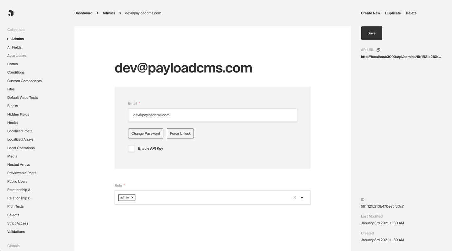
|
||||
_Admin panel screenshot depicting an Admins Collection with Auth enabled_
|
||||
_Admin Panel screenshot depicting an Admins Collection with Auth enabled_
|
||||
|
||||
**Here are some common use cases of Authentication outside of Payload's dashboard itself:**
|
||||
|
||||
@@ -28,9 +28,9 @@ _Admin panel screenshot depicting an Admins Collection with Auth enabled_
|
||||
- P2P app or social site where users need to log in and manage their profiles
|
||||
- Online game where players need to track their progress over time
|
||||
|
||||
By default, Payload provides you with a `User` collection that supports Authentication, which is used to access the Admin panel. But, you can add support to one or many Collections of your own. For more information on how to customize, override, or remove the default `User` collection, [click here](/docs/admin/overview#the-admin-user-collection).
|
||||
By default, Payload provides you with a `User` collection that supports Authentication, which is used to access the [Admin Panel](../admin/overview). But, you can add support to one or many Collections of your own. For more information on how to customize, override, or remove the default `User` collection, [click here](/docs/admin/overview#the-admin-user-collection).
|
||||
|
||||
### Enabling Auth on a collection
|
||||
## Enabling Auth on a collection
|
||||
|
||||
Every Payload Collection can opt-in to supporting Authentication by specifying the `auth` property on the Collection's config to either `true` or to an object containing `auth` options.
|
||||
|
||||
@@ -66,111 +66,39 @@ export const Admins: CollectionConfig = {
|
||||
**By enabling Authentication on a config, the following modifications will automatically be made to your Collection:**
|
||||
|
||||
1. `email` as well as password `salt` & `hash` fields will be added to your Collection's schema
|
||||
1. The Admin panel will feature a new set of corresponding UI to allow for changing password and editing email
|
||||
1. The [Admin Panel](../admin/overview) will feature a new set of corresponding UI to allow for changing password and editing email
|
||||
1. [A new set of `operations`](/docs/authentication/operations) will be exposed via Payload's REST, Local, and GraphQL APIs
|
||||
|
||||
Once enabled, each document that is created within the Collection can be thought of as a `user` - who can make use of commonly required authentication functions such as logging in / out, resetting their password, and more.
|
||||
|
||||
### Logging in / out, resetting password, etc.
|
||||
## Authentication Strategies
|
||||
|
||||
Out of the box Payload ships with a few powerful authentication strategies. HTTP-Only Cookies, JWT's and API-Keys, they can work together or individually. You can also have multiple collections that have auth enabled, but only 1 of them can be used to log into the admin panel.
|
||||
|
||||
### HTTP-Only Cookies
|
||||
|
||||
HTTP-only cookies are a highly secure method of storing identifiable data on a user's device so that Payload can automatically recognize a returning user until their cookie expires. They are totally protected from common XSS attacks and <strong>cannot be read by JavaScript in the browser</strong>, unlike JWT's.
|
||||
|
||||
You can learn more about this strategy from the [HTTP-Only Cookies](/docs/authentication/http-only-cookies) docs.
|
||||
|
||||
### JSON Web Tokens
|
||||
|
||||
JWT (JSON Web Tokens) can also be utilized to perform authentication. Tokens are generated on `login`, `refresh` and `me` operations and can be attached to future requests to authenticate users.
|
||||
|
||||
You can learn more about this strategy from the [JWT](/docs/authentication/jwt) docs.
|
||||
|
||||
### API Keys
|
||||
|
||||
API Keys can be enabled on auth collections. These are particularly useful when you want to authenticate against Payload from a third party service.
|
||||
|
||||
You can learn more about this strategy from the [API Keys](/docs/authentication/api-keys) docs.
|
||||
|
||||
### Custom Strategies
|
||||
|
||||
There are cases where these may not be enough for your application. Payload is extendable by design so you can wire up your own strategy when you need to.
|
||||
|
||||
You can learn more about custom strategies from the [Custom Strategies](/docs/authentication/custom-strategies) docs.
|
||||
|
||||
## Logging in / out, resetting password, etc.
|
||||
|
||||
[Click here](/docs/authentication/operations) for a list of all automatically-enabled Auth operations, including `login`, `logout`, `refresh`, and others.
|
||||
|
||||
### Token-based auth
|
||||
|
||||
Successfully logging in returns a `JWT` (JSON web token) which is how a user will identify themselves to Payload. By providing this JWT via either an HTTP-only cookie or an `Authorization: JWT` or `Authorization: Bearer` header, Payload will automatically identify the user and add its user JWT data to the Express `req`, which is available throughout Payload including within access control, hooks, and more.
|
||||
|
||||
You can specify what data gets encoded to the JWT token by setting `saveToJWT` to true in your auth collection fields. If you wish to use a different key other than the field `name`, you can provide it to `saveToJWT` as a string. It is also possible to use `saveToJWT` on fields that are nested in inside groups and tabs. If a group has a `saveToJWT` set it will include the object with all sub-fields in the token. You can set `saveToJWT: false` for any fields you wish to omit. If a field inside a group has `saveToJWT` set, but the group does not, the field will be included at the top level of the token.
|
||||
|
||||
<Banner type="success">
|
||||
<strong>Tip:</strong>
|
||||
<br />
|
||||
You can access the logged-in user from access control functions and hooks via the Express{' '}
|
||||
<strong>req</strong>. The logged-in user is automatically added as the <strong>user</strong>{' '}
|
||||
property.
|
||||
</Banner>
|
||||
|
||||
### HTTP-only cookies
|
||||
|
||||
Payload `login`, `logout`, and `refresh` operations make use of HTTP-only cookies for authentication purposes. HTTP-only cookies are a highly secure method of storing identifiable data on a user's device so that Payload can automatically recognize a returning user until their cookie expires. They are totally protected from common XSS attacks and cannot be read at all via JavaScript in the browser.
|
||||
|
||||
##### Automatic browser inclusion
|
||||
|
||||
Modern browsers automatically include `http-only` cookies when making requests directly to URLs—meaning that if you are running your API on http://example.com, and you have logged in and visit http://example.com/test-page, your browser will automatically include the Payload authentication cookie for you.
|
||||
|
||||
##### Using Fetch or other HTTP APIs
|
||||
|
||||
However, if you use `fetch` or similar APIs to retrieve Payload resources from its REST or GraphQL API, you need to specify to include credentials (cookies).
|
||||
|
||||
Fetch example, including credentials:
|
||||
|
||||
```ts
|
||||
const response = await fetch('http://localhost:3000/api/pages', {
|
||||
credentials: 'include',
|
||||
})
|
||||
|
||||
const pages = await response.json()
|
||||
```
|
||||
|
||||
For more about how to automatically include cookies in requests from your app to your Payload API, [click here](https://developer.mozilla.org/en-US/docs/Web/API/Fetch_API/Using_Fetch#Sending_a_request_with_credentials_included).
|
||||
|
||||
<Banner type="success">
|
||||
<strong>Tip:</strong>
|
||||
<br />
|
||||
To make sure you have a Payload cookie set properly in your browser after logging in, you can use
|
||||
Chrome's Developer Tools - Application - Cookies - [your-domain-here]. The Chrome Developer tools
|
||||
will still show HTTP-only cookies, even when JavaScript running on the page can't.
|
||||
</Banner>
|
||||
|
||||
### CSRF Protection
|
||||
|
||||
CSRF (cross-site request forgery) attacks are common and dangerous. By using an HTTP-only cookie, Payload removes many XSS vulnerabilities, however, CSRF attacks can still be possible.
|
||||
|
||||
For example, let's say you have a very popular app running at coolsite.com. This app allows users to manage finances and send / receive money. As Payload is using HTTP-only cookies, that means that browsers automatically will include cookies when sending requests to your domain - no matter what page created the request.
|
||||
|
||||
So, if a user of coolsite.com is logged in and just browsing around on the internet, they might stumble onto a page with bad intentions. That bad page might automatically make requests to all sorts of sites to see if they can find one that they can log into - and coolsite.com might be on their list. If your user was logged in while they visited that evil site, the attacker could do whatever they wanted as if they were your coolsite.com user by just sending requests to the coolsite API (which would automatically include the auth cookie). They could send themselves a bunch of money from your user's account, change the user's password, etc. This is what a CSRF attack is.
|
||||
|
||||
<Banner type="warning">
|
||||
<strong>
|
||||
To protect against CSRF attacks, Payload only accepts cookie-based authentication from domains
|
||||
that you explicitly whitelist.
|
||||
</strong>
|
||||
</Banner>
|
||||
|
||||
To define domains that should allow users to identify themselves via the Payload HTTP-only cookie, use the `csrf` option on the base Payload config to whitelist domains that you trust.
|
||||
|
||||
`payload.config.ts`:
|
||||
|
||||
```ts
|
||||
import { buildConfig } from 'payload/config'
|
||||
|
||||
const config = buildConfig({
|
||||
collections: [
|
||||
// collections here
|
||||
],
|
||||
// highlight-start
|
||||
csrf: [
|
||||
// whitelist of domains to allow cookie auth from
|
||||
'https://your-frontend-app.com',
|
||||
'https://your-other-frontend-app.com',
|
||||
],
|
||||
// highlight-end
|
||||
})
|
||||
|
||||
export default config
|
||||
```
|
||||
|
||||
### Identifying users via the Authorization Header
|
||||
|
||||
In addition to authenticating via an HTTP-only cookie, you can also identify users via the `Authorization` header on an HTTP request.
|
||||
|
||||
Example:
|
||||
|
||||
```ts
|
||||
const request = await fetch('http://localhost:3000', {
|
||||
headers: {
|
||||
Authorization: `JWT ${token}`,
|
||||
},
|
||||
})
|
||||
```
|
||||
|
||||
You can retrieve a user's token via the response to `login`, `refresh`, and `me` auth operations.
|
||||
|
||||
107
docs/authentication/token-data.mdx
Normal file
107
docs/authentication/token-data.mdx
Normal file
@@ -0,0 +1,107 @@
|
||||
---
|
||||
title: Token Data
|
||||
label: Token Data
|
||||
order: 70
|
||||
desc: Storing data for read on the request object.
|
||||
keywords: authentication, config, configuration, documentation, Content Management System, cms, headless, javascript, node, react, nextjs
|
||||
---
|
||||
|
||||
During the lifecycle of a request you will be able to access the data you have configured to be stored in the JWT by accessing `req.user`. The user object is automatically appeneded to the request for you.
|
||||
|
||||
### Definining Token Data
|
||||
|
||||
You can specify what data gets encoded to the Cookie/JWT-Token by setting `saveToJWT` property on fields within your auth collection.
|
||||
|
||||
```ts
|
||||
import type { CollectionConfig } from 'payload'
|
||||
|
||||
export const Users: CollectionConfig = {
|
||||
slug: 'users',
|
||||
auth: true,
|
||||
fields: [
|
||||
{
|
||||
// will be stored in the JWT
|
||||
saveToJWT: true,
|
||||
type: 'select',
|
||||
name: 'role',
|
||||
options: [
|
||||
'super-admin',
|
||||
'user',
|
||||
]
|
||||
},
|
||||
{
|
||||
// the entire object will be stored in the JWT
|
||||
// tab fields can do the same thing!
|
||||
saveToJWT: true,
|
||||
type: 'group',
|
||||
name: 'group1',
|
||||
fields: [
|
||||
{
|
||||
type: 'text',
|
||||
name: 'includeField',
|
||||
},
|
||||
{
|
||||
// will be omitted from the JWT
|
||||
saveToJWT: false,
|
||||
type: 'text',
|
||||
name: 'omitField',
|
||||
},
|
||||
]
|
||||
},
|
||||
{
|
||||
type: 'group',
|
||||
name: 'group2',
|
||||
fields: [
|
||||
{
|
||||
// will be stored in the JWT
|
||||
// but stored at the top level
|
||||
saveToJWT: true,
|
||||
type: 'text',
|
||||
name: 'includeField',
|
||||
},
|
||||
{
|
||||
type: 'text',
|
||||
name: 'omitField',
|
||||
},
|
||||
]
|
||||
},
|
||||
]
|
||||
}
|
||||
```
|
||||
|
||||
<Banner type="success">
|
||||
<strong>Tip:</strong>
|
||||
<br/>
|
||||
If you wish to use a different key other than the field `name`, you can define `saveToJWT` as a string.
|
||||
</Banner>
|
||||
|
||||
|
||||
### Using Token Data
|
||||
|
||||
This is especially helful when writing hooks and access control that depend on user defined fields.
|
||||
|
||||
```ts
|
||||
import type { CollectionConfig } from 'payload'
|
||||
|
||||
export const Invoices: CollectionConfig = {
|
||||
slug: 'invoices',
|
||||
access: {
|
||||
read: ({ req, data }) => {
|
||||
if (!req?.user) return false
|
||||
// highlight-start
|
||||
if ({ req.user?.role === 'super-admin'}) {
|
||||
return true
|
||||
}
|
||||
// highlight-end
|
||||
return data.owner === req.user.id
|
||||
}
|
||||
}
|
||||
fields: [
|
||||
{
|
||||
name: 'owner',
|
||||
relationTo: 'users'
|
||||
},
|
||||
// ... other fields
|
||||
],
|
||||
}
|
||||
```
|
||||
@@ -1,56 +0,0 @@
|
||||
---
|
||||
title: Using the Payload Auth Middleware
|
||||
label: Using the Middleware
|
||||
order: 40
|
||||
desc: Make full use of Payload's built-in authentication with your own custom Express endpoints by adding Payload's authentication middleware.
|
||||
keywords: authentication, middleware, config, configuration, documentation, Content Management System, cms, headless, javascript, node, react, express
|
||||
---
|
||||
|
||||
Because Payload uses your existing Express server, you are free to add whatever logic you need to your app through endpoints of your own. However, Payload does not add its middleware to your Express app itself—instead, it scopes all of its middleware to Payload-specific routers.
|
||||
|
||||
This approach has a ton of benefits - it's great for isolation of concerns and limiting scope, but it also means that your additional routes won't have access to Payload's user authentication.
|
||||
|
||||
<Banner type="success">
|
||||
You can make full use of Payload's built-in authentication within your own custom Express
|
||||
endpoints by adding Payload's authentication middleware.
|
||||
</Banner>
|
||||
|
||||
<Banner type="warning">
|
||||
Payload must be initialized before the `payload.authenticate` middleware can be used. This is done
|
||||
by calling `payload.init()` prior to adding the middleware.
|
||||
</Banner>
|
||||
|
||||
Example in `server.js`:
|
||||
|
||||
```ts
|
||||
import express from 'express'
|
||||
import payload from 'payload'
|
||||
|
||||
const app = express()
|
||||
|
||||
const start = async () => {
|
||||
await payload.init({
|
||||
secret: 'PAYLOAD_SECRET_KEY',
|
||||
express: app,
|
||||
})
|
||||
|
||||
const router = express.Router()
|
||||
|
||||
// Note: Payload must be initialized before the `payload.authenticate` middleware can be used
|
||||
router.use(payload.authenticate) // highlight-line
|
||||
|
||||
router.get('/', (req, res) => {
|
||||
if (req.user) {
|
||||
return res.send(`Authenticated successfully as ${req.user.email}.`)
|
||||
}
|
||||
|
||||
return res.send('Not authenticated')
|
||||
})
|
||||
|
||||
app.use('/some-route-here', router)
|
||||
|
||||
app.listen(3000)
|
||||
}
|
||||
|
||||
start()
|
||||
```
|
||||
@@ -6,7 +6,7 @@ desc: Quickly configure and deploy your Payload Cloud project in a few simple st
|
||||
keywords: configuration, config, settings, project, cloud, payload cloud, deploy, deployment
|
||||
---
|
||||
|
||||
### Select your plan
|
||||
## Select your plan
|
||||
|
||||
Once you have created a project, you will need to select your plan. This will determine the resources that are allocated to your project and the features that are available to you.
|
||||
|
||||
@@ -17,7 +17,7 @@ Once you have created a project, you will need to select your plan. This will de
|
||||
anytime.
|
||||
</Banner>
|
||||
|
||||
### Project Details
|
||||
## Project Details
|
||||
|
||||
| Option | Description |
|
||||
| ---------------- | --------------------------------------------------------------------------------------------------------------------------------------------------------------------------------------------------------------------------------------------- |
|
||||
@@ -26,7 +26,7 @@ Once you have created a project, you will need to select your plan. This will de
|
||||
| **Project Slug** | Choose a unique slug to identify your project. This needs to be unique for your team and you can change it any time. |
|
||||
| **Team** | Select the team you want to create the project under. If this is your first project, a personal team will be created for you automatically. You can modify your team settings and invite new members at any time from the Team Settings page. |
|
||||
|
||||
### Build Settings
|
||||
## Build Settings
|
||||
|
||||
If you are deploying a new project from a template, the following settings will be automatically configured for you. If you are using your own repository, you need to make sure your build settings are accurate for your project to deploy correctly.
|
||||
|
||||
@@ -39,17 +39,17 @@ If you are deploying a new project from a template, the following settings will
|
||||
| **Branch to Deploy** | Select the branch of your repository that you want to deploy from. This is the branch that will be used to build your project when you commit new changes. |
|
||||
| **Default Domain** | Set a default domain for your project. This must be unique and you will not able to change it. You can always add a custom domain later in your project settings. |
|
||||
|
||||
### Environment Variables
|
||||
## Environment Variables
|
||||
|
||||
Any of the features in Payload Cloud that require environment variables will automatically be provided to your application. If your app requires any custom environment variables, you can set them here.
|
||||
|
||||
<Banner type="warning">
|
||||
Note: For security reasons, any variables you wish to provide to the Admin panel must be prefixed
|
||||
with `PAYLOAD_PUBLIC_`. Learn more
|
||||
[here](https://payloadcms.com/docs/admin/webpack#admin-environment-vars).
|
||||
Note: For security reasons, any variables you wish to provide to the [Admin Panel](../admin/overview) must be prefixed
|
||||
with `NEXT_PUBLIC_`. Learn more
|
||||
[here](../configuration/environment-vars).
|
||||
</Banner>
|
||||
|
||||
### Payment
|
||||
## Payment
|
||||
|
||||
Payment methods can be set per project and can be updated any time. You can use team’s default payment method, or add a new one. Modify your payment methods in your Project settings / Team settings.
|
||||
|
||||
|
||||
@@ -6,7 +6,7 @@ desc: Manage your Payload Cloud projects.
|
||||
keywords: cloud, payload cloud, projects, project, overview, database, file storage, build settings, environment variables, custom domains, email, developing locally
|
||||
---
|
||||
|
||||
### Overview
|
||||
## Overview
|
||||
|
||||
<Banner>
|
||||
The overview tab shows your most recent deployment, along with build and deployment logs. From
|
||||
@@ -18,19 +18,19 @@ keywords: cloud, payload cloud, projects, project, overview, database, file stor
|
||||
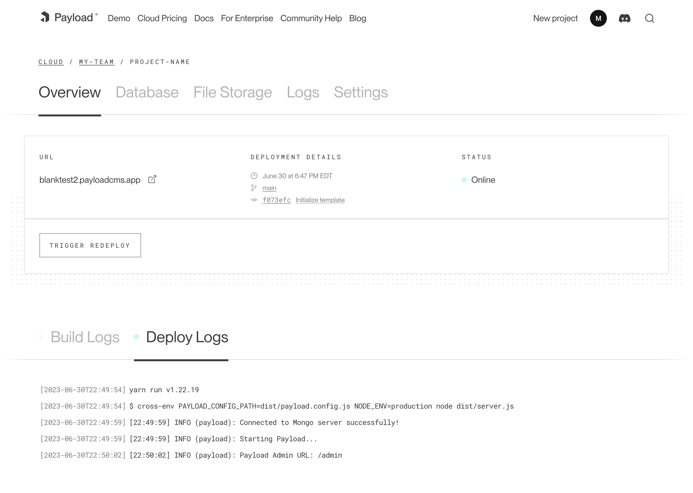
|
||||
_A screenshot of the Overview page for a Cloud project._
|
||||
|
||||
### Database
|
||||
## Database
|
||||
|
||||
Your Payload Cloud project comes with a MongoDB serverless Atlas DB instance or a Dedicated Atlas cluster, depending on your plan. To interact with your cloud database, you will be provided with a MongoDB connection string. This can be found under the **Database** tab of your project.
|
||||
|
||||
`mongodb+srv://your_connection_string`
|
||||
|
||||
### File Storage
|
||||
## File Storage
|
||||
|
||||
Payload Cloud gives you S3 file storage backed by Cloudflare as a CDN, and this plugin extends Payload so that all of your media will be stored in S3 rather than locally.
|
||||
|
||||
AWS Cognito is used for authentication to your S3 bucket. The [Payload Cloud Plugin](https://github.com/payloadcms/plugin-cloud) will automatically pick up these values. These values are only if you'd like to access your files directly, outside of Payload Cloud.
|
||||
|
||||
#### Accessing Files Outside of Payload Cloud
|
||||
### Accessing Files Outside of Payload Cloud
|
||||
|
||||
If you'd like to access your files outside of Payload Cloud, you'll need to retrieve some values from your project's settings and put them into your environment variables. In Payload Cloud, navigate to the File Storage tab and copy the values using the copy button. Put these values in your .env file. Also copy the Cognito Password value separately and put into your .env file as well.
|
||||
|
||||
@@ -50,21 +50,21 @@ PAYLOAD_CLOUD_COGNITO_PASSWORD=
|
||||
|
||||
The plugin will pick up these values and use them to access your files.
|
||||
|
||||
### Build Settings
|
||||
## Build Settings
|
||||
|
||||
You can update settings from your Project’s Settings tab. Changes to your build settings will trigger a redeployment of your project.
|
||||
|
||||
### Environment Variables
|
||||
## Environment Variables
|
||||
|
||||
From the Environment Variables page of the Settings tab, you can add, update and delete variables for use in your project. Like build settings, these changes will trigger a redeployment of your project.
|
||||
|
||||
<Banner>
|
||||
Note: For security reasons, any variables you wish to provide to the Admin panel must be prefixed
|
||||
Note: For security reasons, any variables you wish to provide to the [Admin Panel](../admin/overview) must be prefixed
|
||||
with `PAYLOAD_PUBLIC_`. Learn more
|
||||
[here](https://payloadcms.com/docs/admin/webpack#admin-environment-vars).
|
||||
[here](../configuration/environment-vars).
|
||||
</Banner>
|
||||
|
||||
### Custom Domains
|
||||
## Custom Domains
|
||||
|
||||
With Payload Cloud, you can add custom domain names to your project. To do so, first go to the Domains page of the Settings tab of your project. Here you can see your default domain. To add a new domain, type in the domain name you wish to use.
|
||||
|
||||
@@ -84,19 +84,19 @@ export default buildConfig({
|
||||
})
|
||||
```
|
||||
|
||||
### Email
|
||||
## Email
|
||||
|
||||
Powered by [Resend](https://resend.com), Payload Cloud comes with integrated email support out of the box. No configuration is needed, and you can use `payload.sendEmail()` to send email right from your Payload app. To learn more about sending email with Payload, checkout the [Email Configuration](https://payloadcms.com/docs/email/overview) overview.
|
||||
|
||||
If you are on the Pro or Enterprise plan, you can add your own custom Email domain name. From the Email page of your project’s Settings, add the domain you wish to use for email delivery. This will generate a set of DNS records. Add these records to your DNS provider and click verify to check that your records are resolving properly. Once verified, your emails will now be sent from your custom domain name.
|
||||
|
||||
### Developing Locally
|
||||
## Developing Locally
|
||||
|
||||
To make changes to your project, you will need to clone the repository defined in your project settings to your local machine. In order to run your project locally, you will need configure your local environment first. Refer to your repository’s `README.md` file to see the steps needed for your specific template.
|
||||
|
||||
From there, you are ready to make updates to your project. When you are ready to make your changes live, commit your changes to the branch you specified in your Project settings, and your application will automatically trigger a redeploy and build from your latest commit.
|
||||
|
||||
### Cloud Plugin
|
||||
## Cloud Plugin
|
||||
|
||||
Projects generated from a template will come pre-configured with the official Cloud Plugin, but if you are using your own repository you will need to add this into your project. To do so, add the plugin to your Payload config:
|
||||
|
||||
@@ -117,7 +117,7 @@ export default buildConfig({
|
||||
over Payload Cloud's email service.
|
||||
</Banner>
|
||||
|
||||
##### **Optional configuration**
|
||||
#### **Optional configuration**
|
||||
|
||||
If you wish to opt-out of any Payload cloud features, the plugin also accepts options to do so.
|
||||
|
||||
|
||||
@@ -14,22 +14,22 @@ keywords: team, teams, billing, subscription, payment, plan, plans, cloud, paylo
|
||||
|
||||
_A screenshot of the Team Settings page._
|
||||
|
||||
### Members
|
||||
## Members
|
||||
|
||||
Each team has members that can interact with your projects. You can invite multiple people to your team and each individual can belong to more than one team. You can assign them either `owner` or `user` permissions. Owners are able to make admin-only changes, such as deleting projects, and editing billing information.
|
||||
|
||||
### Adding Members
|
||||
## Adding Members
|
||||
|
||||
To add a new member to your team, visit your Team’s Settings page, and click “Invite Teammate”. You can then add their email address, and assign their role. Press “Save” to send the invitations, which will send an email to the invited team member where they can create a new account.
|
||||
|
||||
### Billing
|
||||
## Billing
|
||||
|
||||
Users can update billing settings and subscriptions for any teams where they are designated as an `owner`. To make updates to the team’s payment methods, visit the Billing page under the Team Settings tab. You can add new cards, delete cards, and set a payment method as a default. The default payment method will be used in the event that another payment method fails.
|
||||
|
||||
### Subscriptions
|
||||
## Subscriptions
|
||||
|
||||
From the Subscriptions page, a team owner can see all current plans for their team. From here, you can see the price of each plan, if there is an active trial, and when you will be billed next.
|
||||
|
||||
### Invoices
|
||||
## Invoices
|
||||
|
||||
The Invoices page will you show you the invoices for your account, as well as the status on their payment.
|
||||
|
||||
@@ -3,186 +3,224 @@ title: Collection Configs
|
||||
label: Collections
|
||||
order: 20
|
||||
desc: Structure your Collections for your needs by defining fields, adding slugs and labels, establishing access control, tying in hooks, setting timestamps and more.
|
||||
keywords: collections, config, configuration, documentation, Content Management System, cms, headless, javascript, node, react, express
|
||||
keywords: collections, config, configuration, documentation, Content Management System, cms, headless, javascript, node, react, nextjs
|
||||
---
|
||||
|
||||
Payload Collections are defined through configs of their own, and you can define as many as your application needs. Each
|
||||
Collection will scaffold a new collection automatically in your database of choice, based on fields that you define.
|
||||
Payload Collections are defined through configs of their own. You can define as many Collections as your application needs. Each Collection will automatically scaffold a new collection / table in your database of choice, based on fields that you define.
|
||||
|
||||
It's often best practice to write your Collections in separate files and then import them into the main Payload config.
|
||||
## Config Options
|
||||
|
||||
## Options
|
||||
|
||||
| Option | Description |
|
||||
|------------------------|--------------------------------------------------------------------------------------------------------------------------------------------------------------------------------------------------------------------------|
|
||||
| **`slug`** \* | Unique, URL-friendly string that will act as an identifier for this Collection. |
|
||||
| **`fields`** \* | Array of field types that will determine the structure and functionality of the data stored within this Collection. [Click here](/docs/fields/overview) for a full list of field types as well as how to configure them. |
|
||||
| **`labels`** | Singular and plural labels for use in identifying this Collection throughout Payload. Auto-generated from slug if not defined. |
|
||||
| **`admin`** | Admin-specific configuration. See below for [more detail](#admin-options). |
|
||||
| **`hooks`** | Entry points to "tie in" to Collection actions at specific points. [More](/docs/hooks/overview#collection-hooks) |
|
||||
| **`access`** | Provide access control functions to define exactly who should be able to do what with Documents in this Collection. [More](/docs/access-control/overview/#collections) |
|
||||
| **`auth`** | Specify options if you would like this Collection to feature authentication. For more, consult the [Authentication](/docs/authentication/config) documentation. |
|
||||
| **`upload`** | Specify options if you would like this Collection to support file uploads. For more, consult the [Uploads](/docs/upload/overview) documentation. |
|
||||
| **`timestamps`** | Set to false to disable documents' automatically generated `createdAt` and `updatedAt` timestamps. |
|
||||
| **`versions`** | Set to true to enable default options, or configure with object properties. [More](/docs/versions/overview#collection-config) |
|
||||
| **`endpoints`** | Add custom routes to the REST API. Set to `false` to disable routes. [More](/docs/rest-api/overview#custom-endpoints) |
|
||||
| **`graphQL`** | An object with `singularName` and `pluralName` strings used in schema generation. Auto-generated from slug if not defined. Set to `false` to disable GraphQL. |
|
||||
| **`typescript`** | An object with property `interface` as the text used in schema generation. Auto-generated from slug if not defined. |
|
||||
| **`disableDuplicate`** | When true, do not show the "Duplicate" button while editing documents within this collection and prevent `duplicate` from all APIs. |
|
||||
| **`defaultSort`** | Pass a top-level field to sort by default in the collection List view. Prefix the name of the field with a minus symbol ("-") to sort in descending order. |
|
||||
| **`dbName`** | Custom table or collection name depending on the database adapter. Auto-generated from slug if not defined.
|
||||
| **`custom`** | Extension point for adding custom data (e.g. for plugins) |
|
||||
|
||||
_\* An asterisk denotes that a property is required._
|
||||
|
||||
#### Simple collection example
|
||||
To define a Collection Config, use the `collection` property in your [Payload Config](./overview).
|
||||
|
||||
```ts
|
||||
import { CollectionConfig } from 'payload/types'
|
||||
import { buildConfig } from 'payload'
|
||||
|
||||
export const Orders: CollectionConfig = {
|
||||
slug: 'orders',
|
||||
fields: [
|
||||
{
|
||||
name: 'total',
|
||||
type: 'number',
|
||||
required: true,
|
||||
},
|
||||
{
|
||||
name: 'placedBy',
|
||||
type: 'relationship',
|
||||
relationTo: 'customers',
|
||||
required: true,
|
||||
},
|
||||
export default buildConfig({
|
||||
// ...
|
||||
collections: [ // highlight-line
|
||||
// Your Collection Configs go here
|
||||
],
|
||||
}
|
||||
})
|
||||
```
|
||||
|
||||
#### More collection config examples
|
||||
It's often best practice to write your Collections in separate files and then import them into the main Payload Config.
|
||||
|
||||
You can find an assortment
|
||||
of [example collection configs](https://github.com/payloadcms/public-demo/tree/master/src/payload/collections) in the Public
|
||||
Demo source code on GitHub.
|
||||
|
||||
### Admin options
|
||||
|
||||
You can customize the way that the Admin panel behaves on a collection-by-collection basis by defining the `admin`
|
||||
property on a collection's config.
|
||||
|
||||
| Option | Description |
|
||||
| ---------------------------- | ----------------------------------------------------------------------------------------------------------------------------------------------------------------------------------------------------- |
|
||||
| `group` | Text used as a label for grouping collection and global links together in the navigation. |
|
||||
| `hidden` | Set to true or a function, called with the current user, returning true to exclude this collection from navigation and admin routing. |
|
||||
| `hooks` | Admin-specific hooks for this collection. [More](#admin-hooks) |
|
||||
| `useAsTitle` | Specify a top-level field to use for a document title throughout the Admin panel. If no field is defined, the ID of the document is used as the title. |
|
||||
| `description` | Text or React component to display below the Collection label in the List view to give editors more information. |
|
||||
| `defaultColumns` | Array of field names that correspond to which columns to show by default in this collection's List view. |
|
||||
| `hideAPIURL` | Hides the "API URL" meta field while editing documents within this collection. |
|
||||
| `enableRichTextLink` | The [Rich Text](/docs/fields/rich-text) field features a `Link` element which allows for users to automatically reference related documents within their rich text. Set to `true` by default. |
|
||||
| `enableRichTextRelationship` | The [Rich Text](/docs/fields/rich-text) field features a `Relationship` element which allows for users to automatically reference related documents within their rich text. Set to `true` by default. |
|
||||
| `meta` | Metadata overrides to apply to the [Admin panel](../admin/overview). Included properties are `description` and `openGraph`. |
|
||||
| `preview` | Function to generate preview URLS within the Admin panel that can point to your app. [More](#preview). |
|
||||
| `livePreview` | Enable real-time editing for instant visual feedback of your front-end application. [More](/docs/live-preview/overview). |
|
||||
| `components` | Swap in your own React components to be used within this collection. [More](/docs/admin/components#collections) |
|
||||
| `listSearchableFields` | Specify which fields should be searched in the List search view. [More](#list-searchable-fields) |
|
||||
| **`pagination`** | Set pagination-specific options for this collection. [More](#pagination) |
|
||||
|
||||
### Preview
|
||||
|
||||
Collection `admin` options can accept a `preview` function that will be used to generate a link pointing to the frontend
|
||||
of your app to preview data.
|
||||
|
||||
If the function is specified, a Preview button will automatically appear in the corresponding collection's Edit view.
|
||||
Clicking the Preview button will link to the URL that is generated by the function.
|
||||
|
||||
**The preview function accepts two arguments:**
|
||||
|
||||
1. The document being edited
|
||||
1. An `options` object, containing `locale` and `token` properties. The `token` is the currently logged-in user's JWT.
|
||||
|
||||
**Example collection with preview function:**
|
||||
Here is what a simple Collection Config might look like:
|
||||
|
||||
```ts
|
||||
import { CollectionConfig } from 'payload/types'
|
||||
import { CollectionConfig } from 'payload'
|
||||
|
||||
export const Posts: CollectionConfig = {
|
||||
slug: 'posts',
|
||||
fields: [
|
||||
{
|
||||
name: 'slug',
|
||||
name: 'title',
|
||||
type: 'text',
|
||||
required: true,
|
||||
},
|
||||
],
|
||||
admin: {
|
||||
preview: (doc, { locale }) => {
|
||||
if (doc?.slug) {
|
||||
return `https://bigbird.com/preview/posts/${doc.slug}?locale=${locale}`
|
||||
}
|
||||
}
|
||||
]
|
||||
}
|
||||
```
|
||||
|
||||
return null
|
||||
},
|
||||
<Banner type="success">
|
||||
<strong>Reminder:</strong>
|
||||
For a more complex example, see the [Public Demo](https://github.com/payloadcms/public-demo) source code on GitHub.
|
||||
</Banner>
|
||||
|
||||
The following options are available:
|
||||
|
||||
| Option | Description |
|
||||
|------------------------|--------------------------------------------------------------------------------------------------------------------------------------------------------------------------------------------------------------------------|
|
||||
| **`admin`** | The configuration options for the Admin Panel. [More details](#admin-options). |
|
||||
| **`access`** | Provide access control functions to define exactly who should be able to do what with Documents in this Collection. [More details](../access-control/overview/#collections). |
|
||||
| **`auth`** | Specify options if you would like this Collection to feature authentication. For more, consult the [Authentication](../authentication/config) documentation. |
|
||||
| **`custom`** | Extension point for adding custom data (e.g. for plugins) |
|
||||
| **`disableDuplicate`** | When true, do not show the "Duplicate" button while editing documents within this Collection and prevent `duplicate` from all APIs. |
|
||||
| **`defaultSort`** | Pass a top-level field to sort by default in the Collection List View. Prefix the name of the field with a minus symbol ("-") to sort in descending order. |
|
||||
| **`dbName`** | Custom table or Collection name depending on the database adapter. Auto-generated from slug if not defined. |
|
||||
| **`endpoints`** | Add custom routes to the REST API. Set to `false` to disable routes. [More details](../rest-api/overview#custom-endpoints). |
|
||||
| **`fields`** \* | Array of field types that will determine the structure and functionality of the data stored within this Collection. [Click here](../fields/overview) for a full list of field types as well as how to configure them. |
|
||||
| **`graphQL`** | An object with `singularName` and `pluralName` strings used in schema generation. Auto-generated from slug if not defined. Set to `false` to disable GraphQL. |
|
||||
| **`hooks`** | Entry points to "tie in" to Collection actions at specific points. [More details](../hooks/overview#collection-hooks). |
|
||||
| **`labels`** | Singular and plural labels for use in identifying this Collection throughout Payload. Auto-generated from slug if not defined. |
|
||||
| **`slug`** \* | Unique, URL-friendly string that will act as an identifier for this Collection. |
|
||||
| **`timestamps`** | Set to false to disable documents' automatically generated `createdAt` and `updatedAt` timestamps. |
|
||||
| **`typescript`** | An object with property `interface` as the text used in schema generation. Auto-generated from slug if not defined. |
|
||||
| **`upload`** | Specify options if you would like this Collection to support file uploads. For more, consult the [Uploads](../upload/overview) documentation. |
|
||||
| **`versions`** | Set to true to enable default options, or configure with object properties. [More details](../versions/overview#collection-config). |
|
||||
|
||||
_\* An asterisk denotes that a property is required._
|
||||
|
||||
## Admin Options
|
||||
|
||||
You can customize the way that the [Admin Panel](../admin/overview) behaves on a Collection-by-Collection basis.
|
||||
|
||||
To configure Collection Admin Options, use the `admin` property in your Collection Config:
|
||||
|
||||
```ts
|
||||
import { CollectionConfig } from 'payload'
|
||||
|
||||
export const Posts: CollectionConfig = {
|
||||
// ...
|
||||
admin: { // highlight-line
|
||||
// ...
|
||||
},
|
||||
}
|
||||
```
|
||||
|
||||
The following options are available:
|
||||
|
||||
| Option | Description |
|
||||
| ---------------------------- | ----------------------------------------------------------------------------------------------------------------------------------------------------------------------------------------------------- |
|
||||
| **`group`** | Text used as a label for grouping Collection and Global links together in the navigation. |
|
||||
| **`hidden`** | Set to true or a function, called with the current user, returning true to exclude this Collection from navigation and admin routing. |
|
||||
| **`hooks`** | Admin-specific hooks for this Collection. [More details](#admin-hooks). |
|
||||
| **`useAsTitle`** | Specify a top-level field to use for a document title throughout the [Admin Panel](../admin/overview). If no field is defined, the ID of the document is used as the title. |
|
||||
| **`description`** | Text or React component to display below the Collection label in the List View to give editors more information. |
|
||||
| **`defaultColumns`** | Array of field names that correspond to which columns to show by default in this Collection's List View. |
|
||||
| **`hideAPIURL`** | Hides the "API URL" meta field while editing documents within this Collection. |
|
||||
| **`enableRichTextLink`** | The [Rich Text](../fields/rich-text) field features a `Link` element which allows for users to automatically reference related documents within their rich text. Set to `true` by default. |
|
||||
| **`enableRichTextRelationship`** | The [Rich Text](../fields/rich-text) field features a `Relationship` element which allows for users to automatically reference related documents within their rich text. Set to `true` by default. |
|
||||
| **`meta`** | Metadata overrides to apply to the [Admin Panel](../admin/overview). Included properties are `description` and `openGraph`. |
|
||||
| **`preview`** | Function to generate preview URLs within the [Admin Panel](../admin/overview) that can point to your app. [More details](#preview). |
|
||||
| **`livePreview`** | Enable real-time editing for instant visual feedback of your front-end application. [More details](../live-preview/overview). |
|
||||
| **`components`** | Swap in your own React components to be used within this Collection. [More details](../admin/components#collections). |
|
||||
| **`listSearchableFields`** | Specify which fields should be searched in the List search view. [More details](#list-searchable-fields). |
|
||||
| **`pagination`** | Set pagination-specific options for this Collection. [More details](#pagination). |
|
||||
|
||||
#### Preview
|
||||
|
||||
It is possible to display a Preview Button in the Admin Panel within the Edit View. This will allow editors to visit the frontend of your app the corresponds to the document they are actively editing. This way they can preview the latest, potentially unpublished changes.
|
||||
|
||||
To configure the Preview Button, set the `admin.preview` property to a function in your Collection Config:
|
||||
|
||||
```ts
|
||||
import { CollectionConfig } from 'payload'
|
||||
|
||||
export const Posts: CollectionConfig = {
|
||||
// ...
|
||||
admin: {
|
||||
// highlight-start
|
||||
preview: (doc, { locale }) => {
|
||||
if (doc?.slug) {
|
||||
return `/${doc.slug}?locale=${locale}`
|
||||
}
|
||||
|
||||
return null
|
||||
},
|
||||
// highlight-end
|
||||
},
|
||||
}
|
||||
```
|
||||
|
||||
The preview function receives two arguments:
|
||||
|
||||
| Argument | Description |
|
||||
| --- | --- |
|
||||
| **`doc`** | The document being edited |
|
||||
| **`ctx`** | An object containing `locale` and `token` properties. The `token` is the currently logged-in user's JWT. |
|
||||
|
||||
<Banner type="success">
|
||||
<strong>Reminder:</strong>
|
||||
For fully working example of this, check of the official [Draft Preview Example](https://github.com/payloadcms/payload/tree/main/examples/draft-preview) in the [Examples Directory](https://github.com/payloadcms/payload/tree/main/examples).
|
||||
</Banner>
|
||||
|
||||
### Pagination
|
||||
|
||||
Here are a few options that you can specify options for pagination on a collection-by-collection basis:
|
||||
All Collections receive their own List View which displays a paginated list of documents that can be sorted and filtered. The pagination behavior of the List View can be customized on a per-Collection basis.
|
||||
|
||||
To configure pagination options, use the `admin.pagination` property in your Collection Config:
|
||||
|
||||
```ts
|
||||
import { CollectionConfig } from 'payload'
|
||||
|
||||
export const Posts: CollectionConfig = {
|
||||
// ...
|
||||
admin: {
|
||||
// highlight-start
|
||||
pagination: {
|
||||
defaultLimit: 10,
|
||||
limits: [10, 20, 50],
|
||||
},
|
||||
// highlight-end
|
||||
},
|
||||
}
|
||||
```
|
||||
|
||||
The following options are available:
|
||||
|
||||
| Option | Description |
|
||||
| -------------- | --------------------------------------------------------------------------------------------------- |
|
||||
| `defaultLimit` | Integer that specifies the default per-page limit that should be used. Defaults to 10. |
|
||||
| `limits` | Provide an array of integers to use as per-page options for admins to choose from in the List view. |
|
||||
| `limits` | Provide an array of integers to use as per-page options for admins to choose from in the List View. |
|
||||
|
||||
### Access control
|
||||
### Access Control
|
||||
|
||||
You can specify extremely granular access control (what users can do with documents in a collection) on a collection by
|
||||
collection basis. To learn more, go to the [Access Control](/docs/access-control/overview) docs.
|
||||
You can specify extremely granular access control (what users can do with documents in a Collection) on a Collection by
|
||||
Collection basis. To learn more, go to the [Access Control](../access-control/overview) docs.
|
||||
|
||||
### Hooks
|
||||
|
||||
Hooks are a powerful way to extend collection functionality and execute your own logic, and can be defined on a
|
||||
collection by collection basis. To learn more, go to the [Hooks](/docs/hooks/overview) documentation.
|
||||
|
||||
### Field types
|
||||
|
||||
Collections support all field types that Payload has to offer—including simple fields like text and checkboxes all the
|
||||
way to more complicated layout-building field groups like Blocks. [Click here](/docs/fields/overview) to learn more
|
||||
about field types.
|
||||
Hooks are a powerful way to extend Collection functionality and execute your own logic, and can be defined on a
|
||||
Collection by Collection basis. To learn more, go to the [Hooks](../hooks/overview) documentation.
|
||||
|
||||
### List Searchable Fields
|
||||
|
||||
In the List view, there is a "search" box that allows you to quickly find a document with a search. By default, it
|
||||
searches on the ID field. If you have `admin.useAsTitle` defined, the list search will use that field. However, you can
|
||||
define more than one field to search to make it easier on your admin editors to find the data they need.
|
||||
In the List View, there is a "search" box that allows you to quickly find a document through a simple text search. By default, it searches on the ID field. If defined, the `admin.useAsTitle` field is used. Or, you can explicitly define which fields to search based on the needs of your application.
|
||||
|
||||
For example, let's say you have a Posts collection with `title`, `metaDescription`, and `tags` fields - and you want all
|
||||
three of those fields to be searchable in the List view. You can simply
|
||||
add `admin.listSearchableFields: ['title', 'metaDescription', 'tags']` - and the admin UI will automatically search on
|
||||
those three fields plus the ID field.
|
||||
|
||||
<Banner type="warning">
|
||||
<strong>Note:</strong>
|
||||
<br />
|
||||
If you are adding <strong>listSearchableFields</strong>, make sure you index each of these fields
|
||||
so your admin queries can remain performant.
|
||||
</Banner>
|
||||
|
||||
### TypeScript
|
||||
|
||||
You can import collection types as follows:
|
||||
To define which fields should be searched, use the `admin.listSearchableFields` property in your Collection Config:
|
||||
|
||||
```ts
|
||||
import { CollectionConfig } from 'payload/types'
|
||||
import { CollectionConfig } from 'payload'
|
||||
|
||||
// This is the type used for incoming collection configs.
|
||||
export const Posts: CollectionConfig = {
|
||||
// ...
|
||||
admin: {
|
||||
// highlight-start
|
||||
listSearchableFields: ['title', 'slug'],
|
||||
// highlight-end
|
||||
},
|
||||
}
|
||||
```
|
||||
|
||||
<Banner type="warning">
|
||||
<strong>Tip:</strong>
|
||||
If you are adding `listSearchableFields`, make sure you index each of these fields so your admin queries can remain performant.
|
||||
</Banner>
|
||||
|
||||
## TypeScript
|
||||
|
||||
You can import Collection types as follows:
|
||||
|
||||
```ts
|
||||
import { CollectionConfig } from 'payload'
|
||||
|
||||
// This is the type used for incoming Collection configs.
|
||||
// Only the bare minimum properties are marked as required.
|
||||
```
|
||||
|
||||
```ts
|
||||
import { SanitizedCollectionConfig } from 'payload/types'
|
||||
import { SanitizedCollectionConfig } from 'payload'
|
||||
|
||||
// This is the type used after an incoming collection config is fully sanitized.
|
||||
// This is the type used after an incoming Collection config is fully sanitized.
|
||||
// Generally, this is only used internally by Payload.
|
||||
```
|
||||
|
||||
99
docs/configuration/environment-vars.mdx
Normal file
99
docs/configuration/environment-vars.mdx
Normal file
@@ -0,0 +1,99 @@
|
||||
---
|
||||
title: Environment Variables
|
||||
label: Environment Variables
|
||||
order: 100
|
||||
desc: Learn how to use Environment Variables in your Payload project
|
||||
---
|
||||
|
||||
Environment Variables are a way to store sensitive information that your application needs to function. This could be anything from API keys to [Database](../database/overview) credentials. Payload allows you to easily use Environment Variables within your config and throughout your application.
|
||||
|
||||
If you are using Next.js, no additional setup is required other than creating your `.env` file. Otherwise, you can use the `dotenv` package to load your Environment Variables into `process.env`. [More details](#outside-of-nextjs).
|
||||
|
||||
Environment Variables are typically stored in an `.env` file at the root of your project:
|
||||
|
||||
```plaintext
|
||||
project-name/
|
||||
├─ .env
|
||||
├─ package.json
|
||||
├─ payload.config.ts
|
||||
```
|
||||
|
||||
Here is an example of what an `.env` file might look like:
|
||||
|
||||
```plaintext
|
||||
SERVER_URL=localhost:3000
|
||||
DATABASE_URI=mongodb://localhost:27017/my-database
|
||||
```
|
||||
|
||||
To use Environment Variables in your Payload config, you can access them directly from `process.env`:
|
||||
|
||||
```ts
|
||||
import { buildConfig } from 'payload'
|
||||
|
||||
export default buildConfig({
|
||||
serverURL: process.env.SERVER_URL, // highlight-line
|
||||
// ...
|
||||
})
|
||||
```
|
||||
|
||||
## Client-side Environments
|
||||
|
||||
For security and safety reasons, the [Admin Panel](../admin/overview) does **not** include Environment Variables in its _client-side_ bundle by default. But, Next.js provides a mechanism to expose Environment Variables to the client-side bundle when needed.
|
||||
|
||||
If you are building a [Custom Component](../admin/components) and need to access Environment Variables from the client-side, you can do so by prefixing them with `NEXT_PUBLIC_`.
|
||||
|
||||
<Banner type="warning">
|
||||
<strong>Important:</strong>
|
||||
Be careful about what variables you provide to your client-side code. Analyze every single one to make sure that you're not accidentally leaking sensitive information. Only ever include keys that are safe for the public to read in plain text.
|
||||
</Banner>
|
||||
|
||||
For example, if you've got the following Environment Variable:
|
||||
|
||||
```bash
|
||||
NEXT_PUBLIC_STRIPE_PUBLISHABLE_KEY=pk_test_XXXXXXXXXXXXXXXXXX
|
||||
```
|
||||
|
||||
This key will automatically be made available to the client-side Payload bundle and can be referenced in your Custom Component as follows:
|
||||
|
||||
```tsx
|
||||
'use client'
|
||||
import React from 'react'
|
||||
|
||||
const stripeKey = process.env.NEXT_PUBLIC_STRIPE_PUBLISHABLE_KEY // highlight-line
|
||||
|
||||
const MyClientComponent = () => {
|
||||
// do something with the key
|
||||
|
||||
return (
|
||||
<div>
|
||||
My Client Component
|
||||
</div>
|
||||
)
|
||||
}
|
||||
```
|
||||
|
||||
For more information, check out the [Next.js Documentation](https://nextjs.org/docs/app/building-your-application/configuring/environment-variables).
|
||||
|
||||
## Outside of Next.js
|
||||
|
||||
If you are using Payload outside of Next.js, we suggest using the [`dotenv`](https://www.npmjs.com/package/dotenv) package to handle Environment Variables from `.env` files. This will automatically load your Environment Variables into `process.env`.
|
||||
|
||||
To do this, import the package as high up in your application as possible:
|
||||
|
||||
```ts
|
||||
import dotenv from 'dotenv'
|
||||
dotenv.config() // highlight-line
|
||||
|
||||
import { buildConfig } from 'payload'
|
||||
|
||||
export default buildConfig({
|
||||
serverURL: process.env.SERVER_URL,
|
||||
// ...
|
||||
})
|
||||
```
|
||||
|
||||
<Banner type="warning">
|
||||
<strong>Tip:</strong>
|
||||
Be sure that `dotenv` can find your `.env` file. By default, it will look for a file named `.env` in the root of your project. If you need to specify a different file, pass the path into the config options.
|
||||
</Banner>
|
||||
|
||||
@@ -1,81 +0,0 @@
|
||||
---
|
||||
title: Express
|
||||
label: Express
|
||||
order: 60
|
||||
desc: Payload utilizes Express middleware packages, you can customize how they work by passing in configuration options.
|
||||
keywords: config, configuration, documentation, Content Management System, cms, headless, javascript, node, react, express
|
||||
---
|
||||
|
||||
Payload utilizes a few Express-specific middleware packages within its own routers. You can customize how they work by passing in configuration options to the main Payload config's `express` property.
|
||||
|
||||
### Custom Middleware
|
||||
|
||||
Payload allows you to pass in custom Express middleware to be used on all of the routes it opens. This is useful for adding logging or any other custom functionality to your endpoints.
|
||||
|
||||
There are 2 exposed properties. Each property is an array of middleware functions.
|
||||
|
||||
- `preMiddleware` - runs before any of the Payload middleware
|
||||
- `postMiddleware` - runs after all of the Payload middleware
|
||||
|
||||
```ts
|
||||
{
|
||||
express: {
|
||||
preMiddleware: [
|
||||
(req, res, next) => {
|
||||
// do something
|
||||
next()
|
||||
}
|
||||
],
|
||||
postMiddleware: [
|
||||
(req, res, next) => {
|
||||
// do something
|
||||
next()
|
||||
}
|
||||
]
|
||||
}
|
||||
}
|
||||
|
||||
// Example logging middleware function
|
||||
const requestLoggerMiddleware = (req, res, next) => {
|
||||
req.payload.logger.info(`request: ${req.method} ${req.url}`)
|
||||
next()
|
||||
}
|
||||
```
|
||||
|
||||
### JSON
|
||||
|
||||
`express.json()` is used to parse JSON body content into JavaScript objects accessible on the Express `req`. Payload allows you to customize all of the `json` method's options. Common examples of customization use-cases are increasing the max allowed JSON body size which defaults to `2MB`.
|
||||
|
||||
**Example payload.config.js for how to increase the max JSON size allowed to be sent to Payload endpoints:**
|
||||
|
||||
```js
|
||||
{
|
||||
express: {
|
||||
json: {
|
||||
limit: '4mb',
|
||||
}
|
||||
}
|
||||
}
|
||||
```
|
||||
|
||||
You can find a list of all available options that are able to be passed to `express.json()` [here](https://expressjs.com/en/api.html).
|
||||
|
||||
### Compression
|
||||
|
||||
Payload uses the `compression` package to optimize transfer size for all of the routes it opens, and you can pass customization options through the Payload config.
|
||||
|
||||
To customize compression options, pass an object to the Payload config's `express` property.
|
||||
|
||||
**Example payload.config.js:**
|
||||
|
||||
```js
|
||||
{
|
||||
express: {
|
||||
compression: {
|
||||
// settings go here
|
||||
}
|
||||
}
|
||||
}
|
||||
```
|
||||
|
||||
Typically, the default options for this package are suitable. However, for a list of all available customization options, [click here](http://expressjs.com/en/resources/middleware/compression.html).
|
||||
@@ -3,39 +3,34 @@ title: Global Configs
|
||||
label: Globals
|
||||
order: 30
|
||||
desc: Set up your Global config for your needs by defining fields, adding slugs and labels, establishing access control, tying in hooks and more.
|
||||
keywords: globals, config, configuration, documentation, Content Management System, cms, headless, javascript, node, react, express
|
||||
keywords: globals, config, configuration, documentation, Content Management System, cms, headless, javascript, node, react, nextjs
|
||||
---
|
||||
|
||||
Global configs are in many ways similar to [Collections](/docs/configuration/collections). The big difference is that Collections will potentially contain _many_ documents, while a Global is a "one-off". Globals are perfect for things like header nav, site-wide banner alerts, app-wide localized strings, and other "global" data that your site or app might rely on.
|
||||
Payload Globals are in many ways similar to [Collections](../configuration/collections). The big difference is that Collections will potentially contain _many_ documents, while a Global is a "one-off". Globals are perfect for things like header nav, site-wide banner alerts, app-wide localized strings, and other "global" data that your site or app might rely on.
|
||||
|
||||
As with Collection configs, it's often best practice to write your Globals in separate files and then import them into the main Payload config.
|
||||
## Config Options
|
||||
|
||||
## Options
|
||||
|
||||
| Option | Description |
|
||||
| ------------------ | -------------------------------------------------------------------------------------------------------------------------------------------------------------------------------------------------------------------- |
|
||||
| **`slug`** \* | Unique, URL-friendly string that will act as an identifier for this Global. |
|
||||
| **`fields`** \* | Array of field types that will determine the structure and functionality of the data stored within this Global. [Click here](/docs/fields/overview) for a full list of field types as well as how to configure them. |
|
||||
| **`label`** | Text for the name in the Admin panel or an object with keys for each language. Auto-generated from slug if not defined. |
|
||||
| **`description`** | Text or React component to display below the Global header to give editors more information. |
|
||||
| **`admin`** | Admin-specific configuration. See below for [more detail](/docs/configuration/globals#admin-options). |
|
||||
| **`hooks`** | Entry points to "tie in" to collection actions at specific points. [More](/docs/hooks/overview#global-hooks) |
|
||||
| **`access`** | Provide access control functions to define exactly who should be able to do what with this Global. [More](/docs/access-control/overview/#globals) |
|
||||
| **`versions`** | Set to true to enable default options, or configure with object properties. [More](/docs/versions/overview#globals-config) |
|
||||
| **`endpoints`** | Add custom routes to the REST API. [More](/docs/rest-api/overview#custom-endpoints) |
|
||||
| **`graphQL.name`** | Text used in schema generation. Auto-generated from slug if not defined. |
|
||||
| **`typescript`** | An object with property `interface` as the text used in schema generation. Auto-generated from slug if not defined. |
|
||||
| **`custom`** | Extension point for adding custom data (e.g. for plugins) |
|
||||
| **`dbName`** | Custom table or collection name for this global depending on the database adapter. Auto-generated from slug if not defined.
|
||||
|
||||
_\* An asterisk denotes that a property is required._
|
||||
|
||||
#### Simple Global example
|
||||
To define a Global Config, use the `globals` property in your [Payload Config](./overview):
|
||||
|
||||
```ts
|
||||
import { GlobalConfig } from 'payload/types'
|
||||
import { buildConfig } from 'payload'
|
||||
|
||||
const Nav: GlobalConfig = {
|
||||
export default buildConfig({
|
||||
// ...
|
||||
globals: [ // highlight-line
|
||||
// Your Global Configs go here
|
||||
],
|
||||
})
|
||||
```
|
||||
|
||||
It's often best practice to write your Globals in separate files and then import them into the main Payload Config.
|
||||
|
||||
Here is what a simple Global Config might look like:
|
||||
|
||||
```ts
|
||||
import { GlobalConfig } from 'payload'
|
||||
|
||||
export const Nav: GlobalConfig = {
|
||||
slug: 'nav',
|
||||
fields: [
|
||||
{
|
||||
@@ -54,91 +49,122 @@ const Nav: GlobalConfig = {
|
||||
},
|
||||
],
|
||||
}
|
||||
|
||||
export default Nav
|
||||
```
|
||||
|
||||
#### Global config example
|
||||
<Banner type="success">
|
||||
<strong>Reminder:</strong>
|
||||
For a more complex example, see the [Public Demo](https://github.com/payloadcms/public-demo) source code on GitHub.
|
||||
</Banner>
|
||||
|
||||
You can find a few [example Global configs](https://github.com/payloadcms/public-demo/tree/master/src/payload/globals) in the Public Demo source code on GitHub.
|
||||
The following options are available:
|
||||
|
||||
### Admin options
|
||||
| Option | Description |
|
||||
| ------------------ | -------------------------------------------------------------------------------------------------------------------------------------------------------------------------------------------------------------------- |
|
||||
| **`access`** | Provide access control functions to define exactly who should be able to do what with this Global. [More details](../access-control/overview/#globals). |
|
||||
| **`admin`** | The configuration options for the Admin Panel. [More details](#admin-options). |
|
||||
| **`custom`** | Extension point for adding custom data (e.g. for plugins) |
|
||||
| **`dbName`** | Custom table or collection name for this Global depending on the database adapter. Auto-generated from slug if not defined. |
|
||||
| **`description`** | Text or React component to display below the Global header to give editors more information. |
|
||||
| **`endpoints`** | Add custom routes to the REST API. [More details](../rest-api/overview#custom-endpoints). |
|
||||
| **`fields`** \* | Array of field types that will determine the structure and functionality of the data stored within this Global. [Click here](../fields/overview) for a full list of field types as well as how to configure them. |
|
||||
| **`graphQL.name`** | Text used in schema generation. Auto-generated from slug if not defined. |
|
||||
| **`hooks`** | Entry points to "tie in" to collection actions at specific points. [More details](../hooks/overview#global-hooks). |
|
||||
| **`label`** | Text for the name in the Admin Panel or an object with keys for each language. Auto-generated from slug if not defined. |
|
||||
| **`slug`** \* | Unique, URL-friendly string that will act as an identifier for this Global. |
|
||||
| **`typescript`** | An object with property `interface` as the text used in schema generation. Auto-generated from slug if not defined. |
|
||||
| **`versions`** | Set to true to enable default options, or configure with object properties. [More details](../versions/overview#globals-config). |
|
||||
|
||||
You can customize the way that the Admin panel behaves on a Global-by-Global basis by defining the `admin` property on a Global's config.
|
||||
_\* An asterisk denotes that a property is required._
|
||||
|
||||
| Option | Description |
|
||||
| ------------- | --------------------------------------------------------------------------------------------------------------------------------- |
|
||||
| `group` | Text used as a label for grouping collection and global links together in the navigation. |
|
||||
| `hidden` | Set to true or a function, called with the current user, returning true to exclude this global from navigation and admin routing. |
|
||||
| `components` | Swap in your own React components to be used within this Global. [More](/docs/admin/components#globals) |
|
||||
| `preview` | Function to generate a preview URL within the Admin panel for this global that can point to your app. [More](#preview). |
|
||||
| `livePreview` | Enable real-time editing for instant visual feedback of your front-end application. [More](/docs/live-preview/overview). |
|
||||
| `hideAPIURL` | Hides the "API URL" meta field while editing documents within this collection. |
|
||||
| `meta` | Metadata overrides to apply to the [Admin panel](../admin/overview). Included properties are `description` and `openGraph`. |
|
||||
|
||||
### Preview
|
||||
### Access Control
|
||||
|
||||
Global `admin` options can accept a `preview` function that will be used to generate a link pointing to the frontend of your app to preview data.
|
||||
As with Collections, you can specify extremely granular access control (what users can do with this Global) on a Global-by-Global basis. However, Globals only have `update` and `read` access control due to their nature of only having one document. To learn more, go to the [Access Control](../access-control/overview) docs.
|
||||
|
||||
If the function is specified, a Preview button will automatically appear in the corresponding global's Edit view. Clicking the Preview button will link to the URL that is generated by the function.
|
||||
### Hooks
|
||||
|
||||
**The preview function accepts two arguments:**
|
||||
Globals also fully support a smaller subset of Hooks. To learn more, go to the [Hooks](../hooks/overview) documentation.
|
||||
|
||||
1. The document being edited
|
||||
1. An `options` object, containing `locale` and `token` properties. The `token` is the currently logged-in user's JWT.
|
||||
### Admin Options
|
||||
|
||||
**Example global with preview function:**
|
||||
You can customize the way that the [Admin Panel](../admin/overview) behaves on a Global-by-Global basis.
|
||||
|
||||
To configure Collection Admin Options, use the `admin` property in your Global Config:
|
||||
|
||||
```ts
|
||||
import { GlobalConfig } from 'payload/types'
|
||||
import { GlobalConfig } from 'payload'
|
||||
|
||||
export const MyGlobal: GlobalConfig = {
|
||||
slug: 'my-global',
|
||||
fields: [
|
||||
{
|
||||
name: 'slug',
|
||||
type: 'text',
|
||||
required: true,
|
||||
},
|
||||
],
|
||||
admin: {
|
||||
preview: (doc, { locale }) => {
|
||||
if (doc?.slug) {
|
||||
return `https://bigbird.com/preview/${doc.slug}?locale=${locale}`
|
||||
}
|
||||
|
||||
return null
|
||||
},
|
||||
const MyGlobal: GlobalConfig = {
|
||||
// ...
|
||||
admin: { // highlight-line
|
||||
// ...
|
||||
},
|
||||
}
|
||||
```
|
||||
|
||||
### Access control
|
||||
The following options are available:
|
||||
|
||||
As with Collections, you can specify extremely granular access control (what users can do with this Global) on a Global-by-Global basis. However, Globals only have `update` and `read` access control due to their nature of only having one document. To learn more, go to the [Access Control](/docs/access-control/overview) docs.
|
||||
| Option | Description |
|
||||
| ------------- | --------------------------------------------------------------------------------------------------------------------------------- |
|
||||
| **`group`** | Text used as a label for grouping Collection and Global links together in the navigation. |
|
||||
| **`hidden`** | Set to true or a function, called with the current user, returning true to exclude this Global from navigation and admin routing. |
|
||||
| **`components`** | Swap in your own React components to be used within this Global. [More details](../admin/components#globals). |
|
||||
| **`preview`** | Function to generate a preview URL within the [Admin Panel](../admin/overview) for this Global that can point to your app. [More details](#preview). |
|
||||
| **`livePreview`** | Enable real-time editing for instant visual feedback of your front-end application. [More details](../live-preview/overview). |
|
||||
| **`hideAPIURL`** | Hides the "API URL" meta field while editing documents within this collection. |
|
||||
| **`meta`** | Metadata overrides to apply to the [Admin Panel](../admin/overview). Included properties are `description` and `openGraph`. |
|
||||
|
||||
### Hooks
|
||||
#### Preview
|
||||
|
||||
Globals also fully support a smaller subset of Hooks. To learn more, go to the [Hooks](/docs/hooks/overview) documentation.
|
||||
It is possible to display a Preview Button in the Admin Panel within the Edit View. This will allow editors to visit the frontend of your app the corresponds to the document they are actively editing. This way they can preview the latest, potentially unpublished changes.
|
||||
|
||||
### Field types
|
||||
|
||||
Globals support all field types that Payload has to offer—including simple fields like text and checkboxes all the way to more complicated layout-building field groups like Blocks. [Click here](/docs/fields/overview) to learn more about field types.
|
||||
|
||||
### TypeScript
|
||||
|
||||
You can import global types as follows:
|
||||
To configure the Preview Button, set the `admin.preview` property to a function in your Global Config:
|
||||
|
||||
```ts
|
||||
import { GlobalConfig } from 'payload/types'
|
||||
import { GlobalConfig } from 'payload'
|
||||
|
||||
// This is the type used for incoming global configs.
|
||||
export const MainMenu: GlobalConfig = {
|
||||
// ...
|
||||
admin: {
|
||||
// highlight-start
|
||||
preview: (doc, { locale }) => {
|
||||
if (doc?.slug) {
|
||||
return `/${doc.slug}?locale=${locale}`
|
||||
}
|
||||
|
||||
return null
|
||||
},
|
||||
// highlight-end
|
||||
},
|
||||
}
|
||||
```
|
||||
|
||||
The preview function receives two arguments:
|
||||
|
||||
| Argument | Description |
|
||||
| --- | --- |
|
||||
| **`doc`** | The document being edited |
|
||||
| **`ctx`** | An object containing `locale` and `token` properties. The `token` is the currently logged-in user's JWT. |
|
||||
|
||||
<Banner type="success">
|
||||
<strong>Reminder:</strong>
|
||||
For fully working example of this, check of the official [Draft Preview Example](https://github.com/payloadcms/payload/tree/main/examples/draft-preview) in the [Examples Directory](https://github.com/payloadcms/payload/tree/main/examples).
|
||||
</Banner>
|
||||
|
||||
## TypeScript
|
||||
|
||||
You can import Global types as follows:
|
||||
|
||||
```ts
|
||||
import { GlobalConfig } from 'payload'
|
||||
|
||||
// This is the type used for incoming Global configs.
|
||||
// Only the bare minimum properties are marked as required.
|
||||
```
|
||||
|
||||
```ts
|
||||
import { SanitizedGlobalConfig } from 'payload/types'
|
||||
|
||||
// This is the type used after an incoming global config is fully sanitized.
|
||||
// This is the type used after an incoming Global config is fully sanitized.
|
||||
// Generally, this is only used internally by Payload.
|
||||
```
|
||||
|
||||
@@ -3,17 +3,92 @@ title: I18n
|
||||
label: I18n
|
||||
order: 40
|
||||
desc: Manage and customize internationalization support in your CMS editor experience
|
||||
keywords: internationalization, i18n, config, configuration, documentation, Content Management System, cms, headless, javascript, node, react, express
|
||||
keywords: internationalization, i18n, config, configuration, documentation, Content Management System, cms, headless, javascript, node, react, nextjs
|
||||
---
|
||||
|
||||
Not only does Payload support managing localized content, it also has internationalization support so that admin users can work in their preferred language. It comes included by default and can be extended in your config.
|
||||
The [Admin Panel](../admin/overview) is translated in over [30 languages and counting](https://github.com/payloadcms/payload/tree/beta/packages/translations). With i18n, editors can navigate the interface and read API error messages in their preferred language. Users can easily select a language from the Account View and have their preference saved for future visits.
|
||||
|
||||
While Payload's built-in features come translated, you may want to also translate parts of your project's configuration too. This is possible in places like collections and globals labels and groups, field labels, descriptions and input placeholder text. The admin UI will display all the correct translations you provide based on the user's language.
|
||||
By default, Payload comes with preinstalled with English, but you can easily load other languages into your own application. Languages are automatically detected based on the user's browser. If no language was detected, or if the user's language is not yet supported by your application, English will be chosen.
|
||||
|
||||
<Banner type="success">
|
||||
<strong>Note:</strong>
|
||||
If there is a language that Payload does not yet support, we accept [code contributions](https://github.com/payloadcms/payload/blob/main/CONTRIBUTING.md).
|
||||
</Banner>
|
||||
|
||||
## Config Options
|
||||
|
||||
You can easily customize and override any of the i18n settings that Payload provides by default. Payload will use your custom options and merge them in with its own.
|
||||
|
||||
To add a new language, use the `i18n` key in your [Payload Config](./overview):
|
||||
|
||||
```ts
|
||||
import { buildConfig } from 'payload'
|
||||
import { en } from 'payload/i18n/en'
|
||||
import { de } from 'payload/i18n/de'
|
||||
|
||||
export default buildConfig({
|
||||
// ...
|
||||
// highlight-start
|
||||
i18n: {
|
||||
// Payload will support either English or German,
|
||||
// able to be specified in preferences on a user-by-user basis
|
||||
supportedLanguages: { en, de },
|
||||
},
|
||||
// highlight-end
|
||||
})
|
||||
```
|
||||
|
||||
<Banner type="warning">
|
||||
<strong>Tip:</strong>
|
||||
It's best to only support the languages that you need so that the bundled JavaScript is kept to a minimum for your project.
|
||||
</Banner>
|
||||
|
||||
The following options are available:
|
||||
|
||||
| Option | Description |
|
||||
| --------------------- | --------------------------------|
|
||||
| **`fallbackLanguage`** | The language to fall back to if the user's preferred language is not supported. Default is `'en'`. |
|
||||
| **`debug`** | Whether to log debug information to the console. Default is `false`. |
|
||||
| **`translations`** | An object containing the translations. The keys are the language codes and the values are the translations. |
|
||||
| **`supportedLanguages`** | An object containing the supported languages. The keys are the language codes and the values are the translations. |
|
||||
|
||||
## Custom Translations
|
||||
|
||||
Here is an example of how you can add custom translations to your project:
|
||||
|
||||
```ts
|
||||
import { buildConfig } from 'payload/config'
|
||||
|
||||
export default buildConfig({
|
||||
//...
|
||||
i18n: {
|
||||
fallbackLanguage: 'en', // default
|
||||
debug: false, // default
|
||||
// highlight-start
|
||||
translations: {
|
||||
en: {
|
||||
custom: {
|
||||
// namespace can be anything you want
|
||||
key1: 'Translation with {{variable}}', // translation
|
||||
},
|
||||
// override existing translation keys
|
||||
general: {
|
||||
dashboard: 'Home',
|
||||
},
|
||||
},
|
||||
},
|
||||
// highlight-end
|
||||
},
|
||||
//...
|
||||
})
|
||||
```
|
||||
|
||||
While Payload's built-in features come translated, you may want to also translate parts of your project's configuration too. This is possible in places like Collections and Globals labels and groups, field labels, descriptions and input placeholder text. The admin UI will display all the correct translations you provide based on the user's language.
|
||||
|
||||
Here is an example of a simple collection supporting both English and Spanish editors:
|
||||
|
||||
```ts
|
||||
import { CollectionConfig } from 'payload/types'
|
||||
import { CollectionConfig } from 'payload'
|
||||
|
||||
export const Articles: CollectionConfig = {
|
||||
slug: 'articles',
|
||||
@@ -56,57 +131,17 @@ export const Articles: CollectionConfig = {
|
||||
}
|
||||
```
|
||||
|
||||
### Admin UI
|
||||
## Node
|
||||
|
||||
The Payload admin panel reads the language settings of a user's browser and display all text in that language, or will fall back to English if the user's language is not yet supported.
|
||||
After a user logs in, they can change their language selection in the `/account` view.
|
||||
|
||||
<Banner>
|
||||
<strong>Note:</strong>
|
||||
<br />
|
||||
If there is a language that Payload does not yet support, we accept code
|
||||
[contributions](https://github.com/payloadcms/payload/blob/main/CONTRIBUTING.md).
|
||||
</Banner>
|
||||
|
||||
### Node Express
|
||||
|
||||
Payload's backend uses express middleware to set the language on incoming requests before they are handled. This allows backend validation to return error messages in the user's own language or system generated emails to be sent using the correct translation. You can make HTTP requests with the `accept-language` header and Payload will use that language.
|
||||
Payload's backend sets the language on incoming requests before they are handled. This allows backend validation to return error messages in the user's own language or system generated emails to be sent using the correct translation. You can make HTTP requests with the `accept-language` header and Payload will use that language.
|
||||
|
||||
Anywhere in your Payload app that you have access to the `req` object, you can access payload's extensive internationalization features assigned to `req.i18n`. To access text translations you can use `req.t('namespace:key')`.
|
||||
|
||||
### Configuration Options
|
||||
## TypeScript
|
||||
|
||||
In your Payload config, you can add translations and customize the settings in `i18n`. Payload will use your custom options and merge it with the default, allowing you to override the settings Payload provides.
|
||||
In order to use custom translations in your project, you need to provide the types for the translations.
|
||||
|
||||
**Example Payload config extending i18n:**
|
||||
|
||||
```ts
|
||||
import { buildConfig } from 'payload/config'
|
||||
|
||||
export default buildConfig({
|
||||
//...
|
||||
i18n: {
|
||||
fallbackLanguage: 'en', // default
|
||||
translations: {
|
||||
en: {
|
||||
custom: {
|
||||
// namespace can be anything you want
|
||||
key1: 'Translation with {{variable}}', // translation
|
||||
},
|
||||
// override existing translation keys
|
||||
general: {
|
||||
dashboard: 'Home',
|
||||
},
|
||||
},
|
||||
},
|
||||
},
|
||||
//...
|
||||
})
|
||||
```
|
||||
|
||||
## Types for custom translations
|
||||
|
||||
In order to use custom translations in your project, you need to provide the types for the translations. Here is an example of how you can define the types for the custom translations in a custom react component:
|
||||
Here is an example of how you can define the types for the custom translations in a [Custom Component](../admin/components):
|
||||
|
||||
```ts
|
||||
'use client'
|
||||
|
||||
@@ -3,13 +3,13 @@ title: Localization
|
||||
label: Localization
|
||||
order: 50
|
||||
desc: Add and maintain as many locales as you need by adding Localization to your Payload config, set options for default locale, fallbacks, fields and more.
|
||||
keywords: localization, internationalization, i18n, config, configuration, documentation, Content Management System, cms, headless, javascript, node, react, express
|
||||
keywords: localization, internationalization, i18n, config, configuration, documentation, Content Management System, cms, headless, javascript, node, react, nextjs
|
||||
---
|
||||
|
||||
Payload features deep field-based localization support. Maintaining as many locales as you need is easy. All
|
||||
localization support is opt-in by default. To do so, follow the two steps below.
|
||||
|
||||
### Enabling in the Payload config
|
||||
## Enabling in the Payload config
|
||||
|
||||
Add the `localization` property to your Payload config to enable localization project-wide. You'll need to provide a
|
||||
list of all locales that you'd like to support as well as set a few other options.
|
||||
@@ -17,7 +17,7 @@ list of all locales that you'd like to support as well as set a few other option
|
||||
**Example Payload config set up for localization:**
|
||||
|
||||
```ts
|
||||
import { buildConfig } from 'payload/config'
|
||||
import { buildConfig } from 'payload'
|
||||
|
||||
export default buildConfig({
|
||||
collections: [
|
||||
@@ -34,7 +34,7 @@ export default buildConfig({
|
||||
**Example Payload config set up for localization with full locales objects:**
|
||||
|
||||
```ts
|
||||
import { buildConfig } from 'payload/config'
|
||||
import { buildConfig } from 'payload'
|
||||
|
||||
export default buildConfig({
|
||||
collections: [
|
||||
@@ -64,7 +64,7 @@ export default buildConfig({
|
||||
including [internationalization](/docs/configuration/i18n) support):**
|
||||
|
||||
```ts
|
||||
import { buildConfig } from 'payload/config'
|
||||
import { buildConfig } from 'payload'
|
||||
|
||||
export default buildConfig({
|
||||
collections: [
|
||||
@@ -103,7 +103,7 @@ right-to-left), and `fallbackLocale` property. The locale codes do not need to b
|
||||
to define how to represent your locales. Common patterns are to use two-letter ISO 639 language codes or four-letter
|
||||
language and country codes (ISO 3166‑1) such as `en-US`, `en-UK`, `es-MX`, etc.
|
||||
|
||||
### Locale Properties:
|
||||
## Locale Object Properties
|
||||
|
||||
| Option | Description |
|
||||
| -------------------- | ------------------------------------------------------------------------------------------------------------------------------ |
|
||||
@@ -125,7 +125,7 @@ Boolean enabling "fallback" locale functionality. If a document is requested in
|
||||
localized value corresponding to the requested locale, then if this property is enabled, the document will automatically
|
||||
fall back to the fallback locale value. If this property is not enabled, the value will not be populated.
|
||||
|
||||
### Field by field localization
|
||||
## Field by field localization
|
||||
|
||||
Payload localization works on a **field** level—not a document level. In addition to configuring the base Payload config
|
||||
to support localization, you need to specify each field that you would like to localize.
|
||||
@@ -166,12 +166,12 @@ and `block`s.
|
||||
strategy.
|
||||
</Banner>
|
||||
|
||||
### Retrieving localized docs
|
||||
## Retrieving localized docs
|
||||
|
||||
When retrieving documents, you can specify which locale you'd like to receive as well as which fallback locale should be
|
||||
used.
|
||||
|
||||
##### REST API
|
||||
#### REST API
|
||||
|
||||
REST API locale functionality relies on URL query parameters.
|
||||
|
||||
@@ -190,7 +190,7 @@ valid locale as provided to your base Payload config, or `'null'`, `'false'`, or
|
||||
fetch('https://localhost:3000/api/pages?locale=es&fallback-locale=none');
|
||||
```
|
||||
|
||||
##### GraphQL API
|
||||
#### GraphQL API
|
||||
|
||||
In the GraphQL API, you can specify `locale` and `fallbackLocale` args to all relevant queries and mutations.
|
||||
|
||||
@@ -218,7 +218,7 @@ query {
|
||||
arguments in nested related document queries.
|
||||
</Banner>
|
||||
|
||||
##### Local API
|
||||
#### Local API
|
||||
|
||||
You can specify `locale` as well as `fallbackLocale` within the Local API as well as properties on the `options`
|
||||
argument. The `locale` property will accept any valid locale, and the `fallbackLocale` property will accept any valid
|
||||
|
||||
@@ -2,149 +2,111 @@
|
||||
title: The Payload Config
|
||||
label: Overview
|
||||
order: 10
|
||||
desc: The Payload config is central to everything that Payload does, from adding custom React components, to modifying collections, controlling localization and much more.
|
||||
keywords: overview, config, configuration, documentation, Content Management System, cms, headless, javascript, node, react, express
|
||||
desc: The Payload Config is central to everything that Payload does, from adding custom React components, to modifying collections, controlling localization and much more.
|
||||
keywords: overview, config, configuration, documentation, Content Management System, cms, headless, javascript, node, react, nextjs
|
||||
---
|
||||
|
||||
Payload is a _config-based_, code-first CMS and application framework. The Payload config is central to everything that Payload does. It scaffolds the data that Payload stores as well as maintains custom React components, hook logic, custom validations, and much more.
|
||||
Payload is a _config-based_, code-first CMS and application framework. The Payload Config is central to everything that Payload does, allowing for the deep configuration of your application through a simple API.
|
||||
|
||||
**Also, because the Payload source code is fully written in TypeScript, its configs are strongly typed—meaning that even if you aren't using TypeScript, your IDE (such as VSCode) may still provide helpful information like type-ahead suggestions while you write your config.**
|
||||
Everything from your [Database](../database/overview) choice, to the appearance of the [Admin Panel](../admin/overview), is fully controlled through the Payload Config. From here you can define [Fields](../fields/overview), add [Localization](./localization), enable [Authentication](../authentication/overview), configure [Access Control](../access-control/overview), and so much more.
|
||||
|
||||
<Banner type="warning">
|
||||
<strong>Important:</strong>
|
||||
<br />
|
||||
This file is included in the Payload admin bundle, so make sure you do not embed any sensitive
|
||||
information.
|
||||
</Banner>
|
||||
|
||||
## Options
|
||||
|
||||
| Option | Description |
|
||||
| --------------------- | ---------------------------------------------------------------------------------------------------------------------------------------------------------------------------------- |
|
||||
| `admin` \* | Base Payload admin configuration. Specify bundler\*, custom components, control metadata, set the Admin user collection, and [more](/docs/admin/overview#admin-options). Required. |
|
||||
| `editor` \* | Rich Text Editor which will be used by richText fields. Required. |
|
||||
| `db` \* | Database Adapter which will be used by Payload. Read more [here](/docs/database/overview). Required. |
|
||||
| `serverURL` | A string used to define the absolute URL of your app including the protocol, for example `https://example.com`. No paths allowed, only protocol, domain and (optionally) port |
|
||||
| `collections` | An array of all Collections that Payload will manage. To read more about how to define your collection configs, [click here](/docs/configuration/collections). |
|
||||
| `globals` | An array of all Globals that Payload will manage. For more on Globals and their configs, [click here](/docs/configuration/globals). |
|
||||
| `cors` | Either a whitelist array of URLS to allow CORS requests from, or a wildcard string (`'*'`) to accept incoming requests from any domain. |
|
||||
| `localization` | Opt-in and control how Payload handles the translation of your content into multiple locales. [More](/docs/configuration/localization) |
|
||||
| `graphQL` | Manage GraphQL-specific functionality here. Define your own queries and mutations, manage query complexity limits, and [more](/docs/graphql/overview#graphql-options). |
|
||||
| `cookiePrefix` | A string that will be prefixed to all cookies that Payload sets. |
|
||||
| `csrf` | A whitelist array of URLs to allow Payload cookies to be accepted from as a form of CSRF protection. [More](/docs/authentication/overview#csrf-protection) |
|
||||
| `defaultDepth` | If a user does not specify `depth` while requesting a resource, this depth will be used. [More](/docs/getting-started/concepts#depth) |
|
||||
| `maxDepth` | The maximum allowed depth to be permitted application-wide. This setting helps prevent against malicious queries. Defaults to `10`. |
|
||||
| `indexSortableFields` | Automatically index all sortable top-level fields in the database to improve sort performance and add database compatibility for Azure Cosmos and similar. |
|
||||
| `upload` | Base Payload upload configuration. [More](/docs/upload/overview#payload-wide-upload-options). |
|
||||
| `routes` | Control the routing structure that Payload binds itself to. Specify `admin`, `api`, `graphQL`, and `graphQLPlayground`. |
|
||||
| `email` | Base email settings to allow Payload to generate email such as Forgot Password requests and other requirements. [More](/docs/email/overview#configuration) |
|
||||
| `express` | Express-specific middleware options such as compression and JSON parsing. [More](/docs/configuration/express) |
|
||||
| `debug` | Enable to expose more detailed error information. |
|
||||
| `telemetry` | Disable Payload telemetry by passing `false`. [More](/docs/configuration/overview#telemetry) |
|
||||
| `rateLimit` | Control IP-based rate limiting for all Payload resources. Used to prevent DDoS attacks and [more](/docs/production/preventing-abuse#rate-limiting-requests). |
|
||||
| `hooks` | Tap into Payload-wide hooks. [More](/docs/hooks/overview) |
|
||||
| `plugins` | An array of Payload plugins. [More](/docs/plugins/overview) |
|
||||
| `endpoints` | An array of custom API endpoints added to the Payload router. [More](/docs/rest-api/overview#custom-endpoints) |
|
||||
| `custom` | Extension point for adding custom data (e.g. for plugins) |
|
||||
|
||||
_\* An asterisk denotes that a property is required._
|
||||
|
||||
#### Simple example
|
||||
The Payload Config is a `payload.config.ts` file typically located in the root of your project:
|
||||
|
||||
```ts
|
||||
import { buildConfig } from 'payload/config'
|
||||
import { mongooseAdapter } from '@payloadcms/db-mongodb'
|
||||
import { postgresAdapter } from '@payloadcms/db-postgres' // beta
|
||||
|
||||
import { viteBundler } from '@payloadcms/bundler-vite'
|
||||
import { webpackBundler } from '@payloadcms/bundler-webpack'
|
||||
|
||||
import { lexicalEditor } from '@payloadcms/richtext-lexical' // beta
|
||||
import { slateEditor } from '@payloadcms/richtext-slate'
|
||||
import { buildConfig } from 'payload'
|
||||
|
||||
export default buildConfig({
|
||||
admin: {
|
||||
bundler: webpackBundler(), // or viteBundler()
|
||||
},
|
||||
db: mongooseAdapter({}) // or postgresAdapter({}),
|
||||
editor: lexicalEditor({}) // or slateEditor({})
|
||||
// Your config goes here
|
||||
})
|
||||
```
|
||||
|
||||
The Payload Config is strongly typed and ties directly into Payload's TypeScript codebase. This means your IDE (such as VSCode) will provide helpful information like type-ahead suggestions while you write your config.
|
||||
|
||||
<Banner type="success">
|
||||
<strong>Tip:</strong>
|
||||
The location of your Payload Config can be customized. [More details](#customizing--automating-config-location-detection).
|
||||
</Banner>
|
||||
|
||||
## Config Options
|
||||
|
||||
To author your Payload Config, first determine which [Database](../database/overview) you'd like to use, then use [Collections](./collections) or [Globals](./globals) to define the schema of your data.
|
||||
|
||||
Here is one of the simplest possible Payload configs:
|
||||
|
||||
```ts
|
||||
import { buildConfig } from 'payload'
|
||||
import { mongooseAdapter } from '@payloadcms/db-mongodb'
|
||||
// import { postgresAdapter } from '@payloadcms/db-postgres'
|
||||
|
||||
export default buildConfig({
|
||||
secret: process.env.PAYLOAD_SECRET,
|
||||
db: mongooseAdapter({
|
||||
url: process.env.DATABASE_URI,
|
||||
}),
|
||||
collections: [
|
||||
{
|
||||
slug: 'pages',
|
||||
fields: [
|
||||
{
|
||||
name: 'title',
|
||||
type: 'text',
|
||||
required: true,
|
||||
},
|
||||
{
|
||||
name: 'content',
|
||||
type: 'richText',
|
||||
required: true,
|
||||
},
|
||||
],
|
||||
},
|
||||
],
|
||||
globals: [
|
||||
{
|
||||
slug: 'header',
|
||||
fields: [
|
||||
{
|
||||
name: 'nav',
|
||||
type: 'array',
|
||||
fields: [
|
||||
{
|
||||
name: 'page',
|
||||
type: 'relationship',
|
||||
relationTo: 'pages',
|
||||
},
|
||||
],
|
||||
},
|
||||
],
|
||||
},
|
||||
type: 'text'
|
||||
}
|
||||
]
|
||||
}
|
||||
],
|
||||
})
|
||||
```
|
||||
|
||||
#### Full example config
|
||||
|
||||
You can see a full [example config](https://github.com/payloadcms/public-demo/blob/master/src/payload/payload.config.ts) in the Public Demo source code on GitHub.
|
||||
|
||||
### Using environment variables in your config
|
||||
|
||||
We suggest using the `dotenv` package to handle environment variables alongside of Payload. All that's necessary to do is to require the package as high up in your application as possible (for example, at the top of your `server.js` file), and ensure that it can find an `.env` file that you create.
|
||||
|
||||
**Add this line to the top of your server:**
|
||||
|
||||
```
|
||||
require('dotenv').config()
|
||||
// ...
|
||||
// the rest of your `server.js` file goes here
|
||||
```
|
||||
|
||||
Note that if you rely on any environment variables in your config itself, you should also call `dotenv()` at the top of your config itself as well. There's no harm in calling it in both your server and your config itself!
|
||||
|
||||
**Here is an example project structure w/ `dotenv` and an `.env` file:**
|
||||
|
||||
```
|
||||
project-name
|
||||
---- .env
|
||||
---- package.json
|
||||
---- payload.config.js
|
||||
---- server.js
|
||||
```
|
||||
|
||||
<Banner type="warning">
|
||||
<strong>Important:</strong>
|
||||
<br />
|
||||
If you use an environment variable to configure any properties that are required for the Admin
|
||||
panel to function (ex. serverURL or any routes), you need to make sure that your Admin panel code
|
||||
can access it. [Click here](/docs/admin/webpack#admin-environment-vars) for more info.
|
||||
<Banner type="success">
|
||||
<strong>More:</strong>
|
||||
For a more complex example, see the [Public Demo](https://github.com/payloadcms/public-demo) source code on GitHub.
|
||||
</Banner>
|
||||
|
||||
### Customizing & Automating Config Location Detection
|
||||
The following options are available:
|
||||
|
||||
Payload is designed to automatically locate your configuration file. By default, it will first look in the root of your current working directory for a file named `payload.config.js` or `payload.config.ts` if you're using TypeScript.
|
||||
| Option | Description |
|
||||
| ---------------------- | ---------------------------------------------------------------------------------------------------------------------------------------------------------------------------------- |
|
||||
| **`admin`** | The configuration options for the Admin Panel, including Custom Components, Live Preview, etc. [More details](../admin/overview#admin-options). |
|
||||
| **`bin`** | Register custom bin scripts with the `payload` bin function. |
|
||||
| **`editor`** | The Rich Text Editor which will be used by `richText` fields. [More details](../rich-text/overview). |
|
||||
| **`db`** \* | The Database Adapter which will be used by Payload. [More details](../database/overview). |
|
||||
| **`serverURL`** | A string used to define the absolute URL of your app including the protocol, for example `https://example.com`. No paths allowed, only protocol, domain and (optionally) port |
|
||||
| **`collections`** | An array of Collections for Payload to manage. [More details](./collections). |
|
||||
| **`globals`** | An array of Globals for Payload to manage. [More details](./globals). |
|
||||
| **`cors`** | Either a whitelist array of URLS to allow CORS requests from, or a wildcard string (`'*'`) to accept incoming requests from any domain. |
|
||||
| **`localization`** | Opt-in and control how Payload handles the translation of your content into multiple locales. [More details](./localization). |
|
||||
| **`graphQL`** | Manage GraphQL-specific functionality, including custom queries and mutations, query complexity limits, etc. [More details](../graphql/overview#graphql-options). |
|
||||
| **`cookiePrefix`** | A string that will be prefixed to all cookies that Payload sets. |
|
||||
| **`csrf`** | A whitelist array of URLs to allow Payload cookies to be accepted from as a form of CSRF protection. [More details](../authentication/overview#csrf-protection). |
|
||||
| **`defaultDepth`** | If a user does not specify `depth` while requesting a resource, this depth will be used. [More details](../getting-started/concepts#depth). |
|
||||
| **`defaultMaxTextLength`** | The maximum allowed string length to be permitted application-wide. Helps to prevent malicious public document creation. |
|
||||
| **`maxDepth`** | The maximum allowed depth to be permitted application-wide. This setting helps prevent against malicious queries. Defaults to `10`. |
|
||||
| **`indexSortableFields`** | Automatically index all sortable top-level fields in the database to improve sort performance and add database compatibility for Azure Cosmos and similar. |
|
||||
| **`upload`** | Base Payload upload configuration. [More details](../upload/overview#payload-wide-upload-options). |
|
||||
| **`routes`** | Control the routing structure that Payload binds itself to. Specify `admin`, `api`, `graphQL`, and `graphQLPlayground`. [More details](../admin/overview#root-level-routes). |
|
||||
| **`email`** | Configure the Email Adapter for Payload to use. [More details](../email/overview). |
|
||||
| **`debug`** | Enable to expose more detailed error information. |
|
||||
| **`telemetry`** | Disable Payload telemetry by passing `false`. [More details](#telemetry). |
|
||||
| **`rateLimit`** | Control IP-based rate limiting for all Payload resources. Used to prevent DDoS attacks, etc. [More details](../production/preventing-abuse#rate-limiting-requests). |
|
||||
| **`hooks`** | Tap into Payload-wide hooks. [More details](../hooks/overview). |
|
||||
| **`plugins`** | An array of Payload plugins. [More details](../plugins/overview). |
|
||||
| **`endpoints`** | An array of custom API endpoints added to the Payload router. [More details](../rest-api/overview#custom-endpoints). |
|
||||
| **`custom`** | Extension point for adding custom data (e.g. for plugins). |
|
||||
| **`i18n`** | Internationalization configuration. Pass all i18n languages you'd like the admin UI to support. Defaults to English-only. [More details](./i18n). |
|
||||
| **`secret`** \* | A secure, unguessable string that Payload will use for any encryption workflows - for example, password salt / hashing. |
|
||||
| **`sharp`** | If you would like Payload to offer cropping, focal point selection, and automatic media resizing, install and pass the Sharp module to the config here. |
|
||||
| **`typescript`** | Configure TypeScript settings here. [More details](#typescript). |
|
||||
|
||||
_\* An asterisk denotes that a property is required._
|
||||
|
||||
<Banner type="warning">
|
||||
<strong>Reminder:</strong>
|
||||
Some properties are removed from the client-side bundle. [More details](../admin/components#accessing-the-payload-config).
|
||||
</Banner>
|
||||
|
||||
## Config Location
|
||||
|
||||
For Payload command-line scripts, we need to be able to locate your Payload Config. We'll check a variety of locations for the presence of `payload.config.ts` by default, including the root current working directory, your `tsconfig`'s `rootDir`, and your `tsconfig`'s `outDir`.
|
||||
|
||||
In development mode, if the configuration file is not found at the root, Payload will attempt to read your `tsconfig.json`, and search in the directory specified in `compilerOptions.rootDir` (typically "src").
|
||||
|
||||
@@ -152,46 +114,62 @@ In production mode, Payload will first attempt to find the config file in the ou
|
||||
|
||||
Please ensure your `tsconfig.json` is properly configured if you want Payload to accurately auto-detect your configuration file location. If `tsconfig.json` does not exist or doesn't specify `rootDir` or `outDir`, Payload will default to the current working directory.
|
||||
|
||||
#### Overriding the Config Location
|
||||
### Customizing the Config Location
|
||||
|
||||
In addition to the above automated detection, you can specify your own location for the Payload config file. This is done by using the environment variable `PAYLOAD_CONFIG_PATH`. The path you provide via this environment variable can either be absolute or relative to your current working directory. This can be useful in situations where your Payload config is not in a standard location, or you wish to switch between multiple configurations.
|
||||
In addition to the above automated detection, you can specify your own location for the Payload Config. This is done by using the environment variable `PAYLOAD_CONFIG_PATH`. The path you provide via this environment variable can either be absolute or relative to your current working directory. This can be useful in situations where your Payload Config is not in a standard location, or you wish to switch between multiple configurations.
|
||||
|
||||
**Example in package.json:**
|
||||
|
||||
```json
|
||||
{
|
||||
"scripts": {
|
||||
"dev": "PAYLOAD_CONFIG_PATH=path/to/custom-config.js node server.js"
|
||||
"payload": "PAYLOAD_CONFIG_PATH=/path/to/custom-config.ts payload"
|
||||
}
|
||||
}
|
||||
```
|
||||
|
||||
When `PAYLOAD_CONFIG_PATH` is set, Payload will use this path to load the configuration, bypassing all automated detection.
|
||||
|
||||
### Developing within the Config
|
||||
## TypeScript
|
||||
|
||||
Payload comes with `isomorphic-fetch` installed which means that even in Node, you can use the `fetch` API just as you would within the browser. No need to import `axios` or similar, unless you want to!
|
||||
Payload exposes a variety of TypeScript settings that you can leverage on your Config's `typescript` property.
|
||||
|
||||
### TypeScript
|
||||
**`autoGenerate`**
|
||||
|
||||
By default, in Next.js development mode, Payload will auto-generate TypeScript interfaces for all collections and globals that your config defines.
|
||||
|
||||
You can opt out by setting `typescript.autoGenerate: false`.
|
||||
|
||||
**`declare`**
|
||||
|
||||
By default, Payload adds a `declare` block to your generated types, which makes sure that Payload uses your generated types for all Local API methods. This promotes strong typing across all of Payload's APIs. However, if you are using your Payload Config in a monorepo sub-package, and you are using it in multiple applications, you might want to disable this automatic declaration and then manually add the `declare` block to a file that you control.
|
||||
|
||||
In these cases, you can set `typescript.declare: false` to opt out.
|
||||
|
||||
**`outputFile`**
|
||||
|
||||
You can control the output path and filename of Payload's auto-generated types by defining the `typescript.outputFile` property to a full, absolute path.
|
||||
|
||||
### Importing Payload Config types
|
||||
|
||||
You can import config types as follows:
|
||||
|
||||
```ts
|
||||
import { Config } from 'payload/config'
|
||||
import { Config } from 'payload'
|
||||
|
||||
// This is the type used for an incoming Payload config.
|
||||
// This is the type used for an incoming Payload Config.
|
||||
// Only the bare minimum properties are marked as required.
|
||||
```
|
||||
|
||||
```ts
|
||||
import { SanitizedConfig } from 'payload/config'
|
||||
import { SanitizedConfig } from 'payload'
|
||||
|
||||
// This is the type used after an incoming Payload config is fully sanitized.
|
||||
// This is the type used after an incoming Payload Config is fully sanitized.
|
||||
// Generally, this is only used internally by Payload.
|
||||
```
|
||||
|
||||
### Telemetry
|
||||
## Telemetry
|
||||
|
||||
Payload collects **completely anonymous** telemetry data about general usage. This data is super important to us and helps us accurately understand how we're growing and what we can do to build the software into everything that it can possibly be. The telemetry that we collect also help us demonstrate our growth in an accurate manner, which helps us as we seek investment to build and scale our team. If we can accurately demonstrate our growth, we can more effectively continue to support Payload as free and open-source software. To opt out of telemetry, you can pass `telemetry: false` within your Payload config.
|
||||
Payload collects **completely anonymous** telemetry data about general usage. This data is super important to us and helps us accurately understand how we're growing and what we can do to build the software into everything that it can possibly be. The telemetry that we collect also help us demonstrate our growth in an accurate manner, which helps us as we seek investment to build and scale our team. If we can accurately demonstrate our growth, we can more effectively continue to support Payload as free and open-source software. To opt out of telemetry, you can pass `telemetry: false` within your Payload Config.
|
||||
|
||||
For more information about what we track, take a look at our [privacy policy](/privacy).
|
||||
|
||||
@@ -2,7 +2,7 @@
|
||||
title: Migrations
|
||||
label: Migrations
|
||||
order: 20
|
||||
keywords: database, migrations, ddl, sql, mongodb, postgres, documentation, Content Management System, cms, headless, typescript, node, react, express
|
||||
keywords: database, migrations, ddl, sql, mongodb, postgres, documentation, Content Management System, cms, headless, typescript, node, react, nextjs
|
||||
desc: Payload features first-party database migrations all done in TypeScript.
|
||||
---
|
||||
|
||||
@@ -24,7 +24,7 @@ Ensure you have an npm script called "payload" in your `package.json` file.
|
||||
because Payload should not be globally installed on your system.
|
||||
</Banner>
|
||||
|
||||
### Migration file contents
|
||||
## Migration file contents
|
||||
|
||||
Payload stores all created migrations in a folder that you can specify. By default, migrations are stored
|
||||
in `./src/migrations`.
|
||||
@@ -53,7 +53,7 @@ export async function down({ payload, req }: MigrateDownArgs): Promise<void> {
|
||||
}
|
||||
```
|
||||
|
||||
### Migrations Directory
|
||||
## Migrations Directory
|
||||
|
||||
Each DB adapter has an optional property `migrationDir` where you can override where you want your migrations to be
|
||||
stored/read. If this is not specified, Payload will check the default and possibly make a best effort to find your
|
||||
@@ -124,3 +124,90 @@ Drops all entities from the database and re-runs all migrations from scratch.
|
||||
```text
|
||||
npm run payload migrate:fresh
|
||||
```
|
||||
|
||||
## When to run migrations
|
||||
|
||||
Depending on which database adapter you use, your migration workflow might differ subtly.
|
||||
|
||||
In relational databases, migrations will be **required** for non-development database environments. But with MongoDB, you might only need to run migrations once in a while (or never even need them).
|
||||
|
||||
#### MongoDB
|
||||
|
||||
In MongoDB, you'll only ever really need to run migrations for times where you change your database shape, and you have lots of existing data that you'd like to transform from Shape A to Shape B.
|
||||
|
||||
In this case, you can create a migration by running `pnpm payload migrate:create`, and then write the logic that you need to perform to migrate your documents to their new shape. You can then either run your migrations in CI before you build / deploy, or you can run them locally, against your production database, by using your production database connection string on your local computer and running the `pnpm payload migrate` command.
|
||||
|
||||
#### Postgres
|
||||
|
||||
In relational databases like Postgres, migrations are a bit more important, because each time you add a new field or a new collection, you'll need to update the shape of your database to match your Payload config (otherwise you'll see errors upon trying to read / write your data).
|
||||
|
||||
That means that Postgres users of Payload should become familiar with the entire migration workflow from top to bottom.
|
||||
|
||||
Here is an overview of a common workflow for working locally against a development database, creating migrations, and then running migrations against your production database before deploying.
|
||||
|
||||
**1 - work locally using push mode**
|
||||
|
||||
Payload uses Drizzle ORM's powerful `push` mode to automatically sync data changes to your database for you while in development mode. By default, this is enabled and is the suggested workflow to using Postgres and Payload while doing local development.
|
||||
|
||||
You can disable this setting and solely use migrations to manage your local development database (pass `push: false` to your Postgres adapter), but if you do disable it, you may see frequent errors while running development mode. This is because Payload will have updated to your new data shape, but your local database will not have updated.
|
||||
|
||||
For this reason, we suggest that you leave `push` as its default setting and treat your local dev database as a sandbox.
|
||||
|
||||
For more information about push mode and prototyping in development, [click here](/docs/beta/database/postgres#prototyping-in-dev-mode).
|
||||
|
||||
The typical workflow in Payload is to build out your Payload configs, install plugins, and make progress in development mode - allowing Drizzle to push your changes to your local database for you. Once you're finished, you can create a migration.
|
||||
|
||||
But importantly, you do not need to run migrations against your development database, because Drizzle will have already pushed your changes to your database for you.
|
||||
|
||||
<Banner type="warning">
|
||||
Warning: do not mix "push" and migrations with your local development database. If you use "push"
|
||||
locally, and then try to migrate, Payload will throw a warning, telling you that these two methods
|
||||
are not meant to be used interchangeably.
|
||||
</Banner>
|
||||
|
||||
**2 - create a migration**
|
||||
|
||||
Once you're done with working in your Payload config, you can create a migration. It's best practice to try and complete a specific task or fully build out a feature before you create a migration.
|
||||
|
||||
But once you're ready, you can run `pnpm payload migrate:create`, which will perform the following steps for you:
|
||||
|
||||
- We will look for any existing migrations, and automatically generate SQL changes necessary to convert your schema from its prior state to the new state of your Payload config
|
||||
- We will then create a new migration file in your `/migrations` folder that contains all the SQL necessary to be run
|
||||
|
||||
We won't immediately run this migration for you, however.
|
||||
|
||||
<Banner type="success">
|
||||
Tip: migrations created by Payload are relatively programmatic in nature, so there should not be any surprises, but before you check in the created migration it's a good idea to always double-check the contents of the migration files.
|
||||
</Banner>
|
||||
|
||||
**3 - set up your build process to run migrations**
|
||||
|
||||
Generally, you want to run migrations before you build Payload for production. This typically happens in your CI pipeline and can usually be configured on platforms like Payload Cloud, Vercel, or Netlify by specifying your build script.
|
||||
|
||||
A common set of scripts in a `package.json`, set up to run migrations in CI, might look like this:
|
||||
|
||||
```js
|
||||
"scripts": {
|
||||
// For running in dev mode
|
||||
"dev": "next dev --turbo",
|
||||
|
||||
// To build your Next + Payload app for production
|
||||
"build": "next build",
|
||||
|
||||
// A "tie-in" to Payload's CLI for convenience
|
||||
// this helps you run `pnpm payload migrate:create` and similar
|
||||
"payload": "cross-env NODE_OPTIONS=--no-deprecation payload",
|
||||
|
||||
// This command is what you'd set your `build script` to.
|
||||
// Notice how it runs `payload migrate` and then `pnpm build`?
|
||||
// This will run all migrations for you before building, in your CI,
|
||||
// against your production database
|
||||
"ci": "payload migrate && pnpm build",
|
||||
},
|
||||
```
|
||||
|
||||
In the example above, we've specified a `ci` script which we can use as our "build script" in the platform that we are deploying to production with.
|
||||
|
||||
This will require that your build pipeline can connect to your database, and it will simply run the `payload migrate` command prior to starting the build process. By calling `payload migrate`, Payload will automatically execute any migrations in your `/migrations` folder that have not yet been executed against your production database, in the order that they were created.
|
||||
|
||||
If it fails, the deployment will be rejected. But now, with your build script set up to run your migrations, you will be all set! Next time you deploy, your CI will execute the required migrations for you, and your database will be caught up with the shape that your Payload config requires.
|
||||
|
||||
@@ -3,7 +3,7 @@ title: MongoDB
|
||||
label: MongoDB
|
||||
order: 40
|
||||
desc: Payload has supported MongoDB natively since we started. The flexible nature of MongoDB lends itself well to Payload's powerful fields.
|
||||
keywords: MongoDB, documentation, typescript, Content Management System, cms, headless, javascript, node, react, express
|
||||
keywords: MongoDB, documentation, typescript, Content Management System, cms, headless, javascript, node, react, nextjs
|
||||
---
|
||||
|
||||
To use Payload with MongoDB, install the package `@payloadcms/db-mongodb`. It will come with everything you need to
|
||||
@@ -28,17 +28,17 @@ export default buildConfig({
|
||||
})
|
||||
```
|
||||
|
||||
### Options
|
||||
## Options
|
||||
|
||||
| Option | Description |
|
||||
| -------------------- | --------------------------------------------------------------------------------------------------------------------------------------------------------------------------------------------------------------------------------------------------------------------------------------------- | --- |
|
||||
| `autoPluralization` | Tell Mongoose to auto-pluralize any collection names if it encounters any singular words used as collection `slug`s. |
|
||||
| `connectOptions` | Customize MongoDB connection options. Payload will connect to your MongoDB database using default options which you can override and extend to include all the [options](https://mongoosejs.com/docs/connections.html#options) available to mongoose. |
|
||||
| Option | Description |
|
||||
| -------------------- | ----------- |
|
||||
| `autoPluralization` | Tell Mongoose to auto-pluralize any collection names if it encounters any singular words used as collection `slug`s. |
|
||||
| `connectOptions` | Customize MongoDB connection options. Payload will connect to your MongoDB database using default options which you can override and extend to include all the [options](https://mongoosejs.com/docs/connections.html#options) available to mongoose. |
|
||||
| `disableIndexHints` | Set to true to disable hinting to MongoDB to use 'id' as index. This is currently done when counting documents for pagination, as it increases the speed of the count function used in that query. Disabling this optimization might fix some problems with AWS DocumentDB. Defaults to false |
|
||||
| `migrationDir` | Customize the directory that migrations are stored. |
|
||||
| `transactionOptions` | An object with configuration properties used in [transactions](https://www.mongodb.com/docs/manual/core/transactions/) or `false` which will disable the use of transactions. | |
|
||||
| `migrationDir` | Customize the directory that migrations are stored. |
|
||||
| `transactionOptions` | An object with configuration properties used in [transactions](https://www.mongodb.com/docs/manual/core/transactions/) or `false` which will disable the use of transactions. |
|
||||
|
||||
### Access to Mongoose models
|
||||
## Access to Mongoose models
|
||||
|
||||
After Payload is initialized, this adapter exposes all of your Mongoose models and they are available for you to work
|
||||
with directly.
|
||||
|
||||
@@ -2,7 +2,7 @@
|
||||
title: Database
|
||||
label: Overview
|
||||
order: 10
|
||||
keywords: database, mongodb, postgres, documentation, Content Management System, cms, headless, typescript, node, react, express
|
||||
keywords: database, mongodb, postgres, documentation, Content Management System, cms, headless, typescript, node, react, nextjs
|
||||
desc: With Payload, you bring your own database and own your data. You have full control.
|
||||
---
|
||||
|
||||
@@ -19,7 +19,7 @@ To use a specific database adapter, you need to install it and configure it acco
|
||||
|
||||
There are several factors to consider when choosing which database technology and hosting option is right for your project and workload. Payload can theoretically support any database, but it's up to you to decide which database to use.
|
||||
|
||||
#### When to use MongoDB
|
||||
### When to use MongoDB
|
||||
|
||||
If your project has a lot of dynamic fields, and you are comfortable with allowing Payload to enforce data integrity across your documents, MongoDB is a great choice. With it, your Payload documents are stored as _one_ document in your database—no matter if you have localization enabled, how many block or array fields you have, etc. This means that the shape of your data in your database will very closely reflect your field schema, and there is minimal complexity involved in storing or retrieving your data.
|
||||
|
||||
@@ -30,7 +30,7 @@ You should prefer MongoDB if:
|
||||
- Most (or everything) in your project is localized
|
||||
- You leverage a lot of array fields, block fields, or `hasMany` select fields and similar
|
||||
|
||||
#### When to use a relational DB
|
||||
### When to use a relational DB
|
||||
|
||||
Many projects might call for more rigid database architecture where the shape of your data is strongly enforced at the database level. For example, if you know the shape of your data and it's relatively "flat", and you don't anticipate it to change often, your workload might suit relational databases like Postgres very well.
|
||||
|
||||
@@ -40,7 +40,7 @@ You should prefer a relational DB like Postgres if:
|
||||
- You require enforced data consistency at the database level
|
||||
- You have a lot of relationships between collections and require relationships to be enforced
|
||||
|
||||
#### Differences in Payload features
|
||||
### Differences in Payload features
|
||||
|
||||
It's important to note that almost everything Payload does is available in all of our officially supported database adapters, including localization, arrays, blocks, etc.
|
||||
|
||||
|
||||
@@ -3,16 +3,11 @@ title: Postgres
|
||||
label: Postgres
|
||||
order: 50
|
||||
desc: Payload supports Postgres through an officially supported Drizzle database adapter.
|
||||
keywords: Postgres, documentation, typescript, Content Management System, cms, headless, javascript, node, react, express
|
||||
keywords: Postgres, documentation, typescript, Content Management System, cms, headless, javascript, node, react, nextjs
|
||||
---
|
||||
|
||||
To use Payload with Postgres, install the package `@payloadcms/db-postgres`. It leverages Drizzle ORM and `node-postgres` to interact with a Postgres database that you provide.
|
||||
|
||||
<Banner>
|
||||
The Postgres database adapter is currently in beta. If you would like to help us test this
|
||||
package, we'd love to hear if you find any bugs or issues!
|
||||
</Banner>
|
||||
|
||||
It automatically manages changes to your database for you in development mode, and exposes a full suite of migration controls for you to leverage in order to keep other database environments in sync with your schema. DDL transformations are automatically generated.
|
||||
|
||||
To configure Payload to use Postgres, pass the `postgresAdapter` to your Payload config as follows:
|
||||
@@ -36,7 +31,7 @@ export default buildConfig({
|
||||
})
|
||||
```
|
||||
|
||||
### Options
|
||||
## Options
|
||||
|
||||
| Option | Description |
|
||||
|-----------------------|-------------------------------------------------------------------------------------------------------------------------------------------------------------------------------------------------------|
|
||||
@@ -51,7 +46,7 @@ export default buildConfig({
|
||||
|
||||
|
||||
|
||||
### Access to Drizzle
|
||||
## Access to Drizzle
|
||||
|
||||
After Payload is initialized, this adapter will expose the full power of Drizzle to you for use if you need it.
|
||||
|
||||
@@ -61,7 +56,7 @@ You can access Drizzle as follows:
|
||||
payload.db.drizzle
|
||||
```
|
||||
|
||||
### Tables, relations, and enums
|
||||
## Tables, relations, and enums
|
||||
|
||||
In addition to exposing Drizzle directly, all of the tables, Drizzle relations, and enum configs are exposed for you via the `payload.db` property as well.
|
||||
|
||||
@@ -69,7 +64,7 @@ In addition to exposing Drizzle directly, all of the tables, Drizzle relations,
|
||||
- Enums - `payload.db.enums`
|
||||
- Relations - `payload.db.relations`
|
||||
|
||||
### Prototyping in development mode
|
||||
## Prototyping in development mode
|
||||
|
||||
Drizzle exposes two ways to work locally in development mode.
|
||||
|
||||
@@ -79,19 +74,8 @@ You will be warned if any changes that you make will entail data loss while in d
|
||||
|
||||
Alternatively, you can disable `push` and rely solely on migrations to keep your local database in sync with your Payload config.
|
||||
|
||||
### Migration workflows
|
||||
## Migration workflows
|
||||
|
||||
Migrations are extremely powerful thanks to the seamless way that Payload and Drizzle work together. Let's take the following scenario:
|
||||
In Postgres, migrations are a fundamental aspect of working with Payload and you should become familiar with how they work.
|
||||
|
||||
1. You are building your Payload config locally, with a local database used for testing.
|
||||
1. You have left the default setting of `push` enabled, so every time you change your Payload config (add or remove fields, collections, etc.), Drizzle will automatically push changes to your local DB.
|
||||
1. Once you're done with your changes, or have completed a feature, you can run `npm run payload migrate:create`.
|
||||
1. Payload and Drizzle will look for any existing migrations, and automatically generate all SQL changes necessary to convert your schema from its prior state into the state of your current Payload config, and store the resulting DDL in a newly created migration.
|
||||
1. Once you're ready to go to production, you will be able to run `npm run payload migrate` against your production database, which will apply any new migrations that have not yet run.
|
||||
1. Now your production database is in sync with your Payload config!
|
||||
|
||||
<Banner type="warning">
|
||||
Warning: do not mix "push" and migrations with your local development database. If you use "push"
|
||||
locally, and then try to migrate, Payload will throw a warning, telling you that these two methods
|
||||
are not meant to be used interchangeably.
|
||||
</Banner>
|
||||
For more information about migrations, [click here](/docs/beta/database/migrations#when-to-run-migrations).
|
||||
|
||||
@@ -2,7 +2,7 @@
|
||||
title: Transactions
|
||||
label: Transactions
|
||||
order: 30
|
||||
keywords: database, transactions, sql, mongodb, postgres, documentation, Content Management System, cms, headless, typescript, node, react, express
|
||||
keywords: database, transactions, sql, mongodb, postgres, documentation, Content Management System, cms, headless, typescript, node, react, nextjs
|
||||
desc: Database transactions are fully supported within Payload.
|
||||
---
|
||||
|
||||
@@ -32,7 +32,7 @@ const afterChange: CollectionAfterChangeHook = async ({ req }) => {
|
||||
}
|
||||
```
|
||||
|
||||
### Async Hooks with Transactions
|
||||
## Async Hooks with Transactions
|
||||
|
||||
Since Payload hooks can be async and be written to not await the result, it is possible to have an incorrect success response returned on a request that is rolled back. If you have a hook where you do not `await` the result, then you should **not** pass the `req.transactionID`.
|
||||
|
||||
@@ -59,7 +59,7 @@ const afterChange: CollectionAfterChangeHook = async ({ req }) => {
|
||||
}
|
||||
```
|
||||
|
||||
### Direct Transaction Access
|
||||
## Direct Transaction Access
|
||||
|
||||
When writing your own scripts or custom endpoints, you may wish to have direct control over transactions. This is useful for interacting with your database outside of Payload's local API.
|
||||
|
||||
|
||||
@@ -3,22 +3,22 @@ title: Email Functionality
|
||||
label: Overview
|
||||
order: 10
|
||||
desc: Payload uses an adapter pattern to enable email functionality. Set up email functions such as password resets, order confirmations and more.
|
||||
keywords: email, overview, config, configuration, documentation, Content Management System, cms, headless, javascript, node, react, express
|
||||
keywords: email, overview, config, configuration, documentation, Content Management System, cms, headless, javascript, node, react, nextjs
|
||||
---
|
||||
|
||||
### Introduction
|
||||
## Introduction
|
||||
|
||||
Payload has a few email adapters that can be imported to enable email functionality. The [@payloadcms/email-nodemailer](https://www.npmjs.com/package/@payloadcms/email-nodemailer) package will be the package most will want to install. This package provides an easy way to use [Nodemailer](https://nodemailer.com) for email and won't get in your way for those already familiar.
|
||||
|
||||
The email adapter should be passed into the `email` property of the Payload config. This will allow Payload to send emails for things like password resets, new user verification, and any other email sending needs you may have.
|
||||
|
||||
### Configuration
|
||||
## Configuration
|
||||
|
||||
#### Default Configuration
|
||||
### Default Configuration
|
||||
|
||||
When email is not needed or desired, Payload will log a warning on startup notifying that email is not configured. A warning message will also be logged on any attempt to send an email.
|
||||
|
||||
#### Email Adapter
|
||||
### Email Adapter
|
||||
|
||||
An email adapter will require at least the following fields:
|
||||
|
||||
@@ -28,21 +28,21 @@ An email adapter will require at least the following fields:
|
||||
| **`defaultFromAddress`** \* | The email address part of the From field that will be used when delivering email |
|
||||
|
||||
|
||||
#### Officlal Email Adapters
|
||||
### Official Email Adapters
|
||||
|
||||
| Name | Package | Description |
|
||||
| ---------- | ------------------------------------------------------------------------------------------ | ----------------------------------------------------------------------------------------------------------------------------------------------------------------------------------------------- |
|
||||
| Nodemailer | [@payloadcms/email-nodemailer](https://www.npmjs.com/package/@payloadcms/email-nodemailer) | Use any [Nodemailer transport](https://nodemailer.com/transports), including SMTP, Resend, SendGrid, and more. This was provided by default in Payload 2.x. This is the easiest migration path. |
|
||||
| Resend | [@payloadcms/email-resend](https://www.npmjs.com/package/@payloadcms/email-resend) | Resend email via their REST API. This is preferred for serverless platforms such as Vercel because it is much more lightweight than the nodemailer adapter. |
|
||||
|
||||
### Nodemailer Configuration
|
||||
## Nodemailer Configuration
|
||||
|
||||
| Option | Description |
|
||||
| ---------------------- | -------------------------------------------------------------------------------------------------------------------------------------------------------------------------------------- |
|
||||
| **`transport`** | The Nodemailer transport object for when you want to do it yourself, not needed when transportOptions is set |
|
||||
| **`transportOptions`** | An object that configures the transporter that Payload will create. For all the available options see the [Nodemailer documentation](https://nodemailer.com) or see the examples below |
|
||||
|
||||
### Use SMTP
|
||||
## Use SMTP
|
||||
|
||||
Simple Mail Transfer Protocol (SMTP) options can be passed in using the `transportOptions` object on the `email` options. See the [Nodemailer SMTP documentation](https://nodemailer.com/smtp/) for more information, including details on when `secure` should and should not be set to `true`.
|
||||
|
||||
@@ -127,7 +127,7 @@ export default buildConfig({
|
||||
})
|
||||
```
|
||||
|
||||
### Resend Configuration
|
||||
## Resend Configuration
|
||||
|
||||
The Resend adapter requires an API key to be passed in the options. This can be found in the Resend dashboard. This is the preferred package if you are deploying on Vercel because this is much more lightweight than the Nodemailer adapter.
|
||||
|
||||
@@ -148,7 +148,7 @@ export default buildConfig({
|
||||
})
|
||||
```
|
||||
|
||||
### Sending Mail
|
||||
## Sending Mail
|
||||
|
||||
With a working transport you can call it anywhere you have access to payload by calling `payload.sendEmail(message)`. The `message` will contain the `to`, `subject` and `html` or `text` for the email being sent. Other options are also available and can be seen in the sendEmail args. Support for these will depend on the adapter being used.
|
||||
|
||||
@@ -161,6 +161,6 @@ const email = await payload.sendEmail({
|
||||
})
|
||||
```
|
||||
|
||||
### Using multiple mail providers
|
||||
## Using multiple mail providers
|
||||
|
||||
Payload supports the use of a single transporter of email, but there is nothing stopping you from having more. Consider a use case where sending bulk email is handled differently than transactional email and could be done using a [hook](/docs/hooks/overview).
|
||||
|
||||
40
docs/examples/overview.mdx
Normal file
40
docs/examples/overview.mdx
Normal file
@@ -0,0 +1,40 @@
|
||||
---
|
||||
title: Examples
|
||||
label: Overview
|
||||
order: 10
|
||||
desc:
|
||||
keywords: example, examples, starter, boilerplate, template, templates
|
||||
---
|
||||
|
||||
Payload provides a vast array of examples to help you get started with your project no matter what you are working on. These examples are designed to be easy to get up and running, and to be easy to understand. They showcase nothing more than the specific features being demonstrated so you can easily decipher what is going on.
|
||||
|
||||
Examples are changing every day, so be sure to check back often to see what new examples have been added. If you have a specific example you would like to see, please feel free to start a new [Discussion](https://github.com/payloadcms/payload/discussions) or open a new [PR](https://github.com/payloadcms/payload/pulls) to add it yourself.
|
||||
|
||||
- [Auth](https://github.com/payloadcms/payload/tree/main/examples/auth)
|
||||
- [Custom Server](https://github.com/payloadcms/payload/tree/main/examples/custom-server)
|
||||
- [Draft Preview](https://github.com/payloadcms/payload/tree/main/examples/draft-preview)
|
||||
- [Email](https://github.com/payloadcms/payload/tree/main/examples/email)
|
||||
- [Form Builder](https://github.com/payloadcms/payload/tree/main/examples/form-builder)
|
||||
- [Hierarchy](https://github.com/payloadcms/payload/tree/main/examples/hierarchy)
|
||||
- [Live Preview](https://github.com/payloadcms/payload/tree/main/examples/live-preview)
|
||||
- [Multi-tenant](https://github.com/payloadcms/payload/tree/main/examples/multi-tenant)
|
||||
- [Nested Docs](https://github.com/payloadcms/payload/tree/main/examples/nested-docs)
|
||||
- [Redirects](https://github.com/payloadcms/payload/tree/main/examples/redirects)
|
||||
- [Tailwind / Shadcn-ui](https://github.com/payloadcms/payload/tree/main/examples/tailwind-shadcn-ui)
|
||||
- [Tests](https://github.com/payloadcms/payload/tree/main/examples/testing)
|
||||
- [Virtual Fields](https://github.com/payloadcms/payload/tree/main/examples/virtual-fields)
|
||||
- [White-label Admin UI](https://github.com/payloadcms/payload/tree/main/examples/whitelabel)
|
||||
|
||||
When necessary, some examples include a front-end. Examples that require a front-end share this folder structure:
|
||||
|
||||
```plaintext
|
||||
example/
|
||||
├── payload/
|
||||
├── next-app/
|
||||
├── next-pages/
|
||||
├── react-router/
|
||||
├── vue/
|
||||
├── svelte/
|
||||
```
|
||||
|
||||
Where `payload` is your Payload project, and the other directories are dedicated to their respective front-end framework. We are adding new examples every day, so if your framework of choice is not yet supported in any particular example, please feel free to start a new [Discussion](https://github.com/payloadcms/payload/discussions) or open a new [PR](https://github.com/payloadcms/payload/pulls) to add it yourself.
|
||||
@@ -3,7 +3,7 @@ title: Array Field
|
||||
label: Array
|
||||
order: 20
|
||||
desc: Array fields are intended for sets of repeating fields, that you define. Learn how to use array fields, see examples and options.
|
||||
keywords: array, fields, config, configuration, documentation, Content Management System, cms, headless, javascript, node, react, express
|
||||
keywords: array, fields, config, configuration, documentation, Content Management System, cms, headless, javascript, node, react, nextjs
|
||||
---
|
||||
|
||||
<Banner>
|
||||
@@ -15,7 +15,7 @@ keywords: array, fields, config, configuration, documentation, Content Managemen
|
||||
srcLight="https://payloadcms.com/images/docs/fields/array.png"
|
||||
srcDark="https://payloadcms.com/images/docs/fields/array-dark.png"
|
||||
alt="Array field with two Rows in Payload admin panel"
|
||||
caption="Admin panel screenshot of an Array field with two Rows"
|
||||
caption="Admin Panel screenshot of an Array field with two Rows"
|
||||
/>
|
||||
|
||||
**Example uses:**
|
||||
@@ -24,32 +24,33 @@ keywords: array, fields, config, configuration, documentation, Content Managemen
|
||||
- Navigational structures where editors can specify nav items containing pages ([relationship field](/docs/fields/relationship)), an "open in new tab" [checkbox field](/docs/fields/checkbox)
|
||||
- Event agenda "timeslots" where you need to specify start & end time ([date field](/docs/fields/date)), label ([text field](/docs/fields/text)), and Learn More page [relationship](/docs/fields/relationship)
|
||||
|
||||
### Config
|
||||
## Config
|
||||
|
||||
| Option | Description |
|
||||
| ------------------- | ---------------------------------------------------------------------------------------------------------------------------------------------------------------------------------------------------------------------------------------------------------------------------------- |
|
||||
| **`name`** \* | To be used as the property name when stored and retrieved from the database. [More](/docs/fields/overview#field-names) |
|
||||
| **`label`** | Text used as the heading in the Admin panel or an object with keys for each language. Auto-generated from name if not defined. |
|
||||
| **`fields`** \* | Array of field types to correspond to each row of the Array. |
|
||||
| **`validate`** | Provide a custom validation function that will be executed on both the Admin panel and the backend. [More](/docs/fields/overview#validation) |
|
||||
| **`minRows`** | A number for the fewest allowed items during validation when a value is present. |
|
||||
| **`maxRows`** | A number for the most allowed items during validation when a value is present. |
|
||||
| **`saveToJWT`** | If this field is top-level and nested in a config supporting [Authentication](/docs/authentication/config), include its data in the user JWT. |
|
||||
| **`hooks`** | Provide field-based hooks to control logic for this field. [More](/docs/fields/overview#field-level-hooks) |
|
||||
| **`access`** | Provide field-based access control to denote what users can see and do with this field's data. [More](/docs/fields/overview#field-level-access-control) |
|
||||
| **`hidden`** | Restrict this field's visibility from all APIs entirely. Will still be saved to the database, but will not appear in any API or the Admin panel. |
|
||||
| **`defaultValue`** | Provide an array of row data to be used for this field's default value. [More](/docs/fields/overview#default-values) |
|
||||
| **`localized`** | Enable localization for this field. Requires [localization to be enabled](/docs/configuration/localization) in the Base config. If enabled, a separate, localized set of all data within this Array will be kept, so there is no need to specify each nested field as `localized`. |
|
||||
| **`required`** | Require this field to have a value. |
|
||||
| **`labels`** | Customize the row labels appearing in the Admin dashboard. |
|
||||
| **`admin`** | Admin-specific configuration. See below for [more detail](#admin-config). |
|
||||
| **`custom`** | Extension point for adding custom data (e.g. for plugins) |
|
||||
| **`interfaceName`** | Create a top level, reusable [Typescript interface](/docs/typescript/generating-types#custom-field-interfaces) & [GraphQL type](/docs/graphql/graphql-schema#custom-field-schemas). |
|
||||
| **`dbName`** | Custom table name for the field when using SQL database adapter ([Postgres](/docs/database/postgres)). Auto-generated from name if not defined. |
|
||||
| Option | Description |
|
||||
| ---------------------- | ---------------------------------------------------------------------------------------------------------------------------------------------------------------------------------------------------------------------------------------------------------------------------------- |
|
||||
| **`name`** \* | To be used as the property name when stored and retrieved from the database. [More](/docs/fields/overview#field-names) |
|
||||
| **`label`** | Text used as the heading in the [Admin Panel](../admin/overview) or an object with keys for each language. Auto-generated from name if not defined. |
|
||||
| **`fields`** \* | Array of field types to correspond to each row of the Array. |
|
||||
| **`validate`** | Provide a custom validation function that will be executed on both the [Admin Panel](../admin/overview) and the backend. [More](/docs/fields/overview#validation) |
|
||||
| **`minRows`** | A number for the fewest allowed items during validation when a value is present. |
|
||||
| **`maxRows`** | A number for the most allowed items during validation when a value is present. |
|
||||
| **`saveToJWT`** | If this field is top-level and nested in a config supporting [Authentication](/docs/authentication/config), include its data in the user JWT. |
|
||||
| **`hooks`** | Provide field-based hooks to control logic for this field. [More](/docs/fields/overview#field-level-hooks) |
|
||||
| **`access`** | Provide field-based access control to denote what users can see and do with this field's data. [More](/docs/fields/overview#field-level-access-control) |
|
||||
| **`hidden`** | Restrict this field's visibility from all APIs entirely. Will still be saved to the database, but will not appear in any API or the Admin Panel. |
|
||||
| **`defaultValue`** | Provide an array of row data to be used for this field's default value. [More](/docs/fields/overview#default-values) |
|
||||
| **`localized`** | Enable localization for this field. Requires [localization to be enabled](/docs/configuration/localization) in the Base config. If enabled, a separate, localized set of all data within this Array will be kept, so there is no need to specify each nested field as `localized`. |
|
||||
| **`required`** | Require this field to have a value. |
|
||||
| **`labels`** | Customize the row labels appearing in the Admin dashboard. |
|
||||
| **`admin`** | Admin-specific configuration. See below for [more detail](#admin-config). |
|
||||
| **`custom`** | Extension point for adding custom data (e.g. for plugins) |
|
||||
| **`interfaceName`** | Create a top level, reusable [Typescript interface](/docs/typescript/generating-types#custom-field-interfaces) & [GraphQL type](/docs/graphql/graphql-schema#custom-field-schemas). |
|
||||
| **`dbName`** | Custom table name for the field when using SQL database adapter ([Postgres](/docs/database/postgres)). Auto-generated from name if not defined. |
|
||||
| **`typescriptSchema`** | Override field type generation with providing a JSON schema |
|
||||
|
||||
_\* An asterisk denotes that a property is required._
|
||||
|
||||
### Admin Config
|
||||
## Admin Config
|
||||
|
||||
In addition to the default [field admin config](/docs/fields/overview#admin-config), you can adjust the following properties:
|
||||
|
||||
@@ -59,7 +60,7 @@ In addition to the default [field admin config](/docs/fields/overview#admin-conf
|
||||
| **`components.RowLabel`** | Function or React component to be rendered as the label on the array row. Receives `({ data, index, path })` as args |
|
||||
| **`isSortable`** | Disable order sorting by setting this value to `false` |
|
||||
|
||||
### Example
|
||||
## Example
|
||||
|
||||
`collections/ExampleCollection.ts`
|
||||
|
||||
|
||||
@@ -3,7 +3,7 @@ title: Blocks Field
|
||||
label: Blocks
|
||||
order: 30
|
||||
desc: The Blocks field type is a great layout build and can be used to construct any flexible content model. Learn how to use Block fields, see examples and options.
|
||||
keywords: blocks, fields, config, configuration, documentation, Content Management System, cms, headless, javascript, node, react, express
|
||||
keywords: blocks, fields, config, configuration, documentation, Content Management System, cms, headless, javascript, node, react, nextjs
|
||||
---
|
||||
|
||||
<Banner>
|
||||
@@ -16,8 +16,8 @@ keywords: blocks, fields, config, configuration, documentation, Content Manageme
|
||||
<LightDarkImage
|
||||
srcLight="https://payloadcms.com/images/docs/fields/blocks.png"
|
||||
srcDark="https://payloadcms.com/images/docs/fields/blocks-dark.png"
|
||||
alt="Admin panel screenshot of add Blocks drawer view"
|
||||
caption="Admin panel screenshot of add Blocks drawer view"
|
||||
alt="Admin Panel screenshot of add Blocks drawer view"
|
||||
caption="Admin Panel screenshot of add Blocks drawer view"
|
||||
/>
|
||||
|
||||
**Example uses:**
|
||||
@@ -26,30 +26,31 @@ keywords: blocks, fields, config, configuration, documentation, Content Manageme
|
||||
- A form builder tool where available block configs might be `Text`, `Select`, or `Checkbox`.
|
||||
- Virtual event agenda "timeslots" where a timeslot could either be a `Break`, a `Presentation`, or a `BreakoutSession`.
|
||||
|
||||
### Field config
|
||||
## Field config
|
||||
|
||||
| Option | Description |
|
||||
| ------------------ | ---------------------------------------------------------------------------------------------------------------------------------------------------------------------------------------------------------------------------------------------------------------------------------- |
|
||||
| **`name`** \* | To be used as the property name when stored and retrieved from the database. [More](/docs/fields/overview#field-names) |
|
||||
| **`label`** | Text used as the heading in the Admin panel or an object with keys for each language. Auto-generated from name if not defined. |
|
||||
| **`blocks`** \* | Array of [block configs](/docs/fields/blocks#block-configs) to be made available to this field. |
|
||||
| **`validate`** | Provide a custom validation function that will be executed on both the Admin panel and the backend. [More](/docs/fields/overview#validation) |
|
||||
| **`minRows`** | A number for the fewest allowed items during validation when a value is present. |
|
||||
| **`maxRows`** | A number for the most allowed items during validation when a value is present. |
|
||||
| **`saveToJWT`** | If this field is top-level and nested in a config supporting [Authentication](/docs/authentication/config), include its data in the user JWT. |
|
||||
| **`hooks`** | Provide field-level hooks to control logic for this field. [More](/docs/fields/overview#field-level-hooks) |
|
||||
| **`access`** | Provide field-level access control to denote what users can see and do with this field's data. [More](/docs/fields/overview#field-level-access-control) |
|
||||
| **`hidden`** | Restrict this field's visibility from all APIs entirely. Will still be saved to the database, but will not appear in any API response or the Admin panel. |
|
||||
| **`defaultValue`** | Provide an array of block data to be used for this field's default value. [More](/docs/fields/overview#default-values) |
|
||||
| **`localized`** | Enable localization for this field. Requires [localization to be enabled](/docs/configuration/localization) in the Base config. If enabled, a separate, localized set of all data within this field will be kept, so there is no need to specify each nested field as `localized`. |
|
||||
| **`unique`** | Enforce that each entry in the Collection has a unique value for this field. |
|
||||
| **`labels`** | Customize the block row labels appearing in the Admin dashboard. |
|
||||
| **`admin`** | Admin-specific configuration. See below for [more detail](#admin-config). |
|
||||
| **`custom`** | Extension point for adding custom data (e.g. for plugins) |
|
||||
| Option | Description |
|
||||
| ---------------------- | ---------------------------------------------------------------------------------------------------------------------------------------------------------------------------------------------------------------------------------------------------------------------------------- |
|
||||
| **`name`** \* | To be used as the property name when stored and retrieved from the database. [More](/docs/fields/overview#field-names) |
|
||||
| **`label`** | Text used as the heading in the Admin Panel or an object with keys for each language. Auto-generated from name if not defined. |
|
||||
| **`blocks`** \* | Array of [block configs](/docs/fields/blocks#block-configs) to be made available to this field. |
|
||||
| **`validate`** | Provide a custom validation function that will be executed on both the Admin Panel and the backend. [More](/docs/fields/overview#validation) |
|
||||
| **`minRows`** | A number for the fewest allowed items during validation when a value is present. |
|
||||
| **`maxRows`** | A number for the most allowed items during validation when a value is present. |
|
||||
| **`saveToJWT`** | If this field is top-level and nested in a config supporting [Authentication](/docs/authentication/config), include its data in the user JWT. |
|
||||
| **`hooks`** | Provide field-level hooks to control logic for this field. [More](/docs/fields/overview#field-level-hooks) |
|
||||
| **`access`** | Provide field-level access control to denote what users can see and do with this field's data. [More](/docs/fields/overview#field-level-access-control) |
|
||||
| **`hidden`** | Restrict this field's visibility from all APIs entirely. Will still be saved to the database, but will not appear in any API response or the Admin Panel. |
|
||||
| **`defaultValue`** | Provide an array of block data to be used for this field's default value. [More](/docs/fields/overview#default-values) |
|
||||
| **`localized`** | Enable localization for this field. Requires [localization to be enabled](/docs/configuration/localization) in the Base config. If enabled, a separate, localized set of all data within this field will be kept, so there is no need to specify each nested field as `localized`. |
|
||||
| **`unique`** | Enforce that each entry in the Collection has a unique value for this field. |
|
||||
| **`labels`** | Customize the block row labels appearing in the Admin dashboard. |
|
||||
| **`admin`** | Admin-specific configuration. See below for [more detail](#admin-config). |
|
||||
| **`custom`** | Extension point for adding custom data (e.g. for plugins) |
|
||||
| **`typescriptSchema`** | Override field type generation with providing a JSON schema |
|
||||
|
||||
_\* An asterisk denotes that a property is required._
|
||||
|
||||
### Admin Config
|
||||
## Admin Config
|
||||
|
||||
In addition to the default [field admin config](/docs/fields/overview#admin-config), you can adjust the following properties:
|
||||
|
||||
@@ -58,7 +59,7 @@ In addition to the default [field admin config](/docs/fields/overview#admin-conf
|
||||
| **`initCollapsed`** | Set the initial collapsed state |
|
||||
| **`isSortable`** | Disable order sorting by setting this value to `false` |
|
||||
|
||||
### Block configs
|
||||
## Block configs
|
||||
|
||||
Blocks are defined as separate configs of their own.
|
||||
|
||||
@@ -84,7 +85,7 @@ Blocks are defined as separate configs of their own.
|
||||
| **`dbName`** | Custom table name for this block type when using SQL database adapter ([Postgres](/docs/database/postgres)). Auto-generated from slug if not defined.
|
||||
| **`custom`** | Extension point for adding custom data (e.g. for plugins) |
|
||||
|
||||
#### Auto-generated data per block
|
||||
### Auto-generated data per block
|
||||
|
||||
In addition to the field data that you define on each block, Payload will store two additional properties on each block:
|
||||
|
||||
@@ -94,9 +95,9 @@ The `blockType` is saved as the slug of the block that has been selected.
|
||||
|
||||
**`blockName`**
|
||||
|
||||
The Admin panel provides each block with a `blockName` field which optionally allows editors to label their blocks for better editability and readability.
|
||||
The Admin Panel provides each block with a `blockName` field which optionally allows editors to label their blocks for better editability and readability.
|
||||
|
||||
### Example
|
||||
## Example
|
||||
|
||||
`collections/ExampleCollection.js`
|
||||
|
||||
@@ -139,7 +140,7 @@ export const ExampleCollection: CollectionConfig = {
|
||||
}
|
||||
```
|
||||
|
||||
### TypeScript
|
||||
## TypeScript
|
||||
|
||||
As you build your own Block configs, you might want to store them in separate files but retain typing accordingly. To do so, you can import and use Payload's `Block` type:
|
||||
|
||||
|
||||
@@ -3,7 +3,7 @@ title: Checkbox Field
|
||||
label: Checkbox
|
||||
order: 40
|
||||
desc: Checkbox field types allow the developer to save a boolean value in the database. Learn how to use Checkbox fields, see examples and options.
|
||||
keywords: checkbox, fields, config, configuration, documentation, Content Management System, cms, headless, javascript, node, react, express
|
||||
keywords: checkbox, fields, config, configuration, documentation, Content Management System, cms, headless, javascript, node, react, nextjs
|
||||
---
|
||||
|
||||
<Banner>The Checkbox field type saves a boolean in the database.</Banner>
|
||||
@@ -12,30 +12,31 @@ keywords: checkbox, fields, config, configuration, documentation, Content Manage
|
||||
srcLight="https://payloadcms.com/images/docs/fields/checkbox.png"
|
||||
srcDark="https://payloadcms.com/images/docs/fields/checkbox-dark.png"
|
||||
alt="Checkbox field with text field in Payload admin panel"
|
||||
caption="Admin panel screenshot of Checkbox field with Text field below"
|
||||
caption="Admin Panel screenshot of Checkbox field with Text field below"
|
||||
/>
|
||||
|
||||
### Config
|
||||
## Config
|
||||
|
||||
| Option | Description |
|
||||
| ------------------ | --------------------------------------------------------------------------------------------------------------------------------------------------------------------------- |
|
||||
| **`name`** \* | To be used as the property name when stored and retrieved from the database. [More](/docs/fields/overview#field-names) |
|
||||
| **`label`** | Text used as a field label in the Admin panel or an object with keys for each language. |
|
||||
| **`validate`** | Provide a custom validation function that will be executed on both the Admin panel and the backend. [More](/docs/fields/overview#validation) |
|
||||
| **`index`** | Build an [index](/docs/database/overview) for this field to produce faster queries. Set this field to `true` if your users will perform queries on this field's data often. |
|
||||
| **`saveToJWT`** | If this field is top-level and nested in a config supporting [Authentication](/docs/authentication/config), include its data in the user JWT. |
|
||||
| **`hooks`** | Provide field-based hooks to control logic for this field. [More](/docs/fields/overview#field-level-hooks) |
|
||||
| **`access`** | Provide field-based access control to denote what users can see and do with this field's data. [More](/docs/fields/overview#field-level-access-control) |
|
||||
| **`hidden`** | Restrict this field's visibility from all APIs entirely. Will still be saved to the database, but will not appear in any API or the Admin panel. |
|
||||
| **`defaultValue`** | Provide data to be used for this field's default value, will default to false if field is also `required`. [More](/docs/fields/overview#default-values) |
|
||||
| **`localized`** | Enable localization for this field. Requires [localization to be enabled](/docs/configuration/localization) in the Base config. |
|
||||
| **`required`** | Require this field to have a value. |
|
||||
| **`admin`** | Admin-specific configuration. See the [default field admin config](/docs/fields/overview#admin-config) for more details. |
|
||||
| **`custom`** | Extension point for adding custom data (e.g. for plugins) |
|
||||
| Option | Description |
|
||||
| ---------------------- | --------------------------------------------------------------------------------------------------------------------------------------------------------------------------- |
|
||||
| **`name`** \* | To be used as the property name when stored and retrieved from the database. [More](/docs/fields/overview#field-names) |
|
||||
| **`label`** | Text used as a field label in the Admin Panel or an object with keys for each language. |
|
||||
| **`validate`** | Provide a custom validation function that will be executed on both the Admin Panel and the backend. [More](/docs/fields/overview#validation) |
|
||||
| **`index`** | Build an [index](/docs/database/overview) for this field to produce faster queries. Set this field to `true` if your users will perform queries on this field's data often. |
|
||||
| **`saveToJWT`** | If this field is top-level and nested in a config supporting [Authentication](/docs/authentication/config), include its data in the user JWT. |
|
||||
| **`hooks`** | Provide field-based hooks to control logic for this field. [More](/docs/fields/overview#field-level-hooks) |
|
||||
| **`access`** | Provide field-based access control to denote what users can see and do with this field's data. [More](/docs/fields/overview#field-level-access-control) |
|
||||
| **`hidden`** | Restrict this field's visibility from all APIs entirely. Will still be saved to the database, but will not appear in any API or the Admin Panel. |
|
||||
| **`defaultValue`** | Provide data to be used for this field's default value, will default to false if field is also `required`. [More](/docs/fields/overview#default-values) |
|
||||
| **`localized`** | Enable localization for this field. Requires [localization to be enabled](/docs/configuration/localization) in the Base config. |
|
||||
| **`required`** | Require this field to have a value. |
|
||||
| **`admin`** | Admin-specific configuration. See the [default field admin config](/docs/fields/overview#admin-config) for more details. |
|
||||
| **`custom`** | Extension point for adding custom data (e.g. for plugins) |
|
||||
| **`typescriptSchema`** | Override field type generation with providing a JSON schema |
|
||||
|
||||
_\* An asterisk denotes that a property is required._
|
||||
|
||||
### Example
|
||||
## Example
|
||||
|
||||
`collections/ExampleCollection.ts`
|
||||
|
||||
|
||||
@@ -4,11 +4,11 @@ label: Code
|
||||
order: 50
|
||||
desc: The Code field type will store any string in the Database. Learn how to use Code fields, see examples and options.
|
||||
|
||||
keywords: code, fields, config, configuration, documentation, Content Management System, cms, headless, javascript, node, react, express
|
||||
keywords: code, fields, config, configuration, documentation, Content Management System, cms, headless, javascript, node, react, nextjs
|
||||
---
|
||||
|
||||
<Banner>
|
||||
The Code field type saves a string in the database, but provides the Admin panel with a code
|
||||
The Code field type saves a string in the database, but provides the Admin Panel with a code
|
||||
editor styled interface.
|
||||
</Banner>
|
||||
|
||||
@@ -16,35 +16,36 @@ keywords: code, fields, config, configuration, documentation, Content Management
|
||||
srcLight="https://payloadcms.com/images/docs/fields/code.png"
|
||||
srcDark="https://payloadcms.com/images/docs/fields/code-dark.png"
|
||||
alt="Shows a Code field in the Payload admin panel"
|
||||
caption="Admin panel screenshot of a Code field"
|
||||
caption="Admin Panel screenshot of a Code field"
|
||||
/>
|
||||
|
||||
This field uses the `monaco-react` editor syntax highlighting.
|
||||
|
||||
### Config
|
||||
## Config
|
||||
|
||||
| Option | Description |
|
||||
| ------------------ | --------------------------------------------------------------------------------------------------------------------------------------------------------------------------- |
|
||||
| **`name`** \* | To be used as the property name when stored and retrieved from the database. [More](/docs/fields/overview#field-names) |
|
||||
| **`label`** | Text used as a field label in the Admin panel or an object with keys for each language. |
|
||||
| **`unique`** | Enforce that each entry in the Collection has a unique value for this field. |
|
||||
| **`index`** | Build an [index](/docs/database#overview) for this field to produce faster queries. Set this field to `true` if your users will perform queries on this field's data often. |
|
||||
| **`minLength`** | Used by the default validation function to ensure values are of a minimum character length. |
|
||||
| **`maxLength`** | Used by the default validation function to ensure values are of a maximum character length. |
|
||||
| **`validate`** | Provide a custom validation function that will be executed on both the Admin panel and the backend. [More](/docs/fields/overview#validation) |
|
||||
| **`saveToJWT`** | If this field is top-level and nested in a config supporting [Authentication](/docs/authentication/config), include its data in the user JWT. |
|
||||
| **`hooks`** | Provide field-based hooks to control logic for this field. [More](/docs/fields/overview#field-level-hooks) |
|
||||
| **`access`** | Provide field-based access control to denote what users can see and do with this field's data. [More](/docs/fields/overview#field-level-access-control) |
|
||||
| **`hidden`** | Restrict this field's visibility from all APIs entirely. Will still be saved to the database, but will not appear in any API or the Admin panel. |
|
||||
| **`defaultValue`** | Provide data to be used for this field's default value. [More](/docs/fields/overview#default-values) |
|
||||
| **`localized`** | Enable localization for this field. Requires [localization to be enabled](/docs/configuration/localization) in the Base config. |
|
||||
| **`required`** | Require this field to have a value. |
|
||||
| **`admin`** | Admin-specific configuration. See below for [more detail](#admin-config). |
|
||||
| **`custom`** | Extension point for adding custom data (e.g. for plugins) |
|
||||
| Option | Description |
|
||||
| ---------------------- | --------------------------------------------------------------------------------------------------------------------------------------------------------------------------- |
|
||||
| **`name`** \* | To be used as the property name when stored and retrieved from the database. [More](/docs/fields/overview#field-names) |
|
||||
| **`label`** | Text used as a field label in the Admin Panel or an object with keys for each language. |
|
||||
| **`unique`** | Enforce that each entry in the Collection has a unique value for this field. |
|
||||
| **`index`** | Build an [index](/docs/database#overview) for this field to produce faster queries. Set this field to `true` if your users will perform queries on this field's data often. |
|
||||
| **`minLength`** | Used by the default validation function to ensure values are of a minimum character length. |
|
||||
| **`maxLength`** | Used by the default validation function to ensure values are of a maximum character length. |
|
||||
| **`validate`** | Provide a custom validation function that will be executed on both the Admin Panel and the backend. [More](/docs/fields/overview#validation) |
|
||||
| **`saveToJWT`** | If this field is top-level and nested in a config supporting [Authentication](/docs/authentication/config), include its data in the user JWT. |
|
||||
| **`hooks`** | Provide field-based hooks to control logic for this field. [More](/docs/fields/overview#field-level-hooks) |
|
||||
| **`access`** | Provide field-based access control to denote what users can see and do with this field's data. [More](/docs/fields/overview#field-level-access-control) |
|
||||
| **`hidden`** | Restrict this field's visibility from all APIs entirely. Will still be saved to the database, but will not appear in any API or the Admin Panel. |
|
||||
| **`defaultValue`** | Provide data to be used for this field's default value. [More](/docs/fields/overview#default-values) |
|
||||
| **`localized`** | Enable localization for this field. Requires [localization to be enabled](/docs/configuration/localization) in the Base config. |
|
||||
| **`required`** | Require this field to have a value. |
|
||||
| **`admin`** | Admin-specific configuration. See below for [more detail](#admin-config). |
|
||||
| **`custom`** | Extension point for adding custom data (e.g. for plugins) |
|
||||
| **`typescriptSchema`** | Override field type generation with providing a JSON schema |
|
||||
|
||||
_\* An asterisk denotes that a property is required._
|
||||
|
||||
### Admin Config
|
||||
## Admin Config
|
||||
|
||||
In addition to the default [field admin config](/docs/fields/overview#admin-config), you can adjust the following properties:
|
||||
|
||||
@@ -53,7 +54,7 @@ In addition to the default [field admin config](/docs/fields/overview#admin-conf
|
||||
| **`language`** | This property can be set to any language listed [here](https://github.com/microsoft/monaco-editor/tree/main/src/basic-languages). |
|
||||
| **`editorOptions`** | Options that can be passed to the monaco editor, [view the full list](https://microsoft.github.io/monaco-editor/typedoc/interfaces/editor.IDiffEditorConstructionOptions.html). |
|
||||
|
||||
### Example
|
||||
## Example
|
||||
|
||||
`collections/ExampleCollection.ts
|
||||
|
||||
|
||||
@@ -3,11 +3,11 @@ title: Collapsible Field
|
||||
label: Collapsible
|
||||
order: 60
|
||||
desc: With the Collapsible field, you can place fields within a collapsible layout component that can be collapsed / expanded.
|
||||
keywords: row, fields, config, configuration, documentation, Content Management System, cms, headless, javascript, node, react, express
|
||||
keywords: row, fields, config, configuration, documentation, Content Management System, cms, headless, javascript, node, react, nextjs
|
||||
---
|
||||
|
||||
<Banner>
|
||||
The Collapsible field is presentational-only and only affects the Admin panel. By using it, you
|
||||
The Collapsible field is presentational-only and only affects the Admin Panel. By using it, you
|
||||
can place fields within a nice layout component that can be collapsed / expanded.
|
||||
</Banner>
|
||||
|
||||
@@ -15,10 +15,10 @@ keywords: row, fields, config, configuration, documentation, Content Management
|
||||
srcLight="https://payloadcms.com/images/docs/fields/collapsible.png"
|
||||
srcDark="https://payloadcms.com/images/docs/fields/collapsible-dark.png"
|
||||
alt="Shows a Collapsible field in the Payload admin panel"
|
||||
caption="Admin panel screenshot of a Collapsible field"
|
||||
caption="Admin Panel screenshot of a Collapsible field"
|
||||
/>
|
||||
|
||||
### Config
|
||||
## Config
|
||||
|
||||
| Option | Description |
|
||||
| --------------- | ---------------------------------------------------------------------------------------------------------------------------------------------------------------------------- |
|
||||
@@ -29,7 +29,7 @@ keywords: row, fields, config, configuration, documentation, Content Management
|
||||
|
||||
_\* An asterisk denotes that a property is required._
|
||||
|
||||
### Admin Config
|
||||
## Admin Config
|
||||
|
||||
In addition to the default [field admin config](/docs/fields/overview#admin-config), you can adjust the following properties:
|
||||
|
||||
@@ -37,7 +37,7 @@ In addition to the default [field admin config](/docs/fields/overview#admin-conf
|
||||
| ------------------- | ------------------------------- |
|
||||
| **`initCollapsed`** | Set the initial collapsed state |
|
||||
|
||||
### Example
|
||||
## Example
|
||||
|
||||
`collections/ExampleCollection.ts`
|
||||
|
||||
|
||||
@@ -3,11 +3,11 @@ title: Date Field
|
||||
label: Date
|
||||
order: 70
|
||||
desc: The Date field type stores a Date in the database. Learn how to use and customize the Date field, see examples and options.
|
||||
keywords: date, fields, config, configuration, documentation, Content Management System, cms, headless, javascript, node, react, express
|
||||
keywords: date, fields, config, configuration, documentation, Content Management System, cms, headless, javascript, node, react, nextjs
|
||||
---
|
||||
|
||||
<Banner>
|
||||
The Date field type saves a Date in the database and provides the Admin panel with a customizable
|
||||
The Date field type saves a Date in the database and provides the Admin Panel with a customizable
|
||||
time picker interface.
|
||||
</Banner>
|
||||
|
||||
@@ -15,32 +15,33 @@ keywords: date, fields, config, configuration, documentation, Content Management
|
||||
srcLight="https://payloadcms.com/images/docs/fields/date.png"
|
||||
srcDark="https://payloadcms.com/images/docs/fields/date-dark.png"
|
||||
alt="Shows a Date field in the Payload admin panel"
|
||||
caption="Admin panel screenshot of a Date field"
|
||||
caption="Admin Panel screenshot of a Date field"
|
||||
/>
|
||||
|
||||
This field uses [`react-datepicker`](https://www.npmjs.com/package/react-datepicker) for the Admin panel component.
|
||||
This field uses [`react-datepicker`](https://www.npmjs.com/package/react-datepicker) for the Admin Panel component.
|
||||
|
||||
### Config
|
||||
## Config
|
||||
|
||||
| Option | Description |
|
||||
| ------------------ | --------------------------------------------------------------------------------------------------------------------------------------------------------------------------- |
|
||||
| **`name`** \* | To be used as the property name when stored and retrieved from the database. [More](/docs/fields/overview#field-names) |
|
||||
| **`label`** | Text used as a field label in the Admin panel or an object with keys for each language. |
|
||||
| **`index`** | Build an [index](/docs/database/overview) for this field to produce faster queries. Set this field to `true` if your users will perform queries on this field's data often. |
|
||||
| **`validate`** | Provide a custom validation function that will be executed on both the Admin panel and the backend. [More](/docs/fields/overview#validation) |
|
||||
| **`saveToJWT`** | If this field is top-level and nested in a config supporting [Authentication](/docs/authentication/config), include its data in the user JWT. |
|
||||
| **`hooks`** | Provide field-based hooks to control logic for this field. [More](/docs/fields/overview#field-level-hooks) |
|
||||
| **`access`** | Provide field-based access control to denote what users can see and do with this field's data. [More](/docs/fields/overview#field-level-access-control) |
|
||||
| **`hidden`** | Restrict this field's visibility from all APIs entirely. Will still be saved to the database, but will not appear in any API or the Admin panel. |
|
||||
| **`defaultValue`** | Provide data to be used for this field's default value. [More](/docs/fields/overview#default-values) |
|
||||
| **`localized`** | Enable localization for this field. Requires [localization to be enabled](/docs/configuration/localization) in the Base config. |
|
||||
| **`required`** | Require this field to have a value. |
|
||||
| **`admin`** | Admin-specific configuration. See below for [more detail](#admin-config). |
|
||||
| **`custom`** | Extension point for adding custom data (e.g. for plugins) |
|
||||
| Option | Description |
|
||||
| ---------------------- | --------------------------------------------------------------------------------------------------------------------------------------------------------------------------- |
|
||||
| **`name`** \* | To be used as the property name when stored and retrieved from the database. [More](/docs/fields/overview#field-names) |
|
||||
| **`label`** | Text used as a field label in the Admin Panel or an object with keys for each language. |
|
||||
| **`index`** | Build an [index](/docs/database/overview) for this field to produce faster queries. Set this field to `true` if your users will perform queries on this field's data often. |
|
||||
| **`validate`** | Provide a custom validation function that will be executed on both the Admin Panel and the backend. [More](/docs/fields/overview#validation) |
|
||||
| **`saveToJWT`** | If this field is top-level and nested in a config supporting [Authentication](/docs/authentication/config), include its data in the user JWT. |
|
||||
| **`hooks`** | Provide field-based hooks to control logic for this field. [More](/docs/fields/overview#field-level-hooks) |
|
||||
| **`access`** | Provide field-based access control to denote what users can see and do with this field's data. [More](/docs/fields/overview#field-level-access-control) |
|
||||
| **`hidden`** | Restrict this field's visibility from all APIs entirely. Will still be saved to the database, but will not appear in any API or the Admin Panel. |
|
||||
| **`defaultValue`** | Provide data to be used for this field's default value. [More](/docs/fields/overview#default-values) |
|
||||
| **`localized`** | Enable localization for this field. Requires [localization to be enabled](/docs/configuration/localization) in the Base config. |
|
||||
| **`required`** | Require this field to have a value. |
|
||||
| **`admin`** | Admin-specific configuration. See below for [more detail](#admin-config). |
|
||||
| **`custom`** | Extension point for adding custom data (e.g. for plugins) |
|
||||
| **`typescriptSchema`** | Override field type generation with providing a JSON schema |
|
||||
|
||||
_\* An asterisk denotes that a property is required._
|
||||
|
||||
### Admin Config
|
||||
## Admin Config
|
||||
|
||||
In addition to the default [field admin config](/docs/fields/overview#admin-config), you can customize the following fields that will adjust how the component displays in the admin panel via the `date` property.
|
||||
|
||||
@@ -61,7 +62,7 @@ In addition to the default [field admin config](/docs/fields/overview#admin-conf
|
||||
|
||||
_\* This property is passed directly to [react-datepicker](https://github.com/Hacker0x01/react-datepicker/blob/master/docs/datepicker.md). ._
|
||||
|
||||
#### Display Format and Picker Appearance
|
||||
### Display Format and Picker Appearance
|
||||
|
||||
These properties only affect how the date is displayed in the UI. The full date is always stored in the format `YYYY-MM-DDTHH:mm:ss.SSSZ` (e.g. `1999-01-01T8:00:00.000+05:00`).
|
||||
|
||||
@@ -71,7 +72,7 @@ These properties only affect how the date is displayed in the UI. The full date
|
||||
|
||||
When only `pickerAppearance` is set, an equivalent format will be rendered in the date field cell. To overwrite this format, set `displayFormat`.
|
||||
|
||||
### Example
|
||||
## Example
|
||||
|
||||
`collections/ExampleCollection.ts`
|
||||
|
||||
|
||||
@@ -3,7 +3,7 @@ title: Email Field
|
||||
label: Email
|
||||
order: 80
|
||||
desc: The Email field enforces that the value provided is a valid email address. Learn how to use Email fields, see examples and options.
|
||||
keywords: email, fields, config, configuration, documentation, Content Management System, cms, headless, javascript, node, react, express
|
||||
keywords: email, fields, config, configuration, documentation, Content Management System, cms, headless, javascript, node, react, nextjs
|
||||
---
|
||||
|
||||
<Banner>The Email field enforces that the value provided is a valid email address.</Banner>
|
||||
@@ -12,31 +12,32 @@ keywords: email, fields, config, configuration, documentation, Content Managemen
|
||||
srcLight="https://payloadcms.com/images/docs/fields/email.png"
|
||||
srcDark="https://payloadcms.com/images/docs/fields/email-dark.png"
|
||||
alt="Shows an Email field in the Payload admin panel"
|
||||
caption="Admin panel screenshot of an Email field"
|
||||
caption="Admin Panel screenshot of an Email field"
|
||||
/>
|
||||
|
||||
### Config
|
||||
## Config
|
||||
|
||||
| Option | Description |
|
||||
| ------------------ | --------------------------------------------------------------------------------------------------------------------------------------------------------------------------- |
|
||||
| **`name`** \* | To be used as the property name when stored and retrieved from the database. [More](/docs/fields/overview#field-names) |
|
||||
| **`label`** | Text used as a field label in the Admin panel or an object with keys for each language. |
|
||||
| **`unique`** | Enforce that each entry in the Collection has a unique value for this field. |
|
||||
| **`index`** | Build an [index](/docs/database/overview) for this field to produce faster queries. Set this field to `true` if your users will perform queries on this field's data often. |
|
||||
| **`validate`** | Provide a custom validation function that will be executed on both the Admin panel and the backend. [More](/docs/fields/overview#validation) |
|
||||
| **`saveToJWT`** | If this field is top-level and nested in a config supporting [Authentication](/docs/authentication/config), include its data in the user JWT. |
|
||||
| **`hooks`** | Provide field-based hooks to control logic for this field. [More](/docs/fields/overview#field-level-hooks) |
|
||||
| **`access`** | Provide field-based access control to denote what users can see and do with this field's data. [More](/docs/fields/overview#field-level-access-control) |
|
||||
| **`hidden`** | Restrict this field's visibility from all APIs entirely. Will still be saved to the database, but will not appear in any API or the Admin panel. |
|
||||
| **`defaultValue`** | Provide data to be used for this field's default value. [More](/docs/fields/overview#default-values) |
|
||||
| **`localized`** | Enable localization for this field. Requires [localization to be enabled](/docs/configuration/localization) in the Base config. |
|
||||
| **`required`** | Require this field to have a value. |
|
||||
| **`admin`** | Admin-specific configuration. See below for [more detail](#admin-config). |
|
||||
| **`custom`** | Extension point for adding custom data (e.g. for plugins) |
|
||||
| Option | Description |
|
||||
| ---------------------- | --------------------------------------------------------------------------------------------------------------------------------------------------------------------------- |
|
||||
| **`name`** \* | To be used as the property name when stored and retrieved from the database. [More](/docs/fields/overview#field-names) |
|
||||
| **`label`** | Text used as a field label in the Admin Panel or an object with keys for each language. |
|
||||
| **`unique`** | Enforce that each entry in the Collection has a unique value for this field. |
|
||||
| **`index`** | Build an [index](/docs/database/overview) for this field to produce faster queries. Set this field to `true` if your users will perform queries on this field's data often. |
|
||||
| **`validate`** | Provide a custom validation function that will be executed on both the Admin Panel and the backend. [More](/docs/fields/overview#validation) |
|
||||
| **`saveToJWT`** | If this field is top-level and nested in a config supporting [Authentication](/docs/authentication/config), include its data in the user JWT. |
|
||||
| **`hooks`** | Provide field-based hooks to control logic for this field. [More](/docs/fields/overview#field-level-hooks) |
|
||||
| **`access`** | Provide field-based access control to denote what users can see and do with this field's data. [More](/docs/fields/overview#field-level-access-control) |
|
||||
| **`hidden`** | Restrict this field's visibility from all APIs entirely. Will still be saved to the database, but will not appear in any API or the Admin Panel. |
|
||||
| **`defaultValue`** | Provide data to be used for this field's default value. [More](/docs/fields/overview#default-values) |
|
||||
| **`localized`** | Enable localization for this field. Requires [localization to be enabled](/docs/configuration/localization) in the Base config. |
|
||||
| **`required`** | Require this field to have a value. |
|
||||
| **`admin`** | Admin-specific configuration. See below for [more detail](#admin-config). |
|
||||
| **`custom`** | Extension point for adding custom data (e.g. for plugins) |
|
||||
| **`typescriptSchema`** | Override field type generation with providing a JSON schema |
|
||||
|
||||
_\* An asterisk denotes that a property is required._
|
||||
|
||||
### Admin config
|
||||
## Admin config
|
||||
|
||||
In addition to the default [field admin config](/docs/fields/overview#admin-config), this field type allows for the following `admin` properties:
|
||||
|
||||
@@ -48,7 +49,7 @@ Set this property to define a placeholder string for the field.
|
||||
|
||||
Set this property to a string that will be used for browser autocomplete.
|
||||
|
||||
### Example
|
||||
## Example
|
||||
|
||||
`collections/ExampleCollection.ts`
|
||||
|
||||
|
||||
@@ -3,42 +3,43 @@ title: Group Field
|
||||
label: Group
|
||||
order: 90
|
||||
desc: The Group field allows other fields to be nested under a common property. Learn how to use Group fields, see examples and options.
|
||||
keywords: group, fields, config, configuration, documentation, Content Management System, cms, headless, javascript, node, react, express
|
||||
keywords: group, fields, config, configuration, documentation, Content Management System, cms, headless, javascript, node, react, nextjs
|
||||
---
|
||||
|
||||
<Banner>
|
||||
The Group field allows fields to be nested under a common property name. It also groups fields
|
||||
together visually in the Admin panel.
|
||||
together visually in the Admin Panel.
|
||||
</Banner>
|
||||
|
||||
<LightDarkImage
|
||||
srcLight="https://payloadcms.com/images/docs/fields/group.png"
|
||||
srcDark="https://payloadcms.com/images/docs/fields/group-dark.png"
|
||||
alt="Shows a Group field in the Payload admin panel"
|
||||
caption="Admin panel screenshot of a Group field"
|
||||
caption="Admin Panel screenshot of a Group field"
|
||||
/>
|
||||
|
||||
### Config
|
||||
## Config
|
||||
|
||||
| Option | Description |
|
||||
| ------------------- | ---------------------------------------------------------------------------------------------------------------------------------------------------------------------------------------------------------------------------------------------------------------------------------- |
|
||||
| **`name`** \* | To be used as the property name when stored and retrieved from the database. [More](/docs/fields/overview#field-names) |
|
||||
| **`fields`** \* | Array of field types to nest within this Group. |
|
||||
| **`label`** | Used as a heading in the Admin panel and to name the generated GraphQL type. |
|
||||
| **`validate`** | Provide a custom validation function that will be executed on both the Admin panel and the backend. [More](/docs/fields/overview#validation) |
|
||||
| **`saveToJWT`** | If this field is top-level and nested in a config supporting [Authentication](/docs/authentication/config), include its data in the user JWT. |
|
||||
| **`hooks`** | Provide field-based hooks to control logic for this field. [More](/docs/fields/overview#field-level-hooks) |
|
||||
| **`access`** | Provide field-based access control to denote what users can see and do with this field's data. [More](/docs/fields/overview#field-level-access-control) |
|
||||
| **`hidden`** | Restrict this field's visibility from all APIs entirely. Will still be saved to the database, but will not appear in any API or the Admin panel. |
|
||||
| **`defaultValue`** | Provide an object of data to be used for this field's default value. [More](/docs/fields/overview#default-values) |
|
||||
| **`localized`** | Enable localization for this field. Requires [localization to be enabled](/docs/configuration/localization) in the Base config. If enabled, a separate, localized set of all data within this Group will be kept, so there is no need to specify each nested field as `localized`. |
|
||||
| **`admin`** | Admin-specific configuration. See below for [more detail](#admin-config). |
|
||||
| **`custom`** | Extension point for adding custom data (e.g. for plugins) |
|
||||
| **`interfaceName`** | Create a top level, reusable [Typescript interface](/docs/typescript/generating-types#custom-field-interfaces) & [GraphQL type](/docs/graphql/graphql-schema#custom-field-schemas). |
|
||||
| Option | Description |
|
||||
| ---------------------- | ---------------------------------------------------------------------------------------------------------------------------------------------------------------------------------------------------------------------------------------------------------------------------------- |
|
||||
| **`name`** \* | To be used as the property name when stored and retrieved from the database. [More](/docs/fields/overview#field-names) |
|
||||
| **`fields`** \* | Array of field types to nest within this Group. |
|
||||
| **`label`** | Used as a heading in the Admin Panel and to name the generated GraphQL type. |
|
||||
| **`validate`** | Provide a custom validation function that will be executed on both the Admin Panel and the backend. [More](/docs/fields/overview#validation) |
|
||||
| **`saveToJWT`** | If this field is top-level and nested in a config supporting [Authentication](/docs/authentication/config), include its data in the user JWT. |
|
||||
| **`hooks`** | Provide field-based hooks to control logic for this field. [More](/docs/fields/overview#field-level-hooks) |
|
||||
| **`access`** | Provide field-based access control to denote what users can see and do with this field's data. [More](/docs/fields/overview#field-level-access-control) |
|
||||
| **`hidden`** | Restrict this field's visibility from all APIs entirely. Will still be saved to the database, but will not appear in any API or the Admin Panel. |
|
||||
| **`defaultValue`** | Provide an object of data to be used for this field's default value. [More](/docs/fields/overview#default-values) |
|
||||
| **`localized`** | Enable localization for this field. Requires [localization to be enabled](/docs/configuration/localization) in the Base config. If enabled, a separate, localized set of all data within this Group will be kept, so there is no need to specify each nested field as `localized`. |
|
||||
| **`admin`** | Admin-specific configuration. See below for [more detail](#admin-config). |
|
||||
| **`custom`** | Extension point for adding custom data (e.g. for plugins) |
|
||||
| **`interfaceName`** | Create a top level, reusable [Typescript interface](/docs/typescript/generating-types#custom-field-interfaces) & [GraphQL type](/docs/graphql/graphql-schema#custom-field-schemas). |
|
||||
| **`typescriptSchema`** | Override field type generation with providing a JSON schema |
|
||||
|
||||
_\* An asterisk denotes that a property is required._
|
||||
|
||||
### Admin config
|
||||
## Admin config
|
||||
|
||||
In addition to the default [field admin config](/docs/fields/overview#admin-config), the Group allows for the following admin property:
|
||||
|
||||
@@ -46,7 +47,7 @@ In addition to the default [field admin config](/docs/fields/overview#admin-conf
|
||||
|
||||
Set this property to `true` to hide this field's gutter within the admin panel. The field gutter is rendered as a vertical line and padding, but often if this field is nested within a Group, Block, or Array, you may want to hide the gutter.
|
||||
|
||||
### Example
|
||||
## Example
|
||||
|
||||
`collections/ExampleCollection.ts`
|
||||
|
||||
|
||||
@@ -4,7 +4,7 @@ label: JSON
|
||||
order: 50
|
||||
desc: The JSON field type will store any string in the Database. Learn how to use JSON fields, see examples and options.
|
||||
|
||||
keywords: json, jsonSchema, schema, validation, fields, config, configuration, documentation, Content Management System, cms, headless, javascript, node, react, express
|
||||
keywords: json, jsonSchema, schema, validation, fields, config, configuration, documentation, Content Management System, cms, headless, javascript, node, react, nextjs
|
||||
---
|
||||
|
||||
<Banner>
|
||||
@@ -16,34 +16,35 @@ keywords: json, jsonSchema, schema, validation, fields, config, configuration, d
|
||||
srcLight="https://payloadcms.com/images/docs/fields/json.png"
|
||||
srcDark="https://payloadcms.com/images/docs/fields/json-dark.png"
|
||||
alt="Shows a JSON field in the Payload admin panel"
|
||||
caption="Admin panel screenshot of a JSON field"
|
||||
caption="Admin Panel screenshot of a JSON field"
|
||||
/>
|
||||
|
||||
This field uses the `monaco-react` editor syntax highlighting.
|
||||
|
||||
### Config
|
||||
## Config
|
||||
|
||||
| Option | Description |
|
||||
| ------------------ | --------------------------------------------------------------------------------------------------------------------------------------------------------------------------- |
|
||||
| **`name`** \* | To be used as the property name when stored and retrieved from the database. [More](/docs/fields/overview#field-names) |
|
||||
| **`label`** | Text used as a field label in the Admin panel or an object with keys for each language. |
|
||||
| **`unique`** | Enforce that each entry in the Collection has a unique value for this field. |
|
||||
| **`index`** | Build an [index](/docs/database/overview) for this field to produce faster queries. Set this field to `true` if your users will perform queries on this field's data often. |
|
||||
| **`validate`** | Provide a custom validation function that will be executed on both the Admin panel and the backend. [More](/docs/fields/overview#validation) |
|
||||
| **`jsonSchema`** | Provide a JSON schema that will be used for validation. [JSON schemas](https://json-schema.org/learn/getting-started-step-by-step)
|
||||
| **`saveToJWT`** | If this field is top-level and nested in a config supporting [Authentication](/docs/authentication/config), include its data in the user JWT. |
|
||||
| **`hooks`** | Provide field-based hooks to control logic for this field. [More](/docs/fields/overview#field-level-hooks) |
|
||||
| **`access`** | Provide field-based access control to denote what users can see and do with this field's data. [More](/docs/fields/overview#field-level-access-control) |
|
||||
| **`hidden`** | Restrict this field's visibility from all APIs entirely. Will still be saved to the database, but will not appear in any API or the Admin panel. |
|
||||
| **`defaultValue`** | Provide data to be used for this field's default value. [More](/docs/fields/overview#default-values) |
|
||||
| **`localized`** | Enable localization for this field. Requires [localization to be enabled](/docs/configuration/localization) in the Base config. |
|
||||
| **`required`** | Require this field to have a value. |
|
||||
| **`admin`** | Admin-specific configuration. See below for [more detail](#admin-config). |
|
||||
| **`custom`** | Extension point for adding custom data (e.g. for plugins) |
|
||||
| Option | Description |
|
||||
| ---------------------- | --------------------------------------------------------------------------------------------------------------------------------------------------------------------------- |
|
||||
| **`name`** \* | To be used as the property name when stored and retrieved from the database. [More](/docs/fields/overview#field-names) |
|
||||
| **`label`** | Text used as a field label in the Admin Panel or an object with keys for each language. |
|
||||
| **`unique`** | Enforce that each entry in the Collection has a unique value for this field. |
|
||||
| **`index`** | Build an [index](/docs/database/overview) for this field to produce faster queries. Set this field to `true` if your users will perform queries on this field's data often. |
|
||||
| **`validate`** | Provide a custom validation function that will be executed on both the Admin Panel and the backend. [More](/docs/fields/overview#validation) |
|
||||
| **`jsonSchema`** | Provide a JSON schema that will be used for validation. [JSON schemas](https://json-schema.org/learn/getting-started-step-by-step) |
|
||||
| **`saveToJWT`** | If this field is top-level and nested in a config supporting [Authentication](/docs/authentication/config), include its data in the user JWT. |
|
||||
| **`hooks`** | Provide field-based hooks to control logic for this field. [More](/docs/fields/overview#field-level-hooks) |
|
||||
| **`access`** | Provide field-based access control to denote what users can see and do with this field's data. [More](/docs/fields/overview#field-level-access-control) |
|
||||
| **`hidden`** | Restrict this field's visibility from all APIs entirely. Will still be saved to the database, but will not appear in any API or the Admin Panel. |
|
||||
| **`defaultValue`** | Provide data to be used for this field's default value. [More](/docs/fields/overview#default-values) |
|
||||
| **`localized`** | Enable localization for this field. Requires [localization to be enabled](/docs/configuration/localization) in the Base config. |
|
||||
| **`required`** | Require this field to have a value. |
|
||||
| **`admin`** | Admin-specific configuration. See below for [more detail](#admin-config). |
|
||||
| **`custom`** | Extension point for adding custom data (e.g. for plugins) |
|
||||
| **`typescriptSchema`** | Override field type generation with providing a JSON schema |
|
||||
|
||||
_\* An asterisk denotes that a property is required._
|
||||
|
||||
### Admin Config
|
||||
## Admin Config
|
||||
|
||||
In addition to the default [field admin config](/docs/fields/overview#admin-config), you can adjust the following properties:
|
||||
|
||||
@@ -51,7 +52,7 @@ In addition to the default [field admin config](/docs/fields/overview#admin-conf
|
||||
| ------------------- | ------------------------------------------------------------------------------------------------------------------------------------------------------------- |
|
||||
| **`editorOptions`** | Options that can be passed to the monaco editor, [view the full list](https://microsoft.github.io/monaco-editor/typedoc/variables/editor.EditorOptions.html). |
|
||||
|
||||
### Example
|
||||
## Example
|
||||
|
||||
`collections/ExampleCollection.ts`
|
||||
|
||||
@@ -69,14 +70,14 @@ export const ExampleCollection: CollectionConfig = {
|
||||
],
|
||||
}
|
||||
```
|
||||
### JSON Schema Validation
|
||||
## JSON Schema Validation
|
||||
|
||||
Payload JSON fields fully support the [JSON schema](https://json-schema.org/) standard. By providing a schema in your field config, the editor will be guided in the admin UI, getting typeahead for properties and their formats automatically. When the document is saved, the default validation will prevent saving any invalid data in the field according to the schema in your config.
|
||||
|
||||
If you only provide a URL to a schema, Payload will fetch the desired schema if it is publicly available. If not, it is recommended to add the schema directly to your config or import it from another file so that it can be implemented consistently in your project.
|
||||
|
||||
|
||||
#### Local JSON Schema
|
||||
### Local JSON Schema
|
||||
|
||||
`collections/ExampleCollection.ts`
|
||||
|
||||
@@ -109,7 +110,7 @@ export const ExampleCollection: CollectionConfig = {
|
||||
// Attempting to create {"foo": "not-bar"} will throw an error
|
||||
```
|
||||
|
||||
#### Remote JSON Schema
|
||||
### Remote JSON Schema
|
||||
|
||||
`collections/ExampleCollection.ts`
|
||||
|
||||
|
||||
@@ -3,7 +3,7 @@ title: Number Field
|
||||
label: Number
|
||||
order: 100
|
||||
desc: Number fields store and validate numeric data. Learn how to use and format Number fields, see examples and Number field options.
|
||||
keywords: number, fields, config, configuration, documentation, Content Management System, cms, headless, javascript, node, react, express
|
||||
keywords: number, fields, config, configuration, documentation, Content Management System, cms, headless, javascript, node, react, nextjs
|
||||
---
|
||||
|
||||
<Banner>
|
||||
@@ -15,36 +15,37 @@ keywords: number, fields, config, configuration, documentation, Content Manageme
|
||||
srcLight="https://payloadcms.com/images/docs/fields/number.png"
|
||||
srcDark="https://payloadcms.com/images/docs/fields/number-dark.png"
|
||||
alt="Shows a Number field in the Payload admin panel"
|
||||
caption="Admin panel screenshot of a Number field"
|
||||
caption="Admin Panel screenshot of a Number field"
|
||||
/>
|
||||
|
||||
### Config
|
||||
## Config
|
||||
|
||||
| Option | Description |
|
||||
|--------------------|--------------------------------------------------------------------------------------------------------------------------------------------------------------------------------------|
|
||||
| **`name`** \* | To be used as the property name when stored and retrieved from the database. [More](/docs/fields/overview#field-names) |
|
||||
| **`label`** | Text used as a field label in the Admin panel or an object with keys for each language. |
|
||||
| **`min`** | Minimum value accepted. Used in the default `validation` function. |
|
||||
| **`max`** | Maximum value accepted. Used in the default `validation` function. |
|
||||
| **`hasMany`** | Makes this field an ordered array of numbers instead of just a single number. |
|
||||
| **`minRows`** | Minimum number of numbers in the numbers array, if `hasMany` is set to true. |
|
||||
| **`maxRows`** | Maximum number of numbers in the numbers array, if `hasMany` is set to true. |
|
||||
| **`unique`** | Enforce that each entry in the Collection has a unique value for this field. |
|
||||
| **`index`** | Build an [index](/docs/database/overview) for this field to produce faster queries. Set this field to `true` if your users will perform queries on this field's data often. |
|
||||
| **`validate`** | Provide a custom validation function that will be executed on both the Admin panel and the backend. [More](/docs/fields/overview#validation) |
|
||||
| **`saveToJWT`** | If this field is top-level and nested in a config supporting [Authentication](/docs/authentication/config), include its data in the user JWT. |
|
||||
| **`hooks`** | Provide field-based hooks to control logic for this field. [More](/docs/fields/overview#field-level-hooks) |
|
||||
| **`access`** | Provide field-based access control to denote what users can see and do with this field's data. [More](/docs/fields/overview#field-level-access-control) |
|
||||
| **`hidden`** | Restrict this field's visibility from all APIs entirely. Will still be saved to the database, but will not appear in any API or the Admin panel. |
|
||||
| **`defaultValue`** | Provide data to be used for this field's default value. [More](/docs/fields/overview#default-values) |
|
||||
| **`localized`** | Enable localization for this field. Requires [localization to be enabled](/docs/configuration/localization) in the Base config. |
|
||||
| **`required`** | Require this field to have a value. |
|
||||
| **`admin`** | Admin-specific configuration. See below for [more detail](#admin-config). |
|
||||
| **`custom`** | Extension point for adding custom data (e.g. for plugins) |
|
||||
| Option | Description |
|
||||
| ---------------------- | --------------------------------------------------------------------------------------------------------------------------------------------------------------------------- |
|
||||
| **`name`** \* | To be used as the property name when stored and retrieved from the database. [More](/docs/fields/overview#field-names) |
|
||||
| **`label`** | Text used as a field label in the Admin Panel or an object with keys for each language. |
|
||||
| **`min`** | Minimum value accepted. Used in the default `validation` function. |
|
||||
| **`max`** | Maximum value accepted. Used in the default `validation` function. |
|
||||
| **`hasMany`** | Makes this field an ordered array of numbers instead of just a single number. |
|
||||
| **`minRows`** | Minimum number of numbers in the numbers array, if `hasMany` is set to true. |
|
||||
| **`maxRows`** | Maximum number of numbers in the numbers array, if `hasMany` is set to true. |
|
||||
| **`unique`** | Enforce that each entry in the Collection has a unique value for this field. |
|
||||
| **`index`** | Build an [index](/docs/database/overview) for this field to produce faster queries. Set this field to `true` if your users will perform queries on this field's data often. |
|
||||
| **`validate`** | Provide a custom validation function that will be executed on both the Admin Panel and the backend. [More](/docs/fields/overview#validation) |
|
||||
| **`saveToJWT`** | If this field is top-level and nested in a config supporting [Authentication](/docs/authentication/config), include its data in the user JWT. |
|
||||
| **`hooks`** | Provide field-based hooks to control logic for this field. [More](/docs/fields/overview#field-level-hooks) |
|
||||
| **`access`** | Provide field-based access control to denote what users can see and do with this field's data. [More](/docs/fields/overview#field-level-access-control) |
|
||||
| **`hidden`** | Restrict this field's visibility from all APIs entirely. Will still be saved to the database, but will not appear in any API or the Admin Panel. |
|
||||
| **`defaultValue`** | Provide data to be used for this field's default value. [More](/docs/fields/overview#default-values) |
|
||||
| **`localized`** | Enable localization for this field. Requires [localization to be enabled](/docs/configuration/localization) in the Base config. |
|
||||
| **`required`** | Require this field to have a value. |
|
||||
| **`admin`** | Admin-specific configuration. See below for [more detail](#admin-config). |
|
||||
| **`custom`** | Extension point for adding custom data (e.g. for plugins) |
|
||||
| **`typescriptSchema`** | Override field type generation with providing a JSON schema |
|
||||
|
||||
_\* An asterisk denotes that a property is required._
|
||||
|
||||
### Admin config
|
||||
## Admin config
|
||||
|
||||
In addition to the default [field admin config](/docs/fields/overview#admin-config), this field type allows for the following `admin` properties:
|
||||
|
||||
@@ -60,7 +61,7 @@ Set this property to define a placeholder string for the field.
|
||||
|
||||
Set this property to a string that will be used for browser autocomplete.
|
||||
|
||||
### Example
|
||||
## Example
|
||||
|
||||
`collections/ExampleCollection.ts`
|
||||
|
||||
|
||||
@@ -3,125 +3,281 @@ title: Fields Overview
|
||||
label: Overview
|
||||
order: 10
|
||||
desc: Fields are the building blocks of Payload, find out how to add or remove a field, change field type, add hooks, define access control and validation.
|
||||
keywords: overview, fields, config, configuration, documentation, Content Management System, cms, headless, javascript, node, react, express
|
||||
keywords: overview, fields, config, configuration, documentation, Content Management System, cms, headless, javascript, node, react, nextjs
|
||||
---
|
||||
|
||||
<Banner type="info">
|
||||
Fields are the building blocks of Payload. Collections and Globals both use Fields to define the
|
||||
shape of the data that they store. Payload offers a wide variety of field types - both simple and
|
||||
complex.
|
||||
Fields are the building blocks of Payload. Both [Collections](../configuration/collections) and [Globals](../configuration/globals) use fields to define the shape of the data that will be stored in the [Database](../database/overview), as well as automatically generate the corresponding UI within the [Admin Panel](../admin/overview).
|
||||
|
||||
There are many [Field Types](#field-types) to choose from, ranging anywhere from simple text strings to nested arrays and blocks. Most fields save data to the database, while others are strictly presentational. Fields can have [Custom Validations](#validations), [Conditional Logic](../admin/fields#conditional-logic), [Access Control](#field-level-access-control), [Hooks](#field-level-hooks), and so much more.
|
||||
|
||||
<Banner type="success">
|
||||
You can fully customize the appearance and behavior of all fields within the Admin Panel. [More details](../admin/fields).
|
||||
</Banner>
|
||||
|
||||
Fields are defined as an array on Collections and Globals via the `fields` key. They define the shape of the data that will be stored as well as automatically construct the corresponding Admin UI.
|
||||
## Field Types
|
||||
|
||||
The required `type` property on a field determines what values it can accept, how it is presented in the API, and how the field will be rendered in the admin interface.
|
||||
Payload provides a wide variety of built-in Field Types, each with its own unique properties and behaviors that determine which values it can accept, how it is presented in the API, and how it will be rendered in the [Admin Panel](../admin/overview).
|
||||
|
||||
**Simple collection with two fields:**
|
||||
To configure fields, use the `fields` property in your [Collection](../configuration/collections) or [Global](../configuration/globals) config:
|
||||
|
||||
```ts
|
||||
import { CollectionConfig } from 'payload/types'
|
||||
import type { CollectionConfig } from 'payload'
|
||||
|
||||
export const Page: CollectionConfig = {
|
||||
slug: 'pages',
|
||||
// highlight-start
|
||||
fields: [
|
||||
{
|
||||
name: 'myField',
|
||||
type: 'text', // highlight-line
|
||||
},
|
||||
{
|
||||
name: 'otherField',
|
||||
type: 'checkbox', // highlight-line
|
||||
},
|
||||
],
|
||||
name: 'field',
|
||||
type: 'text',
|
||||
}
|
||||
]
|
||||
// highlight-end
|
||||
}
|
||||
```
|
||||
|
||||
### Field types
|
||||
<Banner type="warning">
|
||||
<strong>Reminder:</strong>
|
||||
Each field is an object with at least the `type` property. This matches the field to its corresponding Field Type. [More details](#field-options).
|
||||
</Banner>
|
||||
|
||||
- [Array](/docs/fields/array) - for repeating content, supports nested fields
|
||||
- [Blocks](/docs/fields/blocks) - block-based fields, allowing powerful layout creation
|
||||
- [Checkbox](/docs/fields/checkbox) - boolean true / false checkbox
|
||||
- [Code](/docs/fields/code) - code editor that saves a string to the database
|
||||
- [Collapsible](/docs/fields/collapsible) - used for admin layout, nest fields within a collapsible component
|
||||
- [Date](/docs/fields/date) - date / time field that saves a timestamp
|
||||
- [Email](/docs/fields/email) - validates the entry is a properly formatted email
|
||||
- [Group](/docs/fields/group) - nest fields within an object
|
||||
- [JSON](/docs/fields/json) - saves actual JSON in the database
|
||||
- [Number](/docs/fields/number) - field that enforces that its value be a number
|
||||
- [Point](/docs/fields/point) - geometric coordinates for location data
|
||||
- [Radio](/docs/fields/radio) - radio button group, allowing only one value to be selected
|
||||
- [Relationship](/docs/fields/relationship) - assign relationships to other collections
|
||||
- [Rich Text](/docs/fields/rich-text) - fully extensible Rich Text editor
|
||||
- [Row](/docs/fields/row) - used for admin field layout, no effect on data shape
|
||||
- [Select](/docs/fields/select) - dropdown / picklist style value selector
|
||||
- [Tabs](/docs/fields/tabs) - used for admin layout, nest fields within tabs
|
||||
- [Text](/docs/fields/text) - simple text input
|
||||
- [Textarea](/docs/fields/textarea) - allows a bit larger of a text editor
|
||||
- [Upload](/docs/fields/upload) - allows local file and image upload
|
||||
- [UI](/docs/fields/ui) - inject your own custom components and do whatever you need
|
||||
There are two main categories of fields in Payload:
|
||||
|
||||
### Field-level hooks
|
||||
- [Data Fields](#data-fields)
|
||||
- [Presentational Fields](#presentational-fields)
|
||||
|
||||
One of the most powerful parts about Payload is its ability for you to define field-level hooks that can control the logic of your fields to a fine-grained level. for more information about how to define field hooks, [click here](/docs/hooks/overview#field-hooks).
|
||||
To begin writing fields, first determine which [Field Type](#field-types) best supports your application. Then to author your field accordingly using the [Field Options](#field-options) for your chosen field type.
|
||||
|
||||
### Field-level access control
|
||||
### Data Fields
|
||||
|
||||
In addition to being able to define access control on a document-level, you can define extremely granular permissions on a field by field level. For more information about field-level access control, [click here](/docs/access-control/overview#fields).
|
||||
Data Fields are used to store data in the [Database](../database/overview). All Data Fields have a `name` property. This is the key that will be used to store the field's value.
|
||||
|
||||
### Field names
|
||||
Here are the available Data Fields:
|
||||
|
||||
Some fields use their `name` property as a unique identifier to store and retrieve from the database. `__v`, `salt`, and `hash` are all reserved field names which are sanitized from Payload's config and cannot be used.
|
||||
- [Array](./array) - for repeating content, supports nested fields
|
||||
- [Blocks](./blocks) - for block-based content, supports nested fields
|
||||
- [Checkbox](./checkbox) - saves boolean true / false values
|
||||
- [Code](./code) - renders a code editor interface that saves a string
|
||||
- [Date](./date) - renders a date picker and saves a timestamp
|
||||
- [Email](./email) - ensures the value is a properly formatted email address
|
||||
- [Group](./group) - nests fields within a keyed object
|
||||
- [JSON](./json) - renders a JSON editor interface that saves a JSON object
|
||||
- [Number](./number) - saves numeric values
|
||||
- [Point](./point) - for location data, saves geometric coordinates
|
||||
- [Radio](./radio) - renders a radio button group that allows only one value to be selected
|
||||
- [Relationship](./relationship) - assign relationships to other collections
|
||||
- [Rich Text](./rich-text) - renders a fully extensible rich text editor
|
||||
- [Select](./select) - renders a dropdown / picklist style value selector
|
||||
- [Tabs (Named)](./tabs) - similar to group, but renders nested fields within a tabbed layout
|
||||
- [Text](./text) - simple text input that saves a string
|
||||
- [Textarea](./textarea) - similar to text, but allows for multi-line input
|
||||
- [Upload](./upload) - allows local file and image upload
|
||||
|
||||
### Validation
|
||||
### Presentational Fields
|
||||
|
||||
Field validation is enforced automatically based on the field type and other properties such as `required` or `min` and `max` value constraints on certain field types. This default behavior can be replaced by providing your own validate function for any field. It will be used on both the frontend and the backend, so it should not rely on any Node-specific packages. The validation function can be either synchronous or asynchronous and expects to return either `true` or a string error message to display in both API responses and within the Admin panel.
|
||||
Presentational Fields do not store data in the database. Instead, they are used to organize and present other fields in the [Admin Panel](../admin/overview), or to add custom UI components.
|
||||
|
||||
There are two arguments available to custom validation functions.
|
||||
Here are the available Presentational Fields:
|
||||
|
||||
1. The value which is currently assigned to the field
|
||||
2. An optional object with dynamic properties for more complex validation having the following:
|
||||
- [Collapsible](/docs/fields/collapsible) - nests fields within a collapsible component
|
||||
- [Row](/docs/fields/row) - aligns fields horizontally
|
||||
- [Tabs (Unnamed)](/docs/fields/tabs) - nests fields within a tabbed layout
|
||||
- [UI](/docs/fields/ui) - blank field for custom UI components
|
||||
|
||||
<Banner type="warning">
|
||||
<strong>Tip:</strong>
|
||||
Don't see a Field Type that fits your needs? You can build your own using a [Custom Field Component](../admin/fields#the-field-component).
|
||||
</Banner>
|
||||
|
||||
## Field Options
|
||||
|
||||
All fields require at least the `type` property. This matches the field to its corresponding [Field Type](#field-types) to determine its appearance and behavior within the [Admin Panel](../admin/overview). Each Field Type has its own unique set of options based on its own type.
|
||||
|
||||
To set a field's type, use the `type` property in your Field Config:
|
||||
|
||||
```ts
|
||||
import type { Field } from 'payload'
|
||||
|
||||
export const MyField: Field = {
|
||||
type: 'text', // highlight-line
|
||||
name: 'myField',
|
||||
}
|
||||
```
|
||||
|
||||
<Banner type="warning">
|
||||
For a full list of configuration options, see the documentation for each [Field Type](#field-types).
|
||||
</Banner>
|
||||
|
||||
### Field Names
|
||||
|
||||
All [Data Fields](#data-fields) require a `name` property. This is the key that will be used to store and retrieve the field's value in the database. This property must be unique within the Collection, Global, or nested group that it is defined in.
|
||||
|
||||
To set a field's name, use the `name` property in your Field Config:
|
||||
|
||||
```ts
|
||||
import type { Field } from 'payload'
|
||||
|
||||
export const MyField: Field = {
|
||||
type: 'text',
|
||||
name: 'myField', // highlight-line
|
||||
}
|
||||
```
|
||||
|
||||
Payload reserves various field names for internal use. Using reserved field names will result in your field being sanitized from the config.
|
||||
|
||||
The following field names are forbidden and cannot be used:
|
||||
|
||||
- `__v`
|
||||
- `salt`
|
||||
- `hash`
|
||||
|
||||
### Field-level Hooks
|
||||
|
||||
In addition to being able to define [Hooks](../hooks/overview) on a document-level, you can define extremely granular logic field-by-field.
|
||||
|
||||
To define Field-level Hooks, use the `hooks` property in your Field Config:
|
||||
|
||||
```ts
|
||||
import type { Field } from 'payload'
|
||||
|
||||
export const MyField: Field = {
|
||||
type: 'text',
|
||||
name: 'myField',
|
||||
// highlight-start
|
||||
hooks: {
|
||||
// ...
|
||||
}
|
||||
// highlight-end
|
||||
}
|
||||
```
|
||||
|
||||
For full details on Field-level Hooks, see the [Field Hooks](../hooks/fields) documentation.
|
||||
|
||||
### Field-level Access Control
|
||||
|
||||
In addition to being able to define [Access Control](../access-control/overview) on a document-level, you can define extremely granular permissions field-by-field.
|
||||
|
||||
To define Field-level Access Control, use the `access` property in your Field Config:
|
||||
|
||||
```ts
|
||||
import type { Field } from 'payload'
|
||||
|
||||
export const MyField: Field = {
|
||||
type: 'text',
|
||||
name: 'myField',
|
||||
// highlight-start
|
||||
access: {
|
||||
// ...
|
||||
}
|
||||
// highlight-end
|
||||
}
|
||||
```
|
||||
|
||||
For full details on Field-level Access Control, see the [Field Access Control](../access-control/fields) documentation.
|
||||
|
||||
### Default Values
|
||||
|
||||
Fields can be optionally prefilled with initial values. This is used in both the [Admin Panel](../admin/overview) as well as API requests to populate missing or undefined field values during the `create` or `update` operations.
|
||||
|
||||
To set a field's default value, use the `defaultValue` property in your Field Config:
|
||||
|
||||
```ts
|
||||
import type { Field } from 'payload'
|
||||
|
||||
export const MyField: Field = {
|
||||
type: 'text',
|
||||
name: 'myField',
|
||||
defaultValue: 'Hello, World!', // highlight-line
|
||||
}
|
||||
```
|
||||
|
||||
Default values can be defined as a static string or a function that returns a string. Functions are called with the following arguments:
|
||||
|
||||
- `user` - the authenticated user object
|
||||
- `locale` - the currently selected locale string
|
||||
|
||||
Here is an example of a `defaultValue` function:
|
||||
|
||||
```ts
|
||||
import type { Field } from 'payload'
|
||||
|
||||
const translation: {
|
||||
en: 'Written by'
|
||||
es: 'Escrito por'
|
||||
}
|
||||
|
||||
export const myField: Field = {
|
||||
name: 'attribution',
|
||||
type: 'text',
|
||||
// highlight-start
|
||||
defaultValue: ({ user, locale }) =>
|
||||
`${translation[locale]} ${user.name}`,
|
||||
// highlight-end
|
||||
}
|
||||
```
|
||||
|
||||
<Banner type="success">
|
||||
<strong>Tip:</strong>
|
||||
You can use async `defaultValue` functions to fill fields with data from API requests.
|
||||
</Banner>
|
||||
|
||||
### Validations
|
||||
|
||||
Fields are automatically validated based on their [Field Type](#field-types) and other [Field Options](#field-options) such as `required` or `min` and `max` value constraints. If needed, however, field validations can be customized or entirely replaced by providing your own custom validation functions.
|
||||
|
||||
To set a custom field validation function, use the `validate` property in your Field Config:
|
||||
|
||||
```ts
|
||||
import type { Field } from 'payload'
|
||||
|
||||
export const MyField: Field = {
|
||||
type: 'text',
|
||||
name: 'myField',
|
||||
validate: value => Boolean(value) || 'This field is required' // highlight-line
|
||||
}
|
||||
```
|
||||
|
||||
Custom validation functions should return either `true` or a `string` representing the error message to display in API responses.
|
||||
|
||||
The following arguments are provided to the `validate` function:
|
||||
|
||||
| Argument | Description |
|
||||
| -------- | --------------------------------------------------------------------------------------------- |
|
||||
| `value` | The value of the field being validated. |
|
||||
| `ctx` | An object with additional data and context. [More details](#validation-context) |
|
||||
|
||||
#### Validation Context
|
||||
|
||||
The `ctx` argument contains full document data, sibling field data, the current operation, and other useful information such as currently authenticated in user:
|
||||
|
||||
```ts
|
||||
import type { Field } from 'payload'
|
||||
|
||||
export const MyField: Field = {
|
||||
type: 'text',
|
||||
name: 'myField',
|
||||
// highlight-start
|
||||
validate: (val, { user }) =>
|
||||
Boolean(user) || 'You must be logged in to save this field',
|
||||
// highlight-end
|
||||
}
|
||||
```
|
||||
|
||||
The following additional properties are provided in the `ctx` object:
|
||||
|
||||
| Property | Description |
|
||||
| ------------- | ------------------------------------------------------------------------------------------------------------------------ |
|
||||
| `data` | An object containing the full collection or global document currently being edited |
|
||||
| `siblingData` | An object containing document data that is scoped to only fields within the same parent of this field |
|
||||
| `operation` | Will be `create` or `update` depending on the UI action or API call |
|
||||
| `id` | The `id` of the current document being edited. `id` is `undefined` during the `create` operation |
|
||||
| `t` | The function for translating text, [more](/docs/configuration/i18n) |
|
||||
| `user` | An object containing the currently authenticated user |
|
||||
| `payload` | If the `validate` function is being executed on the server, Payload will be exposed for easily running local operations. |
|
||||
| `data` | An object containing the full collection or global document currently being edited. |
|
||||
| `siblingData` | An object containing document data that is scoped to only fields within the same parent of this field. |
|
||||
| `operation` | Will be `create` or `update` depending on the UI action or API call. |
|
||||
| `id` | The `id` of the current document being edited. `id` is `undefined` during the `create` operation. |
|
||||
| `req` | The current HTTP request object. Contains `payload`, `user`, etc. |
|
||||
|
||||
### Example
|
||||
#### Reusing Default Field Validations
|
||||
|
||||
```ts
|
||||
import { CollectionConfig } from 'payload/types'
|
||||
When using custom validation functions, Payload will use yours in place of the default. However, you might want to simply augment the default validation with your own custom logic.
|
||||
|
||||
export const Orders: CollectionConfig = {
|
||||
slug: 'orders',
|
||||
fields: [
|
||||
{
|
||||
name: 'customerNumber',
|
||||
type: 'text',
|
||||
validate: async (val, { operation }) => {
|
||||
if (operation !== 'create') {
|
||||
// skip validation on update
|
||||
return true
|
||||
}
|
||||
const response = await fetch(`https://your-api.com/customers/${val}`)
|
||||
if (response.ok) {
|
||||
return true
|
||||
}
|
||||
|
||||
return 'The customer number provided does not match any customers within our records.'
|
||||
},
|
||||
},
|
||||
],
|
||||
}
|
||||
```
|
||||
|
||||
When supplying a field `validate` function, Payload will use yours in place of the default. To make use of the default field validation in your custom logic you can import, call and return the result as needed.
|
||||
|
||||
For example:
|
||||
To reuse default field validations, call them from within your custom validation function:
|
||||
|
||||
```ts
|
||||
import { text } from 'payload/fields/validations'
|
||||
@@ -130,194 +286,87 @@ const field: Field = {
|
||||
name: 'notBad',
|
||||
type: 'text',
|
||||
validate: (val, args) => {
|
||||
if (val === 'bad') {
|
||||
return 'This cannot be "bad"'
|
||||
}
|
||||
// highlight-start
|
||||
return text(val, args)
|
||||
// highlight-end
|
||||
if (val === 'bad') return 'This cannot be "bad"'
|
||||
return text(val, args) // highlight-line
|
||||
},
|
||||
}
|
||||
```
|
||||
|
||||
### Customizable ID
|
||||
#### Async Field Validations
|
||||
|
||||
Collections ID fields are generated automatically by default. An explicit `id` field can be declared in the `fields` array to override this behavior.
|
||||
Users are then required to provide a custom ID value when creating a record through the Admin UI or API.
|
||||
Valid ID types are `number` and `text`.
|
||||
Custom validation functions can also be asynchronous depending on your needs. This makes it possible to make requests to external services or perform other miscellaneous asynchronous logic.
|
||||
|
||||
Example:
|
||||
To write asynchronous validation functions, use the `async` keyword to define your function:
|
||||
|
||||
```ts
|
||||
{
|
||||
import type { CollectionConfig } from 'payload'
|
||||
|
||||
export const Orders: CollectionConfig = {
|
||||
slug: 'orders',
|
||||
fields: [
|
||||
{
|
||||
name: 'id',
|
||||
name: 'customerNumber',
|
||||
type: 'text',
|
||||
// highlight-start
|
||||
validate: async (val, { operation }) => {
|
||||
if (operation !== 'create') return true
|
||||
const response = await fetch(`https://your-api.com/customers/${val}`)
|
||||
if (response.ok) return true
|
||||
return 'The customer number provided does not match any customers within our records.'
|
||||
},
|
||||
// highlight-end
|
||||
},
|
||||
],
|
||||
}
|
||||
```
|
||||
|
||||
### Admin Options
|
||||
|
||||
In addition to each field's base configuration, you can use the `admin` key to specify traits and properties for fields that will only effect how they are _rendered_ within the [Admin Panel](../admin/overview), such as their appearance or behavior.
|
||||
|
||||
```ts
|
||||
import type { Field } from 'payload'
|
||||
|
||||
export const MyField: Field = {
|
||||
type: 'text',
|
||||
name: 'myField',
|
||||
admin: { // highlight-line
|
||||
// ...
|
||||
}
|
||||
}
|
||||
```
|
||||
|
||||
For full details on Admin Options, see the [Field Admin Options](../admin/fields) documentation.
|
||||
|
||||
## Custom ID Fields
|
||||
|
||||
All [Collections](../configuration/collections) automatically generate their own ID field. If needed, you can override this behavior by providing an explicit ID field to your config. This will force users to provide a their own ID value when creating a record.
|
||||
|
||||
To define a custom ID field, add a new field with the `name` property set to `id`:
|
||||
|
||||
```ts
|
||||
import type { CollectionConfig } from 'payload'
|
||||
|
||||
export const MyCollection: CollectionConfig = {
|
||||
// ...
|
||||
fields: [
|
||||
{
|
||||
name: 'id', // highlight-line
|
||||
type: 'number',
|
||||
},
|
||||
],
|
||||
}
|
||||
```
|
||||
|
||||
### Admin config
|
||||
|
||||
In addition to each field's base configuration, you can define specific traits and properties for fields that only have effect on how they are rendered in the Admin panel. The following properties are available for all fields within the `admin` property:
|
||||
|
||||
| Option | Description |
|
||||
| ------------------- | -------------------------------------------------------------------------------------------------------------------------------------------------------------------------------------------------------------------------------- |
|
||||
| `condition` | You can programmatically show / hide fields based on what other fields are doing. [Click here](#conditional-logic) for more info. |
|
||||
| `components` | All field components can be completely and easily swapped out for custom components that you define. [Click here](#custom-components) for more info. |
|
||||
| `description` | Helper text to display with the field to provide more information for the editor user. [Click here](#description) for more info. |
|
||||
| `position` | Specify if the field should be rendered in the sidebar by defining `position: 'sidebar'`. |
|
||||
| `width` | Restrict the width of a field. you can pass any string-based value here, be it pixels, percentages, etc. This property is especially useful when fields are nested within a `Row` type where they can be organized horizontally. |
|
||||
| `style` | Attach raw CSS style properties to the root DOM element of a field. |
|
||||
| `className` | Attach a CSS class name to the root DOM element of a field. |
|
||||
| `readOnly` | Setting a field to `readOnly` has no effect on the API whatsoever but disables the admin component's editability to prevent editors from modifying the field's value. |
|
||||
| `disabled` | If a field is `disabled`, it is completely omitted from the Admin panel. |
|
||||
| `disableBulkEdit` | Set `disableBulkEdit` to `true` to prevent fields from appearing in the select options when making edits for multiple documents. |
|
||||
| `disableListColumn` | Set `disableListColumn` to `true` to prevent fields from appearing in the list view column selector. |
|
||||
| `disableListFilter` | Set `disableListFilter` to `true` to prevent fields from appearing in the list view filter options. |
|
||||
| `hidden` | Setting a field's `hidden` property on its `admin` config will transform it into a `hidden` input type. Its value will still submit with the Admin panel's requests, but the field itself will not be visible to editors. |
|
||||
|
||||
### Custom components
|
||||
|
||||
All Payload fields support the ability to swap in your own React components with ease. For more information, including examples, [click here](/docs/admin/components#fields).
|
||||
|
||||
### Conditional logic
|
||||
|
||||
You can show and hide fields based on what other fields are doing by utilizing conditional logic on a field by field basis. The `condition` property on a field's admin config accepts a function which takes three arguments:
|
||||
|
||||
- `data` - the entire document's data that is currently being edited
|
||||
- `siblingData` - only the fields that are direct siblings to the field with the condition
|
||||
- `{ user }` - the final argument is an object containing the currently authenticated user
|
||||
|
||||
The `condition` function should return a boolean that will control if the field should be displayed or not.
|
||||
|
||||
**Example:**
|
||||
|
||||
```ts
|
||||
{
|
||||
fields: [
|
||||
{
|
||||
name: 'enableGreeting',
|
||||
type: 'checkbox',
|
||||
defaultValue: false,
|
||||
},
|
||||
{
|
||||
name: 'greeting',
|
||||
type: 'text',
|
||||
admin: {
|
||||
// highlight-start
|
||||
condition: (data, siblingData, { user }) => {
|
||||
if (data.enableGreeting) {
|
||||
return true
|
||||
} else {
|
||||
return false
|
||||
}
|
||||
},
|
||||
// highlight-end
|
||||
},
|
||||
},
|
||||
]
|
||||
}
|
||||
```
|
||||
|
||||
### Default values
|
||||
|
||||
Fields can be prefilled with starting values using the `defaultValue` property. This is used in the admin UI and also on the backend as API requests will be populated with missing or undefined field values. You can assign the defaultValue directly in the field configuration or supply a function for dynamic behavior. Values assigned during a create request on the server are added before validation occurs.
|
||||
|
||||
Functions are called with an optional argument object containing:
|
||||
|
||||
- `user` - the authenticated user object
|
||||
- `locale` - the currently selected locale string
|
||||
|
||||
Here is an example of a defaultValue function that uses both:
|
||||
|
||||
```ts
|
||||
const translation: {
|
||||
en: 'Written by'
|
||||
es: 'Escrito por'
|
||||
}
|
||||
|
||||
const field = {
|
||||
name: 'attribution',
|
||||
type: 'text',
|
||||
// highlight-start
|
||||
defaultValue: ({ user, locale }) => `${translation[locale]} ${user.name}`,
|
||||
// highlight-end
|
||||
}
|
||||
```
|
||||
|
||||
<Banner type="success">
|
||||
You can use async defaultValue functions to fill fields with data from API requests.
|
||||
<Banner type="warning">
|
||||
<strong>Reminder:</strong>
|
||||
The Custom ID Fields can only be of type [`Number`](./number) or [`Text`](./text).
|
||||
</Banner>
|
||||
|
||||
### Description
|
||||
## TypeScript
|
||||
|
||||
A description can be configured in three ways.
|
||||
|
||||
- As a string
|
||||
- As a function which returns a string
|
||||
- As a React component
|
||||
|
||||
Functions are called with an optional argument object with the following shape, and React components are rendered with the following props:
|
||||
|
||||
- `path` - the path of the field
|
||||
- `value` - the current value of the field
|
||||
|
||||
As shown above, you can simply provide a string that will show by the field, but there are use cases where you may want to create some dynamic feedback. By using a function or a component for the `description` property you can provide realtime feedback as the user interacts with the form.
|
||||
|
||||
**Function Example:**
|
||||
You can import the Payload `Field` type as well as other common types from the `payload` package. [More details](../typescript/overview).
|
||||
|
||||
```ts
|
||||
{
|
||||
fields: [
|
||||
{
|
||||
name: 'message',
|
||||
type: 'text',
|
||||
maxLength: 20,
|
||||
admin: {
|
||||
description: ({ path, value }) =>
|
||||
`${typeof value === 'string' ? 20 - value.length : '20'} characters left (field: ${path})`,
|
||||
},
|
||||
},
|
||||
]
|
||||
}
|
||||
```
|
||||
|
||||
This example will display the number of characters allowed as the user types.
|
||||
|
||||
**Component Example:**
|
||||
|
||||
```ts
|
||||
{
|
||||
fields: [
|
||||
{
|
||||
name: 'message',
|
||||
type: 'text',
|
||||
maxLength: 20,
|
||||
admin: {
|
||||
description:
|
||||
({ path, value }) => (
|
||||
<div>
|
||||
Character count:
|
||||
{' '}
|
||||
{ value?.length || 0 }
|
||||
(field: {path})
|
||||
</div>
|
||||
)
|
||||
}
|
||||
}
|
||||
]
|
||||
}
|
||||
```
|
||||
|
||||
This component will count the number of characters entered, as well as display the path of the field.
|
||||
|
||||
### TypeScript
|
||||
|
||||
You can import the internal Payload `Field` type as well as other common field types as follows:
|
||||
|
||||
```ts
|
||||
import type { Field } from 'payload/types'
|
||||
import type { Field } from 'payload'
|
||||
```
|
||||
|
||||
@@ -4,7 +4,7 @@ label: Point
|
||||
order: 110
|
||||
desc: The Point field type stores coordinates in the database. Learn how to use Point field for geolocation and geometry.
|
||||
|
||||
keywords: point, geolocation, geospatial, geojson, 2dsphere, config, configuration, documentation, Content Management System, cms, headless, javascript, node, react, express
|
||||
keywords: point, geolocation, geospatial, geojson, 2dsphere, config, configuration, documentation, Content Management System, cms, headless, javascript, node, react, nextjs
|
||||
---
|
||||
|
||||
<Banner>
|
||||
@@ -20,29 +20,30 @@ keywords: point, geolocation, geospatial, geojson, 2dsphere, config, configurati
|
||||
srcLight="https://payloadcms.com/images/docs/fields/point.png"
|
||||
srcDark="https://payloadcms.com/images/docs/fields/point-dark.png"
|
||||
alt="Shows a Point field in the Payload admin panel"
|
||||
caption="Admin panel screenshot of a Point field"
|
||||
caption="Admin Panel screenshot of a Point field"
|
||||
/>
|
||||
|
||||
The data structure in the database matches the GeoJSON structure to represent point. The Payload APIs simplifies the object data to only the [longitude, latitude] location.
|
||||
|
||||
### Config
|
||||
## Config
|
||||
|
||||
| Option | Description |
|
||||
| ------------------ | ----------------------------------------------------------------------------------------------------------------------------------------------------------------------------------------- |
|
||||
| **`name`** \* | To be used as the property name when stored and retrieved from the database. [More](/docs/fields/overview#field-names) |
|
||||
| **`label`** | Used as a field label in the Admin panel and to name the generated GraphQL type. |
|
||||
| **`unique`** | Enforce that each entry in the Collection has a unique value for this field. |
|
||||
| **`index`** | Build an [index](/docs/database/overview) for this field to produce faster queries. To support location queries, point index defaults to `2dsphere`, to disable the index set to `false`. |
|
||||
| **`validate`** | Provide a custom validation function that will be executed on both the Admin panel and the backend. [More](/docs/fields/overview#validation) |
|
||||
| **`saveToJWT`** | If this field is top-level and nested in a config supporting [Authentication](/docs/authentication/config), include its data in the user JWT. |
|
||||
| **`hooks`** | Provide field-based hooks to control logic for this field. [More](/docs/fields/overview#field-level-hooks) |
|
||||
| **`access`** | Provide field-based access control to denote what users can see and do with this field's data. [More](/docs/fields/overview#field-level-access-control) |
|
||||
| **`hidden`** | Restrict this field's visibility from all APIs entirely. Will still be saved to the database, but will not appear in any API or the Admin panel. |
|
||||
| **`defaultValue`** | Provide data to be used for this field's default value. [More](/docs/fields/overview#default-values) |
|
||||
| **`localized`** | Enable localization for this field. Requires [localization to be enabled](/docs/configuration/localization) in the Base config. |
|
||||
| **`required`** | Require this field to have a value. |
|
||||
| **`admin`** | Admin-specific configuration. See below for [more detail](#admin-config). |
|
||||
| **`custom`** | Extension point for adding custom data (e.g. for plugins) |
|
||||
| Option | Description |
|
||||
| ---------------------- | ----------------------------------------------------------------------------------------------------------------------------------------------------------------------------------------- |
|
||||
| **`name`** \* | To be used as the property name when stored and retrieved from the database. [More](/docs/fields/overview#field-names) |
|
||||
| **`label`** | Used as a field label in the Admin Panel and to name the generated GraphQL type. |
|
||||
| **`unique`** | Enforce that each entry in the Collection has a unique value for this field. |
|
||||
| **`index`** | Build an [index](/docs/database/overview) for this field to produce faster queries. To support location queries, point index defaults to `2dsphere`, to disable the index set to `false`. |
|
||||
| **`validate`** | Provide a custom validation function that will be executed on both the Admin Panel and the backend. [More](/docs/fields/overview#validation) |
|
||||
| **`saveToJWT`** | If this field is top-level and nested in a config supporting [Authentication](/docs/authentication/config), include its data in the user JWT. |
|
||||
| **`hooks`** | Provide field-based hooks to control logic for this field. [More](/docs/fields/overview#field-level-hooks) |
|
||||
| **`access`** | Provide field-based access control to denote what users can see and do with this field's data. [More](/docs/fields/overview#field-level-access-control) |
|
||||
| **`hidden`** | Restrict this field's visibility from all APIs entirely. Will still be saved to the database, but will not appear in any API or the Admin Panel. |
|
||||
| **`defaultValue`** | Provide data to be used for this field's default value. [More](/docs/fields/overview#default-values) |
|
||||
| **`localized`** | Enable localization for this field. Requires [localization to be enabled](/docs/configuration/localization) in the Base config. |
|
||||
| **`required`** | Require this field to have a value. |
|
||||
| **`admin`** | Admin-specific configuration. See below for [more detail](#admin-config). |
|
||||
| **`custom`** | Extension point for adding custom data (e.g. for plugins) |
|
||||
| **`typescriptSchema`** | Override field type generation with providing a JSON schema |
|
||||
|
||||
_\* An asterisk denotes that a property is required._
|
||||
|
||||
@@ -50,7 +51,7 @@ _\* An asterisk denotes that a property is required._
|
||||
<strong>Note:</strong> The Point field type is currently only supported in MongoDB.
|
||||
</Banner>
|
||||
|
||||
### Example
|
||||
## Example
|
||||
|
||||
`collections/ExampleCollection.ts`
|
||||
|
||||
@@ -69,6 +70,6 @@ export const ExampleCollection: CollectionConfig = {
|
||||
}
|
||||
```
|
||||
|
||||
### Querying
|
||||
## Querying
|
||||
|
||||
In order to do query based on the distance to another point, you can use the `near` operator. When querying using the near operator, the returned documents will be sorted by nearest first.
|
||||
|
||||
@@ -3,40 +3,41 @@ title: Radio Group Field
|
||||
label: Radio Group
|
||||
order: 120
|
||||
desc: The Radio field type allows for the selection of one value from a predefined set of possible values. Learn how to use Radio fields, see examples and options.
|
||||
keywords: radio, fields, config, configuration, documentation, Content Management System, cms, headless, javascript, node, react, express
|
||||
keywords: radio, fields, config, configuration, documentation, Content Management System, cms, headless, javascript, node, react, nextjs
|
||||
---
|
||||
|
||||
<Banner>
|
||||
The Radio Group field type allows for the selection of one value from a predefined set of possible
|
||||
values and presents a radio group-style set of inputs to the Admin panel.
|
||||
values and presents a radio group-style set of inputs to the Admin Panel.
|
||||
</Banner>
|
||||
|
||||
<LightDarkImage
|
||||
srcLight="https://payloadcms.com/images/docs/fields/radio.png"
|
||||
srcDark="https://payloadcms.com/images/docs/fields/radio-dark.png"
|
||||
alt="Shows a Radio field in the Payload admin panel"
|
||||
caption="Admin panel screenshot of a Radio field"
|
||||
caption="Admin Panel screenshot of a Radio field"
|
||||
/>
|
||||
|
||||
### Config
|
||||
## Config
|
||||
|
||||
| Option | Description |
|
||||
| ------------------ | --------------------------------------------------------------------------------------------------------------------------------------------------------------------------- |
|
||||
| **`name`** \* | To be used as the property name when stored and retrieved from the database. [More](/docs/fields/overview#field-names) |
|
||||
| **`options`** \* | Array of options to allow the field to store. Can either be an array of strings, or an array of objects containing an `label` string and a `value` string. |
|
||||
| **`label`** | Text used as a field label in the Admin panel or an object with keys for each language. |
|
||||
| **`validate`** | Provide a custom validation function that will be executed on both the Admin panel and the backend. [More](/docs/fields/overview#validation) |
|
||||
| **`index`** | Build an [index](/docs/database/overview) for this field to produce faster queries. Set this field to `true` if your users will perform queries on this field's data often. |
|
||||
| **`saveToJWT`** | If this field is top-level and nested in a config supporting [Authentication](/docs/authentication/config), include its data in the user JWT. |
|
||||
| **`hooks`** | Provide field-based hooks to control logic for this field. [More](/docs/fields/overview#field-level-hooks) |
|
||||
| **`access`** | Provide field-based access control to denote what users can see and do with this field's data. [More](/docs/fields/overview#field-level-access-control) |
|
||||
| **`hidden`** | Restrict this field's visibility from all APIs entirely. Will still be saved to the database, but will not appear in any API or the Admin panel. |
|
||||
| **`defaultValue`** | Provide data to be used for this field's default value. The default value must exist within provided values in `options`. [More](/docs/fields/overview#default-values) |
|
||||
| **`localized`** | Enable localization for this field. Requires [localization to be enabled](/docs/configuration/localization) in the Base config. |
|
||||
| **`required`** | Require this field to have a value. |
|
||||
| **`admin`** | Admin-specific configuration. See below for [more detail](#admin-config). |
|
||||
| **`custom`** | Extension point for adding custom data (e.g. for plugins) |
|
||||
| **`enumName`** | Custom enum name for this field when using SQL database adapter ([Postgres](/docs/database/postgres)). Auto-generated from name if not defined.
|
||||
| Option | Description |
|
||||
| ---------------------- | --------------------------------------------------------------------------------------------------------------------------------------------------------------------------- |
|
||||
| **`name`** \* | To be used as the property name when stored and retrieved from the database. [More](/docs/fields/overview#field-names) |
|
||||
| **`options`** \* | Array of options to allow the field to store. Can either be an array of strings, or an array of objects containing an `label` string and a `value` string. |
|
||||
| **`label`** | Text used as a field label in the Admin Panel or an object with keys for each language. |
|
||||
| **`validate`** | Provide a custom validation function that will be executed on both the Admin Panel and the backend. [More](/docs/fields/overview#validation) |
|
||||
| **`index`** | Build an [index](/docs/database/overview) for this field to produce faster queries. Set this field to `true` if your users will perform queries on this field's data often. |
|
||||
| **`saveToJWT`** | If this field is top-level and nested in a config supporting [Authentication](/docs/authentication/config), include its data in the user JWT. |
|
||||
| **`hooks`** | Provide field-based hooks to control logic for this field. [More](/docs/fields/overview#field-level-hooks) |
|
||||
| **`access`** | Provide field-based access control to denote what users can see and do with this field's data. [More](/docs/fields/overview#field-level-access-control) |
|
||||
| **`hidden`** | Restrict this field's visibility from all APIs entirely. Will still be saved to the database, but will not appear in any API or the Admin Panel. |
|
||||
| **`defaultValue`** | Provide data to be used for this field's default value. The default value must exist within provided values in `options`. [More](/docs/fields/overview#default-values) |
|
||||
| **`localized`** | Enable localization for this field. Requires [localization to be enabled](/docs/configuration/localization) in the Base config. |
|
||||
| **`required`** | Require this field to have a value. |
|
||||
| **`admin`** | Admin-specific configuration. See below for [more detail](#admin-config). |
|
||||
| **`custom`** | Extension point for adding custom data (e.g. for plugins) |
|
||||
| **`enumName`** | Custom enum name for this field when using SQL database adapter ([Postgres](/docs/database/postgres)). Auto-generated from name if not defined. |
|
||||
| **`typescriptSchema`** | Override field type generation with providing a JSON schema |
|
||||
|
||||
_\* An asterisk denotes that a property is required._
|
||||
|
||||
@@ -49,7 +50,7 @@ _\* An asterisk denotes that a property is required._
|
||||
being used as a GraphQL enum.
|
||||
</Banner>
|
||||
|
||||
### Admin config
|
||||
## Admin config
|
||||
|
||||
In addition to the default [field admin config](/docs/fields/overview#admin-config), the Radio Group field type allows for the specification of the following `admin` properties:
|
||||
|
||||
@@ -57,7 +58,7 @@ In addition to the default [field admin config](/docs/fields/overview#admin-conf
|
||||
|
||||
The `layout` property allows for the radio group to be styled as a horizonally or vertically distributed list. The default value is `horizontal`.
|
||||
|
||||
### Example
|
||||
## Example
|
||||
|
||||
`collections/ExampleCollection.ts`
|
||||
|
||||
|
||||
@@ -3,7 +3,7 @@ title: Relationship Field
|
||||
label: Relationship
|
||||
order: 130
|
||||
desc: The Relationship field provides the ability to relate documents together. Learn how to use Relationship fields, see examples and options.
|
||||
keywords: relationship, fields, config, configuration, documentation, Content Management System, cms, headless, javascript, node, react, express
|
||||
keywords: relationship, fields, config, configuration, documentation, Content Management System, cms, headless, javascript, node, react, nextjs
|
||||
---
|
||||
|
||||
<Banner>
|
||||
@@ -15,7 +15,7 @@ keywords: relationship, fields, config, configuration, documentation, Content Ma
|
||||
srcLight="https://payloadcms.com/images/docs/fields/relationship.png"
|
||||
srcDark="https://payloadcms.com/images/docs/fields/relationship-dark.png"
|
||||
alt="Shows a relationship field in the Payload admin panel"
|
||||
caption="Admin panel screenshot of a Relationship field"
|
||||
caption="Admin Panel screenshot of a Relationship field"
|
||||
/>
|
||||
|
||||
**Example uses:**
|
||||
@@ -24,30 +24,31 @@ keywords: relationship, fields, config, configuration, documentation, Content Ma
|
||||
- To allow for an `Order` to feature a `placedBy` relationship to either an `Organization` or `User` collection
|
||||
- To assign `Category` documents to `Post` documents
|
||||
|
||||
### Config
|
||||
## Config
|
||||
|
||||
| Option | Description |
|
||||
|---------------------|--------------------------------------------------------------------------------------------------------------------------------------------------------------------------------|
|
||||
| **`name`** \* | To be used as the property name when stored and retrieved from the database. [More](/docs/fields/overview#field-names) |
|
||||
| **`relationTo`** \* | Provide one or many collection `slug`s to be able to assign relationships to. |
|
||||
| **`filterOptions`** | A query to filter which options appear in the UI and validate against. [More](#filtering-relationship-options). |
|
||||
| **`hasMany`** | Boolean when, if set to `true`, allows this field to have many relations instead of only one. |
|
||||
| **`minRows`** | A number for the fewest allowed items during validation when a value is present. Used with `hasMany`. |
|
||||
| **`maxRows`** | A number for the most allowed items during validation when a value is present. Used with `hasMany`. |
|
||||
| **`maxDepth`** | Sets a maximum population depth for this field, regardless of the remaining depth when this field is reached. [Max Depth](/docs/getting-started/concepts#field-level-max-depth) |
|
||||
| **`label`** | Text used as a field label in the Admin panel or an object with keys for each language. |
|
||||
| **`unique`** | Enforce that each entry in the Collection has a unique value for this field. |
|
||||
| **`validate`** | Provide a custom validation function that will be executed on both the Admin panel and the backend. [More](/docs/fields/overview#validation) |
|
||||
| **`index`** | Build an [index](/docs/database/overview) for this field to produce faster queries. Set this field to `true` if your users will perform queries on this field's data often. |
|
||||
| **`saveToJWT`** | If this field is top-level and nested in a config supporting [Authentication](/docs/authentication/config), include its data in the user JWT. |
|
||||
| **`hooks`** | Provide field-based hooks to control logic for this field. [More](/docs/fields/overview#field-level-hooks) |
|
||||
| **`access`** | Provide field-based access control to denote what users can see and do with this field's data. [More](/docs/fields/overview#field-level-access-control) |
|
||||
| **`hidden`** | Restrict this field's visibility from all APIs entirely. Will still be saved to the database, but will not appear in any API or the Admin panel. |
|
||||
| **`defaultValue`** | Provide data to be used for this field's default value. [More](/docs/fields/overview#default-values) |
|
||||
| **`localized`** | Enable localization for this field. Requires [localization to be enabled](/docs/configuration/localization) in the Base config. |
|
||||
| **`required`** | Require this field to have a value. |
|
||||
| **`admin`** | Admin-specific configuration. See the [default field admin config](/docs/fields/overview#admin-config) for more details. |
|
||||
| **`custom`** | Extension point for adding custom data (e.g. for plugins) |
|
||||
| Option | Description |
|
||||
| ---------------------- | ------------------------------------------------------------------------------------------------------------------------------------------------------------------------------- |
|
||||
| **`name`** \* | To be used as the property name when stored and retrieved from the database. [More](/docs/fields/overview#field-names) |
|
||||
| **`relationTo`** \* | Provide one or many collection `slug`s to be able to assign relationships to. |
|
||||
| **`filterOptions`** | A query to filter which options appear in the UI and validate against. [More](#filtering-relationship-options). |
|
||||
| **`hasMany`** | Boolean when, if set to `true`, allows this field to have many relations instead of only one. |
|
||||
| **`minRows`** | A number for the fewest allowed items during validation when a value is present. Used with `hasMany`. |
|
||||
| **`maxRows`** | A number for the most allowed items during validation when a value is present. Used with `hasMany`. |
|
||||
| **`maxDepth`** | Sets a maximum population depth for this field, regardless of the remaining depth when this field is reached. [Max Depth](/docs/getting-started/concepts#field-level-max-depth) |
|
||||
| **`label`** | Text used as a field label in the Admin Panel or an object with keys for each language. |
|
||||
| **`unique`** | Enforce that each entry in the Collection has a unique value for this field. |
|
||||
| **`validate`** | Provide a custom validation function that will be executed on both the Admin Panel and the backend. [More](/docs/fields/overview#validation) |
|
||||
| **`index`** | Build an [index](/docs/database/overview) for this field to produce faster queries. Set this field to `true` if your users will perform queries on this field's data often. |
|
||||
| **`saveToJWT`** | If this field is top-level and nested in a config supporting [Authentication](/docs/authentication/config), include its data in the user JWT. |
|
||||
| **`hooks`** | Provide field-based hooks to control logic for this field. [More](/docs/fields/overview#field-level-hooks) |
|
||||
| **`access`** | Provide field-based access control to denote what users can see and do with this field's data. [More](/docs/fields/overview#field-level-access-control) |
|
||||
| **`hidden`** | Restrict this field's visibility from all APIs entirely. Will still be saved to the database, but will not appear in any API or the Admin Panel. |
|
||||
| **`defaultValue`** | Provide data to be used for this field's default value. [More](/docs/fields/overview#default-values) |
|
||||
| **`localized`** | Enable localization for this field. Requires [localization to be enabled](/docs/configuration/localization) in the Base config. |
|
||||
| **`required`** | Require this field to have a value. |
|
||||
| **`admin`** | Admin-specific configuration. See the [default field admin config](/docs/fields/overview#admin-config) for more details. |
|
||||
| **`custom`** | Extension point for adding custom data (e.g. for plugins) |
|
||||
| **`typescriptSchema`** | Override field type generation with providing a JSON schema |
|
||||
|
||||
_\* An asterisk denotes that a property is required._
|
||||
|
||||
@@ -58,7 +59,7 @@ _\* An asterisk denotes that a property is required._
|
||||
related documents that are returned by the API.
|
||||
</Banner>
|
||||
|
||||
### Admin config
|
||||
## Admin config
|
||||
|
||||
In addition to the default [field admin config](/docs/fields/overview#admin-config), the Relationship field type also
|
||||
allows for the following admin-specific properties:
|
||||
@@ -122,7 +123,7 @@ In this configuration:
|
||||
|
||||
Note: If `sortOptions` is not defined, the default sorting behavior of the Relationship field dropdown will be used.
|
||||
|
||||
### Filtering relationship options
|
||||
## Filtering relationship options
|
||||
|
||||
Options can be dynamically limited by supplying a [query constraint](/docs/queries/overview), which will be used both
|
||||
for validating input and filtering available relationships in the UI.
|
||||
@@ -139,7 +140,7 @@ called with an argument object with the following properties:
|
||||
| `id` | The `id` of the current document being edited. `id` is `undefined` during the `create` operation |
|
||||
| `user` | An object containing the currently authenticated user |
|
||||
|
||||
### Example
|
||||
## Example
|
||||
|
||||
```ts
|
||||
import { CollectionConfig } from 'payload/types'
|
||||
@@ -181,13 +182,13 @@ You can learn more about writing queries [here](/docs/queries/overview).
|
||||
<strong>payload/fields/validations</strong> in your validate function.
|
||||
</Banner>
|
||||
|
||||
### How the data is saved
|
||||
## How the data is saved
|
||||
|
||||
Given the variety of options possible within the `relationship` field type, the shape of the data needed for creating
|
||||
and updating these fields can vary. The following sections will describe the variety of data shapes that can arise from
|
||||
this field.
|
||||
|
||||
#### Has One
|
||||
### Has One
|
||||
|
||||
The most simple pattern of a relationship is to use `hasMany: false` with a `relationTo` that allows for only one type
|
||||
of collection.
|
||||
@@ -221,7 +222,7 @@ When querying documents in this collection via REST API, you could query as foll
|
||||
|
||||
`?where[owner][equals]=6031ac9e1289176380734024`.
|
||||
|
||||
#### Has One - Polymorphic
|
||||
### Has One - Polymorphic
|
||||
|
||||
Also known as **dynamic references**, in this configuration, the `relationTo` field is an array of Collection slugs that
|
||||
tells Payload which Collections are valid to reference.
|
||||
@@ -263,7 +264,7 @@ You can also query for documents where a field has a relationship to a specific
|
||||
|
||||
This query would return only documents that have an owner relationship to organizations.
|
||||
|
||||
#### Has Many
|
||||
### Has Many
|
||||
|
||||
The `hasMany` tells Payload that there may be more than one collection saved to the field.
|
||||
|
||||
@@ -295,7 +296,7 @@ When querying documents, the format does not change for arrays:
|
||||
|
||||
`?where[owners][equals]=6031ac9e1289176380734024`.
|
||||
|
||||
#### Has Many - Polymorphic
|
||||
### Has Many - Polymorphic
|
||||
|
||||
```ts
|
||||
{
|
||||
@@ -336,7 +337,7 @@ Querying is done in the same way as the earlier Polymorphic example:
|
||||
|
||||
`?where[owners.value][equals]=6031ac9e1289176380734024`.
|
||||
|
||||
#### Querying and Filtering Polymorphic Relationships
|
||||
### Querying and Filtering Polymorphic Relationships
|
||||
|
||||
Polymorphic and non-polymorphic relationships must be queried differently because of how the related data is stored and
|
||||
may be inconsistent across different collections. Because of this, filtering polymorphic relationship fields from the
|
||||
|
||||
@@ -3,7 +3,7 @@ title: Rich Text Field
|
||||
label: Rich Text
|
||||
order: 140
|
||||
desc: The Rich Text field allows dynamic content to be written through the Admin Panel. Learn how to use Rich Text fields, see examples and options.
|
||||
keywords: rich text, fields, config, configuration, documentation, Content Management System, cms, headless, javascript, node, react, express
|
||||
keywords: rich text, fields, config, configuration, documentation, Content Management System, cms, headless, javascript, node, react, nextjs
|
||||
---
|
||||
|
||||
<Banner>
|
||||
@@ -15,7 +15,7 @@ keywords: rich text, fields, config, configuration, documentation, Content Manag
|
||||
srcLight="https://payloadcms.com/images/docs/fields/richtext.png"
|
||||
srcDark="https://payloadcms.com/images/docs/fields/richtext-dark.png"
|
||||
alt="Shows a Rich Text field in the Payload admin panel"
|
||||
caption="Admin panel screenshot of a Rich Text field"
|
||||
caption="Admin Panel screenshot of a Rich Text field"
|
||||
/>
|
||||
|
||||
Payload's rich text field is built on an "adapter pattern" which lets you specify which rich text editor you'd like to use.
|
||||
@@ -28,34 +28,39 @@ Right now, Payload is officially supporting two rich text editors:
|
||||
<Banner type="success">
|
||||
<strong>
|
||||
Consistent with Payload's goal of making you learn as little of Payload as possible, customizing
|
||||
and using the Rich Text Editor does not involve learning how to develop for a <em>Payload</em>{' '}
|
||||
and using the Rich Text Editor does not involve learning how to develop for a
|
||||
{' '}
|
||||
<em>Payload</em>
|
||||
{' '}
|
||||
rich text editor.
|
||||
</strong>{' '}
|
||||
</strong>
|
||||
|
||||
Instead, you can invest your time and effort into learning the underlying open-source tools that
|
||||
will allow you to apply your learnings elsewhere as well.
|
||||
</Banner>
|
||||
|
||||
### Config
|
||||
## Config
|
||||
|
||||
| Option | Description |
|
||||
| ------------------ | ------------------------------------------------------------------------------------------------------------------------------------------------------- |
|
||||
| **`name`** \* | To be used as the property name when stored and retrieved from the database. [More](/docs/fields/overview#field-names) |
|
||||
| **`label`** | Text used as a field label in the Admin panel or an object with keys for each language. |
|
||||
| **`validate`** | Provide a custom validation function that will be executed on both the Admin panel and the backend. [More](/docs/fields/overview#validation) |
|
||||
| **`saveToJWT`** | If this field is top-level and nested in a config supporting [Authentication](/docs/authentication/config), include its data in the user JWT. |
|
||||
| **`hooks`** | Provide field-based hooks to control logic for this field. [More](/docs/fields/overview#field-level-hooks) |
|
||||
| **`access`** | Provide field-based access control to denote what users can see and do with this field's data. [More](/docs/fields/overview#field-level-access-control) |
|
||||
| **`hidden`** | Restrict this field's visibility from all APIs entirely. Will still be saved to the database, but will not appear in any API or the Admin panel. |
|
||||
| **`defaultValue`** | Provide data to be used for this field's default value. [More](/docs/fields/overview#default-values) |
|
||||
| **`localized`** | Enable localization for this field. Requires [localization to be enabled](/docs/configuration/localization) in the Base config. |
|
||||
| **`required`** | Require this field to have a value. |
|
||||
| **`admin`** | Admin-specific configuration. See below for [more detail](#admin-config). |
|
||||
| **`editor`** | Override the rich text editor specified in your base configuration for this field. |
|
||||
| **`custom`** | Extension point for adding custom data (e.g. for plugins) |
|
||||
| Option | Description |
|
||||
| ---------------------- | ------------------------------------------------------------------------------------------------------------------------------------------------------- |
|
||||
| **`name`** \* | To be used as the property name when stored and retrieved from the database. [More](/docs/fields/overview#field-names) |
|
||||
| **`label`** | Text used as a field label in the Admin Panel or an object with keys for each language. |
|
||||
| **`validate`** | Provide a custom validation function that will be executed on both the Admin Panel and the backend. [More](/docs/fields/overview#validation) |
|
||||
| **`saveToJWT`** | If this field is top-level and nested in a config supporting [Authentication](/docs/authentication/config), include its data in the user JWT. |
|
||||
| **`hooks`** | Provide field-based hooks to control logic for this field. [More](/docs/fields/overview#field-level-hooks) |
|
||||
| **`access`** | Provide field-based access control to denote what users can see and do with this field's data. [More](/docs/fields/overview#field-level-access-control) |
|
||||
| **`hidden`** | Restrict this field's visibility from all APIs entirely. Will still be saved to the database, but will not appear in any API or the Admin Panel. |
|
||||
| **`defaultValue`** | Provide data to be used for this field's default value. [More](/docs/fields/overview#default-values) |
|
||||
| **`localized`** | Enable localization for this field. Requires [localization to be enabled](/docs/configuration/localization) in the Base config. |
|
||||
| **`required`** | Require this field to have a value. |
|
||||
| **`admin`** | Admin-specific configuration. See below for [more detail](#admin-config). |
|
||||
| **`editor`** | Override the rich text editor specified in your base configuration for this field. |
|
||||
| **`custom`** | Extension point for adding custom data (e.g. for plugins) |
|
||||
| **`typescriptSchema`** | Override field type generation with providing a JSON schema |
|
||||
|
||||
_\* An asterisk denotes that a property is required._
|
||||
|
||||
### Admin config
|
||||
## Admin config
|
||||
|
||||
In addition to the default [field admin config](/docs/fields/overview#admin-config), the Rich Text editor allows for the following admin properties:
|
||||
|
||||
@@ -69,8 +74,8 @@ Set this property to `true` to hide this field's gutter within the admin panel.
|
||||
|
||||
**`rtl`**
|
||||
|
||||
Override the default text direction of the Admin panel for this field. Set to `true` to force right-to-left text direction.
|
||||
Override the default text direction of the Admin Panel for this field. Set to `true` to force right-to-left text direction.
|
||||
|
||||
### Editor-specific options
|
||||
## Editor-specific options
|
||||
|
||||
For a ton more editor-specific options, including how to build custom rich text elements directly into your editor, take a look at either the [Slate docs](/docs/rich-text/slate) or the [Lexical docs](/docs/rich-text/lexical) depending on which editor you're using.
|
||||
|
||||
@@ -3,11 +3,11 @@ title: Row Field
|
||||
label: Row
|
||||
order: 150
|
||||
desc: With the Row field you can arrange fields next to each other in the Admin Panel to help you customize your Dashboard.
|
||||
keywords: row, fields, config, configuration, documentation, Content Management System, cms, headless, javascript, node, react, express
|
||||
keywords: row, fields, config, configuration, documentation, Content Management System, cms, headless, javascript, node, react, nextjs
|
||||
---
|
||||
|
||||
<Banner>
|
||||
The Row field is presentational-only and only affects the Admin panel. By using it, you can
|
||||
The Row field is presentational-only and only affects the Admin Panel. By using it, you can
|
||||
arrange fields next to each other horizontally.
|
||||
</Banner>
|
||||
|
||||
@@ -15,10 +15,10 @@ keywords: row, fields, config, configuration, documentation, Content Management
|
||||
srcLight="https://payloadcms.com/images/docs/fields/row.png"
|
||||
srcDark="https://payloadcms.com/images/docs/fields/row-dark.png"
|
||||
alt="Shows a row field in the Payload admin panel"
|
||||
caption="Admin panel screenshot of a Row field"
|
||||
caption="Admin Panel screenshot of a Row field"
|
||||
/>
|
||||
|
||||
### Config
|
||||
## Config
|
||||
|
||||
| Option | Description |
|
||||
| --------------- | -------------------------------------------------------------------------------------------------------------------------------------------------------------------------- |
|
||||
@@ -28,7 +28,7 @@ keywords: row, fields, config, configuration, documentation, Content Management
|
||||
|
||||
_\* An asterisk denotes that a property is required._
|
||||
|
||||
### Example
|
||||
## Example
|
||||
|
||||
`collections/ExampleCollection.ts`
|
||||
|
||||
|
||||
@@ -3,7 +3,7 @@ title: Select Field
|
||||
label: Select
|
||||
order: 160
|
||||
desc: The Select field provides a dropdown-style interface for choosing options from a predefined list. Learn how to use Select fields, see examples and options.
|
||||
keywords: select, multi-select, fields, config, configuration, documentation, Content Management System, cms, headless, javascript, node, react, express
|
||||
keywords: select, multi-select, fields, config, configuration, documentation, Content Management System, cms, headless, javascript, node, react, nextjs
|
||||
---
|
||||
|
||||
<Banner>
|
||||
@@ -15,31 +15,32 @@ keywords: select, multi-select, fields, config, configuration, documentation, Co
|
||||
srcLight="https://payloadcms.com/images/docs/fields/select.png"
|
||||
srcDark="https://payloadcms.com/images/docs/fields/select-dark.png"
|
||||
alt="Shows a Select field in the Payload admin panel"
|
||||
caption="Admin panel screenshot of a Select field"
|
||||
caption="Admin Panel screenshot of a Select field"
|
||||
/>
|
||||
|
||||
### Config
|
||||
## Config
|
||||
|
||||
| Option | Description |
|
||||
| ------------------ | --------------------------------------------------------------------------------------------------------------------------------------------------------------------------- |
|
||||
| **`name`** \* | To be used as the property name when stored and retrieved from the database. [More](/docs/fields/overview#field-names) |
|
||||
| **`options`** \* | Array of options to allow the field to store. Can either be an array of strings, or an array of objects containing a `label` string and a `value` string. |
|
||||
| **`hasMany`** | Boolean when, if set to `true`, allows this field to have many selections instead of only one. |
|
||||
| **`label`** | Text used as a field label in the Admin panel or an object with keys for each language. |
|
||||
| **`unique`** | Enforce that each entry in the Collection has a unique value for this field. |
|
||||
| **`validate`** | Provide a custom validation function that will be executed on both the Admin panel and the backend. [More](/docs/fields/overview#validation) |
|
||||
| **`index`** | Build an [index](/docs/database/overview) for this field to produce faster queries. Set this field to `true` if your users will perform queries on this field's data often. |
|
||||
| **`saveToJWT`** | If this field is top-level and nested in a config supporting [Authentication](/docs/authentication/config), include its data in the user JWT. |
|
||||
| **`hooks`** | Provide field-based hooks to control logic for this field. [More](/docs/fields/overview#field-level-hooks) |
|
||||
| **`access`** | Provide field-based access control to denote what users can see and do with this field's data. [More](/docs/fields/overview#field-level-access-control) |
|
||||
| **`hidden`** | Restrict this field's visibility from all APIs entirely. Will still be saved to the database, but will not appear in any API or the Admin panel. |
|
||||
| **`defaultValue`** | Provide data to be used for this field's default value. [More](/docs/fields/overview#default-values) |
|
||||
| **`localized`** | Enable localization for this field. Requires [localization to be enabled](/docs/configuration/localization) in the Base config. |
|
||||
| **`required`** | Require this field to have a value. |
|
||||
| **`admin`** | Admin-specific configuration. See the [default field admin config](/docs/fields/overview#admin-config) for more details. |
|
||||
| **`custom`** | Extension point for adding custom data (e.g. for plugins) |
|
||||
| **`enumName`** | Custom enum name for this field when using SQL database adapter ([Postgres](/docs/database/postgres)). Auto-generated from name if not defined. |
|
||||
| **`dbName`** | Custom table name (if `hasMany` set to `true`) for this field when using SQL database adapter ([Postgres](/docs/database/postgres)). Auto-generated from name if not defined. |
|
||||
| Option | Description |
|
||||
| ---------------------- | ----------------------------------------------------------------------------------------------------------------------------------------------------------------------------- |
|
||||
| **`name`** \* | To be used as the property name when stored and retrieved from the database. [More](/docs/fields/overview#field-names) |
|
||||
| **`options`** \* | Array of options to allow the field to store. Can either be an array of strings, or an array of objects containing a `label` string and a `value` string. |
|
||||
| **`hasMany`** | Boolean when, if set to `true`, allows this field to have many selections instead of only one. |
|
||||
| **`label`** | Text used as a field label in the Admin Panel or an object with keys for each language. |
|
||||
| **`unique`** | Enforce that each entry in the Collection has a unique value for this field. |
|
||||
| **`validate`** | Provide a custom validation function that will be executed on both the Admin Panel and the backend. [More](/docs/fields/overview#validation) |
|
||||
| **`index`** | Build an [index](/docs/database/overview) for this field to produce faster queries. Set this field to `true` if your users will perform queries on this field's data often. |
|
||||
| **`saveToJWT`** | If this field is top-level and nested in a config supporting [Authentication](/docs/authentication/config), include its data in the user JWT. |
|
||||
| **`hooks`** | Provide field-based hooks to control logic for this field. [More](/docs/fields/overview#field-level-hooks) |
|
||||
| **`access`** | Provide field-based access control to denote what users can see and do with this field's data. [More](/docs/fields/overview#field-level-access-control) |
|
||||
| **`hidden`** | Restrict this field's visibility from all APIs entirely. Will still be saved to the database, but will not appear in any API or the Admin Panel. |
|
||||
| **`defaultValue`** | Provide data to be used for this field's default value. [More](/docs/fields/overview#default-values) |
|
||||
| **`localized`** | Enable localization for this field. Requires [localization to be enabled](/docs/configuration/localization) in the Base config. |
|
||||
| **`required`** | Require this field to have a value. |
|
||||
| **`admin`** | Admin-specific configuration. See the [default field admin config](/docs/fields/overview#admin-config) for more details. |
|
||||
| **`custom`** | Extension point for adding custom data (e.g. for plugins) |
|
||||
| **`enumName`** | Custom enum name for this field when using SQL database adapter ([Postgres](/docs/database/postgres)). Auto-generated from name if not defined. |
|
||||
| **`dbName`** | Custom table name (if `hasMany` set to `true`) for this field when using SQL database adapter ([Postgres](/docs/database/postgres)). Auto-generated from name if not defined. |
|
||||
| **`typescriptSchema`** | Override field type generation with providing a JSON schema |
|
||||
|
||||
_\* An asterisk denotes that a property is required._
|
||||
|
||||
@@ -52,7 +53,7 @@ _\* An asterisk denotes that a property is required._
|
||||
being used as a GraphQL enum.
|
||||
</Banner>
|
||||
|
||||
### Admin config
|
||||
## Admin config
|
||||
|
||||
In addition to the default [field admin config](/docs/fields/overview#admin-config), the Select field type also allows for the following admin-specific properties:
|
||||
|
||||
@@ -64,7 +65,7 @@ Set to `true` if you'd like this field to be clearable within the Admin UI.
|
||||
|
||||
Set to `true` if you'd like this field to be sortable within the Admin UI using drag and drop. (Only works when `hasMany` is set to `true`)
|
||||
|
||||
### Example
|
||||
## Example
|
||||
|
||||
`collections/ExampleCollection.ts`
|
||||
|
||||
@@ -101,7 +102,7 @@ export const ExampleCollection: CollectionConfig = {
|
||||
}
|
||||
```
|
||||
|
||||
### Customization
|
||||
## Customization
|
||||
|
||||
The Select field UI component can be customized by providing a custom React component to the `components` object in the Base config.
|
||||
|
||||
|
||||
@@ -3,11 +3,11 @@ title: Tabs Field
|
||||
label: Tabs
|
||||
order: 170
|
||||
desc: The Tabs field is a great way to organize complex editing experiences into specific tab-based areas.
|
||||
keywords: tabs, fields, config, configuration, documentation, Content Management System, cms, headless, javascript, node, react, express
|
||||
keywords: tabs, fields, config, configuration, documentation, Content Management System, cms, headless, javascript, node, react, nextjs
|
||||
---
|
||||
|
||||
<Banner>
|
||||
The Tabs field is presentational-only and only affects the Admin panel (unless a tab is named). By
|
||||
The Tabs field is presentational-only and only affects the Admin Panel (unless a tab is named). By
|
||||
using it, you can place fields within a nice layout component that separates certain sub-fields by
|
||||
a tabbed interface.
|
||||
</Banner>
|
||||
@@ -19,7 +19,7 @@ keywords: tabs, fields, config, configuration, documentation, Content Management
|
||||
caption="Tabs field type used to separate Hero fields from Page Layout"
|
||||
/>
|
||||
|
||||
### Config
|
||||
## Config
|
||||
|
||||
| Option | Description |
|
||||
| ------------- | ------------------------------------------------------------------------------------------------------------------------ |
|
||||
@@ -27,7 +27,7 @@ keywords: tabs, fields, config, configuration, documentation, Content Management
|
||||
| **`admin`** | Admin-specific configuration. See the [default field admin config](/docs/fields/overview#admin-config) for more details. |
|
||||
| **`custom`** | Extension point for adding custom data (e.g. for plugins) |
|
||||
|
||||
#### Tab-specific Config
|
||||
### Tab-specific Config
|
||||
|
||||
Each tab must have either a `name` or `label` and the required `fields` array. You can also optionally pass a `description` to render within each individual tab.
|
||||
|
||||
@@ -41,7 +41,7 @@ Each tab must have either a `name` or `label` and the required `fields` array. Y
|
||||
|
||||
_\* An asterisk denotes that a property is required._
|
||||
|
||||
### Example
|
||||
## Example
|
||||
|
||||
`collections/ExampleCollection.ts`
|
||||
|
||||
|
||||
@@ -2,49 +2,50 @@
|
||||
title: Text Field
|
||||
label: Text
|
||||
order: 180
|
||||
desc: Text field types simply save a string to the database and provide the Admin panel with a text input. Learn how to use Text fields, see examples and options.
|
||||
keywords: text, fields, config, configuration, documentation, Content Management System, cms, headless, javascript, node, react, express
|
||||
desc: Text field types simply save a string to the database and provide the Admin Panel with a text input. Learn how to use Text fields, see examples and options.
|
||||
keywords: text, fields, config, configuration, documentation, Content Management System, cms, headless, javascript, node, react, nextjs
|
||||
---
|
||||
|
||||
<Banner>
|
||||
The Text field type is one of the most commonly used fields. It saves a string to the database and
|
||||
provides the Admin panel with a simple text input.
|
||||
provides the Admin Panel with a simple text input.
|
||||
</Banner>
|
||||
|
||||
<LightDarkImage
|
||||
srcLight="https://payloadcms.com/images/docs/fields/text.png"
|
||||
srcDark="https://payloadcms.com/images/docs/fields/text-dark.png"
|
||||
alt="Shows a text field and read-only text field in the Payload admin panel"
|
||||
caption="Admin panel screenshot of a Text field and read-only Text field"
|
||||
caption="Admin Panel screenshot of a Text field and read-only Text field"
|
||||
/>
|
||||
|
||||
### Config
|
||||
## Config
|
||||
|
||||
| Option | Description |
|
||||
| ------------------ | --------------------------------------------------------------------------------------------------------------------------------------------------------------------------- |
|
||||
| **`name`** \* | To be used as the property name when stored and retrieved from the database. [More](/docs/fields/overview#field-names) |
|
||||
| **`label`** | Text used as a field label in the Admin panel or an object with keys for each language. |
|
||||
| **`unique`** | Enforce that each entry in the Collection has a unique value for this field. |
|
||||
| **`minLength`** | Used by the default validation function to ensure values are of a minimum character length. |
|
||||
| **`maxLength`** | Used by the default validation function to ensure values are of a maximum character length. |
|
||||
| **`validate`** | Provide a custom validation function that will be executed on both the Admin panel and the backend. [More](/docs/fields/overview#validation) |
|
||||
| **`index`** | Build an [index](/docs/database/overview) for this field to produce faster queries. Set this field to `true` if your users will perform queries on this field's data often. |
|
||||
| **`saveToJWT`** | If this field is top-level and nested in a config supporting [Authentication](/docs/authentication/config), include its data in the user JWT. |
|
||||
| **`hooks`** | Provide field-based hooks to control logic for this field. [More](/docs/fields/overview#field-level-hooks) |
|
||||
| **`access`** | Provide field-based access control to denote what users can see and do with this field's data. [More](/docs/fields/overview#field-level-access-control) |
|
||||
| **`hidden`** | Restrict this field's visibility from all APIs entirely. Will still be saved to the database, but will not appear in any API or the Admin panel. |
|
||||
| **`defaultValue`** | Provide data to be used for this field's default value. [More](/docs/fields/overview#default-values) |
|
||||
| **`localized`** | Enable localization for this field. Requires [localization to be enabled](/docs/configuration/localization) in the Base config. |
|
||||
| **`required`** | Require this field to have a value. |
|
||||
| **`admin`** | Admin-specific configuration. See below for [more detail](#admin-config). |
|
||||
| **`custom`** | Extension point for adding custom data (e.g. for plugins) |
|
||||
| **`hasMany`** | Makes this field an ordered array of text instead of just a single text. |
|
||||
| **`minRows`** | Minimum number of texts in the array, if `hasMany` is set to true. |
|
||||
| **`maxRows`** | Maximum number of texts in the array, if `hasMany` is set to true. |
|
||||
| Option | Description |
|
||||
| ---------------------- | --------------------------------------------------------------------------------------------------------------------------------------------------------------------------- |
|
||||
| **`name`** \* | To be used as the property name when stored and retrieved from the database. [More](/docs/fields/overview#field-names) |
|
||||
| **`label`** | Text used as a field label in the Admin Panel or an object with keys for each language. |
|
||||
| **`unique`** | Enforce that each entry in the Collection has a unique value for this field. |
|
||||
| **`minLength`** | Used by the default validation function to ensure values are of a minimum character length. |
|
||||
| **`maxLength`** | Used by the default validation function to ensure values are of a maximum character length. |
|
||||
| **`validate`** | Provide a custom validation function that will be executed on both the Admin Panel and the backend. [More](/docs/fields/overview#validation) |
|
||||
| **`index`** | Build an [index](/docs/database/overview) for this field to produce faster queries. Set this field to `true` if your users will perform queries on this field's data often. |
|
||||
| **`saveToJWT`** | If this field is top-level and nested in a config supporting [Authentication](/docs/authentication/config), include its data in the user JWT. |
|
||||
| **`hooks`** | Provide field-based hooks to control logic for this field. [More](/docs/fields/overview#field-level-hooks) |
|
||||
| **`access`** | Provide field-based access control to denote what users can see and do with this field's data. [More](/docs/fields/overview#field-level-access-control) |
|
||||
| **`hidden`** | Restrict this field's visibility from all APIs entirely. Will still be saved to the database, but will not appear in any API or the Admin Panel. |
|
||||
| **`defaultValue`** | Provide data to be used for this field's default value. [More](/docs/fields/overview#default-values) |
|
||||
| **`localized`** | Enable localization for this field. Requires [localization to be enabled](/docs/configuration/localization) in the Base config. |
|
||||
| **`required`** | Require this field to have a value. |
|
||||
| **`admin`** | Admin-specific configuration. See below for [more detail](#admin-config). |
|
||||
| **`custom`** | Extension point for adding custom data (e.g. for plugins) |
|
||||
| **`hasMany`** | Makes this field an ordered array of text instead of just a single text. |
|
||||
| **`minRows`** | Minimum number of texts in the array, if `hasMany` is set to true. |
|
||||
| **`maxRows`** | Maximum number of texts in the array, if `hasMany` is set to true. |
|
||||
| **`typescriptSchema`** | Override field type generation with providing a JSON schema |
|
||||
|
||||
_\* An asterisk denotes that a property is required._
|
||||
|
||||
### Admin config
|
||||
## Admin config
|
||||
|
||||
In addition to the default [field admin config](/docs/fields/overview#admin-config), the Text field type allows for the following `admin` properties:
|
||||
|
||||
@@ -58,9 +59,9 @@ Set this property to a string that will be used for browser autocomplete.
|
||||
|
||||
**`rtl`**
|
||||
|
||||
Override the default text direction of the Admin panel for this field. Set to `true` to force right-to-left text direction.
|
||||
Override the default text direction of the Admin Panel for this field. Set to `true` to force right-to-left text direction.
|
||||
|
||||
### Example
|
||||
## Example
|
||||
|
||||
`collections/ExampleCollection.ts`
|
||||
|
||||
|
||||
@@ -3,7 +3,7 @@ title: Textarea Field
|
||||
label: Textarea
|
||||
order: 190
|
||||
desc: Textarea field types save a string to the database, similar to the Text field type but equipped for longer text. Learn how to use Textarea fields, see examples and options.
|
||||
keywords: textarea, fields, config, configuration, documentation, Content Management System, cms, headless, javascript, node, react, express
|
||||
keywords: textarea, fields, config, configuration, documentation, Content Management System, cms, headless, javascript, node, react, nextjs
|
||||
---
|
||||
|
||||
<Banner>
|
||||
@@ -15,33 +15,34 @@ keywords: textarea, fields, config, configuration, documentation, Content Manage
|
||||
srcLight="https://payloadcms.com/images/docs/fields/textarea.png"
|
||||
srcDark="https://payloadcms.com/images/docs/fields/textarea-dark.png"
|
||||
alt="Shows a textarea field and read-only textarea field in the Payload admin panel"
|
||||
caption="Admin panel screenshot of a Textarea field and read-only Textarea field"
|
||||
caption="Admin Panel screenshot of a Textarea field and read-only Textarea field"
|
||||
/>
|
||||
|
||||
### Config
|
||||
## Config
|
||||
|
||||
| Option | Description |
|
||||
| ------------------ | --------------------------------------------------------------------------------------------------------------------------------------------------------------------------- |
|
||||
| **`name`** \* | To be used as the property name when stored and retrieved from the database. [More](/docs/fields/overview#field-names) |
|
||||
| **`label`** | Text used as a field label in the Admin panel or an object with keys for each language. |
|
||||
| **`unique`** | Enforce that each entry in the Collection has a unique value for this field. |
|
||||
| **`minLength`** | Used by the default validation function to ensure values are of a minimum character length. |
|
||||
| **`maxLength`** | Used by the default validation function to ensure values are of a maximum character length. |
|
||||
| **`validate`** | Provide a custom validation function that will be executed on both the Admin panel and the backend. [More](/docs/fields/overview#validation) |
|
||||
| **`index`** | Build an [index](/docs/database/overview) for this field to produce faster queries. Set this field to `true` if your users will perform queries on this field's data often. |
|
||||
| **`saveToJWT`** | If this field is top-level and nested in a config supporting [Authentication](/docs/authentication/config), include its data in the user JWT. |
|
||||
| **`hooks`** | Provide field-based hooks to control logic for this field. [More](/docs/fields/overview#field-level-hooks) |
|
||||
| **`access`** | Provide field-based access control to denote what users can see and do with this field's data. [More](/docs/fields/overview#field-level-access-control) |
|
||||
| **`hidden`** | Restrict this field's visibility from all APIs entirely. Will still be saved to the database, but will not appear in any API or the Admin panel. |
|
||||
| **`defaultValue`** | Provide data to be used for this field's default value. [More](/docs/fields/overview#default-values) |
|
||||
| **`localized`** | Enable localization for this field. Requires [localization to be enabled](/docs/configuration/localization) in the Base config. |
|
||||
| **`required`** | Require this field to have a value. |
|
||||
| **`admin`** | Admin-specific configuration. See below for [more detail](#admin-config). |
|
||||
| **`custom`** | Extension point for adding custom data (e.g. for plugins) |
|
||||
| Option | Description |
|
||||
| ---------------------- | --------------------------------------------------------------------------------------------------------------------------------------------------------------------------- |
|
||||
| **`name`** \* | To be used as the property name when stored and retrieved from the database. [More](/docs/fields/overview#field-names) |
|
||||
| **`label`** | Text used as a field label in the Admin Panel or an object with keys for each language. |
|
||||
| **`unique`** | Enforce that each entry in the Collection has a unique value for this field. |
|
||||
| **`minLength`** | Used by the default validation function to ensure values are of a minimum character length. |
|
||||
| **`maxLength`** | Used by the default validation function to ensure values are of a maximum character length. |
|
||||
| **`validate`** | Provide a custom validation function that will be executed on both the Admin Panel and the backend. [More](/docs/fields/overview#validation) |
|
||||
| **`index`** | Build an [index](/docs/database/overview) for this field to produce faster queries. Set this field to `true` if your users will perform queries on this field's data often. |
|
||||
| **`saveToJWT`** | If this field is top-level and nested in a config supporting [Authentication](/docs/authentication/config), include its data in the user JWT. |
|
||||
| **`hooks`** | Provide field-based hooks to control logic for this field. [More](/docs/fields/overview#field-level-hooks) |
|
||||
| **`access`** | Provide field-based access control to denote what users can see and do with this field's data. [More](/docs/fields/overview#field-level-access-control) |
|
||||
| **`hidden`** | Restrict this field's visibility from all APIs entirely. Will still be saved to the database, but will not appear in any API or the Admin Panel. |
|
||||
| **`defaultValue`** | Provide data to be used for this field's default value. [More](/docs/fields/overview#default-values) |
|
||||
| **`localized`** | Enable localization for this field. Requires [localization to be enabled](/docs/configuration/localization) in the Base config. |
|
||||
| **`required`** | Require this field to have a value. |
|
||||
| **`admin`** | Admin-specific configuration. See below for [more detail](#admin-config). |
|
||||
| **`custom`** | Extension point for adding custom data (e.g. for plugins) |
|
||||
| **`typescriptSchema`** | Override field type generation with providing a JSON schema |
|
||||
|
||||
_\* An asterisk denotes that a property is required._
|
||||
|
||||
### Admin config
|
||||
## Admin config
|
||||
|
||||
In addition to the default [field admin config](/docs/fields/overview#admin-config), the Textarea field type allows for the following `admin` properties:
|
||||
|
||||
@@ -55,9 +56,9 @@ Set this property to a string that will be used for browser autocomplete.
|
||||
|
||||
**`rtl`**
|
||||
|
||||
Override the default text direction of the Admin panel for this field. Set to `true` to force right-to-left text direction.
|
||||
Override the default text direction of the Admin Panel for this field. Set to `true` to force right-to-left text direction.
|
||||
|
||||
### Example
|
||||
## Example
|
||||
|
||||
`collections/ExampleCollection.ts`
|
||||
|
||||
|
||||
@@ -3,39 +3,40 @@ title: UI Field
|
||||
label: UI
|
||||
order: 200
|
||||
desc: UI fields are purely presentational and allow developers to customize the admin panel to a very fine degree, including adding actions and other functions.
|
||||
keywords: custom field, react component, fields, config, configuration, documentation, Content Management System, cms, headless, javascript, node, react, express
|
||||
keywords: custom field, react component, fields, config, configuration, documentation, Content Management System, cms, headless, javascript, node, react, nextjs
|
||||
---
|
||||
|
||||
<Banner>
|
||||
The UI (user interface) field gives you a ton of power to add your own React components directly
|
||||
into the Admin panel, nested directly within your other fields. It has absolutely no effect on the
|
||||
into the Admin Panel, nested directly within your other fields. It has absolutely no effect on the
|
||||
data of your documents. It is presentational-only.
|
||||
</Banner>
|
||||
|
||||
This field is helpful if you need to build in custom functionality via React components within the Admin panel. Think of it as a way for you to "plug in" your own React components directly within your other fields, so you can provide your editors with new controls exactly where you want them to go.
|
||||
This field is helpful if you need to build in custom functionality via React components within the Admin Panel. Think of it as a way for you to "plug in" your own React components directly within your other fields, so you can provide your editors with new controls exactly where you want them to go.
|
||||
|
||||
With this field, you can also inject custom `Cell` components that appear as additional columns within collections' List views.
|
||||
|
||||
**Example uses:**
|
||||
|
||||
- Add a custom message or block of text within the body of an Edit view to describe the purpose of surrounding fields
|
||||
- Add a "Refund" button to an Order's Edit view sidebar, which might make a fetch call to a custom `refund` endpoint
|
||||
- Add a "view page" button into a Pages List view to give editors a shortcut to view a page on the frontend of the site
|
||||
- Add a custom message or block of text within the body of an Edit View to describe the purpose of surrounding fields
|
||||
- Add a "Refund" button to an Order's Edit View sidebar, which might make a fetch call to a custom `refund` endpoint
|
||||
- Add a "view page" button into a Pages List View to give editors a shortcut to view a page on the frontend of the site
|
||||
- Build a "clear cache" button or similar mechanism to manually clear caches of specific documents
|
||||
|
||||
### Config
|
||||
## Config
|
||||
|
||||
| Option | Description |
|
||||
| ------------------------------- | ---------------------------------------------------------------------------------------------------------------------- |
|
||||
| **`name`** \* | A unique identifier for this field. |
|
||||
| **`label`** | Human-readable label for this UI field. |
|
||||
| **`admin.components.Field`** \* | React component to be rendered for this field within the Edit view. [More](/docs/admin/components/#field-component) |
|
||||
| **`admin.components.Field`** \* | React component to be rendered for this field within the Edit View. [More](/docs/admin/components/#field-component) |
|
||||
| **`admin.components.Cell`** | React component to be rendered as a Cell within collection List views. [More](/docs/admin/components/#field-component) |
|
||||
| **`admin.disableListColumn`** | Set `disableListColumn` to `true` to prevent the UI field from appearing in the list view column selector. |
|
||||
| **`custom`** | Extension point for adding custom data (e.g. for plugins) |
|
||||
|
||||
_\* An asterisk denotes that a property is required._
|
||||
|
||||
### Example
|
||||
## Example
|
||||
|
||||
`collections/ExampleCollection.ts`
|
||||
|
||||
|
||||
@@ -3,12 +3,12 @@ title: Upload Field
|
||||
label: Upload
|
||||
order: 210
|
||||
desc: Upload fields will allow a file to be uploaded, only from a collection supporting Uploads. Learn how to use Upload fields, see examples and options.
|
||||
keywords: upload, images media, fields, config, configuration, documentation, Content Management System, cms, headless, javascript, node, react, express
|
||||
keywords: upload, images media, fields, config, configuration, documentation, Content Management System, cms, headless, javascript, node, react, nextjs
|
||||
---
|
||||
|
||||
<Banner>
|
||||
The Upload field allows for the selection of a Document from a collection supporting Uploads, and
|
||||
formats the selection as a thumbnail in the Admin panel.
|
||||
formats the selection as a thumbnail in the Admin Panel.
|
||||
</Banner>
|
||||
|
||||
<Banner type="warning">
|
||||
@@ -23,7 +23,7 @@ keywords: upload, images media, fields, config, configuration, documentation, Co
|
||||
srcLight="https://payloadcms.com/images/docs/fields/upload.png"
|
||||
srcDark="https://payloadcms.com/images/docs/fields/upload-dark.png"
|
||||
alt="Shows an upload field in the Payload admin panel"
|
||||
caption="Admin panel screenshot of an Upload field"
|
||||
caption="Admin Panel screenshot of an Upload field"
|
||||
/>
|
||||
|
||||
**Example uses:**
|
||||
@@ -32,31 +32,32 @@ keywords: upload, images media, fields, config, configuration, documentation, Co
|
||||
- To allow for a `Product` to deliver a downloadable asset like PDF or MP3
|
||||
- To give a layout building block the ability to feature a background image
|
||||
|
||||
### Config
|
||||
## Config
|
||||
|
||||
| Option | Description |
|
||||
| -------------------- | --------------------------------------------------------------------------------------------------------------------------------------------------------------------------- |
|
||||
| **`name`** \* | To be used as the property name when stored and retrieved from the database. [More](/docs/fields/overview#field-names) |
|
||||
| **`*relationTo`** \* | Provide a single collection `slug` to allow this field to accept a relation to. <strong>Note: the related collection must be configured to support Uploads.</strong> |
|
||||
| **`filterOptions`** | A query to filter which options appear in the UI and validate against. [More](#filtering-upload-options). |
|
||||
| **`maxDepth`** | Sets a number limit on iterations of related documents to populate when queried. [Depth](/docs/getting-started/concepts#depth) |
|
||||
| **`label`** | Text used as a field label in the Admin panel or an object with keys for each language. |
|
||||
| **`unique`** | Enforce that each entry in the Collection has a unique value for this field. |
|
||||
| **`validate`** | Provide a custom validation function that will be executed on both the Admin panel and the backend. [More](/docs/fields/overview#validation) |
|
||||
| **`index`** | Build an [index](/docs/database/overview) for this field to produce faster queries. Set this field to `true` if your users will perform queries on this field's data often. |
|
||||
| **`saveToJWT`** | If this field is top-level and nested in a config supporting [Authentication](/docs/authentication/config), include its data in the user JWT. |
|
||||
| **`hooks`** | Provide field-based hooks to control logic for this field. [More](/docs/fields/overview#field-level-hooks) |
|
||||
| **`access`** | Provide field-based access control to denote what users can see and do with this field's data. [More](/docs/fields/overview#field-level-access-control) |
|
||||
| **`hidden`** | Restrict this field's visibility from all APIs entirely. Will still be saved to the database, but will not appear in any API or the Admin panel. |
|
||||
| **`defaultValue`** | Provide data to be used for this field's default value. [More](/docs/fields/overview#default-values) |
|
||||
| **`localized`** | Enable localization for this field. Requires [localization to be enabled](/docs/configuration/localization) in the Base config. |
|
||||
| **`required`** | Require this field to have a value. |
|
||||
| **`admin`** | Admin-specific configuration. See the [default field admin config](/docs/fields/overview#admin-config) for more details. |
|
||||
| **`custom`** | Extension point for adding custom data (e.g. for plugins) |
|
||||
| Option | Description |
|
||||
| ---------------------- | --------------------------------------------------------------------------------------------------------------------------------------------------------------------------- |
|
||||
| **`name`** \* | To be used as the property name when stored and retrieved from the database. [More](/docs/fields/overview#field-names) |
|
||||
| **`*relationTo`** \* | Provide a single collection `slug` to allow this field to accept a relation to. <strong>Note: the related collection must be configured to support Uploads.</strong> |
|
||||
| **`filterOptions`** | A query to filter which options appear in the UI and validate against. [More](#filtering-upload-options). |
|
||||
| **`maxDepth`** | Sets a number limit on iterations of related documents to populate when queried. [Depth](/docs/getting-started/concepts#depth) |
|
||||
| **`label`** | Text used as a field label in the Admin Panel or an object with keys for each language. |
|
||||
| **`unique`** | Enforce that each entry in the Collection has a unique value for this field. |
|
||||
| **`validate`** | Provide a custom validation function that will be executed on both the Admin Panel and the backend. [More](/docs/fields/overview#validation) |
|
||||
| **`index`** | Build an [index](/docs/database/overview) for this field to produce faster queries. Set this field to `true` if your users will perform queries on this field's data often. |
|
||||
| **`saveToJWT`** | If this field is top-level and nested in a config supporting [Authentication](/docs/authentication/config), include its data in the user JWT. |
|
||||
| **`hooks`** | Provide field-based hooks to control logic for this field. [More](/docs/fields/overview#field-level-hooks) |
|
||||
| **`access`** | Provide field-based access control to denote what users can see and do with this field's data. [More](/docs/fields/overview#field-level-access-control) |
|
||||
| **`hidden`** | Restrict this field's visibility from all APIs entirely. Will still be saved to the database, but will not appear in any API or the Admin Panel. |
|
||||
| **`defaultValue`** | Provide data to be used for this field's default value. [More](/docs/fields/overview#default-values) |
|
||||
| **`localized`** | Enable localization for this field. Requires [localization to be enabled](/docs/configuration/localization) in the Base config. |
|
||||
| **`required`** | Require this field to have a value. |
|
||||
| **`admin`** | Admin-specific configuration. See the [default field admin config](/docs/fields/overview#admin-config) for more details. |
|
||||
| **`custom`** | Extension point for adding custom data (e.g. for plugins) |
|
||||
| **`typescriptSchema`** | Override field type generation with providing a JSON schema |
|
||||
|
||||
_\* An asterisk denotes that a property is required._
|
||||
|
||||
### Example
|
||||
## Example
|
||||
|
||||
`collections/ExampleCollection.ts`
|
||||
|
||||
@@ -76,7 +77,7 @@ export const ExampleCollection: CollectionConfig = {
|
||||
}
|
||||
```
|
||||
|
||||
### Filtering upload options
|
||||
## Filtering upload options
|
||||
|
||||
Options can be dynamically limited by supplying a [query constraint](/docs/queries/overview), which will be used both
|
||||
for validating input and filtering available uploads in the UI.
|
||||
@@ -93,7 +94,7 @@ called with an argument object with the following properties:
|
||||
| `id` | The `id` of the current document being edited. `id` is `undefined` during the `create` operation |
|
||||
| `user` | An object containing the currently authenticated user |
|
||||
|
||||
### Example
|
||||
## Example
|
||||
|
||||
```ts
|
||||
const uploadField = {
|
||||
|
||||
@@ -3,18 +3,18 @@ title: Payload Concepts
|
||||
label: Concepts
|
||||
order: 20
|
||||
desc: Payload is based around a small and intuitive set of concepts. Key concepts include collections, globals, fields and more.
|
||||
keywords: documentation, getting started, guide, Content Management System, cms, headless, javascript, node, react, express
|
||||
keywords: documentation, getting started, guide, Content Management System, cms, headless, javascript, node, react, nextjs
|
||||
---
|
||||
|
||||
Payload is based around a small and intuitive set of concepts. Before starting to work with Payload, it's a good idea to familiarize yourself with the following:
|
||||
|
||||
### Config
|
||||
## Config
|
||||
|
||||
<Banner type="info">The Payload config is where you configure everything that Payload does.</Banner>
|
||||
|
||||
By default, the Payload config lives in the root folder of your code and is named `payload.config.js` (`payload.config.ts` if you're using TypeScript), but you can customize its name and where you store it. You can write full functions and even full React components right into your config.
|
||||
By default, the Payload config lives in the root folder of your code and is named `payload.config.ts`, but you can customize its name and where you store it. You can write full functions and even full React components right into your config.
|
||||
|
||||
### Collections
|
||||
## Collections
|
||||
|
||||
<Banner type="info">
|
||||
A Collection represents a type of content that Payload will store and can contain many documents.
|
||||
@@ -24,7 +24,7 @@ Collections define the shape of your data as well as all functionalities attache
|
||||
|
||||
They can represent anything you can store in a database - for example - pages, posts, users, people, orders, categories, events, customers, transactions, and anything else your app needs.
|
||||
|
||||
### Globals
|
||||
## Globals
|
||||
|
||||
<Banner type="info">
|
||||
A Global is a "one-off" piece of content that is perfect for storing navigational structures,
|
||||
@@ -33,7 +33,7 @@ They can represent anything you can store in a database - for example - pages, p
|
||||
|
||||
Globals are in many ways similar to Collections, but there is only ever **one** instance of a Global, whereas Collections can contain many documents.
|
||||
|
||||
### Fields
|
||||
## Fields
|
||||
|
||||
<Banner type="info">
|
||||
Fields are the building blocks of Payload. Collections and Globals both use Fields to define the
|
||||
@@ -42,7 +42,7 @@ Globals are in many ways similar to Collections, but there is only ever **one**
|
||||
|
||||
Payload comes with [many different field types](../fields/overview) that give you a ton of flexibility while designing your API. Each Field type has its own potential properties that allow you to customize how they work.
|
||||
|
||||
### Hooks
|
||||
## Hooks
|
||||
|
||||
<Banner type="info">
|
||||
Hooks are where you can "tie in" to existing Payload actions to perform your own additional logic
|
||||
@@ -53,7 +53,7 @@ Hooks are an extremely powerful concept and are central to extending and customi
|
||||
|
||||
There are many more potential reasons to use Hooks. For more, visit the [Hooks documentation](/docs/hooks/overview).
|
||||
|
||||
### Access Control
|
||||
## Access Control
|
||||
|
||||
<Banner type="info">
|
||||
Access Control refers to Payload's system of defining who can do what to your API.
|
||||
@@ -63,7 +63,84 @@ Access Control is extremely powerful but easy and intuitive to manage. You can e
|
||||
|
||||
For more, visit the [Access Control documentation](/docs/access-control/overview).
|
||||
|
||||
### Depth
|
||||
## Retrieving Payload data
|
||||
|
||||
Everything Payload does (create, read, update, delete, login, logout, etc) is exposed to you via three APIs:
|
||||
|
||||
**1 - Payload's Local API**
|
||||
|
||||
By far one of the most powerful aspects of Payload is the fact that it gives you direct-to-database access to your data. It's _extremely_ fast and does not incur any typical REST API / GraphQL / HTTP overhead - you query your database directly in Node.js / TypeScript.
|
||||
|
||||
Everything is strongly typed and it's extremely nice to use. It works anywhere on the server, including custom Next.js route handlers, Payload hooks, Payload access control, and React Server Components.
|
||||
|
||||
Here's a quick example of a React Server Component fetching page data with Payload's Local API:
|
||||
|
||||
```tsx
|
||||
import React from 'react'
|
||||
import config from '@payload-config'
|
||||
import { getPayloadHMR } from '@payloadcms/next'
|
||||
|
||||
const MyServerComponent: React.FC = () => {
|
||||
// If you're working in Next.js, and you want HMR,
|
||||
// you should get Payload via the `getPayloadHMR` function.
|
||||
const payload = await getPayloadHMR({ config })
|
||||
|
||||
// If you are writing a standalone script and do not need HMR,
|
||||
// you can get Payload via import { getPayload } from 'payload' instead.
|
||||
|
||||
// The `findResult` here will be fully typed as `PaginatedDocs<Page>`,
|
||||
// where you will have the `docs` that are returned as well as
|
||||
// information about how many items are returned / are available in total / etc
|
||||
const findResult = await payload.find({ collection: 'pages' })
|
||||
|
||||
return (
|
||||
<ul>
|
||||
{findResult.docs.map((page) => {
|
||||
// Render whatever here!
|
||||
// The `page` is fully typed as your Pages collection!
|
||||
})}
|
||||
</ul>
|
||||
)
|
||||
}
|
||||
```
|
||||
|
||||
For more docs about the Payload Local API, [click here](/docs/beta/local-api/overview).
|
||||
|
||||
**2 - The REST API**
|
||||
|
||||
By default, the Payload REST API will be mounted automatically for you at the `/api` path of your app.
|
||||
|
||||
For example, if you have a collection with the `slug` as `pages`, you'd fetch pages via `http://localhost:3000/api/pages`.
|
||||
|
||||
Here's an example:
|
||||
|
||||
```ts
|
||||
const pages = await fetch('http://localhost:3000/api/pages', {
|
||||
// Include cookies, like the Payload auth token
|
||||
credentials: 'include',
|
||||
}).then((res) => res.json())
|
||||
```
|
||||
|
||||
For a full list of REST API endpoints, including examples, [click here](/docs/beta/rest-api/overview).
|
||||
|
||||
**3 - GraphQL**
|
||||
|
||||
Payload automatically exposes GraphQL queries and mutations for everything it does.
|
||||
|
||||
By default, you'll find the GraphQL route handler in your `/app/(payload)/api/graphql` folder, which makes the GraphQL endpoint available by default at `http://localhost:3000/api/graphql`.
|
||||
|
||||
You'll also find a full GraphQL Playground which can be accessible via `http://localhost:3000/api/graphql-playground`.
|
||||
|
||||
You can use any GraphQL client with Payload's GraphQL endpoint. Here are a few packages:
|
||||
|
||||
- [`graphql-request`](https://www.npmjs.com/package/graphql-request) - a very lightweight GraphQL client
|
||||
- [`@apollo/client`](https://www.apollographql.com/docs/react/api/core/ApolloClient/) - an industry-standard GraphQL client with lots of nice features
|
||||
|
||||
If you don't use GraphQL, you can delete those files! But if you do, you'll find that GraphQL is a first-class API in Payload. Either way, the overhead of GraphQL is completely constrained to these endpoints, and will not slow down / affect Payload outside of those endpoints themselves.
|
||||
|
||||
For more docs on GraphQL, [click here](/docs/beta/graphql/overview).
|
||||
|
||||
## Depth
|
||||
|
||||
<Banner type="info">
|
||||
"Depth" gives you control over how many levels down related documents should be automatically
|
||||
@@ -156,7 +233,7 @@ To populate `user.author.department` in it's entirety you could specify `?depth=
|
||||
}
|
||||
```
|
||||
|
||||
#### Field-level max depth
|
||||
### Field-level max depth
|
||||
|
||||
Fields like relationships or uploads can have a `maxDepth` property that limits the depth of the population for that field. Here are some examples:
|
||||
|
||||
@@ -184,3 +261,49 @@ In this case, the field would not be populated, as the current depth (2) has exc
|
||||
When access control on collections prevents relationship fields from populating, the API response
|
||||
will contain the relationship id instead of the full document.
|
||||
</Banner>
|
||||
|
||||
## Package organization
|
||||
|
||||
Payload is abstracted into a set of dedicated packages, and it's a good idea to familiarize yourself with what each one is responsible for.
|
||||
|
||||
<Banner type="success">
|
||||
<strong>Note:</strong>
|
||||
<br/>
|
||||
Version numbers of all official Payload packages are kept in sync - and you should always make sure that you use matching versions for all official Payload packages.
|
||||
</Banner>
|
||||
|
||||
`payload`
|
||||
|
||||
The `payload` package is where core business logic for Payload lives. You can think of Payload as an ORM with superpowers - it contains the logic for all Payload "operations" like `find`, `create`, `update`, and `delete`. It executes access control, hooks, validation, and more.
|
||||
|
||||
Payload itself is extremely compact, and can be used in any Node environment. As long as you have `payload` installed and you have access to your Payload config, you can query and mutate your database directly without going through an unnecessary HTTP layer.
|
||||
|
||||
Payload also contains all TypeScript definitions, which can be imported from `payload` directly.
|
||||
|
||||
Here's how to import some common Payload types:
|
||||
|
||||
```ts
|
||||
import { CollectionConfig, Field, GlobalConfig, Config } from 'payload'
|
||||
```
|
||||
|
||||
`@payloadcms/next`
|
||||
|
||||
Whereas Payload itself is responsible for direct database access, and control over Payload business logic, the `@payloadcms/next` package is responsible for the admin panel and the entire HTTP layer (REST, GraphQL) that Payload exposes.
|
||||
|
||||
`@payloadcms/graphql`
|
||||
|
||||
All of Payload's GraphQL functionality is abstracted into a separate package. Payload, its Admin UI, and REST API have absolutely no overlap with GraphQL, and you will incur no performance overhead from GraphQL if you are not using it. However, it's installed within in the `@payloadcms/next` package so you don't have to install it manually. You do, however, need to have GraphQL installed separately in your `package.json` if you are using GraphQL.
|
||||
|
||||
`@payloadcms/ui`
|
||||
|
||||
This is the UI library that Payload's admin panel uses. All components are exported from this package and can be re-used as you build extensions to the Payload admin UI, or want to use Payload components in your own React apps. Some exports are server components and some are client components.
|
||||
|
||||
`@payloadcms/db-postgres`, `@payloadcms/db-mongodb`
|
||||
|
||||
You can choose which database adapter you'd like to use for your project, and no matter which you choose, the entire data layer for Payload is contained within these packages. You can only use one at a time for any given project.
|
||||
|
||||
`@payloadcms/richtext-lexical`, `@payloadcms/richtext-slate`
|
||||
|
||||
Payload's Rich Text functionality is abstracted into separate packages and if you want to enable Rich Text in your project, you'll need to install one of these packages. We recommend Lexical for all new projects, and this is where Payload will focus its efforts on from this point, but Slate is still supported if you have already built with it.
|
||||
|
||||
Rich Text is entirely optional and you may not need it for your project.
|
||||
|
||||
@@ -3,15 +3,15 @@ title: Installation
|
||||
label: Installation
|
||||
order: 30
|
||||
desc: To quickly get started with Payload, simply run npx create-payload-app or install from scratch.
|
||||
keywords: documentation, getting started, guide, Content Management System, cms, headless, javascript, node, react, express
|
||||
keywords: documentation, getting started, guide, Content Management System, cms, headless, javascript, node, react, nextjs
|
||||
---
|
||||
|
||||
#### Software Requirements
|
||||
## Software Requirements
|
||||
|
||||
Payload requires the following software:
|
||||
|
||||
- Any JavaScript package manager (Yarn, NPM, or pnpm)
|
||||
- Node.js version 18+
|
||||
- Any JavaScript package manager (Yarn, NPM, or pnpm - pnpm is preferred)
|
||||
- Node.js version 20.9.0+
|
||||
- Any [compatible database](/docs/database/overview) (MongoDB or Postgres)
|
||||
|
||||
<Banner type="warning">
|
||||
@@ -23,131 +23,151 @@ Payload requires the following software:
|
||||
To quickly scaffold a new Payload app in the fastest way possible, you can use [create-payload-app](https://npmjs.com/package/create-payload-app). To do so, run the following command:
|
||||
|
||||
```
|
||||
npx create-payload-app@latest
|
||||
npx create-payload-app@beta
|
||||
```
|
||||
|
||||
Then just follow the prompts! You'll get set up with a new folder and a functioning Payload app inside.
|
||||
|
||||
## Adding to an existing app
|
||||
|
||||
Adding Payload to either a new or existing TypeScript + Express app is super straightforward. To add to an existing app, just run `npm install --save --legacy-peer-deps payload`.
|
||||
Adding Payload to an existing Next.js app is super straightforward. You can either run the `npx create-payload-app@beta` command inside your Next.js project's folder, or manually install Payload by following the steps below.
|
||||
|
||||
From there, the first step is writing a baseline config. Create a new `payload.config.ts` in your project's `/src` directory (or whatever your root TS dir is). The simplest config contains the following:
|
||||
If you don't have a Next.js app already, but you still want to start a project from a blank Next.js app, you can create a new Next.js app using `npx create-next-app` - and then just follow the steps below to install Payload.
|
||||
|
||||
```js
|
||||
import { buildConfig } from 'payload/config'
|
||||
#### 1 - install the relevant packages
|
||||
|
||||
export default buildConfig({
|
||||
// By default, Payload will boot up normally
|
||||
// and you will be provided with a base `User` collection.
|
||||
// But, here is where you define how you'd like Payload to work!
|
||||
})
|
||||
First, you'll want to add the required Payload packages to your project and can do so by running the command below (swap out `pnpm` for your package manager). Note that if you are using NPM, you might need to install using legacy peer deps (`npm i --legacy-peer-deps`).
|
||||
|
||||
```
|
||||
pnpm i payload@beta @payloadcms/next@beta @payloadcms/richtext-lexical@beta sharp graphql
|
||||
```
|
||||
|
||||
Write the above code into your newly created config file. This baseline config will automatically provide you with a default `User` collection. For more information about users and authentication, including how to provide your own user config, jump to the [Authentication](/docs/authentication/config) section.
|
||||
You'll also need to install the database adapter that you'd like to use. You have the option of Postgres (`@payloadcms/db-postgres`) or MongoDB (`@payloadcms/db-mongodb`).
|
||||
|
||||
#### 2 - copy Payload files into your Next.js app folder
|
||||
|
||||
Payload installs directly in your Next.js `/app` folder, and you'll need to place some files into that folder for Payload to run.
|
||||
|
||||
The files that Payload needs to have in your `/app` folder do not regenerate, and will never change. Once you slot them in, you never have to revisit them. They are not meant to be edited and simply import Payload dependencies from `@payloadcms/next` for the REST / GraphQL API and Payload admin UI.
|
||||
|
||||
You can copy the Payload `/app` folder files from the Payload blank template on GitHub:
|
||||
|
||||
```
|
||||
https://github.com/payloadcms/payload/tree/beta/templates/blank-3.0/src/app/(payload)
|
||||
```
|
||||
|
||||
Notice how the Payload files are all kept within the `(payload)` [Route Group](https://nextjs.org/docs/app/building-your-application/routing/route-groups)? That's so that the Payload admin UI can have its own separate [Root Layout](https://nextjs.org/docs/app/building-your-application/routing/pages-and-layouts#root-layout-required) which will allow it to not interfere whatsoever with an existing Next.js app if you have one.
|
||||
|
||||
<Banner type="warning">
|
||||
You may need to copy all of your existing frontend files, including your existing root layout, into its own newly created route group.
|
||||
</Banner>
|
||||
|
||||
Once you have the required Payload files in place in your `/app` folder, you should have something like this:
|
||||
|
||||
```
|
||||
/app
|
||||
-- (payload) // This is the Payload route group
|
||||
-- layout.tsx // Payload's root layout
|
||||
-- admin // The Payload admin UI
|
||||
-- api // Payload's REST / GraphQL handlers
|
||||
-- custom.scss // Define custom SCSS for the Payload admin here
|
||||
-- (my-app) // this is where your existing app goes
|
||||
-- layout.tsx // move your existing root layout here
|
||||
-- page.tsx // your existing home page
|
||||
-- ...etc // whatever else you have
|
||||
```
|
||||
|
||||
You can name the `(my-app)` folder anything you want. The name does not matter and will just be used to clarify your directory structure for yourself. Common names might be `(frontend)`, `(app)`, or similar. [Check out the Admin documentation](/docs/beta/admin/overview) for more information.
|
||||
|
||||
#### 3 - add the Payload plugin to your Next.js config
|
||||
|
||||
Payload has a plugin that it uses to ensure Next.js compatibility with some of the packages Payload relies on, like `mongodb` or `drizzle-kit`.
|
||||
|
||||
You need to import the `withPayload` plugin in your `next.config.js` file and wrap your config with it.
|
||||
|
||||
Here's an example of what your Next.js config should look like after you've imported the Payload plugin:
|
||||
|
||||
```js
|
||||
import { withPayload } from '@payloadcms/next/withPayload'
|
||||
|
||||
/** @type {import('next').NextConfig} */
|
||||
const nextConfig = {
|
||||
// Your Next.js config here
|
||||
experimental: {
|
||||
reactCompiler: false
|
||||
}
|
||||
}
|
||||
|
||||
// Make sure you wrap your `nextConfig`
|
||||
// with the `withPayload` plugin
|
||||
export default withPayload(nextConfig)
|
||||
```
|
||||
|
||||
**Important:** Payload is a fully ESM project, and that means the `withPayload` function is an EcmaScript module.
|
||||
|
||||
To import it, you need to make sure your `next.config` file is set up to use ESM.
|
||||
|
||||
You can do this in one of two ways:
|
||||
|
||||
1. Set your own project to use ESM, by adding `"type": "module"` to your `package.json` file
|
||||
2. Give your Next.js config the `.mjs` file extension
|
||||
|
||||
In either case, all `require`s and `export`s in your `next.config` file will need to be converted to `import` / `export` if they are not set up that way already.
|
||||
|
||||
#### 4 - create a Payload config and add it to your TypeScript config
|
||||
|
||||
Finally, you need to create a barebones Payload config.
|
||||
|
||||
Generally the Payload config is located at the root of your repository, or next to your `/app` folder, and is named `payload.config.ts`. Here's what Payload needs at a bare minimum:
|
||||
|
||||
```ts
|
||||
import sharp from 'sharp'
|
||||
import { lexicalEditor } from '@payloadcms/richtext-lexical'
|
||||
import { mongooseAdapter } from '@payloadcms/db-mongodb'
|
||||
import { buildConfig } from 'payload'
|
||||
|
||||
export default buildConfig({
|
||||
// If you'd like to use Rich Text, pass your editor here
|
||||
editor: lexicalEditor(),
|
||||
|
||||
// Define and configure your collections in this array
|
||||
collections: [],
|
||||
|
||||
// Your Payload secret - should be a complex and secure string, unguessable
|
||||
secret: process.env.PAYLOAD_SECRET || '',
|
||||
|
||||
// Whichever database adapter you're using should go here
|
||||
// Mongoose is shown as an example, but you can also use Postgres
|
||||
db: mongooseAdapter({
|
||||
url: process.env.DATABASE_URI || '',
|
||||
}),
|
||||
|
||||
// If you want to resize images, crop, set focal point, etc.
|
||||
// make sure to install it and pass it to the config.
|
||||
// This is optional - if you don't need to do these things,
|
||||
// you don't need it!
|
||||
sharp,
|
||||
})
|
||||
```
|
||||
|
||||
Although this is just the bare minimum config, there are _many_ more options that you can control here. To reference the full config and all of its options, [click here](/docs/configuration/overview).
|
||||
|
||||
### Server
|
||||
Once you have your config created, update your `tsconfig` to include a `path` that points to your config:
|
||||
|
||||
Now that you've got a baseline Payload config, it's time to initialize Payload. It requires an Express server that you provide, so if you're not familiar with how to set up a baseline Express server, please read up on exactly what Express is and why to use it. Express' own [Documentation](https://expressjs.com/en/starter/hello-world.html) is a good place to start. Otherwise, follow along below for how to build your own Express server to use with Payload.
|
||||
|
||||
1. Run `npm install --save --legacy-peer-deps express` if you have not done so already
|
||||
1. Create a new `server.ts` file in the root directory of your app
|
||||
1. Add the following code to `server.ts`:
|
||||
|
||||
```ts
|
||||
import express from 'express'
|
||||
|
||||
const app = express()
|
||||
|
||||
app.listen(3000, async () => {
|
||||
console.log('Express is now listening for incoming connections on port 3000.')
|
||||
})
|
||||
```
|
||||
|
||||
This server doesn't do anything just yet. But, after you have this in place, we can initialize Payload via its asynchronous `init()` method, which accepts a small set of arguments to tell it how to operate.
|
||||
|
||||
To initialize Payload, update your `server.ts` file to reflect the following code:
|
||||
|
||||
```ts
|
||||
import express from 'express'
|
||||
import payload from 'payload'
|
||||
|
||||
require('dotenv').config()
|
||||
const app = express()
|
||||
|
||||
const start = async () => {
|
||||
await payload.init({
|
||||
secret: process.env.PAYLOAD_SECRET,
|
||||
express: app,
|
||||
})
|
||||
|
||||
app.listen(3000, async () => {
|
||||
console.log('Express is now listening for incoming connections on port 3000.')
|
||||
})
|
||||
```json
|
||||
{
|
||||
"compilerOptions": {
|
||||
"paths": {
|
||||
"@payload-config": [
|
||||
"./payload.config.ts"
|
||||
]
|
||||
}
|
||||
},
|
||||
}
|
||||
|
||||
start()
|
||||
```
|
||||
|
||||
A quick reminder: in this configuration, we're making use of environmental variables, `process.env.PAYLOAD_SECRET`. Often, it's smart to store these values in an `.env` file at the root of your directory and set different values for each of your environments (local, stage, prod, etc). The `dotenv` package is very handy and works well alongside of Payload. A typical `.env` file will look like this:
|
||||
#### 5 - fire it up!
|
||||
|
||||
```
|
||||
DATABASE_URI=mongodb://127.0.0.1/your-payload-app
|
||||
PAYLOAD_SECRET=your-payload-secret
|
||||
```
|
||||
|
||||
Here is a list of all properties available to pass through `payload.init`:
|
||||
|
||||
##### secret
|
||||
|
||||
**Required**. This is a secure string that will be used to authenticate with Payload. It can be random but should be at least 14 characters and be very difficult to guess.
|
||||
|
||||
Payload uses this secret key to generate secure user tokens (JWT). Behind the scenes, we do not use your secret key to encrypt directly - instead, we first take the secret key and create an encrypted string using the SHA-256 hash function. Then, we reduce the encrypted string to its first 32 characters. This final value is what Payload uses for encryption.
|
||||
|
||||
##### config
|
||||
|
||||
Allows you to pass your config directly to the onInit function. The config passed here should match the payload.config file.
|
||||
|
||||
##### disableOnInit
|
||||
|
||||
A boolean that disables running your `onInit` function when Payload starts up.
|
||||
|
||||
##### disableDBConnect
|
||||
|
||||
A boolean that disables the database connection when Payload starts up.
|
||||
|
||||
##### email
|
||||
|
||||
An object used to configure SMTP. [Read more](/docs/email/overview).
|
||||
|
||||
##### express
|
||||
|
||||
This is your Express app as shown above. Payload will tie into your existing `app` and scope all of its functionalities to sub-routers. By default, Payload will add an `/admin` router and an `/api` router, but you can customize these paths.
|
||||
|
||||
##### local
|
||||
|
||||
A boolean that when set to `true` tells Payload to start in local-only mode which will bypass setting up API routes. When set to `true`, `express` is not required. This is useful when running scripts that need to use Payload's [local-api](/docs/local-api/overview).
|
||||
|
||||
##### loggerDestination
|
||||
|
||||
Specify destination stream for the built-in Pino logger that Payload uses for internal logging. See [Pino Docs](https://getpino.io/#/docs/api?id=pino-destination) for more info on what is available.
|
||||
|
||||
##### loggerOptions
|
||||
|
||||
Specify options for the built-in Pino logger that Payload uses for internal logging. See [Pino Docs](https://getpino.io/#/docs/api?id=options) for more info on what is available.
|
||||
|
||||
##### onInit
|
||||
|
||||
A function that is called immediately following startup that receives the Payload instance as it's only argument.
|
||||
|
||||
### Test it out
|
||||
|
||||
After you've gotten this far, it's time to boot up Payload. Start your project in your application's folder to get going.
|
||||
After you've gotten this far, it's time to boot up Payload. Start your project in your application's folder to get going. By default, the Next.js dev script is `pnpm dev` (or `npm run dev` if using NPM).
|
||||
|
||||
After it starts, you can go to `http://localhost:3000/admin` to create your first Payload user!
|
||||
|
||||
### Docker
|
||||
|
||||
Looking to deploy Payload with Docker? New projects with `create-payload-app` come with a Dockerfile and docker-compose.yml file ready to go. Examples of these files can be seen in our [Deployment docs](/docs/production/deployment#docker).
|
||||
|
||||
@@ -2,7 +2,7 @@
|
||||
title: What is Payload?
|
||||
label: What is Payload?
|
||||
order: 10
|
||||
desc: Payload is a next-gen headless Content Management System (CMS) and application framework.
|
||||
desc: Payload is a next-gen application framework that can be used as a Content Management System, enterprise tool framework, headless commerce platform, or digital asset management tool.
|
||||
keywords: documentation, getting started, guide, Content Management System, cms, headless, javascript, node, react, express
|
||||
---
|
||||
|
||||
@@ -11,56 +11,117 @@ keywords: documentation, getting started, guide, Content Management System, cms,
|
||||
title="Payload Introduction - Closing the Gap Between Headless CMS and Application Frameworks"
|
||||
/>
|
||||
|
||||
Payload is a headless CMS and application framework. It's meant to provide a massive boost to your
|
||||
development process, but importantly, stay out of your way as your apps get more complex.
|
||||
**Payload is the Next.js fullstack framework.** Write a Payload config and instantly get:
|
||||
|
||||
- A full admin panel using React server / client components, matching the shape of your data and completely extensible with your own React components
|
||||
- Automatic database schema, including direct DB access and ownership, with migrations, transactions, proper indexing, and more
|
||||
- Instant REST, GraphQL, and straight-to-DB Node APIs
|
||||
- Authentication which can be used in your own apps
|
||||
- A deeply customizable access control pattern
|
||||
- File storage and image management tools like cropping / focal point selection
|
||||
- Live preview - see your frontend render content changes in realtime as you update
|
||||
- Lots more
|
||||
|
||||
### Instant backend superpowers
|
||||
|
||||
No matter what you're building, Payload will give you backend superpowers. It can be installed in one line into any existing Next.js app, and is designed to catapult your development process. Payload takes the most complex and time-consuming parts of any modern web app and makes them simple.
|
||||
|
||||
### Open source - deploy anywhere, including Vercel
|
||||
|
||||
It's fully open source with an MIT license and you can self-host anywhere that you can run a Node app. You can also deploy serverless to hosts like Vercel, right inside your existing Next.js app folder.
|
||||
|
||||
### Fully extensible
|
||||
|
||||
Even in spite of how much you get out of the box, you still have full control over every aspect of your app - be it database, admin UI, or anything else. Every part of Payload has been designed to be extensible and customizable with modern TypeScript / React. And you'll fully understand the code that you write.
|
||||
|
||||
In Payload, there are no "click ops" - as in clicking around in an admin panel to define your schema. In Payload, everything is done the right way—code-first and version controlled like a proper backend. But once developers define how Payload should work, non-technical users can independently make use of its admin panel to manage whatever they need to without having to know code whatsoever.
|
||||
|
||||
## Use cases
|
||||
|
||||
Payload started as a headless Content Management System (CMS), but since, we've seen our community leverage Payload in ways far outside of simply managing pages and blog posts. It's grown into a full-stack TypeScript app framework.
|
||||
|
||||
Large enterprises use Payload to power significant internal tools, retailers power their entire storefronts without the need for headless Shopify, and massive amounts of digital assets are stored + managed within Payload. Of course, websites large and small still use Payload for content management as well.
|
||||
|
||||
### As a CMS
|
||||
|
||||
The biggest barrier in large web projects cited by marketers is engineering. On the flip side, engineers say the opposite. This is a big problem that has yet to be solved even though we have countless CMS options.
|
||||
|
||||
Payload has restored a little love back into the dev / marketer equation with features like Live Preview, redirects, form builders, visual editing, static A/B testing, and more. But even with all this focus on marketing efficiency, we aren't compromising on the developer experience. That way engineers and marketers alike can be proud of the products they build.
|
||||
|
||||
If you're building a website and your frontend is on Next.js, then Payload is a no-brainer.
|
||||
|
||||
<Banner type="success">
|
||||
<strong>Payload 2.0 has been released!</strong>
|
||||
<br />
|
||||
Includes Postgres support, Live Preview, Lexical Editor, and more.{' '}
|
||||
<a href="/blog/payload-2-0">Read the announcement</a>.
|
||||
Instead of going out and signing up for a SaaS vendor that makes it so you have to manage two completely separate concerns, with little to no native connection back and forth, just install Payload in your existing Next.js repo and instantly get a full CMS.
|
||||
</Banner>
|
||||
|
||||
Out of the box, Payload gives you a lot of the things that you often need when developing a new website, web app, or native app:
|
||||
Get started with Payload as a CMS using our official Website template:
|
||||
|
||||
- A database to store your data (Postgres and MongoDB supported)
|
||||
- A way to store, retrieve, and manipulate data of any shape via full REST and GraphQL APIs
|
||||
- Authentication—complete with commonly required functionality like registration, email verification, login, & password reset
|
||||
- Deep access control to your data, based on document or field-level functions
|
||||
- File storage and access control
|
||||
- A beautiful admin UI that's generated specifically to suit your data
|
||||
```
|
||||
npx create-payload-app@latest -t website
|
||||
```
|
||||
|
||||
## What does "headless" mean?
|
||||
### For enterprise tools
|
||||
|
||||
A headless CMS is a system that sticks to what it's good at—managing content. It concentrates solely on granting administrators an effective way to author and maintain content, but doesn't control how and where that content is used.
|
||||
When a large organization starts up a new software initiative, there's a lot of plumbing to take care of.
|
||||
|
||||
In this way, the CMS can ensure that its content editing experience is highly polished and effective while avoiding placing creative constraints on designers or restricting development teams. In contrast, traditional content management systems bind the presentation of your content to the storage of your content and severely limit the creativity, development and usability of the content that they manage.
|
||||
- Scaffold the data layer with an ORM or an app framework like Ruby on Rails or Laravel
|
||||
- Implement their SSO provider for authentication
|
||||
- Design an access control pattern for authorization
|
||||
- Open up any REST endpoints required or implement GraphQL queries / mutations
|
||||
- Implement a migrations workflow for the database as it changes over time
|
||||
- Integrate with other third party solutions by crafting a system of webhooks or similar
|
||||
|
||||
At this point this concept is [widely](https://en.wikipedia.org/wiki/Headless_content_management_system) [discussed](https://css-tricks.com/what-is-a-headless-cms/) online, and for good reason. The web has become more complicated and with complexity comes the demand for developers to better structure their code. The rise of interface libraries like React and Vue are now the de-facto standard for building modern applications and traditional content management systems are often not designed to make use of them.
|
||||
And then there's the admin panel. Most enterprise tools require an admin UI, and building one from scratch can be the most time-consuming aspect of any new enterprise tool. There are off-the-shelf packages for app frameworks like Rails, but often the customization is so involved that using Material UI or similar from scratch might be better.
|
||||
|
||||
### Why Payload?
|
||||
Then there are no-code admin builders that could be used. However, wiring up access control and the connection to the data layer, with proper version control, makes this a challenging task as well.
|
||||
|
||||
The team behind Payload has been building websites and apps with existing content management systems and application frameworks for over a decade. We know what works and what doesn't about each of the existing solutions, and to this day have found no silver bullet solution.
|
||||
That's where Payload comes in. Payload instantly provides all of this out of the box, making complex internal tools extremely simple to both spin up and maintain over time. The only custom code that will need to be written is any custom business logic. That means Payload can expedite timelines, keep budgets low, and allow engineers to focus on their specific requirements rather than complex backend / admin UI plumbing.
|
||||
|
||||
**We believe that a CMS should be:**
|
||||
Generally, the best place to start for a new enterprise tool is with a blank canvas, where you can define your own functionality:
|
||||
|
||||
- Cost-effective and should save time and effort
|
||||
- Intuitive for developers and content authors alike
|
||||
- Self-hosted however and wherever the application specifies
|
||||
- Designed in code but used with no coding experience
|
||||
- Blazing fast
|
||||
- Secure
|
||||
- Fully flexible and extensible
|
||||
```
|
||||
npx create-payload-app@latest -t blank
|
||||
```
|
||||
|
||||
Payload is our silver bullet solution. We've blended the best parts of our experience with other CMS and app frameworks into Payload, and we finally have everything we need when we build new apps and websites:
|
||||
### Headless commerce
|
||||
|
||||
- A beautiful, dynamic, customizable admin UI
|
||||
- Extensible and reusable authentication
|
||||
- Content localization
|
||||
- Local file storage
|
||||
- Extremely flexible access control
|
||||
- Field conditional logic
|
||||
- Block-based layout building
|
||||
- Array field type(s)
|
||||
- Security
|
||||
- and much more
|
||||
Companies who prioritize UX generally run into frontend constraints with traditional commerce vendors. These companies will then opt for frontend frameworks like Next.js which allow them to fine-tune their user experience as much as possible—promoting conversions, personalizing experiences, and optimizing for SEO.
|
||||
|
||||
But the challenge with using something like Next.js for headless commerce is that in order for non-technical users to manage the storefront, you instantly need to pair a headless commerce product with a headless CMS. Then, your editors need to bounce back and forth between different admin UIs for different functionality. The code required to seamlessly glue them together on the frontend becomes overly complex.
|
||||
|
||||
Payload can integrate with any payment processor like Stripe and its content authoring capabilities allow it to manage every aspect of a storefront—all in one place.
|
||||
|
||||
If you can build your storefront with a single backend, and only offload things like payment processing, the code will be simpler and the editing experience will be significantly streamlined. Manage products, catalogs, page content, media, and more—all in one spot.
|
||||
|
||||
Payload's official Ecommerce template gives you everything you need for a storefront out of the box, including a Next.js frontend, product variations, and a full Stripe implementation:
|
||||
|
||||
```
|
||||
npx create-payload-app@latest -t ecommerce
|
||||
```
|
||||
|
||||
### Digital asset management
|
||||
|
||||
Payload's API-first tagging, sorting, and querying engine lends itself perfectly to all types of content that a CMS might ordinarily store, but these strong fundamentals also make it a formidable Digital Asset Management (DAM) tool as well.
|
||||
|
||||
Similarly to the Ecommerce use case above, if an organization uses a CMS for its content but a separate DAM for its digital assets, administrators of both tools will need to juggle completely different services for tasks that are closely related. Two subscriptions will need to be managed, two sets of infrastructure will need to be provisioned, and two admin UIs need to be used / learned.
|
||||
|
||||
Payload flattens CMS and DAM into a single tool that makes no compromises on either side. Powerful features like folder-based organization, file versioning, bulk upload, and media access control allow Payload to simultaneously function as a full Digital Asset Management platform as well as a Content Management System at the same time.
|
||||
|
||||
[Click here](https://payloadcms.com/use-cases/digital-asset-management) for more information on how to get started with Payload as a DAM.
|
||||
|
||||
### When Payload might be for you
|
||||
|
||||
- If data ownership and privacy are important to you, and you don't want to allow another proprietary SaaS vendor to host and own your data
|
||||
- If you're building a Next.js site that needs a CMS
|
||||
- If you need to re-use your data outside of a SaaS API
|
||||
- If what you're building has custom business logic requirements outside of a typical headless CMS
|
||||
- You want to deploy serverless on platforms like Vercel
|
||||
|
||||
### When Payload might not be for you
|
||||
|
||||
- If you can manage your project fully with code, and don't need an admin UI
|
||||
- If you are building a website that fits within the limits a tool like Webflow or Framer
|
||||
- If you already have a full database and just need to visualize the data somehow
|
||||
- If you are confident that you won't need code / data ownership at any point in the future
|
||||
|
||||
Ready to get started? First, let's review some high-level concepts that are used in Payload.
|
||||
|
||||
@@ -3,7 +3,7 @@ title: Adding your own Queries and Mutations
|
||||
label: Custom Queries and Mutations
|
||||
order: 20
|
||||
desc: Payload allows you to add your own GraphQL queries and mutations, simply set up GraphQL in your main Payload config by following these instructions.
|
||||
keywords: graphql, resolvers, mutations, custom, queries, config, configuration, documentation, Content Management System, cms, headless, javascript, node, react, express
|
||||
keywords: graphql, resolvers, mutations, custom, queries, config, configuration, documentation, Content Management System, cms, headless, javascript, node, react, nextjs
|
||||
---
|
||||
|
||||
You can add your own GraphQL queries and mutations to Payload, making use of all the types that Payload has defined for you.
|
||||
@@ -25,16 +25,16 @@ This is Payload's GraphQL dependency. You should not install your own copy of Gr
|
||||
|
||||
This is a copy of the currently running Payload instance, which provides you with existing GraphQL types for all of your Collections and Globals - among other things.
|
||||
|
||||
##### Return value
|
||||
## Return value
|
||||
|
||||
Both `graphQL.queries` and `graphQL.mutations` functions should return an object with properties equal to your newly written GraphQL queries and mutations.
|
||||
|
||||
### Example
|
||||
## Example
|
||||
|
||||
`payload.config.js`:
|
||||
|
||||
```ts
|
||||
import { buildConfig } from 'payload/config'
|
||||
import { buildConfig } from 'payload'
|
||||
import myCustomQueryResolver from './graphQL/resolvers/myCustomQueryResolver'
|
||||
|
||||
export default buildConfig({
|
||||
@@ -68,7 +68,7 @@ export default buildConfig({
|
||||
})
|
||||
```
|
||||
|
||||
### Resolver function
|
||||
## Resolver function
|
||||
|
||||
In your resolver, make sure you set `depth: 0` if you're returning data directly from the local API so that GraphQL can correctly resolve queries to nested values such as relationship data.
|
||||
|
||||
@@ -96,13 +96,28 @@ An object containing the `req` and `res` objects that will provide you with the
|
||||
|
||||
Contextual information about the currently running GraphQL operation. You can get schema information from this as well as contextual information about where this resolver function is being run.
|
||||
|
||||
### Types
|
||||
## Types
|
||||
|
||||
We've exposed a few types and utilities to help you extend the API further. Payload uses the GraphQL.js package for which you can view the full list of available types in the [official documentation](https://graphql.org/graphql-js/type/).
|
||||
|
||||
**`GraphQLJSON`** & **`GraphQLJSONObject`**
|
||||
|
||||
```ts
|
||||
import { GraphQLJSON, GraphQLJSONObject } from '@payloadcms/graphql/types'
|
||||
```
|
||||
|
||||
**`GraphQL`**
|
||||
|
||||
You can directly import the GraphQL package used by Payload, most useful for typing. For queries, mutations and handlers make sure you use the `GraphQL` and `payload` instances provided via arguments.
|
||||
You can directly import the GraphQL package used by Payload, most useful for typing.
|
||||
|
||||
```ts
|
||||
import { GraphQL } from '@payloadcms/graphql/types'
|
||||
```
|
||||
|
||||
<Banner type="warning">
|
||||
For queries, mutations and handlers make sure you use the `GraphQL` and `payload` instances provided via arguments.
|
||||
</Banner>
|
||||
|
||||
|
||||
**`buildPaginatedListType`**
|
||||
|
||||
@@ -112,6 +127,8 @@ It takes in two arguments, the first for the name of this new schema type and th
|
||||
Example
|
||||
|
||||
```ts
|
||||
import { buildPaginatedListType } from '@payloadcms/graphql/types'
|
||||
|
||||
export const getMyPosts = (GraphQL, payload) => {
|
||||
return {
|
||||
args: {},
|
||||
@@ -138,7 +155,7 @@ graphQL?: {
|
||||
}
|
||||
```
|
||||
|
||||
### Best practices
|
||||
## Best practices
|
||||
|
||||
There are a few ways to structure your code, we recommend using a dedicated `graphql` directory so you can keep all of your logic in one place. You have total freedom of how you want to structure this but a common pattern is to group functions by type and with their resolver.
|
||||
|
||||
|
||||
@@ -3,20 +3,26 @@ title: GraphQL Schema
|
||||
label: GraphQL Schema
|
||||
order: 30
|
||||
desc: Output your own GraphQL schema based on your collections and globals to a file.
|
||||
keywords: headless cms, typescript, documentation, Content Management System, cms, headless, javascript, node, react, express
|
||||
keywords: headless cms, typescript, documentation, Content Management System, cms, headless, javascript, node, react, nextjs
|
||||
---
|
||||
|
||||
When working with GraphQL it is useful to have the schema for development of other projects that need to call on your GraphQL endpoint. In Payload the schema is controlled by your collections and globals and is made available to the developer or third parties, it is not necessary for developers using Payload to write schema types manually.
|
||||
In Payload the schema is controlled by your collections and globals. All you need to do is run the generate command and the entire schema will be created for you.
|
||||
|
||||
### Schema generation script
|
||||
## Schema generation script
|
||||
|
||||
Run the following command in a Payload project to generate your project's GraphQL schema from Payload:
|
||||
Install `@payloadcms/graphql` as a dev dependency:
|
||||
|
||||
```
|
||||
payload generate:graphQLSchema
|
||||
```bash
|
||||
pnpm add @payloadcms/graphql --save-dev
|
||||
```
|
||||
|
||||
### Custom Field Schemas
|
||||
Run the following command to generate the schema:
|
||||
|
||||
```bash
|
||||
pnpm payload-graphql generate:schema
|
||||
```
|
||||
|
||||
## Custom Field Schemas
|
||||
|
||||
For `array`, `block`, `group` and named `tab` fields, you can generate top level reusable interfaces. The following group field config:
|
||||
|
||||
@@ -24,7 +30,7 @@ For `array`, `block`, `group` and named `tab` fields, you can generate top level
|
||||
{
|
||||
type: 'group',
|
||||
name: 'meta',
|
||||
interfaceName: 'SharedMeta', <-- here!!
|
||||
interfaceName: 'SharedMeta', // highlight-line
|
||||
fields: [
|
||||
{
|
||||
name: 'title',
|
||||
@@ -41,13 +47,13 @@ For `array`, `block`, `group` and named `tab` fields, you can generate top level
|
||||
will generate:
|
||||
|
||||
```ts
|
||||
// a top level reusable type!!
|
||||
// A top level reusable type will be generated
|
||||
type SharedMeta {
|
||||
title: String
|
||||
description: String
|
||||
}
|
||||
|
||||
// example usage inside collection schema
|
||||
// And will be referenced inside the generated schema
|
||||
type Collection1 {
|
||||
// ...other fields
|
||||
meta: SharedMeta
|
||||
@@ -56,7 +62,7 @@ type Collection1 {
|
||||
|
||||
The above example outputs all your definitions to a file relative from your payload config as `./graphql/schema.graphql`. By default, the file will be output to your current working directory as `schema.graphql`.
|
||||
|
||||
#### Adding an NPM script
|
||||
### Adding an NPM script
|
||||
|
||||
<Banner type="warning">
|
||||
<strong>Important</strong>
|
||||
@@ -64,16 +70,18 @@ The above example outputs all your definitions to a file relative from your payl
|
||||
Payload needs to be able to find your config to generate your GraphQL schema.
|
||||
</Banner>
|
||||
|
||||
Payload will automatically try and locate your config, but might not always be able to find it. For example, if you are working in a `/src` directory or similar, you need to tell Payload where to find your config manually by using an environment variable. If this applies to you, you can create an NPM script to make generating your types easier.
|
||||
Payload will automatically try and locate your config, but might not always be able to find it. For example, if you are working in a `/src` directory or similar, you need to tell Payload where to find your config manually by using an environment variable.
|
||||
|
||||
To add an NPM script to generate your types and show Payload where to find your config, open your `package.json` and update the `scripts` property to the following:
|
||||
If this applies to you, create an NPM script to make generating types easier:
|
||||
|
||||
```json
|
||||
// package.json
|
||||
|
||||
{
|
||||
"scripts": {
|
||||
"generate:graphQLSchema": "cross-env PAYLOAD_CONFIG_PATH=src/payload.config.ts payload generate:graphQLSchema"
|
||||
"generate:graphQLSchema": "cross-env PAYLOAD_CONFIG_PATH=src/payload.config.ts payload-graphql generate:schema"
|
||||
}
|
||||
}
|
||||
```
|
||||
|
||||
Now you can run `yarn generate:graphQLSchema` to easily generate your schema.
|
||||
Now you can run `pnpm generate:graphQLSchema` to easily generate your schema.
|
||||
|
||||
@@ -3,7 +3,7 @@ title: GraphQL Overview
|
||||
label: Overview
|
||||
order: 10
|
||||
desc: Payload ships with a fully featured and extensible GraphQL API, which can be used in addition to the REST and Local APIs to give you more flexibility.
|
||||
keywords: graphql, resolvers, mutations, config, configuration, documentation, Content Management System, cms, headless, javascript, node, react, express
|
||||
keywords: graphql, resolvers, mutations, config, configuration, documentation, Content Management System, cms, headless, javascript, node, react, nextjs
|
||||
---
|
||||
|
||||
In addition to its REST and Local APIs, Payload ships with a fully featured and extensible GraphQL API.
|
||||
@@ -29,7 +29,7 @@ At the top of your Payload config you can define all the options to manage Graph
|
||||
Everything that can be done to a Collection via the REST or Local API can be done with GraphQL (outside of uploading files, which is REST-only). If you have a collection as follows:
|
||||
|
||||
```ts
|
||||
import { CollectionConfig } from 'payload/types';
|
||||
import type { CollectionConfig } from 'payload'
|
||||
|
||||
export const PublicUser: CollectionConfig = {
|
||||
slug: 'public-users',
|
||||
@@ -44,32 +44,32 @@ export const PublicUser: CollectionConfig = {
|
||||
|
||||
| Query Name | Operation |
|
||||
| ------------------ | ------------------- |
|
||||
| **`PublicUser`** | `findByID` |
|
||||
| **`PublicUsers`** | `find` |
|
||||
| **`countPublicUsers`** | `count` |
|
||||
| **`mePublicUser`** | `me` auth operation |
|
||||
| `PublicUser` | `findByID` |
|
||||
| `PublicUsers` | `find` |
|
||||
| `countPublicUsers` | `count` |
|
||||
| `mePublicUser` | `me` auth operation |
|
||||
|
||||
**And the following mutations:**
|
||||
|
||||
| Query Name | Operation |
|
||||
| ------------------------------ | ------------------------------- |
|
||||
| **`createPublicUser`** | `create` |
|
||||
| **`updatePublicUser`** | `update` |
|
||||
| **`deletePublicUser`** | `delete` |
|
||||
| **`forgotPasswordPublicUser`** | `forgotPassword` auth operation |
|
||||
| **`resetPasswordPublicUser`** | `resetPassword` auth operation |
|
||||
| **`unlockPublicUser`** | `unlock` auth operation |
|
||||
| **`verifyPublicUser`** | `verify` auth operation |
|
||||
| **`loginPublicUser`** | `login` auth operation |
|
||||
| **`logoutPublicUser`** | `logout` auth operation |
|
||||
| **`refreshTokenPublicUser`** | `refresh` auth operation |
|
||||
| `createPublicUser` | `create` |
|
||||
| `updatePublicUser` | `update` |
|
||||
| `deletePublicUser` | `delete` |
|
||||
| `forgotPasswordPublicUser` | `forgotPassword` auth operation |
|
||||
| `resetPasswordPublicUser` | `resetPassword` auth operation |
|
||||
| `unlockPublicUser` | `unlock` auth operation |
|
||||
| `verifyPublicUser` | `verify` auth operation |
|
||||
| `loginPublicUser` | `login` auth operation |
|
||||
| `logoutPublicUser` | `logout` auth operation |
|
||||
| `refreshTokenPublicUser` | `refresh` auth operation |
|
||||
|
||||
## Globals
|
||||
|
||||
Globals are also fully supported. For example:
|
||||
|
||||
```ts
|
||||
import { GlobalConfig } from 'payload/types';
|
||||
import type { GlobalConfig } from 'payload';
|
||||
|
||||
const Header: GlobalConfig = {
|
||||
slug: 'header',
|
||||
@@ -83,13 +83,13 @@ const Header: GlobalConfig = {
|
||||
|
||||
| Query Name | Operation |
|
||||
| ------------ | --------- |
|
||||
| **`Header`** | `findOne` |
|
||||
| `Header` | `findOne` |
|
||||
|
||||
**And the following mutation:**
|
||||
|
||||
| Query Name | Operation |
|
||||
| ------------------ | --------- |
|
||||
| **`updateHeader`** | `update` |
|
||||
| `updateHeader` | `update` |
|
||||
|
||||
## Preferences
|
||||
|
||||
@@ -99,14 +99,14 @@ User [preferences](/docs/admin/overview#preferences) for the admin panel are als
|
||||
|
||||
| Query Name | Operation |
|
||||
| ---------------- | --------- |
|
||||
| **`Preference`** | `findOne` |
|
||||
| `Preference` | `findOne` |
|
||||
|
||||
**And the following mutations:**
|
||||
|
||||
| Query Name | Operation |
|
||||
| ---------------------- | --------- |
|
||||
| **`updatePreference`** | `update` |
|
||||
| **`deletePreference`** | `delete` |
|
||||
| `updatePreference` | `update` |
|
||||
| `deletePreference` | `delete` |
|
||||
|
||||
## GraphQL Playground
|
||||
|
||||
@@ -119,7 +119,7 @@ You can even log in using the `login[collection-singular-label-here]` mutation t
|
||||
<br />
|
||||
To see more regarding how the above queries and mutations are used, visit your GraphQL playground
|
||||
(by default at
|
||||
[http://localhost:3000/api/graphql-playground](http://localhost:3000/api/graphql-playground))
|
||||
[`${SERVER_URL}/api/graphql-playground`](http://localhost:3000/api/graphql-playground))
|
||||
while your server is running. There, you can use the "Schema" and "Docs" buttons on the right to
|
||||
see a ton of detail about how GraphQL operates within Payload.
|
||||
</Banner>
|
||||
|
||||
@@ -3,7 +3,7 @@ title: Collection Hooks
|
||||
label: Collections
|
||||
order: 20
|
||||
desc: You can add hooks to any Collection, several hook types are available including beforeChange, afterRead, afterDelete and more.
|
||||
keywords: hooks, collections, config, configuration, documentation, Content Management System, cms, headless, javascript, node, react, express
|
||||
keywords: hooks, collections, config, configuration, documentation, Content Management System, cms, headless, javascript, node, react, nextjs
|
||||
---
|
||||
|
||||
Collections feature the ability to define the following hooks:
|
||||
@@ -26,6 +26,8 @@ Additionally, `auth`-enabled collections feature the following hooks:
|
||||
- [afterRefresh](#afterrefresh)
|
||||
- [afterMe](#afterme)
|
||||
- [afterForgotPassword](#afterforgotpassword)
|
||||
- [refresh](#refresh)
|
||||
- [me](#me)
|
||||
|
||||
## Config
|
||||
|
||||
@@ -34,7 +36,7 @@ All collection Hook properties accept arrays of synchronous or asynchronous func
|
||||
`collections/exampleHooks.js`
|
||||
|
||||
```ts
|
||||
import { CollectionConfig } from 'payload/types';
|
||||
import type { CollectionConfig } from 'payload';
|
||||
|
||||
export const ExampleHooks: CollectionConfig = {
|
||||
slug: 'example-hooks',
|
||||
@@ -59,6 +61,8 @@ export const ExampleHooks: CollectionConfig = {
|
||||
afterRefresh: [(args) => {...}],
|
||||
afterMe: [(args) => {...}],
|
||||
afterForgotPassword: [(args) => {...}],
|
||||
refresh: [(args) => {...}],
|
||||
me: [(args) => {...}],
|
||||
},
|
||||
}
|
||||
```
|
||||
@@ -70,12 +74,12 @@ The `beforeOperation` hook can be used to modify the arguments that operations a
|
||||
Available Collection operations include `create`, `read`, `update`, `delete`, `login`, `refresh`, and `forgotPassword`.
|
||||
|
||||
```ts
|
||||
import { CollectionBeforeOperationHook } from 'payload/types'
|
||||
import type { CollectionBeforeOperationHook } from 'payload'
|
||||
|
||||
const beforeOperationHook: CollectionBeforeOperationHook = async ({
|
||||
args, // original arguments passed into the operation
|
||||
operation, // name of the operation
|
||||
req, // full express request
|
||||
req, // full Request object
|
||||
}) => {
|
||||
return args // return modified operation arguments as necessary
|
||||
}
|
||||
@@ -92,11 +96,11 @@ Please do note that this does not run before the client-side validation. If you
|
||||
3. `validate` runs on the server
|
||||
|
||||
```ts
|
||||
import { CollectionBeforeValidateHook } from 'payload/types'
|
||||
import type { CollectionBeforeValidateHook } from 'payload'
|
||||
|
||||
const beforeValidateHook: CollectionBeforeValidateHook = async ({
|
||||
data, // incoming data to update or create with
|
||||
req, // full express request
|
||||
req, // full Request object
|
||||
operation, // name of the operation ie. 'create', 'update'
|
||||
originalDoc, // original document
|
||||
}) => {
|
||||
@@ -109,11 +113,11 @@ const beforeValidateHook: CollectionBeforeValidateHook = async ({
|
||||
Immediately following validation, `beforeChange` hooks will run within `create` and `update` operations. At this stage, you can be confident that the data that will be saved to the document is valid in accordance to your field validations. You can optionally modify the shape of data to be saved.
|
||||
|
||||
```ts
|
||||
import { CollectionBeforeChangeHook } from 'payload/types'
|
||||
import type { CollectionBeforeChangeHook } from 'payload'
|
||||
|
||||
const beforeChangeHook: CollectionBeforeChangeHook = async ({
|
||||
data, // incoming data to update or create with
|
||||
req, // full express request
|
||||
req, // full Request object
|
||||
operation, // name of the operation ie. 'create', 'update'
|
||||
originalDoc, // original document
|
||||
}) => {
|
||||
@@ -126,11 +130,11 @@ const beforeChangeHook: CollectionBeforeChangeHook = async ({
|
||||
After a document is created or updated, the `afterChange` hook runs. This hook is helpful to recalculate statistics such as total sales within a global, syncing user profile changes to a CRM, and more.
|
||||
|
||||
```ts
|
||||
import { CollectionAfterChangeHook } from 'payload/types'
|
||||
import type { CollectionAfterChangeHook } from 'payload'
|
||||
|
||||
const afterChangeHook: CollectionAfterChangeHook = async ({
|
||||
doc, // full document data
|
||||
req, // full express request
|
||||
req, // full Request object
|
||||
previousDoc, // document data before updating the collection
|
||||
operation, // name of the operation ie. 'create', 'update'
|
||||
}) => {
|
||||
@@ -143,11 +147,11 @@ const afterChangeHook: CollectionAfterChangeHook = async ({
|
||||
Runs before `find` and `findByID` operations are transformed for output by `afterRead`. This hook fires before hidden fields are removed and before localized fields are flattened into the requested locale. Using this Hook will provide you with all locales and all hidden fields via the `doc` argument.
|
||||
|
||||
```ts
|
||||
import { CollectionBeforeReadHook } from 'payload/types'
|
||||
import type { CollectionBeforeReadHook } from 'payload'
|
||||
|
||||
const beforeReadHook: CollectionBeforeReadHook = async ({
|
||||
doc, // full document data
|
||||
req, // full express request
|
||||
req, // full Request object
|
||||
query, // JSON formatted query
|
||||
}) => {
|
||||
return doc
|
||||
@@ -159,11 +163,11 @@ const beforeReadHook: CollectionBeforeReadHook = async ({
|
||||
Runs as the last step before documents are returned. Flattens locales, hides protected fields, and removes fields that users do not have access to.
|
||||
|
||||
```ts
|
||||
import { CollectionAfterReadHook } from 'payload/types'
|
||||
import type { CollectionAfterReadHook } from 'payload'
|
||||
|
||||
const afterReadHook: CollectionAfterReadHook = async ({
|
||||
doc, // full document data
|
||||
req, // full express request
|
||||
req, // full Request object
|
||||
query, // JSON formatted query
|
||||
findMany, // boolean to denote if this hook is running against finding one, or finding many
|
||||
}) => {
|
||||
@@ -176,10 +180,10 @@ const afterReadHook: CollectionAfterReadHook = async ({
|
||||
Runs before the `delete` operation. Returned values are discarded.
|
||||
|
||||
```ts
|
||||
import { CollectionBeforeDeleteHook } from 'payload/types';
|
||||
import type { CollectionBeforeDeleteHook } from 'payload';
|
||||
|
||||
const beforeDeleteHook: CollectionBeforeDeleteHook = async ({
|
||||
req, // full express request
|
||||
req, // full Request object
|
||||
id, // id of document to delete
|
||||
}) => {...}
|
||||
```
|
||||
@@ -189,10 +193,10 @@ const beforeDeleteHook: CollectionBeforeDeleteHook = async ({
|
||||
Runs immediately after the `delete` operation removes records from the database. Returned values are discarded.
|
||||
|
||||
```ts
|
||||
import { CollectionAfterDeleteHook } from 'payload/types';
|
||||
import type { CollectionAfterDeleteHook } from 'payload';
|
||||
|
||||
const afterDeleteHook: CollectionAfterDeleteHook = async ({
|
||||
req, // full express request
|
||||
req, // full Request object
|
||||
id, // id of document to delete
|
||||
doc, // deleted document
|
||||
}) => {...}
|
||||
@@ -205,12 +209,12 @@ The `afterOperation` hook can be used to modify the result of operations or exec
|
||||
Available Collection operations include `create`, `find`, `findByID`, `update`, `updateByID`, `delete`, `deleteByID`, `login`, `refresh`, and `forgotPassword`.
|
||||
|
||||
```ts
|
||||
import { CollectionAfterOperationHook } from 'payload/types'
|
||||
import type { CollectionAfterOperationHook } from 'payload'
|
||||
|
||||
const afterOperationHook: CollectionAfterOperationHook = async ({
|
||||
args, // arguments passed into the operation
|
||||
operation, // name of the operation
|
||||
req, // full express request
|
||||
req, // full Request object
|
||||
result, // the result of the operation, before modifications
|
||||
}) => {
|
||||
return result // return modified result as necessary
|
||||
@@ -222,10 +226,10 @@ const afterOperationHook: CollectionAfterOperationHook = async ({
|
||||
For auth-enabled Collections, this hook runs during `login` operations where a user with the provided credentials exist, but before a token is generated and added to the response. You can optionally modify the user that is returned, or throw an error in order to deny the login operation.
|
||||
|
||||
```ts
|
||||
import { CollectionBeforeLoginHook } from 'payload/types'
|
||||
import type { CollectionBeforeLoginHook } from 'payload'
|
||||
|
||||
const beforeLoginHook: CollectionBeforeLoginHook = async ({
|
||||
req, // full express request
|
||||
req, // full Request object
|
||||
user, // user being logged in
|
||||
}) => {
|
||||
return user
|
||||
@@ -237,10 +241,10 @@ const beforeLoginHook: CollectionBeforeLoginHook = async ({
|
||||
For auth-enabled Collections, this hook runs after successful `login` operations. You can optionally modify the user that is returned.
|
||||
|
||||
```ts
|
||||
import { CollectionAfterLoginHook } from 'payload/types';
|
||||
import type { CollectionAfterLoginHook } from 'payload';
|
||||
|
||||
const afterLoginHook: CollectionAfterLoginHook = async ({
|
||||
req, // full express request
|
||||
req, // full Request object
|
||||
user, // user that was logged in
|
||||
token, // user token
|
||||
}) => {...}
|
||||
@@ -251,10 +255,10 @@ const afterLoginHook: CollectionAfterLoginHook = async ({
|
||||
For auth-enabled Collections, this hook runs after `logout` operations.
|
||||
|
||||
```ts
|
||||
import { CollectionAfterLogoutHook } from 'payload/types';
|
||||
import type { CollectionAfterLogoutHook } from 'payload';
|
||||
|
||||
const afterLogoutHook: CollectionAfterLogoutHook = async ({
|
||||
req, // full express request
|
||||
req, // full Request object
|
||||
}) => {...}
|
||||
```
|
||||
|
||||
@@ -263,11 +267,11 @@ const afterLogoutHook: CollectionAfterLogoutHook = async ({
|
||||
For auth-enabled Collections, this hook runs after `refresh` operations.
|
||||
|
||||
```ts
|
||||
import { CollectionAfterRefreshHook } from 'payload/types';
|
||||
import type { CollectionAfterRefreshHook } from 'payload';
|
||||
|
||||
const afterRefreshHook: CollectionAfterRefreshHook = async ({
|
||||
req, // full express request
|
||||
res, // full express response
|
||||
req, // full Request object
|
||||
res, // full Response object
|
||||
token, // newly refreshed user token
|
||||
}) => {...}
|
||||
```
|
||||
@@ -277,10 +281,10 @@ const afterRefreshHook: CollectionAfterRefreshHook = async ({
|
||||
For auth-enabled Collections, this hook runs after `me` operations.
|
||||
|
||||
```ts
|
||||
import { CollectionAfterMeHook } from 'payload/types';
|
||||
import type { CollectionAfterMeHook } from 'payload';
|
||||
|
||||
const afterMeHook: CollectionAfterMeHook = async ({
|
||||
req, // full express request
|
||||
req, // full Request object
|
||||
response, // response to return
|
||||
}) => {...}
|
||||
```
|
||||
@@ -290,7 +294,7 @@ const afterMeHook: CollectionAfterMeHook = async ({
|
||||
For auth-enabled Collections, this hook runs after successful `forgotPassword` operations. Returned values are discarded.
|
||||
|
||||
```ts
|
||||
import { CollectionAfterForgotPasswordHook } from 'payload/types'
|
||||
import type { CollectionAfterForgotPasswordHook } from 'payload'
|
||||
|
||||
const afterForgotPasswordHook: CollectionAfterForgotPasswordHook = async ({
|
||||
args, // arguments passed into the operation
|
||||
@@ -299,6 +303,32 @@ const afterForgotPasswordHook: CollectionAfterForgotPasswordHook = async ({
|
||||
}) => {...}
|
||||
```
|
||||
|
||||
### refresh
|
||||
|
||||
For auth-enabled Collections, this hook allows you to optionally replace the default behavior of the `refresh` operation with your own. If you optionally return a value from your hook, the operation will not perform its own logic and continue.
|
||||
|
||||
```ts
|
||||
import type { CollectionRefreshHook } from 'payload'
|
||||
|
||||
const myRefreshHook: CollectionRefreshHook = async ({
|
||||
args, // arguments passed into the `refresh` operation
|
||||
user, // the user as queried from the database
|
||||
}) => {...}
|
||||
```
|
||||
|
||||
### me
|
||||
|
||||
For auth-enabled Collections, this hook allows you to optionally replace the default behavior of the `me` operation with your own. If you optionally return a value from your hook, the operation will not perform its own logic and continue.
|
||||
|
||||
```ts
|
||||
import type { CollectionMeHook } from 'payload'
|
||||
|
||||
const meHook: CollectionMeHook = async ({
|
||||
args, // arguments passed into the `me` operation
|
||||
user, // the user as queried from the database
|
||||
}) => {...}
|
||||
```
|
||||
|
||||
## TypeScript
|
||||
|
||||
Payload exports a type for each Collection hook which can be accessed as follows:
|
||||
@@ -319,5 +349,7 @@ import type {
|
||||
CollectionAfterRefreshHook,
|
||||
CollectionAfterMeHook,
|
||||
CollectionAfterForgotPasswordHook,
|
||||
} from 'payload/types'
|
||||
CollectionRefreshHook,
|
||||
CollectionMeHook,
|
||||
} from 'payload'
|
||||
```
|
||||
|
||||
@@ -3,7 +3,7 @@ title: Field Hooks
|
||||
label: Fields
|
||||
order: 30
|
||||
desc: Hooks can be added to any fields, and optionally modify the return value of the field before the operation continues.
|
||||
keywords: hooks, fields, config, configuration, documentation, Content Management System, cms, headless, javascript, node, react, express
|
||||
keywords: hooks, fields, config, configuration, documentation, Content Management System, cms, headless, javascript, node, react, nextjs
|
||||
---
|
||||
|
||||
Field-level hooks offer incredible potential for encapsulating your logic. They help to isolate concerns and package up
|
||||
@@ -30,7 +30,7 @@ functionalities to be easily reusable across your projects.
|
||||
Example field configuration:
|
||||
|
||||
```ts
|
||||
import { Field } from 'payload/types';
|
||||
import type { Field } from 'payload';
|
||||
|
||||
const ExampleField: Field = {
|
||||
name: 'name',
|
||||
@@ -74,7 +74,7 @@ Field Hooks receive one `args` argument that contains the following properties:
|
||||
| **`originalDoc`** | The full original document in `update` operations. In the `afterChange` hook, this is the resulting document of the operation. |
|
||||
| **`previousDoc`** | The document before changes were applied, only in `afterChange` hooks. |
|
||||
| **`previousSiblingDoc`** | The sibling data of the document before changes being applied, only in `beforeChange` and `afterChange` hook. |
|
||||
| **`req`** | The Express `request` object. It is mocked for Local API operations. |
|
||||
| **`req`** | The [Request](https://developer.mozilla.org/en-US/docs/Web/API/Request) object. It is mocked for Local API operations. |
|
||||
| **`value`** | The value of the field. |
|
||||
| **`previousValue`** | The previous value of the field, before changes, only in `beforeChange` and `afterChange` hooks. |
|
||||
| **`context`** | Context passed to this hook. More info can be found under [Context](/docs/hooks/context) |
|
||||
@@ -107,7 +107,7 @@ Runs before the `update` operation. This hook allows you to pre-process or forma
|
||||
validation.
|
||||
|
||||
```ts
|
||||
import { Field } from 'payload/types'
|
||||
import type { Field } from 'payload'
|
||||
|
||||
const usernameField: Field = {
|
||||
name: 'username',
|
||||
@@ -134,7 +134,7 @@ you can be confident that the field data that will be saved to the document is v
|
||||
validations.
|
||||
|
||||
```ts
|
||||
import { Field } from 'payload/types'
|
||||
import type { Field } from 'payload'
|
||||
|
||||
const emailField: Field = {
|
||||
name: 'email',
|
||||
@@ -162,7 +162,7 @@ The `afterChange` hook is executed after a field's value has been changed and sa
|
||||
for post-processing or triggering side effects based on the new value of the field.
|
||||
|
||||
```ts
|
||||
import { Field } from 'payload/types'
|
||||
import type { Field } from 'payload'
|
||||
|
||||
const membershipStatusField: Field = {
|
||||
name: 'membershipStatus',
|
||||
@@ -199,7 +199,7 @@ The `afterRead` hook is invoked after a field value is read from the database. T
|
||||
transforming the field data for output.
|
||||
|
||||
```ts
|
||||
import { Field } from 'payload/types'
|
||||
import type { Field } from 'payload'
|
||||
|
||||
const dateField: Field = {
|
||||
name: 'createdAt',
|
||||
@@ -230,7 +230,7 @@ By Default, unique and required text fields Payload will append "- Copy" to the
|
||||
Here is an example of a number field with a hook that increments the number to avoid unique constraint errors when duplicating a document:
|
||||
|
||||
```ts
|
||||
import { Field } from 'payload/types'
|
||||
import type { Field } from 'payload'
|
||||
|
||||
const numberField: Field = {
|
||||
name: 'number',
|
||||
@@ -249,7 +249,7 @@ const numberField: Field = {
|
||||
Payload exports a type for field hooks which can be accessed and used as follows:
|
||||
|
||||
```ts
|
||||
import type { FieldHook } from 'payload/types'
|
||||
import type { FieldHook } from 'payload'
|
||||
|
||||
// Field hook type is a generic that takes three arguments:
|
||||
// 1: The document type
|
||||
|
||||
@@ -3,7 +3,7 @@ title: Global Hooks
|
||||
label: Globals
|
||||
order: 40
|
||||
desc: Hooks can be added to any Global and allow you to validate data, flatten locales, hide protected fields, remove fields and more.
|
||||
keywords: hooks, globals, config, configuration, documentation, Content Management System, cms, headless, javascript, node, react, express
|
||||
keywords: hooks, globals, config, configuration, documentation, Content Management System, cms, headless, javascript, node, react, nextjs
|
||||
---
|
||||
|
||||
Globals feature the ability to define the following hooks:
|
||||
@@ -21,7 +21,7 @@ All Global Hook properties accept arrays of synchronous or asynchronous function
|
||||
`globals/example-hooks.js`
|
||||
|
||||
```ts
|
||||
import { GlobalConfig } from 'payload/types';
|
||||
import type { GlobalConfig } from 'payload';
|
||||
|
||||
const ExampleHooks: GlobalConfig = {
|
||||
slug: 'header',
|
||||
@@ -43,11 +43,11 @@ const ExampleHooks: GlobalConfig = {
|
||||
Runs before the `update` operation. This hook allows you to add or format data before the incoming data is validated.
|
||||
|
||||
```ts
|
||||
import { GlobalBeforeValidateHook } from 'payload/types'
|
||||
import type { GlobalBeforeValidateHook } from 'payload'
|
||||
|
||||
const beforeValidateHook: GlobalBeforeValidateHook = async ({
|
||||
data, // incoming data to update or create with
|
||||
req, // full express request
|
||||
req, // full Request object
|
||||
originalDoc, // original document
|
||||
}) => {
|
||||
return data // Return data to update the document with
|
||||
@@ -59,11 +59,11 @@ const beforeValidateHook: GlobalBeforeValidateHook = async ({
|
||||
Immediately following validation, `beforeChange` hooks will run within the `update` operation. At this stage, you can be confident that the data that will be saved to the document is valid in accordance to your field validations. You can optionally modify the shape of data to be saved.
|
||||
|
||||
```ts
|
||||
import { GlobalBeforeChangeHook } from 'payload/types'
|
||||
import type { GlobalBeforeChangeHook } from 'payload'
|
||||
|
||||
const beforeChangeHook: GlobalBeforeChangeHook = async ({
|
||||
data, // incoming data to update or create with
|
||||
req, // full express request
|
||||
req, // full Request object
|
||||
originalDoc, // original document
|
||||
}) => {
|
||||
return data // Return data to update the document with
|
||||
@@ -75,12 +75,12 @@ const beforeChangeHook: GlobalBeforeChangeHook = async ({
|
||||
After a global is updated, the `afterChange` hook runs. Use this hook to purge caches of your applications, sync site data to CRMs, and more.
|
||||
|
||||
```ts
|
||||
import { GlobalAfterChangeHook } from 'payload/types'
|
||||
import type { GlobalAfterChangeHook } from 'payload'
|
||||
|
||||
const afterChangeHook: GlobalAfterChangeHook = async ({
|
||||
doc, // full document data
|
||||
previousDoc, // document data before updating the collection
|
||||
req, // full express request
|
||||
req, // full Request object
|
||||
}) => {
|
||||
return data
|
||||
}
|
||||
@@ -91,11 +91,11 @@ const afterChangeHook: GlobalAfterChangeHook = async ({
|
||||
Runs before `findOne` global operation is transformed for output by `afterRead`. This hook fires before hidden fields are removed and before localized fields are flattened into the requested locale. Using this Hook will provide you with all locales and all hidden fields via the `doc` argument.
|
||||
|
||||
```ts
|
||||
import { GlobalBeforeReadHook } from 'payload/types'
|
||||
import type { GlobalBeforeReadHook } from 'payload'
|
||||
|
||||
const beforeReadHook: GlobalBeforeReadHook = async ({
|
||||
doc, // full document data
|
||||
req, // full express request
|
||||
req, // full Request object
|
||||
}) => {...}
|
||||
```
|
||||
|
||||
@@ -104,11 +104,11 @@ const beforeReadHook: GlobalBeforeReadHook = async ({
|
||||
Runs as the last step before a global is returned. Flattens locales, hides protected fields, and removes fields that users do not have access to.
|
||||
|
||||
```ts
|
||||
import { GlobalAfterReadHook } from 'payload/types'
|
||||
import type { GlobalAfterReadHook } from 'payload'
|
||||
|
||||
const afterReadHook: GlobalAfterReadHook = async ({
|
||||
doc, // full document data
|
||||
req, // full express request
|
||||
req, // full Request object
|
||||
findMany, // boolean to denote if this hook is running against finding one, or finding many (useful in versions)
|
||||
}) => {...}
|
||||
```
|
||||
@@ -124,5 +124,5 @@ import type {
|
||||
GlobalAfterChangeHook,
|
||||
GlobalBeforeReadHook,
|
||||
GlobalAfterReadHook,
|
||||
} from 'payload/types'
|
||||
} from 'payload'
|
||||
```
|
||||
|
||||
@@ -3,7 +3,7 @@ title: Hooks Overview
|
||||
label: Overview
|
||||
order: 10
|
||||
desc: Hooks allow you to add your own logic to Payload, including integrating with third-party APIs, adding auto-generated data, or modifing Payload's base functionality.
|
||||
keywords: hooks, overview, config, configuration, documentation, Content Management System, cms, headless, javascript, node, react, express
|
||||
keywords: hooks, overview, config, configuration, documentation, Content Management System, cms, headless, javascript, node, react, nextjs
|
||||
---
|
||||
|
||||
<Banner type="info">
|
||||
@@ -28,15 +28,15 @@ Example uses:
|
||||
|
||||
There are many more use cases for Hooks and the sky is the limit.
|
||||
|
||||
#### Async vs. synchronous
|
||||
## Async vs. synchronous
|
||||
|
||||
All hooks can be written as either synchronous or asynchronous functions. If the Hook should modify data before a document is updated or created, and it relies on asynchronous actions such as fetching data from a third party, it might make sense to define your Hook as an asynchronous function, so you can be sure that your Hook completes before the operation's lifecycle continues. Async hooks are run in series - so if you have two async hooks defined, the second hook will wait for the first to complete before it starts.
|
||||
|
||||
If your Hook simply performs a side-effect, such as updating a CRM, it might be okay to define it synchronously, so the Payload operation does not have to wait for your hook to complete.
|
||||
|
||||
#### Server-only execution
|
||||
## Server-only execution
|
||||
|
||||
Payload Hooks are only triggered on the server. You can safely [remove your hooks](/docs/admin/webpack#aliasing-server-only-modules) from your Admin panel's client-side code by customizing the Webpack config, which not only keeps your Admin bundles' filesize small but also ensures that any server-side only code does not cause problems within browser environments.
|
||||
Payload Hooks are only triggered on the server and are automatically excluded from the Payload Admin bundle.
|
||||
|
||||
## Hook Types
|
||||
|
||||
|
||||
103
docs/integrations/vercel-content-link.mdx
Normal file
103
docs/integrations/vercel-content-link.mdx
Normal file
@@ -0,0 +1,103 @@
|
||||
---
|
||||
title: Vercel Content Link
|
||||
label: Vercel Content Link
|
||||
order: 10
|
||||
desc: Payload + Vercel Content Link allows yours editors to navigate directly from the content rendered on your front-end to the fields in Payload that control it.
|
||||
keywords: vercel, vercel content link, content link, visual editing, content source maps, Content Management System, cms, headless, javascript, node, react, nextjs
|
||||
---
|
||||
|
||||
[Vercel Content Link](https://vercel.com/docs/workflow-collaboration/edit-mode#content-link) will allow your editors to navigate directly from the content rendered on your front-end to the fields in Payload that control it. This requires no changes to your front-end code and very few changes to your Payload config.
|
||||
|
||||

|
||||
|
||||
<Banner type="warning">
|
||||
Vercel Content Link is an enterprise-only feature and only available for deployments hosted on
|
||||
Vercel. If you are an existing enterprise customer, [contact our sales
|
||||
team](https://payloadcms.com/for-enterprise) for help with your integration.
|
||||
</Banner>
|
||||
|
||||
## How it works
|
||||
|
||||
To power Vercel Content Link, Payload embeds Content Source Maps into its API responses. Content Source Maps are invisible, encoded JSON values that include a link back to the field in the CMS that generated the content. When rendered on the page, Vercel detects and decodes these values to display the Content Link interface.
|
||||
|
||||
For full details on how the encoding and decoding algorithm works, check out [`@vercel/stega`](https://www.npmjs.com/package/@vercel/stega).
|
||||
|
||||
## Getting Started
|
||||
|
||||
Setting up Payload with Vercel Content Link is easy. First, install the `@payloadcms/plugin-csm` plugin into your project. This plugin requires an API key to install, [contact our sales team](https://payloadcms.com/for-enterprise) if you don't already have one.
|
||||
|
||||
```bash
|
||||
npm i @payloadcms/plugin-csm
|
||||
```
|
||||
|
||||
Then in the `plugins` array of your Payload config, call the plugin and enable any collections that require Content Source Maps.
|
||||
|
||||
```ts
|
||||
import { buildConfig } from "payload/config"
|
||||
import contentSourceMaps from "@payloadcms/plugin-csm"
|
||||
|
||||
const config = buildConfig({
|
||||
collections: [
|
||||
{
|
||||
slug: "pages",
|
||||
fields: [
|
||||
{
|
||||
name: 'slug',
|
||||
type: 'text',
|
||||
},
|
||||
{
|
||||
name: 'title,'
|
||||
type: 'text',
|
||||
},
|
||||
],
|
||||
},
|
||||
],
|
||||
plugins: [
|
||||
contentSourceMaps({
|
||||
collections: ["pages"],
|
||||
}),
|
||||
],
|
||||
})
|
||||
|
||||
export default config
|
||||
```
|
||||
|
||||
Now in your Next.js app, include the `?encodeSourceMaps=true` parameter in any of your API requests. For performance reasons, this should only be done when in draft mode or on preview deployments.
|
||||
|
||||
```ts
|
||||
if (isDraftMode || process.env.VERCEL_ENV === 'preview') {
|
||||
const res = await fetch(
|
||||
`${process.env.NEXT_PUBLIC_PAYLOAD_CMS_URL}/api/pages?where[slug][equals]=${slug}&encodeSourceMaps=true`,
|
||||
)
|
||||
}
|
||||
```
|
||||
|
||||
And that's it! You are now ready to enter Edit Mode and begin visually editing your content.
|
||||
|
||||
#### Edit Mode
|
||||
|
||||
To see Content Link on your site, you first need to visit any preview deployment on Vercel and login using the Vercel Toolbar. When Content Source Maps are detected on the page, a pencil icon will appear in the toolbar. Clicking this icon will enable Edit Mode, highlighting all editable fields on the page in blue.
|
||||
|
||||

|
||||
|
||||
## Troubleshooting
|
||||
|
||||
### Date Fields
|
||||
|
||||
The plugin does not encode `date` fields by default, but for some cases like text that uses negative CSS letter-spacing, it may be necessary to split the encoded data out from the rendered text. This way you can safely use the cleaned data as expected.
|
||||
|
||||
```ts
|
||||
import { vercelStegaSplit } from '@vercel/stega'
|
||||
const { cleaned, encoded } = vercelStegaSplit(text)
|
||||
```
|
||||
|
||||
### Blocks and array fields
|
||||
|
||||
All `blocks` and `array` fields by definition do not have plain text strings to encode. For this reason, they are given an additional `_encodedSourceMap` property, which you can use to enable Content Link on entire _sections_ of your site. You can then specify the editing container by adding the `data-vercel-edit-target` HTML attribute to any top-level element of your block.
|
||||
|
||||
```ts
|
||||
<div data-vercel-edit-target>
|
||||
<span style={{ display: "none" }}>{_encodedSourceMap}</span>
|
||||
{children}
|
||||
</div>
|
||||
```
|
||||
@@ -1,103 +0,0 @@
|
||||
---
|
||||
title: Vercel Visual Editing
|
||||
label: Vercel Visual Editing
|
||||
order: 10
|
||||
desc: Payload + Vercel Visual Editing allows yours editors to navigate directly from the content rendered on your front-end to the fields in Payload that control it.
|
||||
keywords: vercel, vercel visual editing, visual editing, content source maps, Content Management System, cms, headless, javascript, node, react, express
|
||||
---
|
||||
|
||||
[Vercel Visual Editing](https://vercel.com/docs/workflow-collaboration/visual-editing) will allow your editors to navigate directly from the content rendered on your front-end to the fields in Payload that control it. This requires no changes to your front-end code and very few changes to your Payload config.
|
||||
|
||||

|
||||
|
||||
<Banner type="warning">
|
||||
Vercel Visual Editing is an enterprise-only feature and only available for deployments hosted on
|
||||
Vercel. If you are an existing enterprise customer, [contact our sales
|
||||
team](https://payloadcms.com/for-enterprise) for help with your integration.
|
||||
</Banner>
|
||||
|
||||
### How it works
|
||||
|
||||
To power Vercel Visual Editing, Payload embeds Content Source Maps into its API responses. Content Source Maps are invisible, encoded JSON values that include a link back to the field in the CMS that generated the content. When rendered on the page, Vercel detects and decodes these values to display the Visual Editing interface.
|
||||
|
||||
For full details on how the encoding and decoding algorithm works, check out [`@vercel/stega`](https://www.npmjs.com/package/@vercel/stega).
|
||||
|
||||
### Getting Started
|
||||
|
||||
Setting up Payload with Vercel Visual Editing is easy. First, install the `@payloadcms/plugin-csm` plugin into your project. This plugin requires an API key to install, [contact our sales team](https://payloadcms.com/for-enterprise) if you don't already have one.
|
||||
|
||||
```bash
|
||||
npm i @payloadcms/plugin-csm
|
||||
```
|
||||
|
||||
Then in the `plugins` array of your Payload config, call the plugin and enable any collections that require Content Source Maps.
|
||||
|
||||
```ts
|
||||
import { buildConfig } from "payload/config"
|
||||
import contentSourceMaps from "@payloadcms/plugin-csm"
|
||||
|
||||
const config = buildConfig({
|
||||
collections: [
|
||||
{
|
||||
slug: "pages",
|
||||
fields: [
|
||||
{
|
||||
name: 'slug',
|
||||
type: 'text',
|
||||
},
|
||||
{
|
||||
name: 'title,'
|
||||
type: 'text',
|
||||
},
|
||||
],
|
||||
},
|
||||
],
|
||||
plugins: [
|
||||
contentSourceMaps({
|
||||
collections: ["pages"],
|
||||
}),
|
||||
],
|
||||
})
|
||||
|
||||
export default config
|
||||
```
|
||||
|
||||
Now in your Next.js app, include the `?encodeSourceMaps=true` parameter in any of your API requests. For performance reasons, this should only be done when in draft mode or on preview deployments.
|
||||
|
||||
```ts
|
||||
if (isDraftMode || process.env.VERCEL_ENV === 'preview') {
|
||||
const res = await fetch(
|
||||
`${process.env.NEXT_PUBLIC_PAYLOAD_CMS_URL}/api/pages?where[slug][equals]=${slug}&encodeSourceMaps=true`,
|
||||
)
|
||||
}
|
||||
```
|
||||
|
||||
And that's it! You are now ready to enter Edit Mode and begin visually editing your content.
|
||||
|
||||
##### Edit Mode
|
||||
|
||||
To see Visual Editing on your site, you first need to visit any preview deployment on Vercel and login using the Vercel Toolbar. When Content Source Maps are detected on the page, a pencil icon will appear in the toolbar. Clicking this icon will enable Edit Mode, highlighting all editable fields on the page in blue.
|
||||
|
||||

|
||||
|
||||
### Troubleshooting
|
||||
|
||||
##### Dates
|
||||
|
||||
The plugin does not encode `date` fields by default, but for some cases like text that uses negative CSS letter-spacing, it may be necessary to split the encoded data out from the rendered text. This way you can safely use the cleaned data as expected.
|
||||
|
||||
```ts
|
||||
import { vercelStegaSplit } from '@vercel/stega'
|
||||
const { cleaned, encoded } = vercelStegaSplit(text)
|
||||
```
|
||||
|
||||
##### Blocks
|
||||
|
||||
All `blocks` fields by definition do not have plain text strings to encode. For this reason, blocks are given an additional `encodedSourceMap` key, which you can use to enable Visual Editing on entire sections of your site. You can then specify the editing container by adding the `data-vercel-edit-target` HTML attribute to any top-level element of your block.
|
||||
|
||||
```ts
|
||||
<div data-vercel-edit-target>
|
||||
<span style={{ display: "none" }}>{encodedSourceMap}</span>
|
||||
{children}
|
||||
</div>
|
||||
```
|
||||
839
docs/lexical/building-custom-features.mdx
Normal file
839
docs/lexical/building-custom-features.mdx
Normal file
@@ -0,0 +1,839 @@
|
||||
---
|
||||
title: Lexical Building Custom Features
|
||||
label: Custom Features
|
||||
order: 40
|
||||
desc: Building custom lexical features
|
||||
keywords: lexical, rich text, editor, headless cms, feature, features
|
||||
---
|
||||
|
||||
Before you begin building custom features for Lexical, it is crucial to familiarize yourself with the [Lexical docs](https://lexical.dev/docs/intro), particularly the "Concepts" section. This foundation is necessary for understanding Lexical's core principles, such as nodes, editor state, and commands.
|
||||
|
||||
Lexical features are designed to be modular, meaning each piece of functionality is encapsulated within just two specific interfaces: one for server-side code and one for client-side code.
|
||||
|
||||
By convention, these are named feature.server.ts for server-side functionality and feature.client.ts for client-side functionality. The primary functionality is housed within feature.server.ts, which users will import into their projects. The client-side feature, although defined separately, is integrated and rendered server-side through the server feature. That way, we still maintain a clear boundary between server and client code, while also centralizing the code needed for a feature in basically one place. This approach is beneficial for managing all the bits and pieces which make up your feature as a whole, such as toolbar entries, buttons, or new nodes, allowing each feature to be neatly contained and managed independently.
|
||||
|
||||
|
||||
## Server Feature
|
||||
|
||||
To start building new features, you should start with the server feature, which is the entry-point.
|
||||
|
||||
**Example myFeature/feature.server.ts:**
|
||||
|
||||
```ts
|
||||
import { createServerFeature } from '@payloadcms/richtext-lexical';
|
||||
|
||||
export const MyFeature = createServerFeature({
|
||||
feature: {
|
||||
},
|
||||
key: 'myFeature',
|
||||
})
|
||||
```
|
||||
|
||||
`createServerFeature` is a helper function which lets you create new features without boilerplate code.
|
||||
|
||||
Now, the feature is ready to be used in the editor:
|
||||
|
||||
```ts
|
||||
import { MyFeature } from './myFeature/feature.server';
|
||||
import { lexicalEditor } from '@payloadcms/richtext-lexical';
|
||||
|
||||
//...
|
||||
{
|
||||
name: 'richText',
|
||||
type: 'richText',
|
||||
editor: lexicalEditor({
|
||||
features: [
|
||||
MyFeature(),
|
||||
],
|
||||
}),
|
||||
},
|
||||
```
|
||||
|
||||
By default, this server feature does nothing - you haven't added any functionality yet. Depending on what you want your
|
||||
feature to do, the ServerFeature type exposes various properties you can set to inject custom functionality into the lexical editor.
|
||||
|
||||
### i18n
|
||||
|
||||
Each feature can register their own translations, which are automatically scoped to the feature key:
|
||||
|
||||
```ts
|
||||
import { createServerFeature } from '@payloadcms/richtext-lexical';
|
||||
|
||||
|
||||
export const MyFeature = createServerFeature({
|
||||
feature: {
|
||||
i18n: {
|
||||
en: {
|
||||
label: 'My Feature',
|
||||
},
|
||||
de: {
|
||||
label: 'Mein Feature',
|
||||
},
|
||||
},
|
||||
},
|
||||
key: 'myFeature',
|
||||
})
|
||||
```
|
||||
|
||||
This allows you to add i18n translations scoped to your feature. This specific example translation will be available under `lexical:myFeature:label` - `myFeature` being your feature key.
|
||||
|
||||
### Markdown Transformers
|
||||
|
||||
The Server Feature, just like the Client Feature, allows you to add markdown transformers. Markdown transformers on the server are used when [converting the editor from or to markdown](/docs/lexical/converters#markdown-lexical).
|
||||
|
||||
```ts
|
||||
import { createServerFeature } from '@payloadcms/richtext-lexical';
|
||||
import type { ElementTransformer } from '@lexical/markdown'
|
||||
import {
|
||||
$createMyNode,
|
||||
$isMyNode,
|
||||
MyNode
|
||||
} from './nodes/MyNode'
|
||||
|
||||
const MyMarkdownTransformer: ElementTransformer = {
|
||||
type: 'element',
|
||||
dependencies: [MyNode],
|
||||
export: (node, exportChildren) => {
|
||||
if (!$isMyNode(node)) {
|
||||
return null
|
||||
}
|
||||
return '+++'
|
||||
},
|
||||
// match ---
|
||||
regExp: /^+++\s*$/,
|
||||
replace: (parentNode) => {
|
||||
const node = $createMyNode()
|
||||
if (node) {
|
||||
parentNode.replace(node)
|
||||
}
|
||||
},
|
||||
}
|
||||
|
||||
|
||||
export const MyFeature = createServerFeature({
|
||||
feature: {
|
||||
markdownTransformers: [MyMarkdownTransformer],
|
||||
},
|
||||
key: 'myFeature',
|
||||
})
|
||||
```
|
||||
|
||||
In this example, the node will be outputted as `+++` in Markdown, and the markdown `+++` will be converted to a `MyNode` node in the editor.
|
||||
|
||||
### Nodes
|
||||
|
||||
While nodes added to the server feature do not control how the node is rendered in the editor, they control other aspects of the node:
|
||||
- HTML conversion
|
||||
- Node Hooks
|
||||
- Sub fields
|
||||
- Behavior in a headless editor
|
||||
|
||||
The `createNode` helper function is used to create nodes with proper typing. It is recommended to use this function to create nodes.
|
||||
|
||||
```ts
|
||||
import { createServerFeature, createNode } from '@payloadcms/richtext-lexical';
|
||||
import {
|
||||
MyNode
|
||||
} from './nodes/MyNode'
|
||||
|
||||
export const MyFeature = createServerFeature({
|
||||
feature: {
|
||||
|
||||
nodes: [
|
||||
// Use the createNode helper function to more easily create nodes with proper typing
|
||||
createNode({
|
||||
converters: {
|
||||
html: {
|
||||
converter: () => {
|
||||
return `<hr/>`
|
||||
},
|
||||
nodeTypes: [MyNode.getType()],
|
||||
},
|
||||
},
|
||||
// Here you can add your actual node. On the server, they will be
|
||||
// used to initialize a headless editor which can be used to perform
|
||||
// operations on the editor, like markdown / html conversion.
|
||||
node: MyNode,
|
||||
}),
|
||||
],
|
||||
},
|
||||
key: 'myFeature',
|
||||
})
|
||||
```
|
||||
|
||||
While nodes in the client feature are added by themselves to the nodes array, nodes in the server feature can be added together with the following sibling options:
|
||||
|
||||
| Option | Description |
|
||||
|---------------------------------|---------------------------------------------------------------------------------------------------------------------------------------------------------------------------------------------------------------------------------------------------------------------------------------------------------------------------------------------------------------------------------------------------------------------------------------------------------------|
|
||||
| **`getSubFields`** | If a node includes sub-fields (e.g. block and link nodes), passing the subFields schema here will make payload automatically populate & run hooks for them. |
|
||||
| **`getSubFieldsData`** | If a node includes sub-fields, the sub-fields data needs to be returned here, alongside `getSubFields` which returns their schema. |
|
||||
| **`graphQLPopulationPromises`** | Allows you to run population logic when a node's data was requested from GraphQL. While `getSubFields` and `getSubFieldsData` automatically handle populating sub-fields (since they run hooks on them), those are only populated in the Rest API. This is because the Rest API hooks do not have access to the 'depth' property provided by GraphQL. In order for them to be populated correctly in GraphQL, the population logic needs to be provided here. |
|
||||
| **`node`** | The actual lexical node needs to be provided here. This also supports [lexical node replacements](https://lexical.dev/docs/concepts/node-replacement). |
|
||||
| **`validations`** | This allows you to provide node validations, which are run when your document is being validated, alongside other payload fields. You can use it to throw a validation error for a specific node in case its data is incorrect. |
|
||||
| **`converters`** | Allows you to define how a node can be serialized into different formats. Currently, only supports HTML. Markdown converters are defined in `markdownTransformers` and not here. |
|
||||
| **`hooks`** | Just like payload fields, you can provide hooks which are run for this specific node. These are called Node Hooks. |
|
||||
|
||||
### Feature load order
|
||||
|
||||
Server features can also accept a function as the `feature` property (useful for sanitizing props, as mentioned below). This function will be called when the feature is loaded during the payload sanitization process:
|
||||
|
||||
```ts
|
||||
import { createServerFeature } from '@payloadcms/richtext-lexical';
|
||||
|
||||
createServerFeature({
|
||||
//...
|
||||
feature: async ({ config, isRoot, props, resolvedFeatures, unSanitizedEditorConfig, featureProviderMap }) => {
|
||||
|
||||
return {
|
||||
//Actual server feature here...
|
||||
}
|
||||
}
|
||||
})
|
||||
```
|
||||
|
||||
"Loading" here means the process of calling this `feature` function. By default, features are called in the order in which they are added to the editor.
|
||||
However, sometimes you might want to load a feature after another feature has been loaded, or require a different feature to be loaded, throwing an error if this is not the case.
|
||||
|
||||
Within lexical, one example where this is done are our list features. Both `UnorderedListFeature` and `OrderedListFeature` register the same `ListItem` node. Within `UnorderedListFeature` we register it normally, but within `OrderedListFeature` we want to only register the `ListItem` node if the `UnorderedListFeature` is not present - otherwise, we would have two features registering the same node.
|
||||
|
||||
Here is how we do it:
|
||||
|
||||
```ts
|
||||
import { createServerFeature, createNode } from '@payloadcms/richtext-lexical';
|
||||
|
||||
export const OrderedListFeature = createServerFeature({
|
||||
feature: ({ featureProviderMap }) => {
|
||||
return {
|
||||
// ...
|
||||
nodes: featureProviderMap.has('unorderedList')
|
||||
? []
|
||||
: [
|
||||
createNode({
|
||||
// ...
|
||||
}),
|
||||
],
|
||||
}
|
||||
},
|
||||
key: 'orderedList',
|
||||
})
|
||||
```
|
||||
|
||||
`featureProviderMap` will always be available and contain all the features, even yet-to-be-loaded ones, so we can check if a feature is loaded by checking if its `key` present in the map.
|
||||
|
||||
If you wanted to make sure a feature is loaded before another feature, you can use the `dependenciesPriority` property:
|
||||
|
||||
```ts
|
||||
import { createServerFeature } from '@payloadcms/richtext-lexical';
|
||||
|
||||
export const MyFeature = createServerFeature({
|
||||
feature: ({ featureProviderMap }) => {
|
||||
return {
|
||||
// ...
|
||||
}
|
||||
},
|
||||
key: 'myFeature',
|
||||
dependenciesPriority: ['otherFeature'],
|
||||
})
|
||||
```
|
||||
|
||||
| Option | Description |
|
||||
|----------------------------|-----------------------------------------------------------------------------------------------------------------------------------------------------------------------------------------------------------|
|
||||
| **`dependenciesSoft`** | Keys of soft-dependencies needed for this feature. These are optional. Payload will attempt to load them before this feature, but doesn't throw an error if that's not possible. |
|
||||
| **`dependencies`** | Keys of dependencies needed for this feature. These dependencies do not have to be loaded first, but they have to exist, otherwise an error will be thrown. |
|
||||
| **`dependenciesPriority`** | Keys of priority dependencies needed for this feature. These dependencies have to be loaded first AND have to exist, otherwise an error will be thrown. They will be available in the `feature` property. |
|
||||
|
||||
## Client Feature
|
||||
|
||||
Most of the functionality which the user actually sees and interacts with, like toolbar items and React components for nodes, resides on the client-side.
|
||||
|
||||
To set up your client-side feature, follow these three steps:
|
||||
|
||||
1. **Create a Separate File**: Start by creating a new file specifically for your client feature, such as `myFeature/feature.client.ts`. It's important to keep client and server features in separate files to maintain a clean boundary between server and client code.
|
||||
2. **'use client'**: Mark that file with a 'use client' directive at the top of the file
|
||||
3. **Register the Client Feature**: Register the client feature within your server feature, by passing it to the `ClientFeature` prop. This is needed because the server feature is the sole entry-point of your feature. This also means you are not able to create a client feature without a server feature, as you will not be able to register it otherwise.
|
||||
|
||||
**Example myFeature/feature.client.ts:**
|
||||
|
||||
```ts
|
||||
'use client'
|
||||
|
||||
import { createClientFeature } from '@payloadcms/richtext-lexical/client';
|
||||
|
||||
export const MyClientFeature = createClientFeature({
|
||||
|
||||
})
|
||||
```
|
||||
|
||||
Explore the APIs available through ClientFeature to add the specific functionality you need. Remember, do not import directly from `'@payloadcms/richtext-lexical'` when working on the client-side, as it will cause errors with webpack or turbopack. Instead, use `'@payloadcms/richtext-lexical/client'` for all client-side imports. Type-imports are excluded from this rule and can always be imported.
|
||||
|
||||
### Nodes
|
||||
|
||||
Add nodes to the `nodes` array in **both** your client & server feature. On the server side, nodes are utilized for backend operations like HTML conversion in a headless editor. On the client side, these nodes are integral to how content is displayed and managed in the editor, influencing how they are rendered, behave, and saved in the database.
|
||||
|
||||
Example:
|
||||
|
||||
**myFeature/feature.client.ts:**
|
||||
|
||||
```ts
|
||||
'use client'
|
||||
|
||||
import { createClientFeature } from '@payloadcms/richtext-lexical/client';
|
||||
import { MyNode } from './nodes/MyNode';
|
||||
|
||||
export const MyClientFeature = createClientFeature({
|
||||
nodes: [MyNode]
|
||||
})
|
||||
```
|
||||
|
||||
This also supports [lexical node replacements](https://lexical.dev/docs/concepts/node-replacement).
|
||||
|
||||
**myFeature/nodes/MyNode.tsx:**
|
||||
|
||||
Here is a basic DecoratorNode example:
|
||||
|
||||
```ts
|
||||
import type {
|
||||
DOMConversionMap,
|
||||
DOMConversionOutput,
|
||||
DOMExportOutput,
|
||||
EditorConfig,
|
||||
LexicalNode,
|
||||
SerializedLexicalNode,
|
||||
} from 'lexical'
|
||||
|
||||
import { $applyNodeReplacement, DecoratorNode } from 'lexical'
|
||||
|
||||
// SerializedLexicalNode is the default lexical node.
|
||||
// By setting your SerializedMyNode type to SerializedLexicalNode,
|
||||
// you are basically saying that this node does not save any additional data.
|
||||
// If you want your node to save data, feel free to extend it
|
||||
export type SerializedMyNode = SerializedLexicalNode
|
||||
|
||||
// Lazy-import the React component to your node here
|
||||
const MyNodeComponent = React.lazy(() =>
|
||||
import('../component/index.js').then((module) => ({
|
||||
default: module.MyNodeComponent,
|
||||
})),
|
||||
)
|
||||
|
||||
/**
|
||||
* This node is a DecoratorNode. DecoratorNodes allow you to render React components in the editor.
|
||||
*
|
||||
* They need both createDom and decorate functions. createDom => outside of the html. decorate => React Component inside of the html.
|
||||
*
|
||||
* If we used DecoratorBlockNode instead, we would only need a decorate method
|
||||
*/
|
||||
export class MyNode extends DecoratorNode<React.ReactElement> {
|
||||
static clone(node: MyNode): MyNode {
|
||||
return new MyNode(node.__key)
|
||||
}
|
||||
|
||||
static getType(): string {
|
||||
return 'myNode'
|
||||
}
|
||||
|
||||
/**
|
||||
* Defines what happens if you copy a div element from another page and paste it into the lexical editor
|
||||
*
|
||||
* This also determines the behavior of lexical's internal HTML -> Lexical converter
|
||||
*/
|
||||
static importDOM(): DOMConversionMap | null {
|
||||
return {
|
||||
div: () => ({
|
||||
conversion: $yourConversionMethod,
|
||||
priority: 0,
|
||||
}),
|
||||
}
|
||||
}
|
||||
|
||||
/**
|
||||
* The data for this node is stored serialized as JSON. This is the "load function" of that node: it takes the saved data and converts it into a node.
|
||||
*/
|
||||
static importJSON(serializedNode: SerializedMyNode): MyNode {
|
||||
return $createMyNode()
|
||||
}
|
||||
|
||||
/**
|
||||
* Determines how the hr element is rendered in the lexical editor. This is only the "initial" / "outer" HTML element.
|
||||
*/
|
||||
createDOM(config: EditorConfig): HTMLElement {
|
||||
const element = document.createElement('div')
|
||||
return element
|
||||
}
|
||||
|
||||
/**
|
||||
* Allows you to render a React component within whatever createDOM returns.
|
||||
*/
|
||||
decorate(): React.ReactElement {
|
||||
return <MyNodeComponent nodeKey={this.__key} />
|
||||
}
|
||||
|
||||
/**
|
||||
* Opposite of importDOM, this function defines what happens when you copy a div element from the lexical editor and paste it into another page.
|
||||
*
|
||||
* This also determines the behavior of lexical's internal Lexical -> HTML converter
|
||||
*/
|
||||
exportDOM(): DOMExportOutput {
|
||||
return { element: document.createElement('div') }
|
||||
}
|
||||
/**
|
||||
* Opposite of importJSON. This determines what data is saved in the database / in the lexical editor state.
|
||||
*/
|
||||
exportJSON(): SerializedLexicalNode {
|
||||
return {
|
||||
type: 'myNode',
|
||||
version: 1,
|
||||
}
|
||||
}
|
||||
|
||||
getTextContent(): string {
|
||||
return '\n'
|
||||
}
|
||||
|
||||
isInline(): false {
|
||||
return false
|
||||
}
|
||||
|
||||
updateDOM(): boolean {
|
||||
return false
|
||||
}
|
||||
}
|
||||
|
||||
// This is used in the importDOM method. Totally optional if you do not want your node to be created automatically when copy & pasting certain dom elements
|
||||
// into your editor.
|
||||
function $yourConversionMethod(): DOMConversionOutput {
|
||||
return { node: $createMyNode() }
|
||||
}
|
||||
|
||||
// This is a utility method to create a new MyNode. Utility methods prefixed with $ make it explicit that this should only be used within lexical
|
||||
export function $createMyNode(): MyNode {
|
||||
return $applyNodeReplacement(new MyNode())
|
||||
}
|
||||
|
||||
// This is just a utility method you can use to check if a node is a MyNode. This also ensures correct typing.
|
||||
export function $isMyNode(
|
||||
node: LexicalNode | null | undefined,
|
||||
): node is MyNode {
|
||||
return node instanceof MyNode
|
||||
}
|
||||
```
|
||||
|
||||
Please do not add any 'use client' directives to your nodes, as the node class can be used on the server.
|
||||
|
||||
### Plugins
|
||||
|
||||
One small part of a feature are plugins. The name stems from the lexical playground plugins and is just a small part of a lexical feature.
|
||||
Plugins are simply React components which are added to the editor, within all the lexical context providers. They can be used to add any functionality
|
||||
to the editor, by utilizing the lexical API.
|
||||
|
||||
Most commonly, they are used to register [lexical listeners](https://lexical.dev/docs/concepts/listeners), [node transforms](https://lexical.dev/docs/concepts/transforms) or [commands](https://lexical.dev/docs/concepts/commands).
|
||||
For example, you could add a drawer to your plugin and register a command which opens it. That command can then be called from anywhere within lexical, e.g. from within your custom lexical node.
|
||||
|
||||
To add a plugin, simply add it to the `plugins` array in your client feature:
|
||||
|
||||
```ts
|
||||
'use client'
|
||||
|
||||
import { createClientFeature } from '@payloadcms/richtext-lexical/client';
|
||||
import { MyPlugin } from './plugin';
|
||||
|
||||
export const MyClientFeature = createClientFeature({
|
||||
plugins: [MyPlugin]
|
||||
})
|
||||
```
|
||||
|
||||
Example plugin.tsx:
|
||||
|
||||
```ts
|
||||
'use client'
|
||||
import type {
|
||||
LexicalCommand,
|
||||
} from 'lexical'
|
||||
|
||||
import {
|
||||
createCommand,
|
||||
$getSelection,
|
||||
$isRangeSelection,
|
||||
COMMAND_PRIORITY_EDITOR
|
||||
} from 'lexical'
|
||||
|
||||
import { useLexicalComposerContext } from '@lexical/react/LexicalComposerContext.js'
|
||||
import { $insertNodeToNearestRoot } from '@lexical/utils'
|
||||
import { useEffect } from 'react'
|
||||
|
||||
import type { PluginComponent } from '@payloadcms/richtext-lexical' // type imports can be imported from @payloadcms/richtext-lexical - even on the client
|
||||
|
||||
import {
|
||||
$createMyNode,
|
||||
} from '../nodes/MyNode'
|
||||
import './index.scss'
|
||||
|
||||
export const INSERT_MYNODE_COMMAND: LexicalCommand<void> = createCommand(
|
||||
'INSERT_MYNODE_COMMAND',
|
||||
)
|
||||
|
||||
/**
|
||||
* Plugin which registers a lexical command to insert a new MyNode into the editor
|
||||
*/
|
||||
export const MyNodePlugin: PluginComponent= () => {
|
||||
// The useLexicalComposerContext hook can be used to access the lexical editor instance
|
||||
const [editor] = useLexicalComposerContext()
|
||||
|
||||
useEffect(() => {
|
||||
return editor.registerCommand(
|
||||
INSERT_MYNODE_COMMAND,
|
||||
(type) => {
|
||||
const selection = $getSelection()
|
||||
|
||||
if (!$isRangeSelection(selection)) {
|
||||
return false
|
||||
}
|
||||
|
||||
const focusNode = selection.focus.getNode()
|
||||
|
||||
if (focusNode !== null) {
|
||||
const newMyNode = $createMyNode()
|
||||
$insertNodeToNearestRoot(newMyNode)
|
||||
}
|
||||
|
||||
return true
|
||||
},
|
||||
COMMAND_PRIORITY_EDITOR,
|
||||
)
|
||||
}, [editor])
|
||||
|
||||
return null
|
||||
}
|
||||
```
|
||||
|
||||
In this example, we register a lexical command, which simply inserts a new MyNode into the editor. This command can be called from anywhere within lexical, e.g. from within a custom node.
|
||||
|
||||
### Toolbar groups
|
||||
|
||||
Toolbar groups are visual containers which hold toolbar items. There are different toolbar group types which determine *how* a toolbar item is displayed: `dropdown` and `buttons`.
|
||||
|
||||
All the default toolbar groups are exported from `@payloadcms/richtext-lexical/client`. You can use them to add your own toolbar items to the editor:
|
||||
- Dropdown: `toolbarAddDropdownGroupWithItems`
|
||||
- Dropdown: `toolbarTextDropdownGroupWithItems`
|
||||
- Buttons: `toolbarFormatGroupWithItems`
|
||||
- Buttons: `toolbarFeatureButtonsGroupWithItems`
|
||||
|
||||
Within dropdown groups, items are positioned vertically when the dropdown is opened and include the icon & label. Within button groups, items are positioned horizontally and only include the icon. If a toolbar group with the same key is declared twice, all its items will be merged into one group.
|
||||
|
||||
#### Custom buttons toolbar group
|
||||
|
||||
| Option | Description |
|
||||
|-------------|--------------------------------------------------------------------------------------------------------------------------------------------------------|
|
||||
| **`items`** | All toolbar items part of this toolbar group need to be added here. |
|
||||
| **`key`** | Each toolbar group needs to have a unique key. Groups with the same keys will have their items merged together. |
|
||||
| **`order`** | Determines where the toolbar group will be. |
|
||||
| **`type`** | Controls the toolbar group type. Set to `buttons` to create a buttons toolbar group, which displays toolbar items horizontally using only their icons. |
|
||||
|
||||
Example:
|
||||
```ts
|
||||
import type { ToolbarGroup, ToolbarGroupItem } from '@payloadcms/richtext-lexical'
|
||||
|
||||
export const toolbarFormatGroupWithItems = (items: ToolbarGroupItem[]): ToolbarGroup => {
|
||||
return {
|
||||
type: 'buttons',
|
||||
items,
|
||||
key: 'myButtonsToolbar',
|
||||
order: 10,
|
||||
}
|
||||
}
|
||||
```
|
||||
|
||||
#### Custom dropdown toolbar group
|
||||
|
||||
| Option | Description |
|
||||
|----------------------|--------------------------------------------------------------------------------------------------------------------------------------------------------------------------------------|
|
||||
| **`items`** | All toolbar items part of this toolbar group need to be added here. |
|
||||
| **`key`** | Each toolbar group needs to have a unique key. Groups with the same keys will have their items merged together. |
|
||||
| **`order`** | Determines where the toolbar group will be. |
|
||||
| **`type`** | Controls the toolbar group type. Set to `dropdown` to create a buttons toolbar group, which displays toolbar items vertically using their icons and labels, if the dropdown is open. |
|
||||
| **`ChildComponent`** | The dropdown toolbar ChildComponent allows you to pass in a React Component which will be displayed within the dropdown button. |
|
||||
|
||||
Example:
|
||||
```ts
|
||||
import type { ToolbarGroup, ToolbarGroupItem } from '@payloadcms/richtext-lexical'
|
||||
|
||||
import { MyIcon } from './icons/MyIcon'
|
||||
|
||||
export const toolbarAddDropdownGroupWithItems = (items: ToolbarGroupItem[]): ToolbarGroup => {
|
||||
return {
|
||||
type: 'dropdown',
|
||||
ChildComponent: MyIcon,
|
||||
items,
|
||||
key: 'myDropdownToolbar',
|
||||
order: 10,
|
||||
}
|
||||
}
|
||||
```
|
||||
|
||||
### Toolbar items
|
||||
|
||||
Custom nodes and features on its own are pointless, if they can't be added to the editor. You will need to hook in one of our interfaces which allow the user to interact with the editor:
|
||||
|
||||
- Fixed toolbar which stays fixed at the top of the editor
|
||||
- Inline, floating toolbar which appears when selecting text
|
||||
- Slash menu which appears when typing `/` in the editor
|
||||
- Markdown transformers, which are triggered when a certain text pattern is typed in the editor
|
||||
- Or any other interfaces which can be added via your own plugins. Our toolbars are a prime example of this - they are just plugins.
|
||||
|
||||
To add a toolbar item to either the floating or the inline toolbar, you can add a ToolbarGroup with a ToolbarItem to the `toolbarFixed` or `toolbarInline` props of your client feature:
|
||||
|
||||
```ts
|
||||
'use client'
|
||||
|
||||
import { createClientFeature, toolbarAddDropdownGroupWithItems } from '@payloadcms/richtext-lexical/client';
|
||||
import { IconComponent } from './icon';
|
||||
import { $isHorizontalRuleNode } from './nodes/MyNode';
|
||||
import { INSERT_MYNODE_COMMAND } from './plugin';
|
||||
import { $isNodeSelection } from 'lexical'
|
||||
|
||||
export const MyClientFeature = createClientFeature({
|
||||
toolbarFixed: {
|
||||
groups: [
|
||||
toolbarAddDropdownGroupWithItems([
|
||||
{
|
||||
ChildComponent: IconComponent,
|
||||
isActive: ({ selection }) => {
|
||||
if (!$isNodeSelection(selection) || !selection.getNodes().length) {
|
||||
return false
|
||||
}
|
||||
|
||||
const firstNode = selection.getNodes()[0]
|
||||
return $isHorizontalRuleNode(firstNode)
|
||||
},
|
||||
key: 'myNode',
|
||||
label: ({ i18n }) => {
|
||||
return i18n.t('lexical:myFeature:label')
|
||||
},
|
||||
onSelect: ({ editor }) => {
|
||||
editor.dispatchCommand(INSERT_MYNODE_COMMAND, undefined)
|
||||
},
|
||||
},
|
||||
]),
|
||||
],
|
||||
},
|
||||
})
|
||||
```
|
||||
|
||||
You will have to provide a toolbar group first, and then the items for that toolbar group (more on that above).
|
||||
|
||||
A `ToolbarItem` various props you can use to customize its behavior:
|
||||
|
||||
| Option | Description |
|
||||
|----------------------|--------------------------------------------------------------------------------------------------------------------------------------------------------------------------------------------|
|
||||
| **`ChildComponent`** | A React component which is rendered within your toolbar item's default button component. Usually, you want this to be an icon. |
|
||||
| **`Component`** | A React component which is rendered in place of the toolbar item's default button component, thus completely replacing it. The `ChildComponent` and `onSelect` properties will be ignored. |
|
||||
| **`label`** | The label will be displayed in your toolbar item, if it's within a dropdown group. To make use of i18n, this can be a function. |
|
||||
| **`key`** | Each toolbar item needs to have a unique key. |
|
||||
| **`onSelect`** | A function which is called when the toolbar item is clicked. |
|
||||
| **`isEnabled`** | This is optional and controls if the toolbar item is clickable or not. If `false` is returned here, it will be grayed out and unclickable. |
|
||||
| **`isActive`** | This is optional and controls if the toolbar item is highlighted or not |
|
||||
|
||||
The API for adding an item to the floating inline toolbar (`toolbarInline`) is identical. If you wanted to add an item to both the fixed and inline toolbar, you can extract it into its own variable
|
||||
(typed as `ToolbarGroup[]`) and add it to both the `toolbarFixed` and `toolbarInline` props.
|
||||
|
||||
### Slash Menu groups
|
||||
|
||||
We're exporting `slashMenuBasicGroupWithItems` from `@payloadcms/richtext-lexical/client` which you can use to add items to the slash menu labelled "Basic". If you want to create your own slash menu group, here is an example:
|
||||
|
||||
```ts
|
||||
import type {
|
||||
SlashMenuGroup,
|
||||
SlashMenuItem,
|
||||
} from '@payloadcms/richtext-lexical'
|
||||
|
||||
export function mwnSlashMenuGroupWithItems(items: SlashMenuItem[]): SlashMenuGroup {
|
||||
return {
|
||||
items,
|
||||
key: 'myGroup',
|
||||
label: 'My Group' // <= This can be a function to make use of i18n
|
||||
}
|
||||
}
|
||||
```
|
||||
|
||||
By creating a helper function like this, you can easily re-use it and add items to it. All Slash Menu groups with the same keys will have their items merged together.
|
||||
|
||||
| Option | Description |
|
||||
|-------------|---------------------------------------------------------------------------------------------------------------------------------------|
|
||||
| **`items`** | An array of `SlashMenuItem`'s which will be displayed in the slash menu. |
|
||||
| **`label`** | The label will be displayed before your Slash Menu group. In order to make use of i18n, this can be a function. |
|
||||
| **`key`** | Used for class names and, if label is not provided, for display. Slash menus with the same key will have their items merged together. |
|
||||
|
||||
|
||||
### Slash Menu items
|
||||
|
||||
The API for adding items to the slash menu is similar. There are slash menu groups, and each slash menu groups has items. Here is an example:
|
||||
|
||||
```ts
|
||||
'use client'
|
||||
|
||||
import { createClientFeature, slashMenuBasicGroupWithItems } from '@payloadcms/richtext-lexical/client';
|
||||
import { INSERT_MYNODE_COMMAND } from './plugin';
|
||||
import { IconComponent } from './icon';
|
||||
|
||||
export const MyClientFeature = createClientFeature({
|
||||
slashMenu: {
|
||||
groups: [
|
||||
slashMenuBasicGroupWithItems([
|
||||
{
|
||||
Icon: IconComponent,
|
||||
key: 'myNode',
|
||||
keywords: ['myNode', 'myFeature', 'someOtherKeyword'],
|
||||
label: ({ i18n }) => {
|
||||
return i18n.t('lexical:myFeature:label')
|
||||
},
|
||||
onSelect: ({ editor }) => {
|
||||
editor.dispatchCommand(INSERT_MYNODE_COMMAND, undefined)
|
||||
},
|
||||
},
|
||||
]),
|
||||
],
|
||||
},
|
||||
})
|
||||
```
|
||||
|
||||
| Option | Description |
|
||||
|----------------|-----------------------------------------------------------------------------------------------------------------------------------------------------------------------------------------------------------------------------------------------------------------------------------|
|
||||
| **`Icon`** | The icon which is rendered in your slash menu item. |
|
||||
| **`label`** | The label will be displayed in your slash menu item. In order to make use of i18n, this can be a function. |
|
||||
| **`key`** | Each slash menu item needs to have a unique key. The key will be matched when typing, displayed if no `label` property is set, and used for classNames. |
|
||||
| **`onSelect`** | A function which is called when the slash menu item is selected. |
|
||||
| **`keywords`** | Keywords are used to match the item for different texts typed after the '/'. E.g. you might want to show a horizontal rule item if you type both /hr, /separator, /horizontal etc. In addition to the keywords, the label and key will be used to find the right slash menu item. |
|
||||
|
||||
|
||||
### Markdown Transformers
|
||||
|
||||
The Client Feature, just like the Server Feature, allows you to add markdown transformers. Markdown transformers on the client are used to create new nodes when a certain markdown pattern is typed in the editor.
|
||||
|
||||
```ts
|
||||
import { createClientFeature } from '@payloadcms/richtext-lexical/client';
|
||||
import type { ElementTransformer } from '@lexical/markdown'
|
||||
import {
|
||||
$createMyNode,
|
||||
$isMyNode,
|
||||
MyNode
|
||||
} from './nodes/MyNode'
|
||||
|
||||
const MyMarkdownTransformer: ElementTransformer = {
|
||||
type: 'element',
|
||||
dependencies: [MyNode],
|
||||
export: (node, exportChildren) => {
|
||||
if (!$isMyNode(node)) {
|
||||
return null
|
||||
}
|
||||
return '+++'
|
||||
},
|
||||
// match ---
|
||||
regExp: /^+++\s*$/,
|
||||
replace: (parentNode) => {
|
||||
const node = $createMyNode()
|
||||
if (node) {
|
||||
parentNode.replace(node)
|
||||
}
|
||||
},
|
||||
}
|
||||
|
||||
|
||||
export const MyFeature = createClientFeature({
|
||||
markdownTransformers: [MyMarkdownTransformer],
|
||||
})
|
||||
```
|
||||
|
||||
In this example, a new `MyNode` will be inserted into the editor when `+++ ` is typed.
|
||||
|
||||
### Providers
|
||||
|
||||
You can add providers to your client feature, which will be nested below the `EditorConfigProvider`. This can be useful if you want to provide some context to your nodes or other parts of your feature.
|
||||
|
||||
```ts
|
||||
'use client'
|
||||
|
||||
import { createClientFeature } from '@payloadcms/richtext-lexical/client';
|
||||
import { TableContext } from './context';
|
||||
|
||||
export const MyClientFeature = createClientFeature({
|
||||
providers: [TableContext],
|
||||
})
|
||||
```
|
||||
|
||||
## Props
|
||||
|
||||
To accept props in your feature, type them as a generic.
|
||||
|
||||
Server Feature:
|
||||
|
||||
```ts
|
||||
createServerFeature<UnSanitizedProps, SanitizedProps, UnSanitizedClientProps>({
|
||||
//...
|
||||
})
|
||||
```
|
||||
|
||||
Client Feature:
|
||||
|
||||
```ts
|
||||
createClientFeature<UnSanitizedClientProps, SanitizedClientProps>({
|
||||
//...
|
||||
})
|
||||
```
|
||||
|
||||
The unSanitized props are what the user will pass to the feature when they call its provider function and add it to their editor config. You then have an option to sanitize those props.
|
||||
To sanitize those in the server feature, you can pass a function to `feature` instead of an object:
|
||||
|
||||
```ts
|
||||
createServerFeature<UnSanitizedProps, SanitizedProps, UnSanitizedClientProps>({
|
||||
//...
|
||||
feature: async ({ config, isRoot, props, resolvedFeatures, unSanitizedEditorConfig, featureProviderMap }) => {
|
||||
const sanitizedProps = doSomethingWithProps(props)
|
||||
|
||||
return {
|
||||
sanitizedServerFeatureProps: sanitizedProps,
|
||||
//Actual server feature here...
|
||||
}
|
||||
}
|
||||
})
|
||||
```
|
||||
|
||||
Keep in mind that any sanitized props then have to be returned in the `sanitizedServerFeatureProps` property.
|
||||
|
||||
In the client feature, it works similarly:
|
||||
|
||||
```ts
|
||||
createClientFeature<UnSanitizedClientProps, SanitizedClientProps>(
|
||||
({ clientFunctions, featureProviderMap, props, resolvedFeatures, unSanitizedEditorConfig }) => {
|
||||
const sanitizedProps = doSomethingWithProps(props)
|
||||
return {
|
||||
sanitizedClientFeatureProps: sanitizedProps,
|
||||
//Actual client feature here...
|
||||
}
|
||||
},
|
||||
)
|
||||
```
|
||||
|
||||
### Bringing props from the server to the client
|
||||
|
||||
By default, the client feature will never receive any props from the server feature. In order to pass props from the server to the client, you can need to return those props in the server feature:
|
||||
|
||||
```ts
|
||||
type UnSanitizedClientProps = {
|
||||
test: string
|
||||
}
|
||||
|
||||
createServerFeature<UnSanitizedProps, SanitizedProps, UnSanitizedClientProps>({
|
||||
//...
|
||||
feature: {
|
||||
clientFeatureProps: {
|
||||
test: 'myValue'
|
||||
}
|
||||
}
|
||||
})
|
||||
```
|
||||
|
||||
The reason the client feature does not have the same props available as the server by default is because all client props need to be serializable. You can totally accept things like functions or Maps as props in your server feature, but you will not be able to send those to the client. In the end, those props are sent from the server to the client over the network, so they need to be serializable.
|
||||
|
||||
## More information
|
||||
|
||||
Have a look at the [features we've already built](https://github.com/payloadcms/payload/tree/beta/packages/richtext-lexical/src/features) - understanding how they work will help you understand how to create your own. There is no difference between the features included by default and the ones you create yourself - since those features are all isolated from the "core", you have access to the same APIs, whether the feature is part of payload or not!
|
||||
414
docs/lexical/converters.mdx
Normal file
414
docs/lexical/converters.mdx
Normal file
@@ -0,0 +1,414 @@
|
||||
---
|
||||
title: Lexical Converters
|
||||
label: Converters
|
||||
order: 20
|
||||
desc: Conversion between lexical, markdown and html
|
||||
keywords: lexical, rich text, editor, headless cms, convert, html, mdx, markdown, md, conversion, export
|
||||
---
|
||||
|
||||
## Lexical => HTML
|
||||
|
||||
Lexical saves data in JSON, but can also generate its HTML representation via two main methods:
|
||||
|
||||
1. **Outputting HTML from the Collection:** Create a new field in your collection to convert saved JSON content to HTML. Payload generates and outputs the HTML for use in your frontend.
|
||||
2. **Generating HTML on any server** Convert JSON to HTML on-demand on the server.
|
||||
|
||||
The editor comes with built-in HTML serializers, simplifying the process of converting JSON to HTML.
|
||||
|
||||
### Outputting HTML from the Collection
|
||||
|
||||
To add HTML generation directly within the collection, follow the example below:
|
||||
|
||||
```ts
|
||||
import type { CollectionConfig } from 'payload'
|
||||
|
||||
import { HTMLConverterFeature, lexicalEditor, lexicalHTML } from '@payloadcms/richtext-lexical'
|
||||
|
||||
const Pages: CollectionConfig = {
|
||||
slug: 'pages',
|
||||
fields: [
|
||||
{
|
||||
name: 'nameOfYourRichTextField',
|
||||
type: 'richText',
|
||||
editor: lexicalEditor({
|
||||
features: ({ defaultFeatures }) => [
|
||||
...defaultFeatures,
|
||||
// The HTMLConverter Feature is the feature which manages the HTML serializers.
|
||||
// If you do not pass any arguments to it, it will use the default serializers.
|
||||
HTMLConverterFeature({}),
|
||||
],
|
||||
}),
|
||||
},
|
||||
lexicalHTML('nameOfYourRichTextField', { name: 'nameOfYourRichTextField_html' }),
|
||||
],
|
||||
}
|
||||
```
|
||||
|
||||
The `lexicalHTML()` function creates a new field that automatically converts the referenced lexical richText field into HTML through an afterRead hook.
|
||||
|
||||
### Generating HTML anywhere on the server
|
||||
|
||||
If you wish to convert JSON to HTML ad-hoc, use the `convertLexicalToHTML` function:
|
||||
|
||||
```ts
|
||||
import { consolidateHTMLConverters, convertLexicalToHTML } from '@payloadcms/richtext-lexical'
|
||||
|
||||
|
||||
await convertLexicalToHTML({
|
||||
converters: consolidateHTMLConverters({ editorConfig }),
|
||||
data: editorData,
|
||||
payload, // if you have payload but no req available, pass it in here to enable server-only functionality (e.g. proper conversion of upload nodes)
|
||||
req, // if you have req available, pass it in here to enable server-only functionality (e.g. proper conversion of upload nodes). No need to pass in payload if req is passed in.
|
||||
})
|
||||
```
|
||||
This method employs `convertLexicalToHTML` from `@payloadcms/richtext-lexical`, which converts the serialized editor state into HTML.
|
||||
|
||||
Because every `Feature` is able to provide html converters, and because the `htmlFeature` can modify those or provide their own, we need to consolidate them with the default html Converters using the `consolidateHTMLConverters` function.
|
||||
|
||||
#### Example: Generating HTML within an afterRead hook
|
||||
|
||||
```ts
|
||||
import type { FieldHook } from 'payload'
|
||||
|
||||
import {
|
||||
HTMLConverterFeature,
|
||||
consolidateHTMLConverters,
|
||||
convertLexicalToHTML,
|
||||
defaultEditorConfig,
|
||||
defaultEditorFeatures,
|
||||
sanitizeServerEditorConfig,
|
||||
} from '@payloadcms/richtext-lexical'
|
||||
|
||||
const hook: FieldHook = async ({ req, siblingData }) => {
|
||||
const editorConfig = defaultEditorConfig
|
||||
|
||||
editorConfig.features = [...defaultEditorFeatures, HTMLConverterFeature({})]
|
||||
|
||||
const sanitizedEditorConfig = await sanitizeServerEditorConfig(editorConfig, req.payload.config)
|
||||
|
||||
const html = await convertLexicalToHTML({
|
||||
converters: consolidateHTMLConverters({ editorConfig: sanitizedEditorConfig }),
|
||||
data: siblingData.lexicalSimple,
|
||||
req,
|
||||
})
|
||||
return html
|
||||
}
|
||||
```
|
||||
|
||||
### CSS
|
||||
|
||||
Payload's lexical HTML converter does not generate CSS for you, but it does add classes to the generated HTML. You can use these classes to style the HTML in your frontend.
|
||||
|
||||
Here is some "base" CSS you can use to ensure that nested lists render correctly:
|
||||
|
||||
```css
|
||||
/* Base CSS for Lexical HTML */
|
||||
.nestedListItem, .list-check {
|
||||
list-style-type: none;
|
||||
}
|
||||
```
|
||||
|
||||
### Creating your own HTML Converter
|
||||
|
||||
HTML Converters are typed as `HTMLConverter`, which contains the node type it should handle, and a function that accepts the serialized node from the lexical editor, and outputs the HTML string. Here's the HTML Converter of the Upload node as an example:
|
||||
|
||||
```ts
|
||||
import type { HTMLConverter } from '@payloadcms/richtext-lexical'
|
||||
|
||||
const UploadHTMLConverter: HTMLConverter<SerializedUploadNode> = {
|
||||
converter: async ({ node, req }) => {
|
||||
const uploadDocument: {
|
||||
value?: any
|
||||
} = {}
|
||||
if(req) {
|
||||
await populate({
|
||||
id,
|
||||
collectionSlug: node.relationTo,
|
||||
currentDepth: 0,
|
||||
data: uploadDocument,
|
||||
depth: 1,
|
||||
draft: false,
|
||||
key: 'value',
|
||||
overrideAccess: false,
|
||||
req,
|
||||
showHiddenFields: false,
|
||||
})
|
||||
}
|
||||
|
||||
const url = (req?.payload?.config?.serverURL || '') + uploadDocument?.value?.url
|
||||
|
||||
if (!(uploadDocument?.value?.mimeType as string)?.startsWith('image')) {
|
||||
// Only images can be serialized as HTML
|
||||
return ``
|
||||
}
|
||||
|
||||
return `<img src="${url}" alt="${uploadDocument?.value?.filename}" width="${uploadDocument?.value?.width}" height="${uploadDocument?.value?.height}"/>`
|
||||
},
|
||||
nodeTypes: [UploadNode.getType()], // This is the type of the lexical node that this converter can handle. Instead of hardcoding 'upload' we can get the node type directly from the UploadNode, since it's static.
|
||||
}
|
||||
```
|
||||
|
||||
As you can see, we have access to all the information saved in the node (for the Upload node, this is `value`and `relationTo`) and we can use that to generate the HTML.
|
||||
|
||||
The `convertLexicalToHTML` is part of `@payloadcms/richtext-lexical` automatically handles traversing the editor state and calling the correct converter for each node.
|
||||
|
||||
### Embedding the HTML Converter in your Feature
|
||||
|
||||
You can embed your HTML Converter directly within your custom `ServerFeature`, allowing it to be handled automatically by the `consolidateHTMLConverters` function. Here is an example:
|
||||
|
||||
```ts
|
||||
import { createNode } from '@payloadcms/richtext-lexical'
|
||||
import type { FeatureProviderProviderServer } from '@payloadcms/richtext-lexical'
|
||||
|
||||
export const UploadFeature: FeatureProviderProviderServer<
|
||||
UploadFeatureProps,
|
||||
UploadFeaturePropsClient
|
||||
> = (props) => {
|
||||
/*...*/
|
||||
return {
|
||||
feature: () => {
|
||||
return {
|
||||
nodes: [
|
||||
createNode({
|
||||
converters: {
|
||||
html: yourHTMLConverter, // <= This is where you define your HTML Converter
|
||||
},
|
||||
node: UploadNode,
|
||||
//...
|
||||
}),
|
||||
],
|
||||
ClientComponent: UploadFeatureClientComponent,
|
||||
clientFeatureProps: clientProps,
|
||||
serverFeatureProps: props,
|
||||
/*...*/
|
||||
}
|
||||
},
|
||||
key: 'upload',
|
||||
serverFeatureProps: props,
|
||||
}
|
||||
}
|
||||
```
|
||||
|
||||
## Headless Editor
|
||||
|
||||
Lexical provides a seamless way to perform conversions between various other formats:
|
||||
|
||||
- HTML to Lexical (or, importing HTML into the lexical editor)
|
||||
- Markdown to Lexical (or, importing Markdown into the lexical editor)
|
||||
- Lexical to Markdown
|
||||
|
||||
A headless editor can perform such conversions outside of the main editor instance. Follow this method to initiate a headless editor:
|
||||
|
||||
```ts
|
||||
import { createHeadlessEditor } from '@lexical/headless' // <= make sure this package is installed
|
||||
import { getEnabledNodes, sanitizeServerEditorConfig } from '@payloadcms/richtext-lexical'
|
||||
|
||||
const yourEditorConfig // <= your editor config here
|
||||
const payloadConfig // <= your payload config here
|
||||
|
||||
const headlessEditor = createHeadlessEditor({
|
||||
nodes: getEnabledNodes({
|
||||
editorConfig: sanitizeServerEditorConfig(yourEditorConfig, payloadConfig),
|
||||
}),
|
||||
})
|
||||
```
|
||||
|
||||
### Getting the editor config
|
||||
|
||||
As you can see, you need to provide an editor config in order to create a headless editor. This is because the editor config is used to determine which nodes & features are enabled, and which converters are used.
|
||||
|
||||
To get the editor config, simply import the default editor config and adjust it - just like you did inside of the `editor: lexicalEditor({})` property:
|
||||
|
||||
```ts
|
||||
import { defaultEditorConfig, defaultEditorFeatures } from '@payloadcms/richtext-lexical' // <= make sure this package is installed
|
||||
|
||||
const yourEditorConfig = defaultEditorConfig
|
||||
|
||||
// If you made changes to the features of the field's editor config, you should also make those changes here:
|
||||
yourEditorConfig.features = [
|
||||
...defaultEditorFeatures,
|
||||
// Add your custom features here
|
||||
]
|
||||
```
|
||||
|
||||
### Getting the editor config from an existing field
|
||||
|
||||
If you have access to the sanitized collection config, you can get access to the lexical sanitized editor config & features, as every lexical richText field returns it. Here is an example how you can get it from another field's afterRead hook:
|
||||
|
||||
```ts
|
||||
import type { CollectionConfig, RichTextField } from 'payload'
|
||||
import { createHeadlessEditor } from '@lexical/headless'
|
||||
import type { LexicalRichTextAdapter, SanitizedServerEditorConfig } from '@payloadcms/richtext-lexical'
|
||||
import {
|
||||
getEnabledNodes,
|
||||
lexicalEditor
|
||||
} from '@payloadcms/richtext-lexical'
|
||||
|
||||
export const MyCollection: CollectionConfig = {
|
||||
slug: 'slug',
|
||||
fields: [
|
||||
{
|
||||
name: 'text',
|
||||
type: 'text',
|
||||
hooks: {
|
||||
afterRead: [
|
||||
({ value, collection }) => {
|
||||
const otherRichTextField: RichTextField = collection.fields.find(
|
||||
(field) => 'name' in field && field.name === 'richText',
|
||||
) as RichTextField
|
||||
|
||||
const lexicalAdapter: LexicalRichTextAdapter =
|
||||
otherRichTextField.editor as LexicalRichTextAdapter
|
||||
|
||||
const sanitizedServerEditorConfig: SanitizedServerEditorConfig =
|
||||
lexicalAdapter.editorConfig
|
||||
|
||||
const headlessEditor = createHeadlessEditor({
|
||||
nodes: getEnabledNodes({
|
||||
editorConfig: sanitizedServerEditorConfig,
|
||||
}),
|
||||
})
|
||||
|
||||
// Do whatever you want with the headless editor
|
||||
|
||||
return value
|
||||
},
|
||||
],
|
||||
},
|
||||
},
|
||||
{
|
||||
name: 'richText',
|
||||
type: 'richText',
|
||||
editor: lexicalEditor({
|
||||
features,
|
||||
}),
|
||||
}
|
||||
]
|
||||
}
|
||||
```
|
||||
|
||||
## HTML => Lexical
|
||||
|
||||
Once you have your headless editor instance, you can use it to convert HTML to Lexical:
|
||||
|
||||
```ts
|
||||
import { $generateNodesFromDOM } from '@lexical/html'
|
||||
import { $getRoot, $getSelection } from 'lexical'
|
||||
import { JSDOM } from 'jsdom'
|
||||
|
||||
headlessEditor.update(
|
||||
() => {
|
||||
// In a headless environment you can use a package such as JSDom to parse the HTML string.
|
||||
const dom = new JSDOM(htmlString)
|
||||
|
||||
// Once you have the DOM instance it's easy to generate LexicalNodes.
|
||||
const nodes = $generateNodesFromDOM(headlessEditor, dom.window.document)
|
||||
|
||||
// Select the root
|
||||
$getRoot().select()
|
||||
|
||||
// Insert them at a selection.
|
||||
const selection = $getSelection()
|
||||
selection.insertNodes(nodes)
|
||||
},
|
||||
{ discrete: true },
|
||||
)
|
||||
|
||||
// Do this if you then want to get the editor JSON
|
||||
const editorJSON = headlessEditor.getEditorState().toJSON()
|
||||
```
|
||||
|
||||
Functions prefixed with a `$` can only be run inside an `editor.update()` or `editorState.read()` callback.
|
||||
|
||||
This has been taken from the [lexical serialization & deserialization docs](https://lexical.dev/docs/concepts/serialization#html---lexical).
|
||||
|
||||
<Banner type="success">
|
||||
<strong>Note:</strong>
|
||||
<br />
|
||||
Using the <code>discrete: true</code> flag ensures instant updates to the editor state. If
|
||||
immediate reading of the updated state isn't necessary, you can omit the flag.
|
||||
</Banner>
|
||||
|
||||
## Markdown => Lexical
|
||||
|
||||
Convert markdown content to the Lexical editor format with the following:
|
||||
|
||||
```ts
|
||||
import { $convertFromMarkdownString } from '@lexical/markdown'
|
||||
import { sanitizeServerEditorConfig } from '@payloadcms/richtext-lexical'
|
||||
|
||||
const yourSanitizedEditorConfig = sanitizeServerEditorConfig(yourEditorConfig, payloadConfig) // <= your editor config & payload config here
|
||||
const markdown = `# Hello World`
|
||||
|
||||
headlessEditor.update(
|
||||
() => {
|
||||
$convertFromMarkdownString(markdown, yourSanitizedEditorConfig.features.markdownTransformers)
|
||||
},
|
||||
{ discrete: true },
|
||||
)
|
||||
|
||||
// Do this if you then want to get the editor JSON
|
||||
const editorJSON = headlessEditor.getEditorState().toJSON()
|
||||
```
|
||||
|
||||
## Lexical => Markdown
|
||||
|
||||
Export content from the Lexical editor into Markdown format using these steps:
|
||||
|
||||
1. Import your current editor state into the headless editor.
|
||||
2. Convert and fetch the resulting markdown string.
|
||||
|
||||
Here's the code for it:
|
||||
|
||||
```ts
|
||||
import { $convertToMarkdownString } from '@lexical/markdown'
|
||||
import { sanitizeServerEditorConfig } from '@payloadcms/richtext-lexical'
|
||||
import type { SerializedEditorState } from 'lexical'
|
||||
|
||||
const yourSanitizedEditorConfig = sanitizeServerEditorConfig(yourEditorConfig, payloadConfig) // <= your editor config & payload config here
|
||||
const yourEditorState: SerializedEditorState // <= your current editor state here
|
||||
|
||||
// Import editor state into your headless editor
|
||||
try {
|
||||
headlessEditor.setEditorState(headlessEditor.parseEditorState(yourEditorState)) // This should commit the editor state immediately
|
||||
} catch (e) {
|
||||
logger.error({ err: e }, 'ERROR parsing editor state')
|
||||
}
|
||||
|
||||
// Export to markdown
|
||||
let markdown: string
|
||||
headlessEditor.getEditorState().read(() => {
|
||||
markdown = $convertToMarkdownString(yourSanitizedEditorConfig?.features?.markdownTransformers)
|
||||
})
|
||||
```
|
||||
|
||||
The `.setEditorState()` function immediately updates your editor state. Thus, there's no need for the `discrete: true` flag when reading the state afterward.
|
||||
|
||||
## Lexical => Plain Text
|
||||
|
||||
Export content from the Lexical editor into plain text using these steps:
|
||||
|
||||
1. Import your current editor state into the headless editor.
|
||||
2. Convert and fetch the resulting plain text string.
|
||||
|
||||
Here's the code for it:
|
||||
|
||||
```ts
|
||||
import type { SerializedEditorState } from 'lexical'
|
||||
import { $getRoot } from 'lexical'
|
||||
|
||||
const yourEditorState: SerializedEditorState // <= your current editor state here
|
||||
|
||||
// Import editor state into your headless editor
|
||||
try {
|
||||
headlessEditor.setEditorState(headlessEditor.parseEditorState(yourEditorState)) // This should commit the editor state immediately
|
||||
} catch (e) {
|
||||
logger.error({ err: e }, 'ERROR parsing editor state')
|
||||
}
|
||||
|
||||
// Export to plain text
|
||||
const plainTextContent =
|
||||
headlessEditor.getEditorState().read(() => {
|
||||
return $getRoot().getTextContent()
|
||||
}) || ''
|
||||
```
|
||||
145
docs/lexical/migration.mdx
Normal file
145
docs/lexical/migration.mdx
Normal file
@@ -0,0 +1,145 @@
|
||||
---
|
||||
title: Lexical Migration
|
||||
label: Migration
|
||||
order: 30
|
||||
desc: Migration from slate and payload-plugin-lexical to lexical
|
||||
keywords: lexical, rich text, editor, headless cms, migrate, migration
|
||||
---
|
||||
|
||||
## Migrating from Slate
|
||||
|
||||
While both Slate and Lexical save the editor state in JSON, the structure of the JSON is different.
|
||||
|
||||
### Migration via Migration Script (Recommended)
|
||||
|
||||
Just import the `migrateSlateToLexical` function we provide, pass it the `payload` object and run it. Depending on the amount of collections, this might take a while.
|
||||
|
||||
IMPORTANT: This will overwrite all slate data. We recommend doing the following first:
|
||||
1. Take a backup of your entire database. If anything goes wrong and you do not have a backup, you are on your own and will not receive any support.
|
||||
2. Make every richText field a lexical editor. This script will only convert lexical richText fields with old Slate data
|
||||
3. Add the SlateToLexicalFeature (as seen below) first, and test it out by loading up the admin panel, to see if the migrator works as expected. You might have to build some custom converters for some fields first in order to convert custom Slate nodes. The SlateToLexicalFeature is where the converters are stored. Only fields with this feature added will be migrated.
|
||||
|
||||
```ts
|
||||
import { migrateSlateToLexical } from '@payloadcms/richtext-lexical'
|
||||
|
||||
await migrateSlateToLexical({ payload })
|
||||
```
|
||||
|
||||
### Migration via SlateToLexicalFeature
|
||||
|
||||
One way to handle this is to just give your lexical editor the ability to read the slate JSON.
|
||||
|
||||
Simply add the `SlateToLexicalFeature` to your editor:
|
||||
|
||||
```ts
|
||||
import type { CollectionConfig } from 'payload'
|
||||
|
||||
import { SlateToLexicalFeature, lexicalEditor } from '@payloadcms/richtext-lexical'
|
||||
|
||||
const Pages: CollectionConfig = {
|
||||
slug: 'pages',
|
||||
fields: [
|
||||
{
|
||||
name: 'nameOfYourRichTextField',
|
||||
type: 'richText',
|
||||
editor: lexicalEditor({
|
||||
features: ({ defaultFeatures }) => [...defaultFeatures, SlateToLexicalFeature({})],
|
||||
}),
|
||||
},
|
||||
],
|
||||
}
|
||||
```
|
||||
|
||||
and done! Now, everytime this lexical editor is initialized, it converts the slate date to lexical on-the-fly. If the data is already in lexical format, it will just pass it through.
|
||||
|
||||
This is by far the easiest way to migrate from Slate to Lexical, although it does come with a few caveats:
|
||||
|
||||
- There is a performance hit when initializing the lexical editor
|
||||
- The editor will still output the Slate data in the output JSON, as the on-the-fly converter only runs for the admin panel
|
||||
|
||||
The easy way to solve this: Edit the richText field and save the document! This overrides the slate data with the lexical data, and the next time the document is loaded, the lexical data will be used. This solves both the performance and the output issue for that specific document. This, however, is a slow and gradual migration process, thus you will have to support both API formats. Especially for a large number of documents, we recommend running the migration script, as explained above.
|
||||
|
||||
### Converting custom Slate nodes
|
||||
|
||||
If you have custom Slate nodes, create a custom converter for them. Here's the Upload converter as an example:
|
||||
|
||||
```ts
|
||||
import type { SerializedUploadNode } from '../uploadNode.'
|
||||
import type { SlateNodeConverter } from '@payloadcms/richtext-lexical'
|
||||
|
||||
export const SlateUploadConverter: SlateNodeConverter = {
|
||||
converter({ slateNode }) {
|
||||
return {
|
||||
fields: {
|
||||
...slateNode.fields,
|
||||
},
|
||||
format: '',
|
||||
relationTo: slateNode.relationTo,
|
||||
type: 'upload',
|
||||
value: {
|
||||
id: slateNode.value?.id || '',
|
||||
},
|
||||
version: 1,
|
||||
} as const as SerializedUploadNode
|
||||
},
|
||||
nodeTypes: ['upload'],
|
||||
}
|
||||
```
|
||||
|
||||
It's pretty simple: You get a Slate node as input, and you return the lexical node. The `nodeTypes` array is used to determine which Slate nodes this converter can handle.
|
||||
|
||||
When using a migration script, you can add your custom converters to the `converters` property of the `convertSlateToLexical` props, as seen in the example above
|
||||
|
||||
When using the `SlateToLexicalFeature`, you can add your custom converters to the `converters` property of the `SlateToLexicalFeature` props:
|
||||
|
||||
```ts
|
||||
import type { CollectionConfig } from 'payload'
|
||||
|
||||
import {
|
||||
SlateToLexicalFeature,
|
||||
lexicalEditor,
|
||||
defaultSlateConverters,
|
||||
} from '@payloadcms/richtext-lexical'
|
||||
|
||||
import { YourCustomConverter } from '../converters/YourCustomConverter'
|
||||
|
||||
const Pages: CollectionConfig = {
|
||||
slug: 'pages',
|
||||
fields: [
|
||||
{
|
||||
name: 'nameOfYourRichTextField',
|
||||
type: 'richText',
|
||||
editor: lexicalEditor({
|
||||
features: ({ defaultFeatures }) => [
|
||||
...defaultFeatures,
|
||||
SlateToLexicalFeature({
|
||||
converters: [...defaultSlateConverters, YourCustomConverter],
|
||||
}),
|
||||
],
|
||||
}),
|
||||
},
|
||||
],
|
||||
}
|
||||
```
|
||||
|
||||
## Migrating from payload-plugin-lexical
|
||||
|
||||
Migrating from [payload-plugin-lexical](https://github.com/AlessioGr/payload-plugin-lexical) works similar to migrating from Slate.
|
||||
|
||||
Instead of a `SlateToLexicalFeature` there is a `LexicalPluginToLexicalFeature` you can use. And instead of `convertSlateToLexical` you can use `convertLexicalPluginToLexical`.
|
||||
|
||||
## Migrating lexical data from old version to new version
|
||||
|
||||
Each lexical node has a `version` property which is saved in the database. Every time we make a breaking change to the node's data, we increment the version. This way, we can detect an old version and automatically convert old data to the new format once you open up the editor.
|
||||
|
||||
The problem is, this migration only happens when you open the editor, modify the richText field (so that the field's `setValue` function is called) and save the document. Until you do that for all documents, some documents will still have the old data.
|
||||
|
||||
To solve this, we export an `upgradeLexicalData` function which goes through every single document in your payload app and re-saves it, if it has a lexical editor. This way, the data is automatically converted to the new format, and that automatic conversion gets applied to every single document in your app.
|
||||
|
||||
IMPORTANT: Take a backup of your entire database. If anything goes wrong and you do not have a backup, you are on your own and will not receive any support.
|
||||
|
||||
```ts
|
||||
import { upgradeLexicalData } from '@payloadcms/richtext-lexical'
|
||||
|
||||
await upgradeLexicalData({ payload })
|
||||
```
|
||||
298
docs/lexical/overview.mdx
Normal file
298
docs/lexical/overview.mdx
Normal file
@@ -0,0 +1,298 @@
|
||||
---
|
||||
title: Lexical Overview
|
||||
label: Overview
|
||||
order: 10
|
||||
desc: Built by Meta, Lexical is an incredibly powerful rich text editor, and it works beautifully within Payload.
|
||||
keywords: lexical, rich text, editor, headless cms
|
||||
---
|
||||
|
||||
One of Payload's goals is to build the best rich text editor experience that we possibly can. We want to combine the beauty and polish of the Medium editing experience with the strength and features of the Notion editor - all in one place.
|
||||
|
||||
Classically, we've used SlateJS to work toward this goal, but building custom elements into Slate has proven to be more difficult than we'd like, and we've been keeping our options open.
|
||||
|
||||
<Banner type="warning">
|
||||
Payload's Lexical rich text editor is currently in beta. It's stable enough to use as you build on
|
||||
Payload, so if you're up for helping us fine-tune it, you should use it. But if you're looking for
|
||||
stability, use Slate instead.
|
||||
</Banner>
|
||||
|
||||
Lexical is extremely impressive and trivializes a lot of the hard parts of building new elements into a rich text editor. It has a few distinct advantages over Slate, including the following:
|
||||
|
||||
1. A "/" menu, which allows editors to easily add new elements while never leaving their keyboard
|
||||
1. A "hover" toolbar that pops up if you select text
|
||||
1. It supports Payload blocks natively, directly within your rich text editor
|
||||
1. Custom elements, called "features", are much easier to build in Lexical vs. Slate
|
||||
|
||||
To use the Lexical editor, first you need to install it:
|
||||
|
||||
```
|
||||
npm install @payloadcms/richtext-lexical
|
||||
```
|
||||
|
||||
Once you have it installed, you can pass it to your top-level Payload config as follows:
|
||||
|
||||
```ts
|
||||
import { buildConfig } from 'payload'
|
||||
import { lexicalEditor } from '@payloadcms/richtext-lexical'
|
||||
|
||||
export default buildConfig({
|
||||
collections: [
|
||||
// your collections here
|
||||
],
|
||||
// Pass the Lexical editor to the root config
|
||||
editor: lexicalEditor({}),
|
||||
})
|
||||
```
|
||||
|
||||
You can also override Lexical settings on a field-by-field basis as follows:
|
||||
|
||||
```ts
|
||||
import type { CollectionConfig } from 'payload'
|
||||
import { lexicalEditor } from '@payloadcms/richtext-lexical'
|
||||
|
||||
export const Pages: CollectionConfig = {
|
||||
slug: 'pages',
|
||||
fields: [
|
||||
{
|
||||
name: 'content',
|
||||
type: 'richText',
|
||||
// Pass the Lexical editor here and override base settings as necessary
|
||||
editor: lexicalEditor({}),
|
||||
},
|
||||
],
|
||||
}
|
||||
```
|
||||
|
||||
## Extending the lexical editor with Features
|
||||
|
||||
Lexical has been designed with extensibility in mind. Whether you're aiming to introduce new functionalities or tweak the existing ones, Lexical makes it seamless for you to bring those changes to life.
|
||||
|
||||
### Features: The Building Blocks
|
||||
|
||||
At the heart of Lexical's customization potential are "features". While Lexical ships with a set of default features we believe are essential for most use cases, the true power lies in your ability to redefine, expand, or prune these as needed.
|
||||
|
||||
If you remove all the default features, you're left with a blank editor. You can then add in only the features you need, or you can build your own custom features from scratch.
|
||||
|
||||
### Integrating New Features
|
||||
|
||||
To weave in your custom features, utilize the `features` prop when initializing the Lexical Editor. Here's a basic example of how this is done:
|
||||
|
||||
```ts
|
||||
import {
|
||||
BlocksFeature,
|
||||
LinkFeature,
|
||||
UploadFeature,
|
||||
lexicalEditor,
|
||||
} from '@payloadcms/richtext-lexical'
|
||||
import { Banner } from '../blocks/Banner'
|
||||
import { CallToAction } from '../blocks/CallToAction'
|
||||
|
||||
{
|
||||
editor: lexicalEditor({
|
||||
features: ({ defaultFeatures, rootFeatures }) => [
|
||||
...defaultFeatures,
|
||||
LinkFeature({
|
||||
// Example showing how to customize the built-in fields
|
||||
// of the Link feature
|
||||
fields: ({ defaultFields }) => [
|
||||
...defaultFields,
|
||||
{
|
||||
name: 'rel',
|
||||
label: 'Rel Attribute',
|
||||
type: 'select',
|
||||
hasMany: true,
|
||||
options: ['noopener', 'noreferrer', 'nofollow'],
|
||||
admin: {
|
||||
description:
|
||||
'The rel attribute defines the relationship between a linked resource and the current document. This is a custom link field.',
|
||||
},
|
||||
},
|
||||
],
|
||||
}),
|
||||
UploadFeature({
|
||||
collections: {
|
||||
uploads: {
|
||||
// Example showing how to customize the built-in fields
|
||||
// of the Upload feature
|
||||
fields: [
|
||||
{
|
||||
name: 'caption',
|
||||
type: 'richText',
|
||||
editor: lexicalEditor(),
|
||||
},
|
||||
],
|
||||
},
|
||||
},
|
||||
}),
|
||||
// This is incredibly powerful. You can re-use your Payload blocks
|
||||
// directly in the Lexical editor as follows:
|
||||
BlocksFeature({
|
||||
blocks: [Banner, CallToAction],
|
||||
}),
|
||||
],
|
||||
})
|
||||
}
|
||||
```
|
||||
|
||||
`features` can be both an array of features, or a function returning an array of features. The function provides the following props:
|
||||
|
||||
|
||||
| Prop | Description |
|
||||
|-----------------------|--------------------------------------------------------------------------------------------------------------------------------------------------------------------------------------------------------------------------------------------------------|
|
||||
| **`defaultFeatures`** | This opinionated array contains all "recommended" default features. You can see which features are included in the default features in the table below. |
|
||||
| **`rootFeatures`** | This array contains all features that are enabled in the root richText editor (the one defined in the payload.config.ts). If this field is the root richText editor, or if the root richText editor is not a lexical editor, this array will be empty. |
|
||||
|
||||
|
||||
## Features overview
|
||||
|
||||
Here's an overview of all the included features:
|
||||
|
||||
| Feature Name | Included by default | Description |
|
||||
|---------------------------------|---------------------|----------------------------------------------------------------------------------------------------------------------------------------------------------------------------------------|
|
||||
| **`BoldTextFeature`** | Yes | Handles the bold text format |
|
||||
| **`ItalicTextFeature`** | Yes | Handles the italic text format |
|
||||
| **`UnderlineTextFeature`** | Yes | Handles the underline text format |
|
||||
| **`StrikethroughTextFeature`** | Yes | Handles the strikethrough text format |
|
||||
| **`SubscriptTextFeature`** | Yes | Handles the subscript text format |
|
||||
| **`SuperscriptTextFeature`** | Yes | Handles the superscript text format |
|
||||
| **`InlineCodeTextFeature`** | Yes | Handles the inline-code text format |
|
||||
| **`ParagraphFeature`** | Yes | Handles paragraphs. Since they are already a key feature of lexical itself, this Feature mainly handles the Slash and Add-Block menu entries for paragraphs |
|
||||
| **`HeadingFeature`** | Yes | Adds Heading Nodes (by default, H1 - H6, but that can be customized) |
|
||||
| **`AlignFeature`** | Yes | Allows you to align text left, centered and right |
|
||||
| **`IndentFeature`** | Yes | Allows you to indent text with the tab key |
|
||||
| **`UnorderedListFeature`** | Yes | Adds unordered lists (ul) |
|
||||
| **`OrderedListFeature`** | Yes | Adds ordered lists (ol) |
|
||||
| **`CheckListFeature`** | Yes | Adds checklists |
|
||||
| **`LinkFeature`** | Yes | Allows you to create internal and external links |
|
||||
| **`RelationshipFeature`** | Yes | Allows you to create block-level (not inline) relationships to other documents |
|
||||
| **`BlockQuoteFeature`** | Yes | Allows you to create block-level quotes |
|
||||
| **`UploadFeature`** | Yes | Allows you to create block-level upload nodes - this supports all kinds of uploads, not just images |
|
||||
| **`HorizontalRuleFeature`** | Yes | Horizontal rules / separators. Basically displays an `<hr>` element |
|
||||
| **`InlineToolbarFeature`** | Yes | The inline toolbar is the floating toolbar which appears when you select text. This toolbar only contains actions relevant for selected text |
|
||||
| **`FixedToolbarFeature`** | No | This classic toolbar is pinned to the top and always visible. Both inline and fixed toolbars can be enabled at the same time. |
|
||||
| **`BlocksFeature`** | No | Allows you to use Payload's [Blocks Field](/docs/fields/blocks) directly inside your editor. In the feature props, you can specify the allowed blocks - just like in the Blocks field. |
|
||||
| **`TreeViewFeature`** | No | Adds a debug box under the editor, which allows you to see the current editor state live, the dom, as well as time travel. Very useful for debugging |
|
||||
| **`EXPERIMENTAL_TableFeature`** | No | Adds support for tables. This feature may be removed or receive breaking changes in the future - even within a stable lexical release, without needing a major release. |
|
||||
|
||||
Notice how even the toolbars are features? That's how extensible our lexical editor is - you could theoretically create your own toolbar if you wanted to!
|
||||
|
||||
## Creating your own, custom Feature
|
||||
|
||||
You can find more information about creating your own feature in our [building custom feature docs](lexical/building-custom-features).
|
||||
|
||||
## TypeScript
|
||||
|
||||
Every single piece of saved data is 100% fully-typed within lexical. It provides a type for every single node, which can be imported from `@payloadcms/richtext-lexical` - each type is prefixed with `Serialized`, e.g. `SerializedUploadNode`.
|
||||
|
||||
In order to fully type the entire editor JSON, you can use our `TypedEditorState` helper type, which accepts a union of all possible node types as a generic. The reason we do not provide a type which already contains all possible node types is because the possible node types depend on which features you have enabled in your editor. Here is an example:
|
||||
|
||||
```ts
|
||||
import type {
|
||||
SerializedAutoLinkNode,
|
||||
SerializedBlockNode,
|
||||
SerializedHorizontalRuleNode,
|
||||
SerializedLinkNode,
|
||||
SerializedListItemNode,
|
||||
SerializedListNode,
|
||||
SerializedParagraphNode,
|
||||
SerializedQuoteNode,
|
||||
SerializedRelationshipNode,
|
||||
SerializedTextNode,
|
||||
SerializedUploadNode,
|
||||
TypedEditorState,
|
||||
SerializedHeadingNode,
|
||||
} from '@payloadcms/richtext-lexical'
|
||||
|
||||
const editorState: TypedEditorState<
|
||||
| SerializedAutoLinkNode
|
||||
| SerializedBlockNode
|
||||
| SerializedHorizontalRuleNode
|
||||
| SerializedLinkNode
|
||||
| SerializedListItemNode
|
||||
| SerializedListNode
|
||||
| SerializedParagraphNode
|
||||
| SerializedQuoteNode
|
||||
| SerializedRelationshipNode
|
||||
| SerializedTextNode
|
||||
| SerializedUploadNode
|
||||
| SerializedHeadingNode
|
||||
> = {
|
||||
root: {
|
||||
type: 'root',
|
||||
direction: 'ltr',
|
||||
format: '',
|
||||
indent: 0,
|
||||
version: 1,
|
||||
children: [
|
||||
{
|
||||
children: [
|
||||
{
|
||||
detail: 0,
|
||||
format: 0,
|
||||
mode: 'normal',
|
||||
style: '',
|
||||
text: 'Some text. Every property here is fully-typed',
|
||||
type: 'text',
|
||||
version: 1,
|
||||
},
|
||||
],
|
||||
direction: 'ltr',
|
||||
format: '',
|
||||
indent: 0,
|
||||
type: 'paragraph',
|
||||
textFormat: 0,
|
||||
version: 1,
|
||||
},
|
||||
],
|
||||
},
|
||||
}
|
||||
```
|
||||
|
||||
Alternatively, you can use the `DefaultTypedEditorState` type, which includes all types for all nodes included in the `defaultFeatures`:
|
||||
|
||||
```ts
|
||||
import type {
|
||||
DefaultTypedEditorState
|
||||
} from '@payloadcms/richtext-lexical'
|
||||
|
||||
const editorState: DefaultTypedEditorState = {
|
||||
root: {
|
||||
type: 'root',
|
||||
direction: 'ltr',
|
||||
format: '',
|
||||
indent: 0,
|
||||
version: 1,
|
||||
children: [
|
||||
{
|
||||
children: [
|
||||
{
|
||||
detail: 0,
|
||||
format: 0,
|
||||
mode: 'normal',
|
||||
style: '',
|
||||
text: 'Some text. Every property here is fully-typed',
|
||||
type: 'text',
|
||||
version: 1,
|
||||
},
|
||||
],
|
||||
direction: 'ltr',
|
||||
format: '',
|
||||
indent: 0,
|
||||
type: 'paragraph',
|
||||
textFormat: 0,
|
||||
version: 1,
|
||||
},
|
||||
],
|
||||
},
|
||||
}
|
||||
```
|
||||
|
||||
Just like `TypedEditorState`, the `DefaultTypedEditorState` also accepts an optional node type union as a generic. Here, this would **add** the specified node types to the default ones. Example: `DefaultTypedEditorState<SerializedBlockNode | YourCustomSerializedNode>`.
|
||||
|
||||
This is a type-safe representation of the editor state. Looking at the auto-suggestions of `type` it will show you all the possible node types you can use.
|
||||
|
||||
Make sure to only use types exported from `@payloadcms/richtext-lexical`, not from the lexical core packages. We only have control over types we export and can guarantee that those are correct, even though lexical core may export types with identical names.
|
||||
|
||||
### Automatic type generation
|
||||
|
||||
Lexical does not generate the accurate type definitions for your richText fields for you yet - this will be improved in the future. Currently, it only outputs the rough shape of the editor JSON which you can enhance using type assertions.
|
||||
@@ -7,10 +7,10 @@ keywords: live preview, frontend, react, next.js, vue, nuxt.js, svelte, hook, us
|
||||
---
|
||||
|
||||
<Banner type="info">
|
||||
If your front-end application supports Server Components like the [Next.js App Router](https://nextjs.org/docs/app), etc., we suggest setting up [server-side Live Preview](./server).
|
||||
If your front-end application supports Server Components like the [Next.js App Router](https://nextjs.org/docs/app), etc., we suggest setting up [server-side Live Preview](./server) instead.
|
||||
</Banner>
|
||||
|
||||
While using Live Preview, the Admin panel emits a new `window.postMessage` event every time your document has changed. Your front-end application can listen for these events and re-render accordingly.
|
||||
While using Live Preview, the [Admin Panel](../admin/overview) emits a new `window.postMessage` event every time your document has changed. Your front-end application can listen for these events and re-render accordingly.
|
||||
|
||||
If your front-end application is built with [React](#react) or [Vue](#vue), use the `useLivePreview` hooks that Payload provides. In the future, all other major frameworks like Svelte will be officially supported. If you are using any of these frameworks today, you can still integrate with Live Preview yourself using the underlying tooling that Payload provides. See [building your own hook](#building-your-own-hook) for more information.
|
||||
|
||||
@@ -44,6 +44,15 @@ And return the following values:
|
||||
It is important that the `depth` argument matches exactly with the depth of your initial page request. The depth property is used to populated relationships and uploads beyond their IDs. See [Depth](../getting-started/concepts#depth) for more information.
|
||||
</Banner>
|
||||
|
||||
## Frameworks
|
||||
|
||||
Live Preview will work with any front-end framework that supports the native [`window.postMessage`](https://developer.mozilla.org/en-US/docs/Web/API/Window/postMessage) API. By default, Payload officially supports the most popular frameworks, including:
|
||||
|
||||
- [React](#react)
|
||||
- [Vue](#vue)
|
||||
|
||||
If your framework is not listed, you can still integrate with Live Preview using the underlying tooling that Payload provides. [More details](#building-your-own-hook).
|
||||
|
||||
### React
|
||||
|
||||
If your front-end application is built with client-side [React](https://react.dev) like [Next.js Pages Router](https://nextjs.org/docs/pages), you can use the `useLivePreview` hook that Payload provides.
|
||||
@@ -79,6 +88,11 @@ export const PageClient: React.FC<{
|
||||
}
|
||||
```
|
||||
|
||||
<Banner type="warning">
|
||||
<strong>Reminder:</strong>
|
||||
If you are using [React Server Components](https://react.dev/reference/rsc/server-components), we strongly suggest setting up [server-side Live Preview](./server) instead.
|
||||
</Banner>
|
||||
|
||||
### Vue
|
||||
|
||||
If your front-end application is built with [Vue 3](https://vuejs.org) or [Nuxt 3](https://nuxt.js), you can use the `useLivePreview` composable that Payload provides.
|
||||
@@ -91,7 +105,7 @@ npm install @payloadcms/live-preview-vue
|
||||
|
||||
Then, use the `useLivePreview` hook in your Vue component:
|
||||
|
||||
```vue
|
||||
```ts
|
||||
<script setup lang="ts">
|
||||
import type { PageData } from '~/types';
|
||||
import { defineProps } from 'vue';
|
||||
@@ -114,7 +128,7 @@ const { data } = useLivePreview<PageData>({
|
||||
</template>
|
||||
```
|
||||
|
||||
### Building your own hook
|
||||
## Building your own hook
|
||||
|
||||
No matter what front-end framework you are using, you can build your own hook using the same underlying tooling that Payload provides.
|
||||
|
||||
@@ -128,10 +142,10 @@ This package provides the following functions:
|
||||
|
||||
| Path | Description |
|
||||
| ------------------------ | -------------------------------------------------------------------------------------------------------------------------- |
|
||||
| **`subscribe`** | Subscribes to the Admin panel's `window.postMessage` events and calls the provided callback function. |
|
||||
| **`unsubscribe`** | Unsubscribes from the Admin panel's `window.postMessage` events. |
|
||||
| **`ready`** | Sends a `window.postMessage` event to the Admin panel to indicate that the front-end is ready to receive messages. |
|
||||
| **`isLivePreviewEvent`** | Checks if a `MessageEvent` originates from the Admin panel and is a Live Preview event, i.e. debounced form state. |
|
||||
| **`subscribe`** | Subscribes to the Admin Panel's `window.postMessage` events and calls the provided callback function. |
|
||||
| **`unsubscribe`** | Unsubscribes from the Admin Panel's `window.postMessage` events. |
|
||||
| **`ready`** | Sends a `window.postMessage` event to the Admin Panel to indicate that the front-end is ready to receive messages. |
|
||||
| **`isLivePreviewEvent`** | Checks if a `MessageEvent` originates from the Admin Panel and is a Live Preview event, i.e. debounced form state. |
|
||||
|
||||
The `subscribe` function takes the following args:
|
||||
|
||||
@@ -154,7 +168,7 @@ import { subscribe, unsubscribe } from '@payloadcms/live-preview'
|
||||
// 3. Populating relationships and uploads
|
||||
// 4. Calling the `onChange` callback with the result
|
||||
// Your hook should also:
|
||||
// 1. Tell the Admin panel when it is ready to receive messages
|
||||
// 1. Tell the Admin Panel when it is ready to receive messages
|
||||
// 2. Handle the results of the `onChange` callback to update the UI
|
||||
// 3. Unsubscribe from the `window.postMessage` events when it unmounts
|
||||
```
|
||||
@@ -186,7 +200,7 @@ export const useLivePreview = <T extends any>(props: {
|
||||
}, [])
|
||||
|
||||
useEffect(() => {
|
||||
// Listen for `window.postMessage` events from the Admin panel
|
||||
// Listen for `window.postMessage` events from the Admin Panel
|
||||
// When a change is made, the `onChange` callback will be called with the merged data
|
||||
const subscription = subscribe({
|
||||
callback: onChange,
|
||||
@@ -195,7 +209,7 @@ export const useLivePreview = <T extends any>(props: {
|
||||
serverURL,
|
||||
})
|
||||
|
||||
// Once subscribed, send a `ready` message back up to the Admin panel
|
||||
// Once subscribed, send a `ready` message back up to the Admin Panel
|
||||
// This will indicate that the front-end is ready to receive messages
|
||||
if (!hasSentReadyMessage.current) {
|
||||
hasSentReadyMessage.current = true
|
||||
@@ -232,7 +246,7 @@ For a working demonstration of this, check out the official [Live Preview Exampl
|
||||
|
||||
## Troubleshooting
|
||||
|
||||
#### Relationships and/or uploads are not populating
|
||||
### Relationships and/or uploads are not populating
|
||||
|
||||
If you are using relationships or uploads in your front-end application, and your front-end application runs on a different domain than your Payload server, you may need to configure [CORS](../configuration/overview) to allow requests to be made between the two domains. This includes sites that are running on a different port or subdomain. Similarly, if you are protecting resources behind user authentication, you may also need to configure [CSRF](../authentication/overview#csrf-protection) to allow cookies to be sent between the two domains. For example:
|
||||
|
||||
@@ -257,7 +271,7 @@ If you are using relationships or uploads in your front-end application, and you
|
||||
}
|
||||
```
|
||||
|
||||
#### Relationships and/or uploads disappear after editing a document
|
||||
### Relationships and/or uploads disappear after editing a document
|
||||
|
||||
It is possible that either you are setting an improper [`depth`](../getting-started/concepts#depth) in your initial request and/or your `useLivePreview` hook, or they're mismatched. Ensure that the `depth` parameter is set to the correct value, and that it matches exactly in both places. For example:
|
||||
|
||||
@@ -282,3 +296,11 @@ const { data } = useLivePreview<PageType>({
|
||||
depth: 1, // Ensure this matches the depth of your initial request
|
||||
})
|
||||
```
|
||||
|
||||
### Iframe refuses to connect
|
||||
|
||||
If your front-end application has set a [Content Security Policy](https://developer.mozilla.org/en-US/docs/Web/HTTP/CSP) (CSP) that blocks the Admin Panel from loading your front-end application, the iframe will not be able to load your site. To resolve this, you can whitelist the Admin Panel's domain in your CSP by setting the `frame-ancestors` directive:
|
||||
|
||||
```plaintext
|
||||
frame-ancestors: "self" localhost:* https://your-site.com;
|
||||
```
|
||||
|
||||
@@ -6,11 +6,11 @@ desc: Learn how to implement Live Preview in your front-end application.
|
||||
keywords: live preview, frontend, react, next.js, vue, nuxt.js, svelte, hook, useLivePreview
|
||||
---
|
||||
|
||||
There are two ways to use Live Preview in your own application depending on whether your front-end framework supports server components:
|
||||
There are two ways to use Live Preview in your own application depending on whether your front-end framework supports Server Components:
|
||||
|
||||
- [Server-side Live Preview (suggested)](./server)
|
||||
- [Client-side Live Preview](./client)
|
||||
|
||||
<Banner type="info">
|
||||
We suggest using server-side Live Preview if your framework supports it, it is both simpler to setup and more performant to run than the client-side alternative.
|
||||
We suggest using server-side Live Preview if your framework supports Server Components, it is both simpler to setup and more performant to run than the client-side alternative.
|
||||
</Banner>
|
||||
|
||||
@@ -2,27 +2,40 @@
|
||||
title: Live Preview
|
||||
label: Overview
|
||||
order: 10
|
||||
desc: With Live Preview you can render your front-end application directly within the Admin panel. Your changes take effect as you type. No save needed.
|
||||
desc: With Live Preview you can render your front-end application directly within the Admin Panel. Your changes take effect as you type. No save needed.
|
||||
keywords: live preview, preview, live, iframe, iframe preview, visual editing, design
|
||||
---
|
||||
|
||||
**With Live Preview you can render your front-end application directly within the Admin panel. As you type, your changes take effect in real-time. No need to save a draft or publish your changes.**
|
||||
With Live Preview you can render your front-end application directly within the [Admin Panel](../admin/overview). As you type, your changes take effect in real-time. No need to save a draft or publish your changes. This works in both [Server-side](./server) as well as [Client-side](./client) environments.
|
||||
|
||||
Live Preview works by rendering an iframe on the page that loads your front-end application. The Admin panel communicates with your app through [`window.postMessage`](https://developer.mozilla.org/en-US/docs/Web/API/Window/postMessage) events. These events are emitted every time a change is made to the document. Your app then listens for these events and re-renders itself with the data it receives. Live Preview works in both server-side as well as client-side environments. See [Front-End](./frontend) for more details.
|
||||
Live Preview works by rendering an iframe on the page that loads your front-end application. The Admin Panel communicates with your app through [`window.postMessage`](https://developer.mozilla.org/en-US/docs/Web/API/Window/postMessage) events. These events are emitted every time a change is made to the document. Your app then listens for these events and re-renders itself with the data it receives.
|
||||
|
||||
{/* IMAGE OF LIVE PREVIEW HERE */}
|
||||
|
||||
<Banner type="warning">
|
||||
Live Preview is currently in beta. You may use this feature in production, but please be aware
|
||||
that it is subject to change and may not be fully stable for all use cases. If you encounter any
|
||||
issues, please [report
|
||||
them](https://github.com/payloadcms/payload/issues/new?assignees=jacobsfletch&labels=possible-bug&projects=&title=Live%20Preview&template=1.bug_report.yml)
|
||||
with as much detail as possible.
|
||||
</Banner>
|
||||
|
||||
## Setup
|
||||
|
||||
Setting up Live Preview is easy. You first need to enable it through the `admin.livePreview` property of your Payload config. It takes the following options:
|
||||
Setting up Live Preview is easy. This can be done either globally through the [Root Config](../configuration/overview), or on individual [Collection](../configuration/collections) and [Global](../configuration/globals) configs. Once configured, a new "Live Preview" tab will appear at the top of enabled documents. Navigating to this tab opens the preview window and loads your front-end application.
|
||||
|
||||
To add Live Preview, use the `admin.livePreview` property in your [Payload Config](../configuration/overview):
|
||||
|
||||
```ts
|
||||
import { buildConfig } from 'payload'
|
||||
|
||||
const config = buildConfig({
|
||||
// ...
|
||||
admin: {
|
||||
// ...
|
||||
// highlight-start
|
||||
livePreview: {
|
||||
url: 'http://localhost:3000', // The URL to your front-end, this can also be a function (see below)
|
||||
collections: ['pages'], // The Collection(s) to enable Live Preview on (Globals are also possible)
|
||||
},
|
||||
// highlight-end
|
||||
}
|
||||
})
|
||||
```
|
||||
|
||||
The following options are available:
|
||||
|
||||
| Path | Description |
|
||||
| ----------------- | ----------------------------------------------------------------------------------------------------------------------------------------------------- |
|
||||
@@ -33,60 +46,47 @@ Setting up Live Preview is easy. You first need to enable it through the `admin.
|
||||
|
||||
_\* An asterisk denotes that a property is required._
|
||||
|
||||
Here is a basic example of enabling Live Preview on a `pages` collection:
|
||||
|
||||
```ts
|
||||
// payload.config.ts
|
||||
{
|
||||
// ...
|
||||
admin: {
|
||||
// ...
|
||||
livePreview: {
|
||||
url: 'http://localhost:3000', // The URL to your front-end, this can also be a function (see below)
|
||||
collections: ['pages'], // The collections to enable Live Preview on (globals are also possible)
|
||||
},
|
||||
}
|
||||
}
|
||||
```
|
||||
|
||||
Alternatively, you can define the <code>admin.livePreview</code> property on individual collection and global configs. Settings defined here will be merged into the top-level as overrides (if applicable).
|
||||
|
||||
```ts
|
||||
// Collection.ts
|
||||
{
|
||||
// ...
|
||||
admin: {
|
||||
// ...
|
||||
livePreview: {
|
||||
url: 'http://localhost:3000',
|
||||
},
|
||||
}
|
||||
}
|
||||
```
|
||||
|
||||
Once configured, a new "Live Preview" tab will appear at the top of enabled documents. Navigating to this tab opens the preview window and loads your front-end application.
|
||||
<Banner type="warning">
|
||||
<strong>Reminder:</strong>
|
||||
Alternatively, you can define the <code>admin.livePreview</code> property on individual [Collection](../configuration/collections) and [Global](../configuration/globals) configs. Settings defined here will be merged into the top-level as overrides.
|
||||
</Banner>
|
||||
|
||||
### URL
|
||||
|
||||
The `url` property is a string that points to your front-end application. This value is used as the `src` attribute of the iframe rendering your front-end.
|
||||
The `url` property is a string that points to your front-end application. This value is used as the `src` attribute of the iframe rendering your front-end. Once loaded, the Admin Panel will communicate directly with your app through `window.postMessage` events.
|
||||
|
||||
You can also pass a function in order to dynamically format URLs. This function is called with the following arguments:
|
||||
|
||||
| Path | Description |
|
||||
| ------------------ | ----------------------------------------------------------------------------------------------------------------- |
|
||||
| **`data`** | The data of the document being edited. This includes changes that have not yet been saved. |
|
||||
| **`documentInfo`** | Information about the document being edited like collection slug. [More details](../admin/hooks#usedocumentinfo). |
|
||||
| **`locale`** | The locale currently being edited (if applicable). [More details](../configuration/localization). |
|
||||
|
||||
Here is an example of using a function that returns a dynamic URL:
|
||||
To set the URL, use the `admin.livePreview.url` property in your [Payload Config](../configuration/overview):
|
||||
|
||||
```ts
|
||||
// payload.config.ts
|
||||
{
|
||||
import { buildConfig } from 'payload'
|
||||
|
||||
const config = buildConfig({
|
||||
// ...
|
||||
admin: {
|
||||
// ...
|
||||
livePreview: {
|
||||
url: 'http://localhost:3000', // highlight-line
|
||||
collections: ['pages'],
|
||||
},
|
||||
}
|
||||
})
|
||||
```
|
||||
|
||||
#### Dynamic URLs
|
||||
|
||||
You can also pass a function in order to dynamically format URLs. This is useful for multi-tenant applications, localization, or any other scenario where the URL needs to be generated based on the document being edited.
|
||||
|
||||
To set dynamic URLs, set the `admin.livePreview.url` property in your [Payload Config](../configuration/overview) to a function:
|
||||
|
||||
```ts
|
||||
import { buildConfig } from 'payload'
|
||||
|
||||
const config = buildConfig({
|
||||
// ...
|
||||
admin: {
|
||||
// ...
|
||||
livePreview: {
|
||||
// highlight-start
|
||||
url: ({
|
||||
data,
|
||||
documentInfo,
|
||||
@@ -96,13 +96,50 @@ Here is an example of using a function that returns a dynamic URL:
|
||||
}${locale ? `?locale=${locale?.code}` : ''}`, // Localization query param
|
||||
collections: ['pages'],
|
||||
},
|
||||
// highlight-end
|
||||
}
|
||||
}
|
||||
})
|
||||
```
|
||||
|
||||
The following arguments are provided to the `url` function:
|
||||
|
||||
| Path | Description |
|
||||
| ------------------ | ----------------------------------------------------------------------------------------------------------------- |
|
||||
| **`data`** | The data of the document being edited. This includes changes that have not yet been saved. |
|
||||
| **`documentInfo`** | Information about the document being edited like collection slug. [More details](../admin/hooks#usedocumentinfo). |
|
||||
| **`locale`** | The locale currently being edited (if applicable). [More details](../configuration/localization). |
|
||||
|
||||
### Breakpoints
|
||||
|
||||
The breakpoints property is an array of objects which are used as “device sizes” in the preview window. Each item will render as an option in the toolbar. When selected, the preview window will resize to the exact dimensions specified in that breakpoint. Each breakpoint takes the following properties:
|
||||
The breakpoints property is an array of objects which are used as “device sizes” in the preview window. Each item will render as an option in the toolbar. When selected, the preview window will resize to the exact dimensions specified in that breakpoint.
|
||||
|
||||
To set breakpoints, use the `admin.livePreview.breakpoints` property in your [Payload Config](../configuration/overview):
|
||||
|
||||
```ts
|
||||
import { buildConfig } from 'payload'
|
||||
|
||||
const config = buildConfig({
|
||||
// ...
|
||||
admin: {
|
||||
// ...
|
||||
livePreview: {
|
||||
url: 'http://localhost:3000',
|
||||
// highlight-start
|
||||
breakpoints: [
|
||||
{
|
||||
label: 'Mobile',
|
||||
name: 'mobile',
|
||||
width: 375,
|
||||
height: 667,
|
||||
},
|
||||
],
|
||||
// highlight-end
|
||||
},
|
||||
}
|
||||
})
|
||||
```
|
||||
|
||||
The following options are available for each breakpoint:
|
||||
|
||||
| Path | Description |
|
||||
| --------------- | --------------------------------------------------------------------------- |
|
||||
@@ -113,41 +150,6 @@ The breakpoints property is an array of objects which are used as “device size
|
||||
|
||||
_\* An asterisk denotes that a property is required._
|
||||
|
||||
Here is an example of defining breakpoints:
|
||||
|
||||
```ts
|
||||
// payload.config.ts
|
||||
{
|
||||
// ...
|
||||
admin: {
|
||||
// ...
|
||||
livePreview: {
|
||||
url: 'http://localhost:3000',
|
||||
breakpoints: [
|
||||
{
|
||||
label: 'Mobile',
|
||||
name: 'mobile',
|
||||
width: 375,
|
||||
height: 667,
|
||||
},
|
||||
{
|
||||
label: 'Tablet',
|
||||
name: 'tablet',
|
||||
width: 768,
|
||||
height: 1024,
|
||||
},
|
||||
{
|
||||
label: 'Desktop',
|
||||
name: 'desktop',
|
||||
width: 1440,
|
||||
height: 900,
|
||||
},
|
||||
],
|
||||
},
|
||||
}
|
||||
}
|
||||
```
|
||||
|
||||
{/* IMAGE OF TOOLBAR HERE */}
|
||||
|
||||
The "Responsive" option is always available in the drop-down and requires no additional configuration. This is the default breakpoint that will be used on initial load. This option styles the iframe with a width and height of `100%` so that it fills the screen at its maximum size and automatically resizes as the window changes size.
|
||||
|
||||
@@ -10,7 +10,7 @@ keywords: live preview, frontend, react, next.js, vue, nuxt.js, svelte, hook, us
|
||||
Server-side Live Preview is only for front-end frameworks that support the concept of Server Components, i.e. [React Server Components](https://react.dev/reference/rsc/server-components). If your front-end application is built with a client-side framework like the [Next.js Pages Router](https://nextjs.org/docs/pages), [React Router](https://reactrouter.com), [Vue 3](https://vuejs.org), etc., see [client-side Live Preview](./client).
|
||||
</Banner>
|
||||
|
||||
Server-side Live Preview works by making a roundtrip to the server every time your document is saved, i.e. draft save, autosave, or publish. While using Live Preview, the Admin panel emits a new `window.postMessage` event which your front-end application can use to invoke this process. In Next.js, this means simply calling `router.refresh()` which will hydrate the HTML using new data straight from the [Local API](../local-api/overview).
|
||||
Server-side Live Preview works by making a roundtrip to the server every time your document is saved, i.e. draft save, autosave, or publish. While using Live Preview, the Admin Panel emits a new `window.postMessage` event which your front-end application can use to invoke this process. In Next.js, this means simply calling `router.refresh()` which will hydrate the HTML using new data straight from the [Local API](../local-api/overview).
|
||||
|
||||
<Banner type="warning">
|
||||
It is recommended that you enable [Autosave](../versions/autosave) alongside Live Preview to make the experience feel more responsive.
|
||||
@@ -18,9 +18,9 @@ Server-side Live Preview works by making a roundtrip to the server every time yo
|
||||
|
||||
If your front-end application is built with [React](#react), you can use the `RefreshRouteOnChange` function that Payload provides. In the future, all other major frameworks like Vue and Svelte will be officially supported. If you are using any of these frameworks today, you can still integrate with Live Preview yourself using the underlying tooling that Payload provides. See [building your own router refresh component](#building-your-own-router-refresh-component) for more information.
|
||||
|
||||
### React
|
||||
## React
|
||||
|
||||
If your front-end application is built with [React](https://react.dev) or [Next.js](https://nextjs.org), you can use the `RefreshRouteOnSave` component that Payload provides.
|
||||
If your front-end application is built with server-side [React](https://react.dev) like [Next.js App Router](https://nextjs.org/docs/app), you can use the `RefreshRouteOnSave` component that Payload provides.
|
||||
|
||||
First, install the `@payloadcms/live-preview-react` package:
|
||||
|
||||
@@ -28,7 +28,7 @@ First, install the `@payloadcms/live-preview-react` package:
|
||||
npm install @payloadcms/live-preview-react
|
||||
```
|
||||
|
||||
Then, render `RefreshRouteOnSave` anywhere in your `page.tsx`. Here's an example:
|
||||
Then, render the `RefreshRouteOnSave` component anywhere in your `page.tsx`. Here's an example:
|
||||
|
||||
`page.tsx`:
|
||||
|
||||
@@ -40,8 +40,9 @@ import config from '../payload.config'
|
||||
export default async function Page() {
|
||||
const payload = await getPayloadHMR({ config })
|
||||
|
||||
const page = await payload.find({
|
||||
const page = await payload.findByID({
|
||||
collection: 'pages',
|
||||
id: '123',
|
||||
draft: true
|
||||
})
|
||||
|
||||
@@ -64,7 +65,13 @@ import React from 'react'
|
||||
|
||||
export const RefreshRouteOnSave: React.FC = () => {
|
||||
const router = useRouter()
|
||||
return <PayloadLivePreview refresh={router.refresh} serverURL={process.env.PAYLOAD_SERVER_URL} />
|
||||
|
||||
return (
|
||||
<PayloadLivePreview
|
||||
refresh={() => router.refresh()}
|
||||
serverURL={process.env.NEXT_PUBLIC_PAYLOAD_URL}
|
||||
/>
|
||||
)
|
||||
}
|
||||
```
|
||||
|
||||
@@ -82,8 +89,8 @@ This package provides the following functions:
|
||||
|
||||
| Path | Description |
|
||||
| --------------------- | ------------------------------------------------------------------------------------------------------------------------------------------ |
|
||||
| **`ready`** | Sends a `window.postMessage` event to the Admin panel to indicate that the front-end is ready to receive messages. |
|
||||
| **`isDocumentEvent`** | Checks if a `MessageEvent` originates from the Admin panel and is a document-level event, i.e. draft save, autosave, publish, etc. |
|
||||
| **`ready`** | Sends a `window.postMessage` event to the Admin Panel to indicate that the front-end is ready to receive messages. |
|
||||
| **`isDocumentEvent`** | Checks if a `MessageEvent` originates from the Admin Panel and is a document-level event, i.e. draft save, autosave, publish, etc. |
|
||||
|
||||
With these functions, you can build your own hook using your front-end framework of choice:
|
||||
|
||||
@@ -91,8 +98,8 @@ With these functions, you can build your own hook using your front-end framework
|
||||
import { ready, isDocumentEvent } from '@payloadcms/live-preview'
|
||||
|
||||
// To build your own component:
|
||||
// 1. Listen for document-level `window.postMessage` events sent from the Admin panel
|
||||
// 2. Tell the Admin panel when it is ready to receive messages
|
||||
// 1. Listen for document-level `window.postMessage` events sent from the Admin Panel
|
||||
// 2. Tell the Admin Panel when it is ready to receive messages
|
||||
// 3. Refresh the route every time a new document-level event is received
|
||||
// 4. Unsubscribe from the `window.postMessage` events when it unmounts
|
||||
```
|
||||
@@ -153,13 +160,15 @@ export const RefreshRouteOnSave: React.FC<{
|
||||
|
||||
## Example
|
||||
|
||||
{/* TODO: add example once beta has been release and an example can be created */}
|
||||
For a working demonstration of this, check out the official [Live Preview Example](https://github.com/payloadcms/payload/tree/main/examples/live-preview/payload). There you will find a fully working example of how to implement Live Preview in your Next.js App Router application.
|
||||
|
||||
## Troubleshooting
|
||||
|
||||
#### Updates do not appear as fast as client-side Live Preview
|
||||
### Updates do not appear as fast as client-side Live Preview
|
||||
|
||||
If you are noticing that updates feel less snappy than client-side Live Preview (i.e. the `useLivePreview` hook), this is because of how the two differ in how they work—instead of emitting events against form state as you type, server-side Live Preview refreshes the route after a new document is saved. You can use autosave to mimic this effect. Try decreasing the value of `versions.autoSave.interval` to make the experience feel more responsive:
|
||||
If you are noticing that updates feel less snappy than client-side Live Preview (i.e. the `useLivePreview` hook), this is because of how the two differ in how they work—instead of emitting events against _form state_, server-side Live Preview refreshes the route after a new document is _saved_.
|
||||
|
||||
Use [Autosave](../versions/autosave) to mimic this effect server-side. Try decreasing the value of `versions.autoSave.interval` to make the experience feel more responsive:
|
||||
|
||||
```ts
|
||||
// collection.ts
|
||||
@@ -173,3 +182,11 @@ If you are noticing that updates feel less snappy than client-side Live Preview
|
||||
},
|
||||
}
|
||||
```
|
||||
|
||||
### Iframe refuses to connect
|
||||
|
||||
If your front-end application has set a [Content Security Policy](https://developer.mozilla.org/en-US/docs/Web/HTTP/CSP) (CSP) that blocks the Admin Panel from loading your front-end application, the iframe will not be able to load your site. To resolve this, you can whitelist the Admin Panel's domain in your CSP by setting the `frame-ancestors` directive:
|
||||
|
||||
```plaintext
|
||||
frame-ancestors: "self" localhost:* https://your-site.com;
|
||||
```
|
||||
|
||||
76
docs/local-api/outside-nextjs.mdx
Normal file
76
docs/local-api/outside-nextjs.mdx
Normal file
@@ -0,0 +1,76 @@
|
||||
---
|
||||
title: Using Payload outside Next.js
|
||||
label: Outside Next.js
|
||||
order: 20
|
||||
desc: Payload can be used outside of Next.js within standalone scripts or in other frameworks like Remix, Sveltekit, Nuxt, and similar.
|
||||
keywords: local api, config, configuration, documentation, Content Management System, cms, headless, javascript, node, react, express
|
||||
---
|
||||
|
||||
Payload can be used completely outside of Next.js which is helpful in cases like running scripts, using Payload in a separate backend service, or using Payload's Local API to fetch your data directly from your database in other frontend frameworks like Sveltekit, Remix, Nuxt, and similar.
|
||||
|
||||
<Banner>
|
||||
<strong>Note:</strong>
|
||||
<br/>
|
||||
Payload and all of its official packages are fully ESM. If you want to use Payload within your own projects, make sure you are writing your scripts in ESM format or dynamically importing the Payload config.
|
||||
</Banner>
|
||||
|
||||
## Importing the Payload config outside of Next.js
|
||||
|
||||
Your Payload config likely has imports which need to be handled properly, such as CSS imports and similar. If you were to try and import your config without any Node support for SCSS / CSS files, you'll see errors that arise accordingly.
|
||||
|
||||
This is especially relevant if you are importing your Payload config outside of a bundler context, such as in standalone Node scripts.
|
||||
|
||||
For these cases, you can use Payload's `importConfig` function to handle importing your config safely. It will handle everything you need to be able to load and use your Payload config, without any client-side files present.
|
||||
|
||||
Here's an example of a seed script that creates a few documents for local development / testing purposes, using Payload's `importConfig` function to safely import Payload, and the `getPayload` function to retrieve an initialized copy of Payload.
|
||||
|
||||
```ts
|
||||
// We are importing `getPayload` because we don't need HMR
|
||||
// for a standalone script. For usage of Payload inside Next.js,
|
||||
// you should always use `import { getPayloadHMR } from '@payloadcms/next/utilities'` instead.
|
||||
import { getPayload } from 'payload'
|
||||
|
||||
// This is a helper function that will make sure we can safely load the Payload config
|
||||
// and all of its client-side files, such as CSS, SCSS, etc.
|
||||
import { importConfig } from 'payload/node'
|
||||
|
||||
import path from 'path'
|
||||
import { fileURLToPath } from 'node:url'
|
||||
import dotenv from 'dotenv'
|
||||
|
||||
// In ESM, you can create the "dirname" variable
|
||||
// like this. We'll use this with `dotenv` to load our `.env` file, if necessary.
|
||||
const filename = fileURLToPath(import.meta.url)
|
||||
const dirname = path.dirname(filename)
|
||||
|
||||
// If you don't need to load your .env file,
|
||||
// then you can skip this part!
|
||||
dotenv.config({
|
||||
path: path.resolve(dirname, '../.env'),
|
||||
})
|
||||
|
||||
const seed = async () => {
|
||||
// Get a local copy of Payload by passing your config
|
||||
const payload = await getPayload({ config })
|
||||
|
||||
const user = await payload.create({
|
||||
collection: 'users',
|
||||
data: {
|
||||
email: 'dev@payloadcms.com',
|
||||
password: 'some-password'
|
||||
}
|
||||
})
|
||||
|
||||
const page = await payload.create({
|
||||
collection: 'pages',
|
||||
data: {
|
||||
title: 'My Homepage',
|
||||
// other data to seed here
|
||||
}
|
||||
})
|
||||
}
|
||||
|
||||
// Call the function here to run your seed script
|
||||
seed()
|
||||
|
||||
```
|
||||
@@ -3,56 +3,32 @@ title: Local API
|
||||
label: Overview
|
||||
order: 10
|
||||
desc: The Payload Local API allows you to interact with your database and execute the same operations that are available through REST and GraphQL within Node, directly on your server.
|
||||
keywords: local api, config, configuration, documentation, Content Management System, cms, headless, javascript, node, react, express
|
||||
keywords: local api, config, configuration, documentation, Content Management System, cms, headless, javascript, node, react, nextjs
|
||||
---
|
||||
|
||||
The Payload Local API gives you the ability to execute the same operations that are available through REST and GraphQL
|
||||
within Node, directly on your server. Here, you don't need to deal with server latency or network speed whatsoever and
|
||||
can interact directly with your database.
|
||||
The Payload Local API gives you the ability to execute the same operations that are available through REST and GraphQL within Node, directly on your server. Here, you don't need to deal with server latency or network speed whatsoever and can interact directly with your database.
|
||||
|
||||
<Banner type="success">
|
||||
<strong>Tip:</strong>
|
||||
<br />
|
||||
The Local API is incredibly powerful when used with server-side rendering app frameworks like
|
||||
NextJS. With other headless CMS, you need to request your data from third-party servers which can
|
||||
add significant loading time to your server-rendered pages. With Payload, you don't have to leave
|
||||
your server to gather the data you need. It can be incredibly fast and is definitely a game
|
||||
changer.
|
||||
The Local API is incredibly powerful when used in React Server Components and other similar server-side contexts. With other headless CMS, you need to request your data from third-party servers via an HTTP layer, which can add significant loading time to your server-rendered pages. With Payload, you don't have to leave your server to gather the data you need. It can be incredibly fast and is definitely a game changer.
|
||||
</Banner>
|
||||
|
||||
Here are some common examples of how you can use the Local API:
|
||||
|
||||
- Fetching Payload data within React Server Components
|
||||
- Seeding data via Node seed scripts that you write and maintain
|
||||
- Opening custom Express routes which feature additional functionality but still rely on Payload
|
||||
- Opening custom Next.js route handlers which feature additional functionality but still rely on Payload
|
||||
- Within Payload access control and hook functions
|
||||
- Within access control and hook functions
|
||||
|
||||
### Accessing payload
|
||||
## Accessing Payload
|
||||
|
||||
You can gain access to the currently running `payload` object via two ways:
|
||||
|
||||
##### Importing it
|
||||
#### Accessing from args or `req`
|
||||
|
||||
You can import or require `payload` into your own files after it's been initialized, but you need to make sure that
|
||||
your `import` / `require` statements come **after** you call `payload.init()`—otherwise Payload won't have been
|
||||
initialized yet. That might be obvious. To us, it's usually not.
|
||||
|
||||
Example:
|
||||
|
||||
```ts
|
||||
import payload from 'payload'
|
||||
import { CollectionAfterChangeHook } from 'payload/types'
|
||||
|
||||
const afterChangeHook: CollectionAfterChangeHook = async () => {
|
||||
const posts = await payload.find({
|
||||
collection: 'posts',
|
||||
})
|
||||
}
|
||||
```
|
||||
|
||||
##### Accessing from the `req`
|
||||
|
||||
Payload is available anywhere you have access to the Express `req` - including within your access control and hook
|
||||
functions.
|
||||
In most places within Payload itself, you can access `payload` directly from the arguments of hooks, access control, validation functions, and similar. This is the simplest way to access Payload in most cases. Most config functions take the `req` (Request) object, which has Payload bound to it (`req.payload`).
|
||||
|
||||
Example:
|
||||
|
||||
@@ -64,22 +40,58 @@ const afterChangeHook: CollectionAfterChangeHook = async ({ req: { payload } })
|
||||
}
|
||||
```
|
||||
|
||||
### Local options available
|
||||
#### Importing it
|
||||
|
||||
You can specify more options within the Local API vs. REST or GraphQL due to the server-only context that they are
|
||||
executed in.
|
||||
If you want to import Payload in places where you don't have the option to access it from function arguments or `req`, you can import it and initialize it.
|
||||
|
||||
| Local Option | Description |
|
||||
| ------------------ | --------------------------------------------------------------------------------------------------------------------------------------------------------------------------------------------------------------------------------------------------------------------------------------------------------------------------------------------------------------------- |
|
||||
| `collection` | Required for Collection operations. Specifies the Collection slug to operate against. |
|
||||
| `data` | The data to use within the operation. Required for `create`, `update`. |
|
||||
| `depth` | [Control auto-population](/docs/getting-started/concepts#depth) of nested relationship and upload fields. |
|
||||
| `locale` | Specify [locale](/docs/configuration/localization) for any returned documents. |
|
||||
| `fallbackLocale` | Specify a [fallback locale](/docs/configuration/localization) to use for any returned documents. |
|
||||
| `overrideAccess` | Skip access control. By default, this property is set to true within all Local API operations. |
|
||||
| `user` | If you set `overrideAccess` to `false`, you can pass a user to use against the access control checks. |
|
||||
| `showHiddenFields` | Opt-in to receiving hidden fields. By default, they are hidden from returned documents in accordance to your config. |
|
||||
| `pagination` | Set to false to return all documents and avoid querying for document counts. |
|
||||
There are two places to import Payload:
|
||||
|
||||
**Option 1 - using HMR, within Next.js**
|
||||
|
||||
```ts
|
||||
import { getPayloadHMR } from '@payloadcms/next/utilities'
|
||||
import config from '@payload-config'
|
||||
|
||||
const payload = await getPayloadHMR({ config })
|
||||
```
|
||||
|
||||
You should import Payload using the first option (`getPayloadHMR`) if you are using Payload inside of Next.js (like route handlers, server components, and similar.)
|
||||
|
||||
This way, in Next.js development mode, Payload will work with Hot Module Replacement (HMR), and as you make changes to your Payload config, your usage of Payload will always be in sync with your changes. In production, `getPayloadHMR` simply disables all HMR functionality so you don't need to write your code any differently. We handle optimization for you in production mode.
|
||||
|
||||
If you are accessing Payload via function arguments or `req.payload`, HMR is automatically supported if you are using it within Next.js.
|
||||
|
||||
**Option 2 - outside of Next.js**
|
||||
|
||||
If you are using Payload outside of Next.js, for example in standalone scripts or in other frameworks, you can import Payload with no HMR functionality.
|
||||
|
||||
```ts
|
||||
import { getPayload } from 'payload'
|
||||
import { importConfig } from 'payload/node'
|
||||
|
||||
const config = await importConfig('./payload.config.ts')
|
||||
const payload = await getPayload({ config })
|
||||
```
|
||||
|
||||
Both options function in exactly the same way outside of one having HMR support and the other not. However, when you import your Payload config, you need to make sure that you can import it safely.
|
||||
|
||||
For more information about using Payload outside of Next.js, [click here](/docs/beta/local-api/outside-nextjs).
|
||||
|
||||
## Local options available
|
||||
|
||||
You can specify more options within the Local API vs. REST or GraphQL due to the server-only context that they are executed in.
|
||||
|
||||
| Local Option | Description |
|
||||
| ------------------ | ------------ |
|
||||
| `collection` | Required for Collection operations. Specifies the Collection slug to operate against. |
|
||||
| `data` | The data to use within the operation. Required for `create`, `update`. |
|
||||
| `depth` | [Control auto-population](/docs/getting-started/concepts#depth) of nested relationship and upload fields. |
|
||||
| `locale` | Specify [locale](/docs/configuration/localization) for any returned documents. |
|
||||
| `fallbackLocale` | Specify a [fallback locale](/docs/configuration/localization) to use for any returned documents. |
|
||||
| `overrideAccess` | Skip access control. By default, this property is set to true within all Local API operations. |
|
||||
| `user` | If you set `overrideAccess` to `false`, you can pass a user to use against the access control checks. |
|
||||
| `showHiddenFields` | Opt-in to receiving hidden fields. By default, they are hidden from returned documents in accordance to your config. |
|
||||
| `pagination` | Set to false to return all documents and avoid querying for document counts. |
|
||||
| `context` | [Context](/docs/hooks/context), which will then be passed to `context` and `req.context`, which can be read by hooks. Useful if you want to pass additional information to the hooks which shouldn't be necessarily part of the document, for example a `triggerBeforeChange` option which can be read by the BeforeChange hook to determine if it should run or not. |
|
||||
|
||||
_There are more options available on an operation by operation basis outlined below._
|
||||
@@ -95,7 +107,7 @@ _There are more options available on an operation by operation basis outlined be
|
||||
|
||||
The following Collection operations are available through the Local API:
|
||||
|
||||
#### Create
|
||||
### Create
|
||||
|
||||
```js
|
||||
// The created Post document is returned
|
||||
@@ -127,7 +139,7 @@ const post = await payload.create({
|
||||
})
|
||||
```
|
||||
|
||||
#### Find
|
||||
### Find
|
||||
|
||||
```js
|
||||
// Result will be a paginated set of Posts.
|
||||
@@ -148,7 +160,7 @@ const result = await payload.find({
|
||||
})
|
||||
```
|
||||
|
||||
#### Find by ID
|
||||
### Find by ID
|
||||
|
||||
```js
|
||||
// Result will be a Post document.
|
||||
@@ -164,7 +176,7 @@ const result = await payload.findByID({
|
||||
})
|
||||
```
|
||||
|
||||
#### Count
|
||||
### Count
|
||||
|
||||
```js
|
||||
// Result will be an object with:
|
||||
@@ -180,7 +192,7 @@ const result = await payload.count({
|
||||
})
|
||||
```
|
||||
|
||||
#### Update by ID
|
||||
### Update by ID
|
||||
|
||||
```js
|
||||
// Result will be the updated Post document.
|
||||
@@ -211,7 +223,7 @@ const result = await payload.update({
|
||||
})
|
||||
```
|
||||
|
||||
#### Update Many
|
||||
### Update Many
|
||||
|
||||
```js
|
||||
// Result will be an object with:
|
||||
@@ -249,7 +261,7 @@ const result = await payload.update({
|
||||
})
|
||||
```
|
||||
|
||||
#### Delete
|
||||
### Delete
|
||||
|
||||
```js
|
||||
// Result will be the now-deleted Post document.
|
||||
@@ -265,7 +277,7 @@ const result = await payload.delete({
|
||||
})
|
||||
```
|
||||
|
||||
#### Delete Many
|
||||
### Delete Many
|
||||
|
||||
```js
|
||||
// Result will be an object with:
|
||||
@@ -293,7 +305,7 @@ const result = await payload.delete({
|
||||
If a collection has [`Authentication`](/docs/authentication/overview) enabled, additional Local API operations will be
|
||||
available:
|
||||
|
||||
#### Login
|
||||
### Login
|
||||
|
||||
```js
|
||||
// result will be formatted as follows:
|
||||
@@ -310,7 +322,7 @@ const result = await payload.login({
|
||||
email: 'dev@payloadcms.com',
|
||||
password: 'rip',
|
||||
},
|
||||
req: req, // pass an Express `req` which will be provided to all hooks
|
||||
req: req, // pass a Request object to be provided to all hooks
|
||||
res: res, // used to automatically set an HTTP-only auth cookie
|
||||
depth: 2,
|
||||
locale: 'en',
|
||||
@@ -320,7 +332,7 @@ const result = await payload.login({
|
||||
})
|
||||
```
|
||||
|
||||
#### Forgot Password
|
||||
### Forgot Password
|
||||
|
||||
```js
|
||||
// Returned token will allow for a password reset
|
||||
@@ -330,11 +342,11 @@ const token = await payload.forgotPassword({
|
||||
// required
|
||||
email: 'dev@payloadcms.com',
|
||||
},
|
||||
req: req, // pass an Express `req` which will be provided to all hooks
|
||||
req: req, // pass a Request object to be provided to all hooks
|
||||
})
|
||||
```
|
||||
|
||||
#### Reset Password
|
||||
### Reset Password
|
||||
|
||||
```js
|
||||
// Result will be formatted as follows:
|
||||
@@ -349,12 +361,12 @@ const result = await payload.resetPassword({
|
||||
password: req.body.password, // the new password to set
|
||||
token: 'afh3o2jf2p3f...', // the token generated from the forgotPassword operation
|
||||
},
|
||||
req: req, // pass an Express `req` which will be provided to all hooks
|
||||
req: req, // pass a Request object to be provided to all hooks
|
||||
res: res, // used to automatically set an HTTP-only auth cookie
|
||||
})
|
||||
```
|
||||
|
||||
#### Unlock
|
||||
### Unlock
|
||||
|
||||
```js
|
||||
// Returned result will be a boolean representing success or failure
|
||||
@@ -364,12 +376,12 @@ const result = await payload.unlock({
|
||||
// required
|
||||
email: 'dev@payloadcms.com',
|
||||
},
|
||||
req: req, // pass an Express `req` which will be provided to all hooks
|
||||
req: req, // pass a Request object to be provided to all hooks
|
||||
overrideAccess: true,
|
||||
})
|
||||
```
|
||||
|
||||
#### Verify
|
||||
### Verify
|
||||
|
||||
```js
|
||||
// Returned result will be a boolean representing success or failure
|
||||
@@ -383,7 +395,7 @@ const result = await payload.verifyEmail({
|
||||
|
||||
The following Global operations are available through the Local API:
|
||||
|
||||
#### Find
|
||||
### Find
|
||||
|
||||
```js
|
||||
// Result will be the Header Global.
|
||||
@@ -398,7 +410,7 @@ const result = await payload.findGlobal({
|
||||
})
|
||||
```
|
||||
|
||||
#### Update
|
||||
### Update
|
||||
|
||||
```js
|
||||
// Result will be the updated Header Global.
|
||||
@@ -424,109 +436,6 @@ const result = await payload.updateGlobal({
|
||||
})
|
||||
```
|
||||
|
||||
## Next.js Conflict with Local API
|
||||
|
||||
There is a known issue when using the Local API with Next.js version `13.4.13` and higher. Next.js executes within a
|
||||
separate child process, and Payload has not been initalized yet in these instances. That means that unless you
|
||||
explicitly initialize Payload within your operation, it will not be running and return no data / an empty object.
|
||||
|
||||
As a workaround, we recommend leveraging the following pattern to determine and ensure Payload is initalized:
|
||||
|
||||
```
|
||||
import dotenv from 'dotenv'
|
||||
import path from 'path'
|
||||
import type { Payload } from 'payload'
|
||||
import payload from 'payload'
|
||||
import type { InitOptions } from 'payload/config'
|
||||
import { seed as seedData } from './seed'
|
||||
|
||||
dotenv.config({
|
||||
path: path.resolve(__dirname, '../.env'),
|
||||
})
|
||||
|
||||
let cached = (global as any).payload
|
||||
|
||||
if (!cached) {
|
||||
cached = (global as any).payload = { client: null, promise: null }
|
||||
}
|
||||
|
||||
interface Args {
|
||||
initOptions?: Partial<InitOptions>
|
||||
seed?: boolean
|
||||
}
|
||||
|
||||
export const getPayloadClient = async ({ initOptions, seed }: Args = {}): Promise<Payload> => {
|
||||
if (!process.env.DATABASE_URI) {
|
||||
throw new Error('DATABASE_URI environment variable is missing')
|
||||
}
|
||||
if (!process.env.PAYLOAD_SECRET) {
|
||||
throw new Error('PAYLOAD_SECRET environment variable is missing')
|
||||
}
|
||||
if (cached.client) {
|
||||
return cached.client
|
||||
}
|
||||
if (!cached.promise) {
|
||||
cached.promise = payload.init({
|
||||
mongoURL: process.env.DATABASE_URI,
|
||||
secret: process.env.PAYLOAD_SECRET,
|
||||
local: initOptions?.express ? false : true,
|
||||
...(initOptions || {}),
|
||||
})
|
||||
}
|
||||
try {
|
||||
process.env.PAYLOAD_DROP_DATABASE = seed ? 'true' : 'false'
|
||||
cached.client = await cached.promise
|
||||
if (seed) {
|
||||
payload.logger.info('---- SEEDING DATABASE ----')
|
||||
await seedData(payload)
|
||||
}
|
||||
} catch (e: unknown) {
|
||||
cached.promise = null
|
||||
throw e
|
||||
}
|
||||
return cached.client
|
||||
}
|
||||
```
|
||||
|
||||
To checkout how this works in a project, take a look at
|
||||
our [custom server example](https://github.com/payloadcms/payload/blob/master/examples/custom-server/src/getPayload.ts).
|
||||
|
||||
## Example Script using Local API
|
||||
|
||||
The Local API is especially useful for running scripts
|
||||
|
||||
```ts
|
||||
import payload from 'payload'
|
||||
import path from 'path'
|
||||
import dotenv from 'dotenv'
|
||||
|
||||
dotenv.config({
|
||||
path: path.resolve(__dirname, '../.env'),
|
||||
})
|
||||
|
||||
const { PAYLOAD_SECRET } = process.env
|
||||
|
||||
const doAction = async (): Promise<void> => {
|
||||
await payload.init({
|
||||
secret: PAYLOAD_SECRET,
|
||||
local: true, // Enables local mode, doesn't spin up a server or frontend
|
||||
})
|
||||
|
||||
// Perform any Local API operations here
|
||||
await payload.find({
|
||||
collection: 'posts',
|
||||
// where: {} // optional
|
||||
})
|
||||
|
||||
await payload.create({
|
||||
collection: 'posts',
|
||||
data: {},
|
||||
})
|
||||
}
|
||||
|
||||
doAction()
|
||||
```
|
||||
|
||||
## TypeScript
|
||||
|
||||
Local API calls will automatically infer your [generated types](/docs/typescript/generating-types).
|
||||
|
||||
1223
docs/migration-guide/overview.mdx
Normal file
1223
docs/migration-guide/overview.mdx
Normal file
File diff suppressed because it is too large
Load Diff
@@ -3,10 +3,10 @@ title: Building Your Own Plugin
|
||||
label: Build Your Own
|
||||
order: 50
|
||||
desc: Starting to build your own plugin? Find everything you need and learn best practices with the Payload plugin template.
|
||||
keywords: plugins, template, config, configuration, extensions, custom, documentation, Content Management System, cms, headless, javascript, node, react, express
|
||||
keywords: plugins, template, config, configuration, extensions, custom, documentation, Content Management System, cms, headless, javascript, node, react, nextjs
|
||||
---
|
||||
|
||||
Building your own plugin is easy, and if you're already familiar with Payload then you'll have everything you need to get started. You can either start from scratch or use the Payload plugin template to get up and running quickly.
|
||||
Building your own [Payload Plugin](./overview) is easy, and if you're already familiar with Payload then you'll have everything you need to get started. You can either start from scratch or use the [Plugin Template](#plugin-template) to get up and running quickly.
|
||||
|
||||
<Banner type="success">
|
||||
To use the template, run `npx create-payload-app@latest -t plugin -n my-new-plugin` directly in
|
||||
@@ -22,11 +22,11 @@ Our plugin template includes everything you need to build a full life-cycle plug
|
||||
|
||||
By abstracting your code into a plugin, you'll be able to reuse your feature across multiple projects and make it available for other developers to use.
|
||||
|
||||
### Plugins Recap
|
||||
## Plugins Recap
|
||||
|
||||
Here is a brief recap of how to integrate plugins with Payload, to learn more head back to the [plugin overview page](https://payloadcms.com/docs/plugins/overview).
|
||||
|
||||
#### How to install a plugin
|
||||
### How to install a plugin
|
||||
|
||||
To install any plugin, simply add it to your Payload config in the plugins array.
|
||||
|
||||
@@ -45,7 +45,7 @@ const config = buildConfig({
|
||||
export default config;
|
||||
```
|
||||
|
||||
#### Initialization
|
||||
### Initialization
|
||||
|
||||
The initialization process goes in the following order:
|
||||
|
||||
@@ -55,22 +55,22 @@ The initialization process goes in the following order:
|
||||
4. Sanitization cleans and validates data
|
||||
5. Final config gets initialized
|
||||
|
||||
### Plugin Template
|
||||
## Plugin Template
|
||||
|
||||
In the [Payload plugin template](https://github.com/payloadcms/payload-plugin-template), you will see a common file structure that is used across plugins:
|
||||
In the [Payload Plugin Template](https://github.com/payloadcms/payload-plugin-template), you will see a common file structure that is used across plugins:
|
||||
|
||||
1. root folder - general configuration
|
||||
2. /src folder - everything related to the plugin
|
||||
3. /dev folder - sanitized test project for development
|
||||
1. `/` root folder - general configuration
|
||||
2. `/src` folder - everything related to the plugin
|
||||
3. `/dev` folder - sanitized test project for development
|
||||
|
||||
#### Root
|
||||
### The root folder
|
||||
|
||||
In the root folder, you will see various files related to the configuration of the plugin. We set up our environment in a similar manner in Payload core and across other projects. The only two files you need to modify are:
|
||||
|
||||
- **README**.md - This contains instructions on how to use the template. When you are ready, update this to contain instructions on how to use your Plugin.
|
||||
- **package**.json - Contains necessary scripts and dependencies. Overwrite the metadata in this file to describe your Plugin.
|
||||
|
||||
#### Dev
|
||||
### The dev folder
|
||||
|
||||
The purpose of the **dev** folder is to provide a sanitized local Payload project. so you can run and test your plugin while you are actively developing it.
|
||||
|
||||
@@ -101,7 +101,7 @@ When you're ready to start development, navigate into this folder with `cd
|
||||
|
||||
And then start the project with `yarn dev` and pull up `http://localhost:3000` in your browser.
|
||||
|
||||
### Testing
|
||||
## Testing
|
||||
|
||||
Another benefit of the dev folder is that you have the perfect environment established for testing.
|
||||
|
||||
@@ -129,7 +129,7 @@ describe('Plugin tests', () => {
|
||||
})
|
||||
```
|
||||
|
||||
### Seeding data
|
||||
## Seeding data
|
||||
|
||||
For development and testing, you will likely need some data to work with. You can streamline this process by seeding and dropping your database - instead of manually entering data.
|
||||
|
||||
@@ -159,7 +159,7 @@ export const seed = async (payload: Payload): Promise<void> => {
|
||||
|
||||
```
|
||||
|
||||
#### Src
|
||||
## Overview of the src folder
|
||||
|
||||
Now that we have our environment setup and dev project ready to go - it's time to build the plugin!
|
||||
|
||||
@@ -169,7 +169,7 @@ First up, the `src/index.ts` file - this is where the plugin should be imported
|
||||
|
||||
**Plugin.ts**
|
||||
|
||||
To reiterate, the essence of a payload plugin is simply to extend the Payload config - and that is exactly what we are doing in this file.
|
||||
To reiterate, the essence of a [Payload Plugin](./overview) is simply to extend the [Payload Config](../configuration/overview) - and that is exactly what we are doing in this file.
|
||||
|
||||
```
|
||||
export const samplePlugin =
|
||||
@@ -188,7 +188,7 @@ export const samplePlugin =
|
||||
3. From here, you can extend the config however you like!
|
||||
4. Finally, return the config and you're all set.
|
||||
|
||||
### Spread Syntax
|
||||
## Spread Syntax
|
||||
|
||||
[Spread syntax](https://developer.mozilla.org/en-US/docs/Web/JavaScript/Reference/Operators/Spread_syntax) (or the spread operator) is a feature in JavaScript that uses the dot notation **(...)** to spread elements from arrays, strings, or objects into various contexts.
|
||||
|
||||
@@ -235,23 +235,7 @@ If you wish to add to the `onInit`, you must include the async/await. We don&apo
|
||||
|
||||
In the template, we have stubbed out a basic `onInitExtension` file that you can use, if not needed feel free to delete it.
|
||||
|
||||
### Webpack
|
||||
|
||||
If any of your files use server only packages such as fs, stripe, nodemailer, etc, they will need to be removed from the browser bundle. To do that, you can [alias the file imports with webpack](https://payloadcms.com/docs/admin/webpack#aliasing-server-only-modules).
|
||||
|
||||
When files are bundled for the browser, the import paths are essentially crawled to determine what files to include in the bundle. To prevent the server only files from making it into the bundle, we can alias their import paths to a file that can be included in the browser. This will short-circuit the import path crawling and ensure browser only code is bundled.
|
||||
|
||||
Webpack is another part of the Payload config that can be a little more tricky to extend. To help here, the template includes a helper function `extendWebpackConfig()` which takes care of spreading the existing webpack, so you can just add your new stuff:
|
||||
|
||||
```
|
||||
config.admin = {
|
||||
...(config.admin || {}),
|
||||
// Add your aliases to the helper function below
|
||||
webpack: extendWebpackConfig(incomingConfig)
|
||||
}
|
||||
```
|
||||
|
||||
### Types
|
||||
## Types
|
||||
|
||||
If your plugin has options, you should define and provide types for these options in a separate file which gets exported from the main `index.ts`.
|
||||
|
||||
@@ -268,26 +252,26 @@ export interface PluginTypes {
|
||||
|
||||
If possible, include [JSDoc comments](https://www.typescriptlang.org/docs/handbook/jsdoc-supported-types.html#types-1) to describe the options and their types. This allows a developer to see details about the options in their editor.
|
||||
|
||||
### Best practices
|
||||
## Best practices
|
||||
|
||||
In addition to the setup covered above, here are other best practices to follow:
|
||||
|
||||
##### Providing an enable / disable option:
|
||||
### Providing an enable / disable option
|
||||
|
||||
For a better user experience, provide a way to disable the plugin without uninstalling it. This is especially important if your plugin adds additional webpack aliases, this will allow you to still let the webpack run to prevent errors.
|
||||
For a better user experience, provide a way to disable the plugin without uninstalling it.
|
||||
|
||||
##### Include tests in your GitHub CI workflow:
|
||||
### Include tests in your GitHub CI workflow
|
||||
|
||||
If you've configured tests for your package, integrate them into your workflow to run the tests each time you commit to the plugin repository. Learn more about [how to configure tests into your GitHub CI workflow.](https://docs.github.com/en/actions/automating-builds-and-tests/building-and-testing-nodejs)
|
||||
|
||||
##### Publish your finished plugin to NPM:
|
||||
### Publish your finished plugin to NPM
|
||||
|
||||
The best way to share and allow others to use your plugin once it is complete is to publish an NPM package. This process is straightforward and well documented, find out more about [creating and publishing a NPM package here](https://docs.npmjs.com/creating-and-publishing-scoped-public-packages/).
|
||||
|
||||
##### Add payload-plugin topic tag:
|
||||
### Add payload-plugin topic tag
|
||||
|
||||
Apply the tag **payload-plugin** to your GitHub repository. This will boost the visibility of your plugin and ensure it gets listed with [existing payload plugins](https://github.com/topics/payload-plugin).
|
||||
|
||||
##### Use [Semantic Versioning](https://semver.org/) (SemVer):
|
||||
### Use Semantic Versioning (SemVer)
|
||||
|
||||
With the SemVer system you release version numbers that reflect the nature of changes (major, minor, patch). Ensure all major versions reference their Payload compatibility.
|
||||
With the [Semantic Versioning](https://semver.org/) (SemVer) system you release version numbers that reflect the nature of changes (major, minor, patch). Ensure all major versions reference their Payload compatibility.
|
||||
|
||||
Some files were not shown because too many files have changed in this diff Show More
Reference in New Issue
Block a user