Compare commits
2 Commits
fix/plugin
...
docs/chang
| Author | SHA1 | Date | |
|---|---|---|---|
|
a12a0ac064 | ||
|
|
c8f6f01279 |
@@ -28,6 +28,3 @@ fb7d1be2f3325d076b7c967b1730afcef37922c2
|
||||
|
||||
# Prettier and lint remaining db packages
|
||||
7fd736ea5b2e9fc4ef936e9dc9e5e3d722f6d8bf
|
||||
|
||||
# Bump all eslint deps, lint and format
|
||||
03291472d6e427ff94e61fca0616cca7796a3a95
|
||||
|
||||
41
.github/CODEOWNERS
vendored
41
.github/CODEOWNERS
vendored
@@ -1,34 +1,29 @@
|
||||
# Order matters. The last matching pattern takes precedence
|
||||
# Order matters. The last matching pattern takes precedence.
|
||||
# Approvals are not required currently but may be enabled in the future.
|
||||
|
||||
## Package Exports
|
||||
### Package Exports ###
|
||||
/**/exports/ @denolfe @jmikrut @DanRibbens
|
||||
|
||||
**/exports/ @denolfe @DanRibbens
|
||||
|
||||
## Packages
|
||||
|
||||
/packages/create-payload-app/src/ @denolfe
|
||||
### Packages ###
|
||||
/packages/plugin-cloud*/src/ @denolfe
|
||||
/packages/email-*/src/ @denolfe
|
||||
/packages/eslint-*/ @denolfe @AlessioGr
|
||||
/packages/plugin-cloud-storage/src/ @denolfe
|
||||
/packages/plugin-multi-tenant/src/ @JarrodMFlesch
|
||||
/packages/richtext-*/src/ @AlessioGr
|
||||
/packages/storage-*/src/ @denolfe
|
||||
/packages/ui/src/ @jacobsfletch @AlessioGr @JarrodMFlesch
|
||||
|
||||
## Templates
|
||||
/packages/create-payload-app/src/ @denolfe
|
||||
/packages/eslint-*/ @denolfe @AlessioGr
|
||||
|
||||
### Templates ###
|
||||
/templates/_data/ @denolfe
|
||||
/templates/_template/ @denolfe
|
||||
|
||||
## Build Files
|
||||
### Build Files ###
|
||||
/tsconfig.json @denolfe
|
||||
/**/tsconfig*.json @denolfe
|
||||
/jest.config.js @denolfe
|
||||
/**/jest.config.js @denolfe
|
||||
|
||||
**/jest.config.js @denolfe @AlessioGr
|
||||
**/tsconfig*.json @denolfe @AlessioGr
|
||||
|
||||
## Root
|
||||
|
||||
/.github/ @denolfe
|
||||
### Root ###
|
||||
/package.json @denolfe
|
||||
/scripts/ @denolfe
|
||||
/.husky/ @denolfe
|
||||
/.vscode/ @denolfe @AlessioGr
|
||||
/package.json @denolfe
|
||||
/tools/ @denolfe
|
||||
/.github/ @denolfe
|
||||
|
||||
47
.github/ISSUE_TEMPLATE/1.bug_report.yml
vendored
Normal file
47
.github/ISSUE_TEMPLATE/1.bug_report.yml
vendored
Normal file
@@ -0,0 +1,47 @@
|
||||
name: Bug Report
|
||||
description: Create a bug report for Payload
|
||||
labels: ['[possible-bug]']
|
||||
body:
|
||||
- type: markdown
|
||||
attributes:
|
||||
value: |
|
||||
*Note:* Feature requests should be opened as [discussions](https://github.com/payloadcms/payload/discussions/new?category=feature-requests-ideas).
|
||||
- type: input
|
||||
id: reproduction-link
|
||||
attributes:
|
||||
label: Link to reproduction
|
||||
description: Want us to look into your issue faster? Follow the [reproduction-guide](https://github.com/payloadcms/payload/blob/main/.github/reproduction-guide.md) for more information.
|
||||
validations:
|
||||
required: false
|
||||
- type: textarea
|
||||
attributes:
|
||||
label: Describe the Bug
|
||||
validations:
|
||||
required: true
|
||||
- type: textarea
|
||||
attributes:
|
||||
label: To Reproduce
|
||||
description: Steps to reproduce the behavior, please provide a clear description of how to reproduce the issue, based on the linked minimal reproduction. Screenshots can be provided in the issue body below. If using code blocks, make sure that [syntax highlighting is correct](https://docs.github.com/en/get-started/writing-on-github/working-with-advanced-formatting/creating-and-highlighting-code-blocks#syntax-highlighting) and double check that the rendered preview is not broken.
|
||||
validations:
|
||||
required: true
|
||||
- type: input
|
||||
id: version
|
||||
attributes:
|
||||
label: Payload Version
|
||||
description: What version of Payload are you running?
|
||||
validations:
|
||||
required: true
|
||||
- type: input
|
||||
id: adapters-plugins
|
||||
attributes:
|
||||
label: Adapters and Plugins
|
||||
description: What adapters and plugins are you using? ie. db-mongodb, db-postgres, bundler-webpack, etc.
|
||||
- type: markdown
|
||||
attributes:
|
||||
value: Before submitting the issue, go through the steps you've written down to make sure the steps provided are detailed and clear.
|
||||
- type: markdown
|
||||
attributes:
|
||||
value: Contributors should be able to follow the steps provided in order to reproduce the bug.
|
||||
- type: markdown
|
||||
attributes:
|
||||
value: These steps are used to add integration tests to ensure the same issue does not happen again. Thanks in advance!
|
||||
75
.github/ISSUE_TEMPLATE/1.bug_report_v3.yml
vendored
75
.github/ISSUE_TEMPLATE/1.bug_report_v3.yml
vendored
@@ -1,75 +0,0 @@
|
||||
name: Functionality Bug
|
||||
description: '[REPRODUCTION REQUIRED] - Create a bug report'
|
||||
labels: ['status: needs-triage', 'validate-reproduction']
|
||||
body:
|
||||
- type: textarea
|
||||
attributes:
|
||||
label: Describe the Bug
|
||||
validations:
|
||||
required: true
|
||||
|
||||
- type: input
|
||||
id: reproduction-link
|
||||
attributes:
|
||||
label: Link to the code that reproduces this issue
|
||||
description: >-
|
||||
_REQUIRED_: Please provide a link to your reproduction. Note, if the URL is invalid (404 or a private repository), we may close the issue.
|
||||
Either use `pnpx create-payload-app@latest -t blank` then push to a repo or follow the [reproduction-guide](https://github.com/payloadcms/payload/blob/main/.github/reproduction-guide.md) for more information.
|
||||
validations:
|
||||
required: true
|
||||
|
||||
- type: textarea
|
||||
attributes:
|
||||
label: Reproduction Steps
|
||||
description: Steps to reproduce the behavior, please provide a clear description of how to reproduce the issue, based on the linked minimal reproduction. Screenshots can be provided in the issue body below. If using code blocks, make sure that [syntax highlighting is correct](https://docs.github.com/en/get-started/writing-on-github/working-with-advanced-formatting/creating-and-highlighting-code-blocks#syntax-highlighting) and double check that the rendered preview is not broken.
|
||||
validations:
|
||||
required: true
|
||||
|
||||
- type: dropdown
|
||||
attributes:
|
||||
label: Which area(s) are affected? (Select all that apply)
|
||||
multiple: true
|
||||
options:
|
||||
- 'Not sure'
|
||||
- 'area: core'
|
||||
- 'area: docs'
|
||||
- 'area: templates'
|
||||
- 'area: ui'
|
||||
- 'db-mongodb'
|
||||
- 'db-postgres'
|
||||
- 'db-sqlite'
|
||||
- 'db-vercel-postgres'
|
||||
- 'email-nodemailer'
|
||||
- 'plugin: cloud'
|
||||
- 'plugin: cloud-storage'
|
||||
- 'plugin: form-builder'
|
||||
- 'plugin: multi-tenant'
|
||||
- 'plugin: nested-docs'
|
||||
- 'plugin: richtext-lexical'
|
||||
- 'plugin: richtext-slate'
|
||||
- 'plugin: search'
|
||||
- 'plugin: sentry'
|
||||
- 'plugin: seo'
|
||||
- 'plugin: stripe'
|
||||
- 'plugin: other'
|
||||
validations:
|
||||
required: true
|
||||
|
||||
- type: textarea
|
||||
attributes:
|
||||
label: Environment Info
|
||||
description: Paste output from `pnpm payload info` _or_ Payload, Node.js, and Next.js versions. Please avoid using "latest"—specific version numbers help us accurately diagnose and resolve issues.
|
||||
render: text
|
||||
placeholder: Run `pnpm payload info` in your terminal and paste the output here.
|
||||
validations:
|
||||
required: true
|
||||
|
||||
- type: markdown
|
||||
attributes:
|
||||
value: Before submitting the issue, go through the steps you've written down to make sure the steps provided are detailed and clear.
|
||||
- type: markdown
|
||||
attributes:
|
||||
value: Contributors should be able to follow the steps provided in order to reproduce the bug.
|
||||
- type: markdown
|
||||
attributes:
|
||||
value: These steps are used to add integration tests to ensure the same issue does not happen again. Thanks in advance!
|
||||
40
.github/ISSUE_TEMPLATE/2.design_issue.yml
vendored
40
.github/ISSUE_TEMPLATE/2.design_issue.yml
vendored
@@ -1,40 +0,0 @@
|
||||
name: Design Issue
|
||||
description: '[SCREENSHOT REQUIRED] - Create a design issue report'
|
||||
labels: ['status: needs-triage', 'v3', 'area: ui']
|
||||
body:
|
||||
- type: textarea
|
||||
attributes:
|
||||
label: Describe the Bug.
|
||||
description: >-
|
||||
_REQUIRED:_ Please a screenshot/video of the issue along with a detailed description of the problem.
|
||||
validations:
|
||||
required: true
|
||||
|
||||
- type: textarea
|
||||
attributes:
|
||||
label: Reproduction Steps
|
||||
description: Steps to reproduce the behavior, please provide a clear description of how to reproduce the issue, based on the linked minimal reproduction. Screenshots can be provided in the issue body below. If using code blocks, make sure that [syntax highlighting is correct](https://docs.github.com/en/get-started/writing-on-github/working-with-advanced-formatting/creating-and-highlighting-code-blocks#syntax-highlighting) and double check that the rendered preview is not broken.
|
||||
validations:
|
||||
required: true
|
||||
|
||||
- type: textarea
|
||||
attributes:
|
||||
label: Environment Info
|
||||
description: Paste output from `pnpm payload info` _or_ Payload, Node.js, and Next.js versions. Please avoid using "latest"—specific version numbers help us accurately diagnose and resolve issues.
|
||||
render: text
|
||||
placeholder: |
|
||||
Payload:
|
||||
Node.js:
|
||||
Next.js:
|
||||
validations:
|
||||
required: true
|
||||
|
||||
- type: markdown
|
||||
attributes:
|
||||
value: Before submitting the issue, go through the steps you've written down to make sure the steps provided are detailed and clear.
|
||||
- type: markdown
|
||||
attributes:
|
||||
value: Contributors should be able to follow the steps provided in order to reproduce the bug.
|
||||
- type: markdown
|
||||
attributes:
|
||||
value: These steps are used to add integration tests to ensure the same issue does not happen again. Thanks in advance!
|
||||
47
.github/ISSUE_TEMPLATE/3.bug_report_v2.yml
vendored
47
.github/ISSUE_TEMPLATE/3.bug_report_v2.yml
vendored
@@ -1,47 +0,0 @@
|
||||
name: v2 Bug Report
|
||||
description: Report a bug for Payload v2. ONLY CRITICAL bugs will be fixed in v2.
|
||||
labels: ['status: needs-triage', 'v2']
|
||||
body:
|
||||
- type: markdown
|
||||
attributes:
|
||||
value: |
|
||||
ONLY CRITICAL bugs will be fixed in v2.
|
||||
- type: input
|
||||
id: reproduction-link
|
||||
attributes:
|
||||
label: Link to reproduction
|
||||
description: Want us to look into your issue faster? Follow the [reproduction-guide](https://github.com/payloadcms/payload/blob/main/.github/reproduction-guide.md) for more information.
|
||||
validations:
|
||||
required: false
|
||||
- type: textarea
|
||||
attributes:
|
||||
label: Describe the Bug
|
||||
validations:
|
||||
required: true
|
||||
- type: textarea
|
||||
attributes:
|
||||
label: To Reproduce
|
||||
description: Steps to reproduce the behavior, please provide a clear description of how to reproduce the issue, based on the linked minimal reproduction. Screenshots can be provided in the issue body below. If using code blocks, make sure that [syntax highlighting is correct](https://docs.github.com/en/get-started/writing-on-github/working-with-advanced-formatting/creating-and-highlighting-code-blocks#syntax-highlighting) and double check that the rendered preview is not broken.
|
||||
validations:
|
||||
required: true
|
||||
- type: input
|
||||
id: version
|
||||
attributes:
|
||||
label: Payload Version
|
||||
description: What version of Payload are you running?
|
||||
validations:
|
||||
required: true
|
||||
- type: input
|
||||
id: adapters-plugins
|
||||
attributes:
|
||||
label: Adapters and Plugins
|
||||
description: What adapters and plugins are you using? ie. db-mongodb, db-postgres, bundler-webpack, etc.
|
||||
- type: markdown
|
||||
attributes:
|
||||
value: Before submitting the issue, go through the steps you've written down to make sure the steps provided are detailed and clear.
|
||||
- type: markdown
|
||||
attributes:
|
||||
value: Contributors should be able to follow the steps provided in order to reproduce the bug.
|
||||
- type: markdown
|
||||
attributes:
|
||||
value: These steps are used to add integration tests to ensure the same issue does not happen again. Thanks in advance!
|
||||
32
.github/PULL_REQUEST_TEMPLATE.md
vendored
32
.github/PULL_REQUEST_TEMPLATE.md
vendored
@@ -1,23 +1,23 @@
|
||||
<!--
|
||||
## Description
|
||||
|
||||
Thank you for the PR! Please go through the checklist below and make sure you've completed all the steps.
|
||||
<!-- Please include a summary of the pull request and any related issues it fixes. Please also include relevant motivation and context. -->
|
||||
|
||||
Please review the [CONTRIBUTING.md](https://github.com/payloadcms/payload/blob/main/CONTRIBUTING.md) document in this repository if you haven't already.
|
||||
- [ ] I have read and understand the [CONTRIBUTING.md](https://github.com/payloadcms/payload/blob/main/CONTRIBUTING.md) document in this repository.
|
||||
|
||||
The following items will ensure that your PR is handled as smoothly as possible:
|
||||
## Type of change
|
||||
|
||||
- PR Title must follow conventional commits format. For example, `feat: my new feature`, `fix(plugin-seo): my fix`.
|
||||
- Minimal description explained as if explained to someone not immediately familiar with the code.
|
||||
- Provide before/after screenshots or code diffs if applicable.
|
||||
- Link any related issues/discussions from GitHub or Discord.
|
||||
- Add review comments if necessary to explain to the reviewer the logic behind a change
|
||||
<!-- Please delete options that are not relevant. -->
|
||||
|
||||
### What?
|
||||
- [ ] Chore (non-breaking change which does not add functionality)
|
||||
- [ ] Bug fix (non-breaking change which fixes an issue)
|
||||
- [ ] New feature (non-breaking change which adds functionality)
|
||||
- [ ] Breaking change (fix or feature that would cause existing functionality to not work as expected)
|
||||
- [ ] Change to the [templates](https://github.com/payloadcms/payload/tree/main/templates) directory (does not affect core functionality)
|
||||
- [ ] Change to the [examples](https://github.com/payloadcms/payload/tree/main/examples) directory (does not affect core functionality)
|
||||
- [ ] This change requires a documentation update
|
||||
|
||||
### Why?
|
||||
## Checklist:
|
||||
|
||||
### How?
|
||||
|
||||
Fixes #
|
||||
|
||||
-->
|
||||
- [ ] I have added tests that prove my fix is effective or that my feature works
|
||||
- [ ] Existing test suite passes locally with my changes
|
||||
- [ ] I have made corresponding changes to the documentation
|
||||
|
||||
27
.github/actions/release-commenter/LICENSE
vendored
27
.github/actions/release-commenter/LICENSE
vendored
@@ -1,27 +0,0 @@
|
||||
MIT License
|
||||
|
||||
Copyright (c) 2020-2025 Cameron Little <cameron@camlittle.com>
|
||||
|
||||
Permission is hereby granted, free of charge, to any person obtaining
|
||||
a copy of this software and associated documentation files (the
|
||||
'Software'), to deal in the Software without restriction, including
|
||||
without limitation the rights to use, copy, modify, merge, publish,
|
||||
distribute, sublicense, and/or sell copies of the Software, and to
|
||||
permit persons to whom the Software is furnished to do so, subject to
|
||||
the following conditions:
|
||||
|
||||
The above copyright notice and this permission notice shall be
|
||||
included in all copies or substantial portions of the Software.
|
||||
|
||||
THE SOFTWARE IS PROVIDED 'AS IS', WITHOUT WARRANTY OF ANY KIND,
|
||||
EXPRESS OR IMPLIED, INCLUDING BUT NOT LIMITED TO THE WARRANTIES OF
|
||||
MERCHANTABILITY, FITNESS FOR A PARTICULAR PURPOSE AND NONINFRINGEMENT.
|
||||
IN NO EVENT SHALL THE AUTHORS OR COPYRIGHT HOLDERS BE LIABLE FOR ANY
|
||||
CLAIM, DAMAGES OR OTHER LIABILITY, WHETHER IN AN ACTION OF CONTRACT,
|
||||
TORT OR OTHERWISE, ARISING FROM, OUT OF OR IN CONNECTION WITH THE
|
||||
SOFTWARE OR THE USE OR OTHER DEALINGS IN THE SOFTWARE.
|
||||
|
||||
---
|
||||
|
||||
Modifications made by Payload CMS, Inc. <info@payloadcms.com>, 2025
|
||||
Details in README.md
|
||||
@@ -4,7 +4,6 @@
|
||||
"private": true,
|
||||
"description": "GitHub Action to automatically comment on PRs and Issues when a fix is released.",
|
||||
"license": "MIT",
|
||||
"author": "Payload <dev@payloadcms.com> (https://payloadcms.com)",
|
||||
"main": "dist/index.js",
|
||||
"scripts": {
|
||||
"build": "pnpm build:typecheck && pnpm build:ncc",
|
||||
@@ -19,7 +18,7 @@
|
||||
},
|
||||
"devDependencies": {
|
||||
"@octokit/webhooks-types": "^7.5.1",
|
||||
"@swc/jest": "^0.2.37",
|
||||
"@swc/jest": "^0.2.36",
|
||||
"@types/jest": "^27.5.2",
|
||||
"@types/node": "^20.16.5",
|
||||
"@typescript-eslint/eslint-plugin": "^4.33.0",
|
||||
@@ -29,6 +28,7 @@
|
||||
"eslint": "^7.32.0",
|
||||
"jest": "^29.7.0",
|
||||
"prettier": "^3.3.3",
|
||||
"ts-jest": "^26.5.6",
|
||||
"typescript": "^4.9.5"
|
||||
}
|
||||
}
|
||||
|
||||
3648
.github/actions/release-commenter/pnpm-lock.yaml
generated
vendored
3648
.github/actions/release-commenter/pnpm-lock.yaml
generated
vendored
File diff suppressed because it is too large
Load Diff
91
.github/actions/setup/action.yml
vendored
91
.github/actions/setup/action.yml
vendored
@@ -1,26 +1,15 @@
|
||||
name: Setup node and pnpm
|
||||
description: |
|
||||
Configures Node, pnpm, cache, performs pnpm install
|
||||
description: Configure the Node.js and pnpm versions
|
||||
|
||||
inputs:
|
||||
node-version:
|
||||
description: Node.js version override
|
||||
description: 'The Node.js version to use'
|
||||
required: true
|
||||
default: 22.6.2
|
||||
pnpm-version:
|
||||
description: Pnpm version override
|
||||
pnpm-run-install:
|
||||
description: Whether to run pnpm install
|
||||
default: true
|
||||
pnpm-restore-cache:
|
||||
description: Whether to restore cache
|
||||
default: true
|
||||
pnpm-install-cache-key:
|
||||
description: The cache key override for the pnpm install cache
|
||||
|
||||
outputs:
|
||||
pnpm-store-path:
|
||||
description: The resolved pnpm store path
|
||||
pnpm-install-cache-key:
|
||||
description: The cache key used for pnpm install cache
|
||||
description: 'The pnpm version to use'
|
||||
required: true
|
||||
default: 9.7.1
|
||||
|
||||
runs:
|
||||
using: composite
|
||||
@@ -30,80 +19,30 @@ runs:
|
||||
shell: bash
|
||||
run: sudo ethtool -K eth0 tx off rx off
|
||||
|
||||
- name: Get versions from .tool-versions or use overrides
|
||||
shell: bash
|
||||
run: |
|
||||
# if node-version input is provided, use it; otherwise, read from .tool-versions
|
||||
if [ "${{ inputs.node-version }}" ]; then
|
||||
echo "Node version override provided: ${{ inputs.node-version }}"
|
||||
echo "NODE_VERSION=${{ inputs.node-version }}" >> $GITHUB_ENV
|
||||
elif [ -f .tool-versions ]; then
|
||||
NODE_VERSION=$(grep '^nodejs ' .tool-versions | awk '{print $2}')
|
||||
echo "NODE_VERSION=$NODE_VERSION" >> $GITHUB_ENV
|
||||
echo "Node version resolved to: $NODE_VERSION"
|
||||
else
|
||||
echo "No .tool-versions file found and no node-version input provided. Invalid configuration."
|
||||
exit 1
|
||||
fi
|
||||
|
||||
# if pnpm-version input is provided, use it; otherwise, read from .tool-versions
|
||||
if [ "${{ inputs.pnpm-version }}" ]; then
|
||||
echo "Pnpm version override provided: ${{ inputs.pnpm-version }}"
|
||||
echo "PNPM_VERSION=${{ inputs.pnpm-version }}" >> $GITHUB_ENV
|
||||
elif [ -f .tool-versions ]; then
|
||||
PNPM_VERSION=$(grep '^pnpm ' .tool-versions | awk '{print $2}')
|
||||
echo "PNPM_VERSION=$PNPM_VERSION" >> $GITHUB_ENV
|
||||
echo "Pnpm version resolved to: $PNPM_VERSION"
|
||||
else
|
||||
echo "No .tool-versions file found and no pnpm-version input provided. Invalid configuration."
|
||||
exit 1
|
||||
fi
|
||||
|
||||
- name: Setup Node@${{ inputs.node-version }}
|
||||
uses: actions/setup-node@v4
|
||||
with:
|
||||
node-version: ${{ env.NODE_VERSION }}
|
||||
node-version: ${{ inputs.node-version }}
|
||||
|
||||
- name: Install pnpm
|
||||
uses: pnpm/action-setup@v4
|
||||
with:
|
||||
version: ${{ env.PNPM_VERSION }}
|
||||
version: ${{ inputs.pnpm-version }}
|
||||
run_install: false
|
||||
|
||||
- name: Get pnpm store path
|
||||
- name: Get pnpm store directory
|
||||
shell: bash
|
||||
run: |
|
||||
STORE_PATH=$(pnpm store path --silent)
|
||||
echo "STORE_PATH=$STORE_PATH" >> $GITHUB_ENV
|
||||
echo "Pnpm store path resolved to: $STORE_PATH"
|
||||
echo "STORE_PATH=$(pnpm store path --silent)" >> $GITHUB_ENV
|
||||
|
||||
- name: Compute Cache Key
|
||||
shell: bash
|
||||
run: |
|
||||
if [ -n "${{ inputs.pnpm-install-cache-key }}" ]; then
|
||||
PNPM_INSTALL_CACHE_KEY="${{ inputs.pnpm-install-cache-key }}"
|
||||
else
|
||||
PNPM_INSTALL_CACHE_KEY="pnpm-store-${{ hashFiles('**/pnpm-lock.yaml') }}"
|
||||
fi
|
||||
echo "Computed PNPM_INSTALL_CACHE_KEY: $PNPM_INSTALL_CACHE_KEY"
|
||||
echo "PNPM_INSTALL_CACHE_KEY=$PNPM_INSTALL_CACHE_KEY" >> $GITHUB_ENV
|
||||
|
||||
- name: Restore pnpm install cache
|
||||
if: ${{ inputs.pnpm-restore-cache == 'true' }}
|
||||
- name: Setup pnpm cache
|
||||
uses: actions/cache@v4
|
||||
with:
|
||||
path: ${{ env.STORE_PATH }}
|
||||
key: ${{ env.PNPM_INSTALL_CACHE_KEY }}
|
||||
key: pnpm-store-${{ hashFiles('**/pnpm-lock.yaml') }}
|
||||
restore-keys: |
|
||||
pnpm-store-${{ env.PNPM_VERSION }}-
|
||||
pnpm-store-
|
||||
pnpm-store-${{ hashFiles('**/pnpm-lock.yaml') }}
|
||||
|
||||
- name: Run pnpm install
|
||||
if: ${{ inputs.pnpm-run-install == 'true' }}
|
||||
shell: bash
|
||||
- shell: bash
|
||||
run: pnpm install
|
||||
|
||||
# Set the cache key output
|
||||
- run: |
|
||||
echo "pnpm-install-cache-key=${{ env.PNPM_INSTALL_CACHE_KEY }}" >> $GITHUB_OUTPUT
|
||||
shell: bash
|
||||
|
||||
22
.github/actions/triage/LICENSE
vendored
22
.github/actions/triage/LICENSE
vendored
@@ -1,22 +0,0 @@
|
||||
MIT License
|
||||
|
||||
Copyright (c) 2024 Payload <info@payloadcms.com>. All modification and additions are copyright of Payload.
|
||||
|
||||
---
|
||||
|
||||
Original license:
|
||||
ISC License
|
||||
|
||||
Copyright (c) 2023, Balázs Orbán
|
||||
|
||||
Permission to use, copy, modify, and/or distribute this software for any
|
||||
purpose with or without fee is hereby granted, provided that the above
|
||||
copyright notice and this permission notice appear in all copies.
|
||||
|
||||
THE SOFTWARE IS PROVIDED "AS IS" AND THE AUTHOR DISCLAIMS ALL WARRANTIES
|
||||
WITH REGARD TO THIS SOFTWARE INCLUDING ALL IMPLIED WARRANTIES OF
|
||||
MERCHANTABILITY AND FITNESS. IN NO EVENT SHALL THE AUTHOR BE LIABLE FOR
|
||||
ANY SPECIAL, DIRECT, INDIRECT, OR CONSEQUENTIAL DAMAGES OR ANY DAMAGES
|
||||
WHATSOEVER RESULTING FROM LOSS OF USE, DATA OR PROFITS, WHETHER IN AN
|
||||
ACTION OF CONTRACT, NEGLIGENCE OR OTHER TORTIOUS ACTION, ARISING OUT OF
|
||||
OR IN CONNECTION WITH THE USE OR PERFORMANCE OF THIS SOFTWARE.
|
||||
21
.github/actions/triage/README.md
vendored
21
.github/actions/triage/README.md
vendored
@@ -1,21 +0,0 @@
|
||||
# Triage
|
||||
|
||||
Modified version of https://github.com/balazsorban44/nissuer
|
||||
|
||||
## Modifications
|
||||
|
||||
- Port to TypeScript
|
||||
- Remove issue locking
|
||||
- Remove reproduction blocklist
|
||||
- Uses `@vercel/ncc` for packaging
|
||||
|
||||
## Development
|
||||
|
||||
> [!IMPORTANT]
|
||||
> Whenever a modification is made to the action, the action built to `dist` must be committed to the repository.
|
||||
|
||||
This is done by running:
|
||||
|
||||
```sh
|
||||
pnpm build
|
||||
```
|
||||
40
.github/actions/triage/action.yml
vendored
40
.github/actions/triage/action.yml
vendored
@@ -1,40 +0,0 @@
|
||||
name: Triage
|
||||
description: Initial triage for issues
|
||||
|
||||
inputs:
|
||||
reproduction-comment:
|
||||
description: 'Either a string or a path to a .md file inside the repository. Example: ".github/invalid-reproduction.md"'
|
||||
default: '.github/invalid-reproduction.md'
|
||||
reproduction-hosts:
|
||||
description: 'Comma-separated list of hostnames that are allowed for reproductions. Example: "github.com,codesandbox.io"'
|
||||
default: github.com
|
||||
reproduction-invalid-label:
|
||||
description: 'Label to apply to issues without a valid reproduction. Example: "invalid-reproduction"'
|
||||
default: 'invalid-reproduction'
|
||||
reproduction-issue-labels:
|
||||
description: 'Comma-separated list of issue labels. If configured, only verify reproduction URLs of issues with one of these labels present. Adding a comma at the end will handle non-labeled issues as invalid. Example: "bug,", will consider issues with the label "bug" or no label.'
|
||||
default: ''
|
||||
reproduction-link-section:
|
||||
description: 'A regular expression string with "(.*)" matching a valid URL in the issue body. The result is trimmed. Example: "### Link to reproduction(.*)### To reproduce"'
|
||||
default: '### Link to reproduction(.*)### To reproduce'
|
||||
actions-to-perform:
|
||||
description: 'Comma-separated list of actions to perform on the issue. Example: "tag,comment,close"'
|
||||
default: 'tag,comment,close'
|
||||
|
||||
runs:
|
||||
using: 'composite'
|
||||
steps:
|
||||
- name: Checkout code
|
||||
if: ${{ github.event_name != 'pull_request' }}
|
||||
uses: actions/checkout@v4
|
||||
- name: Run action
|
||||
run: node ${{ github.action_path }}/dist/index.js
|
||||
shell: sh
|
||||
# https://github.com/actions/runner/issues/665#issuecomment-676581170
|
||||
env:
|
||||
'INPUT_REPRODUCTION_COMMENT': ${{inputs.reproduction-comment}}
|
||||
'INPUT_REPRODUCTION_HOSTS': ${{inputs.reproduction-hosts}}
|
||||
'INPUT_REPRODUCTION_INVALID_LABEL': ${{inputs.reproduction-invalid-label}}
|
||||
'INPUT_REPRODUCTION_ISSUE_LABELS': ${{inputs.reproduction-issue-labels}}
|
||||
'INPUT_REPRODUCTION_LINK_SECTION': ${{inputs.reproduction-link-section}}
|
||||
'INPUT_ACTIONS_TO_PERFORM': ${{inputs.actions-to-perform}}
|
||||
34068
.github/actions/triage/dist/index.js
vendored
34068
.github/actions/triage/dist/index.js
vendored
File diff suppressed because one or more lines are too long
7
.github/actions/triage/jest.config.js
vendored
7
.github/actions/triage/jest.config.js
vendored
@@ -1,7 +0,0 @@
|
||||
module.exports = {
|
||||
testEnvironment: 'node',
|
||||
testPathIgnorePatterns: ['/node_modules/', '<rootDir>/dist/'],
|
||||
transform: {
|
||||
'^.+\\.(t|j)sx?$': ['@swc/jest'],
|
||||
},
|
||||
}
|
||||
33
.github/actions/triage/package.json
vendored
33
.github/actions/triage/package.json
vendored
@@ -1,33 +0,0 @@
|
||||
{
|
||||
"name": "triage",
|
||||
"version": "0.0.0",
|
||||
"private": true,
|
||||
"description": "GitHub Action to triage new issues",
|
||||
"license": "MIT",
|
||||
"main": "dist/index.js",
|
||||
"scripts": {
|
||||
"build": "pnpm build:typecheck && pnpm build:ncc",
|
||||
"build:ncc": "ncc build src/index.ts -t -o dist",
|
||||
"build:typecheck": "tsc",
|
||||
"clean": "rimraf dist",
|
||||
"test": "jest"
|
||||
},
|
||||
"dependencies": {
|
||||
"@actions/core": "^1.3.0",
|
||||
"@actions/github": "^5.0.0"
|
||||
},
|
||||
"devDependencies": {
|
||||
"@octokit/webhooks-types": "^7.5.1",
|
||||
"@swc/jest": "^0.2.37",
|
||||
"@types/jest": "^27.5.2",
|
||||
"@types/node": "^20.16.5",
|
||||
"@typescript-eslint/eslint-plugin": "^4.33.0",
|
||||
"@typescript-eslint/parser": "^4.33.0",
|
||||
"@vercel/ncc": "0.38.1",
|
||||
"concurrently": "^8.2.2",
|
||||
"eslint": "^7.32.0",
|
||||
"jest": "^29.7.0",
|
||||
"prettier": "^3.3.3",
|
||||
"typescript": "^4.9.5"
|
||||
}
|
||||
}
|
||||
4241
.github/actions/triage/pnpm-lock.yaml
generated
vendored
4241
.github/actions/triage/pnpm-lock.yaml
generated
vendored
File diff suppressed because it is too large
Load Diff
215
.github/actions/triage/src/index.ts
vendored
215
.github/actions/triage/src/index.ts
vendored
@@ -1,215 +0,0 @@
|
||||
import { debug, error, getBooleanInput, getInput, info, setFailed } from '@actions/core'
|
||||
|
||||
import { context, getOctokit } from '@actions/github'
|
||||
import { readFile, access } from 'node:fs/promises'
|
||||
import { join } from 'node:path'
|
||||
|
||||
// Ensure GITHUB_TOKEN and GITHUB_WORKSPACE are present
|
||||
if (!process.env.GITHUB_TOKEN) throw new TypeError('No GITHUB_TOKEN provided')
|
||||
if (!process.env.GITHUB_WORKSPACE) throw new TypeError('Not a GitHub workspace')
|
||||
|
||||
const validActionsToPerform = ['tag', 'comment', 'close'] as const
|
||||
type ActionsToPerform = (typeof validActionsToPerform)[number]
|
||||
|
||||
// Define the configuration object
|
||||
interface Config {
|
||||
invalidLink: {
|
||||
comment: string
|
||||
bugLabels: string[]
|
||||
hosts: string[]
|
||||
label: string
|
||||
linkSection: string
|
||||
}
|
||||
actionsToPerform: ActionsToPerform[]
|
||||
token: string
|
||||
workspace: string
|
||||
}
|
||||
|
||||
const config: Config = {
|
||||
invalidLink: {
|
||||
comment: getInput('reproduction_comment') || '.github/invalid-reproduction.md',
|
||||
bugLabels: getInput('reproduction_issue_labels')
|
||||
.split(',')
|
||||
.map((l) => l.trim()),
|
||||
hosts: (getInput('reproduction_hosts') || 'github.com').split(',').map((h) => h.trim()),
|
||||
label: getInput('reproduction_invalid_label') || 'invalid-reproduction',
|
||||
linkSection:
|
||||
getInput('reproduction_link_section') || '### Link to reproduction(.*)### To reproduce',
|
||||
},
|
||||
actionsToPerform: (getInput('actions_to_perform') || validActionsToPerform.join(','))
|
||||
.split(',')
|
||||
.map((a) => {
|
||||
const action = a.trim().toLowerCase() as ActionsToPerform
|
||||
if (validActionsToPerform.includes(action)) {
|
||||
return action
|
||||
}
|
||||
|
||||
throw new TypeError(`Invalid action: ${action}`)
|
||||
}),
|
||||
token: process.env.GITHUB_TOKEN,
|
||||
workspace: process.env.GITHUB_WORKSPACE,
|
||||
}
|
||||
|
||||
// Attempt to parse JSON, return parsed object or error
|
||||
function tryParse(json: string): Record<string, unknown> {
|
||||
try {
|
||||
return JSON.parse(json)
|
||||
} catch (e) {
|
||||
setFailed(`Could not parse JSON: ${e instanceof Error ? e.message : e}`)
|
||||
return {}
|
||||
}
|
||||
}
|
||||
|
||||
// Retrieves a boolean input or undefined based on environment variables
|
||||
function getBooleanOrUndefined(value: string): boolean | undefined {
|
||||
const variable = process.env[`INPUT_${value.toUpperCase()}`]
|
||||
return variable === undefined || variable === '' ? undefined : getBooleanInput(value)
|
||||
}
|
||||
|
||||
// Returns the appropriate label match type
|
||||
function getLabelMatch(value: string | undefined): 'name' | 'description' {
|
||||
return value === 'name' ? 'name' : 'description'
|
||||
}
|
||||
|
||||
// Function to check if an issue contains a valid reproduction link
|
||||
async function checkValidReproduction(): Promise<void> {
|
||||
const { issue, action } = context.payload as {
|
||||
issue: { number: number; body: string; labels: { name: string }[] } | undefined
|
||||
action: string
|
||||
}
|
||||
|
||||
if (action !== 'opened' || !issue?.body) return
|
||||
|
||||
const labels = issue.labels.map((l) => l.name)
|
||||
|
||||
const issueMatchingLabel =
|
||||
labels.length &&
|
||||
config.invalidLink.bugLabels.length &&
|
||||
labels.some((l) => config.invalidLink.bugLabels.includes(l))
|
||||
|
||||
if (!issueMatchingLabel) {
|
||||
info(
|
||||
`Issue #${issue.number} does not match required labels: ${config.invalidLink.bugLabels.join(', ')}`,
|
||||
)
|
||||
info(`Issue labels: ${labels.join(', ')}`)
|
||||
return
|
||||
}
|
||||
|
||||
info(`Issue #${issue.number} labels: ${labels.join(', ')}`)
|
||||
|
||||
const { rest: client } = getOctokit(config.token)
|
||||
const common = { ...context.repo, issue_number: issue.number }
|
||||
|
||||
const labelsToRemove = labels.filter((l) => config.invalidLink.bugLabels.includes(l))
|
||||
|
||||
if (await isValidReproduction(issue.body)) {
|
||||
await Promise.all(
|
||||
labelsToRemove.map((label) => client.issues.removeLabel({ ...common, name: label })),
|
||||
)
|
||||
|
||||
return info(`Issue #${issue.number} contains a valid reproduction 💚`)
|
||||
}
|
||||
|
||||
info(`Invalid reproduction, issue will be closed/labeled/commented...`)
|
||||
|
||||
// Adjust labels
|
||||
await Promise.all(
|
||||
labelsToRemove.map((label) => client.issues.removeLabel({ ...common, name: label })),
|
||||
)
|
||||
|
||||
// Tag
|
||||
if (config.actionsToPerform.includes('tag')) {
|
||||
info(`Added label: ${config.invalidLink.label}`)
|
||||
await client.issues.addLabels({ ...common, labels: [config.invalidLink.label] })
|
||||
} else {
|
||||
info('Tag - skipped, not provided in actions to perform')
|
||||
}
|
||||
|
||||
// Comment
|
||||
if (config.actionsToPerform.includes('comment')) {
|
||||
const comment = join(config.workspace, config.invalidLink.comment)
|
||||
await client.issues.createComment({ ...common, body: await getCommentBody(comment) })
|
||||
info(`Commented with invalid reproduction message`)
|
||||
} else {
|
||||
info('Comment - skipped, not provided in actions to perform')
|
||||
}
|
||||
|
||||
// Close
|
||||
if (config.actionsToPerform.includes('close')) {
|
||||
await client.issues.update({ ...common, state: 'closed' })
|
||||
info(`Closed issue #${issue.number}`)
|
||||
} else {
|
||||
info('Close - skipped, not provided in actions to perform')
|
||||
}
|
||||
}
|
||||
|
||||
/**
|
||||
* Determine if an issue contains a valid/accessible link to a reproduction.
|
||||
*
|
||||
* Returns `true` if the link is valid.
|
||||
* @param body - The body content of the issue
|
||||
*/
|
||||
async function isValidReproduction(body: string): Promise<boolean> {
|
||||
const linkSectionRe = new RegExp(config.invalidLink.linkSection, 'is')
|
||||
const link = body.match(linkSectionRe)?.[1]?.trim()
|
||||
|
||||
if (!link) {
|
||||
info('Missing link')
|
||||
info(`Link section regex: ${linkSectionRe}`)
|
||||
info(`Link section: ${body}`)
|
||||
return false
|
||||
}
|
||||
|
||||
info(`Checking validity of link: ${link}`)
|
||||
|
||||
if (!URL.canParse(link)) {
|
||||
info(`Invalid URL: ${link}`)
|
||||
return false
|
||||
}
|
||||
|
||||
const url = new URL(link)
|
||||
|
||||
if (!config.invalidLink.hosts.includes(url.hostname)) {
|
||||
info('Link did not match allowed reproduction hosts')
|
||||
return false
|
||||
}
|
||||
|
||||
try {
|
||||
// Verify that the link can be accessed
|
||||
const response = await fetch(link)
|
||||
const isOk = response.status < 400 || response.status >= 500
|
||||
|
||||
info(`Link status: ${response.status}`)
|
||||
if (!isOk) {
|
||||
info(`Link returned status ${response.status}`)
|
||||
}
|
||||
return isOk
|
||||
} catch (error) {
|
||||
info(`Error fetching link: ${(error as Error).message}`)
|
||||
return false
|
||||
}
|
||||
}
|
||||
|
||||
/**
|
||||
* Return either a file's content or a string
|
||||
* @param {string} pathOrComment
|
||||
*/
|
||||
async function getCommentBody(pathOrComment: string) {
|
||||
try {
|
||||
await access(pathOrComment)
|
||||
return await readFile(pathOrComment, 'utf8')
|
||||
} catch (error: any) {
|
||||
if (error.code === 'ENOENT') return pathOrComment
|
||||
throw error
|
||||
}
|
||||
}
|
||||
|
||||
async function run() {
|
||||
const { token, workspace, ...safeConfig } = config
|
||||
info('Configuration:')
|
||||
info(JSON.stringify(safeConfig, null, 2))
|
||||
|
||||
await checkValidReproduction()
|
||||
}
|
||||
|
||||
run().catch(setFailed)
|
||||
15
.github/actions/triage/tsconfig.json
vendored
15
.github/actions/triage/tsconfig.json
vendored
@@ -1,15 +0,0 @@
|
||||
{
|
||||
"compilerOptions": {
|
||||
"target": "es5",
|
||||
"lib": ["es2020.string"],
|
||||
"noEmit": true,
|
||||
"strict": true,
|
||||
"noUnusedLocals": false, // Undo this
|
||||
"noImplicitReturns": true,
|
||||
"noFallthroughCasesInSwitch": true,
|
||||
"forceConsistentCasingInFileNames": true,
|
||||
"downlevelIteration": true,
|
||||
"skipLibCheck": true,
|
||||
},
|
||||
"exclude": ["src/**/*.test.ts"]
|
||||
}
|
||||
20
.github/comments/invalid-reproduction.md
vendored
20
.github/comments/invalid-reproduction.md
vendored
@@ -1,20 +0,0 @@
|
||||
**Please add a reproduction in order for us to be able to investigate.**
|
||||
|
||||
Depending on the quality of reproduction steps, this issue may be closed if no reproduction is provided.
|
||||
|
||||
### Why was this issue marked with the `invalid-reproduction` label?
|
||||
|
||||
To be able to investigate, we need access to a reproduction to identify what triggered the issue. We prefer a link to a public GitHub repository created with `create-payload-app@latest -t blank` or a forked/branched version of this repository with tests added (more info in the [reproduction-guide](https://github.com/payloadcms/payload/blob/main/.github/reproduction-guide.md)).
|
||||
|
||||
To make sure the issue is resolved as quickly as possible, please make sure that the reproduction is as **minimal** as possible. This means that you should **remove unnecessary code, files, and dependencies** that do not contribute to the issue. Ensure your reproduction does not depend on secrets, 3rd party registries, private dependencies, or any other data that cannot be made public. Avoid a reproduction including a whole monorepo (unless relevant to the issue). The easier it is to reproduce the issue, the quicker we can help.
|
||||
|
||||
Please test your reproduction against the latest version of Payload to make sure your issue has not already been fixed.
|
||||
|
||||
### I added a link, why was it still marked?
|
||||
|
||||
Ensure the link is pointing to a codebase that is accessible (e.g. not a private repository). "[example.com](http://example.com/)", "n/a", "will add later", etc. are not acceptable links -- we need to see a public codebase. See the above section for accepted links.
|
||||
|
||||
### Useful Resources
|
||||
|
||||
- [Reproduction Guide](https://github.com/payloadcms/payload/blob/main/.github/reproduction-guide.md)
|
||||
- [Contributing to Payload](https://www.youtube.com/watch?v=08Qa3ggR9rw)
|
||||
69
.github/dependabot.yml
vendored
69
.github/dependabot.yml
vendored
@@ -1,69 +0,0 @@
|
||||
# docs: https://docs.github.com/github/administering-a-repository/configuration-options-for-dependency-updates
|
||||
|
||||
version: 2
|
||||
updates:
|
||||
- package-ecosystem: github-actions
|
||||
directories:
|
||||
- /
|
||||
- /.github/workflows
|
||||
- /.github/actions/* # Not working until resolved: https://github.com/dependabot/dependabot-core/issues/6345
|
||||
- /.github/actions/setup
|
||||
target-branch: main
|
||||
schedule:
|
||||
interval: monthly
|
||||
timezone: America/Detroit
|
||||
time: '06:00'
|
||||
groups:
|
||||
github_actions:
|
||||
patterns:
|
||||
- '*'
|
||||
|
||||
- package-ecosystem: npm
|
||||
directory: /
|
||||
target-branch: main
|
||||
open-pull-requests-limit: 0 # Only allow security updates
|
||||
schedule:
|
||||
interval: weekly
|
||||
day: sunday
|
||||
timezone: America/Detroit
|
||||
time: '06:00'
|
||||
commit-message:
|
||||
prefix: 'chore(deps)'
|
||||
labels:
|
||||
- dependencies
|
||||
groups:
|
||||
production-deps:
|
||||
dependency-type: production
|
||||
update-types:
|
||||
- minor
|
||||
- patch
|
||||
patterns:
|
||||
- '*'
|
||||
dev-deps:
|
||||
dependency-type: development
|
||||
update-types:
|
||||
- minor
|
||||
- patch
|
||||
patterns:
|
||||
- '*'
|
||||
|
||||
- package-ecosystem: npm
|
||||
directory: /
|
||||
target-branch: 2.x
|
||||
open-pull-requests-limit: 0 # Only allow security updates
|
||||
schedule:
|
||||
interval: weekly
|
||||
day: sunday
|
||||
timezone: America/Detroit
|
||||
time: '06:00'
|
||||
commit-message:
|
||||
prefix: 'chore(deps)'
|
||||
labels:
|
||||
- dependencies
|
||||
groups:
|
||||
production-deps:
|
||||
dependency-type: production
|
||||
update-types:
|
||||
- patch
|
||||
patterns:
|
||||
- '*'
|
||||
153
.github/pnpm-lock.yaml
generated
vendored
153
.github/pnpm-lock.yaml
generated
vendored
@@ -19,54 +19,8 @@ importers:
|
||||
specifier: ^7.5.1
|
||||
version: 7.5.1
|
||||
'@swc/jest':
|
||||
specifier: ^0.2.37
|
||||
version: 0.2.37(@swc/core@1.7.26)
|
||||
'@types/jest':
|
||||
specifier: ^27.5.2
|
||||
version: 27.5.2
|
||||
'@types/node':
|
||||
specifier: ^20.16.5
|
||||
version: 20.16.5
|
||||
'@typescript-eslint/eslint-plugin':
|
||||
specifier: ^4.33.0
|
||||
version: 4.33.0(@typescript-eslint/parser@4.33.0(eslint@7.32.0)(typescript@4.9.5))(eslint@7.32.0)(typescript@4.9.5)
|
||||
'@typescript-eslint/parser':
|
||||
specifier: ^4.33.0
|
||||
version: 4.33.0(eslint@7.32.0)(typescript@4.9.5)
|
||||
'@vercel/ncc':
|
||||
specifier: 0.38.1
|
||||
version: 0.38.1
|
||||
concurrently:
|
||||
specifier: ^8.2.2
|
||||
version: 8.2.2
|
||||
eslint:
|
||||
specifier: ^7.32.0
|
||||
version: 7.32.0
|
||||
jest:
|
||||
specifier: ^29.7.0
|
||||
version: 29.7.0(@types/node@20.16.5)
|
||||
prettier:
|
||||
specifier: ^3.3.3
|
||||
version: 3.3.3
|
||||
typescript:
|
||||
specifier: ^4.9.5
|
||||
version: 4.9.5
|
||||
|
||||
actions/triage:
|
||||
dependencies:
|
||||
'@actions/core':
|
||||
specifier: ^1.3.0
|
||||
version: 1.10.1
|
||||
'@actions/github':
|
||||
specifier: ^5.0.0
|
||||
version: 5.1.1
|
||||
devDependencies:
|
||||
'@octokit/webhooks-types':
|
||||
specifier: ^7.5.1
|
||||
version: 7.5.1
|
||||
'@swc/jest':
|
||||
specifier: ^0.2.37
|
||||
version: 0.2.37(@swc/core@1.7.26)
|
||||
specifier: ^0.2.36
|
||||
version: 0.2.36(@swc/core@1.7.26)
|
||||
'@types/jest':
|
||||
specifier: ^27.5.2
|
||||
version: 27.5.2
|
||||
@@ -94,6 +48,9 @@ importers:
|
||||
prettier:
|
||||
specifier: ^3.3.3
|
||||
version: 3.3.3
|
||||
ts-jest:
|
||||
specifier: ^26.5.6
|
||||
version: 26.5.6(jest@29.7.0(@types/node@20.16.5))(typescript@4.9.5)
|
||||
typescript:
|
||||
specifier: ^4.9.5
|
||||
version: 4.9.5
|
||||
@@ -380,6 +337,10 @@ packages:
|
||||
resolution: {integrity: sha512-ok/BTPFzFKVMwO5eOHRrvnBVHdRy9IrsrW1GpMaQ9MCnilNLXQKmAX8s1YXDFaai9xJpac2ySzV0YeRRECr2Vw==}
|
||||
engines: {node: ^14.15.0 || ^16.10.0 || >=18.0.0}
|
||||
|
||||
'@jest/types@26.6.2':
|
||||
resolution: {integrity: sha512-fC6QCp7Sc5sX6g8Tvbmj4XUTbyrik0akgRy03yjXbQaBWWNWGE7SGtJk98m0N8nzegD/7SggrUlivxo5ax4KWQ==}
|
||||
engines: {node: '>= 10.14.2'}
|
||||
|
||||
'@jest/types@29.6.3':
|
||||
resolution: {integrity: sha512-u3UPsIilWKOM3F9CXtrG8LEJmNxwoCQC/XVj4IKYXvvpx7QIi/Kg1LI5uDmDpKlac62NUtX7eLjRh+jVZcLOzw==}
|
||||
engines: {node: ^14.15.0 || ^16.10.0 || >=18.0.0}
|
||||
@@ -532,8 +493,8 @@ packages:
|
||||
'@swc/counter@0.1.3':
|
||||
resolution: {integrity: sha512-e2BR4lsJkkRlKZ/qCHPw9ZaSxc0MVUd7gtbtaB7aMvHeJVYe8sOB8DBZkP2DtISHGSku9sCK6T6cnY0CtXrOCQ==}
|
||||
|
||||
'@swc/jest@0.2.37':
|
||||
resolution: {integrity: sha512-CR2BHhmXKGxTiFr21DYPRHQunLkX3mNIFGFkxBGji6r9uyIR5zftTOVYj1e0sFNMV2H7mf/+vpaglqaryBtqfQ==}
|
||||
'@swc/jest@0.2.36':
|
||||
resolution: {integrity: sha512-8X80dp81ugxs4a11z1ka43FPhP+/e+mJNXJSxiNYk8gIX/jPBtY4gQTrKu/KIoco8bzKuPI5lUxjfLiGsfvnlw==}
|
||||
engines: {npm: '>= 7.0.0'}
|
||||
peerDependencies:
|
||||
'@swc/core': '*'
|
||||
@@ -580,6 +541,9 @@ packages:
|
||||
'@types/yargs-parser@21.0.3':
|
||||
resolution: {integrity: sha512-I4q9QU9MQv4oEOz4tAHJtNz1cwuLxn2F3xcc2iV5WdqLPpUnj30aUuxt1mAxYTG+oe8CZMV/+6rU4S4gRDzqtQ==}
|
||||
|
||||
'@types/yargs@15.0.19':
|
||||
resolution: {integrity: sha512-2XUaGVmyQjgyAZldf0D0c14vvo/yv0MhQBSTJcejMMaitsn3nxCB6TmH4G0ZQf+uxROOa9mpanoSm8h6SG/1ZA==}
|
||||
|
||||
'@types/yargs@17.0.33':
|
||||
resolution: {integrity: sha512-WpxBCKWPLr4xSsHgz511rFJAM+wS28w2zEO1QDNY5zM/S8ok70NNfztH0xwhqKyaK0OHCbN98LDAZuy1ctxDkA==}
|
||||
|
||||
@@ -733,6 +697,10 @@ packages:
|
||||
engines: {node: ^6 || ^7 || ^8 || ^9 || ^10 || ^11 || ^12 || >=13.7}
|
||||
hasBin: true
|
||||
|
||||
bs-logger@0.2.6:
|
||||
resolution: {integrity: sha512-pd8DCoxmbgc7hyPKOvxtqNcjYoOsABPQdcCUjGp3d42VR2CX1ORhk2A87oqqu5R1kk+76nsxZupkmyd+MVtCog==}
|
||||
engines: {node: '>= 6'}
|
||||
|
||||
bser@2.1.1:
|
||||
resolution: {integrity: sha512-gQxTNE/GAfIIrmHLUE3oJyp5FO6HRBfhjnw4/wMmA63ZGDJnWBmgY/lyQBpnDUkGmAhbSe39tx2d/iTOAfglwQ==}
|
||||
|
||||
@@ -766,6 +734,9 @@ packages:
|
||||
resolution: {integrity: sha512-kWWXztvZ5SBQV+eRgKFeh8q5sLuZY2+8WUIzlxWVTg+oGwY14qylx1KbKzHd8P6ZYkAg0xyIDU9JMHhyJMZ1jw==}
|
||||
engines: {node: '>=10'}
|
||||
|
||||
ci-info@2.0.0:
|
||||
resolution: {integrity: sha512-5tK7EtrZ0N+OLFMthtqOj4fI2Jeb88C4CAZPu25LDVUgXJ0A3Js4PMGqrn0JU1W0Mh1/Z8wZzYPxqUrXeBboCQ==}
|
||||
|
||||
ci-info@3.9.0:
|
||||
resolution: {integrity: sha512-NIxF55hv4nSqQswkAeiOi1r83xy8JldOFDTWiug55KBu9Jnblncd2U6ViHmYgHf01TPZS77NJBhBMKdWj9HQMQ==}
|
||||
engines: {node: '>=8'}
|
||||
@@ -1113,6 +1084,10 @@ packages:
|
||||
is-arrayish@0.2.1:
|
||||
resolution: {integrity: sha512-zz06S8t0ozoDXMG+ube26zeCTNXcKIPJZJi8hBrF4idCLms4CG9QtK7qBl1boi5ODzFpjswb5JPmHCbMpjaYzg==}
|
||||
|
||||
is-ci@2.0.0:
|
||||
resolution: {integrity: sha512-YfJT7rkpQB0updsdHLGWrvhBJfcfzNNawYDNIyQXJz0IViGf75O8EBPKSdvw2rF+LGCsX4FZ8tcr3b19LcZq4w==}
|
||||
hasBin: true
|
||||
|
||||
is-core-module@2.15.1:
|
||||
resolution: {integrity: sha512-z0vtXSwucUJtANQWldhbtbt7BnL0vxiFjIdDLAatwhDYty2bad6s+rijD6Ri4YuYJubLzIJLUidCh09e1djEVQ==}
|
||||
engines: {node: '>= 0.4'}
|
||||
@@ -1287,6 +1262,10 @@ packages:
|
||||
resolution: {integrity: sha512-Rm0BMWtxBcioHr1/OX5YCP8Uov4riHvKPknOGs804Zg9JGZgmIBkbtlxJC/7Z4msKYVbIJtfU+tKb8xlYNfdkw==}
|
||||
engines: {node: ^14.15.0 || ^16.10.0 || >=18.0.0}
|
||||
|
||||
jest-util@26.6.2:
|
||||
resolution: {integrity: sha512-MDW0fKfsn0OI7MS7Euz6h8HNDXVQ0gaM9uW6RjfDmd1DAFcaxX9OqIakHIqhbnmF08Cf2DLDG+ulq8YQQ0Lp0Q==}
|
||||
engines: {node: '>= 10.14.2'}
|
||||
|
||||
jest-util@29.7.0:
|
||||
resolution: {integrity: sha512-z6EbKajIpqGKU56y5KBUgy1dt1ihhQJgWzUlZHArA/+X2ad7Cb5iF+AK1EWVL/Bo7Rz9uurpqw6SiBCefUbCGA==}
|
||||
engines: {node: ^14.15.0 || ^16.10.0 || >=18.0.0}
|
||||
@@ -1386,6 +1365,9 @@ packages:
|
||||
resolution: {integrity: sha512-hXdUTZYIVOt1Ex//jAQi+wTZZpUpwBj/0QsOzqegb3rGMMeJiSEu5xLHnYfBrRV4RH2+OCSOO95Is/7x1WJ4bw==}
|
||||
engines: {node: '>=10'}
|
||||
|
||||
make-error@1.3.6:
|
||||
resolution: {integrity: sha512-s8UhlNe7vPKomQhC1qFelMokr/Sc3AgNbso3n74mVPA5LTZwkB9NlXf4XPamLxJE8h0gh73rM94xvwRT2CVInw==}
|
||||
|
||||
makeerror@1.0.12:
|
||||
resolution: {integrity: sha512-JmqCvUhmt43madlpFzG4BQzG2Z3m6tvQDNKdClZnO3VbIudJYmxsT0FNJMeiB2+JTSlTQTSbU8QdesVmwJcmLg==}
|
||||
|
||||
@@ -1407,6 +1389,11 @@ packages:
|
||||
minimatch@3.1.2:
|
||||
resolution: {integrity: sha512-J7p63hRiAjw1NDEww1W7i37+ByIrOWO5XQQAzZ3VOcL0PNybwpfmV/N05zFAzwQ9USyEcX6t3UO+K5aqBQOIHw==}
|
||||
|
||||
mkdirp@1.0.4:
|
||||
resolution: {integrity: sha512-vVqVZQyf3WLx2Shd0qJ9xuvqgAyKPLAiqITEtqW0oIUjzo3PePDd6fW9iFz30ef7Ysp/oiWqbhszeGWW2T6Gzw==}
|
||||
engines: {node: '>=10'}
|
||||
hasBin: true
|
||||
|
||||
ms@2.1.3:
|
||||
resolution: {integrity: sha512-6FlzubTLZG3J2a/NVCAleEhjzq5oxgHyaCU9yYXvcLsvoVaHJq/s5xXI6/XXP6tz7R9xAOtHnSO/tXtF3WRTlA==}
|
||||
|
||||
@@ -1716,6 +1703,14 @@ packages:
|
||||
resolution: {integrity: sha512-L0Orpi8qGpRG//Nd+H90vFB+3iHnue1zSSGmNOOCh1GLJ7rUKVwV2HvijphGQS2UmhUZewS9VgvxYIdgr+fG1A==}
|
||||
hasBin: true
|
||||
|
||||
ts-jest@26.5.6:
|
||||
resolution: {integrity: sha512-rua+rCP8DxpA8b4DQD/6X2HQS8Zy/xzViVYfEs2OQu68tkCuKLV0Md8pmX55+W24uRIyAsf/BajRfxOs+R2MKA==}
|
||||
engines: {node: '>= 10'}
|
||||
hasBin: true
|
||||
peerDependencies:
|
||||
jest: '>=26 <27'
|
||||
typescript: '>=3.8 <5.0'
|
||||
|
||||
tslib@1.14.1:
|
||||
resolution: {integrity: sha512-Xni35NKzjgMrwevysHTCArtLDpPvye8zV/0E4EyYn43P7/7qvQwPh9BGkHewbMulVntbigmcT7rdX3BNo9wRJg==}
|
||||
|
||||
@@ -1819,6 +1814,10 @@ packages:
|
||||
yallist@3.1.1:
|
||||
resolution: {integrity: sha512-a4UGQaWPH59mOXUYnAG2ewncQS4i4F43Tv3JoAM+s2VDAmS9NsK8GpDMLrCHPksFT7h3K6TOoUNn2pb7RoXx4g==}
|
||||
|
||||
yargs-parser@20.2.9:
|
||||
resolution: {integrity: sha512-y11nGElTIV+CT3Zv9t7VKl+Q3hTQoT9a1Qzezhhl6Rp21gJ/IVTW7Z3y9EWXhuUBC2Shnf+DX0antecpAwSP8w==}
|
||||
engines: {node: '>=10'}
|
||||
|
||||
yargs-parser@21.1.1:
|
||||
resolution: {integrity: sha512-tVpsJW7DdjecAiFpbIB1e3qxIQsE6NoPc5/eTdrbbIC4h0LVsWhnoa3g+m2HclBIujHzsxZ4VJVA+GUuc2/LBw==}
|
||||
engines: {node: '>=12'}
|
||||
@@ -2259,6 +2258,14 @@ snapshots:
|
||||
transitivePeerDependencies:
|
||||
- supports-color
|
||||
|
||||
'@jest/types@26.6.2':
|
||||
dependencies:
|
||||
'@types/istanbul-lib-coverage': 2.0.6
|
||||
'@types/istanbul-reports': 3.0.4
|
||||
'@types/node': 20.16.5
|
||||
'@types/yargs': 15.0.19
|
||||
chalk: 4.1.2
|
||||
|
||||
'@jest/types@29.6.3':
|
||||
dependencies:
|
||||
'@jest/schemas': 29.6.3
|
||||
@@ -2421,7 +2428,7 @@ snapshots:
|
||||
|
||||
'@swc/counter@0.1.3': {}
|
||||
|
||||
'@swc/jest@0.2.37(@swc/core@1.7.26)':
|
||||
'@swc/jest@0.2.36(@swc/core@1.7.26)':
|
||||
dependencies:
|
||||
'@jest/create-cache-key-function': 29.7.0
|
||||
'@swc/core': 1.7.26
|
||||
@@ -2482,6 +2489,10 @@ snapshots:
|
||||
|
||||
'@types/yargs-parser@21.0.3': {}
|
||||
|
||||
'@types/yargs@15.0.19':
|
||||
dependencies:
|
||||
'@types/yargs-parser': 21.0.3
|
||||
|
||||
'@types/yargs@17.0.33':
|
||||
dependencies:
|
||||
'@types/yargs-parser': 21.0.3
|
||||
@@ -2682,6 +2693,10 @@ snapshots:
|
||||
node-releases: 2.0.18
|
||||
update-browserslist-db: 1.1.0(browserslist@4.23.3)
|
||||
|
||||
bs-logger@0.2.6:
|
||||
dependencies:
|
||||
fast-json-stable-stringify: 2.1.0
|
||||
|
||||
bser@2.1.1:
|
||||
dependencies:
|
||||
node-int64: 0.4.0
|
||||
@@ -2709,6 +2724,8 @@ snapshots:
|
||||
|
||||
char-regex@1.0.2: {}
|
||||
|
||||
ci-info@2.0.0: {}
|
||||
|
||||
ci-info@3.9.0: {}
|
||||
|
||||
cjs-module-lexer@1.4.1: {}
|
||||
@@ -3061,6 +3078,10 @@ snapshots:
|
||||
|
||||
is-arrayish@0.2.1: {}
|
||||
|
||||
is-ci@2.0.0:
|
||||
dependencies:
|
||||
ci-info: 2.0.0
|
||||
|
||||
is-core-module@2.15.1:
|
||||
dependencies:
|
||||
hasown: 2.0.2
|
||||
@@ -3400,6 +3421,15 @@ snapshots:
|
||||
transitivePeerDependencies:
|
||||
- supports-color
|
||||
|
||||
jest-util@26.6.2:
|
||||
dependencies:
|
||||
'@jest/types': 26.6.2
|
||||
'@types/node': 20.16.5
|
||||
chalk: 4.1.2
|
||||
graceful-fs: 4.2.11
|
||||
is-ci: 2.0.0
|
||||
micromatch: 4.0.8
|
||||
|
||||
jest-util@29.7.0:
|
||||
dependencies:
|
||||
'@jest/types': 29.6.3
|
||||
@@ -3504,6 +3534,8 @@ snapshots:
|
||||
dependencies:
|
||||
semver: 7.6.3
|
||||
|
||||
make-error@1.3.6: {}
|
||||
|
||||
makeerror@1.0.12:
|
||||
dependencies:
|
||||
tmpl: 1.0.5
|
||||
@@ -3523,6 +3555,8 @@ snapshots:
|
||||
dependencies:
|
||||
brace-expansion: 1.1.11
|
||||
|
||||
mkdirp@1.0.4: {}
|
||||
|
||||
ms@2.1.3: {}
|
||||
|
||||
natural-compare@1.4.0: {}
|
||||
@@ -3776,6 +3810,21 @@ snapshots:
|
||||
|
||||
tree-kill@1.2.2: {}
|
||||
|
||||
ts-jest@26.5.6(jest@29.7.0(@types/node@20.16.5))(typescript@4.9.5):
|
||||
dependencies:
|
||||
bs-logger: 0.2.6
|
||||
buffer-from: 1.1.2
|
||||
fast-json-stable-stringify: 2.1.0
|
||||
jest: 29.7.0(@types/node@20.16.5)
|
||||
jest-util: 26.6.2
|
||||
json5: 2.2.3
|
||||
lodash: 4.17.21
|
||||
make-error: 1.3.6
|
||||
mkdirp: 1.0.4
|
||||
semver: 7.6.3
|
||||
typescript: 4.9.5
|
||||
yargs-parser: 20.2.9
|
||||
|
||||
tslib@1.14.1: {}
|
||||
|
||||
tslib@2.7.0: {}
|
||||
@@ -3861,6 +3910,8 @@ snapshots:
|
||||
|
||||
yallist@3.1.1: {}
|
||||
|
||||
yargs-parser@20.2.9: {}
|
||||
|
||||
yargs-parser@21.1.1: {}
|
||||
|
||||
yargs@17.7.2:
|
||||
|
||||
4
.github/reproduction-guide.md
vendored
4
.github/reproduction-guide.md
vendored
@@ -40,7 +40,7 @@ There are a couple ways run integration tests:
|
||||
|
||||
- **Granularly** - you can run individual tests in vscode by installing the Jest Runner plugin and using that to run individual tests. Clicking the `debug` button will run the test in debug mode allowing you to set break points.
|
||||
|
||||
<img src="https://raw.githubusercontent.com/payloadcms/payload/main/.github/assets/int-debug.png" />
|
||||
<img src="https://raw.githubusercontent.com/payloadcms/payload/main/packages/payload/src/admin/assets/images/github/int-debug.png" />
|
||||
|
||||
- **Manually** - you can run all int tests in the `/test/_community/int.spec.ts` file by running the following command:
|
||||
|
||||
@@ -57,7 +57,7 @@ The easiest way to run E2E tests is to install
|
||||
|
||||
Once they are installed you can open the `testing` tab in vscode sidebar and drill down to the test you want to run, i.e. `/test/_community/e2e.spec.ts`
|
||||
|
||||
<img src="https://raw.githubusercontent.com/payloadcms/payload/main/.github/assets/e2e-debug.png" />
|
||||
<img src="https://raw.githubusercontent.com/payloadcms/payload/main/packages/payload/src/admin/assets/images/github/e2e-debug.png" />
|
||||
|
||||
#### Notes
|
||||
|
||||
|
||||
36
.github/workflows/audit-dependencies.sh
vendored
36
.github/workflows/audit-dependencies.sh
vendored
@@ -1,36 +0,0 @@
|
||||
#!/bin/bash
|
||||
|
||||
severity=${1:-"high"}
|
||||
output_file="audit_output.json"
|
||||
|
||||
echo "Auditing for ${severity} vulnerabilities..."
|
||||
|
||||
audit_json=$(pnpm audit --prod --json)
|
||||
|
||||
echo "${audit_json}" | jq --arg severity "${severity}" '
|
||||
.advisories | to_entries |
|
||||
map(select(.value.patched_versions != "<0.0.0" and (.value.severity == $severity or ($severity == "high" and .value.severity == "critical"))) |
|
||||
{
|
||||
package: .value.module_name,
|
||||
vulnerable: .value.vulnerable_versions,
|
||||
fixed_in: .value.patched_versions,
|
||||
findings: .value.findings
|
||||
}
|
||||
)
|
||||
' >$output_file
|
||||
|
||||
audit_length=$(jq 'length' $output_file)
|
||||
|
||||
if [[ "${audit_length}" -gt "0" ]]; then
|
||||
echo "Actionable vulnerabilities found in the following packages:"
|
||||
jq -r '.[] | "\u001b[1m\(.package)\u001b[0m vulnerable in \u001b[31m\(.vulnerable)\u001b[0m fixed in \u001b[32m\(.fixed_in)\u001b[0m"' $output_file | while read -r line; do echo -e "$line"; done
|
||||
echo ""
|
||||
echo "Output written to ${output_file}"
|
||||
cat $output_file
|
||||
echo ""
|
||||
echo "This script can be rerun with: './.github/workflows/audit-dependencies.sh $severity'"
|
||||
exit 1
|
||||
else
|
||||
echo "No actionable vulnerabilities"
|
||||
exit 0
|
||||
fi
|
||||
53
.github/workflows/audit-dependencies.yml
vendored
53
.github/workflows/audit-dependencies.yml
vendored
@@ -1,53 +0,0 @@
|
||||
name: audit-dependencies
|
||||
|
||||
on:
|
||||
# Sundays at 2am EST
|
||||
schedule:
|
||||
- cron: '0 7 * * 0'
|
||||
workflow_dispatch:
|
||||
inputs:
|
||||
audit-level:
|
||||
description: The level of audit to run (low, moderate, high, critical)
|
||||
required: false
|
||||
default: high
|
||||
debug:
|
||||
description: Enable debug logging
|
||||
required: false
|
||||
default: false
|
||||
|
||||
env:
|
||||
DO_NOT_TRACK: 1 # Disable Turbopack telemetry
|
||||
NEXT_TELEMETRY_DISABLED: 1 # Disable Next telemetry
|
||||
|
||||
jobs:
|
||||
audit:
|
||||
runs-on: ubuntu-24.04
|
||||
steps:
|
||||
- name: Checkout
|
||||
uses: actions/checkout@v4
|
||||
- name: Setup
|
||||
uses: ./.github/actions/setup
|
||||
|
||||
- name: Run audit dependencies script
|
||||
id: audit_dependencies
|
||||
run: ./.github/workflows/audit-dependencies.sh ${{ inputs.audit-level }}
|
||||
|
||||
- name: Slack notification on failure
|
||||
if: failure()
|
||||
uses: slackapi/slack-github-action@v2.1.0
|
||||
with:
|
||||
webhook: ${{ inputs.debug == 'true' && secrets.SLACK_TEST_WEBHOOK_URL || secrets.SLACK_WEBHOOK_URL }}
|
||||
webhook-type: incoming-webhook
|
||||
payload: |
|
||||
{
|
||||
"username": "GitHub Actions Bot",
|
||||
"blocks": [
|
||||
{
|
||||
"type": "section",
|
||||
"text": {
|
||||
"type": "mrkdwn",
|
||||
"text": "🚨 Actionable vulnerabilities found: <https://github.com/${{ github.repository }}/actions/runs/${{ github.run_id }}|View Script Run Details>"
|
||||
}
|
||||
},
|
||||
]
|
||||
}
|
||||
24
.github/workflows/dispatch-event.yml
vendored
24
.github/workflows/dispatch-event.yml
vendored
@@ -1,24 +0,0 @@
|
||||
name: dispatch-event
|
||||
|
||||
on:
|
||||
workflow_dispatch:
|
||||
|
||||
env:
|
||||
PAYLOAD_PUSH_MAIN_EVENT: payload-push-main-event
|
||||
|
||||
jobs:
|
||||
repository-dispatch:
|
||||
name: Repository dispatch
|
||||
runs-on: ubuntu-latest
|
||||
steps:
|
||||
- uses: actions/checkout@v4
|
||||
|
||||
- name: Dispatch event
|
||||
if: ${{ github.event_name == 'workflow_dispatch' }}
|
||||
uses: peter-evans/repository-dispatch@v3
|
||||
with:
|
||||
token: ${{ secrets.PAYLOAD_REPOSITORY_DISPATCH }}
|
||||
repository: ${{ secrets.REMOTE_REPOSITORY }}
|
||||
event-type: ${{ env.PAYLOAD_PUSH_MAIN_EVENT }}
|
||||
client-payload: '{"event": {"head_commit": {"id": "${{ env.GITHUB_SHA }}"}}}' # mocked for testing
|
||||
# client-payload: '{"event": ${{ toJson(github.event) }}}'
|
||||
68
.github/workflows/label-author.yml
vendored
Normal file
68
.github/workflows/label-author.yml
vendored
Normal file
@@ -0,0 +1,68 @@
|
||||
name: label-author
|
||||
|
||||
on:
|
||||
pull_request:
|
||||
types: [opened]
|
||||
issues:
|
||||
types: [opened]
|
||||
|
||||
permissions:
|
||||
contents: read
|
||||
pull-requests: write
|
||||
issues: write
|
||||
|
||||
jobs:
|
||||
debug-context:
|
||||
runs-on: ubuntu-latest
|
||||
steps:
|
||||
- name: View context attributes
|
||||
uses: actions/github-script@v7
|
||||
with:
|
||||
script: console.log(context)
|
||||
|
||||
label-created-by:
|
||||
name: Label pr/issue on opening
|
||||
runs-on: ubuntu-latest
|
||||
steps:
|
||||
- name: Tag with 'created-by'
|
||||
uses: actions/github-script@v7
|
||||
if: github.event.action == 'opened'
|
||||
with:
|
||||
github-token: ${{ secrets.GITHUB_TOKEN }}
|
||||
script: |
|
||||
const type = context.payload.pull_request ? 'pull_request' : 'issue';
|
||||
const association = context.payload[type].author_association;
|
||||
let label = '';
|
||||
if (
|
||||
association === 'MEMBER' ||
|
||||
association === 'OWNER' ||
|
||||
[
|
||||
'denolfe',
|
||||
'jmikrut',
|
||||
'danribbens',
|
||||
|
||||
'alessiogr',
|
||||
'jacobsfletch',
|
||||
'jarrodmflesch',
|
||||
'jesschowdhury',
|
||||
'kendelljoseph',
|
||||
'patrikkozak',
|
||||
'paulpopus',
|
||||
'r1tsuu',
|
||||
'tylandavis',
|
||||
].includes(context.actor.toLowerCase())
|
||||
) {
|
||||
label = 'created-by: Payload team';
|
||||
} else if (association === 'CONTRIBUTOR') {
|
||||
label = 'created-by: Contributor';
|
||||
}
|
||||
|
||||
if (!label) return;
|
||||
|
||||
github.rest.issues.addLabels({
|
||||
issue_number: context.issue.number,
|
||||
owner: context.repo.owner,
|
||||
repo: context.repo.repo,
|
||||
labels: [label],
|
||||
});
|
||||
console.log(`Added '${label}' label`);
|
||||
116
.github/workflows/label-on-change.yml
vendored
116
.github/workflows/label-on-change.yml
vendored
@@ -1,116 +0,0 @@
|
||||
name: label-on-change
|
||||
|
||||
on:
|
||||
# https://docs.github.com/en/actions/using-workflows/events-that-trigger-workflows#pull_request_target
|
||||
issues:
|
||||
types:
|
||||
- assigned
|
||||
- closed
|
||||
- labeled
|
||||
- reopened
|
||||
|
||||
# TODO: Handle labeling on comment
|
||||
|
||||
jobs:
|
||||
on-labeled-ensure-one-status:
|
||||
runs-on: ubuntu-24.04
|
||||
permissions:
|
||||
issues: write
|
||||
# Only run on issue labeled and if label starts with 'status:'
|
||||
if: github.event.action == 'labeled' && startsWith(github.event.label.name, 'status:')
|
||||
steps:
|
||||
- name: Ensure only one status label
|
||||
uses: actions/github-script@v7
|
||||
with:
|
||||
github-token: ${{ secrets.GITHUB_TOKEN }}
|
||||
script: |
|
||||
// Get all labels that start with 'status:' and are not the incoming label
|
||||
const incomingLabelName = context.payload.label.name;
|
||||
const labelNamesToRemove = context.payload.issue.labels
|
||||
.filter(label => label.name.startsWith('status:') && label.name !== incomingLabelName)
|
||||
.map(label => label.name);
|
||||
|
||||
if (!labelNamesToRemove.length) {
|
||||
console.log('No labels to remove');
|
||||
return;
|
||||
}
|
||||
|
||||
console.log(`Labels to remove: '${labelNamesToRemove}'`);
|
||||
|
||||
// If there is more than one status label, remove all but the incoming label
|
||||
for (const labelName of labelNamesToRemove) {
|
||||
await github.rest.issues.removeLabel({
|
||||
issue_number: context.issue.number,
|
||||
name: labelName,
|
||||
owner: context.repo.owner,
|
||||
repo: context.repo.repo,
|
||||
});
|
||||
console.log(`Removed '${labelName}' label`);
|
||||
}
|
||||
|
||||
on-issue-close:
|
||||
runs-on: ubuntu-24.04
|
||||
permissions:
|
||||
issues: write
|
||||
if: github.event.action == 'closed'
|
||||
steps:
|
||||
- name: Remove all labels on issue close
|
||||
uses: actions/github-script@v7
|
||||
with:
|
||||
github-token: ${{ secrets.GITHUB_TOKEN }}
|
||||
script: |
|
||||
// Get all labels that start with 'status:' and 'stale'
|
||||
const labelNamesToRemove = context.payload.issue.labels
|
||||
.filter(label => label.name.startsWith('status:') || label.name === 'stale')
|
||||
.map(label => label.name);
|
||||
|
||||
if (!labelNamesToRemove.length) {
|
||||
console.log('No labels to remove');
|
||||
return;
|
||||
}
|
||||
|
||||
console.log(`Labels to remove: '${labelNamesToRemove}'`);
|
||||
|
||||
for (const labelName of labelNamesToRemove) {
|
||||
await github.rest.issues.removeLabel({
|
||||
issue_number: context.issue.number,
|
||||
name: labelName,
|
||||
owner: context.repo.owner,
|
||||
repo: context.repo.repo,
|
||||
});
|
||||
console.log(`Removed '${labelName}' label`);
|
||||
}
|
||||
|
||||
on-issue-reopen:
|
||||
runs-on: ubuntu-24.04
|
||||
permissions:
|
||||
issues: write
|
||||
if: github.event.action == 'reopened'
|
||||
steps:
|
||||
- name: Add needs-triage label on issue reopen
|
||||
uses: actions-ecosystem/action-add-labels@v1
|
||||
with:
|
||||
labels: 'status: needs-triage'
|
||||
|
||||
on-issue-assigned:
|
||||
runs-on: ubuntu-24.04
|
||||
permissions:
|
||||
issues: write
|
||||
if: >
|
||||
github.event.action == 'assigned' &&
|
||||
contains(github.event.issue.labels.*.name, 'status: needs-triage')
|
||||
steps:
|
||||
- name: Remove needs-triage label on issue assign
|
||||
uses: actions-ecosystem/action-remove-labels@v1
|
||||
with:
|
||||
labels: 'status: needs-triage'
|
||||
|
||||
# on-pr-merge:
|
||||
# runs-on: ubuntu-24.04
|
||||
# if: github.event.pull_request.merged == true
|
||||
# steps:
|
||||
|
||||
# on-pr-close:
|
||||
# runs-on: ubuntu-24.04
|
||||
# if: github.event_name == 'pull_request_target' && github.event.pull_request.merged == false
|
||||
# steps:
|
||||
26
.github/workflows/lock-issues.yml
vendored
26
.github/workflows/lock-issues.yml
vendored
@@ -1,26 +0,0 @@
|
||||
name: lock-issues
|
||||
|
||||
on:
|
||||
schedule:
|
||||
# Run nightly at 12am EST, staggered with stale workflow
|
||||
- cron: '0 5 * * *'
|
||||
workflow_dispatch:
|
||||
|
||||
permissions:
|
||||
issues: write
|
||||
|
||||
jobs:
|
||||
lock_issues:
|
||||
runs-on: ubuntu-24.04
|
||||
steps:
|
||||
- name: Lock issues
|
||||
uses: dessant/lock-threads@v5
|
||||
with:
|
||||
process-only: 'issues'
|
||||
issue-inactive-days: '7'
|
||||
exclude-any-issue-labels: 'status: awaiting-reply'
|
||||
log-output: true
|
||||
issue-comment: >
|
||||
This issue has been automatically locked.
|
||||
|
||||
Please open a new issue if this issue persists with any additional detail.
|
||||
699
.github/workflows/main.yml
vendored
699
.github/workflows/main.yml
vendored
@@ -1,4 +1,4 @@
|
||||
name: ci
|
||||
name: build
|
||||
|
||||
on:
|
||||
pull_request:
|
||||
@@ -9,6 +9,7 @@ on:
|
||||
push:
|
||||
branches:
|
||||
- main
|
||||
- beta
|
||||
|
||||
concurrency:
|
||||
# <workflow_name>-<branch_name>-<true || commit_sha if branch is protected>
|
||||
@@ -16,17 +17,18 @@ concurrency:
|
||||
cancel-in-progress: true
|
||||
|
||||
env:
|
||||
NODE_VERSION: 22.6.0
|
||||
PNPM_VERSION: 9.7.1
|
||||
DO_NOT_TRACK: 1 # Disable Turbopack telemetry
|
||||
NEXT_TELEMETRY_DISABLED: 1 # Disable Next telemetry
|
||||
|
||||
jobs:
|
||||
changes:
|
||||
runs-on: ubuntu-24.04
|
||||
runs-on: ubuntu-latest
|
||||
permissions:
|
||||
pull-requests: read
|
||||
outputs:
|
||||
needs_build: ${{ steps.filter.outputs.needs_build }}
|
||||
needs_tests: ${{ steps.filter.outputs.needs_tests }}
|
||||
templates: ${{ steps.filter.outputs.templates }}
|
||||
steps:
|
||||
# https://github.com/actions/virtual-environments/issues/1187
|
||||
@@ -34,19 +36,14 @@ jobs:
|
||||
run: sudo ethtool -K eth0 tx off rx off
|
||||
|
||||
- uses: actions/checkout@v4
|
||||
with:
|
||||
fetch-depth: 25
|
||||
- uses: dorny/paths-filter@v3
|
||||
id: filter
|
||||
with:
|
||||
filters: |
|
||||
needs_build:
|
||||
- '.github/workflows/main.yml'
|
||||
- 'packages/**'
|
||||
- 'test/**'
|
||||
- 'pnpm-lock.yaml'
|
||||
- 'package.json'
|
||||
- 'templates/**'
|
||||
needs_tests:
|
||||
- '.github/workflows/main.yml'
|
||||
- '.github/workflows/**'
|
||||
- 'packages/**'
|
||||
- 'test/**'
|
||||
- 'pnpm-lock.yaml'
|
||||
@@ -56,58 +53,128 @@ jobs:
|
||||
- name: Log all filter results
|
||||
run: |
|
||||
echo "needs_build: ${{ steps.filter.outputs.needs_build }}"
|
||||
echo "needs_tests: ${{ steps.filter.outputs.needs_tests }}"
|
||||
echo "templates: ${{ steps.filter.outputs.templates }}"
|
||||
|
||||
lint:
|
||||
runs-on: ubuntu-24.04
|
||||
if: >
|
||||
github.event_name == 'pull_request' && !contains(github.event.pull_request.title, 'no-lint') && !contains(github.event.pull_request.title, 'skip-lint')
|
||||
runs-on: ubuntu-latest
|
||||
steps:
|
||||
- uses: actions/checkout@v4
|
||||
with:
|
||||
fetch-depth: 0
|
||||
|
||||
- name: Node setup
|
||||
uses: ./.github/actions/setup
|
||||
# https://github.com/actions/virtual-environments/issues/1187
|
||||
- name: tune linux network
|
||||
run: sudo ethtool -K eth0 tx off rx off
|
||||
|
||||
- name: Lint
|
||||
run: pnpm lint -- --quiet
|
||||
- name: Setup Node@${{ env.NODE_VERSION }}
|
||||
uses: actions/setup-node@v4
|
||||
with:
|
||||
node-version: ${{ env.NODE_VERSION }}
|
||||
|
||||
- name: Install pnpm
|
||||
uses: pnpm/action-setup@v4
|
||||
with:
|
||||
version: ${{ env.PNPM_VERSION }}
|
||||
run_install: false
|
||||
|
||||
- name: Get pnpm store directory
|
||||
shell: bash
|
||||
run: |
|
||||
echo "STORE_PATH=$(pnpm store path --silent)" >> $GITHUB_ENV
|
||||
|
||||
- name: Setup pnpm cache
|
||||
uses: actions/cache@v4
|
||||
timeout-minutes: 720
|
||||
with:
|
||||
path: ${{ env.STORE_PATH }}
|
||||
key: pnpm-store-${{ hashFiles('**/pnpm-lock.yaml') }}
|
||||
restore-keys: |
|
||||
pnpm-store-
|
||||
pnpm-store-${{ hashFiles('**/pnpm-lock.yaml') }}
|
||||
|
||||
- run: pnpm install
|
||||
- name: Lint staged
|
||||
run: |
|
||||
git diff --name-only --diff-filter=d origin/${GITHUB_BASE_REF}...${GITHUB_SHA}
|
||||
npx lint-staged --diff="origin/${GITHUB_BASE_REF}...${GITHUB_SHA}"
|
||||
|
||||
build:
|
||||
needs: changes
|
||||
if: ${{ needs.changes.outputs.needs_build == 'true' }}
|
||||
runs-on: ubuntu-24.04
|
||||
runs-on: ubuntu-latest
|
||||
|
||||
steps:
|
||||
- uses: actions/checkout@v4
|
||||
with:
|
||||
fetch-depth: 25
|
||||
|
||||
- name: Node setup
|
||||
uses: ./.github/actions/setup
|
||||
# https://github.com/actions/virtual-environments/issues/1187
|
||||
- name: tune linux network
|
||||
run: sudo ethtool -K eth0 tx off rx off
|
||||
|
||||
- name: Setup Node@${{ env.NODE_VERSION }}
|
||||
uses: actions/setup-node@v4
|
||||
with:
|
||||
node-version: ${{ env.NODE_VERSION }}
|
||||
|
||||
- name: Install pnpm
|
||||
uses: pnpm/action-setup@v4
|
||||
with:
|
||||
version: ${{ env.PNPM_VERSION }}
|
||||
run_install: false
|
||||
|
||||
- name: Get pnpm store directory
|
||||
shell: bash
|
||||
run: |
|
||||
echo "STORE_PATH=$(pnpm store path --silent)" >> $GITHUB_ENV
|
||||
|
||||
- name: Setup pnpm cache
|
||||
uses: actions/cache@v4
|
||||
timeout-minutes: 720
|
||||
with:
|
||||
path: ${{ env.STORE_PATH }}
|
||||
key: pnpm-store-${{ hashFiles('**/pnpm-lock.yaml') }}
|
||||
restore-keys: |
|
||||
pnpm-store-
|
||||
pnpm-store-${{ hashFiles('**/pnpm-lock.yaml') }}
|
||||
|
||||
- run: pnpm install
|
||||
- run: pnpm run build:all
|
||||
env:
|
||||
DO_NOT_TRACK: 1 # Disable Turbopack telemetry
|
||||
|
||||
- name: Cache build
|
||||
uses: actions/cache@v4
|
||||
timeout-minutes: 10
|
||||
with:
|
||||
path: ./*
|
||||
key: ${{ github.sha }}-${{ github.run_number }}
|
||||
|
||||
tests-unit:
|
||||
runs-on: ubuntu-24.04
|
||||
needs: [changes, build]
|
||||
if: ${{ needs.changes.outputs.needs_tests == 'true' }}
|
||||
steps:
|
||||
- uses: actions/checkout@v4
|
||||
runs-on: ubuntu-latest
|
||||
needs: build
|
||||
|
||||
- name: Node setup
|
||||
uses: ./.github/actions/setup
|
||||
steps:
|
||||
# https://github.com/actions/virtual-environments/issues/1187
|
||||
- name: tune linux network
|
||||
run: sudo ethtool -K eth0 tx off rx off
|
||||
|
||||
- name: Setup Node@${{ env.NODE_VERSION }}
|
||||
uses: actions/setup-node@v4
|
||||
with:
|
||||
pnpm-run-install: false
|
||||
pnpm-restore-cache: false # Full build is restored below
|
||||
node-version: ${{ env.NODE_VERSION }}
|
||||
|
||||
- name: Install pnpm
|
||||
uses: pnpm/action-setup@v4
|
||||
with:
|
||||
version: ${{ env.PNPM_VERSION }}
|
||||
run_install: false
|
||||
|
||||
- name: Restore build
|
||||
uses: actions/cache@v4
|
||||
timeout-minutes: 10
|
||||
with:
|
||||
path: ./*
|
||||
key: ${{ github.sha }}-${{ github.run_number }}
|
||||
@@ -117,49 +184,19 @@ jobs:
|
||||
env:
|
||||
NODE_OPTIONS: --max-old-space-size=8096
|
||||
|
||||
tests-types:
|
||||
runs-on: ubuntu-24.04
|
||||
needs: [changes, build]
|
||||
if: ${{ needs.changes.outputs.needs_tests == 'true' }}
|
||||
steps:
|
||||
- uses: actions/checkout@v4
|
||||
|
||||
- name: Node setup
|
||||
uses: ./.github/actions/setup
|
||||
with:
|
||||
pnpm-run-install: false
|
||||
pnpm-restore-cache: false # Full build is restored below
|
||||
|
||||
- name: Restore build
|
||||
uses: actions/cache@v4
|
||||
with:
|
||||
path: ./*
|
||||
key: ${{ github.sha }}-${{ github.run_number }}
|
||||
|
||||
- name: Types Tests
|
||||
run: pnpm test:types --target '>=5.7'
|
||||
env:
|
||||
NODE_OPTIONS: --max-old-space-size=8096
|
||||
|
||||
tests-int:
|
||||
runs-on: ubuntu-24.04
|
||||
needs: [changes, build]
|
||||
if: ${{ needs.changes.outputs.needs_tests == 'true' }}
|
||||
name: int-${{ matrix.database }}
|
||||
timeout-minutes: 45
|
||||
runs-on: ubuntu-latest
|
||||
needs: build
|
||||
strategy:
|
||||
fail-fast: false
|
||||
matrix:
|
||||
database:
|
||||
- mongodb
|
||||
- firestore
|
||||
- postgres
|
||||
- postgres-custom-schema
|
||||
- postgres-uuid
|
||||
- supabase
|
||||
- sqlite
|
||||
- sqlite-uuid
|
||||
|
||||
env:
|
||||
POSTGRES_USER: postgres
|
||||
POSTGRES_PASSWORD: postgres
|
||||
@@ -169,38 +206,39 @@ jobs:
|
||||
AWS_SECRET_ACCESS_KEY: localstack
|
||||
AWS_REGION: us-east-1
|
||||
|
||||
services:
|
||||
postgres:
|
||||
# Custom postgres 17 docker image that supports both pg-vector and postgis: https://github.com/payloadcms/postgis-vector
|
||||
image: ${{ (startsWith(matrix.database, 'postgres') ) && 'ghcr.io/payloadcms/postgis-vector:latest' || '' }}
|
||||
env:
|
||||
# must specify password for PG Docker container image, see: https://registry.hub.docker.com/_/postgres?tab=description&page=1&name=10
|
||||
POSTGRES_USER: ${{ env.POSTGRES_USER }}
|
||||
POSTGRES_PASSWORD: ${{ env.POSTGRES_PASSWORD }}
|
||||
POSTGRES_DB: ${{ env.POSTGRES_DB }}
|
||||
ports:
|
||||
- 5432:5432
|
||||
# needed because the postgres container does not provide a healthcheck
|
||||
options: --health-cmd pg_isready --health-interval 10s --health-timeout 5s --health-retries 5
|
||||
|
||||
steps:
|
||||
- uses: actions/checkout@v4
|
||||
|
||||
- name: Node setup
|
||||
uses: ./.github/actions/setup
|
||||
with:
|
||||
pnpm-run-install: false
|
||||
pnpm-restore-cache: false # Full build is restored below
|
||||
fetch-depth: 25
|
||||
# https://github.com/actions/virtual-environments/issues/1187
|
||||
- name: tune linux network
|
||||
run: sudo ethtool -K eth0 tx off rx off
|
||||
|
||||
- name: Restore build
|
||||
uses: actions/cache@v4
|
||||
- name: Setup Node@${{ env.NODE_VERSION }}
|
||||
uses: actions/setup-node@v4
|
||||
with:
|
||||
path: ./*
|
||||
key: ${{ github.sha }}-${{ github.run_number }}
|
||||
node-version: ${{ env.NODE_VERSION }}
|
||||
|
||||
- name: Install pnpm
|
||||
uses: pnpm/action-setup@v4
|
||||
with:
|
||||
version: ${{ env.PNPM_VERSION }}
|
||||
run_install: false
|
||||
|
||||
- run: pnpm install
|
||||
|
||||
- name: Start LocalStack
|
||||
run: pnpm docker:start
|
||||
|
||||
- name: Start PostgreSQL
|
||||
uses: CasperWA/postgresql-action@v1.2
|
||||
with:
|
||||
postgresql version: '14' # See https://hub.docker.com/_/postgres for available versions
|
||||
postgresql db: ${{ env.POSTGRES_DB }}
|
||||
postgresql user: ${{ env.POSTGRES_USER }}
|
||||
postgresql password: ${{ env.POSTGRES_PASSWORD }}
|
||||
if: startsWith(matrix.database, 'postgres')
|
||||
|
||||
- name: Install Supabase CLI
|
||||
uses: supabase/setup-cli@v1
|
||||
with:
|
||||
@@ -213,6 +251,10 @@ jobs:
|
||||
supabase start
|
||||
if: matrix.database == 'supabase'
|
||||
|
||||
- name: Wait for PostgreSQL
|
||||
run: sleep 30
|
||||
if: startsWith(matrix.database, 'postgres')
|
||||
|
||||
- name: Configure PostgreSQL
|
||||
run: |
|
||||
psql "postgresql://$POSTGRES_USER:$POSTGRES_PASSWORD@localhost:5432/$POSTGRES_DB" -c "CREATE ROLE runner SUPERUSER LOGIN;"
|
||||
@@ -238,11 +280,8 @@ jobs:
|
||||
POSTGRES_URL: ${{ env.POSTGRES_URL }}
|
||||
|
||||
tests-e2e:
|
||||
runs-on: ubuntu-24.04
|
||||
needs: [changes, build]
|
||||
if: ${{ needs.changes.outputs.needs_tests == 'true' }}
|
||||
name: e2e-${{ matrix.suite }}
|
||||
timeout-minutes: 45
|
||||
runs-on: ubuntu-latest
|
||||
needs: build
|
||||
strategy:
|
||||
fail-fast: false
|
||||
matrix:
|
||||
@@ -250,213 +289,56 @@ jobs:
|
||||
suite:
|
||||
- _community
|
||||
- access-control
|
||||
- admin__e2e__general
|
||||
- admin__e2e__list-view
|
||||
- admin__e2e__document-view
|
||||
- admin-bar
|
||||
- admin__e2e__1
|
||||
- admin__e2e__2
|
||||
- admin-root
|
||||
- auth
|
||||
- auth-basic
|
||||
- bulk-edit
|
||||
- joins
|
||||
- field-error-states
|
||||
- fields-relationship
|
||||
- fields__collections__Array
|
||||
- fields
|
||||
- fields__collections__Blocks
|
||||
- fields__collections__Blocks#config.blockreferences.ts
|
||||
- fields__collections__Checkbox
|
||||
- fields__collections__Collapsible
|
||||
- fields__collections__ConditionalLogic
|
||||
- fields__collections__CustomID
|
||||
- fields__collections__Array
|
||||
- fields__collections__Relationship
|
||||
- fields__collections__RichText
|
||||
- fields__collections__Lexical__e2e__main
|
||||
- fields__collections__Lexical__e2e__blocks
|
||||
- fields__collections__Date
|
||||
- fields__collections__Email
|
||||
- fields__collections__Indexed
|
||||
- fields__collections__JSON
|
||||
- fields__collections__Number
|
||||
- fields__collections__Point
|
||||
- fields__collections__Radio
|
||||
- fields__collections__Relationship
|
||||
- fields__collections__Row
|
||||
- fields__collections__Select
|
||||
- fields__collections__Tabs
|
||||
- fields__collections__Tabs2
|
||||
- fields__collections__Text
|
||||
- fields__collections__UI
|
||||
- fields__collections__Upload
|
||||
- group-by
|
||||
- folders
|
||||
- hooks
|
||||
- lexical__collections__Lexical__e2e__main
|
||||
- lexical__collections__Lexical__e2e__blocks
|
||||
- lexical__collections__Lexical__e2e__blocks#config.blockreferences.ts
|
||||
- lexical__collections__RichText
|
||||
- query-presets
|
||||
- form-state
|
||||
- live-preview
|
||||
- localization
|
||||
- locked-documents
|
||||
- i18n
|
||||
- plugin-cloud-storage
|
||||
- plugin-form-builder
|
||||
- plugin-import-export
|
||||
- plugin-multi-tenant
|
||||
- plugin-nested-docs
|
||||
- plugin-seo
|
||||
- sort
|
||||
- trash
|
||||
- versions
|
||||
- uploads
|
||||
env:
|
||||
SUITE_NAME: ${{ matrix.suite }}
|
||||
steps:
|
||||
- uses: actions/checkout@v4
|
||||
# https://github.com/actions/virtual-environments/issues/1187
|
||||
- name: tune linux network
|
||||
run: sudo ethtool -K eth0 tx off rx off
|
||||
|
||||
- name: Node setup
|
||||
uses: ./.github/actions/setup
|
||||
- name: Setup Node@${{ env.NODE_VERSION }}
|
||||
uses: actions/setup-node@v4
|
||||
with:
|
||||
pnpm-run-install: false
|
||||
pnpm-restore-cache: false # Full build is restored below
|
||||
|
||||
- name: Restore build
|
||||
uses: actions/cache@v4
|
||||
with:
|
||||
path: ./*
|
||||
key: ${{ github.sha }}-${{ github.run_number }}
|
||||
|
||||
- name: Start LocalStack
|
||||
run: pnpm docker:start
|
||||
if: ${{ matrix.suite == 'plugin-cloud-storage' }}
|
||||
|
||||
- name: Store Playwright's Version
|
||||
run: |
|
||||
# Extract the version number using a more targeted regex pattern with awk
|
||||
PLAYWRIGHT_VERSION=$(pnpm ls @playwright/test --depth=0 | awk '/@playwright\/test/ {print $2}')
|
||||
echo "Playwright's Version: $PLAYWRIGHT_VERSION"
|
||||
echo "PLAYWRIGHT_VERSION=$PLAYWRIGHT_VERSION" >> $GITHUB_ENV
|
||||
|
||||
- name: Cache Playwright Browsers for Playwright's Version
|
||||
id: cache-playwright-browsers
|
||||
uses: actions/cache@v4
|
||||
with:
|
||||
path: ~/.cache/ms-playwright
|
||||
key: playwright-browsers-${{ env.PLAYWRIGHT_VERSION }}
|
||||
|
||||
- name: Setup Playwright - Browsers and Dependencies
|
||||
if: steps.cache-playwright-browsers.outputs.cache-hit != 'true'
|
||||
run: pnpm exec playwright install --with-deps chromium
|
||||
|
||||
- name: Setup Playwright - Dependencies-only
|
||||
if: steps.cache-playwright-browsers.outputs.cache-hit == 'true'
|
||||
run: pnpm exec playwright install-deps chromium
|
||||
|
||||
- name: E2E Tests
|
||||
run: PLAYWRIGHT_JSON_OUTPUT_NAME=results_${{ matrix.suite }}.json pnpm test:e2e:prod:ci:noturbo ${{ matrix.suite }}
|
||||
env:
|
||||
PLAYWRIGHT_JSON_OUTPUT_NAME: results_${{ matrix.suite }}.json
|
||||
NEXT_TELEMETRY_DISABLED: 1
|
||||
|
||||
- uses: actions/upload-artifact@v4
|
||||
if: always()
|
||||
with:
|
||||
name: test-results-${{ matrix.suite }}
|
||||
path: test/test-results/
|
||||
if-no-files-found: ignore
|
||||
retention-days: 1
|
||||
|
||||
# Disabled until this is fixed: https://github.com/daun/playwright-report-summary/issues/156
|
||||
# - uses: daun/playwright-report-summary@v3
|
||||
# with:
|
||||
# report-file: results_${{ matrix.suite }}.json
|
||||
# report-tag: ${{ matrix.suite }}
|
||||
# job-summary: true
|
||||
|
||||
# This is unused, keeping it here for reference and possibly enabling in the future
|
||||
tests-e2e-turbo:
|
||||
runs-on: ubuntu-24.04
|
||||
needs: [changes, build]
|
||||
if: >-
|
||||
needs.changes.outputs.needs_tests == 'true' &&
|
||||
(
|
||||
contains(github.event.pull_request.labels.*.name, 'run-e2e-turbo') ||
|
||||
github.event.label.name == 'run-e2e-turbo'
|
||||
)
|
||||
name: e2e-turbo-${{ matrix.suite }}
|
||||
strategy:
|
||||
fail-fast: false
|
||||
matrix:
|
||||
# find test -type f -name 'e2e.spec.ts' | sort | xargs dirname | xargs -I {} basename {}
|
||||
suite:
|
||||
- _community
|
||||
- access-control
|
||||
- admin__e2e__general
|
||||
- admin__e2e__list-view
|
||||
- admin__e2e__document-view
|
||||
- admin-bar
|
||||
- admin-root
|
||||
- auth
|
||||
- auth-basic
|
||||
- bulk-edit
|
||||
- joins
|
||||
- field-error-states
|
||||
- fields-relationship
|
||||
- fields__collections__Array
|
||||
- fields__collections__Blocks
|
||||
- fields__collections__Blocks#config.blockreferences.ts
|
||||
- fields__collections__Checkbox
|
||||
- fields__collections__Collapsible
|
||||
- fields__collections__ConditionalLogic
|
||||
- fields__collections__CustomID
|
||||
- fields__collections__Date
|
||||
- fields__collections__Email
|
||||
- fields__collections__Indexed
|
||||
- fields__collections__JSON
|
||||
- fields__collections__Number
|
||||
- fields__collections__Point
|
||||
- fields__collections__Radio
|
||||
- fields__collections__Relationship
|
||||
- fields__collections__Row
|
||||
- fields__collections__Select
|
||||
- fields__collections__Tabs
|
||||
- fields__collections__Tabs2
|
||||
- fields__collections__Text
|
||||
- fields__collections__UI
|
||||
- fields__collections__Upload
|
||||
- group-by
|
||||
- folders
|
||||
- hooks
|
||||
- lexical__collections__Lexical__e2e__main
|
||||
- lexical__collections__Lexical__e2e__blocks
|
||||
- lexical__collections__Lexical__e2e__blocks#config.blockreferences.ts
|
||||
- lexical__collections__RichText
|
||||
- query-presets
|
||||
- form-state
|
||||
- live-preview
|
||||
- localization
|
||||
- locked-documents
|
||||
- i18n
|
||||
- plugin-cloud-storage
|
||||
- plugin-form-builder
|
||||
- plugin-import-export
|
||||
- plugin-multi-tenant
|
||||
- plugin-nested-docs
|
||||
- plugin-seo
|
||||
- sort
|
||||
- trash
|
||||
- versions
|
||||
- uploads
|
||||
env:
|
||||
SUITE_NAME: ${{ matrix.suite }}
|
||||
steps:
|
||||
- uses: actions/checkout@v4
|
||||
|
||||
- name: Node setup
|
||||
uses: ./.github/actions/setup
|
||||
with:
|
||||
pnpm-run-install: false
|
||||
pnpm-restore-cache: false # Full build is restored below
|
||||
node-version: ${{ env.NODE_VERSION }}
|
||||
|
||||
- name: Install pnpm
|
||||
uses: pnpm/action-setup@v4
|
||||
with:
|
||||
version: ${{ env.PNPM_VERSION }}
|
||||
run_install: false
|
||||
|
||||
- name: Restore build
|
||||
uses: actions/cache@v4
|
||||
timeout-minutes: 10
|
||||
with:
|
||||
path: ./*
|
||||
key: ${{ github.sha }}-${{ github.run_number }}
|
||||
@@ -496,7 +378,7 @@ jobs:
|
||||
- uses: actions/upload-artifact@v4
|
||||
if: always()
|
||||
with:
|
||||
name: test-results-turbo${{ matrix.suite }}
|
||||
name: test-results-${{ matrix.suite }}
|
||||
path: test/test-results/
|
||||
if-no-files-found: ignore
|
||||
retention-days: 1
|
||||
@@ -508,155 +390,74 @@ jobs:
|
||||
# report-tag: ${{ matrix.suite }}
|
||||
# job-summary: true
|
||||
|
||||
# Build listed templates with packed local packages and then runs their int and e2e tests
|
||||
build-and-test-templates:
|
||||
runs-on: ubuntu-24.04
|
||||
needs: [changes, build]
|
||||
if: ${{ needs.changes.outputs.needs_build == 'true' }}
|
||||
name: build-template-${{ matrix.template }}-${{ matrix.database }}
|
||||
strategy:
|
||||
fail-fast: false
|
||||
matrix:
|
||||
include:
|
||||
- template: blank
|
||||
database: mongodb
|
||||
|
||||
- template: website
|
||||
database: mongodb
|
||||
|
||||
- template: with-payload-cloud
|
||||
database: mongodb
|
||||
|
||||
- template: with-vercel-mongodb
|
||||
database: mongodb
|
||||
|
||||
# Postgres
|
||||
- template: with-postgres
|
||||
database: postgres
|
||||
|
||||
- template: with-vercel-postgres
|
||||
database: postgres
|
||||
|
||||
- template: plugin
|
||||
|
||||
# Re-enable once PG conncection is figured out
|
||||
# - template: with-vercel-website
|
||||
# database: postgres
|
||||
|
||||
env:
|
||||
POSTGRES_USER: postgres
|
||||
POSTGRES_PASSWORD: postgres
|
||||
POSTGRES_DB: payloadtests
|
||||
MONGODB_VERSION: 6.0
|
||||
app-build-with-packed:
|
||||
if: false # Disable until package resolution in tgzs can be figured out
|
||||
runs-on: ubuntu-latest
|
||||
needs: build
|
||||
|
||||
steps:
|
||||
- uses: actions/checkout@v4
|
||||
# https://github.com/actions/virtual-environments/issues/1187
|
||||
- name: tune linux network
|
||||
run: sudo ethtool -K eth0 tx off rx off
|
||||
|
||||
- name: Node setup
|
||||
uses: ./.github/actions/setup
|
||||
- name: Setup Node@${{ env.NODE_VERSION }}
|
||||
uses: actions/setup-node@v4
|
||||
with:
|
||||
pnpm-run-install: false
|
||||
pnpm-restore-cache: false # Full build is restored below
|
||||
node-version: ${{ env.NODE_VERSION }}
|
||||
|
||||
- name: Install pnpm
|
||||
uses: pnpm/action-setup@v4
|
||||
with:
|
||||
version: ${{ env.PNPM_VERSION }}
|
||||
run_install: false
|
||||
|
||||
- name: Restore build
|
||||
uses: actions/cache@v4
|
||||
timeout-minutes: 10
|
||||
with:
|
||||
path: ./*
|
||||
key: ${{ github.sha }}-${{ github.run_number }}
|
||||
|
||||
- name: Start PostgreSQL
|
||||
uses: CasperWA/postgresql-action@v1.2
|
||||
with:
|
||||
postgresql version: '14' # See https://hub.docker.com/_/postgres for available versions
|
||||
postgresql db: ${{ env.POSTGRES_DB }}
|
||||
postgresql user: ${{ env.POSTGRES_USER }}
|
||||
postgresql password: ${{ env.POSTGRES_PASSWORD }}
|
||||
if: matrix.database == 'postgres'
|
||||
|
||||
- name: Wait for PostgreSQL
|
||||
run: sleep 30
|
||||
if: matrix.database == 'postgres'
|
||||
|
||||
- name: Configure PostgreSQL
|
||||
run: |
|
||||
psql "postgresql://$POSTGRES_USER:$POSTGRES_PASSWORD@localhost:5432/$POSTGRES_DB" -c "CREATE ROLE runner SUPERUSER LOGIN;"
|
||||
psql "postgresql://$POSTGRES_USER:$POSTGRES_PASSWORD@localhost:5432/$POSTGRES_DB" -c "SELECT version();"
|
||||
echo "POSTGRES_URL=postgresql://$POSTGRES_USER:$POSTGRES_PASSWORD@localhost:5432/$POSTGRES_DB" >> $GITHUB_ENV
|
||||
if: matrix.database == 'postgres'
|
||||
|
||||
# Avoid dockerhub rate-limiting
|
||||
- name: Cache Docker images
|
||||
uses: ScribeMD/docker-cache@0.5.0
|
||||
with:
|
||||
key: docker-${{ runner.os }}-mongo-${{ env.MONGODB_VERSION }}
|
||||
|
||||
- name: Start MongoDB
|
||||
uses: supercharge/mongodb-github-action@1.12.0
|
||||
uses: supercharge/mongodb-github-action@1.11.0
|
||||
with:
|
||||
mongodb-version: 6.0
|
||||
if: matrix.database == 'mongodb'
|
||||
|
||||
- name: Build Template
|
||||
- name: Pack and build app
|
||||
run: |
|
||||
pnpm run script:pack --dest templates/${{ matrix.template }}
|
||||
pnpm run script:build-template-with-local-pkgs ${{ matrix.template }} $POSTGRES_URL
|
||||
env:
|
||||
NODE_OPTIONS: --max-old-space-size=8096
|
||||
|
||||
- name: Store Playwright's Version
|
||||
run: |
|
||||
# Extract the version number using a more targeted regex pattern with awk
|
||||
PLAYWRIGHT_VERSION=$(pnpm ls @playwright/test --depth=0 | awk '/@playwright\/test/ {print $2}')
|
||||
echo "Playwright's Version: $PLAYWRIGHT_VERSION"
|
||||
echo "PLAYWRIGHT_VERSION=$PLAYWRIGHT_VERSION" >> $GITHUB_ENV
|
||||
|
||||
- name: Cache Playwright Browsers for Playwright's Version
|
||||
id: cache-playwright-browsers
|
||||
uses: actions/cache@v4
|
||||
with:
|
||||
path: ~/.cache/ms-playwright
|
||||
key: playwright-browsers-${{ env.PLAYWRIGHT_VERSION }}
|
||||
|
||||
- name: Setup Playwright - Browsers and Dependencies
|
||||
if: steps.cache-playwright-browsers.outputs.cache-hit != 'true'
|
||||
run: pnpm exec playwright install --with-deps chromium
|
||||
|
||||
- name: Setup Playwright - Dependencies-only
|
||||
if: steps.cache-playwright-browsers.outputs.cache-hit == 'true'
|
||||
run: pnpm exec playwright install-deps chromium
|
||||
|
||||
- name: Runs Template Int Tests
|
||||
run: pnpm --filter ${{ matrix.template }} run test:int
|
||||
env:
|
||||
NODE_OPTIONS: --max-old-space-size=8096
|
||||
PAYLOAD_DATABASE: ${{ matrix.database }}
|
||||
POSTGRES_URL: ${{ env.POSTGRES_URL }}
|
||||
MONGODB_URL: mongodb://localhost:27017/payloadtests
|
||||
|
||||
- name: Runs Template E2E Tests
|
||||
run: PLAYWRIGHT_JSON_OUTPUT_NAME=results_${{ matrix.template }}.json pnpm --filter ${{ matrix.template }} test:e2e
|
||||
env:
|
||||
NODE_OPTIONS: --max-old-space-size=8096
|
||||
PAYLOAD_DATABASE: ${{ matrix.database }}
|
||||
POSTGRES_URL: ${{ env.POSTGRES_URL }}
|
||||
MONGODB_URL: mongodb://localhost:27017/payloadtests
|
||||
NEXT_TELEMETRY_DISABLED: 1
|
||||
set -ex
|
||||
pnpm run script:pack --dest templates/blank
|
||||
cd templates/blank
|
||||
cp .env.example .env
|
||||
ls -la
|
||||
pnpm add ./*.tgz --ignore-workspace
|
||||
pnpm install --ignore-workspace --no-frozen-lockfile
|
||||
cat package.json
|
||||
pnpm run build
|
||||
|
||||
tests-type-generation:
|
||||
runs-on: ubuntu-24.04
|
||||
needs: [changes, build]
|
||||
if: ${{ needs.changes.outputs.needs_tests == 'true' }}
|
||||
steps:
|
||||
- uses: actions/checkout@v4
|
||||
runs-on: ubuntu-latest
|
||||
needs: build
|
||||
|
||||
- name: Node setup
|
||||
uses: ./.github/actions/setup
|
||||
steps:
|
||||
# https://github.com/actions/virtual-environments/issues/1187
|
||||
- name: tune linux network
|
||||
run: sudo ethtool -K eth0 tx off rx off
|
||||
|
||||
- name: Setup Node@${{ env.NODE_VERSION }}
|
||||
uses: actions/setup-node@v4
|
||||
with:
|
||||
pnpm-run-install: false
|
||||
pnpm-restore-cache: false # Full build is restored below
|
||||
node-version: ${{ env.NODE_VERSION }}
|
||||
|
||||
- name: Install pnpm
|
||||
uses: pnpm/action-setup@v4
|
||||
with:
|
||||
version: ${{ env.PNPM_VERSION }}
|
||||
run_install: false
|
||||
|
||||
- name: Restore build
|
||||
uses: actions/cache@v4
|
||||
timeout-minutes: 10
|
||||
with:
|
||||
path: ./*
|
||||
key: ${{ github.sha }}-${{ github.run_number }}
|
||||
@@ -667,19 +468,82 @@ jobs:
|
||||
- name: Generate GraphQL schema file
|
||||
run: pnpm dev:generate-graphql-schema graphql-schema-gen
|
||||
|
||||
templates:
|
||||
needs: changes
|
||||
if: false # Disable until templates are updated for 3.0
|
||||
runs-on: ubuntu-latest
|
||||
strategy:
|
||||
fail-fast: false
|
||||
matrix:
|
||||
template: [blank, website, ecommerce]
|
||||
|
||||
steps:
|
||||
- uses: actions/checkout@v4
|
||||
with:
|
||||
fetch-depth: 25
|
||||
# https://github.com/actions/virtual-environments/issues/1187
|
||||
- name: tune linux network
|
||||
run: sudo ethtool -K eth0 tx off rx off
|
||||
|
||||
- name: Setup Node@${{ env.NODE_VERSION }}
|
||||
uses: actions/setup-node@v4
|
||||
with:
|
||||
node-version: ${{ env.NODE_VERSION }}
|
||||
|
||||
- name: Start MongoDB
|
||||
uses: supercharge/mongodb-github-action@1.11.0
|
||||
with:
|
||||
mongodb-version: 6.0
|
||||
|
||||
- name: Build Template
|
||||
run: |
|
||||
cd templates/${{ matrix.template }}
|
||||
cp .env.example .env
|
||||
yarn install
|
||||
yarn build
|
||||
yarn generate:types
|
||||
|
||||
generated-templates:
|
||||
needs: build
|
||||
if: false # Needs to pull in tgz files from build
|
||||
runs-on: ubuntu-latest
|
||||
|
||||
steps:
|
||||
# https://github.com/actions/virtual-environments/issues/1187
|
||||
- name: tune linux network
|
||||
run: sudo ethtool -K eth0 tx off rx off
|
||||
|
||||
- name: Setup Node@${{ env.NODE_VERSION }}
|
||||
uses: actions/setup-node@v4
|
||||
with:
|
||||
node-version: ${{ env.NODE_VERSION }}
|
||||
|
||||
- name: Install pnpm
|
||||
uses: pnpm/action-setup@v4
|
||||
with:
|
||||
version: ${{ env.PNPM_VERSION }}
|
||||
run_install: false
|
||||
|
||||
- name: Restore build
|
||||
uses: actions/cache@v4
|
||||
timeout-minutes: 10
|
||||
with:
|
||||
path: ./*
|
||||
key: ${{ github.sha }}-${{ github.run_number }}
|
||||
|
||||
- name: Build all generated templates
|
||||
run: pnpm tsx ./scripts/build-generated-templates.ts
|
||||
|
||||
all-green:
|
||||
name: All Green
|
||||
if: always()
|
||||
runs-on: ubuntu-24.04
|
||||
runs-on: ubuntu-latest
|
||||
needs:
|
||||
- lint
|
||||
- build
|
||||
- build-and-test-templates
|
||||
- tests-unit
|
||||
- tests-int
|
||||
- tests-e2e
|
||||
- tests-types
|
||||
- tests-type-generation
|
||||
|
||||
steps:
|
||||
- if: ${{ always() && (contains(needs.*.result, 'failure') || contains(needs.*.result, 'cancelled')) }}
|
||||
@@ -687,8 +551,7 @@ jobs:
|
||||
|
||||
publish-canary:
|
||||
name: Publish Canary
|
||||
runs-on: ubuntu-24.04
|
||||
if: ${{ needs.all-green.result == 'success' && github.ref_name == 'main' }}
|
||||
runs-on: ubuntu-latest
|
||||
needs:
|
||||
- all-green
|
||||
|
||||
@@ -696,37 +559,5 @@ jobs:
|
||||
# debug github.ref output
|
||||
- run: |
|
||||
echo github.ref: ${{ github.ref }}
|
||||
echo isV3: ${{ github.ref == 'refs/heads/main' }}
|
||||
analyze:
|
||||
runs-on: ubuntu-latest
|
||||
needs: [changes, build]
|
||||
timeout-minutes: 5
|
||||
permissions:
|
||||
contents: read # for checkout repository
|
||||
actions: read # for fetching base branch bundle stats
|
||||
pull-requests: write # for comments
|
||||
steps:
|
||||
- uses: actions/checkout@v4
|
||||
|
||||
- name: Node setup
|
||||
uses: ./.github/actions/setup
|
||||
with:
|
||||
pnpm-run-install: false
|
||||
pnpm-restore-cache: false # Full build is restored below
|
||||
|
||||
- name: Restore build
|
||||
uses: actions/cache@v4
|
||||
with:
|
||||
path: ./*
|
||||
key: ${{ github.sha }}-${{ github.run_number }}
|
||||
|
||||
- run: pnpm run build:bundle-for-analysis # Esbuild packages that haven't already been built in the build step for the purpose of analyzing bundle size
|
||||
env:
|
||||
DO_NOT_TRACK: 1 # Disable Turbopack telemetry
|
||||
|
||||
- name: Analyze esbuild bundle size
|
||||
# Temporarily disable this for community PRs until this can be implemented in a separate workflow
|
||||
if: github.event.pull_request.head.repo.fork == false
|
||||
uses: exoego/esbuild-bundle-analyzer@v1
|
||||
with:
|
||||
metafiles: 'packages/payload/meta_index.json,packages/payload/meta_shared.json,packages/ui/meta_client.json,packages/ui/meta_shared.json,packages/next/meta_index.json,packages/richtext-lexical/meta_client.json'
|
||||
echo isBeta: ${{ github.ref == 'refs/heads/beta' }}
|
||||
echo isMain: ${{ github.ref == 'refs/heads/main' }}
|
||||
|
||||
121
.github/workflows/post-release-templates.yml
vendored
121
.github/workflows/post-release-templates.yml
vendored
@@ -1,121 +0,0 @@
|
||||
name: post-release-templates
|
||||
|
||||
on:
|
||||
release:
|
||||
types:
|
||||
- published
|
||||
workflow_dispatch:
|
||||
|
||||
env:
|
||||
DO_NOT_TRACK: 1 # Disable Turbopack telemetry
|
||||
NEXT_TELEMETRY_DISABLED: 1 # Disable Next telemetry
|
||||
|
||||
jobs:
|
||||
wait_for_release:
|
||||
runs-on: ubuntu-24.04
|
||||
outputs:
|
||||
release_tag: ${{ steps.determine_tag.outputs.release_tag }}
|
||||
steps:
|
||||
- name: Checkout
|
||||
uses: actions/checkout@v4
|
||||
with:
|
||||
fetch-depth: 0
|
||||
sparse-checkout: .github/workflows
|
||||
|
||||
- name: Determine Release Tag
|
||||
id: determine_tag
|
||||
run: |
|
||||
if [ "${{ github.event_name }}" == "release" ]; then
|
||||
echo "Using tag from release event: ${{ github.event.release.tag_name }}"
|
||||
echo "release_tag=${{ github.event.release.tag_name }}" >> "$GITHUB_OUTPUT"
|
||||
else
|
||||
# pull latest tag from github, must match any version except v2. Should match v3, v4, v99, etc.
|
||||
echo "Fetching latest tag from github..."
|
||||
LATEST_TAG=$(git describe --tags --abbrev=0 --match 'v[0-9]*' --exclude 'v2*')
|
||||
echo "Latest tag: $LATEST_TAG"
|
||||
echo "release_tag=$LATEST_TAG" >> "$GITHUB_OUTPUT"
|
||||
fi
|
||||
|
||||
- name: Wait until latest versions resolve on npm registry
|
||||
run: |
|
||||
./.github/workflows/wait-until-package-version.sh payload ${{ steps.determine_tag.outputs.release_tag }}
|
||||
./.github/workflows/wait-until-package-version.sh @payloadcms/translations ${{ steps.determine_tag.outputs.release_tag }}
|
||||
./.github/workflows/wait-until-package-version.sh @payloadcms/next ${{ steps.determine_tag.outputs.release_tag }}
|
||||
|
||||
update_templates:
|
||||
needs: wait_for_release
|
||||
runs-on: ubuntu-24.04
|
||||
permissions:
|
||||
contents: write
|
||||
pull-requests: write
|
||||
env:
|
||||
POSTGRES_USER: postgres
|
||||
POSTGRES_PASSWORD: postgres
|
||||
POSTGRES_DB: payloadtests
|
||||
steps:
|
||||
- name: Checkout
|
||||
uses: actions/checkout@v4
|
||||
|
||||
- name: Setup
|
||||
uses: ./.github/actions/setup
|
||||
|
||||
- name: Start PostgreSQL
|
||||
uses: CasperWA/postgresql-action@v1.2
|
||||
with:
|
||||
postgresql version: '14' # See https://hub.docker.com/_/postgres for available versions
|
||||
postgresql db: ${{ env.POSTGRES_DB }}
|
||||
postgresql user: ${{ env.POSTGRES_USER }}
|
||||
postgresql password: ${{ env.POSTGRES_PASSWORD }}
|
||||
|
||||
- name: Wait for PostgreSQL
|
||||
run: sleep 30
|
||||
|
||||
- name: Configure PostgreSQL
|
||||
run: |
|
||||
psql "postgresql://$POSTGRES_USER:$POSTGRES_PASSWORD@localhost:5432/$POSTGRES_DB" -c "CREATE ROLE runner SUPERUSER LOGIN;"
|
||||
psql "postgresql://$POSTGRES_USER:$POSTGRES_PASSWORD@localhost:5432/$POSTGRES_DB" -c "SELECT version();"
|
||||
echo "POSTGRES_URL=postgresql://$POSTGRES_USER:$POSTGRES_PASSWORD@localhost:5432/$POSTGRES_DB" >> $GITHUB_ENV
|
||||
echo "DATABASE_URI=postgresql://$POSTGRES_USER:$POSTGRES_PASSWORD@localhost:5432/$POSTGRES_DB" >> $GITHUB_ENV
|
||||
|
||||
- name: Start MongoDB
|
||||
uses: supercharge/mongodb-github-action@1.12.0
|
||||
with:
|
||||
mongodb-version: 6.0
|
||||
|
||||
# The template generation script runs import map generation which needs the built payload bin scripts
|
||||
- run: pnpm run build:all
|
||||
env:
|
||||
DO_NOT_TRACK: 1 # Disable Turbopack telemetry
|
||||
|
||||
- name: Update template lockfiles and migrations
|
||||
run: pnpm script:gen-templates
|
||||
|
||||
- name: Commit and push changes
|
||||
id: commit
|
||||
env:
|
||||
GITHUB_TOKEN: ${{ secrets.GITHUB_TOKEN }}
|
||||
run: |
|
||||
set -ex
|
||||
git config --global user.name "github-actions[bot]"
|
||||
git config --global user.email "github-actions[bot]@users.noreply.github.com"
|
||||
|
||||
git diff --name-only
|
||||
|
||||
export BRANCH_NAME=templates/bump-${{ needs.wait_for_release.outputs.release_tag }}-$(date +%s)
|
||||
echo "branch=$BRANCH_NAME" >> "$GITHUB_OUTPUT"
|
||||
|
||||
- name: Create pull request
|
||||
uses: peter-evans/create-pull-request@v7
|
||||
with:
|
||||
token: ${{ secrets.GH_TOKEN_POST_RELEASE_TEMPLATES }}
|
||||
labels: 'area: templates'
|
||||
author: github-actions[bot] <github-actions[bot]@users.noreply.github.com>
|
||||
commit-message: 'templates: bump templates for ${{ needs.wait_for_release.outputs.release_tag }}'
|
||||
branch: ${{ steps.commit.outputs.branch }}
|
||||
base: main
|
||||
assignees: ${{ github.actor }}
|
||||
title: 'templates: bump for ${{ needs.wait_for_release.outputs.release_tag }}'
|
||||
body: |
|
||||
🤖 Automated bump of templates for ${{ needs.wait_for_release.outputs.release_tag }}
|
||||
|
||||
Triggered by user: @${{ github.actor }}
|
||||
33
.github/workflows/post-release.yml
vendored
33
.github/workflows/post-release.yml
vendored
@@ -5,25 +5,16 @@ on:
|
||||
types:
|
||||
- published
|
||||
workflow_dispatch:
|
||||
inputs:
|
||||
tag:
|
||||
description: 'Release tag to process (optional)'
|
||||
required: false
|
||||
default: ''
|
||||
|
||||
env:
|
||||
DO_NOT_TRACK: 1 # Disable Turbopack telemetry
|
||||
NEXT_TELEMETRY_DISABLED: 1 # Disable Next telemetry
|
||||
|
||||
jobs:
|
||||
post_release:
|
||||
permissions:
|
||||
issues: write
|
||||
pull-requests: write
|
||||
runs-on: ubuntu-24.04
|
||||
if: ${{ github.event_name != 'workflow_dispatch' }}
|
||||
runs-on: ubuntu-latest
|
||||
steps:
|
||||
- uses: actions/checkout@v4
|
||||
with:
|
||||
fetch-depth: 0
|
||||
# Only needed if debugging on a branch other than default
|
||||
# ref: ${{ github.event.release.target_commitish || github.ref }}
|
||||
- uses: ./.github/actions/release-commenter
|
||||
continue-on-error: true
|
||||
env:
|
||||
@@ -37,17 +28,3 @@ jobs:
|
||||
|
||||
comment-template: |
|
||||
🚀 This is included in version {release_link}
|
||||
|
||||
github-releases-to-discord:
|
||||
runs-on: ubuntu-24.04
|
||||
if: ${{ github.event_name != 'workflow_dispatch' }}
|
||||
steps:
|
||||
- name: Checkout
|
||||
uses: actions/checkout@v4
|
||||
- name: Github Releases To Discord
|
||||
uses: SethCohen/github-releases-to-discord@v1.16.2
|
||||
with:
|
||||
webhook_url: ${{ secrets.DISCORD_RELEASES_WEBHOOK_URL }}
|
||||
color: '16777215'
|
||||
username: 'Payload Releases'
|
||||
avatar_url: 'https://l4wlsi8vxy8hre4v.public.blob.vercel-storage.com/discord-bot-logo.png'
|
||||
|
||||
24
.github/workflows/pr-title.yml
vendored
24
.github/workflows/pr-title.yml
vendored
@@ -1,10 +1,11 @@
|
||||
name: pr-title
|
||||
|
||||
on:
|
||||
pull_request_target:
|
||||
pull_request:
|
||||
types:
|
||||
- opened
|
||||
- edited
|
||||
- synchronize
|
||||
|
||||
permissions:
|
||||
pull-requests: write
|
||||
@@ -12,7 +13,7 @@ permissions:
|
||||
jobs:
|
||||
main:
|
||||
name: lint-pr-title
|
||||
runs-on: ubuntu-24.04
|
||||
runs-on: ubuntu-latest
|
||||
steps:
|
||||
- uses: amannn/action-semantic-pull-request@v5
|
||||
id: lint_pr_title
|
||||
@@ -24,15 +25,14 @@ jobs:
|
||||
chore
|
||||
ci
|
||||
docs
|
||||
examples
|
||||
feat
|
||||
fix
|
||||
perf
|
||||
refactor
|
||||
revert
|
||||
style
|
||||
templates
|
||||
test
|
||||
types
|
||||
scopes: |
|
||||
cpa
|
||||
db-\*
|
||||
@@ -41,20 +41,15 @@ jobs:
|
||||
db-vercel-postgres
|
||||
db-sqlite
|
||||
drizzle
|
||||
email-\*
|
||||
email-nodemailer
|
||||
email-resend
|
||||
eslint
|
||||
graphql
|
||||
live-preview
|
||||
live-preview-react
|
||||
next
|
||||
payload-cloud
|
||||
plugin-cloud
|
||||
plugin-cloud-storage
|
||||
plugin-form-builder
|
||||
plugin-import-export
|
||||
plugin-multi-tenant
|
||||
plugin-nested-docs
|
||||
plugin-redirects
|
||||
plugin-search
|
||||
@@ -111,11 +106,16 @@ jobs:
|
||||
|
||||
label-pr-on-open:
|
||||
name: label-pr-on-open
|
||||
runs-on: ubuntu-24.04
|
||||
runs-on: ubuntu-latest
|
||||
if: github.event.action == 'opened'
|
||||
steps:
|
||||
- name: Tag with 2.x branch with v2
|
||||
if: github.event.pull_request.base.ref == '2.x'
|
||||
- name: Tag with main branch with v2
|
||||
if: github.event.pull_request.base.ref == 'main'
|
||||
uses: actions-ecosystem/action-add-labels@v1
|
||||
with:
|
||||
labels: v2
|
||||
- name: Tag with beta branch with v3
|
||||
if: github.event.pull_request.base.ref == 'beta'
|
||||
uses: actions-ecosystem/action-add-labels@v1
|
||||
with:
|
||||
labels: v3
|
||||
|
||||
43
.github/workflows/publish-prerelease.yml
vendored
43
.github/workflows/publish-prerelease.yml
vendored
@@ -1,43 +0,0 @@
|
||||
name: publish-prerelease
|
||||
|
||||
on:
|
||||
schedule:
|
||||
# Run nightly at 10pm EST
|
||||
- cron: '0 3 * * *'
|
||||
workflow_dispatch:
|
||||
|
||||
env:
|
||||
DO_NOT_TRACK: 1 # Disable Turbopack telemetry
|
||||
NEXT_TELEMETRY_DISABLED: 1 # Disable Next telemetry
|
||||
|
||||
jobs:
|
||||
release:
|
||||
name: publish-prerelease-${{ github.ref_name }}-${{ github.sha }}
|
||||
permissions:
|
||||
id-token: write
|
||||
runs-on: ubuntu-24.04
|
||||
steps:
|
||||
- name: Checkout
|
||||
uses: actions/checkout@v4
|
||||
- name: Setup
|
||||
uses: ./.github/actions/setup
|
||||
- name: Load npm token
|
||||
run: echo "//registry.npmjs.org/:_authToken=$NPM_TOKEN" >> ~/.npmrc
|
||||
env:
|
||||
NPM_TOKEN: ${{ secrets.NPM_TOKEN }}
|
||||
|
||||
- name: Determine release type
|
||||
id: determine_release_type
|
||||
# Use 'canary' for main branch, 'internal' for others
|
||||
run: |
|
||||
if [[ ${{ github.ref_name }} == "main" ]]; then
|
||||
echo "release_type=canary" >> $GITHUB_OUTPUT
|
||||
else
|
||||
echo "release_type=internal" >> $GITHUB_OUTPUT
|
||||
fi
|
||||
|
||||
- name: Release
|
||||
run: pnpm publish-prerelease --tag ${{ steps.determine_release_type.outputs.release_type }}
|
||||
env:
|
||||
NPM_TOKEN: ${{ secrets.NPM_TOKEN }}
|
||||
NPM_CONFIG_PROVENANCE: true
|
||||
36
.github/workflows/release-canary.yml
vendored
Normal file
36
.github/workflows/release-canary.yml
vendored
Normal file
@@ -0,0 +1,36 @@
|
||||
name: release-canary
|
||||
|
||||
on:
|
||||
workflow_dispatch:
|
||||
branches:
|
||||
- beta
|
||||
|
||||
env:
|
||||
NODE_VERSION: 22.6.0
|
||||
PNPM_VERSION: 9.7.1
|
||||
DO_NOT_TRACK: 1 # Disable Turbopack telemetry
|
||||
NEXT_TELEMETRY_DISABLED: 1 # Disable Next telemetry
|
||||
|
||||
jobs:
|
||||
release:
|
||||
permissions:
|
||||
id-token: write
|
||||
runs-on: ubuntu-latest
|
||||
steps:
|
||||
- name: Checkout
|
||||
uses: actions/checkout@v4
|
||||
- name: Setup
|
||||
uses: ./.github/actions/setup
|
||||
with:
|
||||
node-version: ${{ env.NODE_VERSION }}
|
||||
pnpm-version: ${{ env.PNPM_VERSION }}
|
||||
- name: Load npm token
|
||||
run: echo "//registry.npmjs.org/:_authToken=$NPM_TOKEN" >> ~/.npmrc
|
||||
env:
|
||||
NPM_TOKEN: ${{ secrets.NPM_TOKEN }}
|
||||
- name: Canary release script
|
||||
# dry run hard-coded to true for testing and no npm token provided
|
||||
run: pnpm tsx ./scripts/publish-canary.ts
|
||||
env:
|
||||
NPM_TOKEN: ${{ secrets.NPM_TOKEN }}
|
||||
NPM_CONFIG_PROVENANCE: true
|
||||
51
.github/workflows/stale.yml
vendored
51
.github/workflows/stale.yml
vendored
@@ -1,51 +0,0 @@
|
||||
name: stale
|
||||
|
||||
on:
|
||||
schedule:
|
||||
# Run nightly at 1am EST, staggered with lock-issues workflow
|
||||
- cron: '0 6 * * *'
|
||||
|
||||
workflow_dispatch:
|
||||
inputs:
|
||||
dry-run:
|
||||
description: Run the stale action in debug-only mode
|
||||
default: false
|
||||
required: false
|
||||
type: boolean
|
||||
|
||||
jobs:
|
||||
stale:
|
||||
runs-on: ubuntu-24.04
|
||||
permissions:
|
||||
issues: write
|
||||
pull-requests: write
|
||||
steps:
|
||||
- uses: actions/stale@v9
|
||||
id: stale
|
||||
with:
|
||||
debug-only: ${{ inputs.dry-run || false }}
|
||||
|
||||
days-before-stale: 30
|
||||
days-before-close: -1 # Disable closing
|
||||
ascending: true
|
||||
operations-per-run: 300
|
||||
exempt-all-assignees: true
|
||||
|
||||
# Issues
|
||||
stale-issue-label: stale
|
||||
exempt-issue-labels: 'prioritized,keep,created-by: Payload team,created-by: Contributor,status: verified'
|
||||
stale-issue-message: ''
|
||||
|
||||
close-issue-message: |
|
||||
This issue was automatically closed due to lack of activity.
|
||||
|
||||
# Pull Requests
|
||||
stale-pr-label: stale
|
||||
exempt-pr-labels: 'prioritized,keep,created-by: Payload team,created-by: Contributor'
|
||||
stale-pr-message: ''
|
||||
close-pr-message: |
|
||||
This pull request was automatically closed due to lack of activity.
|
||||
|
||||
# TODO: Add a step to notify team
|
||||
- name: Print outputs
|
||||
run: echo ${{ format('{0},{1}', toJSON(steps.stale.outputs.staled-issues-prs), toJSON(steps.stale.outputs.closed-issues-prs)) }}
|
||||
102
.github/workflows/triage.yml
vendored
102
.github/workflows/triage.yml
vendored
@@ -1,102 +0,0 @@
|
||||
name: triage
|
||||
|
||||
on:
|
||||
pull_request_target:
|
||||
types:
|
||||
- opened
|
||||
issues:
|
||||
types:
|
||||
- opened
|
||||
|
||||
env:
|
||||
GITHUB_TOKEN: ${{ secrets.GITHUB_TOKEN }}
|
||||
|
||||
permissions:
|
||||
contents: read
|
||||
issues: write
|
||||
pull-requests: write
|
||||
|
||||
jobs:
|
||||
debug-context:
|
||||
runs-on: ubuntu-24.04
|
||||
steps:
|
||||
- name: View context attributes
|
||||
uses: actions/github-script@v7
|
||||
with:
|
||||
script: console.log({ context })
|
||||
|
||||
label-created-by:
|
||||
name: label-on-open
|
||||
runs-on: ubuntu-24.04
|
||||
steps:
|
||||
- name: Tag with 'created-by'
|
||||
uses: actions/github-script@v7
|
||||
with:
|
||||
github-token: ${{ secrets.GITHUB_TOKEN }}
|
||||
script: |
|
||||
const payloadTeamUsernames = [
|
||||
'denolfe',
|
||||
'jmikrut',
|
||||
'DanRibbens',
|
||||
'jacobsfletch',
|
||||
'JarrodMFlesch',
|
||||
'AlessioGr',
|
||||
'JessChowdhury',
|
||||
'kendelljoseph',
|
||||
'PatrikKozak',
|
||||
'tylandavis',
|
||||
'paulpopus',
|
||||
'r1tsuu',
|
||||
'GermanJablo',
|
||||
];
|
||||
|
||||
const type = context.payload.pull_request ? 'pull_request' : 'issue';
|
||||
|
||||
const isTeamMember = payloadTeamUsernames
|
||||
.map(n => n.toLowerCase())
|
||||
.includes(context.payload[type].user.login.toLowerCase());
|
||||
|
||||
if (isTeamMember) {
|
||||
github.rest.issues.addLabels({
|
||||
issue_number: context.issue.number,
|
||||
owner: context.repo.owner,
|
||||
repo: context.repo.repo,
|
||||
labels: ['created-by: Payload team'],
|
||||
});
|
||||
console.log(`Added 'created-by: Payload team' label`);
|
||||
return;
|
||||
}
|
||||
|
||||
const association = context.payload[type].author_association;
|
||||
let label = ''
|
||||
if (association === 'MEMBER' || association === 'OWNER') {
|
||||
label = 'created-by: Payload team';
|
||||
} else if (association === 'CONTRIBUTOR') {
|
||||
label = 'created-by: Contributor';
|
||||
}
|
||||
|
||||
if (!label) return;
|
||||
|
||||
github.rest.issues.addLabels({
|
||||
issue_number: context.issue.number,
|
||||
owner: context.repo.owner,
|
||||
repo: context.repo.repo,
|
||||
labels: [label],
|
||||
});
|
||||
console.log(`Added '${label}' label.`);
|
||||
|
||||
triage:
|
||||
name: initial-triage
|
||||
if: github.event_name == 'issues'
|
||||
runs-on: ubuntu-24.04
|
||||
steps:
|
||||
- uses: actions/checkout@v4
|
||||
with:
|
||||
ref: ${{ github.event.pull_request.base.ref }}
|
||||
token: ${{ secrets.GITHUB_TOKEN }}
|
||||
- uses: ./.github/actions/triage
|
||||
with:
|
||||
reproduction-comment: '.github/comments/invalid-reproduction.md'
|
||||
reproduction-link-section: '### Link to the code that reproduces this issue(.*)### Reproduction Steps'
|
||||
reproduction-issue-labels: 'validate-reproduction'
|
||||
actions-to-perform: 'tag,comment'
|
||||
31
.github/workflows/wait-until-package-version.sh
vendored
31
.github/workflows/wait-until-package-version.sh
vendored
@@ -1,31 +0,0 @@
|
||||
#!/bin/bash
|
||||
|
||||
if [[ "$#" -ne 2 ]]; then
|
||||
echo "Usage: $0 <package-name> <version>"
|
||||
exit 1
|
||||
fi
|
||||
|
||||
PACKAGE_NAME="$1"
|
||||
TARGET_VERSION=${2#v} # Git tag has leading 'v', npm version does not
|
||||
TIMEOUT=300 # 5 minutes in seconds
|
||||
INTERVAL=10 # 10 seconds
|
||||
ELAPSED=0
|
||||
|
||||
echo "Waiting for version ${TARGET_VERSION} of '${PACKAGE_NAME}' to resolve... (timeout: ${TIMEOUT} seconds)"
|
||||
|
||||
while [[ ${ELAPSED} -lt ${TIMEOUT} ]]; do
|
||||
latest_version=$(npm show "${PACKAGE_NAME}" version 2>/dev/null)
|
||||
|
||||
if [[ ${latest_version} == "${TARGET_VERSION}" ]]; then
|
||||
echo "SUCCCESS: Version ${TARGET_VERSION} of ${PACKAGE_NAME} is available."
|
||||
exit 0
|
||||
else
|
||||
echo "Version ${TARGET_VERSION} of ${PACKAGE_NAME} is not available yet. Retrying in ${INTERVAL} seconds... (elapsed: ${ELAPSED}s)"
|
||||
fi
|
||||
|
||||
sleep "${INTERVAL}"
|
||||
ELAPSED=$((ELAPSED + INTERVAL))
|
||||
done
|
||||
|
||||
echo "Timed out after ${TIMEOUT} seconds waiting for version ${TARGET_VERSION} of '${PACKAGE_NAME}' to resolve."
|
||||
exit 1
|
||||
18
.gitignore
vendored
18
.gitignore
vendored
@@ -3,7 +3,6 @@ package-lock.json
|
||||
dist
|
||||
/.idea/*
|
||||
!/.idea/runConfigurations
|
||||
/.idea/runConfigurations/_template*
|
||||
!/.idea/payload.iml
|
||||
|
||||
# Custom actions
|
||||
@@ -22,13 +21,6 @@ meta_server.json
|
||||
meta_index.json
|
||||
meta_shared.json
|
||||
|
||||
packages/payload/esbuild
|
||||
packages/ui/esbuild
|
||||
packages/next/esbuild
|
||||
packages/richtext-lexical/esbuild
|
||||
|
||||
audit_output.json
|
||||
|
||||
.turbo
|
||||
|
||||
# Ignore test directory media folder/files
|
||||
@@ -314,8 +306,6 @@ $RECYCLE.BIN/
|
||||
/build
|
||||
.swc
|
||||
app/(payload)/admin/importMap.js
|
||||
test/admin-bar/app/(payload)/admin/importMap.js
|
||||
/test/admin-bar/app/(payload)/admin/importMap.js
|
||||
test/live-preview/app/(payload)/admin/importMap.js
|
||||
/test/live-preview/app/(payload)/admin/importMap.js
|
||||
test/admin-root/app/(payload)/admin/importMap.js
|
||||
@@ -327,11 +317,3 @@ test/databaseAdapter.js
|
||||
/filename-compound-index
|
||||
/media-with-relation-preview
|
||||
/media-without-relation-preview
|
||||
/media-without-cache-tags
|
||||
test/.localstack
|
||||
test/google-cloud-storage
|
||||
test/azurestoragedata/
|
||||
/media-without-delete-access
|
||||
|
||||
|
||||
licenses.csv
|
||||
|
||||
3
.idea/payload.iml
generated
3
.idea/payload.iml
generated
@@ -80,9 +80,8 @@
|
||||
<excludeFolder url="file://$MODULE_DIR$/packages/drizzle/dist" />
|
||||
<excludeFolder url="file://$MODULE_DIR$/packages/db-sqlite/.turbo" />
|
||||
<excludeFolder url="file://$MODULE_DIR$/packages/db-sqlite/dist" />
|
||||
<excludeFolder url="file://$MODULE_DIR$/packages/plugin-import-export/dist" />
|
||||
</content>
|
||||
<orderEntry type="inheritedJdk" />
|
||||
<orderEntry type="sourceFolder" forTests="false" />
|
||||
</component>
|
||||
</module>
|
||||
</module>
|
||||
|
||||
9
.idea/runConfigurations/_template__of_JavaScriptTestRunnerJest.xml
generated
Normal file
9
.idea/runConfigurations/_template__of_JavaScriptTestRunnerJest.xml
generated
Normal file
@@ -0,0 +1,9 @@
|
||||
<component name="ProjectRunConfigurationManager">
|
||||
<configuration default="true" type="JavaScriptTestRunnerJest">
|
||||
<node-interpreter value="project" />
|
||||
<node-options value="--no-deprecation" />
|
||||
<envs />
|
||||
<scope-kind value="ALL" />
|
||||
<method v="2" />
|
||||
</configuration>
|
||||
</component>
|
||||
@@ -1 +1 @@
|
||||
v23.11.0
|
||||
v22.6.0
|
||||
|
||||
1
.npmrc
1
.npmrc
@@ -1,4 +1,3 @@
|
||||
symlink=true
|
||||
node-linker=isolated
|
||||
hoist-workspace-packages=false # the default in pnpm v9 is true, but that can break our runtime dependency checks
|
||||
save-prefix=''
|
||||
|
||||
@@ -8,6 +8,7 @@
|
||||
**/dist/**
|
||||
**/node_modules
|
||||
**/temp
|
||||
**/docs/**
|
||||
tsconfig.json
|
||||
packages/payload/*.js
|
||||
packages/payload/*.d.ts
|
||||
|
||||
@@ -1,2 +1,2 @@
|
||||
pnpm 9.7.1
|
||||
nodejs 23.11.0
|
||||
nodejs 22.6.0
|
||||
|
||||
28
.vscode/launch.json
vendored
28
.vscode/launch.json
vendored
@@ -63,13 +63,6 @@
|
||||
"request": "launch",
|
||||
"type": "node-terminal"
|
||||
},
|
||||
{
|
||||
"command": "pnpm tsx --no-deprecation test/dev.ts query-presets",
|
||||
"cwd": "${workspaceFolder}",
|
||||
"name": "Run Dev Query Presets",
|
||||
"request": "launch",
|
||||
"type": "node-terminal"
|
||||
},
|
||||
{
|
||||
"command": "pnpm tsx --no-deprecation test/dev.ts login-with-username",
|
||||
"cwd": "${workspaceFolder}",
|
||||
@@ -118,13 +111,6 @@
|
||||
"request": "launch",
|
||||
"type": "node-terminal"
|
||||
},
|
||||
{
|
||||
"command": "pnpm tsx --no-deprecation test/dev.ts folder-view",
|
||||
"cwd": "${workspaceFolder}",
|
||||
"name": "Run Dev Folder View",
|
||||
"request": "launch",
|
||||
"type": "node-terminal"
|
||||
},
|
||||
{
|
||||
"command": "pnpm tsx --no-deprecation test/dev.ts localization",
|
||||
"cwd": "${workspaceFolder}",
|
||||
@@ -139,13 +125,6 @@
|
||||
"request": "launch",
|
||||
"type": "node-terminal"
|
||||
},
|
||||
{
|
||||
"command": "pnpm tsx --no-deprecation test/dev.ts trash",
|
||||
"cwd": "${workspaceFolder}",
|
||||
"name": "Run Dev Trash",
|
||||
"request": "launch",
|
||||
"type": "node-terminal"
|
||||
},
|
||||
{
|
||||
"command": "pnpm tsx --no-deprecation test/dev.ts uploads",
|
||||
"cwd": "${workspaceFolder}",
|
||||
@@ -160,13 +139,6 @@
|
||||
"request": "launch",
|
||||
"type": "node-terminal"
|
||||
},
|
||||
{
|
||||
"command": "pnpm tsx --no-deprecation test/dev.ts plugin-search",
|
||||
"cwd": "${workspaceFolder}",
|
||||
"name": "Run Dev plugin-search",
|
||||
"request": "launch",
|
||||
"type": "node-terminal"
|
||||
},
|
||||
{
|
||||
"command": "pnpm run test:int live-preview",
|
||||
"cwd": "${workspaceFolder}",
|
||||
|
||||
48
.vscode/settings.json
vendored
48
.vscode/settings.json
vendored
@@ -1,14 +1,40 @@
|
||||
{
|
||||
"npm.packageManager": "pnpm",
|
||||
"editor.defaultFormatter": "esbenp.prettier-vscode",
|
||||
"editor.formatOnSave": true,
|
||||
"editor.codeActionsOnSave": {
|
||||
"source.fixAll.eslint": "explicit"
|
||||
"[typescript]": {
|
||||
"editor.defaultFormatter": "esbenp.prettier-vscode",
|
||||
"editor.formatOnSave": true,
|
||||
"editor.codeActionsOnSave": {
|
||||
"source.fixAll.eslint": "explicit"
|
||||
}
|
||||
},
|
||||
"[typescriptreact]": {
|
||||
"editor.defaultFormatter": "esbenp.prettier-vscode",
|
||||
"editor.formatOnSave": true,
|
||||
"editor.codeActionsOnSave": {
|
||||
"source.fixAll.eslint": "explicit"
|
||||
}
|
||||
},
|
||||
"[javascript]": {
|
||||
"editor.defaultFormatter": "esbenp.prettier-vscode",
|
||||
"editor.formatOnSave": true,
|
||||
"editor.codeActionsOnSave": {
|
||||
"source.fixAll.eslint": "explicit"
|
||||
}
|
||||
},
|
||||
"[json]": {
|
||||
"editor.defaultFormatter": "esbenp.prettier-vscode",
|
||||
"editor.formatOnSave": true
|
||||
},
|
||||
"[jsonc]": {
|
||||
"editor.defaultFormatter": "esbenp.prettier-vscode",
|
||||
"editor.formatOnSave": true
|
||||
},
|
||||
"editor.formatOnSaveMode": "file",
|
||||
"files.insertFinalNewline": true,
|
||||
"files.trimTrailingWhitespace": true,
|
||||
"eslint.rules.customizations": [
|
||||
// Defaultt all ESLint errors to 'warn' to differentate from TypeScript's 'error' level
|
||||
{ "rule": "*", "severity": "warn" },
|
||||
|
||||
// Silence some warnings that will get auto-fixed
|
||||
{ "rule": "perfectionist/*", "severity": "off", "fixable": true },
|
||||
{ "rule": "curly", "severity": "off", "fixable": true },
|
||||
@@ -17,14 +43,14 @@
|
||||
"typescript.tsdk": "node_modules/typescript/lib",
|
||||
// Load .git-blame-ignore-revs file
|
||||
"gitlens.advanced.blame.customArguments": ["--ignore-revs-file", ".git-blame-ignore-revs"],
|
||||
"[javascript][typescript][typescriptreact]": {
|
||||
"editor.codeActionsOnSave": {
|
||||
"source.fixAll.eslint": "explicit"
|
||||
}
|
||||
},
|
||||
"files.insertFinalNewline": true,
|
||||
"jestrunner.jestCommand": "pnpm exec cross-env NODE_OPTIONS=\"--no-deprecation\" node 'node_modules/jest/bin/jest.js'",
|
||||
"jestrunner.changeDirectoryToWorkspaceRoot": false,
|
||||
"jestrunner.debugOptions": {
|
||||
"runtimeArgs": ["--no-deprecation"]
|
||||
},
|
||||
// Essentially disables bun test buttons
|
||||
"bun.test.filePattern": "bun.test.ts",
|
||||
"playwright.env": {
|
||||
"NODE_OPTIONS": "--no-deprecation --no-experimental-strip-types"
|
||||
}
|
||||
}
|
||||
|
||||
4463
CHANGELOG.md
Normal file
4463
CHANGELOG.md
Normal file
File diff suppressed because it is too large
Load Diff
@@ -63,7 +63,7 @@ Each test directory is split up in this way specifically to reduce friction when
|
||||
|
||||
The following command will start Payload with your config: `pnpm dev my-test-dir`. Example: `pnpm dev fields` for the test/`fields` test suite. This command will start up Payload using your config and refresh a test database on every restart. If you're using VS Code, the most common run configs are automatically added to your editor - you should be able to find them in your VS Code launch tab.
|
||||
|
||||
By default, payload will [automatically log you in](https://payloadcms.com/docs/authentication/overview#auto-login) with the default credentials. To disable that, you can either pass in the --no-auto-login flag (example: `pnpm dev my-test-dir --no-auto-login`) or set the `PAYLOAD_PUBLIC_DISABLE_AUTO_LOGIN` environment variable to `false`.
|
||||
By default, payload will [automatically log you in](https://payloadcms.com/docs/authentication/overview#admin-autologin) with the default credentials. To disable that, you can either pass in the --no-auto-login flag (example: `pnpm dev my-test-dir --no-auto-login`) or set the `PAYLOAD_PUBLIC_DISABLE_AUTO_LOGIN` environment variable to `false`.
|
||||
|
||||
The default credentials are `dev@payloadcms.com` as E-Mail and `test` as password. These are used in the auto-login.
|
||||
|
||||
@@ -87,43 +87,41 @@ You can run the entire test suite using `pnpm test`. If you wish to only run e2e
|
||||
|
||||
By default, `pnpm test:int` will only run int test against MongoDB. To run int tests against postgres, you can use `pnpm test:int:postgres`. You will have to have postgres installed on your system for this to work.
|
||||
|
||||
### Pull Requests
|
||||
### Commits
|
||||
|
||||
For all Pull Requests, you should be extremely descriptive about both your problem and proposed solution. If there are any affected open or closed issues, please leave the issue number in your PR description.
|
||||
We use [Conventional Commits](https://www.conventionalcommits.org/en/v1.0.0/) for our commit messages. Please follow this format when creating commits. Here are some examples:
|
||||
|
||||
All commits within a PR are squashed when merged, using the PR title as the commit message. For that reason, please use [Conventional Commits](https://www.conventionalcommits.org/en/v1.0.0/) for your PR titles.
|
||||
- `feat: adds new feature`
|
||||
- `fix: fixes bug`
|
||||
- `docs: adds documentation`
|
||||
- `chore: does chore`
|
||||
|
||||
Here are some examples:
|
||||
Here's a breakdown of the format. At the top-level, we use the following types to categorize our commits:
|
||||
|
||||
- `feat: add new feature`
|
||||
- `fix: fix bug`
|
||||
- `docs: add documentation`
|
||||
- `test: add/fix tests`
|
||||
- `refactor: refactor code`
|
||||
- `chore: anything that does not fit into the above categories`
|
||||
|
||||
If applicable, you must indicate the affected packages in parentheses to "scope" the changes. Changes to the payload chore package do not require scoping.
|
||||
|
||||
Here are some examples:
|
||||
|
||||
- `feat(ui): add new feature`
|
||||
- `fix(richtext-lexical): fix bug`
|
||||
- `feat`: new feature that adds functionality. These are automatically added to the changelog when creating new releases.
|
||||
- `fix`: a fix to an existing feature. These are automatically added to the changelog when creating new releases.
|
||||
- `docs`: changes to [docs](./docs) only. These do not appear in the changelog.
|
||||
- `chore`: changes to code that is neither a fix nor a feature (e.g. refactoring, adding tests, etc.). These do not appear in the changelog.
|
||||
|
||||
If you are committing to [templates](./templates) or [examples](./examples), use the `chore` type with the proper scope, like this:
|
||||
|
||||
- `chore(templates): adds feature to template`
|
||||
- `chore(examples): fixes bug in example`
|
||||
|
||||
## Pull Requests
|
||||
|
||||
For all Pull Requests, you should be extremely descriptive about both your problem and proposed solution. If there are any affected open or closed issues, please leave the issue number in your PR message.
|
||||
|
||||
## Previewing docs
|
||||
|
||||
This is how you can preview changes you made locally to the docs:
|
||||
|
||||
1. Clone our [website repository](https://github.com/payloadcms/website)
|
||||
2. Run `pnpm install`
|
||||
2. Run `yarn install`
|
||||
3. Duplicate the `.env.example` file and rename it to `.env`
|
||||
4. Add a `DOCS_DIR` environment variable to the `.env` file which points to the absolute path of your modified docs folder. For example `DOCS_DIR=/Users/yourname/Documents/GitHub/payload/docs`
|
||||
5. Run `pnpm fetchDocs:local`. If this was successful, you should see no error messages and the following output: _Docs successfully written to /.../website/src/app/docs.json_. There could be error messages if you have incorrect markdown in your local docs folder. In this case, it will tell you how you can fix it
|
||||
6. You're done! Now you can start the website locally using `pnpm dev` and preview the docs under [http://localhost:3000/docs/local](http://localhost:3000/docs/local)
|
||||
5. Run `yarn run fetchDocs:local`. If this was successful, you should see no error messages and the following output: _Docs successfully written to /.../website/src/app/docs.json_. There could be error messages if you have incorrect markdown in your local docs folder. In this case, it will tell you how you can fix it
|
||||
6. You're done! Now you can start the website locally using `yarn run dev` and preview the docs under [http://localhost:3000/docs/](http://localhost:3000/docs/)
|
||||
|
||||
## Internationalization (i18n)
|
||||
|
||||
|
||||
@@ -45,7 +45,7 @@ There are a couple ways to do this:
|
||||
|
||||
- **Granularly** - you can run individual tests in vscode by installing the Jest Runner plugin and using that to run individual tests. Clicking the `debug` button will run the test in debug mode allowing you to set break points.
|
||||
|
||||
<img src="https://raw.githubusercontent.com/payloadcms/payload/main/.github/assets/int-debug.png" />
|
||||
<img src="https://raw.githubusercontent.com/payloadcms/payload/main/src/admin/assets/images/github/int-debug.png" />
|
||||
|
||||
- **Manually** - you can run all int tests in the `/test/_community/int.spec.ts` file by running the following command:
|
||||
|
||||
@@ -62,7 +62,7 @@ The easiest way to run E2E tests is to install
|
||||
|
||||
Once they are installed you can open the `testing` tab in vscode sidebar and drill down to the test you want to run, i.e. `/test/_community/e2e.spec.ts`
|
||||
|
||||
<img src="https://raw.githubusercontent.com/payloadcms/payload/main/.github/assets/e2e-debug.png" />
|
||||
<img src="https://raw.githubusercontent.com/payloadcms/payload/main/src/admin/assets/images/github/e2e-debug.png" />
|
||||
|
||||
#### Notes
|
||||
|
||||
|
||||
22
LICENSE.md
22
LICENSE.md
@@ -1,22 +0,0 @@
|
||||
MIT License
|
||||
|
||||
Copyright (c) 2018-2025 Payload CMS, Inc. <info@payloadcms.com>
|
||||
|
||||
Permission is hereby granted, free of charge, to any person obtaining
|
||||
a copy of this software and associated documentation files (the
|
||||
'Software'), to deal in the Software without restriction, including
|
||||
without limitation the rights to use, copy, modify, merge, publish,
|
||||
distribute, sublicense, and/or sell copies of the Software, and to
|
||||
permit persons to whom the Software is furnished to do so, subject to
|
||||
the following conditions:
|
||||
|
||||
The above copyright notice and this permission notice shall be
|
||||
included in all copies or substantial portions of the Software.
|
||||
|
||||
THE SOFTWARE IS PROVIDED 'AS IS', WITHOUT WARRANTY OF ANY KIND,
|
||||
EXPRESS OR IMPLIED, INCLUDING BUT NOT LIMITED TO THE WARRANTIES OF
|
||||
MERCHANTABILITY, FITNESS FOR A PARTICULAR PURPOSE AND NONINFRINGEMENT.
|
||||
IN NO EVENT SHALL THE AUTHORS OR COPYRIGHT HOLDERS BE LIABLE FOR ANY
|
||||
CLAIM, DAMAGES OR OTHER LIABILITY, WHETHER IN AN ACTION OF CONTRACT,
|
||||
TORT OR OTHERWISE, ARISING FROM, OUT OF OR IN CONNECTION WITH THE
|
||||
SOFTWARE OR THE USE OR OTHER DEALINGS IN THE SOFTWARE.
|
||||
72
README.md
72
README.md
@@ -1,4 +1,4 @@
|
||||
<a href="https://payloadcms.com"><img width="100%" src="https://l4wlsi8vxy8hre4v.public.blob.vercel-storage.com/github-banner-new-logo.jpg" alt="Payload headless CMS Admin panel built with React" /></a>
|
||||
<a href="https://payloadcms.com"><img width="100%" src="https://github.com/payloadcms/payload/blob/main/packages/payload/src/admin/assets/images/github-banner-alt.jpg?raw=true" alt="Payload headless CMS Admin panel built with React" /></a>
|
||||
<br />
|
||||
<br />
|
||||
|
||||
@@ -7,54 +7,57 @@
|
||||
|
||||
<a href="https://discord.gg/payload"><img alt="Discord" src="https://img.shields.io/discord/967097582721572934?label=Discord&color=7289da&style=flat-square" /></a>
|
||||
|
||||
<a href="https://www.npmjs.com/package/payload"><img alt="npm" src="https://img.shields.io/npm/dw/payload?style=flat-square" /></a>
|
||||
|
||||
<a href="https://github.com/payloadcms/payload/graphs/contributors"><img alt="npm" src="https://img.shields.io/github/contributors-anon/payloadcms/payload?color=yellow&style=flat-square" /></a>
|
||||
|
||||
<a href="https://www.npmjs.com/package/payload"><img alt="npm" src="https://img.shields.io/npm/v/payload?style=flat-square" /></a>
|
||||
|
||||
<a href="https://twitter.com/payloadcms"><img src="https://img.shields.io/badge/follow-payloadcms-1DA1F2?logo=twitter&style=flat-square" alt="Payload Twitter" /></a>
|
||||
</p>
|
||||
<hr/>
|
||||
<h4>
|
||||
<a target="_blank" href="https://payloadcms.com/docs/getting-started/what-is-payload" rel="dofollow"><strong>Explore the Docs</strong></a> · <a target="_blank" href="https://payloadcms.com/community-help" rel="dofollow"><strong>Community Help</strong></a> · <a target="_blank" href="https://github.com/payloadcms/payload/discussions/1539" rel="dofollow"><strong>Roadmap</strong></a> · <a target="_blank" href="https://www.g2.com/products/payload-cms/reviews#reviews" rel="dofollow"><strong>View G2 Reviews</strong></a>
|
||||
<a target="_blank" href="https://payloadcms.com/docs/getting-started/what-is-payload" rel="dofollow"><strong>Explore the Docs</strong></a> · <a target="_blank" href="https://payloadcms.com/community-help" rel="dofollow"><strong>Community Help</strong></a> · <a target="_blank" href="https://demo.payloadcms.com/" rel="dofollow"><strong>Try Live Demo</strong></a> · <a target="_blank" href="https://github.com/payloadcms/payload/discussions/1539" rel="dofollow"><strong>Roadmap</strong></a> · <a target="_blank" href="https://www.g2.com/products/payload-cms/reviews#reviews" rel="dofollow"><strong>View G2 Reviews</strong></a>
|
||||
</h4>
|
||||
<hr/>
|
||||
|
||||
> [!IMPORTANT]
|
||||
> 🎉 <strong>We've released 3.0!</strong> Star this repo or keep an eye on it to follow along.
|
||||
|
||||
Payload is the first-ever Next.js native CMS that can install directly in your existing `/app` folder. It's the start of a new era for headless CMS.
|
||||
> 🎉 <strong>Payload 2.0 is now available!</strong> Read more in the <a target="_blank" href="https://payloadcms.com/blog/payload-2-0" rel="dofollow"><strong>announcement post</strong></a>.
|
||||
|
||||
<h3>Benefits over a regular CMS</h3>
|
||||
<ul>
|
||||
<li>Deploy anywhere, including serverless on Vercel for free</li>
|
||||
<li>Combine your front+backend in the same <code>/app</code> folder if you want</li>
|
||||
<li>Don't sign up for yet another SaaS - Payload is open source</li>
|
||||
<li>Query your database in React Server Components</li>
|
||||
<li>Both admin and backend are 100% extensible</li>
|
||||
<li>Don’t hit some third-party SaaS API, hit your own API</li>
|
||||
<li>Use your own database and own your data</li>
|
||||
<li>It's just Express - do what you want outside of Payload</li>
|
||||
<li>No need to learn how Payload works - if you know JS, you know Payload</li>
|
||||
<li>No vendor lock-in</li>
|
||||
<li>Avoid microservices hell - get everything (even auth) in one place</li>
|
||||
<li>Never touch ancient WP code again</li>
|
||||
<li>Build faster, never hit a roadblock</li>
|
||||
<li>Both admin and backend are 100% extensible</li>
|
||||
</ul>
|
||||
|
||||
## Quickstart
|
||||
## ☁️ Deploy instantly with Payload Cloud.
|
||||
|
||||
Create a cloud account, connect your GitHub, and [deploy in minutes](https://payloadcms.com/new).
|
||||
|
||||
## 🚀 Get started by self-hosting completely free, forever.
|
||||
|
||||
Before beginning to work with Payload, make sure you have all of the [required software](https://payloadcms.com/docs/getting-started/installation).
|
||||
|
||||
```text
|
||||
pnpx create-payload-app@latest
|
||||
npx create-payload-app@latest
|
||||
```
|
||||
|
||||
**If you're new to Payload, you should start with the website template** (`pnpx create-payload-app@latest -t website`). It shows how to do _everything_ - including custom Rich Text blocks, on-demand revalidation, live preview, and more. It comes with a frontend built with Tailwind all in one `/app` folder.
|
||||
Alternatively, it only takes about five minutes to [create an app from scratch](https://payloadcms.com/docs/getting-started/installation#from-scratch).
|
||||
|
||||
## One-click templates
|
||||
## 🖱️ One-click templates
|
||||
|
||||
Jumpstart your next project by starting with a pre-made template. These are production-ready, end-to-end solutions designed to get you to market as fast as possible.
|
||||
|
||||
### [🛒 E-Commerce](https://github.com/payloadcms/payload/tree/main/templates/ecommerce)
|
||||
|
||||
Eliminate the need to combine Shopify and a CMS, and instead do it all with Payload + Stripe. Comes with a beautiful, fully functional front-end complete with shopping cart, checkout, orders, and much more.
|
||||
|
||||
### [🌐 Website](https://github.com/payloadcms/payload/tree/main/templates/website)
|
||||
|
||||
Build any kind of website, blog, or portfolio from small to enterprise. Comes with a fully functional front-end built with RSCs and Tailwind.
|
||||
Build any kind of website, blog, or portfolio from small to enterprise. Comes with a beautiful, fully functional front-end complete with posts, projects, comments, and much more.
|
||||
|
||||
We're constantly adding more templates to our [Templates Directory](https://github.com/payloadcms/payload/tree/main/templates). If you maintain your own template, consider adding the `payload-template` topic to your GitHub repository for others to find.
|
||||
|
||||
@@ -64,19 +67,20 @@ We're constantly adding more templates to our [Templates Directory](https://gith
|
||||
## ✨ Features
|
||||
|
||||
- Completely free and open-source
|
||||
- Next.js native, built to run inside _your_ `/app` folder
|
||||
- Use server components to extend Payload UI
|
||||
- Query your database directly in server components, no need for REST / GraphQL
|
||||
- Fully TypeScript with automatic types for your data
|
||||
- [Auth out of the box](https://payloadcms.com/docs/authentication/overview)
|
||||
- [Versions and drafts](https://payloadcms.com/docs/versions/overview)
|
||||
- [Localization](https://payloadcms.com/docs/configuration/localization)
|
||||
- [Block-based layout builder](https://payloadcms.com/docs/fields/blocks)
|
||||
- [Customizable React admin](https://payloadcms.com/docs/admin/overview)
|
||||
- [Lexical rich text editor](https://payloadcms.com/docs/fields/rich-text)
|
||||
- [Conditional field logic](https://payloadcms.com/docs/fields/overview#conditional-logic)
|
||||
- [GraphQL](https://payloadcms.com/docs/graphql/overview), [REST](https://payloadcms.com/docs/rest-api/overview), and [Local](https://payloadcms.com/docs/local-api/overview) APIs
|
||||
- [Easily customizable ReactJS Admin](https://payloadcms.com/docs/admin/overview)
|
||||
- [Fully self-hosted](https://payloadcms.com/docs/production/deployment)
|
||||
- [Extensible Authentication](https://payloadcms.com/docs/authentication/overview)
|
||||
- [Local file storage & upload](https://payloadcms.com/docs/upload/overview)
|
||||
- [Version History and Drafts](https://payloadcms.com/docs/versions/overview)
|
||||
- [Field-based Localization](https://payloadcms.com/docs/configuration/localization)
|
||||
- [Block-based Layout Builder](https://payloadcms.com/docs/fields/blocks)
|
||||
- [Extensible SlateJS rich text editor](https://payloadcms.com/docs/fields/rich-text)
|
||||
- [Array field type](https://payloadcms.com/docs/fields/array)
|
||||
- [Field conditional logic](https://payloadcms.com/docs/fields/overview#conditional-logic)
|
||||
- Extremely granular [Access Control](https://payloadcms.com/docs/access-control/overview)
|
||||
- [Document and field-level hooks](https://payloadcms.com/docs/hooks/overview) for every action Payload provides
|
||||
- Built with Typescript & very Typescript-friendly
|
||||
- Intensely fast API
|
||||
- Highly secure thanks to HTTP-only cookies, CSRF protection, and more
|
||||
|
||||
@@ -86,7 +90,7 @@ We're constantly adding more templates to our [Templates Directory](https://gith
|
||||
|
||||
Check out the [Payload website](https://payloadcms.com/docs/getting-started/what-is-payload) to find in-depth documentation for everything that Payload offers.
|
||||
|
||||
Migrating from v2 to v3? Check out the [3.0 Migration Guide](https://github.com/payloadcms/payload/blob/main/docs/migration-guide/overview.mdx) on how to do it.
|
||||
Migrating from v1 to v2? Check out the [2.0 Release Notes](https://github.com/payloadcms/payload/releases/tag/v2.0.0) on how to do it.
|
||||
|
||||
## 🙋 Contributing
|
||||
|
||||
@@ -96,11 +100,7 @@ If you want to add contributions to this repository, please follow the instructi
|
||||
|
||||
The [Examples Directory](./examples) is a great resource for learning how to setup Payload in a variety of different ways, but you can also find great examples in our blog and throughout our social media.
|
||||
|
||||
If you'd like to run the examples, you can use `create-payload-app` to create a project from one:
|
||||
|
||||
```sh
|
||||
npx create-payload-app --example example_name
|
||||
```
|
||||
If you'd like to run the examples, you can either copy them to a folder outside this repo or run them directly by (1) navigating to the example's subfolder (`cd examples/your-example-folder`) and (2) using the `--ignore-workspace` flag to bypass workspace restrictions (e.g., `pnpm --ignore-workspace install` or `pnpm --ignore-workspace dev`).
|
||||
|
||||
You can see more examples at:
|
||||
|
||||
|
||||
@@ -1,8 +1,8 @@
|
||||
import configPromise from '@payload-config'
|
||||
import { getPayload } from 'payload'
|
||||
import { getPayloadHMR } from '@payloadcms/next/utilities'
|
||||
|
||||
export const Page = async ({ params, searchParams }) => {
|
||||
const payload = await getPayload({
|
||||
const payload = await getPayloadHMR({
|
||||
config: configPromise,
|
||||
})
|
||||
return <div>test ${payload?.config?.collections?.length}</div>
|
||||
|
||||
@@ -1,8 +1,6 @@
|
||||
/* THIS FILE WAS GENERATED AUTOMATICALLY BY PAYLOAD. */
|
||||
/* DO NOT MODIFY IT BECAUSE IT COULD BE REWRITTEN AT ANY TIME. */
|
||||
import config from '@payload-config'
|
||||
import { GRAPHQL_POST, REST_OPTIONS } from '@payloadcms/next/routes'
|
||||
import { GRAPHQL_POST } from '@payloadcms/next/routes'
|
||||
|
||||
export const POST = GRAPHQL_POST(config)
|
||||
|
||||
export const OPTIONS = REST_OPTIONS(config)
|
||||
|
||||
@@ -1,10 +1,8 @@
|
||||
/* THIS FILE WAS GENERATED AUTOMATICALLY BY PAYLOAD. */
|
||||
/* DO NOT MODIFY IT BECAUSE IT COULD BE REWRITTEN AT ANY TIME. */
|
||||
import configPromise from '@payload-config'
|
||||
import { RootLayout } from '@payloadcms/next/layouts'
|
||||
// import '@payloadcms/ui/styles.css' // Uncomment this line if `@payloadcms/ui` in `tsconfig.json` points to `/ui/dist` instead of `/ui/src`
|
||||
import type { ServerFunctionClient } from 'payload'
|
||||
|
||||
import config from '@payload-config'
|
||||
import { handleServerFunctions, RootLayout } from '@payloadcms/next/layouts'
|
||||
import React from 'react'
|
||||
|
||||
import { importMap } from './admin/importMap.js'
|
||||
@@ -14,17 +12,8 @@ type Args = {
|
||||
children: React.ReactNode
|
||||
}
|
||||
|
||||
const serverFunction: ServerFunctionClient = async function (args) {
|
||||
'use server'
|
||||
return handleServerFunctions({
|
||||
...args,
|
||||
config,
|
||||
importMap,
|
||||
})
|
||||
}
|
||||
|
||||
const Layout = ({ children }: Args) => (
|
||||
<RootLayout config={config} importMap={importMap} serverFunction={serverFunction}>
|
||||
<RootLayout config={configPromise} importMap={importMap}>
|
||||
{children}
|
||||
</RootLayout>
|
||||
)
|
||||
|
||||
@@ -1,6 +0,0 @@
|
||||
{
|
||||
"singleQuote": true,
|
||||
"trailingComma": "all",
|
||||
"printWidth": 80,
|
||||
"semi": false
|
||||
}
|
||||
@@ -6,17 +6,16 @@ desc: With Collection-level Access Control you can define which users can create
|
||||
keywords: collections, access control, permissions, documentation, Content Management System, cms, headless, javascript, node, react, nextjs
|
||||
---
|
||||
|
||||
Collection Access Control is [Access Control](../access-control/overview) used to restrict access to Documents within a [Collection](../getting-started/concepts#collections), as well as what they can and cannot see within the [Admin Panel](../admin/overview) as it relates to that Collection.
|
||||
Collection Access Control is [Access Control](../access-control) used to restrict access to Documents within a [Collection](../collections/overview), as well as what they can and cannot see within the [Admin Panel](../admin/overview) as it relates to that Collection.
|
||||
|
||||
To add Access Control to a Collection, use the `access` property in your [Collection Config](../configuration/collections):
|
||||
|
||||
```ts
|
||||
import type { CollectionConfig } from 'payload'
|
||||
import type { CollectionConfig } from 'payload';
|
||||
|
||||
export const CollectionWithAccessControl: CollectionConfig = {
|
||||
// ...
|
||||
access: {
|
||||
// highlight-line
|
||||
access: { // highlight-line
|
||||
// ...
|
||||
},
|
||||
}
|
||||
@@ -53,31 +52,31 @@ export const CollectionWithAccessControl: CollectionConfig = {
|
||||
|
||||
The following options are available:
|
||||
|
||||
| Function | Allows/Denies Access |
|
||||
| ------------ | -------------------------------------------------------------------- |
|
||||
| **`create`** | Used in the `create` operation. [More details](#create). |
|
||||
| **`read`** | Used in the `find` and `findByID` operations. [More details](#read). |
|
||||
| **`update`** | Used in the `update` operation. [More details](#update). |
|
||||
| **`delete`** | Used in the `delete` operation. [More details](#delete). |
|
||||
| Function | Allows/Denies Access |
|
||||
| ----------------------- | -------------------------------------------- |
|
||||
| **`create`** | Used in the `create` operation. [More details](#create). |
|
||||
| **`read`** | Used in the `find` and `findByID` operations. [More details](#read). |
|
||||
| **`update`** | Used in the `update` operation. [More details](#update). |
|
||||
| **`delete`** | Used in the `delete` operation. [More details](#delete). |
|
||||
|
||||
If a Collection supports [`Authentication`](../authentication/overview), the following additional options are available:
|
||||
|
||||
| Function | Allows/Denies Access |
|
||||
| ------------ | ---------------------------------------------------------------------------------------- |
|
||||
| **`admin`** | Used to restrict access to the [Admin Panel](../admin/overview). [More details](#admin). |
|
||||
| Function | Allows/Denies Access |
|
||||
| ----------------------- | -------------------------------------------------------------- |
|
||||
| **`admin`** | Used to restrict access to the [Admin Panel](../admin/overview). [More details](#admin). |
|
||||
| **`unlock`** | Used to restrict which users can access the `unlock` operation. [More details](#unlock). |
|
||||
|
||||
If a Collection supports [Versions](../versions/overview), the following additional options are available:
|
||||
|
||||
| Function | Allows/Denies Access |
|
||||
| ------------------ | ------------------------------------------------------------------------------------------------------------------------------------------------------ |
|
||||
| Function | Allows/Denies Access |
|
||||
| ------------------ | ---------------------------------------------------------------------------------------------------------------------- |
|
||||
| **`readVersions`** | Used to control who can read versions, and who can't. Will automatically restrict the Admin UI version viewing access. [More details](#read-versions). |
|
||||
|
||||
### Create
|
||||
|
||||
Returns a boolean which allows/denies access to the `create` request.
|
||||
|
||||
To add create Access Control to a Collection, use the `create` property in the [Collection Config](../configuration/collections):
|
||||
To add create Access Control to a Collection, use the `create` property in the [Collection Config](../collections/overview):
|
||||
|
||||
```ts
|
||||
import type { CollectionConfig } from 'payload'
|
||||
@@ -96,16 +95,16 @@ export const CollectionWithCreateAccess: CollectionConfig = {
|
||||
|
||||
The following arguments are provided to the `create` function:
|
||||
|
||||
| Option | Description |
|
||||
| ---------- | ----------------------------------------------------------------------------------------------------------------------------- |
|
||||
| Option | Description |
|
||||
| ---------- | ---------------------------------------------------------------------------------------------------------------------------- |
|
||||
| **`req`** | The [Request](https://developer.mozilla.org/en-US/docs/Web/API/Request) object containing the currently authenticated `user`. |
|
||||
| **`data`** | The data passed to create the document with. |
|
||||
| **`data`** | The data passed to create the document with. |
|
||||
|
||||
### Read
|
||||
|
||||
Returns a boolean which allows/denies access to the `read` request.
|
||||
|
||||
To add read Access Control to a Collection, use the `read` property in the [Collection Config](../configuration/collections):
|
||||
To add read Access Control to a Collection, use the `read` property in the [Collection Config](../collections/overview):
|
||||
|
||||
```ts
|
||||
import type { CollectionConfig } from 'payload'
|
||||
@@ -123,9 +122,8 @@ export const CollectionWithReadAccess: CollectionConfig = {
|
||||
```
|
||||
|
||||
<Banner type="success">
|
||||
**Tip:** Return a [Query](../queries/overview) to limit the Documents to only
|
||||
those that match the constraint. This can be helpful to restrict users' access
|
||||
to specific Documents. [More details](../queries/overview).
|
||||
<strong>Tip:</strong>
|
||||
Return a [Query](../queries/overview) to limit the Documents to only those that match the constraint. This can be helpful to restrict users' access to specific Documents. [More details](../queries/overview).
|
||||
</Banner>
|
||||
|
||||
As your application becomes more complex, you may want to define your function in a separate file and import them into your Collection Config:
|
||||
@@ -151,16 +149,16 @@ export const canReadPage: Access = ({ req: { user } }) => {
|
||||
|
||||
The following arguments are provided to the `read` function:
|
||||
|
||||
| Option | Description |
|
||||
| --------- | ----------------------------------------------------------------------------------------------------------------------------- |
|
||||
| Option | Description |
|
||||
| --------- | -------------------------------------------------------------------------- |
|
||||
| **`req`** | The [Request](https://developer.mozilla.org/en-US/docs/Web/API/Request) object containing the currently authenticated `user`. |
|
||||
| **`id`** | `id` of document requested, if within `findByID`. |
|
||||
| **`id`** | `id` of document requested, if within `findByID`. |
|
||||
|
||||
### Update
|
||||
|
||||
Returns a boolean which allows/denies access to the `update` request.
|
||||
|
||||
To add update Access Control to a Collection, use the `update` property in the [Collection Config](../configuration/collections):
|
||||
To add update Access Control to a Collection, use the `update` property in the [Collection Config](../collections/overview):
|
||||
|
||||
```ts
|
||||
import type { CollectionConfig } from 'payload'
|
||||
@@ -169,7 +167,7 @@ export const CollectionWithUpdateAccess: CollectionConfig = {
|
||||
// ...
|
||||
access: {
|
||||
// highlight-start
|
||||
update: ({ req: { user } }) => {
|
||||
update: ({ req: { user }}) => {
|
||||
return Boolean(user)
|
||||
},
|
||||
// highlight-end
|
||||
@@ -178,9 +176,8 @@ export const CollectionWithUpdateAccess: CollectionConfig = {
|
||||
```
|
||||
|
||||
<Banner type="success">
|
||||
**Tip:** Return a [Query](../queries/overview) to limit the Documents to only
|
||||
those that match the constraint. This can be helpful to restrict users' access
|
||||
to specific Documents. [More details](../queries/overview).
|
||||
<strong>Tip:</strong>
|
||||
Return a [Query](../queries/overview) to limit the Documents to only those that match the constraint. This can be helpful to restrict users' access to specific Documents. [More details](../queries/overview).
|
||||
</Banner>
|
||||
|
||||
As your application becomes more complex, you may want to define your function in a separate file and import them into your Collection Config:
|
||||
@@ -201,17 +198,17 @@ export const canUpdateUser: Access = ({ req: { user }, id }) => {
|
||||
|
||||
The following arguments are provided to the `update` function:
|
||||
|
||||
| Option | Description |
|
||||
| ---------- | ----------------------------------------------------------------------------------------------------------------------------- |
|
||||
| Option | Description |
|
||||
| ---------- | -------------------------------------------------------------------------- |
|
||||
| **`req`** | The [Request](https://developer.mozilla.org/en-US/docs/Web/API/Request) object containing the currently authenticated `user`. |
|
||||
| **`id`** | `id` of document requested to update. |
|
||||
| **`data`** | The data passed to update the document with. |
|
||||
| **`id`** | `id` of document requested to update. |
|
||||
| **`data`** | The data passed to update the document with. |
|
||||
|
||||
### Delete
|
||||
|
||||
Similarly to the Update function, returns a boolean or a [query constraint](/docs/queries/overview) to limit which documents can be deleted by which users.
|
||||
|
||||
To add delete Access Control to a Collection, use the `delete` property in the [Collection Config](../configuration/collections):
|
||||
To add delete Access Control to a Collection, use the `delete` property in the [Collection Config](../collections/overview):
|
||||
|
||||
```ts
|
||||
import type { CollectionConfig } from 'payload'
|
||||
@@ -220,7 +217,7 @@ export const CollectionWithDeleteAccess: CollectionConfig = {
|
||||
// ...
|
||||
access: {
|
||||
// highlight-start
|
||||
delete: ({ req: { user } }) => {
|
||||
delete: ({ req: { user }}) => {
|
||||
return Boolean(user)
|
||||
},
|
||||
// highlight-end
|
||||
@@ -255,16 +252,16 @@ export const canDeleteCustomer: Access = async ({ req, id }) => {
|
||||
|
||||
The following arguments are provided to the `delete` function:
|
||||
|
||||
| Option | Description |
|
||||
| --------- | ------------------------------------------------------------------------------------------------------------------------------------------------------ |
|
||||
| Option | Description |
|
||||
| --------- | --------------------------------------------------------------------------------------------------- |
|
||||
| **`req`** | The [Request](https://developer.mozilla.org/en-US/docs/Web/API/Request) object with additional `user` property, which is the currently logged in user. |
|
||||
| **`id`** | `id` of document requested to delete. |
|
||||
| **`id`** | `id` of document requested to delete.
|
||||
|
||||
### Admin
|
||||
|
||||
If the Collection is used to access the [Admin Panel](../admin/overview#the-admin-user-collection), the `Admin` Access Control function determines whether or not the currently logged in user can access the admin UI.
|
||||
If the Collection is use to access the [Admin Panel](../admin/overview#the-admin-user-collection), the `Admin` Access Control function determines whether or not the currently logged in user can access the admin UI.
|
||||
|
||||
To add Admin Access Control to a Collection, use the `admin` property in the [Collection Config](../configuration/collections):
|
||||
To add Admin Access Control to a Collection, use the `admin` property in the [Collection Config](../collections/overview):
|
||||
|
||||
```ts
|
||||
import type { CollectionConfig } from 'payload'
|
||||
@@ -273,7 +270,7 @@ export const CollectionWithAdminAccess: CollectionConfig = {
|
||||
// ...
|
||||
access: {
|
||||
// highlight-start
|
||||
admin: ({ req: { user } }) => {
|
||||
admin: ({ req: { user }}) => {
|
||||
return Boolean(user)
|
||||
},
|
||||
// highlight-end
|
||||
@@ -283,15 +280,15 @@ export const CollectionWithAdminAccess: CollectionConfig = {
|
||||
|
||||
The following arguments are provided to the `admin` function:
|
||||
|
||||
| Option | Description |
|
||||
| --------- | ----------------------------------------------------------------------------------------------------------------------------- |
|
||||
| Option | Description |
|
||||
| --------- | -------------------------------------------------------------------------- |
|
||||
| **`req`** | The [Request](https://developer.mozilla.org/en-US/docs/Web/API/Request) object containing the currently authenticated `user`. |
|
||||
|
||||
### Unlock
|
||||
|
||||
Determines which users can [unlock](/docs/authentication/operations#unlock) other users who may be blocked from authenticating successfully due to [failing too many login attempts](/docs/authentication/overview#config-options).
|
||||
Determines which users can [unlock](/docs/authentication/operations#unlock) other users who may be blocked from authenticating successfully due to [failing too many login attempts](/docs/authentication/overview#options).
|
||||
|
||||
To add Unlock Access Control to a Collection, use the `unlock` property in the [Collection Config](../configuration/collections):
|
||||
To add Unlock Access Control to a Collection, use the `unlock` property in the [Collection Config](../collections/overview):
|
||||
|
||||
```ts
|
||||
import type { CollectionConfig } from 'payload'
|
||||
@@ -300,7 +297,7 @@ export const CollectionWithUnlockAccess: CollectionConfig = {
|
||||
// ...
|
||||
access: {
|
||||
// highlight-start
|
||||
unlock: ({ req: { user } }) => {
|
||||
unlock: ({ req: { user }}) => {
|
||||
return Boolean(user)
|
||||
},
|
||||
// highlight-end
|
||||
@@ -310,15 +307,15 @@ export const CollectionWithUnlockAccess: CollectionConfig = {
|
||||
|
||||
The following arguments are provided to the `unlock` function:
|
||||
|
||||
| Option | Description |
|
||||
| --------- | ----------------------------------------------------------------------------------------------------------------------------- |
|
||||
| Option | Description |
|
||||
| --------- | -------------------------------------------------------------------------- |
|
||||
| **`req`** | The [Request](https://developer.mozilla.org/en-US/docs/Web/API/Request) object containing the currently authenticated `user`. |
|
||||
|
||||
### Read Versions
|
||||
|
||||
If the Collection has [Versions](../versions/overview) enabled, the `readVersions` Access Control function determines whether or not the currently logged in user can access the version history of a Document.
|
||||
|
||||
To add Read Versions Access Control to a Collection, use the `readVersions` property in the [Collection Config](../configuration/collections):
|
||||
To add Read Versions Access Control to a Collection, use the `readVersions` property in the [Collection Config](../collections/overview):
|
||||
|
||||
```ts
|
||||
import type { CollectionConfig } from 'payload'
|
||||
@@ -327,7 +324,7 @@ export const CollectionWithVersionsAccess: CollectionConfig = {
|
||||
// ...
|
||||
access: {
|
||||
// highlight-start
|
||||
readVersions: ({ req: { user } }) => {
|
||||
readVersions: ({ req: { user }}) => {
|
||||
return Boolean(user)
|
||||
},
|
||||
// highlight-end
|
||||
@@ -337,6 +334,6 @@ export const CollectionWithVersionsAccess: CollectionConfig = {
|
||||
|
||||
The following arguments are provided to the `readVersions` function:
|
||||
|
||||
| Option | Description |
|
||||
| --------- | ----------------------------------------------------------------------------------------------------------------------------- |
|
||||
| Option | Description |
|
||||
| --------- | -------------------------------------------------------------------------- |
|
||||
| **`req`** | The [Request](https://developer.mozilla.org/en-US/docs/Web/API/Request) object containing the currently authenticated `user`. |
|
||||
|
||||
@@ -6,26 +6,24 @@ desc: Field-level Access Control is specified within a field's config, and allow
|
||||
keywords: fields, access control, permissions, documentation, Content Management System, cms, headless, javascript, node, react, nextjs
|
||||
---
|
||||
|
||||
Field Access Control is [Access Control](../access-control/overview) used to restrict access to specific [Fields](../fields/overview) within a Document.
|
||||
Field Access Control is [Access Control](../access-control) used to restrict access to specific [Fields](../fields/overview) within a Document.
|
||||
|
||||
To add Access Control to a Field, use the `access` property in your [Field Config](../fields/overview):
|
||||
|
||||
```ts
|
||||
import type { Field } from 'payload'
|
||||
import type { Field } from 'payload';
|
||||
|
||||
export const FieldWithAccessControl: Field = {
|
||||
// ...
|
||||
access: {
|
||||
// highlight-line
|
||||
access: { // highlight-line
|
||||
// ...
|
||||
},
|
||||
}
|
||||
```
|
||||
|
||||
<Banner type="warning">
|
||||
**Note:** Field Access Controls does not support returning
|
||||
[Query](../queries/overview) constraints like [Collection Access
|
||||
Control](./collections) does.
|
||||
<strong>Note:</strong>
|
||||
Field Access Controls does not support returning [Query](../queries/overview) constraints like [Collection Access Control](./collections) does.
|
||||
</Banner>
|
||||
|
||||
## Config Options
|
||||
@@ -57,11 +55,11 @@ export const Posts: CollectionConfig = {
|
||||
|
||||
The following options are available:
|
||||
|
||||
| Function | Purpose |
|
||||
| ------------ | ---------------------------------------------------------------------------------------------------------- |
|
||||
| Function | Purpose |
|
||||
| ----------------------- | -------------------------------------------------------------------------------- |
|
||||
| **`create`** | Allows or denies the ability to set a field's value when creating a new document. [More details](#create). |
|
||||
| **`read`** | Allows or denies the ability to read a field's value. [More details](#read). |
|
||||
| **`update`** | Allows or denies the ability to update a field's value [More details](#update). |
|
||||
| **`read`** | Allows or denies the ability to read a field's value. [More details](#read). |
|
||||
| **`update`** | Allows or denies the ability to update a field's value [More details](#update). |
|
||||
|
||||
### Create
|
||||
|
||||
@@ -69,11 +67,11 @@ Returns a boolean which allows or denies the ability to set a field's value when
|
||||
|
||||
**Available argument properties:**
|
||||
|
||||
| Option | Description |
|
||||
| ----------------- | ---------------------------------------------------------------------------------------------------------------------------- |
|
||||
| Option | Description |
|
||||
| ----------------- | -------------------------------------------------------------------------- |
|
||||
| **`req`** | The [Request](https://developer.mozilla.org/en-US/docs/Web/API/Request) object containing the currently authenticated `user` |
|
||||
| **`data`** | The full data passed to create the document. |
|
||||
| **`siblingData`** | Immediately adjacent field data passed to create the document. |
|
||||
| **`data`** | The full data passed to create the document. |
|
||||
| **`siblingData`** | Immediately adjacent field data passed to create the document. |
|
||||
|
||||
### Read
|
||||
|
||||
@@ -81,12 +79,12 @@ Returns a boolean which allows or denies the ability to read a field's value. If
|
||||
|
||||
**Available argument properties:**
|
||||
|
||||
| Option | Description |
|
||||
| ----------------- | ---------------------------------------------------------------------------------------------------------------------------- |
|
||||
| Option | Description |
|
||||
| ----------------- | -------------------------------------------------------------------------- |
|
||||
| **`req`** | The [Request](https://developer.mozilla.org/en-US/docs/Web/API/Request) object containing the currently authenticated `user` |
|
||||
| **`id`** | `id` of the document being read |
|
||||
| **`doc`** | The full document data. |
|
||||
| **`siblingData`** | Immediately adjacent field data of the document being read. |
|
||||
| **`id`** | `id` of the document being read |
|
||||
| **`doc`** | The full document data. |
|
||||
| **`siblingData`** | Immediately adjacent field data of the document being read. |
|
||||
|
||||
### Update
|
||||
|
||||
@@ -96,10 +94,10 @@ If `false` is returned and you attempt to update the field's value, the operatio
|
||||
|
||||
**Available argument properties:**
|
||||
|
||||
| Option | Description |
|
||||
| ----------------- | ---------------------------------------------------------------------------------------------------------------------------- |
|
||||
| Option | Description |
|
||||
| ----------------- | -------------------------------------------------------------------------- |
|
||||
| **`req`** | The [Request](https://developer.mozilla.org/en-US/docs/Web/API/Request) object containing the currently authenticated `user` |
|
||||
| **`id`** | `id` of the document being updated |
|
||||
| **`data`** | The full data passed to update the document. |
|
||||
| **`siblingData`** | Immediately adjacent field data passed to update the document with. |
|
||||
| **`doc`** | The full document data, before the update is applied. |
|
||||
|
||||
@@ -6,17 +6,16 @@ desc: Global-level Access Control is specified within each Global's `access` pro
|
||||
keywords: globals, access control, permissions, documentation, Content Management System, cms, headless, javascript, node, react, nextjs
|
||||
---
|
||||
|
||||
Global Access Control is [Access Control](../access-control/overview) used to restrict access to [Global](../configuration/globals) Documents, as well as what they can and cannot see within the [Admin Panel](../admin/overview) as it relates to that Global.
|
||||
Global Access Control is [Access Control](../access-control) used to restrict access to [Global](../globals/overview) Documents, as well as what they can and cannot see within the [Admin Panel](../admin/overview) as it relates to that Global.
|
||||
|
||||
To add Access Control to a Global, use the `access` property in your [Global Config](../configuration/globals):
|
||||
|
||||
```ts
|
||||
import type { GlobalConfig } from 'payload'
|
||||
import type { GlobalConfig } from 'payload';
|
||||
|
||||
export const GlobalWithAccessControl: GlobalConfig = {
|
||||
// ...
|
||||
access: {
|
||||
// highlight-line
|
||||
access: { // highlight-line
|
||||
// ...
|
||||
},
|
||||
}
|
||||
@@ -26,7 +25,7 @@ export const GlobalWithAccessControl: GlobalConfig = {
|
||||
|
||||
Access Control is specific to the operation of the request.
|
||||
|
||||
To add Access Control to a [Global](../configuration/globals), use the `access` property in the [Global Config](../configuration/globals):
|
||||
To add Access Control to a [Global](../configuration/globals), use the `access` property in the [Global Config](../globals/overview):
|
||||
|
||||
```ts
|
||||
import { GlobalConfig } from 'payload'
|
||||
@@ -39,7 +38,7 @@ const GlobalWithAccessControl: GlobalConfig = {
|
||||
update: ({ req: { user } }) => {...},
|
||||
|
||||
// Version-enabled Globals only
|
||||
readVersions: () => {...},
|
||||
readVersion: () => {...},
|
||||
},
|
||||
// highlight-end
|
||||
}
|
||||
@@ -49,22 +48,22 @@ export default Header
|
||||
|
||||
The following options are available:
|
||||
|
||||
| Function | Allows/Denies Access |
|
||||
| ------------ | --------------------------------------------------------------- |
|
||||
| **`read`** | Used in the `findOne` Global operation. [More details](#read). |
|
||||
| Function | Allows/Denies Access |
|
||||
| ----------------------- | -------------------------------------- |
|
||||
| **`read`** | Used in the `findOne` Global operation. [More details](#read). |
|
||||
| **`update`** | Used in the `update` Global operation. [More details](#update). |
|
||||
|
||||
If a Global supports [Versions](../versions/overview), the following additional options are available:
|
||||
|
||||
| Function | Allows/Denies Access |
|
||||
| ------------------ | ------------------------------------------------------------------------------------------------------------------------------------------------------ |
|
||||
| Function | Allows/Denies Access |
|
||||
| ------------------ | ---------------------------------------------------------------------------------------------------------------------- |
|
||||
| **`readVersions`** | Used to control who can read versions, and who can't. Will automatically restrict the Admin UI version viewing access. [More details](#read-versions). |
|
||||
|
||||
### Read
|
||||
|
||||
Returns a boolean result or optionally a [query constraint](../queries/overview) which limits who can read this global based on its current properties.
|
||||
|
||||
To add read Access Control to a [Global](../configuration/globals), use the `access` property in the [Global Config](../configuration/globals):
|
||||
To add read Access Control to a [Global](../configuration/globals), use the `read` property in the [Global Config](../globals/overview):
|
||||
|
||||
```ts
|
||||
import { GlobalConfig } from 'payload'
|
||||
@@ -72,26 +71,26 @@ import { GlobalConfig } from 'payload'
|
||||
const Header: GlobalConfig = {
|
||||
// ...
|
||||
// highlight-start
|
||||
access: {
|
||||
read: {
|
||||
read: ({ req: { user } }) => {
|
||||
return Boolean(user)
|
||||
},
|
||||
},
|
||||
}
|
||||
// highlight-end
|
||||
}
|
||||
```
|
||||
|
||||
The following arguments are provided to the `read` function:
|
||||
|
||||
| Option | Description |
|
||||
| --------- | ----------------------------------------------------------------------------------------------------------------------------- |
|
||||
| Option | Description |
|
||||
| --------- | -------------------------------------------------------------------------- |
|
||||
| **`req`** | The [Request](https://developer.mozilla.org/en-US/docs/Web/API/Request) object containing the currently authenticated `user`. |
|
||||
|
||||
### Update
|
||||
|
||||
Returns a boolean result or optionally a [query constraint](../queries/overview) which limits who can update this global based on its current properties.
|
||||
|
||||
To add update Access Control to a [Global](../configuration/globals), use the `access` property in the [Global Config](../configuration/globals):
|
||||
To add update Access Control to a [Global](../configuration/globals), use the `access` property in the [Global Config](../globals/overview):
|
||||
|
||||
```ts
|
||||
import { GlobalConfig } from 'payload'
|
||||
@@ -103,23 +102,23 @@ const Header: GlobalConfig = {
|
||||
update: ({ req: { user }, data }) => {
|
||||
return Boolean(user)
|
||||
},
|
||||
},
|
||||
}
|
||||
// highlight-end
|
||||
}
|
||||
```
|
||||
|
||||
The following arguments are provided to the `update` function:
|
||||
|
||||
| Option | Description |
|
||||
| ---------- | ----------------------------------------------------------------------------------------------------------------------------- |
|
||||
| Option | Description |
|
||||
| ---------- | -------------------------------------------------------------------------- |
|
||||
| **`req`** | The [Request](https://developer.mozilla.org/en-US/docs/Web/API/Request) object containing the currently authenticated `user`. |
|
||||
| **`data`** | The data passed to update the global with. |
|
||||
| **`data`** | The data passed to update the global with. |
|
||||
|
||||
### Read Versions
|
||||
|
||||
If the Global has [Versions](../versions/overview) enabled, the `readVersions` Access Control function determines whether or not the currently logged in user can access the version history of a Document.
|
||||
|
||||
To add Read Versions Access Control to a Collection, use the `readVersions` property in the [Global Config](../configuration/globals):
|
||||
To add Read Versions Access Control to a Collection, use the `readVersions` property in the [Global Config](../globals/overview):
|
||||
|
||||
```ts
|
||||
import type { GlobalConfig } from 'payload'
|
||||
@@ -128,7 +127,7 @@ export const GlobalWithVersionsAccess: GlobalConfig = {
|
||||
// ...
|
||||
access: {
|
||||
// highlight-start
|
||||
readVersions: ({ req: { user } }) => {
|
||||
readVersions: ({ req: { user }}) => {
|
||||
return Boolean(user)
|
||||
},
|
||||
// highlight-end
|
||||
@@ -138,6 +137,6 @@ export const GlobalWithVersionsAccess: GlobalConfig = {
|
||||
|
||||
The following arguments are provided to the `readVersions` function:
|
||||
|
||||
| Option | Description |
|
||||
| --------- | ----------------------------------------------------------------------------------------------------------------------------- |
|
||||
| Option | Description |
|
||||
| --------- | -------------------------------------------------------------------------- |
|
||||
| **`req`** | The [Request](https://developer.mozilla.org/en-US/docs/Web/API/Request) object containing the currently authenticated `user`. |
|
||||
|
||||
@@ -18,7 +18,7 @@ There are many use cases for Access Control, including:
|
||||
- Only allowing public access to posts where a `status` field is equal to `published`
|
||||
- Giving only users with a `role` field equal to `admin` the ability to delete posts
|
||||
- Allowing anyone to submit contact forms, but only logged in users to `read`, `update` or `delete` them
|
||||
- Restricting a user to only be able to see their own orders, but no-one else's
|
||||
- Restricting a user to only be able to see their own orders, but noone else's
|
||||
- Allowing users that belong to a certain organization to access only that organization's resources
|
||||
|
||||
There are three main types of Access Control in Payload:
|
||||
@@ -29,7 +29,7 @@ There are three main types of Access Control in Payload:
|
||||
|
||||
## Default Access Control
|
||||
|
||||
Payload provides default Access Control so that your data is secured behind [Authentication](../authentication/overview) without additional configuration. To do this, Payload sets a default function that simply checks if a user is present on the request. You can override this default behavior by defining your own Access Control functions as needed.
|
||||
Payload provides default Access Control so that your data is secured behind [Authentication](../authentication) without additional configuration. To do this, Payload sets a default function that simply checks if a user is present on the request. You can override this default behavior by defining your own Access Control functions as needed.
|
||||
|
||||
Here is the default Access Control that Payload provides:
|
||||
|
||||
@@ -42,10 +42,8 @@ const defaultPayloadAccess = ({ req: { user } }) => {
|
||||
```
|
||||
|
||||
<Banner type="warning">
|
||||
**Important:** In the [Local API](../local-api/overview), all Access Control
|
||||
is _skipped_ by default. This allows your server to have full control over
|
||||
your application. To opt back in, you can set the `overrideAccess` option to
|
||||
`false` in your requests.
|
||||
<strong>Important:</strong>
|
||||
In the [Local API](../local-api/overview), all Access Control is _skipped_ by default. This allows your server to have full control over your application. To opt back in, you can set the `overrideAccess` option to `false` in your requests.
|
||||
</Banner>
|
||||
|
||||
## The Access Operation
|
||||
@@ -55,28 +53,8 @@ The Admin Panel responds dynamically to your changes to Access Control. For exam
|
||||
To accomplish this, Payload exposes the [Access Operation](../authentication/operations#access). Upon login, Payload executes each Access Control function at the top level, across all Collections, Globals, and Fields, and returns a response that contains a reflection of what the currently authenticated user can do within your application.
|
||||
|
||||
<Banner type="warning">
|
||||
**Important:** When your access control functions are executed via the [Access
|
||||
Operation](../authentication/operations#access), the `id` and `data` arguments
|
||||
will be `undefined`. This is because Payload is executing your functions
|
||||
without referencing a specific Document.
|
||||
<strong>Important:</strong>
|
||||
When your access control functions are executed via the [Access Operation](../authentication/operations#access), the `id` and `data` arguments will be `undefined`. This is because Payload is executing your functions without referencing a specific Document.
|
||||
</Banner>
|
||||
|
||||
If you use `id` or `data` within your access control functions, make sure to check that they are defined first. If they are not, then you can assume that your Access Control is being executed via the Access Operation to determine solely what the user can do within the Admin Panel.
|
||||
|
||||
## Locale Specific Access Control
|
||||
|
||||
To implement locale-specific access control, you can use the `req.locale` argument in your access control functions. This argument allows you to evaluate the current locale of the request and determine access permissions accordingly.
|
||||
|
||||
Here is an example:
|
||||
|
||||
```ts
|
||||
const access = ({ req }) => {
|
||||
// Grant access if the locale is 'en'
|
||||
if (req.locale === 'en') {
|
||||
return true
|
||||
}
|
||||
|
||||
// Deny access for all other locales
|
||||
return false
|
||||
}
|
||||
```
|
||||
|
||||
173
docs/admin/collections.mdx
Normal file
173
docs/admin/collections.mdx
Normal file
@@ -0,0 +1,173 @@
|
||||
---
|
||||
title: Collection Admin Config
|
||||
label: Collections
|
||||
order: 20
|
||||
desc:
|
||||
keywords: admin, components, custom, documentation, Content Management System, cms, headless, javascript, node, react, nextjs
|
||||
---
|
||||
|
||||
The behavior of [Collections](../configuration/collections) within the [Admin Panel](./overview) can be fully customized to fit the needs of your application. This includes grouping or hiding their navigation links, adding [Custom Components](./components), selecting which fields to display in the List View, and more.
|
||||
|
||||
To configure Admin Options for Collections, use the `admin` property in your Collection Config:
|
||||
|
||||
```ts
|
||||
import type { CollectionConfig } from 'payload'
|
||||
|
||||
export const MyCollection: CollectionConfig = {
|
||||
// ...
|
||||
admin: { // highlight-line
|
||||
// ...
|
||||
},
|
||||
}
|
||||
```
|
||||
|
||||
## Admin Options
|
||||
|
||||
The following options are available:
|
||||
|
||||
| Option | Description |
|
||||
| -------------------------------- | --------------------------------------------------------------------------------------------------------------------------------------------------------------------------------------------------------------------- |
|
||||
| **`group`** | Text used as a label for grouping Collection and Global links together in the navigation. |
|
||||
| **`hidden`** | Set to true or a function, called with the current user, returning true to exclude this Collection from navigation and admin routing. |
|
||||
| **`hooks`** | Admin-specific hooks for this Collection. [More details](../hooks/collections). |
|
||||
| **`useAsTitle`** | Specify a top-level field to use for a document title throughout the Admin Panel. If no field is defined, the ID of the document is used as the title. A field with `virtual: true` cannot be used as the title. |
|
||||
| **`description`** | Text to display below the Collection label in the List View to give editors more information. Alternatively, you can use the `admin.components.Description` to render a React component. [More details](#components). |
|
||||
| **`defaultColumns`** | Array of field names that correspond to which columns to show by default in this Collection's List View. |
|
||||
| **`hideAPIURL`** | Hides the "API URL" meta field while editing documents within this Collection. |
|
||||
| **`enableRichTextLink`** | The [Rich Text](../fields/rich-text) field features a `Link` element which allows for users to automatically reference related documents within their rich text. Set to `true` by default. |
|
||||
| **`enableRichTextRelationship`** | The [Rich Text](../fields/rich-text) field features a `Relationship` element which allows for users to automatically reference related documents within their rich text. Set to `true` by default. |
|
||||
| **`meta`** | Page metadata overrides to apply to this Collection within the Admin Panel. [More details](./metadata). |
|
||||
| **`preview`** | Function to generate preview URLs within the Admin Panel that can point to your app. [More details](#preview). |
|
||||
| **`livePreview`** | Enable real-time editing for instant visual feedback of your front-end application. [More details](../live-preview/overview). |
|
||||
| **`components`** | Swap in your own React components to be used within this Collection. [More details](#components). |
|
||||
| **`listSearchableFields`** | Specify which fields should be searched in the List search view. [More details](#list-searchable-fields). |
|
||||
| **`pagination`** | Set pagination-specific options for this Collection. [More details](#pagination). |
|
||||
|
||||
### Components
|
||||
|
||||
Collections can set their own [Custom Components](./components) which only apply to [Collection](../configuration/collections)-specific UI within the [Admin Panel](./overview). This includes elements such as the Save Button, or entire layouts such as the Edit View.
|
||||
|
||||
To override Collection Components, use the `admin.components` property in your [Collection Config](../configuration/collections):
|
||||
|
||||
```ts
|
||||
import type { SanitizedCollectionConfig } from 'payload'
|
||||
|
||||
export const MyCollection: SanitizedCollectionConfig = {
|
||||
// ...
|
||||
admin: {
|
||||
components: { // highlight-line
|
||||
// ...
|
||||
},
|
||||
},
|
||||
}
|
||||
```
|
||||
|
||||
The following options are available:
|
||||
|
||||
| Path | Description |
|
||||
| -------------------------- | ---------------------------------------------------------------------------------------------------------------------- |
|
||||
| **`beforeList`** | An array of components to inject _before_ the built-in List View |
|
||||
| **`beforeListTable`** | An array of components to inject _before_ the built-in List View's table |
|
||||
| **`afterList`** | An array of components to inject _after_ the built-in List View |
|
||||
| **`afterListTable`** | An array of components to inject _after_ the built-in List View's table
|
||||
| **`Description`** | A component to render below the Collection label in the List View. An alternative to the `admin.description` property. |
|
||||
| **`edit.SaveButton`** | Replace the default Save Button with a Custom Component. [Drafts](../versions/drafts) must be disabled. |
|
||||
| **`edit.SaveDraftButton`** | Replace the default Save Draft Button with a Custom Component. [Drafts](../versions/drafts) must be enabled and autosave must be disabled. |
|
||||
| **`edit.PublishButton`** | Replace the default Publish Button with a Custom Component. [Drafts](../versions/drafts) must be enabled. |
|
||||
| **`edit.PreviewButton`** | Replace the default Preview Button with a Custom Component. [Preview](#preview) must be enabled. |
|
||||
| **`views`** | Override or create new views within the Admin Panel. [More details](./views). |
|
||||
|
||||
<Banner type="success">
|
||||
<strong>Note:</strong>
|
||||
For details on how to build Custom Components, see [Building Custom Components](./components#building-custom-components).
|
||||
</Banner>
|
||||
|
||||
### Preview
|
||||
|
||||
It is possible to display a Preview Button within the Edit View of the Admin Panel. This will allow editors to visit the frontend of your app the corresponds to the document they are actively editing. This way they can preview the latest, potentially unpublished changes.
|
||||
|
||||
To configure the Preview Button, set the `admin.preview` property to a function in your [Collection Config](../configuration/collections):
|
||||
|
||||
```ts
|
||||
import type { CollectionConfig } from 'payload'
|
||||
|
||||
export const Posts: CollectionConfig = {
|
||||
// ...
|
||||
admin: {
|
||||
// highlight-start
|
||||
preview: (doc, { locale }) => {
|
||||
if (doc?.slug) {
|
||||
return `/${doc.slug}?locale=${locale}`
|
||||
}
|
||||
|
||||
return null
|
||||
},
|
||||
// highlight-end
|
||||
},
|
||||
}
|
||||
```
|
||||
|
||||
The preview function receives two arguments:
|
||||
|
||||
| Argument | Description |
|
||||
| --- | --- |
|
||||
| **`doc`** | The Document being edited. |
|
||||
| **`ctx`** | An object containing `locale` and `token` properties. The `token` is the currently logged-in user's JWT. |
|
||||
|
||||
<Banner type="success">
|
||||
<strong>Note:</strong>
|
||||
For fully working example of this, check of the official [Draft Preview Example](https://github.com/payloadcms/payload/tree/main/examples/draft-preview) in the [Examples Directory](https://github.com/payloadcms/payload/tree/main/examples).
|
||||
</Banner>
|
||||
|
||||
### Pagination
|
||||
|
||||
All Collections receive their own List View which displays a paginated list of documents that can be sorted and filtered. The pagination behavior of the List View can be customized on a per-Collection basis, and uses the same [Pagination](../queries/pagination) API that Payload provides.
|
||||
|
||||
To configure pagination options, use the `admin.pagination` property in your [Collection Config](../configuration/collections):
|
||||
|
||||
```ts
|
||||
import type { CollectionConfig } from 'payload'
|
||||
|
||||
export const Posts: CollectionConfig = {
|
||||
// ...
|
||||
admin: {
|
||||
// highlight-start
|
||||
pagination: {
|
||||
defaultLimit: 10,
|
||||
limits: [10, 20, 50],
|
||||
},
|
||||
// highlight-end
|
||||
},
|
||||
}
|
||||
```
|
||||
|
||||
The following options are available:
|
||||
|
||||
| Option | Description |
|
||||
| -------------- | --------------------------------------------------------------------------------------------------- |
|
||||
| `defaultLimit` | Integer that specifies the default per-page limit that should be used. Defaults to 10. |
|
||||
| `limits` | Provide an array of integers to use as per-page options for admins to choose from in the List View. |
|
||||
|
||||
### List Searchable Fields
|
||||
|
||||
In the List View, there is a "search" box that allows you to quickly find a document through a simple text search. By default, it searches on the ID field. If defined, the `admin.useAsTitle` field is used. Or, you can explicitly define which fields to search based on the needs of your application.
|
||||
|
||||
To define which fields should be searched, use the `admin.listSearchableFields` property in your [Collection Config](../configuration/collections):
|
||||
|
||||
```ts
|
||||
import type { CollectionConfig } from 'payload'
|
||||
|
||||
export const Posts: CollectionConfig = {
|
||||
// ...
|
||||
admin: {
|
||||
// highlight-start
|
||||
listSearchableFields: ['title', 'slug'],
|
||||
// highlight-end
|
||||
},
|
||||
}
|
||||
```
|
||||
|
||||
<Banner type="warning">
|
||||
<strong>Tip:</strong>
|
||||
If you are adding `listSearchableFields`, make sure you index each of these fields so your admin queries can remain performant.
|
||||
</Banner>
|
||||
601
docs/admin/components.mdx
Normal file
601
docs/admin/components.mdx
Normal file
@@ -0,0 +1,601 @@
|
||||
---
|
||||
title: Swap in your own React components
|
||||
label: Custom Components
|
||||
order: 40
|
||||
desc: Fully customize your Admin Panel by swapping in your own React components. Add fields, remove views, update routes and change functions to sculpt your perfect Dashboard.
|
||||
keywords: admin, components, custom, documentation, Content Management System, cms, headless, javascript, node, react, nextjs
|
||||
---
|
||||
|
||||
The Payload [Admin Panel](./overview) is designed to be as minimal and straightforward as possible to allow for both easy customization and full control over the UI. In order for Payload to support this level of customization, Payload provides a pattern for you to supply your own React components through your [Payload Config](../configuration/overview).
|
||||
|
||||
All Custom Components in Payload are [React Server Components](https://react.dev/reference/rsc/server-components) by default, with the exception of [Custom Providers](#custom-providers). This enables the use of the [Local API](../local-api) directly on the front-end. Custom Components are available for nearly every part of the Admin Panel for extreme granularity and control.
|
||||
|
||||
<Banner type="success">
|
||||
<strong>Note:</strong>
|
||||
Client Components continue to be fully supported. To use Client Components in your app, simply include the `use client` directive. Payload will automatically detect and remove all default, [non-serializable props](https://react.dev/reference/rsc/use-client#serializable-types) before rendering your component. [More details](#client-components).
|
||||
</Banner>
|
||||
|
||||
There are four main types of Custom Components in Payload:
|
||||
|
||||
- [Root Components](#root-components)
|
||||
- [Collection Components](./collections#components)
|
||||
- [Global Components](./globals#components)
|
||||
- [Field Components](./fields)
|
||||
|
||||
To swap in your own Custom Component, consult the list of available components. Determine the scope that corresponds to what you are trying to accomplish, then [author your React component(s)](#building-custom-components) accordingly.
|
||||
|
||||
|
||||
## Defining Custom Components in the Payload Config
|
||||
|
||||
In the Payload Config, you can define custom React Components to enhance the admin interface. However, these components should not be imported directly into the server-only Payload Config to avoid including client-side code. Instead, you specify the path to the component. Here’s how you can do it:
|
||||
|
||||
|
||||
src/components/Logout.tsx
|
||||
```tsx
|
||||
'use client'
|
||||
import React from 'react'
|
||||
|
||||
export const MyComponent = () => {
|
||||
return (
|
||||
<button>Click me!</button>
|
||||
)
|
||||
}
|
||||
```
|
||||
|
||||
payload.config.ts:
|
||||
```ts
|
||||
import { buildConfig } from 'payload'
|
||||
|
||||
const config = buildConfig({
|
||||
// ...
|
||||
admin: { // highlight-line
|
||||
components: {
|
||||
logout: {
|
||||
Button: '/src/components/Logout#MyComponent'
|
||||
}
|
||||
}
|
||||
},
|
||||
})
|
||||
```
|
||||
|
||||
In the path `/src/components/Logout#MyComponent`, `/src/components/Logout` is the file path, and `MyComponent` is the named export. If the component is the default export, the export name can be omitted. Path and export name are separated by a `#`.
|
||||
|
||||
### Configuring the Base Directory
|
||||
|
||||
Component paths, by default, are relative to your working directory - this is usually where your Next.js config lies. To simplify component paths, you have the option to configure the *base directory* using the `admin.baseDir.baseDir` property:
|
||||
|
||||
```ts
|
||||
import { buildConfig } from 'payload'
|
||||
import { fileURLToPath } from 'node:url'
|
||||
import path from 'path'
|
||||
const filename = fileURLToPath(import.meta.url)
|
||||
const dirname = path.dirname(filename)
|
||||
|
||||
const config = buildConfig({
|
||||
// ...
|
||||
admin: { // highlight-line
|
||||
importMap: {
|
||||
baseDir: path.resolve(dirname, 'src'),
|
||||
},
|
||||
components: {
|
||||
logout: {
|
||||
Button: '/components/Logout#MyComponent'
|
||||
}
|
||||
}
|
||||
},
|
||||
})
|
||||
```
|
||||
|
||||
In this example, we set the base directory to the `src` directory - thus we can omit the `/src/` part of our component path string.
|
||||
|
||||
### Passing Props
|
||||
|
||||
Each React Component in the Payload Config is typed as `PayloadComponent`. This usually is a string, but can also be an object containing the following properties:
|
||||
|
||||
| Property | Description |
|
||||
|---------------|-------------------------------------------------------------------------------------------------------------------------------|
|
||||
| `clientProps` | Props to be passed to the React Component if it's a Client Component |
|
||||
| `exportName` | Instead of declaring named exports using `#` in the component path, you can also omit them from `path` and pass them in here. |
|
||||
| `path` | Path to the React Component. Named exports can be appended to the end of the path, separated by a `#` |
|
||||
| `serverProps` | Props to be passed to the React Component if it's a Server Component |
|
||||
|
||||
To pass in props from the config, you can use the `clientProps` and/or `serverProps` properties. This alleviates the need to use an HOC (Higher-Order-Component) to declare a React Component with props passed in.
|
||||
|
||||
Here is an example:
|
||||
|
||||
src/components/Logout.tsx
|
||||
```tsx
|
||||
'use client'
|
||||
import React from 'react'
|
||||
|
||||
export const MyComponent = ({ text }: { text: string }) => {
|
||||
return (
|
||||
<button>Click me! {text}</button>
|
||||
)
|
||||
}
|
||||
```
|
||||
|
||||
payload.config.ts:
|
||||
```ts
|
||||
import { buildConfig } from 'payload'
|
||||
|
||||
const config = buildConfig({
|
||||
// ...
|
||||
admin: { // highlight-line
|
||||
components: {
|
||||
logout: {
|
||||
Button: {
|
||||
path: '/src/components/Logout',
|
||||
clientProps: {
|
||||
text: 'Some Text.'
|
||||
},
|
||||
exportName: 'MyComponent'
|
||||
}
|
||||
}
|
||||
}
|
||||
},
|
||||
})
|
||||
```
|
||||
|
||||
### Import Maps
|
||||
|
||||
It's essential to understand how `PayloadComponent` paths function behind the scenes. Directly importing React Components into your Payload Config using import statements can introduce client-only modules like CSS into your server-only config. This could error when attempting to load the Payload Config in server-only environments and unnecessarily increase the size of the Payload Config, which should remain streamlined and efficient for server use.
|
||||
|
||||
Instead, we utilize component paths to reference React Components. This method enhances the Payload Config with actual React Component imports on the client side, without affecting server-side usage. A script is deployed to scan the Payload Config, collecting all component paths and creating an `importMap.js`. This file, located in app/(payload)/admin/importMap.js, must be statically imported by your Next.js root page and layout. The script imports all the React Components from the specified paths into a Map, associating them with their respective paths (the ones you defined).
|
||||
|
||||
When constructing the `ClientConfig`, Payload uses the component paths as keys to fetch the corresponding React Component imports from the Import Map. It then substitutes the `PayloadComponent` with a `MappedComponent`. A `MappedComponent` includes the React Component and additional metadata, such as whether it's a server or a client component and which props it should receive. These components are then rendered through the `<RenderComponent />` component within the Payload Admin Panel.
|
||||
|
||||
Import maps are regenerated whenever you modify any element related to component paths. This regeneration occurs at startup and whenever Hot Module Replacement (HMR) runs. If the import maps fail to regenerate during HMR, you can restart your application and execute the `payload generate:importmap` command to manually create a new import map. If you encounter any errors running this command, see the [Troubleshooting](../local-api/outside-nextjs#troubleshooting) section.
|
||||
|
||||
### Component paths in external packages
|
||||
|
||||
Component paths are resolved relative to your project's base directory, which is either your current working directory or the directory specified in `config.admin.baseDir`. When using custom components from external packages, you can't use relative paths. Instead, use an import path that's accessible as if you were writing an import statement in your project's base directory.
|
||||
|
||||
For example, to export a field with a custom component from an external package named `my-external-package`:
|
||||
|
||||
```ts
|
||||
import type { Field } from 'payload'
|
||||
export const MyCustomField: Field = {
|
||||
type: 'text',
|
||||
name: 'MyField',
|
||||
admin: {
|
||||
components: {
|
||||
Field: 'my-external-package/client#MyFieldComponent'
|
||||
}
|
||||
}
|
||||
}
|
||||
```
|
||||
|
||||
Despite `MyFieldComponent` living in `src/components/MyFieldComponent.tsx` in `my-external-package`, this will not be accessible from the consuming project. Instead, we recommend exporting all custom components from one file in the external package. For example, you can define a `src/client.ts file in `my-external-package`:
|
||||
|
||||
```ts
|
||||
'use client'
|
||||
export { MyFieldComponent } from './components/MyFieldComponent'
|
||||
```
|
||||
|
||||
Then, update the package.json of `my-external-package:
|
||||
|
||||
```json
|
||||
{
|
||||
...
|
||||
"exports": {
|
||||
"./client": {
|
||||
"import": "./dist/client.js",
|
||||
"types": "./dist/client.d.ts",
|
||||
"default": "./dist/client.js"
|
||||
}
|
||||
}
|
||||
}
|
||||
```
|
||||
|
||||
This setup allows you to specify the component path as `my-external-package/client#MyFieldComponent` as seen above. The import map will generate:
|
||||
|
||||
```ts
|
||||
import { MyFieldComponent } from 'my-external-package/client'
|
||||
```
|
||||
|
||||
which is a valid way to access MyFieldComponent that can be resolved by the consuming project.
|
||||
|
||||
### Custom Components from unknown locations
|
||||
|
||||
By default, any component paths from known locations are added to the import map. However, if you need to add any components from unknown locations to the import map, you can do so by adding them to the `admin.dependencies` array in your Payload Config. This is mostly only relevant for plugin authors and not for regular Payload users.
|
||||
|
||||
Example:
|
||||
|
||||
```ts
|
||||
export default {
|
||||
// ...
|
||||
admin: {
|
||||
// ...
|
||||
dependencies: {
|
||||
myTestComponent: { // myTestComponent is the key - can be anything
|
||||
path: '/components/TestComponent.js#TestComponent',
|
||||
type: 'component',
|
||||
clientProps: {
|
||||
test: 'hello',
|
||||
},
|
||||
},
|
||||
},
|
||||
}
|
||||
}
|
||||
```
|
||||
|
||||
This way, `TestComponent` is added to the import map, no matter if it's referenced in a known location or not. On the client, you can then use the component like this:
|
||||
|
||||
```tsx
|
||||
'use client'
|
||||
|
||||
import { RenderComponent, useConfig } from '@payloadcms/ui'
|
||||
import React from 'react'
|
||||
|
||||
export const CustomView = () => {
|
||||
const { config } = useConfig()
|
||||
return (
|
||||
<div>
|
||||
<RenderComponent mappedComponent={config.admin.dependencies?.myTestComponent} />
|
||||
</div>
|
||||
)
|
||||
}
|
||||
```
|
||||
|
||||
## Root Components
|
||||
|
||||
Root Components are those that effect the [Admin Panel](./overview) generally, such as the logo or the main nav.
|
||||
|
||||
To override Root Components, use the `admin.components` property in your [Payload Config](../getting-started/overview):
|
||||
|
||||
```ts
|
||||
import { buildConfig } from 'payload'
|
||||
|
||||
export default buildConfig({
|
||||
// ...
|
||||
admin: {
|
||||
// highlight-start
|
||||
components: {
|
||||
// ...
|
||||
},
|
||||
// highlight-end
|
||||
},
|
||||
})
|
||||
```
|
||||
|
||||
_For details on how to build Custom Components, see [Building Custom Components](#building-custom-components)._
|
||||
|
||||
The following options are available:
|
||||
|
||||
| Path | Description |
|
||||
|-----------------------|-------------------------------------------------------------------------------------------------------------------------------------------------------------------------------------------------------------------- |
|
||||
| **`Nav`** | Contains the sidebar / mobile menu in its entirety. |
|
||||
| **`beforeNavLinks`** | An array of Custom Components to inject into the built-in Nav, _before_ the links themselves. |
|
||||
| **`afterNavLinks`** | An array of Custom Components to inject into the built-in Nav, _after_ the links. |
|
||||
| **`beforeDashboard`** | An array of Custom Components to inject into the built-in Dashboard, _before_ the default dashboard contents. |
|
||||
| **`afterDashboard`** | An array of Custom Components to inject into the built-in Dashboard, _after_ the default dashboard contents. |
|
||||
| **`beforeLogin`** | An array of Custom Components to inject into the built-in Login, _before_ the default login form. |
|
||||
| **`afterLogin`** | An array of Custom Components to inject into the built-in Login, _after_ the default login form. |
|
||||
| **`logout.Button`** | The button displayed in the sidebar that logs the user out. |
|
||||
| **`graphics.Icon`** | The simplified logo used in contexts like the the `Nav` component. |
|
||||
| **`graphics.Logo`** | The full logo used in contexts like the `Login` view. |
|
||||
| **`providers`** | Custom [React Context](https://react.dev/learn/scaling-up-with-reducer-and-context) providers that will wrap the entire Admin Panel. [More details](#custom-providers). |
|
||||
| **`actions`** | An array of Custom Components to be rendered _within_ the header of the Admin Panel, providing additional interactivity and functionality. |
|
||||
| **`header`** | An array of Custom Components to be injected above the Payload header. |
|
||||
| **`views`** | Override or create new views within the Admin Panel. [More details](./views). |
|
||||
|
||||
<Banner type="success">
|
||||
<strong>Note:</strong>
|
||||
You can also use set [Collection Components](./collections#components) and [Global Components](./globals#components) in their respective configs.
|
||||
</Banner>
|
||||
|
||||
### Custom Providers
|
||||
|
||||
As you add more and more Custom Components to your [Admin Panel](./overview), you may find it helpful to add additional [React Context](https://react.dev/learn/scaling-up-with-reducer-and-context)(s). Payload allows you to inject your own context providers in your app so you can export your own custom hooks, etc.
|
||||
|
||||
To add a Custom Provider, use the `admin.components.providers` property in your [Payload Config](../getting-started/overview):
|
||||
|
||||
```ts
|
||||
import { buildConfig } from 'payload'
|
||||
|
||||
export default buildConfig({
|
||||
// ...
|
||||
admin: {
|
||||
components: {
|
||||
providers: ['/path/to/MyProvider'], // highlight-line
|
||||
},
|
||||
},
|
||||
})
|
||||
```
|
||||
|
||||
Then build your Custom Provider as follows:
|
||||
|
||||
```tsx
|
||||
'use client'
|
||||
import React, { createContext, useContext } from 'react'
|
||||
|
||||
const MyCustomContext = React.createContext(myCustomValue)
|
||||
|
||||
export const MyProvider: React.FC = ({ children }) => {
|
||||
return (
|
||||
<MyCustomContext.Provider value={myCustomValue}>
|
||||
{children}
|
||||
</MyCustomContext.Provider>
|
||||
)
|
||||
}
|
||||
|
||||
export const useMyCustomContext = () => useContext(MyCustomContext)
|
||||
```
|
||||
|
||||
<Banner type="warning">
|
||||
<strong>Reminder:</strong> Custom Providers are by definition Client Components. This means they must include the `use client` directive at the top of their files and cannot use server-only code.
|
||||
</Banner>
|
||||
|
||||
## Building Custom Components
|
||||
|
||||
All Custom Components in Payload are [React Server Components](https://react.dev/reference/rsc/server-components) by default, with the exception of [Custom Providers](#custom-providers). This enables the use of the [Local API](../local-api) directly on the front-end, among other things.
|
||||
|
||||
To make building Custom Components as easy as possible, Payload automatically provides common props, such as the [`payload`](../local-api/overview) class and the [`i18n`](../configuration/i18n) object. This means that when building Custom Components within the Admin Panel, you do not have to get these yourself.
|
||||
|
||||
Here is an example:
|
||||
|
||||
```tsx
|
||||
import React from 'react'
|
||||
|
||||
const MyServerComponent = async ({
|
||||
payload // highlight-line
|
||||
}) => {
|
||||
const page = await payload.findByID({
|
||||
collection: 'pages',
|
||||
id: '123',
|
||||
})
|
||||
|
||||
return (
|
||||
<p>{page.title}</p>
|
||||
)
|
||||
}
|
||||
```
|
||||
|
||||
Each Custom Component receives the following props by default:
|
||||
|
||||
| Prop | Description |
|
||||
| ------------------------- | ----------------------------------------------------------------------------------------------------- |
|
||||
| `payload` | The [Payload](../local-api/overview) class. |
|
||||
| `i18n` | The [i18n](../configuration/i18n) object. |
|
||||
|
||||
Custom Components also receive various other props that are specific to the context in which the Custom Component is being rendered. For example, [Custom Views](./views) receive the `user` prop. For a full list of available props, consult the documentation related to the specific component you are working with.
|
||||
|
||||
<Banner type="success">
|
||||
See [Root Components](#root-components), [Collection Components](#collection-components), [Global Components](#global-components), or [Field Components](#custom-field-components) for a complete list of all available components.
|
||||
</Banner>
|
||||
|
||||
### Client Components
|
||||
|
||||
When [Building Custom Components](#building-custom-components), it's still possible to use client-side code such as `useState` or the `window` object. To do this, simply add the `use client` directive at the top of your file. Payload will automatically detect and remove all default, [non-serializable props](https://react.dev/reference/rsc/use-client#serializable-types) before rendering your component.
|
||||
|
||||
```tsx
|
||||
'use client' // highlight-line
|
||||
import React, { useState } from 'react'
|
||||
|
||||
export const MyClientComponent: React.FC = () => {
|
||||
const [count, setCount] = useState(0)
|
||||
|
||||
return (
|
||||
<button onClick={() => setCount(count + 1)}>
|
||||
Clicked {count} times
|
||||
</button>
|
||||
)
|
||||
}
|
||||
```
|
||||
|
||||
<Banner type="warning">
|
||||
<strong>Reminder:</strong>
|
||||
Client Components cannot be passed [non-serializable props](https://react.dev/reference/rsc/use-client#serializable-types). If you are rendering your Client Component _from within_ a Server Component, ensure that its props are serializable.
|
||||
</Banner>
|
||||
|
||||
### Accessing the Payload Config
|
||||
|
||||
From any Server Component, the [Payload Config](../configuration/overview) can be accessed directly from the `payload` prop:
|
||||
|
||||
```tsx
|
||||
import React from 'react'
|
||||
|
||||
export default async function MyServerComponent({
|
||||
payload: {
|
||||
config // highlight-line
|
||||
}
|
||||
}) {
|
||||
return (
|
||||
<Link href={config.serverURL}>
|
||||
Go Home
|
||||
</Link>
|
||||
)
|
||||
}
|
||||
```
|
||||
|
||||
But, the Payload Config is [non-serializable](https://react.dev/reference/rsc/use-client#serializable-types) by design. It is full of custom validation functions, React components, etc. This means that the Payload Config, in its entirety, cannot be passed directly to Client Components.
|
||||
|
||||
For this reason, Payload creates a Client Config and passes it into the Config Provider. This is a serializable version of the Payload Config that can be accessed from any Client Component via the [`useConfig`](./hooks#useconfig) hook:
|
||||
|
||||
```tsx
|
||||
import React from 'react'
|
||||
import { useConfig } from '@payloadcms/ui'
|
||||
|
||||
export const MyClientComponent: React.FC = () => {
|
||||
const { config: { serverURL } } = useConfig() // highlight-line
|
||||
|
||||
return (
|
||||
<Link href={serverURL}>
|
||||
Go Home
|
||||
</Link>
|
||||
)
|
||||
}
|
||||
```
|
||||
|
||||
<Banner type="success">
|
||||
See [Using Hooks](#using-hooks) for more details.
|
||||
</Banner>
|
||||
|
||||
All [Field Components](./fields) automatically receive their respective Field Config through a common [`field`](./fields#the-field-prop) prop:
|
||||
|
||||
```tsx
|
||||
'use client'
|
||||
import React from 'react'
|
||||
import type { TextFieldClientComponent } from 'payload'
|
||||
|
||||
export const MyClientFieldComponent: TextFieldClientComponent = ({ field: { name } }) => {
|
||||
return (
|
||||
<p>
|
||||
{`This field's name is ${name}`}
|
||||
</p>
|
||||
)
|
||||
}
|
||||
```
|
||||
|
||||
### Using Hooks
|
||||
|
||||
To make it easier to [build your Custom Components](#building-custom-components), you can use [Payload's built-in React Hooks](./hooks) in any Client Component. For example, you might want to interact with one of Payload's many React Contexts:
|
||||
|
||||
```tsx
|
||||
'use client'
|
||||
import React from 'react'
|
||||
import { useDocumentInfo } from '@payloadcms/ui'
|
||||
|
||||
export const MyClientComponent: React.FC = () => {
|
||||
const { slug } = useDocumentInfo() // highlight-line
|
||||
|
||||
return (
|
||||
<p>{`Entity slug: ${slug}`}</p>
|
||||
)
|
||||
}
|
||||
```
|
||||
|
||||
<Banner type="success">
|
||||
See the [Hooks](./hooks) documentation for a full list of available hooks.
|
||||
</Banner>
|
||||
|
||||
### Getting the Current Language
|
||||
|
||||
All Custom Components can support multiple languages to be consistent with Payload's [Internationalization](../configuration/i18n). To do this, first add your translation resources to the [I18n Config](../configuration/i18n).
|
||||
|
||||
From any Server Component, you can translate resources using the `getTranslation` function from `@payloadcms/translations`. All Server Components automatically receive the `i18n` object as a prop by default.
|
||||
|
||||
```tsx
|
||||
import React from 'react'
|
||||
import { getTranslation } from '@payloadcms/translations'
|
||||
|
||||
export default async function MyServerComponent({ i18n }) {
|
||||
const translatedTitle = getTranslation(myTranslation, i18n) // highlight-line
|
||||
|
||||
return (
|
||||
<p>{translatedTitle}</p>
|
||||
)
|
||||
}
|
||||
```
|
||||
|
||||
The best way to do this within a Client Component is to import the `useTranslation` hook from `@payloadcms/ui`:
|
||||
|
||||
```tsx
|
||||
import React from 'react'
|
||||
import { useTranslation } from '@payloadcms/ui'
|
||||
|
||||
export const MyClientComponent: React.FC = () => {
|
||||
const { t, i18n } = useTranslation() // highlight-line
|
||||
|
||||
return (
|
||||
<ul>
|
||||
<li>{t('namespace1:key', { variable: 'value' })}</li>
|
||||
<li>{t('namespace2:key', { variable: 'value' })}</li>
|
||||
<li>{i18n.language}</li>
|
||||
</ul>
|
||||
)
|
||||
}
|
||||
```
|
||||
|
||||
<Banner type="success">
|
||||
See the [Hooks](./hooks) documentation for a full list of available hooks.
|
||||
</Banner>
|
||||
|
||||
### Getting the Current Locale
|
||||
|
||||
All [Custom Views](./views) can support multiple locales to be consistent with Payload's [Localization](../configuration/localization). They automatically receive the `locale` object as a prop by default. This can be used to scope API requests, etc.:
|
||||
|
||||
```tsx
|
||||
import React from 'react'
|
||||
|
||||
export default async function MyServerComponent({ payload, locale }) {
|
||||
const localizedPage = await payload.findByID({
|
||||
collection: 'pages',
|
||||
id: '123',
|
||||
locale,
|
||||
})
|
||||
|
||||
return (
|
||||
<p>{localizedPage.title}</p>
|
||||
)
|
||||
}
|
||||
```
|
||||
|
||||
The best way to do this within a Client Component is to import the `useLocale` hook from `@payloadcms/ui`:
|
||||
|
||||
```tsx
|
||||
import React from 'react'
|
||||
import { useLocale } from '@payloadcms/ui'
|
||||
|
||||
const Greeting: React.FC = () => {
|
||||
const locale = useLocale() // highlight-line
|
||||
|
||||
const trans = {
|
||||
en: 'Hello',
|
||||
es: 'Hola',
|
||||
}
|
||||
|
||||
return (
|
||||
<span>{trans[locale.code]}</span>
|
||||
)
|
||||
}
|
||||
```
|
||||
|
||||
<Banner type="success">
|
||||
See the [Hooks](./hooks) documentation for a full list of available hooks.
|
||||
</Banner>
|
||||
|
||||
### Styling Custom Components
|
||||
|
||||
Payload has a robust [CSS Library](./customizing-css) that you can use to style your Custom Components similarly to Payload's built-in styling. This will ensure that your Custom Components match the existing design system, and so that they automatically adapt to any theme changes that might occur.
|
||||
|
||||
To apply custom styles, simply import your own `.css` or `.scss` file into your Custom Component:
|
||||
|
||||
```tsx
|
||||
import './index.scss'
|
||||
|
||||
export const MyComponent: React.FC = () => {
|
||||
return (
|
||||
<div className="my-component">
|
||||
My Custom Component
|
||||
</div>
|
||||
)
|
||||
}
|
||||
```
|
||||
|
||||
Then to colorize your Custom Component's background, for example, you can use the following CSS:
|
||||
|
||||
```scss
|
||||
.my-component {
|
||||
background-color: var(--theme-elevation-500);
|
||||
}
|
||||
```
|
||||
|
||||
Payload also exports its [SCSS](https://sass-lang.com) library for reuse which includes mixins, etc. To use this, simply import it as follows into your `.scss` file:
|
||||
|
||||
```scss
|
||||
@import '~payload/scss';
|
||||
|
||||
.my-component {
|
||||
@include mid-break {
|
||||
background-color: var(--theme-elevation-900);
|
||||
}
|
||||
}
|
||||
|
||||
```
|
||||
|
||||
<Banner type="success">
|
||||
<strong>Note:</strong>
|
||||
You can also drill into Payload's own component styles, or easily apply global, app-wide CSS. More on that [here](./customizing-css).
|
||||
</Banner>
|
||||
@@ -1,14 +1,14 @@
|
||||
---
|
||||
title: Customizing CSS & SCSS
|
||||
label: Customizing CSS
|
||||
order: 50
|
||||
order: 80
|
||||
desc: Customize the Payload Admin Panel further by adding your own CSS or SCSS style sheet to the configuration, powerful theme and design options are waiting for you.
|
||||
keywords: admin, css, scss, documentation, Content Management System, cms, headless, javascript, node, react, nextjs
|
||||
---
|
||||
|
||||
Customizing the Payload [Admin Panel](./overview) through CSS alone is one of the easiest and most powerful ways to customize the look and feel of the dashboard. To allow for this level of customization, Payload:
|
||||
|
||||
1. Exposes a [root-level stylesheet](#global-css) for you to inject custom selectors
|
||||
1. Exposes a [root-level stylesheet](#global-css) for you to easily to inject custom selectors
|
||||
1. Provides a [CSS library](#css-library) that can be easily overridden or extended
|
||||
1. Uses [BEM naming conventions](http://getbem.com) so that class names are globally accessible
|
||||
|
||||
@@ -29,10 +29,8 @@ Here is an example of how you might target the Dashboard View and change the bac
|
||||
```
|
||||
|
||||
<Banner type="warning">
|
||||
**Note:** If you are building [Custom
|
||||
Components](../custom-components/overview), it is best to import your own
|
||||
stylesheets directly into your components, rather than using the global
|
||||
stylesheet. You can continue to use the [CSS library](#css-library) as needed.
|
||||
<strong>Note:</strong>
|
||||
If you are building [Custom Components](./overview), it is best to import your own stylesheets directly into your components, rather than using the global stylesheet. You can continue to use the [CSS library](#css-library) as needed.
|
||||
</Banner>
|
||||
|
||||
### Specificity rules
|
||||
@@ -42,10 +40,9 @@ All Payload CSS is encapsulated inside CSS layers under `@layer payload-default`
|
||||
We have also provided a layer `@layer payload` if you want to use layers and ensure that your styles are applied after payload.
|
||||
|
||||
To override existing styles in a way that the previous rules of specificity would be respected you can use the default layer like so
|
||||
|
||||
```css
|
||||
@layer payload-default {
|
||||
// my styles within the Payload specificity
|
||||
// my styles within the payload specificity
|
||||
}
|
||||
```
|
||||
|
||||
@@ -65,13 +62,13 @@ You can also override Payload's built-in [CSS Variables](https://developer.mozil
|
||||
|
||||
The following variables are defined and can be overridden:
|
||||
|
||||
- [Breakpoints](https://github.com/payloadcms/payload/blob/main/packages/ui/src/scss/queries.scss)
|
||||
- [Colors](https://github.com/payloadcms/payload/blob/main/packages/ui/src/scss/colors.scss)
|
||||
- [Breakpoints](https://github.com/payloadcms/payload/blob/beta/packages/ui/src/scss/queries.scss)
|
||||
- [Colors](https://github.com/payloadcms/payload/blob/beta/packages/ui/src/scss/colors.scss)
|
||||
- Base color shades (white to black by default)
|
||||
- Success / warning / error color shades
|
||||
- Theme-specific colors (background, input background, text color, etc.)
|
||||
- Elevation colors (used to determine how "bright" something should be when compared to the background)
|
||||
- [Sizing](https://github.com/payloadcms/payload/blob/main/packages/ui/src/scss/app.scss)
|
||||
- [Sizing](https://github.com/payloadcms/payload/blob/beta/packages/ui/src/scss/app.scss)
|
||||
- Horizontal gutter
|
||||
- Transition speeds
|
||||
- Font sizes
|
||||
@@ -80,8 +77,8 @@ The following variables are defined and can be overridden:
|
||||
For an up-to-date, comprehensive list of all available variables, please refer to the [Source Code](https://github.com/payloadcms/payload/blob/main/packages/ui/src/scss).
|
||||
|
||||
<Banner type="warning">
|
||||
**Warning:** If you're overriding colors or theme elevations, make sure to
|
||||
consider how [your changes will affect dark mode](#dark-mode).
|
||||
<strong>Warning:</strong>
|
||||
If you're overriding colors or theme elevations, make sure to consider how [your changes will affect dark mode](#dark-mode).
|
||||
</Banner>
|
||||
|
||||
#### Dark Mode
|
||||
|
||||
572
docs/admin/fields.mdx
Normal file
572
docs/admin/fields.mdx
Normal file
@@ -0,0 +1,572 @@
|
||||
---
|
||||
title: Customizing Fields
|
||||
label: Customizing Fields
|
||||
order: 60
|
||||
desc:
|
||||
keywords:
|
||||
---
|
||||
|
||||
[Fields](../fields/overview) within the [Admin Panel](./overview) can be endlessly customized in their appearance and behavior without affecting their underlying data structure. Fields are designed to withstand heavy modification or even complete replacement through the use of [Custom Field Components](#field-components), [Conditional Logic](#conditional-logic), [Custom Validations](../fields/overview#validation), and more.
|
||||
|
||||
For example, your app might need to render a specific interface that Payload does not inherently support, such as a color picker. To do this, you could replace the default [Text Field](../fields/text) input with your own user-friendly component that formats the data into a valid color value.
|
||||
|
||||
<Banner type="success">
|
||||
<strong>Tip:</strong>
|
||||
Don't see a built-in field type that you need? Build it! Using a combination of [Field Validations](../fields/overview#validation)
|
||||
and [Custom Components](./components), you can override the entirety of how a component functions within the [Admin Panel](./overview) to effectively create your own field type.
|
||||
</Banner>
|
||||
|
||||
## Admin Options
|
||||
|
||||
You can customize the appearance and behavior of fields within the [Admin Panel](./overview) through the `admin` property of any [Field Config](../fields/overview):
|
||||
|
||||
```ts
|
||||
import type { CollectionConfig } from 'payload'
|
||||
|
||||
export const CollectionConfig: CollectionConfig = {
|
||||
// ...
|
||||
fields: [
|
||||
// ...
|
||||
{
|
||||
name: 'myField',
|
||||
type: 'text',
|
||||
admin: { // highlight-line
|
||||
// ...
|
||||
},
|
||||
}
|
||||
]
|
||||
}
|
||||
```
|
||||
|
||||
The following options are available:
|
||||
|
||||
| Option | Description |
|
||||
| ----------------------- | -------------------------------------------------------------------------------------------------------------------------------------------------------------------------------------------------------------------------------- |
|
||||
| **`condition`** | Programmatically show / hide fields based on other fields. [More details](../admin/fields#conditional-logic). |
|
||||
| **`components`** | All Field Components can be swapped out for [Custom Components](../admin/components) that you define. [More details](../admin/fields). |
|
||||
| **`description`** | Helper text to display alongside the field to provide more information for the editor. [More details](../admin/fields#description). |
|
||||
| **`position`** | Specify if the field should be rendered in the sidebar by defining `position: 'sidebar'`. |
|
||||
| **`width`** | Restrict the width of a field. You can pass any string-based value here, be it pixels, percentages, etc. This property is especially useful when fields are nested within a `Row` type where they can be organized horizontally. |
|
||||
| **`style`** | [CSS Properties](https://developer.mozilla.org/en-US/docs/Web/CSS) to inject into the root element of the field. |
|
||||
| **`className`** | Attach a [CSS class attribute](https://developer.mozilla.org/en-US/docs/Web/CSS/Class_selectors) to the root DOM element of a field. |
|
||||
| **`readOnly`** | Setting a field to `readOnly` has no effect on the API whatsoever but disables the admin component's editability to prevent editors from modifying the field's value. |
|
||||
| **`disabled`** | If a field is `disabled`, it is completely omitted from the [Admin Panel](../admin/overview). |
|
||||
| **`disableBulkEdit`** | Set `disableBulkEdit` to `true` to prevent fields from appearing in the select options when making edits for multiple documents. Defaults to `true` for UI fields. |
|
||||
| **`disableListColumn`** | Set `disableListColumn` to `true` to prevent fields from appearing in the list view column selector. |
|
||||
| **`disableListFilter`** | Set `disableListFilter` to `true` to prevent fields from appearing in the list view filter options. |
|
||||
| **`hidden`** | Will transform the field into a `hidden` input type. Its value will still submit with requests in the Admin Panel, but the field itself will not be visible to editors. |
|
||||
|
||||
## Field Components
|
||||
|
||||
Within the [Admin Panel](./overview), fields are rendered in three distinct places:
|
||||
|
||||
- [Field](#the-field-component) - The actual form field rendered in the Edit View.
|
||||
- [Cell](#the-cell-component) - The table cell component rendered in the List View.
|
||||
- [Filter](#the-filter-component) - The filter component rendered in the List View.
|
||||
|
||||
To easily swap in Field Components with your own, use the `admin.components` property in your [Field Config](../fields/overview):
|
||||
|
||||
```ts
|
||||
import type { CollectionConfig } from 'payload'
|
||||
|
||||
export const CollectionConfig: CollectionConfig = {
|
||||
// ...
|
||||
fields: [
|
||||
// ...
|
||||
{
|
||||
// ...
|
||||
admin: {
|
||||
components: { // highlight-line
|
||||
// ...
|
||||
},
|
||||
},
|
||||
}
|
||||
]
|
||||
}
|
||||
```
|
||||
|
||||
The following options are available:
|
||||
|
||||
| Component | Description |
|
||||
| ---------- | --------------------------------------------------------------------------------------------------------------------------- |
|
||||
| **`Field`** | The form field rendered of the Edit View. [More details](#the-field-component). |
|
||||
| **`Cell`** | The table cell rendered of the List View. [More details](#the-cell-component). |
|
||||
| **`Filter`** | The filter component rendered in the List View. [More details](#the-filter-component). || Component | Description |
|
||||
| **`Label`** | Override the default Label of the Field Component. [More details](#the-label-component). |
|
||||
| **`Error`** | Override the default Error of the Field Component. [More details](#the-error-component). |
|
||||
| **`Description`** | Override the default Description of the Field Component. [More details](#the-description-component). |
|
||||
| **`beforeInput`** | An array of elements that will be added before the input of the Field Component. [More details](#afterinput-and-beforeinput).|
|
||||
| **`afterInput`** | An array of elements that will be added after the input of the Field Component. [More details](#afterinput-and-beforeinput). |
|
||||
|
||||
_\* **`beforeInput`** and **`afterInput`** are only supported in fields that do not contain other fields, such as [`Text`](../fields/text), and [`Textarea`](../fields/textarea)._
|
||||
|
||||
### The Field Component
|
||||
|
||||
The Field Component is the actual form field rendered in the Edit View. This is the input that user's will interact with when editing a document.
|
||||
|
||||
To easily swap in your own Field Component, use the `admin.components.Field` property in your [Field Config](../fields/overview):
|
||||
|
||||
```ts
|
||||
import type { CollectionConfig } from 'payload'
|
||||
|
||||
export const CollectionConfig: CollectionConfig = {
|
||||
// ...
|
||||
fields: [
|
||||
// ...
|
||||
{
|
||||
// ...
|
||||
admin: {
|
||||
components: {
|
||||
Field: '/path/to/MyFieldComponent', // highlight-line
|
||||
},
|
||||
},
|
||||
}
|
||||
]
|
||||
}
|
||||
```
|
||||
|
||||
_For details on how to build Custom Components, see [Building Custom Components](./components#building-custom-components)._
|
||||
|
||||
<Banner type="warning">
|
||||
Instead of replacing the entire Field Component, you can alternately replace or slot-in only specific parts by using the [`Label`](#the-label-component), [`Error`](#the-error-component), [`beforeInput`](#afterinput-and-beforinput), and [`afterInput`](#afterinput-and-beforinput) properties.
|
||||
</Banner>
|
||||
|
||||
All Field Components receive the following props:
|
||||
|
||||
| Property | Description |
|
||||
| ---------------- | -------------------------------------------------------------------------------------------------------------------------------------------------------------------------------------------------------------------------------- |
|
||||
| **`docPreferences`** | An object that contains the [Preferences](./preferences) for the document.
|
||||
| **`field`** | In Server Components, this is the original Field Config. In Client Components, this is the sanitized Client Field Config. [More details](#the-field-prop). |
|
||||
| **`clientField`** | Server components receive the Client Field Config through this prop. [More details](#the-field-prop). |
|
||||
| **`locale`** | The locale of the field. [More details](../configuration/localization). |
|
||||
| **`readOnly`** | A boolean value that represents if the field is read-only or not. |
|
||||
| **`user`** | The currently authenticated user. [More details](../authentication/overview). |
|
||||
| **`validate`** | A function that can be used to validate the field. |
|
||||
|
||||
<Banner type="success">
|
||||
<strong>Reminder:</strong>
|
||||
All [Custom Server Components](./components) receive the `payload` and `i18n` properties by default. See [Building Custom Components](./components#building-custom-components) for more details.
|
||||
</Banner>
|
||||
|
||||
#### Sending and receiving values from the form
|
||||
|
||||
When swapping out the `Field` component, you are responsible for sending and receiving the field's `value` from the form itself.
|
||||
|
||||
To do so, import the [`useField`](./hooks#usefield) hook from `@payloadcms/ui` and use it to manage the field's value:
|
||||
|
||||
```tsx
|
||||
'use client'
|
||||
import { useField } from '@payloadcms/ui'
|
||||
|
||||
export const CustomTextField: React.FC = () => {
|
||||
const { value, setValue } = useField() // highlight-line
|
||||
|
||||
return (
|
||||
<input
|
||||
onChange={(e) => setValue(e.target.value)}
|
||||
value={value}
|
||||
/>
|
||||
)
|
||||
}
|
||||
```
|
||||
|
||||
<Banner type="success">
|
||||
For a complete list of all available React hooks, see the [Payload React Hooks](./hooks) documentation. For additional help, see [Building Custom Components](./components#building-custom-components).
|
||||
</Banner>
|
||||
|
||||
#### TypeScript
|
||||
|
||||
When building Custom Field Components, you can import the component type to ensure type safety. There is an explicit type for the Field Component, one for every [Field Type](../fields/overview) and for every client/server environment. The convention is to prepend the field type onto the target type, i.e. `TextFieldClientComponent`:
|
||||
|
||||
```tsx
|
||||
import type {
|
||||
TextFieldClientComponent,
|
||||
TextFieldServerComponent,
|
||||
TextFieldClientProps,
|
||||
TextFieldServerProps,
|
||||
// ...and so on for each Field Type
|
||||
} from 'payload'
|
||||
```
|
||||
|
||||
### The `field` Prop
|
||||
|
||||
All Field Components are passed their own Field Config through a common `field` prop. Within Server Components, this is the original Field Config as written within your Payload Config. Within Client Components, however, this is a "Client Config", which is a sanitized, client-friendly version of the Field Config. This is because the original Field Config is [non-serializable](https://react.dev/reference/rsc/use-client#serializable-types), meaning it cannot be passed into Client Components without first being transformed.
|
||||
|
||||
The Client Field Config is an exact copy of the original Field Config, minus all non-serializable properties, plus all evaluated functions such as field labels, [Custom Components](../components), etc.
|
||||
|
||||
Server Component:
|
||||
|
||||
```tsx
|
||||
import React from 'react'
|
||||
import type { TextFieldServerComponent } from 'payload'
|
||||
import { TextField } from '@payloadcms/ui'
|
||||
|
||||
export const MyServerField: TextFieldServerComponent = ({ clientField }) => {
|
||||
return <TextField field={clientField} />
|
||||
}
|
||||
```
|
||||
|
||||
<Banner type="info">
|
||||
<strong>Tip:</strong>
|
||||
Server Components can still access the original Field Config through the `field` prop.
|
||||
</Banner>
|
||||
|
||||
Client Component:
|
||||
|
||||
```tsx
|
||||
'use client'
|
||||
import React from 'react'
|
||||
import type { TextFieldClientComponent } from 'payload'
|
||||
import { TextField } from '@payloadcms/ui'
|
||||
|
||||
export const MyTextField: TextFieldClientComponent = ({ field }) => {
|
||||
return <TextField field={field} />
|
||||
}
|
||||
```
|
||||
|
||||
The following additional properties are also provided to the `field` prop:
|
||||
|
||||
| Property | Description |
|
||||
| ---------------- | -------------------------------------------------------------------------------------------------------------------------------------------------------------------------------------------------------------------------------- |
|
||||
| **`_isPresentational`** | A boolean indicating that the field is purely visual and does not directly affect data or change data shape, i.e. the [UI Field](../fields/ui). |
|
||||
| **`_path`** | A string representing the direct, dynamic path to the field at runtime, i.e. `myGroup.myArray[0].myField`. |
|
||||
| **`_schemaPath`** | A string representing the direct, static path to the [Field Config](../fields/overview), i.e. `myGroup.myArray.myField` |
|
||||
|
||||
<Banner type="info">
|
||||
<strong>Note:</strong>
|
||||
These properties are underscored to denote that they are not part of the original Field Config, and instead are attached during client sanitization to make fields easier to work with on the front-end.
|
||||
</Banner>
|
||||
|
||||
#### TypeScript
|
||||
|
||||
When building Custom Field Components, you can import the client field props to ensure type safety in your component. There is an explicit type for the Field Component, one for every [Field Type](../fields/overview) and server/client environment. The convention is to prepend the field type onto the target type, i.e. `TextFieldClientComponent`:
|
||||
|
||||
```tsx
|
||||
import type {
|
||||
TextFieldClientComponent,
|
||||
TextFieldServerComponent,
|
||||
TextFieldClientProps,
|
||||
TextFieldServerProps,
|
||||
// ...and so on for each Field Type
|
||||
} from 'payload'
|
||||
```
|
||||
|
||||
### The Cell Component
|
||||
|
||||
The Cell Component is rendered in the table of the List View. It represents the value of the field when displayed in a table cell.
|
||||
|
||||
To easily swap in your own Cell Component, use the `admin.components.Cell` property in your [Field Config](../fields/overview):
|
||||
|
||||
```ts
|
||||
import type { Field } from 'payload'
|
||||
|
||||
export const myField: Field = {
|
||||
name: 'myField',
|
||||
type: 'text',
|
||||
admin: {
|
||||
components: {
|
||||
Cell: '/path/to/MyCustomCellComponent', // highlight-line
|
||||
},
|
||||
},
|
||||
}
|
||||
```
|
||||
|
||||
_For details on how to build Custom Components, see [Building Custom Components](./components#building-custom-components)._
|
||||
|
||||
All Cell Components receive the following props:
|
||||
|
||||
| Property | Description |
|
||||
| ---------------- | ----------------------------------------------------------------- |
|
||||
| **`field`** | In Server Components, this is the original Field Config. In Client Components, this is the sanitized Client Field Config. [More details](#the-field-prop). |
|
||||
| **`clientField`** | Server components receive the Client Field Config through this prop. [More details](#the-field-prop). |
|
||||
| **`link`** | A boolean representing whether this cell should be wrapped in a link. |
|
||||
| **`onClick`** | A function that is called when the cell is clicked. |
|
||||
|
||||
<Banner type="info">
|
||||
<strong>Tip:</strong>
|
||||
Use the [`useTableCell`](./hooks#usetablecell) hook to subscribe to the field's `cellData` and `rowData`.
|
||||
</Banner>
|
||||
|
||||
<Banner type="success">
|
||||
<strong>Reminder:</strong>
|
||||
All [Custom Server Components](./components) receive the `payload` and `i18n` properties by default. See [Building Custom Components](./components#building-custom-components) for more details.
|
||||
</Banner>
|
||||
|
||||
### The Label Component
|
||||
|
||||
The Label Component is rendered anywhere a field needs to be represented by a label. This is typically used in the Edit View, but can also be used in the List View and elsewhere.
|
||||
|
||||
To easily swap in your own Label Component, use the `admin.components.Label` property in your [Field Config](../fields/overview):
|
||||
|
||||
```ts
|
||||
import type { Field } from 'payload'
|
||||
|
||||
export const myField: Field = {
|
||||
name: 'myField',
|
||||
type: 'text',
|
||||
admin: {
|
||||
components: {
|
||||
Label: '/path/to/MyCustomLabelComponent', // highlight-line
|
||||
},
|
||||
},
|
||||
}
|
||||
```
|
||||
|
||||
_For details on how to build Custom Components, see [Building Custom Components](./components#building-custom-components)._
|
||||
|
||||
Custom Label Components receive all [Field Component](#the-field-component) props, plus the following props:
|
||||
|
||||
| Property | Description |
|
||||
| -------------- | ---------------------------------------------------------------- |
|
||||
| **`field`** | In Server Components, this is the original Field Config. In Client Components, this is the sanitized Client Field Config. [More details](#the-field-prop). |
|
||||
| **`clientField`** | Server components receive the Client Field Config through this prop. [More details](#the-field-prop). |
|
||||
|
||||
<Banner type="success">
|
||||
<strong>Reminder:</strong>
|
||||
All [Custom Server Components](./components) receive the `payload` and `i18n` properties by default. See [Building Custom Components](./components#building-custom-components) for more details.
|
||||
</Banner>
|
||||
|
||||
#### TypeScript
|
||||
|
||||
When building Custom Label Components, you can import the component props to ensure type safety in your component. There is an explicit type for the Label Component, one for every [Field Type](../fields/overview) and server/client environment. The convention is to append `LabelServerComponent` or `LabelClientComponent` to the type of field, i.e. `TextFieldLabelClientComponent`.
|
||||
|
||||
```tsx
|
||||
import type {
|
||||
TextFieldLabelServerComponent,
|
||||
TextFieldLabelClientComponent,
|
||||
// ...and so on for each Field Type
|
||||
} from 'payload'
|
||||
```
|
||||
|
||||
### The Error Component
|
||||
|
||||
The Error Component is rendered when a field fails validation. It is typically displayed beneath the field input in a visually-compelling style.
|
||||
|
||||
To easily swap in your own Error Component, use the `admin.components.Error` property in your [Field Config](../fields/overview):
|
||||
|
||||
```ts
|
||||
import type { Field } from 'payload'
|
||||
|
||||
export const myField: Field = {
|
||||
name: 'myField',
|
||||
type: 'text',
|
||||
admin: {
|
||||
components: {
|
||||
Error: '/path/to/MyCustomErrorComponent', // highlight-line
|
||||
},
|
||||
},
|
||||
}
|
||||
```
|
||||
|
||||
_For details on how to build Custom Components, see [Building Custom Components](./components#building-custom-components)._
|
||||
|
||||
Custom Error Components receive all [Field Component](#the-field-component) props, plus the following props:
|
||||
|
||||
| Property | Description |
|
||||
| --------------- | ------------------------------------------------------------- |
|
||||
| **`field`** | In Server Components, this is the original Field Config. In Client Components, this is the sanitized Client Field Config. [More details](#the-field-prop). |
|
||||
| **`clientField`** | Server components receive the Client Field Config through this prop. [More details](#the-field-prop). |
|
||||
|
||||
<Banner type="success">
|
||||
<strong>Reminder:</strong>
|
||||
All [Custom Server Components](./components) receive the `payload` and `i18n` properties by default. See [Building Custom Components](./components#building-custom-components) for more details.
|
||||
</Banner>
|
||||
|
||||
#### TypeScript
|
||||
|
||||
When building Custom Error Components, you can import the component props to ensure type safety in your component. There is an explicit type for the Error Component, one for every [Field Type](../fields/overview) and server/client environment. The convention is to append `ErrorServerComponent` or `ErrorClientComponent` to the type of field, i.e. `TextFieldErrorClientComponent`.
|
||||
|
||||
```tsx
|
||||
import type {
|
||||
TextFieldErrorServerComponent,
|
||||
TextFieldErrorClientComponent,
|
||||
// And so on for each Field Type
|
||||
} from 'payload'
|
||||
```
|
||||
|
||||
### The Description Property
|
||||
|
||||
Field Descriptions are used to provide additional information to the editor about a field, such as special instructions. Their placement varies from field to field, but typically are displayed with subtle style differences beneath the field inputs.
|
||||
|
||||
A description can be configured in three ways:
|
||||
|
||||
- As a string.
|
||||
- As a function which returns a string. [More details](#description-functions).
|
||||
- As a React component. [More details](#the-description-component).
|
||||
|
||||
To easily add a Custom Description to a field, use the `admin.description` property in your [Field Config](../fields/overview):
|
||||
|
||||
```ts
|
||||
import type { SanitizedCollectionConfig } from 'payload'
|
||||
|
||||
export const MyCollectionConfig: SanitizedCollectionConfig = {
|
||||
// ...
|
||||
fields: [
|
||||
// ...
|
||||
{
|
||||
name: 'myField',
|
||||
type: 'text',
|
||||
admin: {
|
||||
description: 'Hello, world!' // highlight-line
|
||||
},
|
||||
},
|
||||
]
|
||||
}
|
||||
```
|
||||
|
||||
<Banner type="warning">
|
||||
<strong>Reminder:</strong>
|
||||
To replace the Field Description with a [Custom Component](./components), use the `admin.components.Description` property. [More details](#the-description-component).
|
||||
</Banner>
|
||||
|
||||
#### Description Functions
|
||||
|
||||
Custom Descriptions can also be defined as a function. Description Functions are executed on the server and can be used to format simple descriptions based on the user's current [Locale](../configuration/localization).
|
||||
|
||||
To easily add a Description Function to a field, set the `admin.description` property to a _function_ in your [Field Config](../fields/overview):
|
||||
|
||||
```ts
|
||||
import type { SanitizedCollectionConfig } from 'payload'
|
||||
|
||||
export const MyCollectionConfig: SanitizedCollectionConfig = {
|
||||
// ...
|
||||
fields: [
|
||||
// ...
|
||||
{
|
||||
name: 'myField',
|
||||
type: 'text',
|
||||
admin: {
|
||||
description: ({ t }) => `${t('Hello, world!')}` // highlight-line
|
||||
},
|
||||
},
|
||||
]
|
||||
}
|
||||
```
|
||||
|
||||
All Description Functions receive the following arguments:
|
||||
|
||||
| Argument | Description |
|
||||
| -------------- | ---------------------------------------------------------------- |
|
||||
| **`t`** | The `t` function used to internationalize the Admin Panel. [More details](../configuration/i18n) |
|
||||
|
||||
### The Description Component
|
||||
|
||||
Alternatively to the [Description Property](#the-description-property), you can also use a [Custom Component](./components) as the Field Description. This can be useful when you need to provide more complex feedback to the user, such as rendering dynamic field values or other interactive elements.
|
||||
|
||||
To easily add a Description Component to a field, use the `admin.components.Description` property in your [Field Config](../fields/overview):
|
||||
|
||||
```ts
|
||||
import type { SanitizedCollectionConfig } from 'payload'
|
||||
|
||||
export const MyCollectionConfig: SanitizedCollectionConfig = {
|
||||
// ...
|
||||
fields: [
|
||||
// ...
|
||||
{
|
||||
name: 'myField',
|
||||
type: 'text',
|
||||
admin: {
|
||||
components: {
|
||||
Description: '/path/to/MyCustomDescriptionComponent', // highlight-line
|
||||
}
|
||||
}
|
||||
}
|
||||
]
|
||||
}
|
||||
```
|
||||
|
||||
_For details on how to build a Custom Description, see [Building Custom Components](./components#building-custom-components)._
|
||||
|
||||
Custom Description Components receive all [Field Component](#the-field-component) props, plus the following props:
|
||||
|
||||
| Property | Description |
|
||||
| -------------- | ---------------------------------------------------------------- |
|
||||
| **`field`** | In Server Components, this is the original Field Config. In Client Components, this is the sanitized Client Field Config. [More details](#the-field-prop). |
|
||||
| **`clientField`** | Server components receive the Client Field Config through this prop. [More details](#the-field-prop). |
|
||||
|
||||
<Banner type="success">
|
||||
<strong>Reminder:</strong>
|
||||
All [Custom Server Components](./components) receive the `payload` and `i18n` properties by default. See [Building Custom Components](./components#building-custom-components) for more details.
|
||||
</Banner>
|
||||
|
||||
#### TypeScript
|
||||
|
||||
When building Custom Description Components, you can import the component props to ensure type safety in your component. There is an explicit type for the Description Component, one for every [Field Type](../fields/overview) and server/client environment. The convention is to append `DescriptionServerComponent` or `DescriptionClientComponent` to the type of field, i.e. `TextFieldDescriptionClientComponent`.
|
||||
|
||||
```tsx
|
||||
import type {
|
||||
TextFieldDescriptionServerComponent,
|
||||
TextFieldDescriptionClientComponent,
|
||||
// And so on for each Field Type
|
||||
} from 'payload'
|
||||
```
|
||||
|
||||
### afterInput and beforeInput
|
||||
|
||||
With these properties you can add multiple components _before_ and _after_ the input element, as their name suggests. This is useful when you need to render additional elements alongside the field without replacing the entire field component.
|
||||
|
||||
To add components before and after the input element, use the `admin.components.beforeInput` and `admin.components.afterInput` properties in your [Field Config](../fields/overview):
|
||||
|
||||
```ts
|
||||
import type { SanitizedCollectionConfig } from 'payload'
|
||||
|
||||
export const MyCollectionConfig: SanitizedCollectionConfig = {
|
||||
// ...
|
||||
fields: [
|
||||
// ...
|
||||
{
|
||||
name: 'myField',
|
||||
type: 'text',
|
||||
admin: {
|
||||
components: {
|
||||
// highlight-start
|
||||
beforeInput: ['/path/to/MyCustomComponent'],
|
||||
afterInput: ['/path/to/MyOtherCustomComponent'],
|
||||
// highlight-end
|
||||
}
|
||||
}
|
||||
}
|
||||
]
|
||||
}
|
||||
```
|
||||
|
||||
_For details on how to build Custom Components, see [Building Custom Components](./components#building-custom-components)._
|
||||
|
||||
## Conditional Logic
|
||||
|
||||
You can show and hide fields based on what other fields are doing by utilizing conditional logic on a field by field basis. The `condition` property on a field's admin config accepts a function which takes three arguments:
|
||||
|
||||
- `data` - the entire document's data that is currently being edited
|
||||
- `siblingData` - only the fields that are direct siblings to the field with the condition
|
||||
- `{ user }` - the final argument is an object containing the currently authenticated user
|
||||
|
||||
The `condition` function should return a boolean that will control if the field should be displayed or not.
|
||||
|
||||
**Example:**
|
||||
|
||||
```ts
|
||||
{
|
||||
fields: [
|
||||
{
|
||||
name: 'enableGreeting',
|
||||
type: 'checkbox',
|
||||
defaultValue: false,
|
||||
},
|
||||
{
|
||||
name: 'greeting',
|
||||
type: 'text',
|
||||
admin: {
|
||||
// highlight-start
|
||||
condition: (data, siblingData, { user }) => {
|
||||
if (data.enableGreeting) {
|
||||
return true
|
||||
} else {
|
||||
return false
|
||||
}
|
||||
},
|
||||
// highlight-end
|
||||
},
|
||||
},
|
||||
]
|
||||
}
|
||||
```
|
||||
107
docs/admin/globals.mdx
Normal file
107
docs/admin/globals.mdx
Normal file
@@ -0,0 +1,107 @@
|
||||
---
|
||||
title: Global Admin Config
|
||||
label: Globals
|
||||
order: 30
|
||||
desc:
|
||||
keywords: admin, components, custom, documentation, Content Management System, cms, headless, javascript, node, react, nextjs
|
||||
---
|
||||
|
||||
The behavior of [Globals](../configuration/globals) within the [Admin Panel](./overview) can be fully customized to fit the needs of your application. This includes grouping or hiding their navigation links, adding [Custom Components](./components), setting page metadata, and more.
|
||||
|
||||
To configure Admin Options for Globals, use the `admin` property in your Global Config:
|
||||
|
||||
```ts
|
||||
import { GlobalConfig } from 'payload'
|
||||
|
||||
export const MyGlobal: GlobalConfig = {
|
||||
// ...
|
||||
admin: { // highlight-line
|
||||
// ...
|
||||
},
|
||||
}
|
||||
```
|
||||
|
||||
## Admin Options
|
||||
|
||||
The following options are available:
|
||||
|
||||
| Option | Description |
|
||||
| ------------- | --------------------------------------------------------------------------------------------------------------------------------- |
|
||||
| **`group`** | Text used as a label for grouping Collection and Global links together in the navigation. |
|
||||
| **`hidden`** | Set to true or a function, called with the current user, returning true to exclude this Global from navigation and admin routing. |
|
||||
| **`components`** | Swap in your own React components to be used within this Global. [More details](#components). |
|
||||
| **`preview`** | Function to generate a preview URL within the Admin Panel for this Global that can point to your app. [More details](#preview). |
|
||||
| **`livePreview`** | Enable real-time editing for instant visual feedback of your front-end application. [More details](../live-preview/overview). |
|
||||
| **`hideAPIURL`** | Hides the "API URL" meta field while editing documents within this collection. |
|
||||
| **`meta`** | Page metadata overrides to apply to this Global within the Admin Panel. [More details](./metadata). |
|
||||
|
||||
### Components
|
||||
|
||||
Globals can set their own [Custom Components](./components) which only apply to [Global](../configuration/globals)-specific UI within the [Admin Panel](./overview). This includes elements such as the Save Button, or entire layouts such as the Edit View.
|
||||
|
||||
To override Global Components, use the `admin.components` property in your [Global Config](../configuration/globals):
|
||||
|
||||
```ts
|
||||
import type { SanitizedGlobalConfig } from 'payload'
|
||||
|
||||
export const MyGlobal: SanitizedGlobalConfig = {
|
||||
// ...
|
||||
admin: {
|
||||
components: { // highlight-line
|
||||
// ...
|
||||
},
|
||||
},
|
||||
}
|
||||
```
|
||||
|
||||
The following options are available:
|
||||
|
||||
| Path | Description |
|
||||
| ------------------------------ | ---------------------------------------------------------------------------------------------------------------------- |
|
||||
| **`elements.SaveButton`** | Replace the default Save Button with a Custom Component. [Drafts](../versions/drafts) must be disabled. |
|
||||
| **`elements.SaveDraftButton`** | Replace the default Save Draft Button with a Custom Component. [Drafts](../versions/drafts) must be enabled and autosave must be disabled. |
|
||||
| **`elements.PublishButton`** | Replace the default Publish Button with a Custom Component. [Drafts](../versions/drafts) must be enabled. |
|
||||
| **`elements.PreviewButton`** | Replace the default Preview Button with a Custom Component. [Preview](#preview) must be enabled. |
|
||||
| **`views`** | Override or create new views within the Admin Panel. [More details](./views). |
|
||||
|
||||
<Banner type="success">
|
||||
<strong>Note:</strong>
|
||||
For details on how to build Custom Components, see [Building Custom Components](./components#building-custom-components).
|
||||
</Banner>
|
||||
|
||||
### Preview
|
||||
|
||||
It is possible to display a Preview Button within the Edit View of the Admin Panel. This will allow editors to visit the frontend of your app the corresponds to the document they are actively editing. This way they can preview the latest, potentially unpublished changes.
|
||||
|
||||
To configure the Preview Button, set the `admin.preview` property to a function in your Global Config:
|
||||
|
||||
```ts
|
||||
import { GlobalConfig } from 'payload'
|
||||
|
||||
export const MainMenu: GlobalConfig = {
|
||||
// ...
|
||||
admin: {
|
||||
// highlight-start
|
||||
preview: (doc, { locale }) => {
|
||||
if (doc?.slug) {
|
||||
return `/${doc.slug}?locale=${locale}`
|
||||
}
|
||||
|
||||
return null
|
||||
},
|
||||
// highlight-end
|
||||
},
|
||||
}
|
||||
```
|
||||
|
||||
The preview function receives two arguments:
|
||||
|
||||
| Argument | Description |
|
||||
| --- | --- |
|
||||
| **`doc`** | The Document being edited. |
|
||||
| **`ctx`** | An object containing `locale` and `token` properties. The `token` is the currently logged-in user's JWT. |
|
||||
|
||||
<Banner type="success">
|
||||
<strong>Note:</strong>
|
||||
For fully working example of this, check of the official [Draft Preview Example](https://github.com/payloadcms/payload/tree/main/examples/draft-preview) in the [Examples Directory](https://github.com/payloadcms/payload/tree/main/examples).
|
||||
</Banner>
|
||||
949
docs/admin/hooks.mdx
Normal file
949
docs/admin/hooks.mdx
Normal file
@@ -0,0 +1,949 @@
|
||||
---
|
||||
title: React Hooks
|
||||
label: React Hooks
|
||||
order: 70
|
||||
desc: Make use of all of the powerful React hooks that Payload provides.
|
||||
keywords: admin, components, custom, documentation, Content Management System, cms, headless, javascript, node, react, nextjs
|
||||
---
|
||||
|
||||
Payload provides a variety of powerful [React Hooks](https://react.dev/reference/react-dom/hooks) that can be used within your own [Custom Components](./components), such as [Custom Fields](./fields). With them, you can interface with Payload itself to build just about any type of complex customization you can think of.
|
||||
|
||||
<Banner type="warning">
|
||||
<strong>Reminder:</strong>
|
||||
All Custom Components are [React Server Components](https://react.dev/reference/rsc/server-components) by default. Hooks, on the other hand, are only available in client-side environments. To use hooks, [ensure your component is a client component](./components#client-components).
|
||||
</Banner>
|
||||
|
||||
## useField
|
||||
|
||||
The `useField` hook is used internally within all field components. It manages sending and receiving a field's state from its parent form. When you build a [Custom Field Component](./fields), you will be responsible for sending and receiving the field's `value` to and from the form yourself.
|
||||
|
||||
To do so, import the `useField` hook as follows:
|
||||
|
||||
```tsx
|
||||
'use client'
|
||||
import { useField } from '@payloadcms/ui'
|
||||
|
||||
const CustomTextField: React.FC = () => {
|
||||
const { value, setValue, path } = useField() // highlight-line
|
||||
|
||||
return (
|
||||
<div>
|
||||
<p>
|
||||
{path}
|
||||
</p>
|
||||
<input
|
||||
onChange={(e) => { setValue(e.target.value) }}
|
||||
value={value}
|
||||
/>
|
||||
</div>
|
||||
)
|
||||
}
|
||||
```
|
||||
|
||||
The `useField` hook accepts the following arguments:
|
||||
|
||||
| Property | Description |
|
||||
| ----------------- | ----------------------------------------------------------------------------------------------------------------------------------------------------------------------------------------------------------------------------- |
|
||||
| `path` | If you do not provide a `path` or a `name`, this hook will look for one using the [`useFieldProps`](#usefieldprops) hook. |
|
||||
| `validate` | A validation function executed client-side _before_ submitting the form to the server. Different than [Field-level Validation](../fields/overview#validation) which runs strictly on the server. |
|
||||
| `disableFormData` | If `true`, the field will not be included in the form data when the form is submitted. |
|
||||
| `hasRows` | If `true`, the field will be treated as a field with rows. This is useful for fields like `array` and `blocks`. |
|
||||
|
||||
The `useField` hook returns the following object:
|
||||
|
||||
```ts
|
||||
type FieldType<T> = {
|
||||
errorMessage?: string
|
||||
errorPaths?: string[]
|
||||
filterOptions?: FilterOptionsResult
|
||||
formInitializing: boolean
|
||||
formProcessing: boolean
|
||||
formSubmitted: boolean
|
||||
initialValue?: T
|
||||
path: string
|
||||
permissions: FieldPermissions
|
||||
readOnly?: boolean
|
||||
rows?: Row[]
|
||||
schemaPath: string
|
||||
setValue: (val: unknown, disableModifyingForm?: boolean) => void
|
||||
showError: boolean
|
||||
valid?: boolean
|
||||
value: T
|
||||
}
|
||||
```
|
||||
|
||||
## useFieldProps
|
||||
|
||||
[Custom Field Components](./fields#the-field-component) can be rendered on the server. When using a server component as a custom field component, you can access dynamic props from within any client component rendered by your custom server component. This is done using the `useFieldProps` hook. This is important because some fields can be dynamic, such as when nested in an [`array`](../fields/array) or [`blocks`](../fields/block) field. For example, items can be added, re-ordered, or deleted on-the-fly.
|
||||
|
||||
You can use the `useFieldProps` hooks to access dynamic props like `path`:
|
||||
|
||||
```tsx
|
||||
'use client'
|
||||
import { useFieldProps } from '@payloadcms/ui'
|
||||
|
||||
const CustomTextField: React.FC = () => {
|
||||
const { path } = useFieldProps() // highlight-line
|
||||
|
||||
return (
|
||||
<div>
|
||||
{path}
|
||||
</div>
|
||||
)
|
||||
}
|
||||
```
|
||||
|
||||
<Banner type="success">
|
||||
<strong>Tip:</strong>
|
||||
The [`useField`](#usefield) hook calls the `useFieldProps` hook internally, so you don't need to use both in the same component unless explicitly needed.
|
||||
</Banner>
|
||||
|
||||
## useFormFields
|
||||
|
||||
There are times when a custom field component needs to have access to data from other fields, and you have a few options to do so. The `useFormFields` hook is a powerful and highly performant way to retrieve a form's field state, as well as to retrieve the `dispatchFields` method, which can be helpful for setting other fields' form states from anywhere within a form.
|
||||
|
||||
<Banner type="success">
|
||||
<strong>This hook is great for retrieving only certain fields from form state</strong> because it
|
||||
ensures that it will only cause a rerender when the items that you ask for change.
|
||||
</Banner>
|
||||
|
||||
Thanks to the awesome package [`use-context-selector`](https://github.com/dai-shi/use-context-selector), you can retrieve a specific field's state easily. This is ideal because you can ensure you have an up-to-date field state, and your component will only re-render when _that field's state_ changes.
|
||||
|
||||
You can pass a Redux-like selector into the hook, which will ensure that you retrieve only the field that you want. The selector takes an argument with type of `[fields: Fields, dispatch: React.Dispatch<Action>]]`.
|
||||
|
||||
```tsx
|
||||
'use client'
|
||||
import { useFormFields } from '@payloadcms/ui'
|
||||
|
||||
const MyComponent: React.FC = () => {
|
||||
// Get only the `amount` field state, and only cause a rerender when that field changes
|
||||
const amount = useFormFields(([fields, dispatch]) => fields.amount)
|
||||
|
||||
// Do the same thing as above, but to the `feePercentage` field
|
||||
const feePercentage = useFormFields(([fields, dispatch]) => fields.feePercentage)
|
||||
|
||||
if (typeof amount?.value !== 'undefined' && typeof feePercentage?.value !== 'undefined') {
|
||||
return <span>The fee is ${(amount.value * feePercentage.value) / 100}</span>
|
||||
}
|
||||
}
|
||||
```
|
||||
|
||||
## useAllFormFields
|
||||
|
||||
**To retrieve more than one field**, you can use the `useAllFormFields` hook. Your component will re-render when _any_ field changes, so use this hook only if you absolutely need to. Unlike the `useFormFields` hook, this hook does not accept a "selector", and it always returns an array with type of `[fields: Fields, dispatch: React.Dispatch<Action>]]`.
|
||||
|
||||
You can do lots of powerful stuff by retrieving the full form state, like using built-in helper functions to reduce field state to values only, or to retrieve sibling data by path.
|
||||
|
||||
```tsx
|
||||
'use client'
|
||||
import { useAllFormFields } from '@payloadcms/ui'
|
||||
import { reduceFieldsToValues, getSiblingData } from 'payload/shared'
|
||||
|
||||
const ExampleComponent: React.FC = () => {
|
||||
// the `fields` const will be equal to all fields' state,
|
||||
// and the `dispatchFields` method is usable to send field state up to the form
|
||||
const [fields, dispatchFields] = useAllFormFields();
|
||||
|
||||
// Pass in fields, and indicate if you'd like to "unflatten" field data.
|
||||
// The result below will reflect the data stored in the form at the given time
|
||||
const formData = reduceFieldsToValues(fields, true);
|
||||
|
||||
// Pass in field state and a path,
|
||||
// and you will be sent all sibling data of the path that you've specified
|
||||
const siblingData = getSiblingData(fields, 'someFieldName');
|
||||
|
||||
return (
|
||||
// return some JSX here if necessary
|
||||
)
|
||||
};
|
||||
```
|
||||
|
||||
#### Updating other fields' values
|
||||
|
||||
If you are building a Custom Component, then you should use `setValue` which is returned from the `useField` hook to programmatically set your field's value. But if you're looking to update _another_ field's value, you can use `dispatchFields` returned from `useFormFields`.
|
||||
|
||||
You can send the following actions to the `dispatchFields` function.
|
||||
|
||||
| Action | Description |
|
||||
| ---------------------- | -------------------------------------------------------------------------- |
|
||||
| **`ADD_ROW`** | Adds a row of data (useful in array / block field data) |
|
||||
| **`DUPLICATE_ROW`** | Duplicates a row of data (useful in array / block field data) |
|
||||
| **`MODIFY_CONDITION`** | Updates a field's conditional logic result (true / false) |
|
||||
| **`MOVE_ROW`** | Moves a row of data (useful in array / block field data) |
|
||||
| **`REMOVE`** | Removes a field from form state |
|
||||
| **`REMOVE_ROW`** | Removes a row of data from form state (useful in array / block field data) |
|
||||
| **`REPLACE_STATE`** | Completely replaces form state |
|
||||
| **`UPDATE`** | Update any property of a specific field's state |
|
||||
|
||||
To see types for each action supported within the `dispatchFields` hook, check out the Form types [here](https://github.com/payloadcms/payload/blob/main/packages/payload/src/admin/components/forms/Form/types.ts).
|
||||
|
||||
## useForm
|
||||
|
||||
The `useForm` hook can be used to interact with the form itself, and sends back many methods that can be used to reactively fetch form state without causing rerenders within your components each time a field is changed. This is useful if you have action-based callbacks that your components fire, and need to interact with form state _based on a user action_.
|
||||
|
||||
<Banner type="warning">
|
||||
<strong>Warning:</strong>
|
||||
<br />
|
||||
This hook is optimized to avoid causing rerenders when fields change, and as such, its `fields`
|
||||
property will be out of date. You should only leverage this hook if you need to perform actions
|
||||
against the form in response to your users' actions. Do not rely on its returned "fields" as being
|
||||
up-to-date. They will be removed from this hook's response in an upcoming version.
|
||||
</Banner>
|
||||
|
||||
The `useForm` hook returns an object with the following properties:
|
||||
|
||||
<TableWithDrawers
|
||||
columns={[
|
||||
'Action',
|
||||
'Description',
|
||||
'Example',
|
||||
]}
|
||||
rows={[
|
||||
[
|
||||
{
|
||||
value: <strong><code>fields</code></strong>,
|
||||
},
|
||||
{
|
||||
value: "Deprecated. This property cannot be relied on as up-to-date.",
|
||||
},
|
||||
{
|
||||
value: ''
|
||||
}
|
||||
],
|
||||
[
|
||||
{
|
||||
value: <strong><code>submit</code></strong>,
|
||||
},
|
||||
{
|
||||
value: "Method to trigger the form to submit",
|
||||
},
|
||||
{
|
||||
value: ''
|
||||
}
|
||||
],
|
||||
[
|
||||
{
|
||||
value: <strong><code>dispatchFields</code></strong>,
|
||||
},
|
||||
{
|
||||
value: "Dispatch actions to the form field state",
|
||||
},
|
||||
{
|
||||
value: ''
|
||||
}
|
||||
],
|
||||
[
|
||||
{
|
||||
value: <strong><code>validateForm</code></strong>,
|
||||
},
|
||||
{
|
||||
value: "Trigger a validation of the form state",
|
||||
},
|
||||
{
|
||||
value: ''
|
||||
}
|
||||
],
|
||||
[
|
||||
{
|
||||
value: <strong><code>createFormData</code></strong>,
|
||||
},
|
||||
{
|
||||
value: <>Create a <code>multipart/form-data</code> object from the current form's state</>,
|
||||
},
|
||||
{
|
||||
value: ''
|
||||
}
|
||||
],
|
||||
[
|
||||
{
|
||||
value: <strong><code>disabled</code></strong>,
|
||||
},
|
||||
{
|
||||
value: "Boolean denoting whether or not the form is disabled",
|
||||
},
|
||||
{
|
||||
value: ''
|
||||
}
|
||||
],
|
||||
[
|
||||
{
|
||||
value: <strong><code>getFields</code></strong>,
|
||||
},
|
||||
{
|
||||
value: 'Gets all fields from state',
|
||||
},
|
||||
{
|
||||
value: '',
|
||||
}
|
||||
],
|
||||
[
|
||||
{
|
||||
value: <strong><code>getField</code></strong>,
|
||||
},
|
||||
{
|
||||
value: 'Gets a single field from state by path',
|
||||
},
|
||||
{
|
||||
value: '',
|
||||
},
|
||||
],
|
||||
[
|
||||
{
|
||||
value: <strong><code>getData</code></strong>,
|
||||
},
|
||||
{
|
||||
value: 'Returns the data stored in the form',
|
||||
},
|
||||
{
|
||||
value: '',
|
||||
},
|
||||
],
|
||||
[
|
||||
{
|
||||
value: <strong><code>getSiblingData</code></strong>,
|
||||
},
|
||||
{
|
||||
value: 'Returns form sibling data for the given field path',
|
||||
},
|
||||
{
|
||||
value: '',
|
||||
},
|
||||
],
|
||||
[
|
||||
{
|
||||
value: <strong><code>setModified</code></strong>,
|
||||
},
|
||||
{
|
||||
value: <>Set the form\'s <code>modified</code> state</>,
|
||||
},
|
||||
{
|
||||
value: '',
|
||||
},
|
||||
],
|
||||
[
|
||||
{
|
||||
value: <strong><code>setProcessing</code></strong>,
|
||||
},
|
||||
{
|
||||
value: <>Set the form\'s <code>processing</code> state</>,
|
||||
},
|
||||
{
|
||||
value: '',
|
||||
},
|
||||
],
|
||||
[
|
||||
{
|
||||
value: <strong><code>setSubmitted</code></strong>,
|
||||
},
|
||||
{
|
||||
value: <>Set the form\'s <code>submitted</code> state</>,
|
||||
},
|
||||
{
|
||||
value: '',
|
||||
},
|
||||
],
|
||||
[
|
||||
{
|
||||
value: <strong><code>formRef</code></strong>,
|
||||
},
|
||||
{
|
||||
value: 'The ref from the form HTML element',
|
||||
},
|
||||
{
|
||||
value: '',
|
||||
},
|
||||
],
|
||||
[
|
||||
{
|
||||
value: <strong><code>reset</code></strong>,
|
||||
},
|
||||
{
|
||||
value: 'Method to reset the form to its initial state',
|
||||
},
|
||||
{
|
||||
value: '',
|
||||
},
|
||||
],
|
||||
[
|
||||
{
|
||||
value: <strong><code>addFieldRow</code></strong>,
|
||||
},
|
||||
{
|
||||
value: "Method to add a row on an array or block field",
|
||||
},
|
||||
{
|
||||
drawerTitle: 'addFieldRow',
|
||||
drawerDescription: 'A useful method to programmatically add a row to an array or block field.',
|
||||
drawerSlug: 'addFieldRow',
|
||||
drawerContent: (
|
||||
<>
|
||||
<TableWithDrawers
|
||||
columns={[
|
||||
'Prop',
|
||||
'Description',
|
||||
]}
|
||||
rows={[
|
||||
[
|
||||
{
|
||||
value: <strong><code>path</code></strong>,
|
||||
},
|
||||
{
|
||||
value: "The path to the array or block field",
|
||||
},
|
||||
],
|
||||
[
|
||||
{
|
||||
value: <strong><code>rowIndex</code></strong>,
|
||||
},
|
||||
{
|
||||
value: "The index of the row to add. If omitted, the row will be added to the end of the array.",
|
||||
},
|
||||
],
|
||||
[
|
||||
{
|
||||
value: <strong><code>data</code></strong>,
|
||||
},
|
||||
{
|
||||
value: "The data to add to the row",
|
||||
},
|
||||
],
|
||||
]}
|
||||
/>
|
||||
|
||||
{' '}
|
||||
|
||||
<br />
|
||||
|
||||
{' '}
|
||||
|
||||
<pre>
|
||||
{`import { useForm } from "payload/components/forms";
|
||||
|
||||
export const CustomArrayManager = () => {
|
||||
const { addFieldRow } = useForm()
|
||||
|
||||
return (
|
||||
<button
|
||||
type="button"
|
||||
onClick={() => {
|
||||
addFieldRow({
|
||||
path: "arrayField",
|
||||
rowIndex: 0,
|
||||
data: {
|
||||
textField: "text",
|
||||
// blockType: "yourBlockSlug",
|
||||
// ^ if managing a block array, you need to specify the block type
|
||||
},
|
||||
})
|
||||
}}
|
||||
>
|
||||
Add Row
|
||||
</button>
|
||||
)
|
||||
}`}
|
||||
</pre>
|
||||
|
||||
<p>An example config to go along with the Custom Component</p>
|
||||
<pre>
|
||||
{`const ExampleCollection = {
|
||||
slug: "example-collection",
|
||||
fields: [
|
||||
{
|
||||
name: "arrayField",
|
||||
type: "array",
|
||||
fields: [
|
||||
{
|
||||
name: "textField",
|
||||
type: "text",
|
||||
},
|
||||
],
|
||||
},
|
||||
{
|
||||
type: "ui",
|
||||
name: "customArrayManager",
|
||||
admin: {
|
||||
components: {
|
||||
Field: '/path/to/CustomArrayManagerField',
|
||||
},
|
||||
},
|
||||
},
|
||||
],
|
||||
}`}
|
||||
</pre>
|
||||
</>
|
||||
)
|
||||
}
|
||||
],
|
||||
[
|
||||
{
|
||||
value: <strong><code>removeFieldRow</code></strong>,
|
||||
},
|
||||
{
|
||||
value: "Method to remove a row from an array or block field",
|
||||
},
|
||||
{
|
||||
drawerTitle: 'removeFieldRow',
|
||||
drawerDescription: 'A useful method to programmatically remove a row from an array or block field.',
|
||||
drawerSlug: 'removeFieldRow',
|
||||
drawerContent: (
|
||||
<>
|
||||
<TableWithDrawers
|
||||
columns={[
|
||||
'Prop',
|
||||
'Description',
|
||||
]}
|
||||
rows={[
|
||||
[
|
||||
{
|
||||
value: <strong><code>path</code></strong>,
|
||||
},
|
||||
{
|
||||
value: "The path to the array or block field",
|
||||
},
|
||||
],
|
||||
[
|
||||
{
|
||||
value: <strong><code>rowIndex</code></strong>,
|
||||
},
|
||||
{
|
||||
value: "The index of the row to remove",
|
||||
},
|
||||
],
|
||||
]}
|
||||
/>
|
||||
|
||||
{' '}
|
||||
|
||||
<br />
|
||||
|
||||
{' '}
|
||||
|
||||
<pre>
|
||||
{`import { useForm } from "payload/components/forms";
|
||||
|
||||
export const CustomArrayManager = () => {
|
||||
const { removeFieldRow } = useForm()
|
||||
|
||||
return (
|
||||
<button
|
||||
type="button"
|
||||
onClick={() => {
|
||||
removeFieldRow({
|
||||
path: "arrayField",
|
||||
rowIndex: 0,
|
||||
})
|
||||
}}
|
||||
>
|
||||
Remove Row
|
||||
</button>
|
||||
)
|
||||
}`}
|
||||
</pre>
|
||||
|
||||
<p>An example config to go along with the Custom Component</p>
|
||||
<pre>
|
||||
{`const ExampleCollection = {
|
||||
slug: "example-collection",
|
||||
fields: [
|
||||
{
|
||||
name: "arrayField",
|
||||
type: "array",
|
||||
fields: [
|
||||
{
|
||||
name: "textField",
|
||||
type: "text",
|
||||
},
|
||||
],
|
||||
},
|
||||
{
|
||||
type: "ui",
|
||||
name: "customArrayManager",
|
||||
admin: {
|
||||
components: {
|
||||
Field: '/path/to/CustomArrayManagerField',
|
||||
},
|
||||
},
|
||||
},
|
||||
],
|
||||
}`}
|
||||
</pre>
|
||||
</>
|
||||
)
|
||||
}
|
||||
],
|
||||
[
|
||||
{
|
||||
value: <strong><code>replaceFieldRow</code></strong>,
|
||||
},
|
||||
{
|
||||
value: "Method to replace a row from an array or block field",
|
||||
},
|
||||
{
|
||||
drawerTitle: 'replaceFieldRow',
|
||||
drawerDescription: 'A useful method to programmatically replace a row from an array or block field.',
|
||||
drawerSlug: 'replaceFieldRow',
|
||||
drawerContent: (
|
||||
<>
|
||||
<TableWithDrawers
|
||||
columns={[
|
||||
'Prop',
|
||||
'Description',
|
||||
]}
|
||||
rows={[
|
||||
[
|
||||
{
|
||||
value: <strong><code>path</code></strong>,
|
||||
},
|
||||
{
|
||||
value: "The path to the array or block field",
|
||||
},
|
||||
],
|
||||
[
|
||||
{
|
||||
value: <strong><code>rowIndex</code></strong>,
|
||||
},
|
||||
{
|
||||
value: "The index of the row to replace",
|
||||
},
|
||||
],
|
||||
[
|
||||
{
|
||||
value: <strong><code>data</code></strong>,
|
||||
},
|
||||
{
|
||||
value: "The data to replace within the row",
|
||||
},
|
||||
],
|
||||
]}
|
||||
/>
|
||||
|
||||
{' '}
|
||||
|
||||
<br />
|
||||
|
||||
{' '}
|
||||
|
||||
<pre>
|
||||
{`import { useForm } from "payload/components/forms";
|
||||
|
||||
export const CustomArrayManager = () => {
|
||||
const { replaceFieldRow } = useForm()
|
||||
|
||||
return (
|
||||
<button
|
||||
type="button"
|
||||
onClick={() => {
|
||||
replaceFieldRow({
|
||||
path: "arrayField",
|
||||
rowIndex: 0,
|
||||
data: {
|
||||
textField: "updated text",
|
||||
// blockType: "yourBlockSlug",
|
||||
// ^ if managing a block array, you need to specify the block type
|
||||
},
|
||||
})
|
||||
}}
|
||||
>
|
||||
Replace Row
|
||||
</button>
|
||||
)
|
||||
}`}
|
||||
</pre>
|
||||
|
||||
<p>An example config to go along with the Custom Component</p>
|
||||
<pre>
|
||||
{`const ExampleCollection = {
|
||||
slug: "example-collection",
|
||||
fields: [
|
||||
{
|
||||
name: "arrayField",
|
||||
type: "array",
|
||||
fields: [
|
||||
{
|
||||
name: "textField",
|
||||
type: "text",
|
||||
},
|
||||
],
|
||||
},
|
||||
{
|
||||
type: "ui",
|
||||
name: "customArrayManager",
|
||||
admin: {
|
||||
components: {
|
||||
Field: '/path/to/CustomArrayManagerField',
|
||||
},
|
||||
},
|
||||
},
|
||||
],
|
||||
}`}
|
||||
</pre>
|
||||
</>
|
||||
)
|
||||
}
|
||||
],
|
||||
]}
|
||||
/>
|
||||
|
||||
## useCollapsible
|
||||
|
||||
The `useCollapsible` hook allows you to control parent collapsibles:
|
||||
|
||||
| Property | Description |
|
||||
| ------------------------- | ------------------------------------------------------------------------------------------------------------- |
|
||||
| **`isCollapsed`** | State of the collapsible. `true` if open, `false` if collapsed. |
|
||||
| **`isVisible`** | If nested, determine if the nearest collapsible is visible. `true` if no parent is closed, `false` otherwise. |
|
||||
| **`toggle`** | Toggles the state of the nearest collapsible. |
|
||||
| **`isWithinCollapsible`** | Determine when you are within another collapsible. |
|
||||
|
||||
**Example:**
|
||||
|
||||
```tsx
|
||||
'use client'
|
||||
import React from 'react'
|
||||
|
||||
import { useCollapsible } from '@payloadcms/ui'
|
||||
|
||||
const CustomComponent: React.FC = () => {
|
||||
const { isCollapsed, toggle } = useCollapsible()
|
||||
|
||||
return (
|
||||
<div>
|
||||
<p className="field-type">I am {isCollapsed ? 'closed' : 'open'}</p>
|
||||
<button onClick={toggle} type="button">
|
||||
Toggle
|
||||
</button>
|
||||
</div>
|
||||
)
|
||||
}
|
||||
```
|
||||
|
||||
## useDocumentInfo
|
||||
|
||||
The `useDocumentInfo` hook provides lots of information about the document currently being edited, including the following:
|
||||
|
||||
| Property | Description |
|
||||
| ------------------------- | ------------------------------------------------------------------------------------------------------------------ |
|
||||
| **`collection`** | If the doc is a collection, its Collection Config will be returned |
|
||||
| **`global`** | If the doc is a global, its Global Config will be returned |
|
||||
| **`id`** | If the doc is a collection, its ID will be returned |
|
||||
| **`preferencesKey`** | The `preferences` key to use when interacting with document-level user preferences |
|
||||
| **`versions`** | Versions of the current doc |
|
||||
| **`unpublishedVersions`** | Unpublished versions of the current doc |
|
||||
| **`publishedDoc`** | The currently published version of the doc being edited |
|
||||
| **`getVersions`** | Method to trigger the retrieval of document versions |
|
||||
| **`docPermissions`** | The current documents permissions. Collection document permissions fallback when no id is present (i.e. on create) |
|
||||
| **`getDocPermissions`** | Method to trigger the retrieval of document level permissions |
|
||||
|
||||
**Example:**
|
||||
|
||||
```tsx
|
||||
'use client'
|
||||
import { useDocumentInfo } from '@payloadcms/ui'
|
||||
|
||||
const LinkFromCategoryToPosts: React.FC = () => {
|
||||
// highlight-start
|
||||
const { id } = useDocumentInfo()
|
||||
// highlight-end
|
||||
|
||||
// id will be undefined on the create form
|
||||
if (!id) {
|
||||
return null
|
||||
}
|
||||
|
||||
return (
|
||||
<a href={`/admin/collections/posts?where[or][0][and][0][category][in][0]=[${id}]`}>
|
||||
View posts
|
||||
</a>
|
||||
)
|
||||
}
|
||||
```
|
||||
|
||||
## useLocale
|
||||
|
||||
In any Custom Component you can get the selected locale object with the `useLocale` hook. `useLocale`gives you the full locale object, consisting of a `label`, `rtl`(right-to-left) property, and then `code`. Here is a simple example:
|
||||
|
||||
```tsx
|
||||
'use client'
|
||||
import { useLocale } from '@payloadcms/ui'
|
||||
|
||||
const Greeting: React.FC = () => {
|
||||
// highlight-start
|
||||
const locale = useLocale()
|
||||
// highlight-end
|
||||
|
||||
const trans = {
|
||||
en: 'Hello',
|
||||
es: 'Hola',
|
||||
}
|
||||
|
||||
return <span> {trans[locale.code]} </span>
|
||||
}
|
||||
```
|
||||
|
||||
## useAuth
|
||||
|
||||
Useful to retrieve info about the currently logged in user as well as methods for interacting with it. It sends back an object with the following properties:
|
||||
|
||||
| Property | Description |
|
||||
| ------------------------ | --------------------------------------------------------------------------------------- |
|
||||
| **`user`** | The currently logged in user |
|
||||
| **`logOut`** | A method to log out the currently logged in user |
|
||||
| **`refreshCookie`** | A method to trigger the silent refreshing of a user's auth token |
|
||||
| **`setToken`** | Set the token of the user, to be decoded and used to reset the user and token in memory |
|
||||
| **`token`** | The logged in user's token (useful for creating preview links, etc.) |
|
||||
| **`refreshPermissions`** | Load new permissions (useful when content that effects permissions has been changed) |
|
||||
| **`permissions`** | The permissions of the current user |
|
||||
|
||||
```tsx
|
||||
'use client'
|
||||
import { useAuth } from '@payloadcms/ui'
|
||||
import type { User } from '../payload-types.ts'
|
||||
|
||||
const Greeting: React.FC = () => {
|
||||
// highlight-start
|
||||
const { user } = useAuth<User>()
|
||||
// highlight-end
|
||||
|
||||
return <span>Hi, {user.email}!</span>
|
||||
}
|
||||
```
|
||||
|
||||
## useConfig
|
||||
|
||||
Used to easily retrieve the Payload [Client Config](./components#accessing-the-payload-config).
|
||||
|
||||
```tsx
|
||||
'use client'
|
||||
import { useConfig } from '@payloadcms/ui'
|
||||
|
||||
const MyComponent: React.FC = () => {
|
||||
// highlight-start
|
||||
const { config } = useConfig()
|
||||
// highlight-end
|
||||
|
||||
return <span>{config.serverURL}</span>
|
||||
}
|
||||
```
|
||||
|
||||
## useEditDepth
|
||||
|
||||
Sends back how many editing levels "deep" the current component is. Edit depth is relevant while adding new documents / editing documents in modal windows and other cases.
|
||||
|
||||
```tsx
|
||||
'use client'
|
||||
import { useEditDepth } from '@payloadcms/ui'
|
||||
|
||||
const MyComponent: React.FC = () => {
|
||||
// highlight-start
|
||||
const editDepth = useEditDepth()
|
||||
// highlight-end
|
||||
|
||||
return <span>My component is {editDepth} levels deep</span>
|
||||
}
|
||||
```
|
||||
|
||||
## usePreferences
|
||||
|
||||
Returns methods to set and get user preferences. More info can be found [here](https://payloadcms.com/docs/admin/preferences).
|
||||
|
||||
## useTheme
|
||||
|
||||
Returns the currently selected theme (`light`, `dark` or `auto`), a set function to update it and a boolean `autoMode`, used to determine if the theme value should be set automatically based on the user's device preferences.
|
||||
|
||||
```tsx
|
||||
'use client'
|
||||
import { useTheme } from '@payloadcms/ui'
|
||||
|
||||
const MyComponent: React.FC = () => {
|
||||
// highlight-start
|
||||
const { autoMode, setTheme, theme } = useTheme()
|
||||
// highlight-end
|
||||
|
||||
return (
|
||||
<>
|
||||
<span>
|
||||
The current theme is {theme} and autoMode is {autoMode}
|
||||
</span>
|
||||
<button
|
||||
type="button"
|
||||
onClick={() => setTheme((prev) => (prev === 'light' ? 'dark' : 'light'))}
|
||||
>
|
||||
Toggle theme
|
||||
</button>
|
||||
</>
|
||||
)
|
||||
}
|
||||
```
|
||||
|
||||
## useTableColumns
|
||||
|
||||
Returns methods to manipulate table columns
|
||||
|
||||
```tsx
|
||||
'use client'
|
||||
import { useTableColumns } from '@payloadcms/ui'
|
||||
|
||||
const MyComponent: React.FC = () => {
|
||||
// highlight-start
|
||||
const { setActiveColumns } = useTableColumns()
|
||||
|
||||
const resetColumns = () => {
|
||||
setActiveColumns(['id', 'createdAt', 'updatedAt'])
|
||||
}
|
||||
// highlight-end
|
||||
|
||||
return (
|
||||
<button type="button" onClick={resetColumns}>
|
||||
Reset columns
|
||||
</button>
|
||||
)
|
||||
}
|
||||
```
|
||||
|
||||
## useTableCell
|
||||
|
||||
Similar to [`useFieldProps`](#usefieldprops), all [Custom Cell Components](./fields#the-cell-component) are rendered on the server, and as such, only have access to static props at render time. But, some props need to be dynamic, such as the field value itself.
|
||||
|
||||
For this reason, dynamic props like `cellData` are managed in their own React context, which can be accessed using the `useTableCell` hook.
|
||||
|
||||
```tsx
|
||||
'use client'
|
||||
import { useTableCell } from '@payloadcms/ui'
|
||||
|
||||
const MyComponent: React.FC = () => {
|
||||
const { cellData } = useTableCell() // highlight-line
|
||||
|
||||
return (
|
||||
<div>
|
||||
{cellData}
|
||||
</div>
|
||||
)
|
||||
}
|
||||
```
|
||||
|
||||
## useDocumentEvents
|
||||
|
||||
The `useDocumentEvents` hook provides a way of subscribing to cross-document events, such as updates made to nested documents within a drawer. This hook will report document events that are outside the scope of the document currently being edited. This hook provides the following:
|
||||
|
||||
| Property | Description |
|
||||
| ---------------------- | --------------------------------------------------------------------------------------------------------------------------------------- |
|
||||
| **`mostRecentUpdate`** | An object containing the most recently updated document. It contains the `entitySlug`, `id` (if collection), and `updatedAt` properties |
|
||||
| **`reportUpdate`** | A method used to report updates to documents. It accepts the same arguments as the `mostRecentUpdate` property. |
|
||||
|
||||
**Example:**
|
||||
|
||||
```tsx
|
||||
'use client'
|
||||
import { useDocumentEvents } from '@payloadcms/ui'
|
||||
|
||||
const ListenForUpdates: React.FC = () => {
|
||||
const { mostRecentUpdate } = useDocumentEvents()
|
||||
|
||||
return <span>{JSON.stringify(mostRecentUpdate)}</span>
|
||||
}
|
||||
```
|
||||
|
||||
<Banner type="info">
|
||||
Right now the `useDocumentEvents` hook only tracks recently updated documents, but in the future
|
||||
it will track more document-related events as needed, such as document creation, deletion, etc.
|
||||
</Banner>
|
||||
@@ -1,8 +1,8 @@
|
||||
---
|
||||
title: Document Locking
|
||||
label: Document Locking
|
||||
order: 40
|
||||
desc: Ensure your documents are locked during editing to prevent concurrent changes from multiple users and maintain data integrity.
|
||||
order: 90
|
||||
desc: Ensure your documents are locked while being edited, preventing concurrent edits from multiple users and preserving data integrity.
|
||||
keywords: locking, document locking, edit locking, document, concurrency, Payload, headless, Content Management System, cms, javascript, react, node, nextjs
|
||||
---
|
||||
|
||||
@@ -12,25 +12,21 @@ The lock is automatically triggered when a user begins editing a document within
|
||||
|
||||
## How it works
|
||||
|
||||
When a user starts editing a document, Payload locks it for that user. If another user attempts to access the same document, they will be notified that it is currently being edited. They can then choose one of the following options:
|
||||
When a user starts editing a document, Payload locks the document for that user. If another user tries to access the same document, they will be notified that it is currently being edited and can choose one of the following options:
|
||||
|
||||
- View in Read-Only: View the document without the ability to make any changes.
|
||||
- Take Over: Take over editing from the current user, which locks the document for the new editor and notifies the original user.
|
||||
- View in Read-Only Mode: View the document without making any changes.
|
||||
- Take Over Editing: Take over editing from the current user, which locks the document for the new editor and notifies the original user.
|
||||
- Return to Dashboard: Navigate away from the locked document and continue with other tasks.
|
||||
|
||||
The lock will automatically expire after a set period of inactivity, configurable using the `duration` property in the `lockDocuments` configuration, after which others can resume editing.
|
||||
The lock will automatically expire after a set period of inactivity, configurable using the duration property in the lockDocuments configuration, after which others can resume editing.
|
||||
|
||||
<Banner type="info">
|
||||
**Note:** If your application does not require document locking, you can
|
||||
disable this feature for any collection or global by setting the
|
||||
`lockDocuments` property to `false`.
|
||||
</Banner>
|
||||
<Banner type="info"> <strong>Note:</strong> If your application does not require document locking, you can disable this feature for any collection by setting the <code>lockDocuments</code> property to <code>false</code>. </Banner>
|
||||
|
||||
### Config Options
|
||||
|
||||
The `lockDocuments` property exists on both the Collection Config and the Global Config. Document locking is enabled by default, but you can customize the lock duration or turn off the feature for any collection or global.
|
||||
The lockDocuments property exists on both the Collection Config and the Global Config. By default, document locking is enabled for all collections and globals, but you can customize the lock duration or disable the feature entirely.
|
||||
|
||||
Here's an example configuration for document locking:
|
||||
Here’s an example configuration for document locking:
|
||||
|
||||
```ts
|
||||
import type { CollectionConfig } from 'payload'
|
||||
@@ -59,13 +55,13 @@ export const Posts: CollectionConfig = {
|
||||
|
||||
### Impact on APIs
|
||||
|
||||
Document locking affects both the Local and REST APIs, ensuring that if a document is locked, concurrent users will not be able to perform updates or deletes on that document (including globals). If a user attempts to update or delete a locked document, they will receive an error.
|
||||
Document locking affects both the Local API and the REST API, ensuring that if a document is locked, concurrent users will not be able to perform updates or deletes on that document (including globals). If a user attempts to update or delete a locked document, they will receive an error.
|
||||
|
||||
Once the document is unlocked or the lock duration has expired, other users can proceed with updates or deletes as normal.
|
||||
|
||||
#### Overriding Locks
|
||||
|
||||
For operations like `update` and `delete`, Payload includes an `overrideLock` option. This boolean flag, when set to `false`, enforces document locks, ensuring that the operation will not proceed if another user currently holds the lock.
|
||||
For operations like update and delete, Payload includes an `overrideLock` option. This boolean flag, when set to `false`, enforces document locks, ensuring that the operation will not proceed if another user currently holds the lock.
|
||||
|
||||
By default, `overrideLock` is set to `true`, which means that document locks are ignored, and the operation will proceed even if the document is locked. To enforce locks and prevent updates or deletes on locked documents, set `overrideLock: false`.
|
||||
|
||||
|
||||
@@ -6,11 +6,7 @@ desc: Customize the metadata of your pages within the Admin Panel
|
||||
keywords: admin, components, custom, documentation, Content Management System, cms, headless, javascript, node, react, nextjs
|
||||
---
|
||||
|
||||
Every page within the Admin Panel automatically receives dynamic, auto-generated metadata derived from live document data, the user's current locale, and more. This includes the page title, description, og:image, etc. and requires no additional configuration.
|
||||
|
||||
Metadata is fully configurable at the root level and cascades down to individual collections, documents, and custom views. This allows for the ability to control metadata on any page with high precision, while also providing sensible defaults.
|
||||
|
||||
All metadata is injected into Next.js' [`generateMetadata`](https://nextjs.org/docs/app/api-reference/functions/generate-metadata) function. This used to generate the `<head>` of pages within the Admin Panel. All metadata options that are available in Next.js are exposed by Payload.
|
||||
Every page within the Admin Panel automatically receives dynamic, auto-generated metadata derived from live document data, the user's current locale, and more, without any additional configuration. This includes the page title, description, og:image and everything in between. Metadata is fully configurable at the root level and cascades down to individual collections, documents, and custom views, allowing for the ability to control metadata on any page with high precision.
|
||||
|
||||
Within the Admin Panel, metadata can be customized at the following levels:
|
||||
|
||||
@@ -40,7 +36,7 @@ To customize Root Metadata, use the `admin.meta` key in your Payload Config:
|
||||
{
|
||||
rel: 'icon',
|
||||
type: 'image/png',
|
||||
url: '/favicon.png',
|
||||
href: '/favicon.png',
|
||||
},
|
||||
],
|
||||
},
|
||||
@@ -50,17 +46,19 @@ To customize Root Metadata, use the `admin.meta` key in your Payload Config:
|
||||
|
||||
The following options are available for Root Metadata:
|
||||
|
||||
| Key | Type | Description |
|
||||
| -------------------- | --------------------------------------- | ------------------------------------------------------------------------------------------------------------------------------------------------------------------------------------------------------------------------------------------------------------------------- |
|
||||
| `defaultOGImageType` | `dynamic` (default), `static`, or `off` | The type of default OG image to use. If set to `dynamic`, Payload will use Next.js image generation to create an image with the title of the page. If set to `static`, Payload will use the `defaultOGImage` URL. If set to `off`, Payload will not generate an OG image. |
|
||||
| `titleSuffix` | `string` | A suffix to append to the end of the title of every page. Defaults to "- Payload". |
|
||||
| `[keyof Metadata]` | `unknown` | Any other properties that Next.js supports within the `generateMetadata` function. [More details](https://nextjs.org/docs/app/api-reference/functions/generate-metadata). |
|
||||
| Key | Type | Description |
|
||||
| --- | --- | --- |
|
||||
| **`title`** | `string` | The title of the Admin Panel. |
|
||||
| **`description`** | `string` | The description of the Admin Panel. |
|
||||
| **`defaultOGImageType`** | `dynamic` (default), `static`, or `off` | The type of default OG image to use. If set to `dynamic`, Payload will use Next.js image generation to create an image with the title of the page. If set to `static`, Payload will use the `defaultOGImage` URL. If set to `off`, Payload will not generate an OG image. |
|
||||
| **`icons`** | `IconConfig[]` | An array of icon objects. [More details](#icons) |
|
||||
| **`keywords`** | `string` | A comma-separated list of keywords to include in the metadata of the Admin Panel. |
|
||||
| **`openGraph`** | `OpenGraphConfig` | An object containing Open Graph metadata. [More details](#open-graph) |
|
||||
| **`titleSuffix`** | `string` | A suffix to append to the end of the title of every page. Defaults to "- Payload". |
|
||||
|
||||
<Banner type="success">
|
||||
**Reminder:** These are the _root-level_ options for the Admin Panel. You can
|
||||
also customize metadata on the [Collection](../configuration/collections),
|
||||
[Global](../configuration/globals), and Document levels through their
|
||||
respective configs.
|
||||
<strong>Reminder:</strong>
|
||||
These are the _root-level_ options for the Admin Panel. You can also customize [Collection Metadata](./collections), [Global Metadata](./globals), and [Document Metadata](./documents) in their respective configs.
|
||||
</Banner>
|
||||
|
||||
### Icons
|
||||
@@ -69,7 +67,7 @@ The Icons Config corresponds to the `<link>` tags that are used to specify icons
|
||||
|
||||
The most common icon type is the favicon, which is displayed in the browser tab. This is specified by the `rel` attribute `icon`. Other common icon types include `apple-touch-icon`, which is used by Apple devices when the Admin Panel is saved to the home screen, and `mask-icon`, which is used by Safari to mask the Admin Panel icon.
|
||||
|
||||
To customize icons, use the `admin.meta.icons` property in your Payload Config:
|
||||
To customize icons, use the `icons` key within the `admin.meta` object in your Payload Config:
|
||||
|
||||
```ts
|
||||
{
|
||||
@@ -82,12 +80,12 @@ To customize icons, use the `admin.meta.icons` property in your Payload Config:
|
||||
{
|
||||
rel: 'icon',
|
||||
type: 'image/png',
|
||||
url: '/favicon.png',
|
||||
href: '/favicon.png',
|
||||
},
|
||||
{
|
||||
rel: 'apple-touch-icon',
|
||||
type: 'image/png',
|
||||
url: '/apple-touch-icon.png',
|
||||
href: '/apple-touch-icon.png',
|
||||
},
|
||||
],
|
||||
},
|
||||
@@ -95,13 +93,23 @@ To customize icons, use the `admin.meta.icons` property in your Payload Config:
|
||||
}
|
||||
```
|
||||
|
||||
For a full list of all available Icon options, see the [Next.js documentation](https://nextjs.org/docs/app/api-reference/functions/generate-metadata#icons).
|
||||
The following options are available for Icons:
|
||||
|
||||
| Key | Type | Description |
|
||||
| --- | --- | --- |
|
||||
| **`rel`** | `string` | The HTML `rel` attribute of the icon. |
|
||||
| **`type`** | `string` | The MIME type of the icon. |
|
||||
| **`color`** | `string` | The color of the icon. |
|
||||
| **`fetchPriority`** | `string` | The [fetch priority](https://developer.mozilla.org/en-US/docs/Web/API/HTMLImageElement/fetchPriority) of the icon. |
|
||||
| **`media`** | `string` | The [media query](https://developer.mozilla.org/en-US/docs/Web/CSS/CSS_media_queries/Using_media_queries) of the icon. |
|
||||
| **`sizes`** | `string` | The [sizes](https://developer.mozilla.org/en-US/docs/Web/API/HTMLImageElement/sizes) of the icon. |
|
||||
| **`url`** | `string` | The URL pointing the resource of the icon. |
|
||||
|
||||
### Open Graph
|
||||
|
||||
Open Graph metadata is a set of tags that are used to control how URLs are displayed when shared on social media platforms. Open Graph metadata is automatically generated by Payload, but can be customized at the Root level.
|
||||
|
||||
To customize Open Graph metadata, use the `admin.meta.openGraph` property in your Payload Config:
|
||||
To customize Open Graph metadata, use the `openGraph` key within the `admin.meta` object in your Payload Config:
|
||||
|
||||
```ts
|
||||
{
|
||||
@@ -127,47 +135,14 @@ To customize Open Graph metadata, use the `admin.meta.openGraph` property in you
|
||||
}
|
||||
```
|
||||
|
||||
For a full list of all available Open Graph options, see the [Next.js documentation](https://nextjs.org/docs/app/api-reference/functions/generate-metadata#opengraph).
|
||||
The following options are available for Open Graph Metadata:
|
||||
|
||||
### Robots
|
||||
|
||||
Setting the `robots` property will allow you to control the `robots` meta tag that is rendered within the `<head>` of the Admin Panel. This can be used to control how search engines index pages and displays them in search results.
|
||||
|
||||
By default, the Admin Panel is set to prevent search engines from indexing pages within the Admin Panel.
|
||||
|
||||
To customize the Robots Config, use the `admin.meta.robots` property in your Payload Config:
|
||||
|
||||
```ts
|
||||
{
|
||||
// ...
|
||||
admin: {
|
||||
meta: {
|
||||
// highlight-start
|
||||
robots: 'noindex, nofollow',
|
||||
// highlight-end
|
||||
},
|
||||
},
|
||||
}
|
||||
```
|
||||
|
||||
For a full list of all available Robots options, see the [Next.js documentation](https://nextjs.org/docs/app/api-reference/functions/generate-metadata#robots).
|
||||
|
||||
##### Prevent Crawling
|
||||
|
||||
While setting meta tags via `admin.meta.robots` can prevent search engines from _indexing_ web pages, it does not prevent them from being _crawled_.
|
||||
|
||||
To prevent your pages from being crawled altogether, add a `robots.txt` file to your root directory.
|
||||
|
||||
```text
|
||||
User-agent: *
|
||||
Disallow: /admin/
|
||||
```
|
||||
|
||||
<Banner type="info">
|
||||
**Note:** If you've customized the path to your Admin Panel via
|
||||
`config.routes`, be sure to update the `Disallow` directive to match your
|
||||
custom path.
|
||||
</Banner>
|
||||
| Key | Type | Description |
|
||||
| --- | --- | --- |
|
||||
| **`description`** | `string` | The description of the Admin Panel. |
|
||||
| **`images`** | `OGImageConfig | OGImageConfig[]` | An array of image objects. |
|
||||
| **`siteName`** | `string` | The name of the site. |
|
||||
| **`title`** | `string` | The title of the Admin Panel. |
|
||||
|
||||
## Collection Metadata
|
||||
|
||||
@@ -183,7 +158,7 @@ export const MyCollection: CollectionConfig = {
|
||||
admin: {
|
||||
// highlight-start
|
||||
meta: {
|
||||
// highlight-end
|
||||
// highlight-end
|
||||
title: 'My Collection',
|
||||
description: 'The best collection in the world',
|
||||
},
|
||||
@@ -207,9 +182,9 @@ export const MyGlobal: GlobalConfig = {
|
||||
admin: {
|
||||
// highlight-start
|
||||
meta: {
|
||||
// highlight-end
|
||||
// highlight-end
|
||||
title: 'My Global',
|
||||
description: 'The best admin panel in the world',
|
||||
description: 'The best
|
||||
},
|
||||
},
|
||||
}
|
||||
@@ -219,7 +194,7 @@ The Global Meta config has the same options as the [Root Metadata](#root-metadat
|
||||
|
||||
## View Metadata
|
||||
|
||||
View Metadata is the metadata that is applied to specific [Views](../custom-components/custom-views) within the Admin Panel. This metadata is used to customize the title and description of a specific view, overriding any metadata set at the [Root](#root-metadata), [Collection](#collection-metadata), or [Global](#global-metadata) level.
|
||||
View Metadata is the metadata that is applied to specific [Views](./views) within the Admin Panel. This metadata is used to customize the title and description of a specific view, overriding any metadata set at the [Root](#root-metadata), [Collection](#collection-metadata), or [Global](#global-metadata) level.
|
||||
|
||||
To customize View Metadata, use the `meta` key within your View Config:
|
||||
|
||||
@@ -239,4 +214,3 @@ To customize View Metadata, use the `meta` key within your View Config:
|
||||
},
|
||||
},
|
||||
}
|
||||
```
|
||||
|
||||
@@ -6,16 +6,14 @@ desc: Manage your data and customize the Payload Admin Panel by swapping in your
|
||||
keywords: admin, components, custom, customize, documentation, Content Management System, cms, headless, javascript, node, react, nextjs
|
||||
---
|
||||
|
||||
Payload dynamically generates a beautiful, [fully type-safe](../typescript/overview) Admin Panel to manage your users and data. It is highly performant, even with 100+ fields, and is translated in over 30 languages. Within the Admin Panel you can manage content, [render your site](../live-preview/overview), [preview drafts](./preview), [diff versions](../versions/overview), and so much more.
|
||||
Payload dynamically generates a beautiful, [fully type-safe](../typescript/overview) Admin Panel to manage your users and data. It is highly performant, even with 100+ fields, and is translated in over 30 languages. Within the Admin Panel you can manage content, [render your site](../live-preview/overview), preview drafts, [diff versions](../versions/overview), and so much more.
|
||||
|
||||
The Admin Panel is designed to [white-label your brand](https://payloadcms.com/blog/white-label-admin-ui). You can endlessly customize and extend the Admin UI by swapping in your own [Custom Components](../custom-components/overview)—everything from simple field labels to entire views can be modified or replaced to perfectly tailor the interface for your editors.
|
||||
The Admin Panel is designed to [white-label your brand](https://payloadcms.com/blog/white-label-admin-ui). You can endlessly customize and extend the Admin UI by swapping in your own [Custom Components](./components)—everything from simple field labels to entire views can be modified or replaced to perfectly tailor the interface for your editors.
|
||||
|
||||
The Admin Panel is written in [TypeScript](https://www.typescriptlang.org) and built with [React](https://react.dev) using the [Next.js App Router](https://nextjs.org/docs/app). It supports [React Server Components](https://react.dev/reference/rsc/server-components), enabling the use of the [Local API](/docs/local-api/overview) on the front-end. You can install Payload into any [existing Next.js app in just one line](../getting-started/installation) and [deploy it anywhere](../production/deployment).
|
||||
The Admin Panel is written in [TypeScript](https://www.typescriptlang.org) and built with [React](https://react.dev) using the [Next.js App Router](https://nextjs.org/docs/app). It supports [React Server Components](https://react.dev/reference/rsc/server-components), enabling the use of the [Local API](/docs/local-api/overview) on the front-end. You can install Payload into any [existing Next.js app in just one line](../getting-started/installation) and [deploy it anywhere](../production).
|
||||
|
||||
<Banner type="success">
|
||||
The Payload Admin Panel is designed to be as minimal and straightforward as
|
||||
possible to allow easy customization and control. [Learn
|
||||
more](../custom-components/overview).
|
||||
The Payload Admin Panel is designed to be as minimal and straightforward as possible to allow easy customization and control. [Learn more](./components).
|
||||
</Banner>
|
||||
|
||||
<LightDarkImage
|
||||
@@ -32,26 +30,25 @@ The Admin Panel serves as the entire HTTP layer for Payload, providing a full CR
|
||||
Once you [install Payload](../getting-started/installation), the following files and directories will be created in your app:
|
||||
|
||||
```plaintext
|
||||
app
|
||||
├─ (payload)
|
||||
├── admin
|
||||
├─── [[...segments]]
|
||||
app/
|
||||
├─ (payload)/
|
||||
├── admin/
|
||||
├─── [[...segments]]/
|
||||
├──── page.tsx
|
||||
├──── not-found.tsx
|
||||
├── api
|
||||
├─── [...slug]
|
||||
├── api/
|
||||
├─── [...slug]/
|
||||
├──── route.ts
|
||||
├── graphql
|
||||
├── graphql/
|
||||
├──── route.ts
|
||||
├── graphql-playground
|
||||
├── graphql-playground/
|
||||
├──── route.ts
|
||||
├── custom.scss
|
||||
├── layout.tsx
|
||||
```
|
||||
|
||||
<Banner type="info">
|
||||
If you are not familiar with Next.js project structure, you can [learn more
|
||||
about it here](https://nextjs.org/docs/getting-started/project-structure).
|
||||
If you are not familiar with Next.js project structure, you can [learn more about it here](https://nextjs.org/docs/getting-started/project-structure).
|
||||
</Banner>
|
||||
|
||||
As shown above, all Payload routes are nested within the `(payload)` route group. This creates a boundary between the Admin Panel and the rest of your application by scoping all layouts and styles. The `layout.tsx` file within this directory, for example, is where Payload manages the `html` tag of the document to set proper [`lang`](https://developer.mozilla.org/en-US/docs/Web/HTML/Global_attributes/lang) and [`dir`](https://developer.mozilla.org/en-US/docs/Web/HTML/Global_attributes/dir) attributes, etc.
|
||||
@@ -59,11 +56,8 @@ As shown above, all Payload routes are nested within the `(payload)` route group
|
||||
The `admin` directory contains all the _pages_ related to the interface itself, whereas the `api` and `graphql` directories contains all the _routes_ related to the [REST API](../rest-api/overview) and [GraphQL API](../graphql/overview). All admin routes are [easily configurable](#customizing-routes) to meet your application's exact requirements.
|
||||
|
||||
<Banner type="warning">
|
||||
**Note:** If you don't intend to use the Admin Panel, [REST
|
||||
API](../rest-api/overview), or [GraphQL API](../graphql/overview), you can
|
||||
opt-out by simply deleting their corresponding directories within your Next.js
|
||||
app. The overhead, however, is completely constrained to these routes, and
|
||||
will not slow down or affect Payload outside when not in use.
|
||||
<strong>Note:</strong>
|
||||
If you don't use the [REST API](../rest/overview) or [GraphQL API](../graphql/overview), you can delete the [Next.js files corresponding to those routes](../admin/overview#project-structure), however, the overhead of this API is completely constrained to these endpoints, and will not slow down or affect Payload outside of the endpoints.
|
||||
</Banner>
|
||||
|
||||
Finally, the `custom.scss` file is where you can add or override globally-oriented styles in the Admin Panel, such as modify the color palette. Customizing the look and feel through CSS alone is a powerful feature of the Admin Panel, [more on that here](./customizing-css).
|
||||
@@ -77,45 +71,39 @@ All auto-generated files will contain the following comments at the top of each
|
||||
|
||||
## Admin Options
|
||||
|
||||
All root-level options for the Admin Panel are defined in your [Payload Config](../configuration/overview) under the `admin` property:
|
||||
All options for the Admin Panel are defined in your [Payload Config](../configuration/overview) under the `admin` property:
|
||||
|
||||
```ts
|
||||
import { buildConfig } from 'payload'
|
||||
|
||||
const config = buildConfig({
|
||||
// ...
|
||||
// highlight-start
|
||||
admin: {
|
||||
admin: { // highlight-line
|
||||
// ...
|
||||
},
|
||||
// highlight-end
|
||||
})
|
||||
```
|
||||
|
||||
The following options are available:
|
||||
|
||||
| Option | Description |
|
||||
| -------------------------- | ----------------------------------------------------------------------------------------------------------------------------------------------- |
|
||||
| `avatar` | Set account profile picture. Options: `gravatar`, `default` or a custom React component. |
|
||||
| `autoLogin` | Used to automate log-in for dev and demonstration convenience. [More details](../authentication/overview). |
|
||||
| `components` | Component overrides that affect the entirety of the Admin Panel. [More details](../custom-components/overview). |
|
||||
| `custom` | Any custom properties you wish to pass to the Admin Panel. |
|
||||
| `dateFormat` | The date format that will be used for all dates within the Admin Panel. Any valid [date-fns](https://date-fns.org/) format pattern can be used. |
|
||||
| `livePreview` | Enable real-time editing for instant visual feedback of your front-end application. [More details](../live-preview/overview). |
|
||||
| `meta` | Base metadata to use for the Admin Panel. [More details](./metadata). |
|
||||
| `routes` | Replace built-in Admin Panel routes with your own custom routes. [More details](#customizing-routes). |
|
||||
| `suppressHydrationWarning` | If set to `true`, suppresses React hydration mismatch warnings during the hydration of the root `<html>` tag. Defaults to `false`. |
|
||||
| `theme` | Restrict the Admin Panel theme to use only one of your choice. Default is `all`. |
|
||||
| `timezones` | Configure the timezone settings for the admin panel. [More details](#timezones) |
|
||||
| `toast` | Customize the handling of toast messages within the Admin Panel. [More details](#toasts) |
|
||||
| `user` | The `slug` of the Collection that you want to allow to login to the Admin Panel. [More details](#the-admin-user-collection). |
|
||||
| Option | Description |
|
||||
|---------------|-----------------------------------------------------------------------------------------------------------------------------------------------------------------------|
|
||||
| **`avatar`** | Set account profile picture. Options: `gravatar`, `default` or a custom React component. |
|
||||
| **`autoLogin`** | Used to automate log-in for dev and demonstration convenience. [More details](../authentication/overview). |
|
||||
| **`buildPath`** | Specify an absolute path for where to store the built Admin bundle used in production. Defaults to `path.resolve(process.cwd(), 'build')`. |
|
||||
| **`components`** | Component overrides that affect the entirety of the Admin Panel. [More details](./components). |
|
||||
| **`custom`** | Any custom properties you wish to pass to the Admin Panel. |
|
||||
| **`dateFormat`** | The date format that will be used for all dates within the Admin Panel. Any valid [date-fns](https://date-fns.org/) format pattern can be used. |
|
||||
| **`disable`** | If set to `true`, the entire Admin Panel will be disabled. |
|
||||
| **`livePreview`** | Enable real-time editing for instant visual feedback of your front-end application. [More details](../live-preview/overview). |
|
||||
| **`meta`** | Base metadata to use for the Admin Panel. [More details](./metadata). |
|
||||
| **`routes`** | Replace built-in Admin Panel routes with your own custom routes. [More details](#customizing-routes). |
|
||||
| **`theme`** | Restrict the Admin Panel theme to use only one of your choice. Default is `all`.
|
||||
| **`user`** | The `slug` of the Collection that you want to allow to login to the Admin Panel. [More details](#the-admin-user-collection). |
|
||||
|
||||
<Banner type="success">
|
||||
**Reminder:** These are the _root-level_ options for the Admin Panel. You can
|
||||
also customize [Collection Admin
|
||||
Options](../configuration/collections#admin-options) and [Global Admin
|
||||
Options](../configuration/globals#admin-options) through their respective
|
||||
`admin` keys.
|
||||
<strong>Reminder:</strong>
|
||||
These are the _root-level_ options for the Admin Panel. You can also customize [Collection Admin Options](./collections) and [Global Admin Options](./globals) through their respective `admin` keys.
|
||||
</Banner>
|
||||
|
||||
### The Admin User Collection
|
||||
@@ -134,10 +122,9 @@ const config = buildConfig({
|
||||
```
|
||||
|
||||
<Banner type="warning">
|
||||
**Important:**
|
||||
|
||||
The Admin Panel can only be used by a single auth-enabled Collection. To enable authentication for a Collection, simply set `auth: true` in the Collection's configuration. See [Authentication](../authentication/overview) for more information.
|
||||
|
||||
<strong>Important:</strong>
|
||||
<br />
|
||||
The Admin Panel can only be used by a single auth-enabled Collection. To enable authentication for a Collection, simply set `auth: true` in the Collection's configuration. See [Authentication](../authentication/overview) for more information.
|
||||
</Banner>
|
||||
|
||||
By default, if you have not specified a Collection, Payload will automatically provide a `User` Collection with access to the Admin Panel. You can customize or override the fields and settings of the default `User` Collection by adding your own Collection with `slug: 'users'`. Doing this will force Payload to use your provided `User` Collection instead of its default version.
|
||||
@@ -147,7 +134,7 @@ You can use whatever Collection you'd like to access the Admin Panel as long as
|
||||
- `admins` - meant to have a higher level of permissions to manage your data and access the Admin Panel
|
||||
- `customers` - meant for end users of your app that should not be allowed to log into the Admin Panel
|
||||
|
||||
To do this, specify `admin: { user: 'admins' }` in your config. This will provide access to the Admin Panel to only `admins`. Any users authenticated as `customers` will be prevented from accessing the Admin Panel. See [Access Control](/docs/access-control/overview) for full details.
|
||||
To do this, specify `admin: { user: 'admins' }` in your config. This will provide access to the Admin Panel to only `admins`. Any users authenticated as `customers` will be prevented from accessing the Admin Panel. See [Access Control](/docs/access-control/overview) for full details.
|
||||
|
||||
### Role-based Access Control
|
||||
|
||||
@@ -156,7 +143,7 @@ It is also possible to allow multiple user types into the Admin Panel with limit
|
||||
- `super-admin` - full access to the Admin Panel to perform any action
|
||||
- `editor` - limited access to the Admin Panel to only manage content
|
||||
|
||||
To do this, add a `roles` or similar field to your auth-enabled Collection, then use the `access.admin` property to grant or deny access based on the value of that field. See [Access Control](/docs/access-control/overview) for full details. For a complete, working example of role-based access control, check out the official [Auth Example](https://github.com/payloadcms/payload/tree/main/examples/auth).
|
||||
To do this, add a `roles` or similar field to your auth-enabled Collection, then use the `access.admin` property to grant or deny access based on the value of that field. See [Access Control](/docs/access-control/overview) for full details. For a complete, working example of role-based access control, check out the official [Auth Example](https://github.com/payloadcms/payload/tree/main/examples/auth/payload).
|
||||
|
||||
## Customizing Routes
|
||||
|
||||
@@ -174,65 +161,41 @@ import { buildConfig } from 'payload'
|
||||
const config = buildConfig({
|
||||
// ...
|
||||
routes: {
|
||||
admin: '/custom-admin-route', // highlight-line
|
||||
},
|
||||
admin: '/custom-admin-route' // highlight-line
|
||||
}
|
||||
})
|
||||
```
|
||||
|
||||
The following options are available:
|
||||
|
||||
| Option | Default route | Description |
|
||||
| ------------------- | --------------------- | ------------------------------------------------- |
|
||||
|---------------------|-----------------------|---------------------------------------------------|
|
||||
| `admin` | `/admin` | The Admin Panel itself. |
|
||||
| `api` | `/api` | The [REST API](../rest-api/overview) base path. |
|
||||
| `graphQL` | `/graphql` | The [GraphQL API](../graphql/overview) base path. |
|
||||
| `graphQLPlayground` | `/graphql-playground` | The GraphQL Playground. |
|
||||
|
||||
<Banner type="warning">
|
||||
**Important:** Changing Root-level Routes also requires a change to [Project
|
||||
Structure](#project-structure) to match the new route. [More
|
||||
details](#customizing-root-level-routes).
|
||||
</Banner>
|
||||
|
||||
<Banner type="success">
|
||||
**Tip:** You can easily add _new_ routes to the Admin Panel through [Custom
|
||||
Endpoints](../rest-api/overview#custom-endpoints) and [Custom
|
||||
Views](../custom-components/custom-views).
|
||||
<strong>Tip:</strong>
|
||||
You can easily add _new_ routes to the Admin Panel through [Custom Endpoints](../rest-api/overview#custom-endpoints) and [Custom Views](./views).
|
||||
</Banner>
|
||||
|
||||
#### Customizing Root-level Routes
|
||||
|
||||
You can change the Root-level Routes as needed, such as to mount the Admin Panel at the root of your application.
|
||||
|
||||
This change, however, also requires a change to your [Project Structure](#project-structure) to match the new route.
|
||||
|
||||
For example, if you set `routes.admin` to `/`:
|
||||
|
||||
```ts
|
||||
import { buildConfig } from 'payload'
|
||||
|
||||
const config = buildConfig({
|
||||
// ...
|
||||
routes: {
|
||||
admin: '/', // highlight-line
|
||||
},
|
||||
})
|
||||
```
|
||||
|
||||
Then you would need to completely remove the `admin` directory from the project structure:
|
||||
Changing Root-level Routes also requires a change to [Project Structure](#project-structure) to match the new route. For example, if you set `routes.admin` to `/`, you would need to completely remove the `admin` directory from the project structure:
|
||||
|
||||
```plaintext
|
||||
app
|
||||
├─ (payload)
|
||||
├── [[...segments]]
|
||||
app/
|
||||
├─ (payload)/
|
||||
├── [[...segments]]/
|
||||
├──── ...
|
||||
├── layout.tsx
|
||||
```
|
||||
|
||||
<Banner type="warning">
|
||||
**Note:** If you set Root-level Routes _before_ auto-generating the Admin
|
||||
Panel via `create-payload-app`, your [Project Structure](#project-structure)
|
||||
will already be set up correctly.
|
||||
<strong>Note:</strong>
|
||||
If you set Root-level Routes _before_ auto-generating the Admin Panel, your [Project Structure](#project-structure) will already be set up correctly.
|
||||
</Banner>
|
||||
|
||||
### Admin-level Routes
|
||||
@@ -248,71 +211,34 @@ const config = buildConfig({
|
||||
// ...
|
||||
admin: {
|
||||
routes: {
|
||||
account: '/my-account', // highlight-line
|
||||
},
|
||||
account: '/my-account' // highlight-line
|
||||
}
|
||||
},
|
||||
})
|
||||
```
|
||||
|
||||
The following options are available:
|
||||
|
||||
| Option | Default route | Description |
|
||||
| ----------------- | -------------------- | ----------------------------------------- |
|
||||
| `account` | `/account` | The user's account page. |
|
||||
| `createFirstUser` | `/create-first-user` | The page to create the first user. |
|
||||
| `forgot` | `/forgot` | The password reset page. |
|
||||
| `inactivity` | `/logout-inactivity` | The page to redirect to after inactivity. |
|
||||
| `login` | `/login` | The login page. |
|
||||
| `logout` | `/logout` | The logout page. |
|
||||
| `reset` | `/reset` | The password reset page. |
|
||||
| `unauthorized` | `/unauthorized` | The unauthorized page. |
|
||||
| Option | Default route | Description |
|
||||
| ----------------- | ----------------------- | ----------------------------------------------- |
|
||||
| `account` | `/account` | The user's account page. |
|
||||
| `createFirstUser` | `/create-first-user` | The page to create the first user. |
|
||||
| `forgot` | `/forgot` | The password reset page. |
|
||||
| `inactivity` | `/logout-inactivity` | The page to redirect to after inactivity. |
|
||||
| `login` | `/login` | The login page. |
|
||||
| `logout` | `/logout` | The logout page. |
|
||||
| `reset` | `/reset` | The password reset page. |
|
||||
| `unauthorized` | `/unauthorized` | The unauthorized page. |
|
||||
|
||||
<Banner type="success">
|
||||
**Note:** You can also swap out entire _views_ out for your own, using the
|
||||
`admin.views` property of the Payload Config. See [Custom
|
||||
Views](../custom-components/custom-views) for more information.
|
||||
<strong>Note:</strong>
|
||||
You can also swap out entire _views_ out for your own, using the `admin.views` property of the Payload Config. See [Custom Views](./views) for more information.
|
||||
</Banner>
|
||||
|
||||
## I18n
|
||||
|
||||
The Payload Admin Panel is translated in over [30 languages and counting](https://github.com/payloadcms/payload/tree/main/packages/translations). Languages are automatically detected based on the user's browser and used by the Admin Panel to display all text in that language. If no language was detected, or if the user's language is not yet supported, English will be chosen. Users can easily specify their language by selecting one from their account page. See [I18n](../configuration/i18n) for more information.
|
||||
The Payload Admin Panel is translated in over [30 languages and counting](https://github.com/payloadcms/payload/tree/beta/packages/translations). Languages are automatically detected based on the user's browser and used by the Admin Panel to display all text in that language. If no language was detected, or if the user's language is not yet supported, English will be chosen. Users can easily specify their language by selecting one from their account page. See [I18n](../configuration/i18n) for more information.
|
||||
|
||||
## Light and Dark Modes
|
||||
|
||||
Users in the Admin Panel have the ability to choose between light mode and dark mode for their editing experience. Users can select their preferred theme from their account page. Once selected, it is saved to their user's preferences and persisted across sessions and devices. If no theme was selected, the Admin Panel will automatically detect the operation system's theme and use that as the default.
|
||||
|
||||
## Timezones
|
||||
|
||||
The `admin.timezones` configuration allows you to configure timezone settings for the Admin Panel. You can customise the available list of timezones and in the future configure the default timezone for the Admin Panel and for all users.
|
||||
|
||||
The following options are available:
|
||||
|
||||
| Option | Description |
|
||||
| -------------------- | --------------------------------------------------------------------------------------------------------------- |
|
||||
| `supportedTimezones` | An array of label/value options for selectable timezones where the value is the IANA name eg. `America/Detroit` |
|
||||
| `defaultTimezone` | The `value` of the default selected timezone. eg. `America/Los_Angeles` |
|
||||
|
||||
We validate the supported timezones array by checking the value against the list of IANA timezones supported via the Intl API, specifically `Intl.supportedValuesOf('timeZone')`.
|
||||
|
||||
<Banner type="info">
|
||||
**Important** You must enable timezones on each individual date field via
|
||||
`timezone: true`. See [Date Fields](../fields/overview#date) for more
|
||||
information.
|
||||
</Banner>
|
||||
|
||||
## Toast
|
||||
|
||||
The `admin.toast` configuration allows you to customize the handling of toast messages within the Admin Panel, such as increasing the duration they are displayed and limiting the number of visible toasts at once.
|
||||
|
||||
<Banner type="info">
|
||||
**Note:** The Admin Panel currently uses the
|
||||
[Sonner](https://sonner.emilkowal.ski) library for toast notifications.
|
||||
</Banner>
|
||||
|
||||
The following options are available for the `admin.toast` configuration:
|
||||
|
||||
| Option | Description | Default |
|
||||
| ---------- | ---------------------------------------------------------------------------------------------------------------- | ------- |
|
||||
| `duration` | The length of time (in milliseconds) that a toast message is displayed. | `4000` |
|
||||
| `expand` | If `true`, will expand the message stack so that all messages are shown simultaneously without user interaction. | `false` |
|
||||
| `limit` | The maximum number of toasts that can be visible on the screen at once. | `5` |
|
||||
|
||||
@@ -1,7 +1,7 @@
|
||||
---
|
||||
title: Managing User Preferences
|
||||
label: Preferences
|
||||
order: 60
|
||||
order: 70
|
||||
desc: Store the preferences of your users as they interact with the Admin Panel.
|
||||
keywords: admin, preferences, custom, customize, documentation, Content Management System, cms, headless, javascript, node, react, nextjs
|
||||
---
|
||||
@@ -16,11 +16,10 @@ Out of the box, Payload handles the persistence of your users' preferences in a
|
||||
1. The last-known state of the `Nav` component, etc.
|
||||
|
||||
<Banner type="warning">
|
||||
**Important:**
|
||||
|
||||
All preferences are stored on an individual user basis. Payload automatically recognizes the user
|
||||
that is reading or setting a preference via all provided authentication methods.
|
||||
|
||||
<strong>Important:</strong>
|
||||
<br />
|
||||
All preferences are stored on an individual user basis. Payload automatically recognizes the user
|
||||
that is reading or setting a preference via all provided authentication methods.
|
||||
</Banner>
|
||||
|
||||
## Use Cases
|
||||
@@ -48,7 +47,7 @@ Payload automatically creates an internally used `payload-preferences` Collectio
|
||||
|
||||
## APIs
|
||||
|
||||
Preferences are available to both [GraphQL](/docs/graphql/overview#preferences) and [REST](/docs/rest-api/overview#preferences) APIs.
|
||||
Preferences are available to both [GraphQL](/docs/graphql/overview#preferences) and [REST](/docs/rest-api/overview#) APIs.
|
||||
|
||||
## Adding or reading Preferences in your own components
|
||||
|
||||
@@ -77,70 +76,86 @@ Here is an example for how you can utilize `usePreferences` within your custom A
|
||||
|
||||
```tsx
|
||||
'use client'
|
||||
import React, { Fragment, useState, useEffect, useCallback } from 'react'
|
||||
import React, { Fragment, useState, useEffect, useCallback } from 'react';
|
||||
import { usePreferences } from '@payloadcms/ui'
|
||||
|
||||
const lastUsedColorsPreferenceKey = 'last-used-colors'
|
||||
const lastUsedColorsPreferenceKey = 'last-used-colors';
|
||||
|
||||
export function CustomComponent() {
|
||||
const { getPreference, setPreference } = usePreferences()
|
||||
const CustomComponent = (props) => {
|
||||
const { getPreference, setPreference } = usePreferences();
|
||||
|
||||
// Store the last used colors in local state
|
||||
const [lastUsedColors, setLastUsedColors] = useState([])
|
||||
const [lastUsedColors, setLastUsedColors] = useState([]);
|
||||
|
||||
// Callback to add a color to the last used colors
|
||||
const updateLastUsedColors = useCallback(
|
||||
(color) => {
|
||||
// First, check if color already exists in last used colors.
|
||||
// If it already exists, there is no need to update preferences
|
||||
const colorAlreadyExists = lastUsedColors.indexOf(color) > -1
|
||||
const updateLastUsedColors = useCallback((color) => {
|
||||
// First, check if color already exists in last used colors.
|
||||
// If it already exists, there is no need to update preferences
|
||||
const colorAlreadyExists = lastUsedColors.indexOf(color) > -1;
|
||||
|
||||
if (!colorAlreadyExists) {
|
||||
const newLastUsedColors = [...lastUsedColors, color]
|
||||
if (!colorAlreadyExists) {
|
||||
const newLastUsedColors = [
|
||||
...lastUsedColors,
|
||||
color,
|
||||
];
|
||||
|
||||
setLastUsedColors(newLastUsedColors)
|
||||
setPreference(lastUsedColorsPreferenceKey, newLastUsedColors)
|
||||
}
|
||||
},
|
||||
[lastUsedColors, setPreference],
|
||||
)
|
||||
setLastUsedColors(newLastUsedColors);
|
||||
setPreference(lastUsedColorsPreferenceKey, newLastUsedColors);
|
||||
}
|
||||
}, [lastUsedColors, setPreference]);
|
||||
|
||||
// Retrieve preferences on component mount
|
||||
// This will only be run one time, because the `getPreference` method never changes
|
||||
useEffect(() => {
|
||||
const asyncGetPreference = async () => {
|
||||
const lastUsedColorsFromPreferences = await getPreference(
|
||||
lastUsedColorsPreferenceKey,
|
||||
)
|
||||
setLastUsedColors(lastUsedColorsFromPreferences)
|
||||
}
|
||||
const lastUsedColorsFromPreferences = await getPreference(lastUsedColorsPreferenceKey);
|
||||
setLastUsedColors(lastUsedColorsFromPreferences);
|
||||
};
|
||||
|
||||
asyncGetPreference()
|
||||
}, [getPreference])
|
||||
asyncGetPreference();
|
||||
}, [getPreference]);
|
||||
|
||||
return (
|
||||
<div>
|
||||
<button type="button" onClick={() => updateLastUsedColors('red')}>
|
||||
<button
|
||||
type="button"
|
||||
onClick={() => updateLastUsedColors('red')}
|
||||
>
|
||||
Use red
|
||||
</button>
|
||||
<button type="button" onClick={() => updateLastUsedColors('blue')}>
|
||||
<button
|
||||
type="button"
|
||||
onClick={() => updateLastUsedColors('blue')}
|
||||
>
|
||||
Use blue
|
||||
</button>
|
||||
<button type="button" onClick={() => updateLastUsedColors('purple')}>
|
||||
<button
|
||||
type="button"
|
||||
onClick={() => updateLastUsedColors('purple')}
|
||||
>
|
||||
Use purple
|
||||
</button>
|
||||
<button type="button" onClick={() => updateLastUsedColors('yellow')}>
|
||||
<button
|
||||
type="button"
|
||||
onClick={() => updateLastUsedColors('yellow')}
|
||||
>
|
||||
Use yellow
|
||||
</button>
|
||||
{lastUsedColors && (
|
||||
<Fragment>
|
||||
<h5>Last used colors:</h5>
|
||||
<ul>
|
||||
{lastUsedColors?.map((color) => <li key={color}>{color}</li>)}
|
||||
{lastUsedColors?.map((color) => (
|
||||
<li key={color}>
|
||||
{color}
|
||||
</li>
|
||||
))}
|
||||
</ul>
|
||||
</Fragment>
|
||||
)}
|
||||
</div>
|
||||
)
|
||||
}
|
||||
);
|
||||
};
|
||||
|
||||
export default CustomComponent;
|
||||
```
|
||||
|
||||
@@ -1,233 +0,0 @@
|
||||
---
|
||||
title: Preview
|
||||
label: Preview
|
||||
order: 30
|
||||
desc: Enable links to your front-end to preview published or draft content.
|
||||
keywords: admin, components, preview, documentation, Content Management System, cms, headless, javascript, node, react, nextjs
|
||||
---
|
||||
|
||||
Preview is a feature that allows you to generate a direct link to your front-end application. When enabled, a "preview" button will appear on the Edit View within the [Admin Panel](./overview) with an href pointing to the URL you provide. This will provide your editors with a quick way of navigating to the front-end application where that Document's data is represented. Otherwise, they'd have to determine that URL themselves which is not always straightforward especially in complex apps.
|
||||
|
||||
The Preview feature can also be used to achieve something known as "Draft Preview". With Draft Preview, you can navigate to your front-end application and enter "draft mode", where your queries are modified to fetch draft content instead of published content. This is useful for seeing how your content will look before being published. [More details](#draft-preview).
|
||||
|
||||
<Banner type="warning">
|
||||
**Note:** Preview is different than [Live Preview](../live-preview/overview).
|
||||
Live Preview loads your app within an iframe and renders it in the Admin Panel
|
||||
allowing you to see changes in real-time. Preview, on the other hand, allows
|
||||
you to generate a direct link to your front-end application.
|
||||
</Banner>
|
||||
|
||||
To add Preview, pass a function to the `admin.preview` property in any [Collection Config](../configuration/collections#admin-options) or [Global Config](../configuration/globals#admin-options):
|
||||
|
||||
```ts
|
||||
import type { CollectionConfig } from 'payload'
|
||||
|
||||
export const Pages: CollectionConfig = {
|
||||
slug: 'pages',
|
||||
admin: {
|
||||
preview: ({ slug }) => `http://localhost:3000/${slug}`,
|
||||
},
|
||||
fields: [
|
||||
{
|
||||
name: 'slug',
|
||||
type: 'text',
|
||||
},
|
||||
],
|
||||
}
|
||||
```
|
||||
|
||||
## Options
|
||||
|
||||
The `preview` function resolves to a string that points to your front-end application with additional URL parameters. This can be an absolute URL or a relative path, and can run async if needed.
|
||||
|
||||
The following arguments are provided to the `preview` function:
|
||||
|
||||
| Path | Description |
|
||||
| ------------- | ------------------------------------------------------------------------------------------ |
|
||||
| **`doc`** | The data of the Document being edited. This includes changes that have not yet been saved. |
|
||||
| **`options`** | An object with additional properties. |
|
||||
|
||||
The `options` object contains the following properties:
|
||||
|
||||
| Path | Description |
|
||||
| ------------ | ----------------------------------------------------- |
|
||||
| **`locale`** | The current locale of the Document being edited. |
|
||||
| **`req`** | The Payload Request object. |
|
||||
| **`token`** | The JWT token of the currently authenticated in user. |
|
||||
|
||||
If your application requires a fully qualified URL, such as within deploying to Vercel Preview Deployments, you can use the `req` property to build this URL:
|
||||
|
||||
```ts
|
||||
preview: (doc, { req }) => `${req.protocol}//${req.host}/${doc.slug}` // highlight-line
|
||||
```
|
||||
|
||||
## Draft Preview
|
||||
|
||||
The Preview feature can be used to achieve "Draft Preview". After clicking the preview button from the Admin Panel, you can enter into "draft mode" within your front-end application. This will allow you to adjust your page queries to include the `draft: true` param. When this param is present on the request, Payload will send back a draft document as opposed to a published one based on the document's `_status` field.
|
||||
|
||||
To enter draft mode, the URL provided to the `preview` function can point to a custom endpoint in your front-end application that sets a cookie or session variable to indicate that draft mode is enabled. This is framework specific, so the mechanisms here vary from framework to framework although the underlying concept is the same.
|
||||
|
||||
### Next.js
|
||||
|
||||
If you're using Next.js, you can do the following code to enter [Draft Mode](https://nextjs.org/docs/app/building-your-application/configuring/draft-mode).
|
||||
|
||||
#### Step 1: Format the Preview URL
|
||||
|
||||
First, format your `admin.preview` function to point to a custom endpoint that you'll open on your front-end. This URL should include a few key query search params:
|
||||
|
||||
```ts
|
||||
import type { CollectionConfig } from 'payload'
|
||||
|
||||
export const Pages: CollectionConfig = {
|
||||
slug: 'pages',
|
||||
admin: {
|
||||
preview: ({ slug, collection }) => {
|
||||
const encodedParams = new URLSearchParams({
|
||||
slug,
|
||||
collection,
|
||||
path: `/${slug}`,
|
||||
previewSecret: process.env.PREVIEW_SECRET || '',
|
||||
})
|
||||
|
||||
return `/preview?${encodedParams.toString()}` // highlight-line
|
||||
},
|
||||
},
|
||||
fields: [
|
||||
{
|
||||
name: 'slug',
|
||||
type: 'text',
|
||||
},
|
||||
],
|
||||
}
|
||||
```
|
||||
|
||||
#### Step 2: Create the Preview Route
|
||||
|
||||
Then, create an API route that verifies the preview secret, authenticates the user, and enters draft mode:
|
||||
|
||||
`/app/preview/route.ts`
|
||||
|
||||
```ts
|
||||
import type { CollectionSlug, PayloadRequest } from 'payload'
|
||||
import { getPayload } from 'payload'
|
||||
|
||||
import { draftMode } from 'next/headers'
|
||||
import { redirect } from 'next/navigation'
|
||||
|
||||
import configPromise from '@payload-config'
|
||||
|
||||
export async function GET(
|
||||
req: {
|
||||
cookies: {
|
||||
get: (name: string) => {
|
||||
value: string
|
||||
}
|
||||
}
|
||||
} & Request,
|
||||
): Promise<Response> {
|
||||
const payload = await getPayload({ config: configPromise })
|
||||
|
||||
const { searchParams } = new URL(req.url)
|
||||
|
||||
const path = searchParams.get('path')
|
||||
const collection = searchParams.get('collection') as CollectionSlug
|
||||
const slug = searchParams.get('slug')
|
||||
const previewSecret = searchParams.get('previewSecret')
|
||||
|
||||
if (previewSecret !== process.env.PREVIEW_SECRET) {
|
||||
return new Response('You are not allowed to preview this page', {
|
||||
status: 403,
|
||||
})
|
||||
}
|
||||
|
||||
if (!path || !collection || !slug) {
|
||||
return new Response('Insufficient search params', { status: 404 })
|
||||
}
|
||||
|
||||
if (!path.startsWith('/')) {
|
||||
return new Response(
|
||||
'This endpoint can only be used for relative previews',
|
||||
{ status: 500 },
|
||||
)
|
||||
}
|
||||
|
||||
let user
|
||||
|
||||
try {
|
||||
user = await payload.auth({
|
||||
req: req as unknown as PayloadRequest,
|
||||
headers: req.headers,
|
||||
})
|
||||
} catch (error) {
|
||||
payload.logger.error(
|
||||
{ err: error },
|
||||
'Error verifying token for live preview',
|
||||
)
|
||||
return new Response('You are not allowed to preview this page', {
|
||||
status: 403,
|
||||
})
|
||||
}
|
||||
|
||||
const draft = await draftMode()
|
||||
|
||||
if (!user) {
|
||||
draft.disable()
|
||||
return new Response('You are not allowed to preview this page', {
|
||||
status: 403,
|
||||
})
|
||||
}
|
||||
|
||||
// You can add additional checks here to see if the user is allowed to preview this page
|
||||
|
||||
draft.enable()
|
||||
|
||||
redirect(path)
|
||||
}
|
||||
```
|
||||
|
||||
#### Step 3: Query Draft Content
|
||||
|
||||
Finally, in your front-end application, you can detect draft mode and adjust your queries to include drafts:
|
||||
|
||||
`/app/[slug]/page.tsx`
|
||||
|
||||
```ts
|
||||
export default async function Page({ params: paramsPromise }) {
|
||||
const { slug = 'home' } = await paramsPromise
|
||||
|
||||
const { isEnabled: isDraftMode } = await draftMode()
|
||||
|
||||
const payload = await getPayload({ config })
|
||||
|
||||
const page = await payload.find({
|
||||
collection: 'pages',
|
||||
depth: 0,
|
||||
draft: isDraftMode, // highlight-line
|
||||
limit: 1,
|
||||
overrideAccess: isDraftMode,
|
||||
where: {
|
||||
slug: {
|
||||
equals: slug,
|
||||
},
|
||||
},
|
||||
})?.then(({ docs }) => docs?.[0])
|
||||
|
||||
if (page === null) {
|
||||
return notFound()
|
||||
}
|
||||
|
||||
return (
|
||||
<main>
|
||||
<h1>{page?.title}</h1>
|
||||
</main>
|
||||
)
|
||||
}
|
||||
```
|
||||
|
||||
<Banner type="success">
|
||||
**Note:** For fully working example of this, check of the official [Draft
|
||||
Preview
|
||||
Example](https://github.com/payloadcms/payload/tree/main/examples/draft-preview)
|
||||
in the [Examples
|
||||
Directory](https://github.com/payloadcms/payload/tree/main/examples).
|
||||
</Banner>
|
||||
File diff suppressed because it is too large
Load Diff
366
docs/admin/views.mdx
Normal file
366
docs/admin/views.mdx
Normal file
@@ -0,0 +1,366 @@
|
||||
---
|
||||
title: Customizing Views
|
||||
label: Customizing Views
|
||||
order: 50
|
||||
desc:
|
||||
keywords:
|
||||
---
|
||||
|
||||
Views are the individual pages that make up the [Admin Panel](./overview), such as the Dashboard, List, and Edit views. One of the most powerful ways to customize the Admin Panel is to create Custom Views. These are [Custom Components](./components) that can either replace built-in views or can be entirely new.
|
||||
|
||||
There are four types of views within the Admin Panel:
|
||||
|
||||
- [Root Views](#root-views)
|
||||
- [Collection Views](#collection-views)
|
||||
- [Global Views](#global-views)
|
||||
- [Document Views](#document-views)
|
||||
|
||||
To swap in your own Custom Views, consult the list of available components. Determine the scope that corresponds to what you are trying to accomplish, then [author your React component(s)](#building-custom-views) accordingly.
|
||||
|
||||
## Root Views
|
||||
|
||||
Root Views are the main views of the [Admin Panel](./overview). These are views that are scoped directly under the `/admin` route, such as the Dashboard or Account views.
|
||||
|
||||
To easily swap Root Views with your own, or to [create entirely new ones](#adding-new-root-views), use the `admin.components.views` property of your root [Payload Config](../configuration/overview):
|
||||
|
||||
```ts
|
||||
import { buildConfig } from 'payload'
|
||||
|
||||
const config = buildConfig({
|
||||
// ...
|
||||
admin: {
|
||||
components: {
|
||||
views: {
|
||||
customView: {
|
||||
Component: '/path/to/MyCustomView#MyCustomView', // highlight-line
|
||||
path: '/my-custom-view',
|
||||
}
|
||||
},
|
||||
},
|
||||
},
|
||||
})
|
||||
```
|
||||
|
||||
Your Custom Root Views can optionally use one of the templates that Payload provides. The most common of these is the Default Template which provides the basic layout and navigation. Here is an example of what that might look like:
|
||||
|
||||
```tsx
|
||||
import type { AdminViewProps } from 'payload'
|
||||
|
||||
import { DefaultTemplate } from '@payloadcms/next/templates'
|
||||
import { Gutter } from '@payloadcms/ui'
|
||||
import React from 'react'
|
||||
|
||||
export const MyCustomView: React.FC<AdminViewProps> = ({
|
||||
initPageResult,
|
||||
params,
|
||||
searchParams,
|
||||
}) => {
|
||||
return (
|
||||
<DefaultTemplate
|
||||
i18n={initPageResult.req.i18n}
|
||||
locale={initPageResult.locale}
|
||||
params={params}
|
||||
payload={initPageResult.req.payload}
|
||||
permissions={initPageResult.permissions}
|
||||
searchParams={searchParams}
|
||||
user={initPageResult.req.user || undefined}
|
||||
visibleEntities={initPageResult.visibleEntities}
|
||||
>
|
||||
<Gutter>
|
||||
<h1>Custom Default Root View</h1>
|
||||
<br />
|
||||
<p>This view uses the Default Template.</p>
|
||||
</Gutter>
|
||||
</DefaultTemplate>
|
||||
)
|
||||
}
|
||||
```
|
||||
|
||||
_For details on how to build Custom Views, including all available props, see [Building Custom Views](#building-custom-views)._
|
||||
|
||||
The following options are available:
|
||||
|
||||
| Property | Description |
|
||||
| --------------- | ----------------------------------------------------------------------------- |
|
||||
| **`account`** | The Account view is used to show the currently logged in user's Account page. |
|
||||
| **`dashboard`** | The main landing page of the [Admin Panel](./overview). |
|
||||
|
||||
For more granular control, pass a configuration object instead. Payload exposes the following properties for each view:
|
||||
|
||||
| Property | Description |
|
||||
| ------------------ | ------------------------------------------------------------------------------------------------------------------------------------------------------------------------------------------ |
|
||||
| **`Component`** \* | Pass in the component path that should be rendered when a user navigates to this route. |
|
||||
| **`path`** \* | Any valid URL path or array of paths that [`path-to-regexp`](https://www.npmjs.com/package/path-to-regex) understands. |
|
||||
| **`exact`** | Boolean. When true, will only match if the path matches the `usePathname()` exactly. |
|
||||
| **`strict`** | When true, a path that has a trailing slash will only match a `location.pathname` with a trailing slash. This has no effect when there are additional URL segments in the pathname. |
|
||||
| **`sensitive`** | When true, will match if the path is case sensitive.
|
||||
| **`meta`** | Page metadata overrides to apply to this view within the Admin Panel. [More details](./metadata). |
|
||||
|
||||
_\* An asterisk denotes that a property is required._
|
||||
|
||||
### Adding New Views
|
||||
|
||||
To add a _new_ views to the [Admin Panel](./overview), simply add your own key to the `views` object with at least a `path` and `Component` property. For example:
|
||||
|
||||
```ts
|
||||
import { buildConfig } from 'payload'
|
||||
|
||||
const config = buildConfig({
|
||||
// ...
|
||||
admin: {
|
||||
components: {
|
||||
views: {
|
||||
// highlight-start
|
||||
myCustomView: {
|
||||
// highlight-end
|
||||
Component: '/path/to/MyCustomView#MyCustomViewComponent',
|
||||
path: '/my-custom-view',
|
||||
},
|
||||
},
|
||||
},
|
||||
},
|
||||
})
|
||||
```
|
||||
|
||||
The above example shows how to add a new [Root View](#root-views), but the pattern is the same for [Collection Views](#collection-views), [Global Views](#global-views), and [Document Views](#document-views). For help on how to build your own Custom Views, see [Building Custom Views](#building-custom-views).
|
||||
|
||||
<Banner type="warning">
|
||||
<strong>Note:</strong>
|
||||
<br />
|
||||
Routes are cascading, so unless explicitly given the `exact` property, they will
|
||||
match on URLs that simply _start_ with the route's path. This is helpful when creating catch-all
|
||||
routes in your application. Alternatively, define your nested route _before_ your parent
|
||||
route.
|
||||
</Banner>
|
||||
|
||||
## Collection Views
|
||||
|
||||
Collection Views are views that are scoped under the `/collections` route, such as the Collection List and Document Edit views.
|
||||
|
||||
To easily swap out Collection Views with your own, or to [create entirely new ones](#adding-new-views), use the `admin.components.views` property of your [Collection Config](../collections/overview):
|
||||
|
||||
```ts
|
||||
import type { SanitizedCollectionConfig } from 'payload'
|
||||
|
||||
export const MyCollectionConfig: SanitizedCollectionConfig = {
|
||||
// ...
|
||||
admin: {
|
||||
components: {
|
||||
views: {
|
||||
edit: {
|
||||
root: {
|
||||
Component: '/path/to/MyCustomEditView', // highlight-line
|
||||
}
|
||||
// other options include:
|
||||
// default
|
||||
// versions
|
||||
// version
|
||||
// api
|
||||
// livePreview
|
||||
// [key: string]
|
||||
// See "Document Views" for more details
|
||||
},
|
||||
list: {
|
||||
Component: '/path/to/MyCustomListView',
|
||||
}
|
||||
},
|
||||
},
|
||||
},
|
||||
}
|
||||
```
|
||||
|
||||
_For details on how to build Custom Views, including all available props, see [Building Custom Views](#building-custom-views)._
|
||||
|
||||
<Banner type="warning">
|
||||
<strong>Note:</strong>
|
||||
The `root` property will replace the _entire_ Edit View, including the title, tabs, etc., _as well as all nested [Document Views](#document-views)_, such as the API, Live Preview, and Version views. To replace only the Edit View precisely, use the `edit.default` key instead.
|
||||
</Banner>
|
||||
|
||||
The following options are available:
|
||||
|
||||
| Property | Description |
|
||||
| ---------- | ----------------------------------------------------------------------------------------------------------------- |
|
||||
| **`edit`** | The Edit View is used to edit a single document for any given Collection. [More details](#document-views). |
|
||||
| **`list`** | The List View is used to show a list of documents for any given Collection. |
|
||||
|
||||
<Banner type="success">
|
||||
<strong>Note:</strong>
|
||||
You can also add _new_ Collection Views to the config by adding a new key to the `views` object with at least a `path` and `Component` property. See [Adding New Views](#adding-new-views) for more information.
|
||||
</Banner>
|
||||
|
||||
## Global Views
|
||||
|
||||
Global Views are views that are scoped under the `/globals` route, such as the Document Edit View.
|
||||
|
||||
To easily swap out Global Views with your own or [create entirely new ones](#adding-new-views), use the `admin.components.views` property in your [Global Config](../globals/overview):
|
||||
|
||||
```ts
|
||||
import type { SanitizedGlobalConfig } from 'payload'
|
||||
|
||||
export const MyGlobalConfig: SanitizedGlobalConfig = {
|
||||
// ...
|
||||
admin: {
|
||||
components: {
|
||||
views: {
|
||||
edit: {
|
||||
root: {
|
||||
Component: '/path/to/MyCustomEditView', // highlight-line
|
||||
}
|
||||
// other options include:
|
||||
// default
|
||||
// versions
|
||||
// version
|
||||
// api
|
||||
// livePreview
|
||||
// [key: string]
|
||||
},
|
||||
},
|
||||
},
|
||||
},
|
||||
}
|
||||
```
|
||||
|
||||
_For details on how to build Custom Views, including all available props, see [Building Custom Views](#building-custom-views)._
|
||||
|
||||
<Banner type="warning">
|
||||
<strong>Note:</strong>
|
||||
The `root` property will replace the _entire_ Edit View, including the title, tabs, etc., _as well as all nested [Document Views](#document-views)_, such as the API, Live Preview, and Version views. To replace only the Edit View precisely, use the `edit.default` key instead.
|
||||
</Banner>
|
||||
|
||||
The following options are available:
|
||||
|
||||
| Property | Description |
|
||||
| ---------- | ------------------------------------------------------------------- |
|
||||
| **`edit`** | The Edit View is used to edit a single document for any given Global. [More details](#document-views). |
|
||||
|
||||
<Banner type="success">
|
||||
<strong>Note:</strong>
|
||||
You can also add _new_ Global Views to the config by adding a new key to the `views` object with at least a `path` and `Component` property. See [Adding New Views](#adding-new-views) for more information.
|
||||
</Banner>
|
||||
|
||||
## Document Views
|
||||
|
||||
Document Views are views that are scoped under the `/collections/:collectionSlug/:id` or the `/globals/:globalSlug` route, such as the Edit View or the API View. All Document Views keep their overall structure across navigation changes, such as their title and tabs, and replace only the content below.
|
||||
|
||||
To easily swap out Document Views with your own, or to [create entirely new ones](#adding-new-document-views), use the `admin.components.views.Edit[key]` property in your [Collection Config](../collections/overview) or [Global Config](../globals/overview):
|
||||
|
||||
```ts
|
||||
import type { SanitizedCollectionConfig } from 'payload'
|
||||
|
||||
export const MyCollectionOrGlobalConfig: SanitizedCollectionConfig = {
|
||||
// ...
|
||||
admin: {
|
||||
components: {
|
||||
views: {
|
||||
edit: {
|
||||
api: {
|
||||
Component: '/path/to/MyCustomAPIViewComponent', // highlight-line
|
||||
},
|
||||
},
|
||||
},
|
||||
},
|
||||
},
|
||||
}
|
||||
```
|
||||
|
||||
_For details on how to build Custom Views, including all available props, see [Building Custom Views](#building-custom-views)._
|
||||
|
||||
<Banner type="warning">
|
||||
<strong>Note:</strong>
|
||||
If you need to replace the _entire_ Edit View, including _all_ nested Document Views, use the `root` key. See [Custom Collection Views](#collection-views) or [Custom Global Views](#global-views) for more information.
|
||||
</Banner>
|
||||
|
||||
The following options are available:
|
||||
|
||||
| Property | Description |
|
||||
| ----------------- | --------------------------------------------------------------------------------------------------------------------------- |
|
||||
| **`root`** | The Root View overrides all other nested views and routes. No document controls or tabs are rendered when this key is set. |
|
||||
| **`default`** | The Default View is the primary view in which your document is edited. It is rendered within the "Edit" tab. |
|
||||
| **`versions`** | The Versions View is used to navigate the version history of a single document. It is rendered within the "Versions" tab. [More details](../versions). |
|
||||
| **`version`** | The Version View is used to edit a single version of a document. It is rendered within the "Version" tab. [More details](../versions). |
|
||||
| **`api`** | The API View is used to display the REST API JSON response for a given document. It is rendered within the "API" tab. |
|
||||
| **`livePreview`** | The LivePreview view is used to display the Live Preview interface. It is rendered within the "Live Preview" tab. [More details](../live-preview). |
|
||||
|
||||
### Document Tabs
|
||||
|
||||
Each Document View can be given a new tab in the Edit View, if desired. Tabs are highly configurable, from as simple as changing the label to swapping out the entire component, they can be modified in any way. To add or customize tabs in the Edit View, use the `tab` key:
|
||||
|
||||
```ts
|
||||
import type { SanitizedCollectionConfig } from 'payload'
|
||||
|
||||
export const MyCollection: SanitizedCollectionConfig = {
|
||||
slug: 'my-collection',
|
||||
admin: {
|
||||
components: {
|
||||
views: {
|
||||
edit: {
|
||||
myCustomTab: {
|
||||
Component: '/path/to/MyCustomTab',
|
||||
path: '/my-custom-tab',
|
||||
tab: {
|
||||
Component: '/path/to/MyCustomTabComponent' // highlight-line
|
||||
}
|
||||
},
|
||||
anotherCustomTab: {
|
||||
Component: '/path/to/AnotherCustomView',
|
||||
path: '/another-custom-view',
|
||||
// highlight-start
|
||||
tab: {
|
||||
label: 'Another Custom View',
|
||||
href: '/another-custom-view',
|
||||
}
|
||||
// highlight-end
|
||||
},
|
||||
},
|
||||
},
|
||||
},
|
||||
},
|
||||
}
|
||||
```
|
||||
|
||||
<Banner type="warning">
|
||||
<strong>Note:</strong>
|
||||
This applies to _both_ Collections _and_ Globals.
|
||||
</Banner>
|
||||
|
||||
## Building Custom Views
|
||||
|
||||
Custom Views are just [Custom Components](./components) rendered at the page-level. To understand how to build Custom Views, first review the [Building Custom Components](./components#building-custom-components) guide. Once you have a Custom Component ready, you can use it as a Custom View.
|
||||
|
||||
```ts
|
||||
import type { SanitizedCollectionConfig } from 'payload'
|
||||
|
||||
export const MyCollectionConfig: SanitizedCollectionConfig = {
|
||||
// ...
|
||||
admin: {
|
||||
components: {
|
||||
views: {
|
||||
edit: {
|
||||
Component: '/path/to/MyCustomView' // highlight-line
|
||||
}
|
||||
},
|
||||
},
|
||||
},
|
||||
}
|
||||
```
|
||||
|
||||
Your Custom Views will be provided with the following props:
|
||||
|
||||
| Prop | Description |
|
||||
| ------------------------- | -------------------------------------------------------------------------------------------------------------------------------------- |
|
||||
| **`initPageResult`** | An object containing `req`, `payload`, `permissions`, etc. |
|
||||
| **`clientConfig`** | The Client Config object. [More details](../components#accessing-the-payload-config). |
|
||||
| **`importMap`** | The import map object. |
|
||||
| **`params`** | An object containing the [Dynamic Route Parameters](https://nextjs.org/docs/app/building-your-application/routing/dynamic-routes). |
|
||||
| **`searchParams`** | An object containing the [Search Parameters](https://developer.mozilla.org/docs/Learn/Common_questions/What_is_a_URL#parameters). |
|
||||
|
||||
<Banner type="success">
|
||||
<strong>Reminder:</strong>
|
||||
All [Custom Server Components](./components) receive `payload` and `i18n` by default. See [Building Custom Components](./components#building-custom-components) for more details.
|
||||
</Banner>
|
||||
|
||||
<Banner type="warning">
|
||||
<strong>Important:</strong>
|
||||
It's up to you to secure your custom views. If your view requires a user to be logged in or to
|
||||
have certain access rights, you should handle that within your view component yourself.
|
||||
</Banner>
|
||||
@@ -14,10 +14,9 @@ For example, if you have a third-party service or external app that needs to be
|
||||
1. Generate a non-expiring API key for that user to request with.
|
||||
|
||||
<Banner type="success">
|
||||
**Tip:**
|
||||
|
||||
This is particularly useful as you can create a "user" that reflects an integration with a specific external service and assign a "role" or specific access only needed by that service/integration.
|
||||
|
||||
<strong>Tip:</strong>
|
||||
<br/>
|
||||
This is particularly useful as you can create a "user" that reflects an integration with a specific external service and assign a "role" or specific access only needed by that service/integration.
|
||||
</Banner>
|
||||
|
||||
Technically, both of these options will work for third-party integrations but the second option with API key is simpler, because it reduces the amount of work that your integrations need to do to be authenticated properly.
|
||||
@@ -40,12 +39,11 @@ User API keys are encrypted within the database, meaning that if your database i
|
||||
your API keys will not be.
|
||||
|
||||
<Banner type="warning">
|
||||
**Important:**
|
||||
<strong>Important:</strong>
|
||||
If you change your `PAYLOAD_SECRET`, you will need to regenerate your API keys.
|
||||
|
||||
The secret key is used to encrypt the API keys, so if you change the secret, existing API keys will
|
||||
no longer be valid.
|
||||
|
||||
<br />
|
||||
The secret key is used to encrypt the API keys, so if you change the secret, existing API keys will
|
||||
no longer be valid.
|
||||
</Banner>
|
||||
|
||||
### HTTP Authentication
|
||||
|
||||
@@ -9,9 +9,8 @@ keywords: authentication, config, configuration, documentation, Content Manageme
|
||||
Payload offers the ability to [Authenticate](./overview) via HTTP-only cookies. These can be read from the responses of `login`, `logout`, `refresh`, and `me` auth operations.
|
||||
|
||||
<Banner type="success">
|
||||
**Tip:** You can access the logged-in user from within [Access
|
||||
Control](../access-control/overview) and [Hooks](../hooks/overview) through
|
||||
the `req.user` argument. [More details](./token-data).
|
||||
<strong>Tip:</strong>
|
||||
You can access the logged-in user from within [Access Control](../access-control/overview) and [Hooks](../hooks/overview) through the `req.user` argument. [More details](./token-data).
|
||||
</Banner>
|
||||
|
||||
### Automatic browser inclusion
|
||||
@@ -35,17 +34,17 @@ const pages = await response.json()
|
||||
For more about including cookies in requests from your app to your Payload API, [read the MDN docs](https://developer.mozilla.org/en-US/docs/Web/API/Fetch_API/Using_Fetch#Sending_a_request_with_credentials_included).
|
||||
|
||||
<Banner type="success">
|
||||
**Tip:** To make sure you have a Payload cookie set properly in your browser
|
||||
after logging in, you can use the browsers Developer Tools > Application >
|
||||
Cookies > [your-domain-here]. The Developer tools will still show HTTP-only
|
||||
cookies.
|
||||
<strong>Tip:</strong>
|
||||
To make sure you have a Payload cookie set properly in your browser after logging in, you can use
|
||||
the browsers Developer Tools > Application > Cookies > [your-domain-here]. The Developer tools
|
||||
will still show HTTP-only cookies.
|
||||
</Banner>
|
||||
|
||||
### CSRF Attacks
|
||||
|
||||
CSRF (cross-site request forgery) attacks are common and dangerous. By using an HTTP-only cookie, Payload removes many XSS vulnerabilities, however, CSRF attacks can still be possible.
|
||||
|
||||
For example, let's say you have a popular app `https://payload-finances.com` that allows users to manage finances, send and receive money. As Payload is using HTTP-only cookies, that means that browsers automatically will include cookies when sending requests to your domain - **no matter what page created the request**.
|
||||
For example, let's say you have a popular app `https://payload-finances.com` that allows users to manage finances, send and receive money. As Payload is using HTTP-only cookies, that means that browsers automatically will include cookies when sending requests to your domain - <strong>no matter what page created the request</strong>.
|
||||
|
||||
So, if a user of `https://payload-finances.com` is logged in and is browsing around on the internet, they might stumble onto a page with malicious intent. Let's look at an example:
|
||||
|
||||
@@ -54,15 +53,15 @@ So, if a user of `https://payload-finances.com` is logged in and is browsing aro
|
||||
// makes an authenticated request as on your behalf
|
||||
|
||||
const maliciousRequest = await fetch(`https://payload-finances.com/api/me`, {
|
||||
credentials: 'include',
|
||||
}).then((res) => await res.json())
|
||||
credentials: 'include'
|
||||
}).then(res => await res.json())
|
||||
```
|
||||
|
||||
In this scenario, if your cookie was still valid, malicious-intent.com would be able to make requests like the one above on your behalf. This is a CSRF attack.
|
||||
|
||||
### CSRF Prevention
|
||||
|
||||
Define domains that you trust and are willing to accept Payload HTTP-only cookie based requests from. Use the `csrf` option on the base Payload Config to do this:
|
||||
Define domains that your trust and are willing to accept Payload HTTP-only cookie based requests from. Use the `csrf` option on the base Payload Config to do this:
|
||||
|
||||
```ts
|
||||
// payload.config.ts
|
||||
@@ -102,8 +101,8 @@ If option 1 isn't possible, then you can get around this limitation by [configur
|
||||
|
||||
```
|
||||
SameSite: None // allows the cookie to cross domains
|
||||
Secure: true // ensures it's sent over HTTPS only
|
||||
HttpOnly: true // ensures it's not accessible via client side JavaScript
|
||||
Secure: true // ensures its sent over HTTPS only
|
||||
HttpOnly: true // ensures its not accessible via client side JavaScript
|
||||
```
|
||||
|
||||
Configuration example:
|
||||
@@ -125,8 +124,8 @@ Configuration example:
|
||||
|
||||
If you're configuring [cors](../production/preventing-abuse#cross-origin-resource-sharing-cors) in your Payload config, you won't be able to use a wildcard anymore, you'll need to specify the list of allowed domains.
|
||||
|
||||
|
||||
<Banner type="success">
|
||||
**Good to know:** Setting up `secure: true` will not work if you're developing
|
||||
on `http://localhost` or any non-https domain. For local development you
|
||||
should conditionally set this to `false` based on the environment.
|
||||
<strong>Good to know:</strong>
|
||||
Setting up <code>secure: true</code> will not work if you're developing on <code>http://localhost</code> or any non-https domain. For local development you should conditionally set this to <code>false</code> based on the environment.
|
||||
</Banner>
|
||||
|
||||
@@ -7,9 +7,8 @@ keywords: authentication, config, configuration, overview, documentation, Conten
|
||||
---
|
||||
|
||||
<Banner type="warning">
|
||||
This is an advanced feature, so only attempt this if you are an experienced
|
||||
developer. Otherwise, just let Payload's built-in authentication handle user
|
||||
auth for you.
|
||||
This is an advanced feature, so only attempt this if you are an experienced developer. Otherwise,
|
||||
just let Payload's built-in authentication handle user auth for you.
|
||||
</Banner>
|
||||
|
||||
### Creating a strategy
|
||||
@@ -18,19 +17,19 @@ At the core, a strategy is a way to authenticate a user making a request. As of
|
||||
|
||||
A strategy is made up of the following:
|
||||
|
||||
| Parameter | Description |
|
||||
| --------------------- | ------------------------------------------------------------------------- |
|
||||
| **`name`** \* | The name of your strategy |
|
||||
| **`authenticate`** \* | A function that takes in the parameters below and returns a user or null. |
|
||||
| Parameter | Description |
|
||||
| --------------------------- | ------------------------------------------------------------------------- |
|
||||
| **`name`** \* | The name of your strategy |
|
||||
| **`authenticate`** \* | A function that takes in the parameters below and returns a user or null. |
|
||||
|
||||
The `authenticate` function is passed the following arguments:
|
||||
|
||||
| Argument | Description |
|
||||
| ---------------------- | ------------------------------------------------------------------------------------------------------------------- |
|
||||
| **`canSetHeaders`** \* | Whether or not the strategy is being executed from a context where response headers can be set. Default is `false`. |
|
||||
| **`headers`** \* | The headers on the incoming request. Useful for retrieving identifiable information on a request. |
|
||||
| **`payload`** \* | The Payload class. Useful for authenticating the identifiable information against Payload. |
|
||||
| **`isGraphQL`** | Whether or not the strategy is being executed within the GraphQL endpoint. Default is `false`. |
|
||||
| Argument | Description |
|
||||
| ------------------- | ------------------------------------------------------------------------------------------------- |
|
||||
| **`headers`** \* | The headers on the incoming request. Useful for retrieving identifiable information on a request. |
|
||||
| **`payload`** \* | The Payload class. Useful for authenticating the identifiable information against Payload. |
|
||||
| **`isGraphQL`** | Whether or not the request was made from a GraphQL endpoint. Default is `false`. |
|
||||
|
||||
|
||||
### Example Strategy
|
||||
|
||||
@@ -63,12 +62,9 @@ export const Users: CollectionConfig = {
|
||||
})
|
||||
|
||||
return {
|
||||
// Send the user with the collection slug back to authenticate,
|
||||
// Send the user back to authenticate,
|
||||
// or send null if no user should be authenticated
|
||||
user: usersQuery.docs[0] ? {
|
||||
collection: 'users'
|
||||
...usersQuery.docs[0],
|
||||
} : null,
|
||||
user: usersQuery.docs[0] || null,
|
||||
|
||||
// Optionally, you can return headers
|
||||
// that you'd like Payload to set here when
|
||||
|
||||
@@ -6,7 +6,7 @@ desc: Email Verification allows users to verify their email address before they'
|
||||
keywords: authentication, email, config, configuration, documentation, Content Management System, cms, headless, javascript, node, react, nextjs
|
||||
---
|
||||
|
||||
[Authentication](./overview) ties directly into the [Email](../email/overview) functionality that Payload provides. This allows you to send emails to users for verification, password resets, and more. While Payload provides default email templates for these actions, you can customize them to fit your brand.
|
||||
[Authentication](./overview) ties directly into the [Email](../email) functionality that Payload provides. This allows you to send emails to users for verification, password resets, and more. While Payload provides default email templates for these actions, you can customize them to fit your brand.
|
||||
|
||||
## Email Verification
|
||||
|
||||
@@ -20,22 +20,22 @@ import type { CollectionConfig } from 'payload'
|
||||
export const Customers: CollectionConfig = {
|
||||
// ...
|
||||
auth: {
|
||||
verify: true, // highlight-line
|
||||
verify: true // highlight-line
|
||||
},
|
||||
}
|
||||
```
|
||||
|
||||
<Banner type="info">
|
||||
**Tip:** Verification emails are fully customizable. [More
|
||||
details](#generateemailhtml).
|
||||
<strong>Tip:</strong>
|
||||
Verification emails are fully customizable. [More details](#generateEmailHTML).
|
||||
</Banner>
|
||||
|
||||
The following options are available:
|
||||
|
||||
| Option | Description |
|
||||
| -------------------------- | ----------------------------------------------------------------------------------------------------------------------------------------------------- |
|
||||
| **`generateEmailHTML`** | Allows for overriding the HTML within emails that are sent to users indicating how to validate their account. [More details](#generateemailhtml). |
|
||||
| **`generateEmailSubject`** | Allows for overriding the subject of the email that is sent to users indicating how to validate their account. [More details](#generateemailsubject). |
|
||||
| Option | Description |
|
||||
|----------------------|-------------------------------------------------------------------------------------------------------------------------------------------------------------------------------------------------------------------------------------|
|
||||
| **`generateEmailHTML`** | Allows for overriding the HTML within emails that are sent to users indicating how to validate their account. [More details](#generateEmailHTML). |
|
||||
| **`generateEmailSubject`** | Allows for overriding the subject of the email that is sent to users indicating how to validate their account. [More details](#generateEmailSubject). |
|
||||
|
||||
#### generateEmailHTML
|
||||
|
||||
@@ -62,16 +62,16 @@ export const Customers: CollectionConfig = {
|
||||
```
|
||||
|
||||
<Banner type="warning">
|
||||
**Important:** If you specify a different URL to send your users to for email
|
||||
verification, such as a page on the frontend of your app or similar, you need
|
||||
to handle making the call to the Payload REST or GraphQL verification
|
||||
operation yourself on your frontend, using the token that was provided for
|
||||
you. Above, it was passed via query parameter.
|
||||
<strong>Important:</strong>
|
||||
If you specify a different URL to send your users to for email verification, such as a page on the
|
||||
frontend of your app or similar, you need to handle making the call to the Payload REST or GraphQL
|
||||
verification operation yourself on your frontend, using the token that was provided for you.
|
||||
Above, it was passed via query parameter.
|
||||
</Banner>
|
||||
|
||||
#### generateEmailSubject
|
||||
|
||||
Similarly to the above `generateEmailHTML`, you can also customize the subject of the email. The function arguments are the same but you can only return a string - not HTML.
|
||||
Similarly to the above `generateEmailHTML`, you can also customize the subject of the email. The function argument are the same but you can only return a string - not HTML.
|
||||
|
||||
```ts
|
||||
import type { CollectionConfig } from 'payload'
|
||||
@@ -82,11 +82,11 @@ export const Customers: CollectionConfig = {
|
||||
verify: {
|
||||
// highlight-start
|
||||
generateEmailSubject: ({ req, user }) => {
|
||||
return `Hey ${user.email}, reset your password!`
|
||||
},
|
||||
return `Hey ${user.email}, reset your password!`;
|
||||
}
|
||||
// highlight-end
|
||||
},
|
||||
},
|
||||
}
|
||||
}
|
||||
}
|
||||
```
|
||||
|
||||
@@ -100,8 +100,7 @@ import type { CollectionConfig } from 'payload'
|
||||
export const Customers: CollectionConfig = {
|
||||
// ...
|
||||
auth: {
|
||||
forgotPassword: {
|
||||
// highlight-line
|
||||
forgotPassword: { // highlight-line
|
||||
// ...
|
||||
},
|
||||
},
|
||||
@@ -110,10 +109,9 @@ export const Customers: CollectionConfig = {
|
||||
|
||||
The following options are available:
|
||||
|
||||
| Option | Description |
|
||||
| -------------------------- | ----------------------------------------------------------------------------------------------------------------------------------------------- |
|
||||
| **`expiration`** | Configure how long password reset tokens remain valid, specified in milliseconds. |
|
||||
| **`generateEmailHTML`** | Allows for overriding the HTML within emails that are sent to users attempting to reset their password. [More details](#generateEmailHTML). |
|
||||
| Option | Description |
|
||||
|----------------------|-------------------------------------------------------------------------------------------------------------------------------------------------------------------------------------------------------------------------------------|
|
||||
| **`generateEmailHTML`** | Allows for overriding the HTML within emails that are sent to users attempting to reset their password. [More details](#generateEmailHTML). |
|
||||
| **`generateEmailSubject`** | Allows for overriding the subject of the email that is sent to users attempting to reset their password. [More details](#generateEmailSubject). |
|
||||
|
||||
#### generateEmailHTML
|
||||
@@ -153,32 +151,32 @@ export const Customers: CollectionConfig = {
|
||||
```
|
||||
|
||||
<Banner type="warning">
|
||||
**Important:** If you specify a different URL to send your users to for
|
||||
resetting their password, such as a page on the frontend of your app or
|
||||
similar, you need to handle making the call to the Payload REST or GraphQL
|
||||
reset-password operation yourself on your frontend, using the token that was
|
||||
provided for you. Above, it was passed via query parameter.
|
||||
<strong>Important:</strong>
|
||||
If you specify a different URL to send your users to for resetting their password, such as a page
|
||||
on the frontend of your app or similar, you need to handle making the call to the Payload REST or
|
||||
GraphQL reset-password operation yourself on your frontend, using the token that was provided for
|
||||
you. Above, it was passed via query parameter.
|
||||
</Banner>
|
||||
|
||||
<Banner type="success">
|
||||
**Tip:** HTML templating can be used to create custom email templates, inline
|
||||
CSS automatically, and more. You can make a reusable function that
|
||||
standardizes all email sent from Payload, which makes sending custom emails
|
||||
more DRY. Payload doesn't ship with an HTML templating engine, so you are free
|
||||
to choose your own.
|
||||
<strong>Tip:</strong>
|
||||
HTML templating can be used to create custom email templates, inline CSS automatically, and more.
|
||||
You can make a reusable function that standardizes all email sent from Payload, which makes
|
||||
sending custom emails more DRY. Payload doesn't ship with an HTML templating engine, so you are
|
||||
free to choose your own.
|
||||
</Banner>
|
||||
|
||||
The following arguments are passed to the `generateEmailHTML` function:
|
||||
|
||||
| Argument | Description |
|
||||
| -------- | ----------------------------------------------------------------- |
|
||||
| `req` | The request object. |
|
||||
| `token` | The token that is generated for the user to reset their password. |
|
||||
| `user` | The user document that is attempting to reset their password. |
|
||||
| Argument | Description |
|
||||
|----------|-----------------------------------------------------------------------------------------------|
|
||||
| `req` | The request object. |
|
||||
| `token` | The token that is generated for the user to reset their password. |
|
||||
| `user` | The user document that is attempting to reset their password. |
|
||||
|
||||
#### generateEmailSubject
|
||||
|
||||
Similarly to the above `generateEmailHTML`, you can also customize the subject of the email. The function arguments are the same but you can only return a string - not HTML.
|
||||
Similarly to the above `generateEmailHTML`, you can also customize the subject of the email. The function argument are the same but you can only return a string - not HTML.
|
||||
|
||||
```ts
|
||||
import type { CollectionConfig } from 'payload'
|
||||
@@ -189,17 +187,17 @@ export const Customers: CollectionConfig = {
|
||||
forgotPassword: {
|
||||
// highlight-start
|
||||
generateEmailSubject: ({ req, user }) => {
|
||||
return `Hey ${user.email}, reset your password!`
|
||||
},
|
||||
return `Hey ${user.email}, reset your password!`;
|
||||
}
|
||||
// highlight-end
|
||||
},
|
||||
},
|
||||
}
|
||||
}
|
||||
}
|
||||
```
|
||||
|
||||
The following arguments are passed to the `generateEmailSubject` function:
|
||||
|
||||
| Argument | Description |
|
||||
| -------- | ------------------------------------------------------------- |
|
||||
| `req` | The request object. |
|
||||
| `user` | The user document that is attempting to reset their password. |
|
||||
| Argument | Description |
|
||||
|----------|-----------------------------------------------------------------------------------------------|
|
||||
| `req` | The request object. |
|
||||
| `user` | The user document that is attempting to reset their password. |
|
||||
|
||||
@@ -9,9 +9,8 @@ keywords: authentication, config, configuration, documentation, Content Manageme
|
||||
Payload offers the ability to [Authenticate](./overview) via JSON Web Tokens (JWT). These can be read from the responses of `login`, `logout`, `refresh`, and `me` auth operations.
|
||||
|
||||
<Banner type="success">
|
||||
**Tip:** You can access the logged-in user from within [Access
|
||||
Control](../access-control/overview) and [Hooks](../hooks/overview) through
|
||||
the `req.user` argument. [More details](./token-data).
|
||||
<strong>Tip:</strong>
|
||||
You can access the logged-in user from within [Access Control](../access-control/overview) and [Hooks](../hooks/overview) through the `req.user` argument. [More details](./token-data).
|
||||
</Banner>
|
||||
|
||||
### Identifying Users Via The Authorization Header
|
||||
@@ -23,14 +22,11 @@ Example:
|
||||
```ts
|
||||
const user = await fetch('http://localhost:3000/api/users/login', {
|
||||
method: 'POST',
|
||||
headers: {
|
||||
'Content-Type': 'application/json',
|
||||
},
|
||||
body: JSON.stringify({
|
||||
email: 'dev@payloadcms.com',
|
||||
password: 'password',
|
||||
}),
|
||||
}).then((req) => await req.json())
|
||||
})
|
||||
}).then(req => await req.json())
|
||||
|
||||
const request = await fetch('http://localhost:3000', {
|
||||
headers: {
|
||||
@@ -41,7 +37,7 @@ const request = await fetch('http://localhost:3000', {
|
||||
|
||||
### Omitting The Token
|
||||
|
||||
In some cases you may want to prevent the token from being returned from the auth operations. You can do that by setting `removeTokenFromResponses` to `true` like so:
|
||||
In some cases you may want to prevent the token from being returned from the auth operations. You can do that by setting `removeTokenFromResponse` to `true` like so:
|
||||
|
||||
```ts
|
||||
import type { CollectionConfig } from 'payload'
|
||||
@@ -49,7 +45,7 @@ import type { CollectionConfig } from 'payload'
|
||||
export const UsersWithoutJWTs: CollectionConfig = {
|
||||
slug: 'users-without-jwts',
|
||||
auth: {
|
||||
removeTokenFromResponses: true, // highlight-line
|
||||
removeTokenFromRepsonse: true, // highlight-line
|
||||
},
|
||||
}
|
||||
```
|
||||
|
||||
@@ -67,7 +67,7 @@ query {
|
||||
}
|
||||
```
|
||||
|
||||
Document access can also be queried on a collection/global basis. Access on a global can be queried like `http://localhost:3000/api/global-slug/access`, Collection document access can be queried like `http://localhost:3000/api/collection-slug/access/:id`.
|
||||
Document access can also be queried on a collection/global basis. Access on a global can queried like `http://localhost:3000/api/global-slug/access`, Collection document access can be queried like `http://localhost:3000/api/collection-slug/access/:id`.
|
||||
|
||||
## Me
|
||||
|
||||
@@ -158,7 +158,7 @@ mutation {
|
||||
|
||||
```ts
|
||||
const result = await payload.login({
|
||||
collection: 'collection-slug',
|
||||
collection: '[collection-slug]',
|
||||
data: {
|
||||
email: 'dev@payloadcms.com',
|
||||
password: 'get-out',
|
||||
@@ -166,13 +166,6 @@ const result = await payload.login({
|
||||
})
|
||||
```
|
||||
|
||||
<Banner type="success">
|
||||
**Server Functions:** Payload offers a ready-to-use `login` server function
|
||||
that utilizes the Local API. For integration details and examples, check out
|
||||
the [Server Function
|
||||
docs](../local-api/server-functions#reusable-payload-server-functions).
|
||||
</Banner>
|
||||
|
||||
## Logout
|
||||
|
||||
As Payload sets HTTP-only cookies, logging out cannot be done by just removing a cookie in JavaScript, as HTTP-only cookies are inaccessible by JS within the browser. So, Payload exposes a `logout` operation to delete the token in a safe way.
|
||||
@@ -180,36 +173,22 @@ As Payload sets HTTP-only cookies, logging out cannot be done by just removing a
|
||||
**Example REST API logout**:
|
||||
|
||||
```ts
|
||||
const res = await fetch(
|
||||
'http://localhost:3000/api/[collection-slug]/logout?allSessions=false',
|
||||
{
|
||||
method: 'POST',
|
||||
headers: {
|
||||
'Content-Type': 'application/json',
|
||||
},
|
||||
const res = await fetch('http://localhost:3000/api/[collection-slug]/logout', {
|
||||
method: 'POST',
|
||||
headers: {
|
||||
'Content-Type': 'application/json',
|
||||
},
|
||||
)
|
||||
})
|
||||
```
|
||||
|
||||
**Example GraphQL Mutation**:
|
||||
|
||||
```
|
||||
mutation {
|
||||
logoutUser(allSessions: false)
|
||||
logout[collection-singular-label]
|
||||
}
|
||||
```
|
||||
|
||||
<Banner type="success">
|
||||
**Server Functions:** Payload provides a ready-to-use `logout` server function
|
||||
that manages the user's cookie for a seamless logout. For integration details
|
||||
and examples, check out the [Server Function
|
||||
docs](../local-api/server-functions#reusable-payload-server-functions).
|
||||
</Banner>
|
||||
|
||||
#### Logging out with sessions enabled
|
||||
|
||||
By default, logging out will only end the session pertaining to the JWT that was used to log out with. However, you can pass `allSessions: true` to the logout operation in order to end all sessions for the user logging out.
|
||||
|
||||
## Refresh
|
||||
|
||||
Allows for "refreshing" JWTs. If your user has a token that is about to expire, but the user is still active and using the app, you might want to use the `refresh` operation to receive a new token by executing this operation via the authenticated user.
|
||||
@@ -221,15 +200,12 @@ If successful, this operation will automatically renew the user's HTTP-only cook
|
||||
**Example REST API token refresh**:
|
||||
|
||||
```ts
|
||||
const res = await fetch(
|
||||
'http://localhost:3000/api/[collection-slug]/refresh-token',
|
||||
{
|
||||
method: 'POST',
|
||||
headers: {
|
||||
'Content-Type': 'application/json',
|
||||
},
|
||||
const res = await fetch('http://localhost:3000/api/[collection-slug]/refresh-token', {
|
||||
method: 'POST',
|
||||
headers: {
|
||||
'Content-Type': 'application/json',
|
||||
},
|
||||
)
|
||||
})
|
||||
|
||||
const json = await res.json()
|
||||
|
||||
@@ -261,13 +237,6 @@ mutation {
|
||||
}
|
||||
```
|
||||
|
||||
<Banner type="success">
|
||||
**Server Functions:** Payload exports a ready-to-use `refresh` server function
|
||||
that automatically renews the user's token and updates the associated cookie.
|
||||
For integration details and examples, check out the [Server Function
|
||||
docs](../local-api/server-functions#reusable-payload-server-functions).
|
||||
</Banner>
|
||||
|
||||
## Verify by Email
|
||||
|
||||
If your collection supports email verification, the Verify operation will be exposed which accepts a verification token and sets the user's `_verified` property to `true`, thereby allowing the user to authenticate with the Payload API.
|
||||
@@ -275,15 +244,12 @@ If your collection supports email verification, the Verify operation will be exp
|
||||
**Example REST API user verification**:
|
||||
|
||||
```ts
|
||||
const res = await fetch(
|
||||
`http://localhost:3000/api/[collection-slug]/verify/${TOKEN_HERE}`,
|
||||
{
|
||||
method: 'POST',
|
||||
headers: {
|
||||
'Content-Type': 'application/json',
|
||||
},
|
||||
const res = await fetch(`http://localhost:3000/api/[collection-slug]/verify/${TOKEN_HERE}`, {
|
||||
method: 'POST',
|
||||
headers: {
|
||||
'Content-Type': 'application/json',
|
||||
},
|
||||
)
|
||||
})
|
||||
```
|
||||
|
||||
**Example GraphQL Mutation**:
|
||||
@@ -298,20 +264,16 @@ mutation {
|
||||
|
||||
```ts
|
||||
const result = await payload.verifyEmail({
|
||||
collection: 'collection-slug',
|
||||
collection: '[collection-slug]',
|
||||
token: 'TOKEN_HERE',
|
||||
})
|
||||
```
|
||||
|
||||
**Note:** the token you need to pass to the `verifyEmail` function is unique to verification and is not the same as the token that you can retrieve from the `forgotPassword` operation. It can be found on the user document, as a hidden `_verificationToken` field. If you'd like to retrieve this token, you can use the Local API's `find` or `findByID` methods, setting `showHiddenFields: true`.
|
||||
|
||||
**Note:** if you do not have a `config.serverURL` set, Payload will attempt to create one for you if the user was created via REST or GraphQL by looking at the incoming `req`. But this is not supported if you are creating the user via the Local API's `payload.create()` method. If this applies to you, and you do not have a `serverURL` set, you may want to override your `verify.generateEmailHTML` function to provide a full URL to link the user to a proper verification page.
|
||||
|
||||
## Unlock
|
||||
|
||||
If a user locks themselves out and you wish to deliberately unlock them, you can utilize the Unlock operation. The [Admin Panel](../admin/overview) features an Unlock control automatically for all collections that feature max login attempts, but you can programmatically unlock users as well by using the Unlock operation.
|
||||
|
||||
To restrict who is allowed to unlock users, you can utilize the [`unlock`](../access-control/collections#unlock) access control function.
|
||||
To restrict who is allowed to unlock users, you can utilize the [`unlock`](../access-control/overview#unlock) access control function.
|
||||
|
||||
**Example REST API unlock**:
|
||||
|
||||
@@ -336,7 +298,7 @@ mutation {
|
||||
|
||||
```ts
|
||||
const result = await payload.unlock({
|
||||
collection: 'collection-slug',
|
||||
collection: '[collection-slug]',
|
||||
})
|
||||
```
|
||||
|
||||
@@ -346,23 +308,20 @@ Payload comes with built-in forgot password functionality. Submitting an email a
|
||||
|
||||
The link to reset the user's password contains a token which is what allows the user to securely reset their password.
|
||||
|
||||
By default, the Forgot Password operations send users to the [Admin Panel](../admin/overview) to reset their password, but you can customize the generated email to send users to the frontend of your app instead by [overriding the email HTML](/docs/authentication/email#forgot-password).
|
||||
By default, the Forgot Password operations send users to the [Admin Panel](../admin/overview) to reset their password, but you can customize the generated email to send users to the frontend of your app instead by [overriding the email HTML](/docs/authentication/overview#forgot-password).
|
||||
|
||||
**Example REST API Forgot Password**:
|
||||
|
||||
```ts
|
||||
const res = await fetch(
|
||||
`http://localhost:3000/api/[collection-slug]/forgot-password`,
|
||||
{
|
||||
method: 'POST',
|
||||
headers: {
|
||||
'Content-Type': 'application/json',
|
||||
},
|
||||
body: JSON.stringify({
|
||||
email: 'dev@payloadcms.com',
|
||||
}),
|
||||
const res = await fetch(`http://localhost:3000/api/[collection-slug]/forgot-password`, {
|
||||
method: 'POST',
|
||||
headers: {
|
||||
'Content-Type': 'application/json',
|
||||
},
|
||||
)
|
||||
body: JSON.stringify({
|
||||
email: 'dev@payloadcms.com',
|
||||
}),
|
||||
})
|
||||
```
|
||||
|
||||
**Example GraphQL Mutation**:
|
||||
@@ -377,33 +336,22 @@ mutation {
|
||||
|
||||
```ts
|
||||
const token = await payload.forgotPassword({
|
||||
collection: 'collection-slug',
|
||||
collection: '[collection-slug]',
|
||||
data: {
|
||||
email: 'dev@payloadcms.com',
|
||||
},
|
||||
disableEmail: false, // you can disable the auto-generation of email via Local API
|
||||
disableEmail: false, // you can disable the auto-generation of email via local API
|
||||
})
|
||||
```
|
||||
|
||||
<Banner type="info">
|
||||
**Note:** if you do not have a `config.serverURL` set, Payload will attempt to
|
||||
create one for you if the `forgot-password` operation was triggered via REST
|
||||
or GraphQL by looking at the incoming `req`. But this is not supported if you
|
||||
are calling `payload.forgotPassword()` via the Local API. If you do not have a
|
||||
`serverURL` set, you may want to override your
|
||||
`auth.forgotPassword.generateEmailHTML` function to provide a full URL to link
|
||||
the user to a proper reset-password page.
|
||||
</Banner>
|
||||
|
||||
<Banner type="success">
|
||||
**Tip:**
|
||||
|
||||
You can stop the reset-password email from being sent via using the Local API. This is helpful if
|
||||
you need to create user accounts programmatically, but not set their password for them. This
|
||||
effectively generates a reset password token which you can then use to send to a page you create,
|
||||
allowing a user to "complete" their account by setting their password. In the background, you'd
|
||||
use the token to "reset" their password.
|
||||
|
||||
<strong>Tip:</strong>
|
||||
<br />
|
||||
You can stop the reset-password email from being sent via using the local API. This is helpful if
|
||||
you need to create user accounts programmatically, but not set their password for them. This
|
||||
effectively generates a reset password token which you can then use to send to a page you create,
|
||||
allowing a user to "complete" their account by setting their password. In the background, you'd
|
||||
use the token to "reset" their password.
|
||||
</Banner>
|
||||
|
||||
## Reset Password
|
||||
|
||||
@@ -11,7 +11,7 @@ keywords: authentication, config, configuration, overview, documentation, Conten
|
||||
title="Simplified Authentication for Headless CMS: Unlocking Reusability in One Line"
|
||||
/>
|
||||
|
||||
Authentication is a critical part of any application. Payload provides a secure, portable way to manage user accounts out of the box. Payload Authentication is designed to be used in both the [Admin Panel](../admin/overview), as well as your own external applications, completely eliminating the need for paid, third-party platforms and services.
|
||||
Authentication is a critical part of any application. Payload provides a secure, portable way to manage user accounts out of the box. Payload Authentication is designed to be used in both the [Admin Panel](../admin/overview), all well as your own external applications, completely eliminating the need for paid, third-party platforms and services.
|
||||
|
||||
Here are some common use cases of Authentication in your own applications:
|
||||
|
||||
@@ -22,7 +22,7 @@ Here are some common use cases of Authentication in your own applications:
|
||||
|
||||
When Authentication is enabled on a [Collection](../configuration/collections), Payload injects all necessary functionality to support the entire user flow. This includes all [auth-related operations](./operations) like account creation, logging in and out, and resetting passwords, all [auth-related emails](./email) like email verification and password reset, as well as any necessary UI to manage users from the Admin Panel.
|
||||
|
||||
To enable Authentication on a Collection, use the `auth` property in the [Collection Config](../configuration/collections#config-options):
|
||||
To enable Authentication on a Collection, use the `auth` property in the [Collection Config](../configuration/collection#auth):
|
||||
|
||||
```ts
|
||||
import type { CollectionConfig } from 'payload'
|
||||
@@ -33,7 +33,7 @@ export const Users: CollectionConfig = {
|
||||
}
|
||||
```
|
||||
|
||||
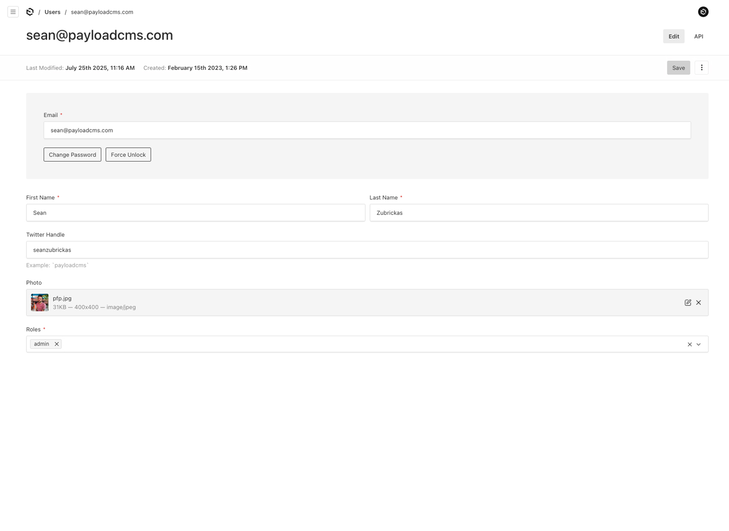
|
||||
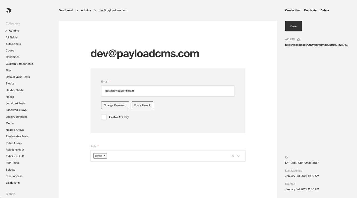
|
||||
_Admin Panel screenshot depicting an Admins Collection with Auth enabled_
|
||||
|
||||
## Config Options
|
||||
@@ -41,9 +41,8 @@ _Admin Panel screenshot depicting an Admins Collection with Auth enabled_
|
||||
Any [Collection](../configuration/collections) can opt-in to supporting Authentication. Once enabled, each Document that is created within the Collection can be thought of as a "user". This enables a complete authentication workflow on your Collection, such as logging in and out, resetting their password, and more.
|
||||
|
||||
<Banner type="warning">
|
||||
**Note:** By default, Payload provides an auth-enabled `User` Collection which
|
||||
is used to access the Admin Panel. [More
|
||||
details](../admin/overview#the-admin-user-collection).
|
||||
<strong>Note:</strong>
|
||||
By default, Payload provides an auth-enabled `User` Collection which is used to access the Admin Panel. [More details](../admin/overview#the-admin-user-collection).
|
||||
</Banner>
|
||||
|
||||
To enable Authentication on a Collection, use the `auth` property in the [Collection Config](../configuration/collections):
|
||||
@@ -66,33 +65,31 @@ export const Admins: CollectionConfig = {
|
||||
```
|
||||
|
||||
<Banner type="info">
|
||||
**Tip:** For default auth behavior, set `auth: true`. This is a good starting
|
||||
point for most applications.
|
||||
<strong>Tip:</strong>
|
||||
For default auth behavior, set `auth: true`. This is a good starting point for most applications.
|
||||
</Banner>
|
||||
|
||||
<Banner type="warning">
|
||||
**Note:** Auth-enabled Collections will be automatically injected with the
|
||||
`hash`, `salt`, and `email` fields. [More
|
||||
details](../fields/overview#field-names).
|
||||
<strong>Note:</strong>
|
||||
Auth-enabled Collections with be automatically injected with the `hash`, `salt`, and `email` fields. [More details](../fields/overview#field-names).
|
||||
</Banner>
|
||||
|
||||
The following options are available:
|
||||
|
||||
| Option | Description |
|
||||
| ------------------------------ | --------------------------------------------------------------------------------------------------------------------------------------------------------------------------------------------------------------------------- |
|
||||
| **`cookies`** | Set cookie options, including `secure`, `sameSite`, and `domain`. For advanced users. |
|
||||
| **`depth`** | How many levels deep a `user` document should be populated when creating the JWT and binding the `user` to the `req`. Defaults to `0` and should only be modified if absolutely necessary, as this will affect performance. |
|
||||
| **`disableLocalStrategy`** | Advanced - disable Payload's built-in local auth strategy. Only use this property if you have replaced Payload's auth mechanisms with your own. |
|
||||
| **`forgotPassword`** | Customize the way that the `forgotPassword` operation functions. [More details](./email#forgot-password). |
|
||||
| **`lockTime`** | Set the time (in milliseconds) that a user should be locked out if they fail authentication more times than `maxLoginAttempts` allows for. |
|
||||
| **`loginWithUsername`** | Ability to allow users to login with username/password. [More](/docs/authentication/overview#login-with-username) |
|
||||
| **`maxLoginAttempts`** | Only allow a user to attempt logging in X amount of times. Automatically locks out a user from authenticating if this limit is passed. Set to `0` to disable. |
|
||||
| **`removeTokenFromResponses`** | Set to true if you want to remove the token from the returned authentication API responses such as login or refresh. |
|
||||
| **`strategies`** | Advanced - an array of custom authentication strategies to extend this collection's authentication with. [More details](./custom-strategies). |
|
||||
| **`tokenExpiration`** | How long (in seconds) to keep the user logged in. JWTs and HTTP-only cookies will both expire at the same time. |
|
||||
| **`useAPIKey`** | Payload Authentication provides for API keys to be set on each user within an Authentication-enabled Collection. [More details](./api-keys). |
|
||||
| **`useSessions`** | True by default. Set to `false` to use stateless JWTs for authentication instead of sessions. |
|
||||
| **`verify`** | Set to `true` or pass an object with verification options to require users to verify by email before they are allowed to log into your app. [More details](./email#email-verification). |
|
||||
| Option | Description |
|
||||
|----------------------------|-------------------------------------------------------------------------------------------------------------------------------------------------------------------------------------------------------------------------------------|
|
||||
| **`cookies`** | Set cookie options, including `secure`, `sameSite`, and `domain`. For advanced users. |
|
||||
| **`depth`** | How many levels deep a `user` document should be populated when creating the JWT and binding the `user` to the `req`. Defaults to `0` and should only be modified if absolutely necessary, as this will affect performance. |
|
||||
| **`disableLocalStrategy`** | Advanced - disable Payload's built-in local auth strategy. Only use this property if you have replaced Payload's auth mechanisms with your own. |
|
||||
| **`forgotPassword`** | Customize the way that the `forgotPassword` operation functions. [More details](./email#forgot-password). |
|
||||
| **`lockTime`** | Set the time (in milliseconds) that a user should be locked out if they fail authentication more times than `maxLoginAttempts` allows for. |
|
||||
| **`loginWithUsername`** | Ability to allow users to login with username/password. [More](/docs/authentication/overview#login-with-username) |
|
||||
| **`maxLoginAttempts`** | Only allow a user to attempt logging in X amount of times. Automatically locks out a user from authenticating if this limit is passed. Set to `0` to disable. |
|
||||
| **`removeTokenFromResponses`** | Set to true if you want to remove the token from the returned authentication API responses such as login or refresh. |
|
||||
| **`strategies`** | Advanced - an array of custom authentification strategies to extend this collection's authentication with. [More details](./custom-strategies). |
|
||||
| **`tokenExpiration`** | How long (in seconds) to keep the user logged in. JWTs and HTTP-only cookies will both expire at the same time. |
|
||||
| **`useAPIKey`** | Payload Authentication provides for API keys to be set on each user within an Authentication-enabled Collection. [More details](./api-keys). |
|
||||
| **`verify`** | Set to `true` or pass an object with verification options to require users to verify by email before they are allowed to log into your app. [More details](./email#email-verification). |
|
||||
|
||||
### Login With Username
|
||||
|
||||
@@ -135,7 +132,7 @@ If set to `true`, an email address is required when creating a new user. If set
|
||||
|
||||
For testing and demo purposes you may want to skip forcing the user to login in order to access your application. Typically, all users should be required to login, however, you can speed up local development time by enabling auto-login.
|
||||
|
||||
To enable auto-login, set the `autoLogin` property in the [Payload Config](../admin/overview#admin-options):
|
||||
To enable auto-login, set the `autoLogin` property in the [Admin Config](../configuration/admin):
|
||||
|
||||
```ts
|
||||
import { buildConfig } from 'payload'
|
||||
@@ -143,31 +140,27 @@ import { buildConfig } from 'payload'
|
||||
export default buildConfig({
|
||||
// ...
|
||||
// highlight-start
|
||||
admin: {
|
||||
autoLogin:
|
||||
process.env.NODE_ENV === 'development'
|
||||
? {
|
||||
email: 'test@example.com',
|
||||
password: 'test',
|
||||
prefillOnly: true,
|
||||
}
|
||||
: false,
|
||||
},
|
||||
|
||||
autoLogin:
|
||||
process.env.NEXT_PUBLIC_ENABLE_AUTOLOGIN === 'true'
|
||||
? {
|
||||
email: 'test@example.com',
|
||||
password: 'test',
|
||||
prefillOnly: true,
|
||||
}
|
||||
: false,
|
||||
// highlight-end
|
||||
})
|
||||
```
|
||||
|
||||
<Banner type="warning">
|
||||
**Warning:** The recommended way to use this feature is behind an [Environment
|
||||
Variable](../configuration/environment-vars). This will ensure it is
|
||||
_disabled_ in production.
|
||||
<strong>Warning:</strong>
|
||||
The recommended way to use this feature is behind an [Environment Variable](../configuration/environment-vars). This will ensure it is _disabled_ in production.
|
||||
</Banner>
|
||||
|
||||
The following options are available:
|
||||
|
||||
| Option | Description |
|
||||
| ----------------- | --------------------------------------------------------------------------------------------------------------- |
|
||||
|-------------------|-----------------------------------------------------------------------------------------------------------------|
|
||||
| **`username`** | The username of the user to login as |
|
||||
| **`email`** | The email address of the user to login as |
|
||||
| **`password`** | The password of the user to login as. This is only needed if `prefillOnly` is set to true |
|
||||
@@ -179,7 +172,7 @@ All auth-related operations are available via Payload's REST, Local, and GraphQL
|
||||
|
||||
## Strategies
|
||||
|
||||
Out of the box Payload ships with three powerful Authentication strategies:
|
||||
Out of the box Payload ships with a three powerful Authentication strategies:
|
||||
|
||||
- [HTTP-Only Cookies](./cookies)
|
||||
- [JSON Web Tokens (JWT)](./jwt)
|
||||
@@ -189,7 +182,7 @@ Each of these strategies can work together or independently. You can also create
|
||||
|
||||
### HTTP-Only Cookies
|
||||
|
||||
[HTTP-only cookies](https://developer.mozilla.org/en-US/docs/Web/HTTP/Cookies) are a highly secure method of storing identifiable data on a user's device so that Payload can automatically recognize a returning user until their cookie expires. They are totally protected from common XSS attacks and **cannot be read by JavaScript in the browser**, unlike JWT's. [More details](./cookies).
|
||||
[HTTP-only cookies](https://developer.mozilla.org/en-US/docs/Web/HTTP/Cookies) are a highly secure method of storing identifiable data on a user's device so that Payload can automatically recognize a returning user until their cookie expires. They are totally protected from common XSS attacks and <strong>cannot be read by JavaScript in the browser</strong>, unlike JWT's. [More details](./cookies).
|
||||
|
||||
### JSON Web Tokens
|
||||
|
||||
@@ -202,43 +195,3 @@ API Keys can be enabled on auth collections. These are particularly useful when
|
||||
### Custom Strategies
|
||||
|
||||
There are cases where these may not be enough for your application. Payload is extendable by design so you can wire up your own strategy when you need to. [More details](./custom-strategies).
|
||||
|
||||
### Access Control
|
||||
|
||||
Default auth fields including `email`, `username`, and `password` can be overridden by defining a custom field with the same name in your collection config. This allows you to customize the field — including access control — while preserving the underlying auth functionality. For example, you might want to restrict the `email` field from being updated once it is created, or only allow it to be read by certain user roles. You can achieve this by redefining the field and setting access rules accordingly.
|
||||
|
||||
Here's an example of how to restrict access to default auth fields:
|
||||
|
||||
```ts
|
||||
import type { CollectionConfig } from 'payload'
|
||||
|
||||
export const Auth: CollectionConfig = {
|
||||
slug: 'users',
|
||||
auth: true,
|
||||
fields: [
|
||||
{
|
||||
name: 'email', // or 'username'
|
||||
type: 'text',
|
||||
access: {
|
||||
create: () => true,
|
||||
read: () => false,
|
||||
update: () => false,
|
||||
},
|
||||
},
|
||||
{
|
||||
name: 'password', // this will be applied to all password-related fields including new password, confirm password.
|
||||
type: 'text',
|
||||
hidden: true, // needed only for the password field to prevent duplication in the Admin panel
|
||||
access: {
|
||||
update: () => false,
|
||||
},
|
||||
},
|
||||
],
|
||||
}
|
||||
```
|
||||
|
||||
**Note:**
|
||||
|
||||
- Access functions will apply across the application — I.e. if `read` access is disabled on `email`, it will not appear in the Admin panel UI or API.
|
||||
- Restricting `read` on the `email` or `username` disables the **Unlock** action in the Admin panel as this function requires access to a user-identifying field.
|
||||
- When overriding the `password` field, you may need to include `hidden: true` to prevent duplicate fields being displayed in the Admin panel.
|
||||
|
||||
@@ -6,9 +6,9 @@ desc: Storing data for read on the request object.
|
||||
keywords: authentication, config, configuration, documentation, Content Management System, cms, headless, javascript, node, react, nextjs
|
||||
---
|
||||
|
||||
During the lifecycle of a request you will be able to access the data you have configured to be stored in the JWT by accessing `req.user`. The user object is automatically appended to the request for you.
|
||||
During the lifecycle of a request you will be able to access the data you have configured to be stored in the JWT by accessing `req.user`. The user object is automatically appeneded to the request for you.
|
||||
|
||||
### Defining Token Data
|
||||
### Definining Token Data
|
||||
|
||||
You can specify what data gets encoded to the Cookie/JWT-Token by setting `saveToJWT` property on fields within your auth collection.
|
||||
|
||||
@@ -24,7 +24,10 @@ export const Users: CollectionConfig = {
|
||||
saveToJWT: true,
|
||||
type: 'select',
|
||||
name: 'role',
|
||||
options: ['super-admin', 'user'],
|
||||
options: [
|
||||
'super-admin',
|
||||
'user',
|
||||
]
|
||||
},
|
||||
{
|
||||
// the entire object will be stored in the JWT
|
||||
@@ -43,7 +46,7 @@ export const Users: CollectionConfig = {
|
||||
type: 'text',
|
||||
name: 'omitField',
|
||||
},
|
||||
],
|
||||
]
|
||||
},
|
||||
{
|
||||
type: 'group',
|
||||
@@ -60,19 +63,19 @@ export const Users: CollectionConfig = {
|
||||
type: 'text',
|
||||
name: 'omitField',
|
||||
},
|
||||
],
|
||||
]
|
||||
},
|
||||
],
|
||||
]
|
||||
}
|
||||
```
|
||||
|
||||
<Banner type="success">
|
||||
**Tip:**
|
||||
|
||||
If you wish to use a different key other than the field `name`, you can define `saveToJWT` as a string.
|
||||
|
||||
<strong>Tip:</strong>
|
||||
<br/>
|
||||
If you wish to use a different key other than the field `name`, you can define `saveToJWT` as a string.
|
||||
</Banner>
|
||||
|
||||
|
||||
### Using Token Data
|
||||
|
||||
This is especially helpful when writing [Hooks](../hooks/overview) and [Access Control](../access-control/overview) that depend on user defined fields.
|
||||
|
||||
61
docs/cloud/configuration.mdx
Normal file
61
docs/cloud/configuration.mdx
Normal file
@@ -0,0 +1,61 @@
|
||||
---
|
||||
title: Project Configuration
|
||||
label: Configuration
|
||||
order: 20
|
||||
desc: Quickly configure and deploy your Payload Cloud project in a few simple steps.
|
||||
keywords: configuration, config, settings, project, cloud, payload cloud, deploy, deployment
|
||||
---
|
||||
|
||||
## Select your plan
|
||||
|
||||
Once you have created a project, you will need to select your plan. This will determine the resources that are allocated to your project and the features that are available to you.
|
||||
|
||||
<Banner type="success">
|
||||
Note: All Payload Cloud teams that deploy a project require a card on file. This helps us prevent
|
||||
fraud and abuse on our platform. If you select a plan with a free trial, you will not be charged
|
||||
until your trial period is over. We’ll remind you 7 days before your trial ends and you can cancel
|
||||
anytime.
|
||||
</Banner>
|
||||
|
||||
## Project Details
|
||||
|
||||
| Option | Description |
|
||||
| ---------------- | --------------------------------------------------------------------------------------------------------------------------------------------------------------------------------------------------------------------------------------------- |
|
||||
| **Region** | Select the region closest to your audience. This will ensure the fastest communication between your data and your client. |
|
||||
| **Project Name** | A name for your project. You can change this at any time. |
|
||||
| **Project Slug** | Choose a unique slug to identify your project. This needs to be unique for your team and you can change it any time. |
|
||||
| **Team** | Select the team you want to create the project under. If this is your first project, a personal team will be created for you automatically. You can modify your team settings and invite new members at any time from the Team Settings page. |
|
||||
|
||||
## Build Settings
|
||||
|
||||
If you are deploying a new project from a template, the following settings will be automatically configured for you. If you are using your own repository, you need to make sure your build settings are accurate for your project to deploy correctly.
|
||||
|
||||
| Option | Description |
|
||||
| -------------------- | ----------------------------------------------------------------------------------------------------------------------------------------------------------------- |
|
||||
| **Root Directory** | The folder where your `package.json` file lives. |
|
||||
| **Install Command** | The command used to install your modules, for example: `yarn install` or `npm install` |
|
||||
| **Build Command** | The command used to build your application, for example: `yarn build` or `npm run build` |
|
||||
| **Serve Command** | The command used to serve your application, for example: `yarn serve` or `npm run serve` |
|
||||
| **Branch to Deploy** | Select the branch of your repository that you want to deploy from. This is the branch that will be used to build your project when you commit new changes. |
|
||||
| **Default Domain** | Set a default domain for your project. This must be unique and you will not able to change it. You can always add a custom domain later in your project settings. |
|
||||
|
||||
## Environment Variables
|
||||
|
||||
Any of the features in Payload Cloud that require environment variables will automatically be provided to your application. If your app requires any custom environment variables, you can set them here.
|
||||
|
||||
<Banner type="warning">
|
||||
Note: For security reasons, any variables you wish to provide to the [Admin Panel](../admin/overview) must be prefixed
|
||||
with `NEXT_PUBLIC_`. Learn more
|
||||
[here](../configuration/environment-vars).
|
||||
</Banner>
|
||||
|
||||
## Payment
|
||||
|
||||
Payment methods can be set per project and can be updated any time. You can use team’s default payment method, or add a new one. Modify your payment methods in your Project settings / Team settings.
|
||||
|
||||
<Banner type="success">
|
||||
<strong>Note:</strong> All Payload Cloud teams that deploy a project require a card on file. This
|
||||
helps us prevent fraud and abuse on our platform. If you select a plan with a free trial, you will
|
||||
not be charged until your trial period is over. We’ll remind you 7 days before your trial ends and
|
||||
you can cancel anytime.
|
||||
</Banner>
|
||||
51
docs/cloud/creating-a-project.mdx
Normal file
51
docs/cloud/creating-a-project.mdx
Normal file
@@ -0,0 +1,51 @@
|
||||
---
|
||||
title: Getting Started
|
||||
label: Getting Started
|
||||
order: 10
|
||||
desc: Get started with Payload Cloud, a deployment solution specifically designed for Node + MongoDB applications.
|
||||
keywords: cloud, hosted, database, storage, email, deployment, serverless, node, mongodb, s3, aws, cloudflare, atlas, resend, payload, cms
|
||||
---
|
||||
|
||||
A deployment solution specifically designed for Node.js + MongoDB applications, offering seamless deployment of your entire stack in one place. You can get started in minutes with a one-click template or bring your own codebase with you.
|
||||
|
||||
Payload Cloud offers various plans tailored to meet your specific needs, including a MongoDB Atlas database, S3 file storage, and email delivery powered by [Resend](https://resend.com). To see a full breakdown of features and plans, see our [Cloud Pricing page](https://payloadcms.com/cloud-pricing).
|
||||
|
||||
To get started, you first need to create an account. Head over to [the login screen](https://payloadcms.com/login) and **Register for Free**.
|
||||
|
||||
<Banner type="success">
|
||||
To create your first project, you can either select [a template](#starting-from-a-template) or
|
||||
[import an existing project](#importing-from-an-existing-codebase) from GitHub.
|
||||
</Banner>
|
||||
|
||||
## Starting from a Template
|
||||
|
||||
Templates come preconfigured and provide a one-click solution to quickly deploy a new application.
|
||||
|
||||
|
||||
_Creating a new project from a template._
|
||||
|
||||
After creating an account, select your desired template from the Projects page. At this point, you need to connect to authorize the Payload Cloud application with your GitHub account. Click Continue with GitHub and follow the prompts to authorize the app.
|
||||
|
||||
Next, select your `GitHub Scope`. If you belong to multiple organizations, they will show up here. If you do not see the organization you are looking for, you may need to adjust your GitHub app permissions.
|
||||
|
||||
After selecting your scope, create a unique `repository name` and select whether you want your repository to be public or private on GitHub.
|
||||
|
||||
<Banner type="warning">
|
||||
<strong>Note:</strong> Public repositories can be accessed by anyone online, while private
|
||||
repositories grant access only to you and anyone you explicitly authorize.
|
||||
</Banner>
|
||||
|
||||
Once you are ready, click **Create Project**. This will clone the selected template to a new repository in your GitHub account, and take you to the configuration page to set up your project for deployment.
|
||||
|
||||
## Importing from an Existing Codebase
|
||||
|
||||
Payload Cloud works for any Node.js + MongoDB app. From the New Project page, select **import an existing Git codebase**. Choose the organization and select the repository you want to import. From here, you will be taken to the configuration page to set up your project for deployment.
|
||||
|
||||
|
||||
_Creating a new project from an existing repository._
|
||||
|
||||
<Banner type="warning">
|
||||
<strong>Note:</strong> In order to make use of the features of Payload Cloud in your own codebase,
|
||||
you will need to add the [Cloud Plugin](https://github.com/payloadcms/plugin-cloud) to your
|
||||
Payload app.
|
||||
</Banner>
|
||||
127
docs/cloud/projects.mdx
Normal file
127
docs/cloud/projects.mdx
Normal file
@@ -0,0 +1,127 @@
|
||||
---
|
||||
title: Cloud Projects
|
||||
label: Projects
|
||||
order: 40
|
||||
desc: Manage your Payload Cloud projects.
|
||||
keywords: cloud, payload cloud, projects, project, overview, database, file storage, build settings, environment variables, custom domains, email, developing locally
|
||||
---
|
||||
|
||||
## Overview
|
||||
|
||||
<Banner>
|
||||
The overview tab shows your most recent deployment, along with build and deployment logs. From
|
||||
here, you can see your live URL, deployment details like timestamps and commit hash, as well as
|
||||
the status of your deployment. You can also trigger a redeployment manually, which will rebuild
|
||||
your project using the current configuration.
|
||||
</Banner>
|
||||
|
||||
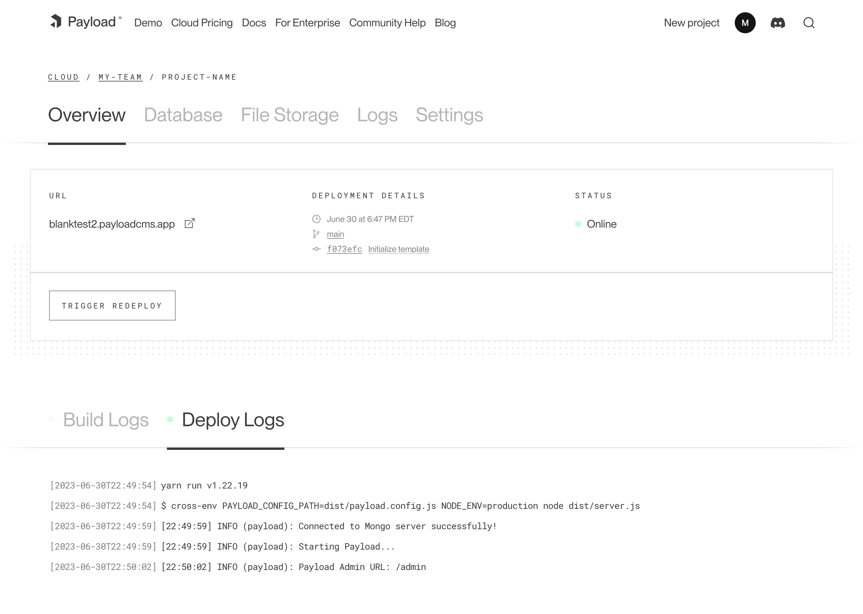
|
||||
_A screenshot of the Overview page for a Cloud project._
|
||||
|
||||
## Database
|
||||
|
||||
Your Payload Cloud project comes with a MongoDB serverless Atlas DB instance or a Dedicated Atlas cluster, depending on your plan. To interact with your cloud database, you will be provided with a MongoDB connection string. This can be found under the **Database** tab of your project.
|
||||
|
||||
`mongodb+srv://your_connection_string`
|
||||
|
||||
## File Storage
|
||||
|
||||
Payload Cloud gives you S3 file storage backed by Cloudflare as a CDN, and this plugin extends Payload so that all of your media will be stored in S3 rather than locally.
|
||||
|
||||
AWS Cognito is used for authentication to your S3 bucket. The [Payload Cloud Plugin](https://github.com/payloadcms/plugin-cloud) will automatically pick up these values. These values are only if you'd like to access your files directly, outside of Payload Cloud.
|
||||
|
||||
### Accessing Files Outside of Payload Cloud
|
||||
|
||||
If you'd like to access your files outside of Payload Cloud, you'll need to retrieve some values from your project's settings and put them into your environment variables. In Payload Cloud, navigate to the File Storage tab and copy the values using the copy button. Put these values in your .env file. Also copy the Cognito Password value separately and put into your .env file as well.
|
||||
|
||||
When you are done, you should have the following values in your .env file:
|
||||
|
||||
```env
|
||||
PAYLOAD_CLOUD=true
|
||||
PAYLOAD_CLOUD_ENVIRONMENT=prod
|
||||
PAYLOAD_CLOUD_COGNITO_USER_POOL_CLIENT_ID=
|
||||
PAYLOAD_CLOUD_COGNITO_USER_POOL_ID=
|
||||
PAYLOAD_CLOUD_COGNITO_IDENTITY_POOL_ID=
|
||||
PAYLOAD_CLOUD_PROJECT_ID=
|
||||
PAYLOAD_CLOUD_BUCKET=
|
||||
PAYLOAD_CLOUD_BUCKET_REGION=
|
||||
PAYLOAD_CLOUD_COGNITO_PASSWORD=
|
||||
```
|
||||
|
||||
The plugin will pick up these values and use them to access your files.
|
||||
|
||||
## Build Settings
|
||||
|
||||
You can update settings from your Project’s Settings tab. Changes to your build settings will trigger a redeployment of your project.
|
||||
|
||||
## Environment Variables
|
||||
|
||||
From the Environment Variables page of the Settings tab, you can add, update and delete variables for use in your project. Like build settings, these changes will trigger a redeployment of your project.
|
||||
|
||||
<Banner>
|
||||
Note: For security reasons, any variables you wish to provide to the [Admin Panel](../admin/overview) must be prefixed with `NEXT_PUBLIC_`. [More details](../configuration/environment-vars).
|
||||
</Banner>
|
||||
|
||||
## Custom Domains
|
||||
|
||||
With Payload Cloud, you can add custom domain names to your project. To do so, first go to the Domains page of the Settings tab of your project. Here you can see your default domain. To add a new domain, type in the domain name you wish to use.
|
||||
|
||||
<Banner>
|
||||
Note: do not include the protocol (http:// or https://) or any paths (/page). Only include the
|
||||
domain name and extension, and optionally a subdomain. - your-domain.com - backend.your-domain.com
|
||||
</Banner>
|
||||
|
||||
Once you click save, a DNS record will be generated for your domain name to point to your live project. Add this record into your DNS provider’s records, and once the records are resolving properly (this can take 1hr to 48hrs in some cases), your domain will now to point to your live project.
|
||||
|
||||
You will also need to configure your Payload project to use your specified domain. In your `payload.config.ts` file, specify your `serverURL` with your domain:
|
||||
|
||||
```ts
|
||||
export default buildConfig({
|
||||
serverURL: 'https://example.com',
|
||||
// the rest of your config,
|
||||
})
|
||||
```
|
||||
|
||||
## Email
|
||||
|
||||
Powered by [Resend](https://resend.com), Payload Cloud comes with integrated email support out of the box. No configuration is needed, and you can use `payload.sendEmail()` to send email right from your Payload app. To learn more about sending email with Payload, checkout the [Email Configuration](../email/overview) overview.
|
||||
|
||||
If you are on the Pro or Enterprise plan, you can add your own custom Email domain name. From the Email page of your project’s Settings, add the domain you wish to use for email delivery. This will generate a set of DNS records. Add these records to your DNS provider and click verify to check that your records are resolving properly. Once verified, your emails will now be sent from your custom domain name.
|
||||
|
||||
## Developing Locally
|
||||
|
||||
To make changes to your project, you will need to clone the repository defined in your project settings to your local machine. In order to run your project locally, you will need configure your local environment first. Refer to your repository’s `README.md` file to see the steps needed for your specific template.
|
||||
|
||||
From there, you are ready to make updates to your project. When you are ready to make your changes live, commit your changes to the branch you specified in your Project settings, and your application will automatically trigger a redeploy and build from your latest commit.
|
||||
|
||||
## Cloud Plugin
|
||||
|
||||
Projects generated from a template will come pre-configured with the official Cloud Plugin, but if you are using your own repository you will need to add this into your project. To do so, add the plugin to your Payload Config:
|
||||
|
||||
`yarn add @payloadcms/plugin-cloud`
|
||||
|
||||
```js
|
||||
import { payloadCloud } from '@payloadcms/plugin-cloud'
|
||||
import { buildConfig } from 'payload'
|
||||
|
||||
export default buildConfig({
|
||||
plugins: [payloadCloud()],
|
||||
// rest of config
|
||||
})
|
||||
```
|
||||
|
||||
<Banner type="warning">
|
||||
**Note:** If your Payload Config already has an email with transport, this will take precedence
|
||||
over Payload Cloud's email service.
|
||||
</Banner>
|
||||
|
||||
#### **Optional configuration**
|
||||
|
||||
If you wish to opt-out of any Payload cloud features, the plugin also accepts options to do so.
|
||||
|
||||
```js
|
||||
payloadCloud({
|
||||
storage: false, // Disable file storage
|
||||
email: false, // Disable email delivery
|
||||
})
|
||||
```
|
||||
35
docs/cloud/teams.mdx
Normal file
35
docs/cloud/teams.mdx
Normal file
@@ -0,0 +1,35 @@
|
||||
---
|
||||
title: Cloud Teams
|
||||
label: Teams
|
||||
order: 30
|
||||
desc: Manage your Payload Cloud team and billing settings.
|
||||
keywords: team, teams, billing, subscription, payment, plan, plans, cloud, payload cloud
|
||||
---
|
||||
|
||||
<Banner>
|
||||
Within Payload Cloud, the team management feature offers you the ability to manage your
|
||||
organization, team members, billing, and subscription settings.
|
||||
</Banner>
|
||||
|
||||
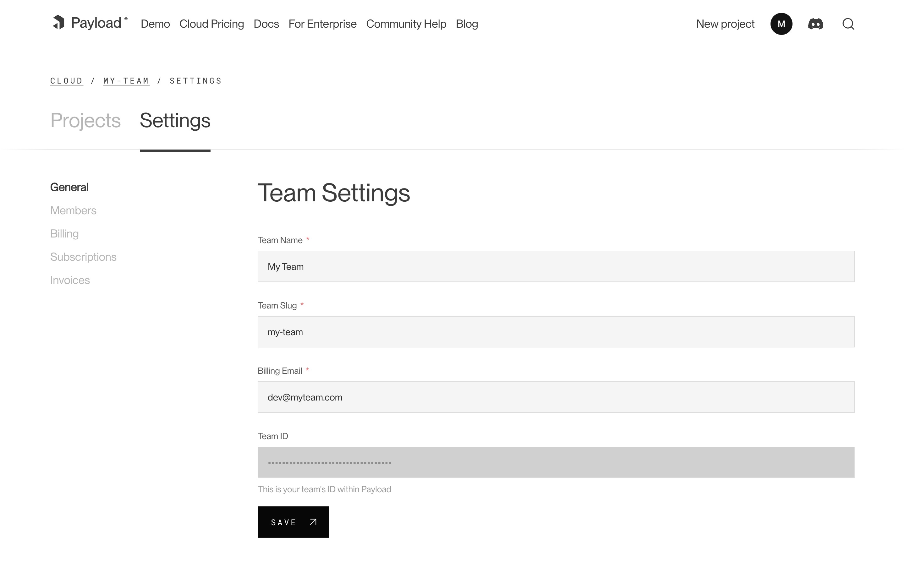
|
||||
_A screenshot of the Team Settings page._
|
||||
|
||||
## Members
|
||||
|
||||
Each team has members that can interact with your projects. You can invite multiple people to your team and each individual can belong to more than one team. You can assign them either `owner` or `user` permissions. Owners are able to make admin-only changes, such as deleting projects, and editing billing information.
|
||||
|
||||
## Adding Members
|
||||
|
||||
To add a new member to your team, visit your Team’s Settings page, and click “Invite Teammate”. You can then add their email address, and assign their role. Press “Save” to send the invitations, which will send an email to the invited team member where they can create a new account.
|
||||
|
||||
## Billing
|
||||
|
||||
Users can update billing settings and subscriptions for any teams where they are designated as an `owner`. To make updates to the team’s payment methods, visit the Billing page under the Team Settings tab. You can add new cards, delete cards, and set a payment method as a default. The default payment method will be used in the event that another payment method fails.
|
||||
|
||||
## Subscriptions
|
||||
|
||||
From the Subscriptions page, a team owner can see all current plans for their team. From here, you can see the price of each plan, if there is an active trial, and when you will be billed next.
|
||||
|
||||
## Invoices
|
||||
|
||||
The Invoices page will you show you the invoices for your account, as well as the status on their payment.
|
||||
@@ -19,21 +19,20 @@ import { buildConfig } from 'payload'
|
||||
|
||||
export default buildConfig({
|
||||
// ...
|
||||
collections: [
|
||||
// highlight-line
|
||||
collections: [ // highlight-line
|
||||
// Your Collections go here
|
||||
],
|
||||
})
|
||||
```
|
||||
|
||||
<Banner type="success">
|
||||
**Tip:** If your Collection is only ever meant to contain a single Document,
|
||||
consider using a [Global](./globals) instead.
|
||||
<strong>Tip:</strong>
|
||||
If your Collection is only ever meant to contain a single Document, consider using a [Global](./globals) instead.
|
||||
</Banner>
|
||||
|
||||
## Config Options
|
||||
|
||||
It's often best practice to write your Collections in separate files and then import them into the main [Payload Config](./overview).
|
||||
It's often best practice to write your Collections in separate files and then import them into the main [Payload Config](../overview).
|
||||
|
||||
Here is what a simple Collection Config might look like:
|
||||
|
||||
@@ -46,47 +45,38 @@ export const Posts: CollectionConfig = {
|
||||
{
|
||||
name: 'title',
|
||||
type: 'text',
|
||||
},
|
||||
],
|
||||
}
|
||||
]
|
||||
}
|
||||
```
|
||||
|
||||
<Banner type="success">
|
||||
**Reminder:** For more complex examples, see the
|
||||
[Templates](https://github.com/payloadcms/payload/tree/main/templates) and
|
||||
[Examples](https://github.com/payloadcms/payload/tree/main/examples)
|
||||
directories in the Payload repository.
|
||||
<strong>Reminder:</strong>
|
||||
For a more complex example, see the [Public Demo](https://github.com/payloadcms/public-demo) source code on GitHub, or the [Templates](https://github.com/payloadcms/payload/tree/main/templates) and [Examples](https://github.com/payloadcms/payload/tree/main/examples) directories in the Payload repository.
|
||||
</Banner>
|
||||
|
||||
The following options are available:
|
||||
|
||||
| Option | Description |
|
||||
| -------------------- | -------------------------------------------------------------------------------------------------------------------------------------------------------------------------------------------------------------------------------- |
|
||||
| `admin` | The configuration options for the Admin Panel. [More details](#admin-options). |
|
||||
| `access` | Provide Access Control functions to define exactly who should be able to do what with Documents in this Collection. [More details](../access-control/collections). |
|
||||
| `auth` | Specify options if you would like this Collection to feature authentication. [More details](../authentication/overview). |
|
||||
| `custom` | Extension point for adding custom data (e.g. for plugins) |
|
||||
| `disableDuplicate` | When true, do not show the "Duplicate" button while editing documents within this Collection and prevent `duplicate` from all APIs. |
|
||||
| `defaultSort` | Pass a top-level field to sort by default in the Collection List View. Prefix the name of the field with a minus symbol ("-") to sort in descending order. Multiple fields can be specified by using a string array. |
|
||||
| `dbName` | Custom table or Collection name depending on the Database Adapter. Auto-generated from slug if not defined. |
|
||||
| `endpoints` | Add custom routes to the REST API. Set to `false` to disable routes. [More details](../rest-api/overview#custom-endpoints). |
|
||||
| `fields` \* | Array of field types that will determine the structure and functionality of the data stored within this Collection. [More details](../fields/overview). |
|
||||
| `graphQL` | Manage GraphQL-related properties for this collection. [More](#graphql) |
|
||||
| `hooks` | Entry point for Hooks. [More details](../hooks/overview#collection-hooks). |
|
||||
| `orderable` | If true, enables custom ordering for the collection, and documents can be reordered via drag and drop. Uses [fractional indexing](https://observablehq.com/@dgreensp/implementing-fractional-indexing) for efficient reordering. |
|
||||
| `labels` | Singular and plural labels for use in identifying this Collection throughout Payload. Auto-generated from slug if not defined. |
|
||||
| `enableQueryPresets` | Enable query presets for this Collection. [More details](../query-presets/overview). |
|
||||
| `lockDocuments` | Enables or disables document locking. By default, document locking is enabled. Set to an object to configure, or set to `false` to disable locking. [More details](../admin/locked-documents). |
|
||||
| `slug` \* | Unique, URL-friendly string that will act as an identifier for this Collection. |
|
||||
| `timestamps` | Set to false to disable documents' automatically generated `createdAt` and `updatedAt` timestamps. |
|
||||
| `trash` | A boolean to enable soft deletes for this collection. Defaults to `false`. [More details](../trash/overview). |
|
||||
| `typescript` | An object with property `interface` as the text used in schema generation. Auto-generated from slug if not defined. |
|
||||
| `upload` | Specify options if you would like this Collection to support file uploads. For more, consult the [Uploads](../upload/overview) documentation. |
|
||||
| `versions` | Set to true to enable default options, or configure with object properties. [More details](../versions/overview#collection-config). |
|
||||
| `defaultPopulate` | Specify which fields to select when this Collection is populated from another document. [More Details](../queries/select#defaultpopulate-collection-config-property). |
|
||||
| `indexes` | Define compound indexes for this collection. This can be used to either speed up querying/sorting by 2 or more fields at the same time or to ensure uniqueness between several fields. |
|
||||
| `forceSelect` | Specify which fields should be selected always, regardless of the `select` query which can be useful that the field exists for access control / hooks |
|
||||
| `disableBulkEdit` | Disable the bulk edit operation for the collection in the admin panel and the REST API |
|
||||
| Option | Description |
|
||||
|------------------------|----------------------------------------------------------------------------------------------------------------------------------------------------------------------------------------------- |
|
||||
| **`admin`** | The configuration options for the Admin Panel. [More details](../admin/collections). |
|
||||
| **`access`** | Provide Access Control functions to define exactly who should be able to do what with Documents in this Collection. [More details](../access-control/collections). |
|
||||
| **`auth`** | Specify options if you would like this Collection to feature authentication. [More details](../authentication/overview). |
|
||||
| **`custom`** | Extension point for adding custom data (e.g. for plugins) |
|
||||
| **`disableDuplicate`** | When true, do not show the "Duplicate" button while editing documents within this Collection and prevent `duplicate` from all APIs. |
|
||||
| **`defaultSort`** | Pass a top-level field to sort by default in the Collection List View. Prefix the name of the field with a minus symbol ("-") to sort in descending order. |
|
||||
| **`dbName`** | Custom table or Collection name depending on the Database Adapter. Auto-generated from slug if not defined. |
|
||||
| **`endpoints`** | Add custom routes to the REST API. Set to `false` to disable routes. [More details](../rest-api/overview#custom-endpoints). |
|
||||
| **`fields`** \* | Array of field types that will determine the structure and functionality of the data stored within this Collection. [More details](../fields/overview). |
|
||||
| **`graphQL`** | An object with `singularName` and `pluralName` strings used in schema generation. Auto-generated from slug if not defined. Set to `false` to disable GraphQL. |
|
||||
| **`hooks`** | Entry point for Hooks. [More details](../hooks/overview#collection-hooks). |
|
||||
| **`labels`** | Singular and plural labels for use in identifying this Collection throughout Payload. Auto-generated from slug if not defined. |
|
||||
| **`lockDocuments`** | Enables or disables document locking. By default, document locking is enabled. Set to an object to configure, or set to `false` to disable locking. [More details](../admin/locked-documents). |
|
||||
| **`slug`** \* | Unique, URL-friendly string that will act as an identifier for this Collection. |
|
||||
| **`timestamps`** | Set to false to disable documents' automatically generated `createdAt` and `updatedAt` timestamps. |
|
||||
| **`typescript`** | An object with property `interface` as the text used in schema generation. Auto-generated from slug if not defined. |
|
||||
| **`upload`** | Specify options if you would like this Collection to support file uploads. For more, consult the [Uploads](../upload/overview) documentation. |
|
||||
| **`versions`** | Set to true to enable default options, or configure with object properties. [More details](../versions/overview#collection-config). |
|
||||
|
||||
_\* An asterisk denotes that a property is required._
|
||||
|
||||
@@ -102,192 +92,13 @@ Fields define the schema of the Documents within a Collection. To learn more, go
|
||||
|
||||
[Collection Hooks](../hooks/collections) allow you to tie into the lifecycle of your Documents so you can execute your own logic during specific events. To learn more, go to the [Hooks](../hooks/overview) documentation.
|
||||
|
||||
## Admin Options
|
||||
### Admin Options
|
||||
|
||||
The behavior of Collections within the [Admin Panel](../admin/overview) can be fully customized to fit the needs of your application. This includes grouping or hiding their navigation links, adding [Custom Components](../custom-components/overview), selecting which fields to display in the List View, and more.
|
||||
|
||||
To configure Admin Options for Collections, use the `admin` property in your Collection Config:
|
||||
|
||||
```ts
|
||||
import type { CollectionConfig } from 'payload'
|
||||
|
||||
export const MyCollection: CollectionConfig = {
|
||||
// ...
|
||||
admin: {
|
||||
// highlight-line
|
||||
// ...
|
||||
},
|
||||
}
|
||||
```
|
||||
|
||||
The following options are available:
|
||||
|
||||
| Option | Description |
|
||||
| ---------------------------- | ---------------------------------------------------------------------------------------------------------------------------------------------------------------------------------------------------------------------------- |
|
||||
| `group` | Text or localization object used to group Collection and Global links in the admin navigation. Set to `false` to hide the link from the navigation while keeping its routes accessible. |
|
||||
| `hidden` | Set to true or a function, called with the current user, returning true to exclude this Collection from navigation and admin routing. |
|
||||
| `hooks` | Admin-specific hooks for this Collection. [More details](../hooks/collections). |
|
||||
| `useAsTitle` | Specify a top-level field to use for a document title throughout the Admin Panel. If no field is defined, the ID of the document is used as the title. |
|
||||
| `description` | Text to display below the Collection label in the List View to give editors more information. Alternatively, you can use the `admin.components.Description` to render a React component. [More details](#custom-components). |
|
||||
| `defaultColumns` | Array of field names that correspond to which columns to show by default in this Collection's List View. |
|
||||
| `disableCopyToLocale` | Disables the "Copy to Locale" button while editing documents within this Collection. Only applicable when localization is enabled. |
|
||||
| `groupBy` | Beta. Enable grouping by a field in the list view. |
|
||||
| `hideAPIURL` | Hides the "API URL" meta field while editing documents within this Collection. |
|
||||
| `enableRichTextLink` | The [Rich Text](../fields/rich-text) field features a `Link` element which allows for users to automatically reference related documents within their rich text. Set to `true` by default. |
|
||||
| `enableRichTextRelationship` | The [Rich Text](../fields/rich-text) field features a `Relationship` element which allows for users to automatically reference related documents within their rich text. Set to `true` by default. |
|
||||
| `folders` | A boolean to enable folders for a given collection. Defaults to `false`. [More details](../folders/overview). |
|
||||
| `meta` | Page metadata overrides to apply to this Collection within the Admin Panel. [More details](../admin/metadata). |
|
||||
| `preview` | Function to generate preview URLs within the Admin Panel that can point to your app. [More details](../admin/preview). |
|
||||
| `livePreview` | Enable real-time editing for instant visual feedback of your front-end application. [More details](../live-preview/overview). |
|
||||
| `components` | Swap in your own React components to be used within this Collection. [More details](#custom-components). |
|
||||
| `listSearchableFields` | Specify which fields should be searched in the List search view. [More details](#list-searchable-fields). |
|
||||
| `pagination` | Set pagination-specific options for this Collection in the List View. [More details](#pagination). |
|
||||
| `baseFilter` | Defines a default base filter which will be applied to the List View (along with any other filters applied by the user) and internal links in Lexical Editor, |
|
||||
|
||||
<Banner type="warning">
|
||||
**Note:** If you set `useAsTitle` to a relationship or join field, it will use
|
||||
only the ID of the related document(s) as the title. To display a specific
|
||||
field (i.e. title) from the related document instead, create a virtual field
|
||||
that extracts the desired data, and set `useAsTitle` to that virtual field.
|
||||
</Banner>
|
||||
|
||||
### Custom Components
|
||||
|
||||
Collections can set their own [Custom Components](../custom-components/overview) which only apply to Collection-specific UI within the [Admin Panel](../admin/overview). This includes elements such as the Save Button, or entire layouts such as the Edit View.
|
||||
|
||||
To override Collection Components, use the `admin.components` property in your Collection Config:
|
||||
|
||||
```ts
|
||||
import type { CollectionConfig } from 'payload'
|
||||
|
||||
export const MyCollection: CollectionConfig = {
|
||||
// ...
|
||||
admin: {
|
||||
components: {
|
||||
// highlight-line
|
||||
// ...
|
||||
},
|
||||
},
|
||||
}
|
||||
```
|
||||
|
||||
The following options are available:
|
||||
|
||||
| Option | Description |
|
||||
| ----------------- | ---------------------------------------------------------------------------------------------------------------------------------------------------------------------------------- |
|
||||
| `afterList` | An array of components to inject _after_ the built-in List View. [More details](../custom-components/list-view#afterlist). |
|
||||
| `afterListTable` | An array of components to inject _after_ the built-in List View's table. [More details](../custom-components/list-view#afterlisttable). |
|
||||
| `beforeList` | An array of components to inject _before_ the built-in List View. [More details](../custom-components/list-view#beforelist). |
|
||||
| `beforeListTable` | An array of components to inject _before_ the built-in List View's table. [More details](../custom-components/list-view#beforelisttable). |
|
||||
| `listMenuItems` | An array of components to render within a menu next to the List Controls (after the Columns and Filters options) |
|
||||
| `Description` | A component to render below the Collection label in the List View. An alternative to the `admin.description` property. [More details](../custom-components/list-view#description). |
|
||||
| `edit` | Override specific components within the Edit View. [More details](#edit-view-options). |
|
||||
| `views` | Override or create new views within the Admin Panel. [More details](../custom-components/custom-views). |
|
||||
|
||||
#### Edit View Options
|
||||
|
||||
```ts
|
||||
import type { CollectionConfig } from 'payload'
|
||||
|
||||
export const MyCollection: CollectionConfig = {
|
||||
// ...
|
||||
admin: {
|
||||
components: {
|
||||
edit: {
|
||||
// highlight-line
|
||||
// ...
|
||||
},
|
||||
},
|
||||
},
|
||||
}
|
||||
```
|
||||
|
||||
The following options are available:
|
||||
|
||||
| Option | Description |
|
||||
| ------------------------ | ------------------------------------------------------------------------------------------------------------------------------------------------------------------------------------------------------- |
|
||||
| `beforeDocumentControls` | Inject custom components before the Save / Publish buttons. [More details](../custom-components/edit-view#beforedocumentcontrols). |
|
||||
| `editMenuItems` | Inject custom components within the 3-dot menu dropdown located in the document controls bar. [More details](../custom-components/edit-view#editmenuitems). |
|
||||
| `SaveButton` | Replace the default Save Button within the Edit View. [Drafts](../versions/drafts) must be disabled. [More details](../custom-components/edit-view#savebutton). |
|
||||
| `SaveDraftButton` | Replace the default Save Draft Button within the Edit View. [Drafts](../versions/drafts) must be enabled and autosave must be disabled. [More details](../custom-components/edit-view#savedraftbutton). |
|
||||
| `PublishButton` | Replace the default Publish Button within the Edit View. [Drafts](../versions/drafts) must be enabled. [More details](../custom-components/edit-view#publishbutton). |
|
||||
| `PreviewButton` | Replace the default Preview Button within the Edit View. [Preview](../admin/preview) must be enabled. [More details](../custom-components/edit-view#previewbutton). |
|
||||
| `Upload` | Replace the default Upload component within the Edit View. [Upload](../upload/overview) must be enabled. [More details](../custom-components/edit-view#upload). |
|
||||
|
||||
<Banner type="success">
|
||||
**Note:** For details on how to build Custom Components, see [Building Custom
|
||||
Components](../custom-components/overview#building-custom-components).
|
||||
</Banner>
|
||||
|
||||
### Pagination
|
||||
|
||||
All Collections receive their own List View which displays a paginated list of documents that can be sorted and filtered. The pagination behavior of the List View can be customized on a per-Collection basis, and uses the same [Pagination](../queries/pagination) API that Payload provides.
|
||||
|
||||
To configure pagination options, use the `admin.pagination` property in your Collection Config:
|
||||
|
||||
```ts
|
||||
import type { CollectionConfig } from 'payload'
|
||||
|
||||
export const Posts: CollectionConfig = {
|
||||
// ...
|
||||
admin: {
|
||||
// highlight-start
|
||||
pagination: {
|
||||
defaultLimit: 10,
|
||||
limits: [10, 20, 50],
|
||||
},
|
||||
// highlight-end
|
||||
},
|
||||
}
|
||||
```
|
||||
|
||||
The following options are available:
|
||||
|
||||
| Option | Description |
|
||||
| -------------- | --------------------------------------------------------------------------------------------------- |
|
||||
| `defaultLimit` | Integer that specifies the default per-page limit that should be used. Defaults to 10. |
|
||||
| `limits` | Provide an array of integers to use as per-page options for admins to choose from in the List View. |
|
||||
|
||||
### List Searchable Fields
|
||||
|
||||
In the List View, there is a "search" box that allows you to quickly find a document through a simple text search. By default, it searches on the ID field. If defined, the `admin.useAsTitle` field is used. Or, you can explicitly define which fields to search based on the needs of your application.
|
||||
|
||||
To define which fields should be searched, use the `admin.listSearchableFields` property in your Collection Config:
|
||||
|
||||
```ts
|
||||
import type { CollectionConfig } from 'payload'
|
||||
|
||||
export const Posts: CollectionConfig = {
|
||||
// ...
|
||||
admin: {
|
||||
// highlight-start
|
||||
listSearchableFields: ['title', 'slug'],
|
||||
// highlight-end
|
||||
},
|
||||
}
|
||||
```
|
||||
|
||||
<Banner type="warning">
|
||||
**Tip:** If you are adding `listSearchableFields`, make sure you index each of
|
||||
these fields so your admin queries can remain performant.
|
||||
</Banner>
|
||||
|
||||
## GraphQL
|
||||
|
||||
You can completely disable GraphQL for this collection by passing `graphQL: false` to your collection config. This will completely disable all queries, mutations, and types from appearing in your GraphQL schema.
|
||||
|
||||
You can also pass an object to the collection's `graphQL` property, which allows you to define the following properties:
|
||||
|
||||
| Option | Description |
|
||||
| ------------------ | ----------------------------------------------------------------------------------- |
|
||||
| `singularName` | Override the "singular" name that will be used in GraphQL schema generation. |
|
||||
| `pluralName` | Override the "plural" name that will be used in GraphQL schema generation. |
|
||||
| `disableQueries` | Disable all GraphQL queries that correspond to this collection by passing `true`. |
|
||||
| `disableMutations` | Disable all GraphQL mutations that correspond to this collection by passing `true`. |
|
||||
You can customize the way that the [Admin Panel](../admin/overview) behaves on a Collection-by-Collection basis. To learn more, go to the [Collection Admin Options](../admin/collections) documentation.
|
||||
|
||||
## TypeScript
|
||||
|
||||
You can import types from Payload to help make writing your Collection configs easier and type-safe. There are two main types that represent the Collection Config, `CollectionConfig` and `SanitizedCollectionConfig`.
|
||||
You can import types from Payload to help make writing your Collection configs easier and type-safe. There are two main types that represent the Collection Config, `CollectionConfig` and `SanitizeCollectionConfig`.
|
||||
|
||||
The `CollectionConfig` type represents a raw Collection Config in its full form, where only the bare minimum properties are marked as required. The `SanitizedCollectionConfig` type represents a Collection Config after it has been fully sanitized. Generally, this is only used internally by Payload.
|
||||
|
||||
|
||||
@@ -1,7 +1,7 @@
|
||||
---
|
||||
title: Environment Variables
|
||||
label: Environment Variables
|
||||
order: 60
|
||||
order: 100
|
||||
desc: Learn how to use Environment Variables in your Payload project
|
||||
---
|
||||
|
||||
@@ -42,13 +42,11 @@ export default buildConfig({
|
||||
|
||||
For security and safety reasons, the [Admin Panel](../admin/overview) does **not** include Environment Variables in its _client-side_ bundle by default. But, Next.js provides a mechanism to expose Environment Variables to the client-side bundle when needed.
|
||||
|
||||
If you are building a [Custom Component](../custom-components/overview) and need to access Environment Variables from the client-side, you can do so by prefixing them with `NEXT_PUBLIC_`.
|
||||
If you are building a [Custom Component](../admin/components) and need to access Environment Variables from the client-side, you can do so by prefixing them with `NEXT_PUBLIC_`.
|
||||
|
||||
<Banner type="warning">
|
||||
**Important:** Be careful about what variables you provide to your client-side
|
||||
code. Analyze every single one to make sure that you're not accidentally
|
||||
leaking sensitive information. Only ever include keys that are safe for the
|
||||
public to read in plain text.
|
||||
<strong>Important:</strong>
|
||||
Be careful about what variables you provide to your client-side code. Analyze every single one to make sure that you're not accidentally leaking sensitive information. Only ever include keys that are safe for the public to read in plain text.
|
||||
</Banner>
|
||||
|
||||
For example, if you've got the following Environment Variable:
|
||||
@@ -68,11 +66,15 @@ const stripeKey = process.env.NEXT_PUBLIC_STRIPE_PUBLISHABLE_KEY // highlight-li
|
||||
const MyClientComponent = () => {
|
||||
// do something with the key
|
||||
|
||||
return <div>My Client Component</div>
|
||||
return (
|
||||
<div>
|
||||
My Client Component
|
||||
</div>
|
||||
)
|
||||
}
|
||||
```
|
||||
|
||||
For more information, check out the [Next.js documentation](https://nextjs.org/docs/app/building-your-application/configuring/environment-variables).
|
||||
For more information, check out the [Next.js Documentation](https://nextjs.org/docs/app/building-your-application/configuring/environment-variables).
|
||||
|
||||
## Outside of Next.js
|
||||
|
||||
@@ -93,7 +95,7 @@ export default buildConfig({
|
||||
```
|
||||
|
||||
<Banner type="warning">
|
||||
**Tip:** Be sure that `dotenv` can find your `.env` file. By default, it will
|
||||
look for a file named `.env` in the root of your project. If you need to
|
||||
specify a different file, pass the path into the config options.
|
||||
<strong>Tip:</strong>
|
||||
Be sure that `dotenv` can find your `.env` file. By default, it will look for a file named `.env` in the root of your project. If you need to specify a different file, pass the path into the config options.
|
||||
</Banner>
|
||||
|
||||
|
||||
@@ -6,7 +6,7 @@ desc: Set up your Global config for your needs by defining fields, adding slugs
|
||||
keywords: globals, config, configuration, documentation, Content Management System, cms, headless, javascript, node, react, nextjs
|
||||
---
|
||||
|
||||
Globals are in many ways similar to [Collections](./collections), except that they correspond to only a single Document. You can define as many Globals as your application needs. Each Global Document is stored in the [Database](../database/overview) based on the [Fields](../fields/overview) that you define, and automatically generates a [Local API](../local-api/overview), [REST API](../rest-api/overview), and [GraphQL API](../graphql/overview) used to manage your Documents.
|
||||
Globals are in many ways similar to [Collections](../configuration/collections), except they correspond to only a single Document. You can define as many Globals as your application needs. Each Global Document is stored in the [Database](../database/overview) based on the [Fields](../fields/overview) that you define, and automatically generates a [Local API](../local-api/overview), [REST API](../rest-api/overview), and [GraphQL API](../graphql/overview) used to manage your Documents.
|
||||
|
||||
Globals are the primary way to structure singletons in Payload, such as a header navigation, site-wide banner alerts, or app-wide localized strings. Each Global can have its own unique [Access Control](../access-control/overview), [Hooks](../hooks/overview), [Admin Options](#admin-options), and more.
|
||||
|
||||
@@ -17,16 +17,15 @@ import { buildConfig } from 'payload'
|
||||
|
||||
export default buildConfig({
|
||||
// ...
|
||||
globals: [
|
||||
// highlight-line
|
||||
globals: [ // highlight-line
|
||||
// Your Globals go here
|
||||
],
|
||||
})
|
||||
```
|
||||
|
||||
<Banner type="success">
|
||||
**Tip:** If you have more than one Global that share the same structure,
|
||||
consider using a [Collection](./collections) instead.
|
||||
<strong>Tip:</strong>
|
||||
If you have more than one Global that share the same structure, consider using a [Collection](../configuration/collections) instead.
|
||||
</Banner>
|
||||
|
||||
## Config Options
|
||||
@@ -60,31 +59,28 @@ export const Nav: GlobalConfig = {
|
||||
```
|
||||
|
||||
<Banner type="success">
|
||||
**Reminder:** For more complex examples, see the
|
||||
[Templates](https://github.com/payloadcms/payload/tree/main/templates) and
|
||||
[Examples](https://github.com/payloadcms/payload/tree/main/examples)
|
||||
directories in the Payload repository.
|
||||
<strong>Reminder:</strong>
|
||||
For a more complex example, see the [Public Demo](https://github.com/payloadcms/public-demo) source code on GitHub, or the [Templates](https://github.com/payloadcms/payload/tree/main/templates) and [Examples](https://github.com/payloadcms/payload/tree/main/examples) directories in the Payload repository.
|
||||
</Banner>
|
||||
|
||||
The following options are available:
|
||||
|
||||
| Option | Description |
|
||||
| --------------- | ---------------------------------------------------------------------------------------------------------------------------------------------------------------------------------------------- |
|
||||
| `access` | Provide Access Control functions to define exactly who should be able to do what with this Global. [More details](../access-control/globals). |
|
||||
| `admin` | The configuration options for the Admin Panel. [More details](#admin-options). |
|
||||
| `custom` | Extension point for adding custom data (e.g. for plugins) |
|
||||
| `dbName` | Custom table or collection name for this Global depending on the Database Adapter. Auto-generated from slug if not defined. |
|
||||
| `description` | Text or React component to display below the Global header to give editors more information. |
|
||||
| `endpoints` | Add custom routes to the REST API. [More details](../rest-api/overview#custom-endpoints). |
|
||||
| `fields` \* | Array of field types that will determine the structure and functionality of the data stored within this Global. [More details](../fields/overview). |
|
||||
| `graphQL` | Manage GraphQL-related properties related to this global. [More details](#graphql) |
|
||||
| `hooks` | Entry point for Hooks. [More details](../hooks/overview#global-hooks). |
|
||||
| `label` | Text for the name in the Admin Panel or an object with keys for each language. Auto-generated from slug if not defined. |
|
||||
| `lockDocuments` | Enables or disables document locking. By default, document locking is enabled. Set to an object to configure, or set to `false` to disable locking. [More details](../admin/locked-documents). |
|
||||
| `slug` \* | Unique, URL-friendly string that will act as an identifier for this Global. |
|
||||
| `typescript` | An object with property `interface` as the text used in schema generation. Auto-generated from slug if not defined. |
|
||||
| `versions` | Set to true to enable default options, or configure with object properties. [More details](../versions/overview#global-config). |
|
||||
| `forceSelect` | Specify which fields should be selected always, regardless of the `select` query which can be useful that the field exists for access control / hooks |
|
||||
| Option | Description |
|
||||
| ------------------- | ---------------------------------------------------------------------------------------------------------------------------------------------------------------------------------------------- |
|
||||
| **`access`** | Provide Access Control functions to define exactly who should be able to do what with this Global. [More details](../access-control/globals). |
|
||||
| **`admin`** | The configuration options for the Admin Panel. [More details](../admin/globals). |
|
||||
| **`custom`** | Extension point for adding custom data (e.g. for plugins) |
|
||||
| **`dbName`** | Custom table or collection name for this Global depending on the Database Adapter. Auto-generated from slug if not defined. |
|
||||
| **`description`** | Text or React component to display below the Global header to give editors more information. |
|
||||
| **`endpoints`** | Add custom routes to the REST API. [More details](../rest-api/overview#custom-endpoints). |
|
||||
| **`fields`** \* | Array of field types that will determine the structure and functionality of the data stored within this Global. [More details](../fields/overview). |
|
||||
| **`graphQL.name`** | Text used in schema generation. Auto-generated from slug if not defined. |
|
||||
| **`hooks`** | Entry point for Hooks. [More details](../hooks/overview#global-hooks). |
|
||||
| **`label`** | Text for the name in the Admin Panel or an object with keys for each language. Auto-generated from slug if not defined. |
|
||||
| **`lockDocuments`** | Enables or disables document locking. By default, document locking is enabled. Set to an object to configure, or set to `false` to disable locking. [More details](../admin/locked-documents). |
|
||||
| **`slug`** \* | Unique, URL-friendly string that will act as an identifier for this Global. |
|
||||
| **`typescript`** | An object with property `interface` as the text used in schema generation. Auto-generated from slug if not defined. |
|
||||
| **`versions`** | Set to true to enable default options, or configure with object properties. [More details](../versions/overview#globals-config). |
|
||||
|
||||
_\* An asterisk denotes that a property is required._
|
||||
|
||||
@@ -100,112 +96,13 @@ Fields define the schema of the Global. To learn more, go to the [Fields](../fie
|
||||
|
||||
[Global Hooks](../hooks/globals) allow you to tie into the lifecycle of your Documents so you can execute your own logic during specific events. To learn more, go to the [Hooks](../hooks/overview) documentation.
|
||||
|
||||
## Admin Options
|
||||
### Admin Options
|
||||
|
||||
The behavior of Globals within the [Admin Panel](../admin/overview) can be fully customized to fit the needs of your application. This includes grouping or hiding their navigation links, adding [Custom Components](../custom-components/overview), setting page metadata, and more.
|
||||
|
||||
To configure Admin Options for Globals, use the `admin` property in your Global Config:
|
||||
|
||||
```ts
|
||||
import { GlobalConfig } from 'payload'
|
||||
|
||||
export const MyGlobal: GlobalConfig = {
|
||||
// ...
|
||||
admin: {
|
||||
// highlight-line
|
||||
// ...
|
||||
},
|
||||
}
|
||||
```
|
||||
|
||||
The following options are available:
|
||||
|
||||
| Option | Description |
|
||||
| ------------- | --------------------------------------------------------------------------------------------------------------------------------------------------------------------------------------- |
|
||||
| `group` | Text or localization object used to group Collection and Global links in the admin navigation. Set to `false` to hide the link from the navigation while keeping its routes accessible. |
|
||||
| `hidden` | Set to true or a function, called with the current user, returning true to exclude this Global from navigation and admin routing. |
|
||||
| `components` | Swap in your own React components to be used within this Global. [More details](#custom-components). |
|
||||
| `preview` | Function to generate a preview URL within the Admin Panel for this Global that can point to your app. [More details](../admin/preview). |
|
||||
| `livePreview` | Enable real-time editing for instant visual feedback of your front-end application. [More details](../live-preview/overview). |
|
||||
| `hideAPIURL` | Hides the "API URL" meta field while editing documents within this collection. |
|
||||
| `meta` | Page metadata overrides to apply to this Global within the Admin Panel. [More details](../admin/metadata). |
|
||||
|
||||
### Custom Components
|
||||
|
||||
Globals can set their own [Custom Components](../custom-components/overview) which only apply to Global-specific UI within the [Admin Panel](../admin/overview). This includes elements such as the Save Button, or entire layouts such as the Edit View.
|
||||
|
||||
To override Global Components, use the `admin.components` property in your Global Config:
|
||||
|
||||
```ts
|
||||
import type { SanitizedGlobalConfig } from 'payload'
|
||||
|
||||
export const MyGlobal: SanitizedGlobalConfig = {
|
||||
// ...
|
||||
admin: {
|
||||
components: {
|
||||
// highlight-line
|
||||
// ...
|
||||
},
|
||||
},
|
||||
}
|
||||
```
|
||||
|
||||
The following options are available:
|
||||
|
||||
#### General
|
||||
|
||||
| Option | Description |
|
||||
| ---------- | ------------------------------------------------------------------------------------------------------- |
|
||||
| `elements` | Override or create new elements within the Edit View. [More details](#edit-view-options). |
|
||||
| `views` | Override or create new views within the Admin Panel. [More details](../custom-components/custom-views). |
|
||||
|
||||
#### Edit View Options
|
||||
|
||||
```ts
|
||||
import type { SanitizedGlobalConfig } from 'payload'
|
||||
|
||||
export const MyGlobal: SanitizedGlobalConfig = {
|
||||
// ...
|
||||
admin: {
|
||||
components: {
|
||||
elements: {
|
||||
// highlight-line
|
||||
// ...
|
||||
},
|
||||
},
|
||||
},
|
||||
}
|
||||
```
|
||||
|
||||
The following options are available:
|
||||
|
||||
| Option | Description |
|
||||
| ----------------- | ---------------------------------------------------------------------------------------------------------------------------------------------------------------------------------------------------------- |
|
||||
| `SaveButton` | Replace the default Save Button with a Custom Component. [Drafts](../versions/drafts) must be disabled. [More details](../custom-components/edit-view#savebutton). |
|
||||
| `SaveDraftButton` | Replace the default Save Draft Button with a Custom Component. [Drafts](../versions/drafts) must be enabled and autosave must be disabled. [More details](../custom-components/edit-view#savedraftbutton). |
|
||||
| `PublishButton` | Replace the default Publish Button with a Custom Component. [Drafts](../versions/drafts) must be enabled. [More details](../custom-components/edit-view#publishbutton). |
|
||||
| `PreviewButton` | Replace the default Preview Button with a Custom Component. [Preview](../admin/preview) must be enabled. [More details](../custom-components/edit-view#previewbutton). |
|
||||
|
||||
<Banner type="success">
|
||||
**Note:** For details on how to build Custom Components, see [Building Custom
|
||||
Components](../custom-components/overview#building-custom-components).
|
||||
</Banner>
|
||||
|
||||
## GraphQL
|
||||
|
||||
You can completely disable GraphQL for this global by passing `graphQL: false` to your global config. This will completely disable all queries, mutations, and types from appearing in your GraphQL schema.
|
||||
|
||||
You can also pass an object to the global's `graphQL` property, which allows you to define the following properties:
|
||||
|
||||
| Option | Description |
|
||||
| ------------------ | ------------------------------------------------------------------------------- |
|
||||
| `name` | Override the name that will be used in GraphQL schema generation. |
|
||||
| `disableQueries` | Disable all GraphQL queries that correspond to this global by passing `true`. |
|
||||
| `disableMutations` | Disable all GraphQL mutations that correspond to this global by passing `true`. |
|
||||
You can customize the way that the [Admin Panel](../admin/overview) behaves on a Global-by-Global basis. To learn more, go to the [Global Admin Options](../admin/globals) documentation.
|
||||
|
||||
## TypeScript
|
||||
|
||||
You can import types from Payload to help make writing your Global configs easier and type-safe. There are two main types that represent the Global Config, `GlobalConfig` and `SanitizedGlobalConfig`.
|
||||
You can import types from Payload to help make writing your Global configs easier and type-safe. There are two main types that represent the Global Config, `GlobalConfig` and `SanitizeGlobalConfig`.
|
||||
|
||||
The `GlobalConfig` type represents a raw Global Config in its full form, where only the bare minimum properties are marked as required. The `SanitizedGlobalConfig` type represents a Global Config after it has been fully sanitized. Generally, this is only used internally by Payload.
|
||||
|
||||
|
||||
@@ -6,34 +6,26 @@ desc: Manage and customize internationalization support in your CMS editor exper
|
||||
keywords: internationalization, i18n, config, configuration, documentation, Content Management System, cms, headless, javascript, node, react, nextjs
|
||||
---
|
||||
|
||||
The [Admin Panel](../admin/overview) is translated in over [30 languages and counting](https://github.com/payloadcms/payload/tree/main/packages/translations). With I18n, editors can navigate the interface and read API error messages in their preferred language. This is similar to [Localization](./localization), but instead of managing translations for the data itself, you are managing translations for your application's interface.
|
||||
The [Admin Panel](../admin/overview) is translated in over [30 languages and counting](https://github.com/payloadcms/payload/tree/beta/packages/translations). With I18n, editors can navigate the interface and read API error messages in their preferred language. This is similar to [Localization](./localization), but instead of managing translations for the data itself, you are managing translations for your application's interface.
|
||||
|
||||
By default, Payload comes preinstalled with English, but you can easily load other languages into your own application. Languages are automatically detected based on the request. If no language is detected, or if the user's language is not yet supported by your application, English will be chosen.
|
||||
By default, Payload comes with preinstalled with English, but you can easily load other languages into your own application. Languages are automatically detected based on the request. If no language was detected, or if the user's language is not yet supported by your application, English will be chosen.
|
||||
|
||||
To add I18n to your project, you first need to install the `@payloadcms/translations` package:
|
||||
|
||||
```bash
|
||||
pnpm install @payloadcms/translations
|
||||
```
|
||||
|
||||
Once installed, it can be configured using the `i18n` key in your [Payload Config](./overview):
|
||||
To configure I18n, use the `i18n` key in your [Payload Config](./overview):
|
||||
|
||||
```ts
|
||||
import { buildConfig } from 'payload'
|
||||
|
||||
export default buildConfig({
|
||||
// ...
|
||||
i18n: {
|
||||
// highlight-line
|
||||
i18n: { // highlight-line
|
||||
// ...
|
||||
},
|
||||
})
|
||||
```
|
||||
|
||||
<Banner type="success">
|
||||
**Note:** If there is a language that Payload does not yet support, we accept
|
||||
[code
|
||||
contributions](https://github.com/payloadcms/payload/blob/main/CONTRIBUTING.md).
|
||||
<strong>Note:</strong>
|
||||
If there is a language that Payload does not yet support, we accept [code contributions](https://github.com/payloadcms/payload/blob/main/CONTRIBUTING.md).
|
||||
</Banner>
|
||||
|
||||
## Config Options
|
||||
@@ -48,18 +40,18 @@ export default buildConfig({
|
||||
// highlight-start
|
||||
i18n: {
|
||||
fallbackLanguage: 'en', // default
|
||||
},
|
||||
}
|
||||
// highlight-end
|
||||
})
|
||||
```
|
||||
|
||||
The following options are available:
|
||||
|
||||
| Option | Description |
|
||||
| -------------------- | ------------------------------------------------------------------------------------------------------------------ |
|
||||
| `fallbackLanguage` | The language to fall back to if the user's preferred language is not supported. Default is `'en'`. |
|
||||
| `translations` | An object containing the translations. The keys are the language codes and the values are the translations. |
|
||||
| `supportedLanguages` | An object containing the supported languages. The keys are the language codes and the values are the translations. |
|
||||
| Option | Description |
|
||||
| --------------------- | --------------------------------|
|
||||
| **`fallbackLanguage`** | The language to fall back to if the user's preferred language is not supported. Default is `'en'`. |
|
||||
| **`translations`** | An object containing the translations. The keys are the language codes and the values are the translations. |
|
||||
| **`supportedLanguages`** | An object containing the supported languages. The keys are the language codes and the values are the translations. |
|
||||
|
||||
## Adding Languages
|
||||
|
||||
@@ -83,8 +75,8 @@ export default buildConfig({
|
||||
```
|
||||
|
||||
<Banner type="warning">
|
||||
**Tip:** It's best to only support the languages that you need so that the
|
||||
bundled JavaScript is kept to a minimum for your project.
|
||||
<strong>Tip:</strong>
|
||||
It's best to only support the languages that you need so that the bundled JavaScript is kept to a minimum for your project.
|
||||
</Banner>
|
||||
|
||||
### Custom Translations
|
||||
@@ -165,7 +157,7 @@ export const Articles: CollectionConfig = {
|
||||
placeholder: {
|
||||
// highlight-start
|
||||
en: 'Enter title',
|
||||
es: 'Introduce el título',
|
||||
es: 'Introduce el título'
|
||||
// highlight-end
|
||||
},
|
||||
},
|
||||
@@ -174,11 +166,7 @@ export const Articles: CollectionConfig = {
|
||||
}
|
||||
```
|
||||
|
||||
## Changing Languages
|
||||
|
||||
Users can change their preferred language in their account settings or by otherwise manipulating their [User Preferences](../admin/preferences).
|
||||
|
||||
## Node.js#node
|
||||
## Node
|
||||
|
||||
Payload's backend sets the language on incoming requests before they are handled. This allows backend validation to return error messages in the user's own language or system generated emails to be sent using the correct translation. You can make HTTP requests with the `accept-language` header and Payload will use that language.
|
||||
|
||||
@@ -186,33 +174,29 @@ Anywhere in your Payload app that you have access to the `req` object, you can a
|
||||
|
||||
## TypeScript
|
||||
|
||||
In order to use [Custom Translations](#custom-translations) in your project, you need to provide the types for the translations.
|
||||
In order to use custom translations in your project, you need to provide the types for the translations.
|
||||
|
||||
Here we create a shareable translations object. We will import this in both our custom components and in our Payload config.
|
||||
|
||||
In this example we show how to extend English, but you can do the same for any language you want.
|
||||
|
||||
```ts
|
||||
// <rootDir>/custom-translations.ts
|
||||
|
||||
import { enTranslations } from '@payloadcms/translations/languages/en'
|
||||
import type { Config } from 'payload'
|
||||
import type { NestedKeysStripped } from '@payloadcms/translations'
|
||||
|
||||
export const customTranslations = {
|
||||
export const customTranslations: Config['i18n']['translations'] = {
|
||||
en: {
|
||||
general: {
|
||||
myCustomKey: 'My custom english translation',
|
||||
},
|
||||
fields: {
|
||||
addLabel: 'Add!',
|
||||
},
|
||||
}
|
||||
},
|
||||
}
|
||||
|
||||
export type CustomTranslationsObject = typeof customTranslations.en &
|
||||
typeof enTranslations
|
||||
export type CustomTranslationsKeys =
|
||||
NestedKeysStripped<CustomTranslationsObject>
|
||||
export type CustomTranslationsObject = typeof customTranslations.en
|
||||
export type CustomTranslationsKeys = NestedKeysStripped<CustomTranslationsObject>
|
||||
```
|
||||
|
||||
Import the shared translations object into our Payload config so they are available for use:
|
||||
@@ -233,7 +217,7 @@ export default buildConfig({
|
||||
})
|
||||
```
|
||||
|
||||
Import the shared translation types to use in your [Custom Component](../custom-components/overview):
|
||||
Import the shared translation types to use in your [Custom Component](../admin/components):
|
||||
|
||||
```ts
|
||||
// <rootDir>/components/MyComponent.tsx
|
||||
@@ -242,16 +226,10 @@ Import the shared translation types to use in your [Custom Component](../custom-
|
||||
import type React from 'react'
|
||||
import { useTranslation } from '@payloadcms/ui'
|
||||
|
||||
import type {
|
||||
CustomTranslationsObject,
|
||||
CustomTranslationsKeys,
|
||||
} from '../custom-translations'
|
||||
import type { CustomTranslationsObject, CustomTranslationsKeys } from '../custom-translations'
|
||||
|
||||
export const MyComponent: React.FC = () => {
|
||||
const { i18n, t } = useTranslation<
|
||||
CustomTranslationsObject,
|
||||
CustomTranslationsKeys
|
||||
>() // These generics merge your custom translations with the default client translations
|
||||
const { i18n, t } = useTranslation<CustomTranslationsObject, CustomTranslationsKeys>() // These generics merge your custom translations with the default client translations
|
||||
|
||||
return t('general:myCustomKey')
|
||||
}
|
||||
@@ -262,10 +240,7 @@ Additionally, Payload exposes the `t` function in various places, for example in
|
||||
```ts
|
||||
// <rootDir>/fields/myField.ts
|
||||
|
||||
import type {
|
||||
DefaultTranslationKeys,
|
||||
TFunction,
|
||||
} from '@payloadcms/translations'
|
||||
import type { DefaultTranslationKeys, TFunction } from '@payloadcms/translations'
|
||||
import type { Field } from 'payload'
|
||||
|
||||
import { CustomTranslationsKeys } from '../custom-translations'
|
||||
@@ -273,9 +248,9 @@ import { CustomTranslationsKeys } from '../custom-translations'
|
||||
const field: Field = {
|
||||
name: 'myField',
|
||||
type: 'text',
|
||||
label: ({ t: defaultT }) => {
|
||||
const t = defaultT as TFunction<CustomTranslationsKeys>
|
||||
return t('fields:addLabel')
|
||||
},
|
||||
label: (
|
||||
{ t }: { t: TFunction<CustomTranslationsKeys | DefaultTranslationKeys> }, // The generic passed to TFunction does not automatically merge the custom translations with the default translations. We need to merge them ourselves here
|
||||
) => t('fields:addLabel'),
|
||||
}
|
||||
```
|
||||
|
||||
|
||||
@@ -17,8 +17,7 @@ import { buildConfig } from 'payload'
|
||||
|
||||
export default buildConfig({
|
||||
// ...
|
||||
localization: {
|
||||
// highlight-line
|
||||
localization: { // highlight-line
|
||||
// ...
|
||||
},
|
||||
})
|
||||
@@ -36,7 +35,7 @@ import { buildConfig } from 'payload'
|
||||
export default buildConfig({
|
||||
// ...
|
||||
localization: {
|
||||
locales: ['en', 'es', 'de'], // required
|
||||
locales: ['en', 'es', 'de'] // required
|
||||
defaultLocale: 'en', // required
|
||||
},
|
||||
})
|
||||
@@ -66,24 +65,23 @@ export default buildConfig({
|
||||
},
|
||||
],
|
||||
defaultLocale: 'en', // required
|
||||
fallback: true, // defaults to true
|
||||
fallback: true,
|
||||
},
|
||||
})
|
||||
```
|
||||
|
||||
<Banner type="success">
|
||||
**Tip:** Localization works very well alongside
|
||||
[I18n](/docs/configuration/i18n).
|
||||
<strong>Tip:</strong>
|
||||
Localization works very well alongside [I18n](/docs/configuration/i18n).
|
||||
</Banner>
|
||||
|
||||
The following options are available:
|
||||
|
||||
| Option | Description |
|
||||
| ---------------------------- | --------------------------------------------------------------------------------------------------------------------------------------------------------------------------------------------------------------------------------------------------------------------------------------------------------------------------------------------------------------------------------------------------------------------------------- |
|
||||
| **`locales`** | Array of all the languages that you would like to support. [More details](#locales) |
|
||||
| **`defaultLocale`** | Required string that matches one of the locale codes from the array provided. By default, if no locale is specified, documents will be returned in this locale. |
|
||||
| **`fallback`** | Boolean enabling "fallback" locale functionality. If a document is requested in a locale, but a field does not have a localized value corresponding to the requested locale, then if this property is enabled, the document will automatically fall back to the fallback locale value. If this property is not enabled, the value will not be populated unless a fallback is explicitly provided in the request. True by default. |
|
||||
| **`filterAvailableLocales`** | A function that is called with the array of `locales` and the `req`, it should return locales to show in admin UI selector. [See more](#filter-available-options). |
|
||||
| Option | Description |
|
||||
| -------------- | ------------------------------------------------------------------------------------------------------------------------------ |
|
||||
| **`locales`** | Array of all the languages that you would like to support. [More details](#locales) |
|
||||
| **`defaultLocale`** | Required string that matches one of the locale codes from the array provided. By default, if no locale is specified, documents will be returned in this locale. |
|
||||
| **`fallback`** | Boolean enabling "fallback" locale functionality. If a document is requested in a locale, but a field does not have a localized value corresponding to the requested locale, then if this property is enabled, the document will automatically fall back to the fallback locale value. If this property is not enabled, the value will not be populated. |
|
||||
|
||||
### Locales
|
||||
|
||||
@@ -102,35 +100,6 @@ The locale codes do not need to be in any specific format. It's up to you to def
|
||||
|
||||
_\* An asterisk denotes that a property is required._
|
||||
|
||||
#### Filter Available Options
|
||||
|
||||
In some projects you may want to filter the available locales shown in the admin UI selector. You can do this by providing a `filterAvailableLocales` function in your Payload Config. This is called on the server side and is passed the array of locales. This means that you can determine what locales are visible in the localizer selection menu at the top of the admin panel. You could do this per user, or implement a function that scopes these to tenants and more. Here is an example using request headers in a multi-tenant application:
|
||||
|
||||
```ts
|
||||
// ... rest of Payload config
|
||||
localization: {
|
||||
defaultLocale: 'en',
|
||||
locales: ['en', 'es'],
|
||||
filterAvailableLocales: async ({ req, locales }) => {
|
||||
if (getTenantFromCookie(req.headers, 'text')) {
|
||||
const fullTenant = await req.payload.findByID({
|
||||
id: getTenantFromCookie(req.headers, 'text') as string,
|
||||
collection: 'tenants',
|
||||
req,
|
||||
})
|
||||
if (fullTenant && fullTenant.supportedLocales?.length) {
|
||||
return locales.filter((locale) => {
|
||||
return fullTenant.supportedLocales?.includes(locale.code as 'en' | 'es')
|
||||
})
|
||||
}
|
||||
}
|
||||
return locales
|
||||
},
|
||||
}
|
||||
```
|
||||
|
||||
Since the filtering happens at the root level of the application and its result is not calculated every time you navigate to a new page, you may want to call `router.refresh` in a custom component that watches when values that affect the result change. In the example above, you would want to do this when `supportedLocales` changes on the tenant document.
|
||||
|
||||
## Field Localization
|
||||
|
||||
Payload Localization works on a **field** level—not a document level. In addition to configuring the base Payload Config to support Localization, you need to specify each field that you would like to localize.
|
||||
@@ -152,18 +121,18 @@ With the above configuration, the `title` field will now be saved in the databas
|
||||
All field types with a `name` property support the `localized` property—even the more complex field types like `array`s and `block`s.
|
||||
|
||||
<Banner type="info">
|
||||
**Note:** Enabling Localization for field types that support nested fields
|
||||
will automatically create localized "sets" of all fields contained within the
|
||||
field. For example, if you have a page layout using a blocks field type, you
|
||||
have the choice of either localizing the full layout, by enabling Localization
|
||||
on the top-level blocks field, or only certain fields within the layout.
|
||||
<strong>Note:</strong>
|
||||
Enabling Localization for field types that support nested fields will automatically create
|
||||
localized "sets" of all fields contained within the field. For example, if you have a page layout
|
||||
using a blocks field type, you have the choice of either localizing the full layout, by enabling
|
||||
Localization on the top-level blocks field, or only certain fields within the layout.
|
||||
</Banner>
|
||||
|
||||
<Banner type="warning">
|
||||
**Important:** When converting an existing field to or from `localized: true`
|
||||
the data structure in the document will change for this field and so existing
|
||||
data for this field will be lost. Before changing the Localization setting on
|
||||
fields with existing data, you may need to consider a field migration
|
||||
<strong>Important:</strong>
|
||||
When converting an existing field to or from `localized: true` the data structure in the document
|
||||
will change for this field and so existing data for this field will be lost. Before changing the
|
||||
Localization setting on fields with existing data, you may need to consider a field migration
|
||||
strategy.
|
||||
</Banner>
|
||||
|
||||
@@ -214,10 +183,9 @@ query {
|
||||
```
|
||||
|
||||
<Banner>
|
||||
In GraphQL, specifying the locale at the top level of a query will
|
||||
automatically apply it throughout all nested relationship fields. You can
|
||||
override this behavior by re-specifying locale arguments in nested related
|
||||
document queries.
|
||||
In GraphQL, specifying the locale at the top level of a query will automatically apply it
|
||||
throughout all nested relationship fields. You can override this behavior by re-specifying locale
|
||||
arguments in nested related document queries.
|
||||
</Banner>
|
||||
|
||||
#### Local API
|
||||
@@ -237,8 +205,8 @@ const posts = await payload.find({
|
||||
```
|
||||
|
||||
<Banner type="success">
|
||||
**Tip:** The REST and Local APIs can return all Localization data in one
|
||||
request by passing 'all' or '*' as the **locale** parameter. The response will
|
||||
be structured so that field values come back as the full objects keyed for
|
||||
each locale instead of the single, translated value.
|
||||
<strong>Tip:</strong>
|
||||
The REST and Local APIs can return all Localization data in one request by passing 'all' or '*' as
|
||||
the <strong>locale</strong> parameter. The response will be structured so that field values come
|
||||
back as the full objects keyed for each locale instead of the single, translated value.
|
||||
</Banner>
|
||||
|
||||
@@ -8,7 +8,7 @@ keywords: overview, config, configuration, documentation, Content Management Sys
|
||||
|
||||
Payload is a _config-based_, code-first CMS and application framework. The Payload Config is central to everything that Payload does, allowing for deep configuration of your application through a simple and intuitive API. The Payload Config is a fully-typed JavaScript object that can be infinitely extended upon.
|
||||
|
||||
Everything from your [Database](../database/overview) choice to the appearance of the [Admin Panel](../admin/overview) is fully controlled through the Payload Config. From here you can define [Fields](../fields/overview), add [Localization](./localization), enable [Authentication](../authentication/overview), configure [Access Control](../access-control/overview), and so much more.
|
||||
Everything from your [Database](../database/overview) choice, to the appearance of the [Admin Panel](../admin/overview), is fully controlled through the Payload Config. From here you can define [Fields](../fields/overview), add [Localization](./localization), enable [Authentication](../authentication/overview), configure [Access Control](../access-control/overview), and so much more.
|
||||
|
||||
The Payload Config is a `payload.config.ts` file typically located in the root of your project:
|
||||
|
||||
@@ -23,13 +23,13 @@ export default buildConfig({
|
||||
The Payload Config is strongly typed and ties directly into Payload's TypeScript codebase. This means your IDE (such as VSCode) will provide helpful information like type-ahead suggestions while you write your config.
|
||||
|
||||
<Banner type="success">
|
||||
**Tip:** The location of your Payload Config can be customized. [More
|
||||
details](#customizing-the-config-location).
|
||||
<strong>Tip:</strong>
|
||||
The location of your Payload Config can be customized. [More details](#customizing--automating-config-location-detection).
|
||||
</Banner>
|
||||
|
||||
## Config Options
|
||||
|
||||
To author your Payload Config, first determine which [Database](../database/overview) you'd like to use, then use [Collections](./collections) or [Globals](./globals) to define the schema of your data through [Fields](../fields/overview).
|
||||
To author your Payload Config, first determine which [Database](../database/overview) you'd like to use, then use [Collections](./collections) or [Globals](./globals) to define the schema of your data.
|
||||
|
||||
Here is one of the simplest possible Payload configs:
|
||||
|
||||
@@ -48,27 +48,25 @@ export default buildConfig({
|
||||
fields: [
|
||||
{
|
||||
name: 'title',
|
||||
type: 'text',
|
||||
},
|
||||
],
|
||||
},
|
||||
type: 'text'
|
||||
}
|
||||
]
|
||||
}
|
||||
],
|
||||
})
|
||||
```
|
||||
|
||||
<Banner type="success">
|
||||
**Note:** For more complex examples, see the
|
||||
[Templates](https://github.com/payloadcms/payload/tree/main/templates) and
|
||||
[Examples](https://github.com/payloadcms/payload/tree/main/examples)
|
||||
directories in the Payload repository.
|
||||
<strong>Note:</strong>
|
||||
For a more complex example, see the [Public Demo](https://github.com/payloadcms/public-demo) source code on GitHub, or the [Templates](https://github.com/payloadcms/payload/tree/main/templates) and [Examples](https://github.com/payloadcms/payload/tree/main/examples) directories in the Payload repository.
|
||||
</Banner>
|
||||
|
||||
The following options are available:
|
||||
|
||||
| Option | Description |
|
||||
| -------------------------- | ---------------------------------------------------------------------------------------------------------------------------------------------------------------------------------------------- |
|
||||
|----------------------------|------------------------------------------------------------------------------------------------------------------------------------------------------------------------------------------------|
|
||||
| **`admin`** | The configuration options for the Admin Panel, including Custom Components, Live Preview, etc. [More details](../admin/overview#admin-options). |
|
||||
| **`bin`** | Register custom bin scripts for Payload to execute. [More Details](#custom-bin-scripts). |
|
||||
| **`bin`** | Register custom bin scripts for Payload to execute. |
|
||||
| **`editor`** | The Rich Text Editor which will be used by `richText` fields. [More details](../rich-text/overview). |
|
||||
| **`db`** \* | The Database Adapter which will be used by Payload. [More details](../database/overview). |
|
||||
| **`serverURL`** | A string used to define the absolute URL of your app. This includes the protocol, for example `https://example.com`. No paths allowed, only protocol, domain and (optionally) port. |
|
||||
@@ -78,22 +76,19 @@ The following options are available:
|
||||
| **`cors`** | Cross-origin resource sharing (CORS) is a mechanism that accept incoming requests from given domains. You can also customize the `Access-Control-Allow-Headers` header. [More details](#cors). |
|
||||
| **`localization`** | Opt-in to translate your content into multiple locales. [More details](./localization). |
|
||||
| **`logger`** | Logger options, logger options with a destination stream, or an instantiated logger instance. [More details](https://getpino.io/#/docs/api?id=options). |
|
||||
| **`loggingLevels`** | An object to override the level to use in the logger for Payload's errors. |
|
||||
| **`graphQL`** | Manage GraphQL-specific functionality, including custom queries and mutations, query complexity limits, etc. [More details](../graphql/overview#graphql-options). |
|
||||
| **`cookiePrefix`** | A string that will be prefixed to all cookies that Payload sets. |
|
||||
| **`csrf`** | A whitelist array of URLs to allow Payload to accept cookies from. [More details](../authentication/cookies#csrf-attacks). |
|
||||
| **`csrf`** | A whitelist array of URLs to allow Payload to accept cookies from. [More details](../authentication/overview#csrf-protection). |
|
||||
| **`defaultDepth`** | If a user does not specify `depth` while requesting a resource, this depth will be used. [More details](../queries/depth). |
|
||||
| **`defaultMaxTextLength`** | The maximum allowed string length to be permitted application-wide. Helps to prevent malicious public document creation. |
|
||||
| `folders` | An optional object to configure global folder settings. [More details](../folders/overview). |
|
||||
| `queryPresets` | An object that to configure Collection Query Presets. [More details](../query-presets/overview). |
|
||||
| **`maxDepth`** | The maximum allowed depth to be permitted application-wide. This setting helps prevent against malicious queries. Defaults to `10`. [More details](../queries/depth). |
|
||||
| **`indexSortableFields`** | Automatically index all sortable top-level fields in the database to improve sort performance and add database compatibility for Azure Cosmos and similar. |
|
||||
| **`upload`** | Base Payload upload configuration. [More details](../upload/overview#payload-wide-upload-options). |
|
||||
| **`routes`** | Control the routing structure that Payload binds itself to. [More details](../admin/overview#root-level-routes). |
|
||||
| **`email`** | Configure the Email Adapter for Payload to use. [More details](../email/overview). |
|
||||
| **`onInit`** | A function that is called immediately following startup that receives the Payload instance as its only argument. |
|
||||
| **`debug`** | Enable to expose more detailed error information. |
|
||||
| **`telemetry`** | Disable Payload telemetry by passing `false`. [More details](#telemetry). |
|
||||
| **`rateLimit`** | Control IP-based rate limiting for all Payload resources. Used to prevent DDoS attacks, etc. [More details](../production/preventing-abuse#rate-limiting-requests). |
|
||||
| **`hooks`** | An array of Root Hooks. [More details](../hooks/overview). |
|
||||
| **`plugins`** | An array of Plugins. [More details](../plugins/overview). |
|
||||
| **`endpoints`** | An array of Custom Endpoints added to the Payload router. [More details](../rest-api/overview#custom-endpoints). |
|
||||
@@ -106,13 +101,14 @@ The following options are available:
|
||||
_\* An asterisk denotes that a property is required._
|
||||
|
||||
<Banner type="warning">
|
||||
**Note:** Some properties are removed from the client-side bundle. [More
|
||||
details](../custom-components/overview#accessing-the-payload-config).
|
||||
<strong>Note:</strong>
|
||||
Some properties are removed from the client-side bundle. [More details](../admin/components#accessing-the-payload-config).
|
||||
</Banner>
|
||||
|
||||
### TypeScript Config
|
||||
|
||||
Payload exposes a variety of TypeScript settings that you can leverage. These settings are used to auto-generate TypeScript interfaces for your [Collections](./collections) and [Globals](./globals), and to ensure that Payload uses your [Generated Types](../typescript/overview) for all [Local API](../local-api/overview) methods.
|
||||
### Typescript Config
|
||||
|
||||
Payload exposes a variety of TypeScript settings that you can leverage. These settings are used to auto-generate TypeScript interfaces for your [Collections](../configuration/collections) and [Globals](../configuration/globals), and to ensure that Payload uses your [Generated Types](../typescript/overview) for all [Local API](../local-api/overview) methods.
|
||||
|
||||
To customize the TypeScript settings, use the `typescript` property in your Payload Config:
|
||||
|
||||
@@ -121,37 +117,33 @@ import { buildConfig } from 'payload'
|
||||
|
||||
export default buildConfig({
|
||||
// ...
|
||||
// highlight-start
|
||||
typescript: {
|
||||
typescript: { // highlight-line
|
||||
// ...
|
||||
},
|
||||
// highlight-end
|
||||
}
|
||||
})
|
||||
```
|
||||
|
||||
The following options are available:
|
||||
|
||||
| Option | Description |
|
||||
| ------------------ | ------------------------------------------------------------------------------------------------------------------------------------------------------------------------------------------------------------------- |
|
||||
| Option | Description |
|
||||
| --------------- | --------------------- |
|
||||
| **`autoGenerate`** | By default, Payload will auto-generate TypeScript interfaces for all collections and globals that your config defines. Opt out by setting `typescript.autoGenerate: false`. [More details](../typescript/overview). |
|
||||
| **`declare`** | By default, Payload adds a `declare` block to your generated types, which makes sure that Payload uses your generated types for all Local API methods. Opt out by setting `typescript.declare: false`. |
|
||||
| **`outputFile`** | Control the output path and filename of Payload's auto-generated types by defining the `typescript.outputFile` property to a full, absolute path. |
|
||||
|
||||
## Config Location
|
||||
|
||||
For Payload command-line scripts, we need to be able to locate your Payload Config. We'll check a variety of locations for the presence of `payload.config.ts` by default, including:
|
||||
|
||||
1. The root current working directory
|
||||
1. The `compilerOptions` in your `tsconfig`\*
|
||||
1. The `dist` directory\*
|
||||
1. The `compilerOptions` in your `tsconfig`*
|
||||
1. The `dist` directory*
|
||||
|
||||
_\* Config location detection is different between development and production environments. See below for more details._
|
||||
|
||||
<Banner type="warning">
|
||||
**Important:** Ensure your `tsconfig.json` is properly configured for Payload
|
||||
to auto-detect your config location. If it does not exist, or does not specify
|
||||
the proper `compilerOptions`, Payload will default to the current working
|
||||
directory.
|
||||
<strong>Important:</strong>
|
||||
Ensure your `tsconfig.json` is properly configured for Payload to auto-detect your config location. If if does not exist, or does not specify the proper `compilerOptions`, Payload will default to the current working directory.
|
||||
</Banner>
|
||||
|
||||
**Development Mode**
|
||||
@@ -171,7 +163,7 @@ In development mode, if the configuration file is not found at the root, Payload
|
||||
|
||||
**Production Mode**
|
||||
|
||||
In production mode, Payload will first attempt to find the config file in the `outDir` of your `tsconfig.json`, and if not found, will fallback to the `rootDir` directory:
|
||||
In production mode, Payload will first attempt to find the config file in the `outDir` of your `tsconfig.json`, and if not found, will fallback to the `rootDor` directory:
|
||||
|
||||
```json
|
||||
{
|
||||
@@ -189,7 +181,7 @@ If none was in either location, Payload will finally check the `dist` directory.
|
||||
|
||||
### Customizing the Config Location
|
||||
|
||||
In addition to the above automated detection, you can specify your own location for the Payload Config. This can be useful in situations where your config is not in a standard location, or you wish to switch between multiple configurations. To do this, Payload exposes an [Environment Variable](../configuration/environment-vars) to bypass all automatic config detection.
|
||||
In addition to the above automated detection, you can specify your own location for the Payload Config. This can be useful in situations where your config is not in a standard location, or you wish to switch between multiple configurations. To do this, Payload exposes an [Environment Variable](..environment-variables) to bypass all automatic config detection.
|
||||
|
||||
To use a custom config location, set the `PAYLOAD_CONFIG_PATH` environment variable:
|
||||
|
||||
@@ -202,8 +194,8 @@ To use a custom config location, set the `PAYLOAD_CONFIG_PATH` environment varia
|
||||
```
|
||||
|
||||
<Banner type="info">
|
||||
**Tip:** `PAYLOAD_CONFIG_PATH` can be either an absolute path, or path
|
||||
relative to your current working directory.
|
||||
<strong>Tip:</strong>
|
||||
`PAYLOAD_CONFIG_PATH` can be either an absolute path, or path relative to your current working directory.
|
||||
</Banner>
|
||||
|
||||
## Telemetry
|
||||
@@ -212,14 +204,14 @@ Payload collects **completely anonymous** telemetry data about general usage. Th
|
||||
|
||||
For more information about what we track, take a look at our [privacy policy](/privacy).
|
||||
|
||||
## Cross-origin resource sharing (CORS)#cors
|
||||
## Cross-origin resource sharing (CORS)
|
||||
|
||||
Cross-origin resource sharing (CORS) can be configured with either a whitelist array of URLS to allow CORS requests from, a wildcard string (`*`) to accept incoming requests from any domain, or an object with the following properties:
|
||||
Cross-origin resource sharing (CORS) can be configured with either a whitelist array of URLS to allow CORS requests from, a wildcard string (`*`) to accept incoming requests from any domain, or a object with the following properties:
|
||||
|
||||
| Option | Description |
|
||||
| ------------- | --------------------------------------------------------------------------------------------------------------------------------------- |
|
||||
| Option | Description |
|
||||
| --------- | --------------------------------------------------------------------------------------------------------------------------------------- |
|
||||
| **`origins`** | Either a whitelist array of URLS to allow CORS requests from, or a wildcard string (`'*'`) to accept incoming requests from any domain. |
|
||||
| **`headers`** | A list of allowed headers that will be appended in `Access-Control-Allow-Headers`. |
|
||||
| **`headers`** | A list of allowed headers that will be appended in `Access-Control-Allow-Headers`. |
|
||||
|
||||
Here's an example showing how to allow incoming requests from any domain:
|
||||
|
||||
@@ -228,9 +220,7 @@ import { buildConfig } from 'payload'
|
||||
|
||||
export default buildConfig({
|
||||
// ...
|
||||
// highlight-start
|
||||
cors: '*',
|
||||
// highlight-end
|
||||
cors: '*' // highlight-line
|
||||
})
|
||||
```
|
||||
|
||||
@@ -243,9 +233,9 @@ export default buildConfig({
|
||||
// ...
|
||||
// highlight-start
|
||||
cors: {
|
||||
origins: ['http://localhost:3000'],
|
||||
headers: ['x-custom-header'],
|
||||
},
|
||||
origins: ['http://localhost:3000']
|
||||
headers: ['x-custom-header']
|
||||
}
|
||||
// highlight-end
|
||||
})
|
||||
```
|
||||
@@ -275,46 +265,3 @@ The Payload Config can accept compatibility flags for running the newest version
|
||||
Payload localization works on a field-by-field basis. As you can nest fields within other fields, you could potentially nest a localized field within a localized field—but this would be redundant and unnecessary. There would be no reason to define a localized field within a localized parent field, given that the entire data structure from the parent field onward would be localized.
|
||||
|
||||
By default, Payload will remove the `localized: true` property from sub-fields if a parent field is localized. Set this compatibility flag to `true` only if you have an existing Payload MongoDB database from pre-3.0, and you have nested localized fields that you would like to maintain without migrating.
|
||||
|
||||
## Custom bin scripts
|
||||
|
||||
Using the `bin` configuration property, you can inject your own scripts to `npx payload`.
|
||||
Example for `pnpm payload seed`:
|
||||
|
||||
Step 1: create `seed.ts` file in the same folder with `payload.config.ts` with:
|
||||
|
||||
```ts
|
||||
import type { SanitizedConfig } from 'payload'
|
||||
|
||||
import payload from 'payload'
|
||||
|
||||
// Script must define a "script" function export that accepts the sanitized config
|
||||
export const script = async (config: SanitizedConfig) => {
|
||||
await payload.init({ config })
|
||||
await payload.create({
|
||||
collection: 'pages',
|
||||
data: { title: 'my title' },
|
||||
})
|
||||
payload.logger.info('Successfully seeded!')
|
||||
process.exit(0)
|
||||
}
|
||||
```
|
||||
|
||||
Step 2: add the `seed` script to `bin`:
|
||||
|
||||
```ts
|
||||
export default buildConfig({
|
||||
bin: [
|
||||
{
|
||||
scriptPath: path.resolve(dirname, 'seed.ts'),
|
||||
key: 'seed',
|
||||
},
|
||||
],
|
||||
})
|
||||
```
|
||||
|
||||
Now you can run the command using:
|
||||
|
||||
```sh
|
||||
pnpm payload seed
|
||||
```
|
||||
|
||||
@@ -1,48 +0,0 @@
|
||||
---
|
||||
title: Swap in your own React Context providers
|
||||
label: Custom Providers
|
||||
order: 30
|
||||
desc:
|
||||
keywords: admin, components, custom, documentation, Content Management System, cms, headless, javascript, node, react, nextjs
|
||||
---
|
||||
|
||||
As you add more and more [Custom Components](./overview) to your [Admin Panel](../admin/overview), you may find it helpful to add additional [React Context](https://react.dev/learn/scaling-up-with-reducer-and-context)(s) to your app. Payload allows you to inject your own context providers where you can export your own custom hooks, etc.
|
||||
|
||||
To add a Custom Provider, use the `admin.components.providers` property in your [Payload Config](../configuration/overview):
|
||||
|
||||
```ts
|
||||
import { buildConfig } from 'payload'
|
||||
|
||||
export default buildConfig({
|
||||
// ...
|
||||
admin: {
|
||||
components: {
|
||||
providers: ['/path/to/MyProvider'], // highlight-line
|
||||
},
|
||||
},
|
||||
})
|
||||
```
|
||||
|
||||
Then build your Custom Provider as follows:
|
||||
|
||||
```tsx
|
||||
'use client'
|
||||
import React, { createContext, use } from 'react'
|
||||
|
||||
const MyCustomContext = React.createContext(myCustomValue)
|
||||
|
||||
export function MyProvider({ children }: { children: React.ReactNode }) {
|
||||
return <MyCustomContext value={myCustomValue}>{children}</MyCustomContext>
|
||||
}
|
||||
|
||||
export const useMyCustomContext = () => use(MyCustomContext)
|
||||
```
|
||||
|
||||
_For details on how to build Custom Components, see [Building Custom Components](./overview#building-custom-components)._
|
||||
|
||||
<Banner type="warning">
|
||||
**Reminder:** React Context exists only within Client Components. This means
|
||||
they must include the `use client` directive at the top of their files and
|
||||
cannot contain server-only code. To use a Server Component here, simply _wrap_
|
||||
your Client Component with it.
|
||||
</Banner>
|
||||
@@ -1,361 +0,0 @@
|
||||
---
|
||||
title: Customizing Views
|
||||
label: Customizing Views
|
||||
order: 40
|
||||
desc:
|
||||
keywords:
|
||||
---
|
||||
|
||||
Views are the individual pages that make up the [Admin Panel](../admin/overview), such as the Dashboard, [List View](./list-view), and [Edit View](./edit-view). One of the most powerful ways to customize the Admin Panel is to create Custom Views. These are [Custom Components](./overview) that can either replace built-in views or be entirely new.
|
||||
|
||||
There are four types of views within the Admin Panel:
|
||||
|
||||
- [Root Views](#root-views)
|
||||
- [Collection Views](#collection-views)
|
||||
- [Global Views](#global-views)
|
||||
- [Document Views](./document-views)
|
||||
|
||||
To swap in your own Custom View, first determine the scope that corresponds to what you are trying to accomplish, consult the list of available components, then [author your React component(s)](#building-custom-views) accordingly.
|
||||
|
||||
## Configuration
|
||||
|
||||
### Replacing Views
|
||||
|
||||
To customize views, use the `admin.components.views` property in your [Payload Config](../configuration/overview). This is an object with keys for each view you want to customize. Each key corresponds to the view you want to customize.
|
||||
|
||||
The exact list of available keys depends on the scope of the view you are customizing, depending on whether it's a [Root View](#root-views), [Collection View](#collection-views), or [Global View](#global-views). Regardless of the scope, the principles are the same.
|
||||
|
||||
Here is an example of how to swap out a built-in view:
|
||||
|
||||
```ts
|
||||
import { buildConfig } from 'payload'
|
||||
|
||||
const config = buildConfig({
|
||||
// ...
|
||||
admin: {
|
||||
components: {
|
||||
views: {
|
||||
// highlight-start
|
||||
dashboard: {
|
||||
Component: '/path/to/MyCustomDashboard',
|
||||
},
|
||||
// highlight-end
|
||||
},
|
||||
},
|
||||
},
|
||||
})
|
||||
```
|
||||
|
||||
For more granular control, pass a configuration object instead. Payload exposes the following properties for each view:
|
||||
|
||||
| Property | Description |
|
||||
| -------------- | ----------------------------------------------------------------------------------------------------------------------------------------------------------------------------------- |
|
||||
| `Component` \* | Pass in the component path that should be rendered when a user navigates to this route. |
|
||||
| `path` \* | Any valid URL path or array of paths that [`path-to-regexp`](https://www.npmjs.com/package/path-to-regex) understands. Must begin with a forward slash (`/`). |
|
||||
| `exact` | Boolean. When true, will only match if the path matches the `usePathname()` exactly. |
|
||||
| `strict` | When true, a path that has a trailing slash will only match a `location.pathname` with a trailing slash. This has no effect when there are additional URL segments in the pathname. |
|
||||
| `sensitive` | When true, will match if the path is case sensitive. |
|
||||
| `meta` | Page metadata overrides to apply to this view within the Admin Panel. [More details](../admin/metadata). |
|
||||
|
||||
_\* An asterisk denotes that a property is required._
|
||||
|
||||
### Adding New Views
|
||||
|
||||
To add a _new_ view to the [Admin Panel](../admin/overview), simply add your own key to the `views` object. This is true for all view scopes.
|
||||
|
||||
New views require at least the `Component` and `path` properties:
|
||||
|
||||
```ts
|
||||
import { buildConfig } from 'payload'
|
||||
|
||||
const config = buildConfig({
|
||||
// ...
|
||||
admin: {
|
||||
components: {
|
||||
views: {
|
||||
// highlight-start
|
||||
myCustomView: {
|
||||
Component: '/path/to/MyCustomView#MyCustomViewComponent',
|
||||
path: '/my-custom-view',
|
||||
},
|
||||
// highlight-end
|
||||
},
|
||||
},
|
||||
},
|
||||
})
|
||||
```
|
||||
|
||||
<Banner type="warning">
|
||||
**Note:** Routes are cascading, so unless explicitly given the `exact`
|
||||
property, they will match on URLs that simply _start_ with the route's path.
|
||||
This is helpful when creating catch-all routes in your application.
|
||||
Alternatively, define your nested route _before_ your parent route.
|
||||
</Banner>
|
||||
|
||||
## Building Custom Views
|
||||
|
||||
Custom Views are simply [Custom Components](./overview) rendered at the page-level. Custom Views can either [replace existing views](#replacing-views) or [add entirely new ones](#adding-new-views). The process is generally the same regardless of the type of view you are customizing.
|
||||
|
||||
To understand how to build Custom Views, first review the [Building Custom Components](./overview#building-custom-components) guide. Once you have a Custom Component ready, you can use it as a Custom View.
|
||||
|
||||
```ts
|
||||
import type { CollectionConfig } from 'payload'
|
||||
|
||||
export const MyCollectionConfig: CollectionConfig = {
|
||||
// ...
|
||||
admin: {
|
||||
components: {
|
||||
views: {
|
||||
// highlight-start
|
||||
edit: {
|
||||
Component: '/path/to/MyCustomView', // highlight-line
|
||||
},
|
||||
// highlight-end
|
||||
},
|
||||
},
|
||||
},
|
||||
}
|
||||
```
|
||||
|
||||
### Default Props
|
||||
|
||||
Your Custom Views will be provided with the following props:
|
||||
|
||||
| Prop | Description |
|
||||
| ---------------- | ---------------------------------------------------------------------------------------------------------------------------------- |
|
||||
| `initPageResult` | An object containing `req`, `payload`, `permissions`, etc. |
|
||||
| `clientConfig` | The Client Config object. [More details](./overview#accessing-the-payload-config). |
|
||||
| `importMap` | The import map object. |
|
||||
| `params` | An object containing the [Dynamic Route Parameters](https://nextjs.org/docs/app/building-your-application/routing/dynamic-routes). |
|
||||
| `searchParams` | An object containing the [Search Parameters](https://developer.mozilla.org/docs/Learn/Common_questions/What_is_a_URL#parameters). |
|
||||
| `doc` | The document being edited. Only available in Document Views. [More details](./document-views). |
|
||||
| `i18n` | The [i18n](../configuration/i18n) object. |
|
||||
| `payload` | The [Payload](../local-api/overview) class. |
|
||||
|
||||
<Banner type="warning">
|
||||
**Note:** Some views may receive additional props, such as [Collection
|
||||
Views](#collection-views) and [Global Views](#global-views). See the relevant
|
||||
section for more details.
|
||||
</Banner>
|
||||
|
||||
Here is an example of a Custom View component:
|
||||
|
||||
```tsx
|
||||
import type { AdminViewServerProps } from 'payload'
|
||||
|
||||
import { Gutter } from '@payloadcms/ui'
|
||||
import React from 'react'
|
||||
|
||||
export function MyCustomView(props: AdminViewServerProps) {
|
||||
return (
|
||||
<Gutter>
|
||||
<h1>Custom Default Root View</h1>
|
||||
<p>This view uses the Default Template.</p>
|
||||
</Gutter>
|
||||
)
|
||||
}
|
||||
```
|
||||
|
||||
<Banner type="success">
|
||||
**Tip:** For consistent layout and navigation, you may want to wrap your
|
||||
Custom View with one of the built-in [Templates](./overview#templates).
|
||||
</Banner>
|
||||
|
||||
### View Templates
|
||||
|
||||
Your Custom Root Views can optionally use one of the templates that Payload provides. The most common of these is the Default Template which provides the basic layout and navigation.
|
||||
|
||||
Here is an example of how to use the Default Template in your Custom View:
|
||||
|
||||
```tsx
|
||||
import type { AdminViewServerProps } from 'payload'
|
||||
|
||||
import { DefaultTemplate } from '@payloadcms/next/templates'
|
||||
import { Gutter } from '@payloadcms/ui'
|
||||
import React from 'react'
|
||||
|
||||
export function MyCustomView({
|
||||
initPageResult,
|
||||
params,
|
||||
searchParams,
|
||||
}: AdminViewServerProps) {
|
||||
return (
|
||||
<DefaultTemplate
|
||||
i18n={initPageResult.req.i18n}
|
||||
locale={initPageResult.locale}
|
||||
params={params}
|
||||
payload={initPageResult.req.payload}
|
||||
permissions={initPageResult.permissions}
|
||||
searchParams={searchParams}
|
||||
user={initPageResult.req.user || undefined}
|
||||
visibleEntities={initPageResult.visibleEntities}
|
||||
>
|
||||
<Gutter>
|
||||
<h1>Custom Default Root View</h1>
|
||||
<p>This view uses the Default Template.</p>
|
||||
</Gutter>
|
||||
</DefaultTemplate>
|
||||
)
|
||||
}
|
||||
```
|
||||
|
||||
### Securing Custom Views
|
||||
|
||||
All Custom Views are public by default. It's up to you to secure your custom views. If your view requires a user to be logged in or to have certain access rights, you should handle that within your view component yourself.
|
||||
|
||||
Here is how you might secure a Custom View:
|
||||
|
||||
```tsx
|
||||
import type { AdminViewServerProps } from 'payload'
|
||||
|
||||
import { Gutter } from '@payloadcms/ui'
|
||||
import React from 'react'
|
||||
|
||||
export function MyCustomView({ initPageResult }: AdminViewServerProps) {
|
||||
const {
|
||||
req: { user },
|
||||
} = initPageResult
|
||||
|
||||
if (!user) {
|
||||
return <p>You must be logged in to view this page.</p>
|
||||
}
|
||||
|
||||
return (
|
||||
<Gutter>
|
||||
<h1>Custom Default Root View</h1>
|
||||
<p>This view uses the Default Template.</p>
|
||||
</Gutter>
|
||||
)
|
||||
}
|
||||
```
|
||||
|
||||
## Root Views
|
||||
|
||||
Root Views are the main views of the [Admin Panel](../admin/overview). These are views that are scoped directly under the `/admin` route, such as the Dashboard or Account views.
|
||||
|
||||
To [swap out](#replacing-views) Root Views with your own, or to [create entirely new ones](#adding-new-views), use the `admin.components.views` property at the root of your [Payload Config](../configuration/overview):
|
||||
|
||||
```ts
|
||||
import { buildConfig } from 'payload'
|
||||
|
||||
const config = buildConfig({
|
||||
// ...
|
||||
admin: {
|
||||
components: {
|
||||
views: {
|
||||
// highlight-start
|
||||
dashboard: {
|
||||
Component: '/path/to/Dashboard',
|
||||
},
|
||||
// highlight-end
|
||||
// Other options include:
|
||||
// - account
|
||||
// - [key: string]
|
||||
// See below for more details
|
||||
},
|
||||
},
|
||||
},
|
||||
})
|
||||
```
|
||||
|
||||
_For details on how to build Custom Views, including all available props, see [Building Custom Views](#building-custom-views)._
|
||||
|
||||
The following options are available:
|
||||
|
||||
| Property | Description |
|
||||
| ----------- | ----------------------------------------------------------------------------------------------- |
|
||||
| `account` | The Account view is used to show the currently logged in user's Account page. |
|
||||
| `dashboard` | The main landing page of the Admin Panel. |
|
||||
| `[key]` | Any other key can be used to add a completely new Root View. [More details](#adding-new-views). |
|
||||
|
||||
## Collection Views
|
||||
|
||||
Collection Views are views that are scoped under the `/collections` route, such as the Collection List and Document Edit views.
|
||||
|
||||
To [swap out](#replacing-views) Collection Views with your own, or to [create entirely new ones](#adding-new-views), use the `admin.components.views` property of your [Collection Config](../configuration/collections):
|
||||
|
||||
```ts
|
||||
import type { CollectionConfig } from 'payload'
|
||||
|
||||
export const MyCollectionConfig: CollectionConfig = {
|
||||
// ...
|
||||
admin: {
|
||||
components: {
|
||||
views: {
|
||||
// highlight-start
|
||||
edit: {
|
||||
default: {
|
||||
Component: '/path/to/MyCustomCollectionView',
|
||||
},
|
||||
},
|
||||
// highlight-end
|
||||
// Other options include:
|
||||
// - list
|
||||
// - [key: string]
|
||||
// See below for more details
|
||||
},
|
||||
},
|
||||
},
|
||||
}
|
||||
```
|
||||
|
||||
<Banner type="success">
|
||||
**Reminder:** The `edit` key is comprised of various nested views, known as
|
||||
Document Views, that relate to the same Collection Document. [More
|
||||
details](./document-views).
|
||||
</Banner>
|
||||
|
||||
The following options are available:
|
||||
|
||||
| Property | Description |
|
||||
| -------- | ----------------------------------------------------------------------------------------------------------------------------------------------- |
|
||||
| `edit` | The Edit View corresponds to a single Document for any given Collection and consists of various nested views. [More details](./document-views). |
|
||||
| `list` | The List View is used to show a list of Documents for any given Collection. [More details](#list-view). |
|
||||
| `[key]` | Any other key can be used to add a completely new Collection View. [More details](#adding-new-views). |
|
||||
|
||||
_For details on how to build Custom Views, including all available props, see [Building Custom Views](#building-custom-views)._
|
||||
|
||||
## Global Views
|
||||
|
||||
Global Views are views that are scoped under the `/globals` route, such as the Edit View.
|
||||
|
||||
To [swap out](#replacing-views) Global Views with your own or [create entirely new ones](#adding-new-views), use the `admin.components.views` property in your [Global Config](../configuration/globals):
|
||||
|
||||
```ts
|
||||
import type { SanitizedGlobalConfig } from 'payload'
|
||||
|
||||
export const MyGlobalConfig: SanitizedGlobalConfig = {
|
||||
// ...
|
||||
admin: {
|
||||
components: {
|
||||
views: {
|
||||
// highlight-start
|
||||
edit: {
|
||||
default: {
|
||||
Component: '/path/to/MyCustomGlobalView',
|
||||
},
|
||||
},
|
||||
// highlight-end
|
||||
// Other options include:
|
||||
// - [key: string]
|
||||
// See below for more details
|
||||
},
|
||||
},
|
||||
},
|
||||
}
|
||||
```
|
||||
|
||||
<Banner type="success">
|
||||
**Reminder:** The `edit` key is comprised of various nested views, known as
|
||||
Document Views, that relate to the same Global Document. [More
|
||||
details](./document-views).
|
||||
</Banner>
|
||||
|
||||
The following options are available:
|
||||
|
||||
| Property | Description |
|
||||
| -------- | --------------------------------------------------------------------------------------------------------------------------------------- |
|
||||
| `edit` | The Edit View represents a single Document for any given Global and consists of various nested views. [More details](./document-views). |
|
||||
| `[key]` | Any other key can be used to add a completely new Global View. [More details](#adding-new-views). |
|
||||
|
||||
_For details on how to build Custom Views, including all available props, see [Building Custom Views](#building-custom-views)._
|
||||
@@ -1,182 +0,0 @@
|
||||
---
|
||||
title: Document Views
|
||||
label: Document Views
|
||||
order: 50
|
||||
desc:
|
||||
keywords:
|
||||
---
|
||||
|
||||
Document Views consist of multiple, individual views that together represent any single [Collection](../configuration/collections) or [Global](../configuration/globals) Document. All Document Views and are scoped under the `/collections/:collectionSlug/:id` or the `/globals/:globalSlug` route, respectively.
|
||||
|
||||
There are a number of default Document Views, such as the [Edit View](./edit-view) and API View, but you can also create [entirely new views](./custom-views#adding-new-views) as needed. All Document Views share a layout and can be given their own tab-based navigation, if desired.
|
||||
|
||||
To customize Document Views, use the `admin.components.views.edit[key]` property in your [Collection Config](../configuration/collections) or [Global Config](../configuration/globals):
|
||||
|
||||
```ts
|
||||
import type { CollectionConfig } from 'payload'
|
||||
|
||||
export const MyCollectionOrGlobalConfig: CollectionConfig = {
|
||||
// ...
|
||||
admin: {
|
||||
components: {
|
||||
views: {
|
||||
// highlight-start
|
||||
edit: {
|
||||
default: {
|
||||
Component: '/path/to/MyCustomEditView',
|
||||
},
|
||||
// Other options include:
|
||||
// - root
|
||||
// - api
|
||||
// - versions
|
||||
// - version
|
||||
// - [key: string]
|
||||
// See below for more details
|
||||
},
|
||||
// highlight-end
|
||||
},
|
||||
},
|
||||
},
|
||||
}
|
||||
```
|
||||
|
||||
## Config Options
|
||||
|
||||
The following options are available:
|
||||
|
||||
| Property | Description |
|
||||
| ------------- | --------------------------------------------------------------------------------------------------------------------------------------------------------------- |
|
||||
| `root` | The Root View overrides all other nested views and routes. No document controls or tabs are rendered when this key is set. [More details](#document-root). |
|
||||
| `default` | The Default View is the primary view in which your document is edited. It is rendered within the "Edit" tab. [More details](./edit-view). |
|
||||
| `versions` | The Versions View is used to navigate the version history of a single document. It is rendered within the "Versions" tab. [More details](../versions/overview). |
|
||||
| `version` | The Version View is used to edit a single version of a document. It is rendered within the "Version" tab. [More details](../versions/overview). |
|
||||
| `api` | The API View is used to display the REST API JSON response for a given document. It is rendered within the "API" tab. |
|
||||
| `livePreview` | The LivePreview view is used to display the Live Preview interface. It is rendered within the "Live Preview" tab. [More details](../live-preview/overview). |
|
||||
| `[key]` | Any other key can be used to add a completely new Document View. |
|
||||
|
||||
_For details on how to build Custom Views, including all available props, see [Building Custom Views](./custom-views#building-custom-views)._
|
||||
|
||||
### Document Root
|
||||
|
||||
The Document Root is mounted on the top-level route for a Document. Setting this property will completely take over the entire Document View layout, including the title, [Document Tabs](#document-tabs), _and all other nested Document Views_ including the [Edit View](./edit-view), API View, etc.
|
||||
|
||||
When setting a Document Root, you are responsible for rendering all necessary components and controls, as no document controls or tabs would be rendered. To replace only the Edit View precisely, use the `edit.default` key instead.
|
||||
|
||||
To override the Document Root, use the `views.edit.root` property in your [Collection Config](../configuration/collections) or [Global Config](../configuration/globals):
|
||||
|
||||
```ts
|
||||
import type { CollectionConfig } from 'payload'
|
||||
|
||||
export const MyCollection: CollectionConfig = {
|
||||
slug: 'my-collection',
|
||||
admin: {
|
||||
components: {
|
||||
views: {
|
||||
edit: {
|
||||
// highlight-start
|
||||
root: {
|
||||
Component: '/path/to/MyCustomRootComponent', // highlight-line
|
||||
},
|
||||
// highlight-end
|
||||
},
|
||||
},
|
||||
},
|
||||
},
|
||||
}
|
||||
```
|
||||
|
||||
### Edit View
|
||||
|
||||
The Edit View is where users interact with individual Collection and Global Documents. This is where they can view, edit, and save their content. The Edit View is keyed under the `default` property in the `views.edit` object.
|
||||
|
||||
For more information on customizing the Edit View, see the [Edit View](./edit-view) documentation.
|
||||
|
||||
## Document Tabs
|
||||
|
||||
Each Document View can be given a tab for navigation, if desired. Tabs are highly configurable, from as simple as changing the label to swapping out the entire component, they can be modified in any way.
|
||||
|
||||
To add or customize tabs in the Document View, use the `views.edit.[key].tab` property in your [Collection Config](../configuration/collections) or [Global Config](../configuration/globals):
|
||||
|
||||
```ts
|
||||
import type { CollectionConfig } from 'payload'
|
||||
|
||||
export const MyCollection: CollectionConfig = {
|
||||
slug: 'my-collection',
|
||||
admin: {
|
||||
components: {
|
||||
views: {
|
||||
edit: {
|
||||
myCustomView: {
|
||||
Component: '/path/to/MyCustomView',
|
||||
path: '/my-custom-tab',
|
||||
// highlight-start
|
||||
tab: {
|
||||
Component: '/path/to/MyCustomTabComponent',
|
||||
},
|
||||
// highlight-end
|
||||
},
|
||||
anotherCustomView: {
|
||||
Component: '/path/to/AnotherCustomView',
|
||||
path: '/another-custom-view',
|
||||
// highlight-start
|
||||
tab: {
|
||||
label: 'Another Custom View',
|
||||
href: '/another-custom-view',
|
||||
order: '100',
|
||||
},
|
||||
// highlight-end
|
||||
},
|
||||
},
|
||||
},
|
||||
},
|
||||
},
|
||||
}
|
||||
```
|
||||
|
||||
<Banner type="warning">
|
||||
**Note:** This applies to _both_ Collections _and_ Globals.
|
||||
</Banner>
|
||||
|
||||
The following options are available for tabs:
|
||||
|
||||
| Property | Description |
|
||||
| ----------- | ------------------------------------------------------------------------------------------------------------- |
|
||||
| `label` | The label to display in the tab. |
|
||||
| `href` | The URL to navigate to when the tab is clicked. This is optional and defaults to the tab's `path`. |
|
||||
| `order` | The order in which the tab appears in the navigation. Can be set on default and custom tabs. |
|
||||
| `Component` | The component to render in the tab. This can be a Server or Client component. [More details](#tab-components) |
|
||||
|
||||
### Tab Components
|
||||
|
||||
If changing the label or href is not enough, you can also replace the entire tab component with your own custom component. This can be done by setting the `tab.Component` property to the path of your custom component.
|
||||
|
||||
Here is an example of how to scaffold a custom Document Tab:
|
||||
|
||||
#### Server Component
|
||||
|
||||
```tsx
|
||||
import React from 'react'
|
||||
import type { DocumentTabServerProps } from 'payload'
|
||||
import { Link } from '@payloadcms/ui'
|
||||
|
||||
export function MyCustomTabComponent(props: DocumentTabServerProps) {
|
||||
return (
|
||||
<Link href="/my-custom-tab">This is a custom Document Tab (Server)</Link>
|
||||
)
|
||||
}
|
||||
```
|
||||
|
||||
#### Client Component
|
||||
|
||||
```tsx
|
||||
'use client'
|
||||
import React from 'react'
|
||||
import type { DocumentTabClientProps } from 'payload'
|
||||
import { Link } from '@payloadcms/ui'
|
||||
|
||||
export function MyCustomTabComponent(props: DocumentTabClientProps) {
|
||||
return (
|
||||
<Link href="/my-custom-tab">This is a custom Document Tab (Client)</Link>
|
||||
)
|
||||
}
|
||||
```
|
||||
@@ -1,586 +0,0 @@
|
||||
---
|
||||
title: Edit View
|
||||
label: Edit View
|
||||
order: 60
|
||||
desc:
|
||||
keywords: admin, components, custom, documentation, Content Management System, cms, headless, javascript, node, react, nextjs
|
||||
---
|
||||
|
||||
The Edit View is where users interact with individual [Collection](../configuration/collections) and [Global](../configuration/globals) Documents within the [Admin Panel](../admin/overview). The Edit View contains the actual form in which submits the data to the server. This is where they can view, edit, and save their content. It contains controls for saving, publishing, and previewing the document, all of which can be customized to a high degree.
|
||||
|
||||
The Edit View can be swapped out in its entirety for a Custom View, or it can be injected with a number of Custom Components to add additional functionality or presentational elements without replacing the entire view.
|
||||
|
||||
<Banner type="warning">
|
||||
**Note:** The Edit View is one of many [Document Views](./document-views) in
|
||||
the Payload Admin Panel. Each Document View is responsible for a different
|
||||
aspect of the interacting with a single Document.
|
||||
</Banner>
|
||||
|
||||
## Custom Edit View
|
||||
|
||||
To swap out the entire Edit View with a [Custom View](./custom-views), use the `views.edit.default` property in your [Collection Config](../configuration/collections) or [Global Config](../configuration/globals):
|
||||
|
||||
```tsx
|
||||
import { buildConfig } from 'payload'
|
||||
|
||||
const config = buildConfig({
|
||||
// ...
|
||||
admin: {
|
||||
components: {
|
||||
views: {
|
||||
edit: {
|
||||
// highlight-start
|
||||
default: {
|
||||
Component: '/path/to/MyCustomEditViewComponent',
|
||||
},
|
||||
// highlight-end
|
||||
},
|
||||
},
|
||||
},
|
||||
},
|
||||
})
|
||||
```
|
||||
|
||||
Here is an example of a custom Edit View:
|
||||
|
||||
#### Server Component
|
||||
|
||||
```tsx
|
||||
import React from 'react'
|
||||
import type { DocumentViewServerProps } from 'payload'
|
||||
|
||||
export function MyCustomServerEditView(props: DocumentViewServerProps) {
|
||||
return <div>This is a custom Edit View (Server)</div>
|
||||
}
|
||||
```
|
||||
|
||||
#### Client Component
|
||||
|
||||
```tsx
|
||||
'use client'
|
||||
import React from 'react'
|
||||
import type { DocumentViewClientProps } from 'payload'
|
||||
|
||||
export function MyCustomClientEditView(props: DocumentViewClientProps) {
|
||||
return <div>This is a custom Edit View (Client)</div>
|
||||
}
|
||||
```
|
||||
|
||||
_For details on how to build Custom Views, including all available props, see [Building Custom Views](./custom-views#building-custom-views)._
|
||||
|
||||
## Custom Components
|
||||
|
||||
In addition to swapping out the entire Edit View with a [Custom View](./custom-views), you can also override individual components. This allows you to customize specific parts of the Edit View without swapping out the entire view.
|
||||
|
||||
<Banner type="warning">
|
||||
**Important:** Collection and Globals are keyed to a different property in the
|
||||
`admin.components` object have slightly different options. Be sure to use the
|
||||
correct key for the entity you are working with.
|
||||
</Banner>
|
||||
|
||||
#### Collections
|
||||
|
||||
To override Edit View components for a Collection, use the `admin.components.edit` property in your [Collection Config](../configuration/collections):
|
||||
|
||||
```ts
|
||||
import type { CollectionConfig } from 'payload'
|
||||
|
||||
export const MyCollection: CollectionConfig = {
|
||||
// ...
|
||||
admin: {
|
||||
components: {
|
||||
// highlight-start
|
||||
edit: {
|
||||
// ...
|
||||
},
|
||||
// highlight-end
|
||||
},
|
||||
},
|
||||
}
|
||||
```
|
||||
|
||||
The following options are available:
|
||||
|
||||
| Path | Description |
|
||||
| ------------------------ | ---------------------------------------------------------------------------------------------------------------------------- |
|
||||
| `beforeDocumentControls` | Inject custom components before the Save / Publish buttons. [More details](#beforedocumentcontrols). |
|
||||
| `editMenuItems` | Inject custom components within the 3-dot menu dropdown located in the document control bar. [More details](#editmenuitems). |
|
||||
| `SaveButton` | A button that saves the current document. [More details](#savebutton). |
|
||||
| `SaveDraftButton` | A button that saves the current document as a draft. [More details](#savedraftbutton). |
|
||||
| `PublishButton` | A button that publishes the current document. [More details](#publishbutton). |
|
||||
| `PreviewButton` | A button that previews the current document. [More details](#previewbutton). |
|
||||
| `Description` | A description of the Collection. [More details](#description). |
|
||||
| `Upload` | A file upload component. [More details](#upload). |
|
||||
|
||||
#### Globals
|
||||
|
||||
To override Edit View components for Globals, use the `admin.components.elements` property in your [Global Config](../configuration/globals):
|
||||
|
||||
```ts
|
||||
import type { GlobalConfig } from 'payload'
|
||||
|
||||
export const MyGlobal: GlobalConfig = {
|
||||
// ...
|
||||
admin: {
|
||||
components: {
|
||||
// highlight-start
|
||||
elements: {
|
||||
// ...
|
||||
},
|
||||
// highlight-end
|
||||
},
|
||||
},
|
||||
}
|
||||
```
|
||||
|
||||
The following options are available:
|
||||
|
||||
| Path | Description |
|
||||
| ------------------------ | ---------------------------------------------------------------------------------------------------------------------------- |
|
||||
| `beforeDocumentControls` | Inject custom components before the Save / Publish buttons. [More details](#beforedocumentcontrols). |
|
||||
| `editMenuItems` | Inject custom components within the 3-dot menu dropdown located in the document control bar. [More details](#editmenuitems). |
|
||||
| `SaveButton` | A button that saves the current document. [More details](#savebutton). |
|
||||
| `SaveDraftButton` | A button that saves the current document as a draft. [More details](#savedraftbutton). |
|
||||
| `PublishButton` | A button that publishes the current document. [More details](#publishbutton). |
|
||||
| `PreviewButton` | A button that previews the current document. [More details](#previewbutton). |
|
||||
| `Description` | A description of the Global. [More details](#description). |
|
||||
|
||||
### SaveButton
|
||||
|
||||
The `SaveButton` property allows you to render a custom Save Button in the Edit View.
|
||||
|
||||
To add a `SaveButton` component, use the `components.edit.SaveButton` property in your [Collection Config](../configuration/collections) or `components.elements.SaveButton` in your [Global Config](../configuration/globals):
|
||||
|
||||
```ts
|
||||
import type { CollectionConfig } from 'payload'
|
||||
|
||||
export const MyCollection: CollectionConfig = {
|
||||
// ...
|
||||
admin: {
|
||||
components: {
|
||||
edit: {
|
||||
// highlight-start
|
||||
SaveButton: '/path/to/MySaveButton',
|
||||
// highlight-end
|
||||
},
|
||||
},
|
||||
},
|
||||
}
|
||||
```
|
||||
|
||||
Here's an example of a custom `SaveButton` component:
|
||||
|
||||
#### Server Component
|
||||
|
||||
```tsx
|
||||
import React from 'react'
|
||||
import { SaveButton } from '@payloadcms/ui'
|
||||
import type { SaveButtonServerProps } from 'payload'
|
||||
|
||||
export function MySaveButton(props: SaveButtonServerProps) {
|
||||
return <SaveButton label="Save" />
|
||||
}
|
||||
```
|
||||
|
||||
#### Client Component
|
||||
|
||||
```tsx
|
||||
'use client'
|
||||
import React from 'react'
|
||||
import { SaveButton } from '@payloadcms/ui'
|
||||
import type { SaveButtonClientProps } from 'payload'
|
||||
|
||||
export function MySaveButton(props: SaveButtonClientProps) {
|
||||
return <SaveButton label="Save" />
|
||||
}
|
||||
```
|
||||
|
||||
### beforeDocumentControls
|
||||
|
||||
The `beforeDocumentControls` property allows you to render custom components just before the default document action buttons (like Save, Publish, or Preview). This is useful for injecting custom buttons, status indicators, or any other UI elements before the built-in controls.
|
||||
|
||||
To add `beforeDocumentControls` components, use the `components.edit.beforeDocumentControls` property in you [Collection Config](../configuration/collections) or `components.elements.beforeDocumentControls` in your [Global Config](../configuration/globals):
|
||||
|
||||
#### Collections
|
||||
|
||||
```
|
||||
export const MyCollection: CollectionConfig = {
|
||||
admin: {
|
||||
components: {
|
||||
edit: {
|
||||
// highlight-start
|
||||
beforeDocumentControls: ['/path/to/CustomComponent'],
|
||||
// highlight-end
|
||||
},
|
||||
},
|
||||
},
|
||||
}
|
||||
```
|
||||
|
||||
#### Globals
|
||||
|
||||
```
|
||||
export const MyGlobal: GlobalConfig = {
|
||||
admin: {
|
||||
components: {
|
||||
elements: {
|
||||
// highlight-start
|
||||
beforeDocumentControls: ['/path/to/CustomComponent'],
|
||||
// highlight-end
|
||||
},
|
||||
},
|
||||
},
|
||||
}
|
||||
```
|
||||
|
||||
Here's an example of a custom `beforeDocumentControls` component:
|
||||
|
||||
#### Server Component
|
||||
|
||||
```tsx
|
||||
import React from 'react'
|
||||
import type { BeforeDocumentControlsServerProps } from 'payload'
|
||||
|
||||
export function MyCustomDocumentControlButton(
|
||||
props: BeforeDocumentControlsServerProps,
|
||||
) {
|
||||
return <div>This is a custom beforeDocumentControl button (Server)</div>
|
||||
}
|
||||
```
|
||||
|
||||
#### Client Component
|
||||
|
||||
```tsx
|
||||
'use client'
|
||||
import React from 'react'
|
||||
import type { BeforeDocumentControlsClientProps } from 'payload'
|
||||
|
||||
export function MyCustomDocumentControlButton(
|
||||
props: BeforeDocumentControlsClientProps,
|
||||
) {
|
||||
return <div>This is a custom beforeDocumentControl button (Client)</div>
|
||||
}
|
||||
```
|
||||
|
||||
### editMenuItems
|
||||
|
||||
The `editMenuItems` property allows you to inject custom components into the 3-dot menu dropdown located in the document controls bar. This dropdown contains default options including `Create New`, `Duplicate`, `Delete`, and other options when additional features are enabled. Any custom components you add will appear below these default items.
|
||||
|
||||
To add `editMenuItems`, use the `components.edit.editMenuItems` property in your [Collection Config](../configuration/collections):
|
||||
|
||||
#### Config Example
|
||||
|
||||
```ts
|
||||
import type { CollectionConfig } from 'payload'
|
||||
|
||||
export const Pages: CollectionConfig = {
|
||||
slug: 'pages',
|
||||
admin: {
|
||||
components: {
|
||||
edit: {
|
||||
// highlight-start
|
||||
editMenuItems: ['/path/to/CustomEditMenuItem'],
|
||||
// highlight-end
|
||||
},
|
||||
},
|
||||
},
|
||||
}
|
||||
```
|
||||
|
||||
Here's an example of a custom `editMenuItems` component:
|
||||
|
||||
#### Server Component
|
||||
|
||||
```tsx
|
||||
import React from 'react'
|
||||
|
||||
import type { EditMenuItemsServerProps } from 'payload'
|
||||
|
||||
export const EditMenuItems = async (props: EditMenuItemsServerProps) => {
|
||||
const href = `/custom-action?id=${props.id}`
|
||||
|
||||
return (
|
||||
<>
|
||||
<a href={href}>Custom Edit Menu Item</a>
|
||||
<a href={href}>
|
||||
Another Custom Edit Menu Item - add as many as you need!
|
||||
</a>
|
||||
</>
|
||||
)
|
||||
}
|
||||
```
|
||||
|
||||
#### Client Component
|
||||
|
||||
```tsx
|
||||
'use client'
|
||||
|
||||
import React from 'react'
|
||||
import { PopupList } from '@payloadcms/ui'
|
||||
|
||||
import type { EditViewMenuItemClientProps } from 'payload'
|
||||
|
||||
export const EditMenuItems = (props: EditViewMenuItemClientProps) => {
|
||||
const handleClick = () => {
|
||||
console.log('Custom button clicked!')
|
||||
}
|
||||
|
||||
return (
|
||||
<PopupList.ButtonGroup>
|
||||
<PopupList.Button onClick={handleClick}>
|
||||
Custom Edit Menu Item
|
||||
</PopupList.Button>
|
||||
<PopupList.Button onClick={handleClick}>
|
||||
Another Custom Edit Menu Item - add as many as you need!
|
||||
</PopupList.Button>
|
||||
</PopupList.ButtonGroup>
|
||||
)
|
||||
}
|
||||
```
|
||||
|
||||
<Banner type="info">
|
||||
**Styling:** Use Payload's built-in `PopupList.Button` to ensure your menu
|
||||
items automatically match the default dropdown styles. If you want a different
|
||||
look, you can customize the appearance by passing your own `className` to
|
||||
`PopupList.Button`, or use a completely custom button built with a standard
|
||||
HTML `button` element or any other component that fits your design
|
||||
preferences.
|
||||
</Banner>
|
||||
|
||||
### SaveDraftButton
|
||||
|
||||
The `SaveDraftButton` property allows you to render a custom Save Draft Button in the Edit View.
|
||||
|
||||
To add a `SaveDraftButton` component, use the `components.edit.SaveDraftButton` property in your [Collection Config](../configuration/collections) or `components.elements.SaveDraftButton` in your [Global Config](../configuration/globals):
|
||||
|
||||
```ts
|
||||
import type { CollectionConfig } from 'payload'
|
||||
|
||||
export const MyCollection: CollectionConfig = {
|
||||
// ...
|
||||
admin: {
|
||||
components: {
|
||||
edit: {
|
||||
// highlight-start
|
||||
SaveDraftButton: '/path/to/MySaveDraftButton',
|
||||
// highlight-end
|
||||
},
|
||||
},
|
||||
},
|
||||
}
|
||||
```
|
||||
|
||||
Here's an example of a custom `SaveDraftButton` component:
|
||||
|
||||
#### Server Component
|
||||
|
||||
```tsx
|
||||
import React from 'react'
|
||||
import { SaveDraftButton } from '@payloadcms/ui'
|
||||
import type { SaveDraftButtonServerProps } from 'payload'
|
||||
|
||||
export function MySaveDraftButton(props: SaveDraftButtonServerProps) {
|
||||
return <SaveDraftButton />
|
||||
}
|
||||
```
|
||||
|
||||
#### Client Component
|
||||
|
||||
```tsx
|
||||
'use client'
|
||||
import React from 'react'
|
||||
import { SaveDraftButton } from '@payloadcms/ui'
|
||||
import type { SaveDraftButtonClientProps } from 'payload'
|
||||
|
||||
export function MySaveDraftButton(props: SaveDraftButtonClientProps) {
|
||||
return <SaveDraftButton />
|
||||
}
|
||||
```
|
||||
|
||||
### PublishButton
|
||||
|
||||
The `PublishButton` property allows you to render a custom Publish Button in the Edit View.
|
||||
|
||||
To add a `PublishButton` component, use the `components.edit.PublishButton` property in your [Collection Config](../configuration/collections) or `components.elements.PublishButton` in your [Global Config](../configuration/globals):
|
||||
|
||||
```ts
|
||||
import type { CollectionConfig } from 'payload'
|
||||
|
||||
export const MyCollection: CollectionConfig = {
|
||||
// ...
|
||||
admin: {
|
||||
components: {
|
||||
edit: {
|
||||
// highlight-start
|
||||
PublishButton: '/path/to/MyPublishButton',
|
||||
// highlight-end
|
||||
},
|
||||
},
|
||||
},
|
||||
}
|
||||
```
|
||||
|
||||
Here's an example of a custom `PublishButton` component:
|
||||
|
||||
#### Server Component
|
||||
|
||||
```tsx
|
||||
import React from 'react'
|
||||
import { PublishButton } from '@payloadcms/ui'
|
||||
import type { PublishButtonClientProps } from 'payload'
|
||||
|
||||
export function MyPublishButton(props: PublishButtonServerProps) {
|
||||
return <PublishButton label="Publish" />
|
||||
}
|
||||
```
|
||||
|
||||
#### Client Component
|
||||
|
||||
```tsx
|
||||
'use client'
|
||||
import React from 'react'
|
||||
import { PublishButton } from '@payloadcms/ui'
|
||||
import type { PublishButtonClientProps } from 'payload'
|
||||
|
||||
export function MyPublishButton(props: PublishButtonClientProps) {
|
||||
return <PublishButton label="Publish" />
|
||||
}
|
||||
```
|
||||
|
||||
### PreviewButton
|
||||
|
||||
The `PreviewButton` property allows you to render a custom Preview Button in the Edit View.
|
||||
|
||||
To add a `PreviewButton` component, use the `components.edit.PreviewButton` property in your [Collection Config](../configuration/collections) or `components.elements.PreviewButton` in your [Global Config](../configuration/globals):
|
||||
|
||||
```ts
|
||||
import type { CollectionConfig } from 'payload'
|
||||
|
||||
export const MyCollection: CollectionConfig = {
|
||||
// ...
|
||||
admin: {
|
||||
components: {
|
||||
edit: {
|
||||
// highlight-start
|
||||
PreviewButton: '/path/to/MyPreviewButton',
|
||||
// highlight-end
|
||||
},
|
||||
},
|
||||
},
|
||||
}
|
||||
```
|
||||
|
||||
Here's an example of a custom `PreviewButton` component:
|
||||
|
||||
#### Server Component
|
||||
|
||||
```tsx
|
||||
import React from 'react'
|
||||
import { PreviewButton } from '@payloadcms/ui'
|
||||
import type { PreviewButtonServerProps } from 'payload'
|
||||
|
||||
export function MyPreviewButton(props: PreviewButtonServerProps) {
|
||||
return <PreviewButton />
|
||||
}
|
||||
```
|
||||
|
||||
#### Client Component
|
||||
|
||||
```tsx
|
||||
'use client'
|
||||
import React from 'react'
|
||||
import { PreviewButton } from '@payloadcms/ui'
|
||||
import type { PreviewButtonClientProps } from 'payload'
|
||||
|
||||
export function MyPreviewButton(props: PreviewButtonClientProps) {
|
||||
return <PreviewButton />
|
||||
}
|
||||
```
|
||||
|
||||
### Description
|
||||
|
||||
The `Description` property allows you to render a custom description of the Collection or Global in the Edit View.
|
||||
|
||||
To add a `Description` component, use the `components.edit.Description` property in your [Collection Config](../configuration/collections) or `components.elements.Description` in your [Global Config](../configuration/globals):
|
||||
|
||||
```ts
|
||||
import type { CollectionConfig } from 'payload'
|
||||
|
||||
export const MyCollection: CollectionConfig = {
|
||||
// ...
|
||||
admin: {
|
||||
components: {
|
||||
// highlight-start
|
||||
Description: '/path/to/MyDescriptionComponent',
|
||||
// highlight-end
|
||||
},
|
||||
},
|
||||
}
|
||||
```
|
||||
|
||||
<Banner type="warning">
|
||||
**Note:** The `Description` component is shared between the Edit View and the
|
||||
[List View](./list-view).
|
||||
</Banner>
|
||||
|
||||
Here's an example of a custom `Description` component:
|
||||
|
||||
#### Server Component
|
||||
|
||||
```tsx
|
||||
import React from 'react'
|
||||
import type { ViewDescriptionServerProps } from 'payload'
|
||||
|
||||
export function MyDescriptionComponent(props: ViewDescriptionServerProps) {
|
||||
return <div>This is a custom description component (Server)</div>
|
||||
}
|
||||
```
|
||||
|
||||
#### Client Component
|
||||
|
||||
```tsx
|
||||
'use client'
|
||||
import React from 'react'
|
||||
import type { ViewDescriptionClientProps } from 'payload'
|
||||
|
||||
export function MyDescriptionComponent(props: ViewDescriptionClientProps) {
|
||||
return <div>This is a custom description component (Client)</div>
|
||||
}
|
||||
```
|
||||
|
||||
### Upload
|
||||
|
||||
The `Upload` property allows you to render a custom file upload component in the Edit View.
|
||||
|
||||
To add an `Upload` component, use the `components.edit.Upload` property in your [Collection Config](../configuration/collections):
|
||||
|
||||
```ts
|
||||
import type { CollectionConfig } from 'payload'
|
||||
|
||||
export const MyCollection: CollectionConfig = {
|
||||
// ...
|
||||
admin: {
|
||||
components: {
|
||||
edit: {
|
||||
// highlight-start
|
||||
Upload: '/path/to/MyUploadComponent',
|
||||
// highlight-end
|
||||
},
|
||||
},
|
||||
},
|
||||
}
|
||||
```
|
||||
|
||||
<Banner type="warning">
|
||||
**Note:** The Upload component is only available for Collections.
|
||||
</Banner>
|
||||
|
||||
Here's an example of a custom `Upload` component:
|
||||
|
||||
```tsx
|
||||
import React from 'react'
|
||||
|
||||
export function MyUploadComponent() {
|
||||
return <input type="file" />
|
||||
}
|
||||
```
|
||||
@@ -1,333 +0,0 @@
|
||||
---
|
||||
title: List View
|
||||
label: List View
|
||||
order: 70
|
||||
desc:
|
||||
keywords: admin, components, custom, documentation, Content Management System, cms, headless, javascript, node, react, nextjs
|
||||
---
|
||||
|
||||
The List View is where users interact with a list of [Collection](../configuration/collections) Documents within the [Admin Panel](../admin/overview). This is where they can view, sort, filter, and paginate their documents to find exactly what they're looking for. This is also where users can perform bulk operations on multiple documents at once, such as deleting, editing, or publishing many.
|
||||
|
||||
The List View can be swapped out in its entirety for a Custom View, or it can be injected with a number of Custom Components to add additional functionality or presentational elements without replacing the entire view.
|
||||
|
||||
<Banner type="info">
|
||||
**Note:** Only [Collections](../configuration/collections) have a List View.
|
||||
[Globals](../configuration/globals) do not have a List View as they are single
|
||||
documents.
|
||||
</Banner>
|
||||
|
||||
## Custom List View
|
||||
|
||||
To swap out the entire List View with a [Custom View](./custom-views), use the `admin.components.views.list` property in your [Payload Config](../configuration/overview):
|
||||
|
||||
```tsx
|
||||
import { buildConfig } from 'payload'
|
||||
|
||||
const config = buildConfig({
|
||||
// ...
|
||||
admin: {
|
||||
components: {
|
||||
views: {
|
||||
// highlight-start
|
||||
list: '/path/to/MyCustomListView',
|
||||
// highlight-end
|
||||
},
|
||||
},
|
||||
},
|
||||
})
|
||||
```
|
||||
|
||||
Here is an example of a custom List View:
|
||||
|
||||
#### Server Component
|
||||
|
||||
```tsx
|
||||
import React from 'react'
|
||||
import type { ListViewServerProps } from 'payload'
|
||||
import { DefaultListView } from '@payloadcms/ui'
|
||||
|
||||
export function MyCustomServerListView(props: ListViewServerProps) {
|
||||
return <div>This is a custom List View (Server)</div>
|
||||
}
|
||||
```
|
||||
|
||||
#### Client Component
|
||||
|
||||
```tsx
|
||||
'use client'
|
||||
import React from 'react'
|
||||
import type { ListViewClientProps } from 'payload'
|
||||
|
||||
export function MyCustomClientListView(props: ListViewClientProps) {
|
||||
return <div>This is a custom List View (Client)</div>
|
||||
}
|
||||
```
|
||||
|
||||
_For details on how to build Custom Views, including all available props, see [Building Custom Views](./custom-views#building-custom-views)._
|
||||
|
||||
## Custom Components
|
||||
|
||||
In addition to swapping out the entire List View with a [Custom View](./custom-views), you can also override individual components. This allows you to customize specific parts of the List View without swapping out the entire view for your own.
|
||||
|
||||
To override List View components for a Collection, use the `admin.components` property in your [Collection Config](../configuration/collections):
|
||||
|
||||
```ts
|
||||
import type { CollectionConfig } from 'payload'
|
||||
|
||||
export const MyCollection: CollectionConfig = {
|
||||
// ...
|
||||
admin: {
|
||||
// highlight-start
|
||||
components: {
|
||||
// ...
|
||||
},
|
||||
// highlight-end
|
||||
},
|
||||
}
|
||||
```
|
||||
|
||||
The following options are available:
|
||||
|
||||
| Path | Description |
|
||||
| ----------------- | ------------------------------------------------------------------------------------------------------------------------- |
|
||||
| `beforeList` | An array of custom components to inject before the list of documents in the List View. [More details](#beforelist). |
|
||||
| `beforeListTable` | An array of custom components to inject before the table of documents in the List View. [More details](#beforelisttable). |
|
||||
| `afterList` | An array of custom components to inject after the list of documents in the List View. [More details](#afterlist). |
|
||||
| `afterListTable` | An array of custom components to inject after the table of documents in the List View. [More details](#afterlisttable). |
|
||||
| `listMenuItems` | An array of components to render within a menu next to the List Controls (after the Columns and Filters options) |
|
||||
| `Description` | A component to render a description of the Collection. [More details](#description). |
|
||||
|
||||
### beforeList
|
||||
|
||||
The `beforeList` property allows you to inject custom components before the list of documents in the List View.
|
||||
|
||||
To add `beforeList` components, use the `components.beforeList` property in your [Collection Config](../configuration/collections):
|
||||
|
||||
```ts
|
||||
import type { CollectionConfig } from 'payload'
|
||||
|
||||
export const MyCollection: CollectionConfig = {
|
||||
// ...
|
||||
admin: {
|
||||
components: {
|
||||
// highlight-start
|
||||
beforeList: ['/path/to/MyBeforeListComponent'],
|
||||
// highlight-end
|
||||
},
|
||||
},
|
||||
}
|
||||
```
|
||||
|
||||
Here's an example of a custom `beforeList` component:
|
||||
|
||||
#### Server Component
|
||||
|
||||
```tsx
|
||||
import React from 'react'
|
||||
import type { BeforeListServerProps } from 'payload'
|
||||
|
||||
export function MyBeforeListComponent(props: BeforeListServerProps) {
|
||||
return <div>This is a custom beforeList component (Server)</div>
|
||||
}
|
||||
```
|
||||
|
||||
#### Client Component
|
||||
|
||||
```tsx
|
||||
'use client'
|
||||
import React from 'react'
|
||||
import type { BeforeListClientProps } from 'payload'
|
||||
|
||||
export function MyBeforeListComponent(props: BeforeListClientProps) {
|
||||
return <div>This is a custom beforeList component (Client)</div>
|
||||
}
|
||||
```
|
||||
|
||||
### beforeListTable
|
||||
|
||||
The `beforeListTable` property allows you to inject custom components before the table of documents in the List View.
|
||||
|
||||
To add `beforeListTable` components, use the `components.beforeListTable` property in your [Collection Config](../configuration/collections):
|
||||
|
||||
```ts
|
||||
import type { CollectionConfig } from 'payload'
|
||||
|
||||
export const MyCollection: CollectionConfig = {
|
||||
// ...
|
||||
admin: {
|
||||
components: {
|
||||
// highlight-start
|
||||
beforeListTable: ['/path/to/MyBeforeListTableComponent'],
|
||||
// highlight-end
|
||||
},
|
||||
},
|
||||
}
|
||||
```
|
||||
|
||||
Here's an example of a custom `beforeListTable` component:
|
||||
|
||||
#### Server Component
|
||||
|
||||
```tsx
|
||||
import React from 'react'
|
||||
import type { BeforeListTableServerProps } from 'payload'
|
||||
|
||||
export function MyBeforeListTableComponent(props: BeforeListTableServerProps) {
|
||||
return <div>This is a custom beforeListTable component (Server)</div>
|
||||
}
|
||||
```
|
||||
|
||||
#### Client Component
|
||||
|
||||
```tsx
|
||||
'use client'
|
||||
import React from 'react'
|
||||
import type { BeforeListTableClientProps } from 'payload'
|
||||
|
||||
export function MyBeforeListTableComponent(props: BeforeListTableClientProps) {
|
||||
return <div>This is a custom beforeListTable component (Client)</div>
|
||||
}
|
||||
```
|
||||
|
||||
### afterList
|
||||
|
||||
The `afterList` property allows you to inject custom components after the list of documents in the List View.
|
||||
|
||||
To add `afterList` components, use the `components.afterList` property in your [Collection Config](../configuration/collections):
|
||||
|
||||
```ts
|
||||
import type { CollectionConfig } from 'payload'
|
||||
|
||||
export const MyCollection: CollectionConfig = {
|
||||
// ...
|
||||
admin: {
|
||||
components: {
|
||||
// highlight-start
|
||||
afterList: ['/path/to/MyAfterListComponent'],
|
||||
// highlight-end
|
||||
},
|
||||
},
|
||||
}
|
||||
```
|
||||
|
||||
Here's an example of a custom `afterList` component:
|
||||
|
||||
#### Server Component
|
||||
|
||||
```tsx
|
||||
import React from 'react'
|
||||
import type { AfterListServerProps } from 'payload'
|
||||
|
||||
export function MyAfterListComponent(props: AfterListServerProps) {
|
||||
return <div>This is a custom afterList component (Server)</div>
|
||||
}
|
||||
```
|
||||
|
||||
#### Client Component
|
||||
|
||||
```tsx
|
||||
'use client'
|
||||
import React from 'react'
|
||||
import type { AfterListClientProps } from 'payload'
|
||||
|
||||
export function MyAfterListComponent(props: AfterListClientProps) {
|
||||
return <div>This is a custom afterList component (Client)</div>
|
||||
}
|
||||
```
|
||||
|
||||
### afterListTable
|
||||
|
||||
The `afterListTable` property allows you to inject custom components after the table of documents in the List View.
|
||||
|
||||
To add `afterListTable` components, use the `components.afterListTable` property in your [Collection Config](../configuration/collections):
|
||||
|
||||
```ts
|
||||
import type { CollectionConfig } from 'payload'
|
||||
|
||||
export const MyCollection: CollectionConfig = {
|
||||
// ...
|
||||
admin: {
|
||||
components: {
|
||||
// highlight-start
|
||||
afterListTable: ['/path/to/MyAfterListTableComponent'],
|
||||
// highlight-end
|
||||
},
|
||||
},
|
||||
}
|
||||
```
|
||||
|
||||
Here's an example of a custom `afterListTable` component:
|
||||
|
||||
#### Server Component
|
||||
|
||||
```tsx
|
||||
import React from 'react'
|
||||
import type { AfterListTableServerProps } from 'payload'
|
||||
|
||||
export function MyAfterListTableComponent(props: AfterListTableServerProps) {
|
||||
return <div>This is a custom afterListTable component (Server)</div>
|
||||
}
|
||||
```
|
||||
|
||||
#### Client Component
|
||||
|
||||
```tsx
|
||||
'use client'
|
||||
import React from 'react'
|
||||
import type { AfterListTableClientProps } from 'payload'
|
||||
|
||||
export function MyAfterListTableComponent(props: AfterListTableClientProps) {
|
||||
return <div>This is a custom afterListTable component (Client)</div>
|
||||
}
|
||||
```
|
||||
|
||||
### Description
|
||||
|
||||
The `Description` property allows you to render a custom description of the Collection in the List View.
|
||||
|
||||
To add a `Description` component, use the `components.Description` property in your [Collection Config](../configuration/collections):
|
||||
|
||||
```ts
|
||||
import type { CollectionConfig } from 'payload'
|
||||
|
||||
export const MyCollection: CollectionConfig = {
|
||||
// ...
|
||||
admin: {
|
||||
components: {
|
||||
// highlight-start
|
||||
Description: '/path/to/MyDescriptionComponent',
|
||||
// highlight-end
|
||||
},
|
||||
},
|
||||
}
|
||||
```
|
||||
|
||||
<Banner type="warning">
|
||||
**Note:** The `Description` component is shared between the List View and the
|
||||
[Edit View](./edit-view).
|
||||
</Banner>
|
||||
|
||||
Here's an example of a custom `Description` component:
|
||||
|
||||
#### Server Component
|
||||
|
||||
```tsx
|
||||
import React from 'react'
|
||||
import type { ViewDescriptionServerProps } from 'payload'
|
||||
|
||||
export function MyDescriptionComponent(props: ViewDescriptionServerProps) {
|
||||
return <div>This is a custom Collection description component (Server)</div>
|
||||
}
|
||||
```
|
||||
|
||||
#### Client Component
|
||||
|
||||
```tsx
|
||||
'use client'
|
||||
import React from 'react'
|
||||
import type { ViewDescriptionClientProps } from 'payload'
|
||||
|
||||
export function MyDescriptionComponent(props: ViewDescriptionClientProps) {
|
||||
return <div>This is a custom Collection description component (Client)</div>
|
||||
}
|
||||
```
|
||||
@@ -1,555 +0,0 @@
|
||||
---
|
||||
title: Swap in your own React components
|
||||
label: Overview
|
||||
order: 10
|
||||
desc: Fully customize your Admin Panel by swapping in your own React components. Add fields, remove views, update routes and change functions to sculpt your perfect Dashboard.
|
||||
keywords: admin, components, custom, documentation, Content Management System, cms, headless, javascript, node, react, nextjs
|
||||
---
|
||||
|
||||
The Payload [Admin Panel](../admin/overview) is designed to be as minimal and straightforward as possible to allow for easy customization and full control over the UI. In order for Payload to support this level of customization, Payload provides a pattern for you to supply your own React components through your [Payload Config](../configuration/overview).
|
||||
|
||||
All Custom Components in Payload are [React Server Components](https://react.dev/reference/rsc/server-components) by default. This enables the use of the [Local API](../local-api/overview) directly on the front-end. Custom Components are available for nearly every part of the Admin Panel for extreme granularity and control.
|
||||
|
||||
<Banner type="success">
|
||||
**Note:** Client Components continue to be fully supported. To use Client
|
||||
Components in your app, simply include the `'use client'` directive. Payload
|
||||
will automatically detect and remove all
|
||||
[non-serializable](https://react.dev/reference/rsc/use-client#serializable-types)
|
||||
default props before rendering your component. [More
|
||||
details](#client-components).
|
||||
</Banner>
|
||||
|
||||
There are four main types of Custom Components in Payload:
|
||||
|
||||
- [Root Components](./root-components)
|
||||
- [Collection Components](../configuration/collections#custom-components)
|
||||
- [Global Components](../configuration/globals#custom-components)
|
||||
- [Field Components](../fields/overview#custom-components)
|
||||
|
||||
To swap in your own Custom Component, first determine the scope that corresponds to what you are trying to accomplish, consult the list of available components, then [author your React component(s)](#building-custom-components) accordingly.
|
||||
|
||||
## Defining Custom Components
|
||||
|
||||
As Payload compiles the Admin Panel, it checks your config for Custom Components. When detected, Payload either replaces its own default component with yours, or if none exists by default, renders yours outright. While there are many places where Custom Components are supported in Payload, each is defined in the same way using [Component Paths](#component-paths).
|
||||
|
||||
To add a Custom Component, point to its file path in your Payload Config:
|
||||
|
||||
```ts
|
||||
import { buildConfig } from 'payload'
|
||||
|
||||
const config = buildConfig({
|
||||
// ...
|
||||
admin: {
|
||||
components: {
|
||||
logout: {
|
||||
Button: '/src/components/Logout#MyComponent', // highlight-line
|
||||
},
|
||||
},
|
||||
},
|
||||
})
|
||||
```
|
||||
|
||||
<Banner type="success">
|
||||
**Note:** All Custom Components can be either Server Components or Client
|
||||
Components, depending on the presence of the `'use client'` directive at the
|
||||
top of the file.
|
||||
</Banner>
|
||||
|
||||
### Component Paths
|
||||
|
||||
In order to ensure the Payload Config is fully Node.js compatible and as lightweight as possible, components are not directly imported into your config. Instead, they are identified by their file path for the Admin Panel to resolve on its own.
|
||||
|
||||
Component Paths, by default, are relative to your project's base directory. This is either your current working directory, or the directory specified in `config.admin.importMap.baseDir`.
|
||||
|
||||
Components using named exports are identified either by appending `#` followed by the export name, or using the `exportName` property. If the component is the default export, this can be omitted.
|
||||
|
||||
```ts
|
||||
import { buildConfig } from 'payload'
|
||||
import { fileURLToPath } from 'node:url'
|
||||
import path from 'path'
|
||||
const filename = fileURLToPath(import.meta.url)
|
||||
const dirname = path.dirname(filename)
|
||||
|
||||
const config = buildConfig({
|
||||
// ...
|
||||
admin: {
|
||||
importMap: {
|
||||
baseDir: path.resolve(dirname, 'src'), // highlight-line
|
||||
},
|
||||
components: {
|
||||
logout: {
|
||||
Button: '/components/Logout#MyComponent', // highlight-line
|
||||
},
|
||||
},
|
||||
},
|
||||
})
|
||||
```
|
||||
|
||||
In this example, we set the base directory to the `src` directory, and omit the `/src/` part of our component path string.
|
||||
|
||||
### Component Config
|
||||
|
||||
While Custom Components are usually defined as a string, you can also pass in an object with additional options:
|
||||
|
||||
```ts
|
||||
import { buildConfig } from 'payload'
|
||||
|
||||
const config = buildConfig({
|
||||
// ...
|
||||
admin: {
|
||||
components: {
|
||||
logout: {
|
||||
// highlight-start
|
||||
Button: {
|
||||
path: '/src/components/Logout',
|
||||
exportName: 'MyComponent',
|
||||
},
|
||||
// highlight-end
|
||||
},
|
||||
},
|
||||
},
|
||||
})
|
||||
```
|
||||
|
||||
The following options are available:
|
||||
|
||||
| Property | Description |
|
||||
| ------------- | ----------------------------------------------------------------------------------------------------------------------------- |
|
||||
| `clientProps` | Props to be passed to the Custom Components if it's a Client Component. [More details](#custom-props). |
|
||||
| `exportName` | Instead of declaring named exports using `#` in the component path, you can also omit them from `path` and pass them in here. |
|
||||
| `path` | File path to the Custom Component. Named exports can be appended to the end of the path, separated by a `#`. |
|
||||
| `serverProps` | Props to be passed to the Custom Component if it's a Server Component. [More details](#custom-props). |
|
||||
|
||||
For details on how to build Custom Components, see [Building Custom Components](#building-custom-components).
|
||||
|
||||
### Import Map
|
||||
|
||||
In order for Payload to make use of [Component Paths](#component-paths), an "Import Map" is automatically generated at either `src/app/(payload)/admin/importMap.js` or `app/(payload)/admin/importMap.js`. This file contains every Custom Component in your config, keyed to their respective paths. When Payload needs to lookup a component, it uses this file to find the correct import.
|
||||
|
||||
The Import Map is automatically regenerated at startup and whenever Hot Module Replacement (HMR) runs, or you can run `payload generate:importmap` to manually regenerate it.
|
||||
|
||||
#### Overriding Import Map Location
|
||||
|
||||
Using the `config.admin.importMap.importMapFile` property, you can override the location of the import map. This is useful if you want to place the import map in a different location, or if you want to use a custom file name.
|
||||
|
||||
```ts
|
||||
import { buildConfig } from 'payload'
|
||||
import { fileURLToPath } from 'node:url'
|
||||
import path from 'path'
|
||||
const filename = fileURLToPath(import.meta.url)
|
||||
const dirname = path.dirname(filename)
|
||||
|
||||
const config = buildConfig({
|
||||
// ...
|
||||
admin: {
|
||||
importMap: {
|
||||
baseDir: path.resolve(dirname, 'src'),
|
||||
importMapFile: path.resolve(
|
||||
dirname,
|
||||
'app',
|
||||
'(payload)',
|
||||
'custom-import-map.js',
|
||||
), // highlight-line
|
||||
},
|
||||
},
|
||||
})
|
||||
```
|
||||
|
||||
#### Custom Imports
|
||||
|
||||
If needed, custom items can be appended onto the Import Map. This is mostly only relevant for plugin authors who need to add a custom import that is not referenced in a known location.
|
||||
|
||||
To add a custom import to the Import Map, use the `admin.dependencies` property in your [Payload Config](../configuration/overview):
|
||||
|
||||
```ts
|
||||
import { buildConfig } from 'payload'
|
||||
|
||||
export default buildConfig({
|
||||
// ...
|
||||
admin: {
|
||||
// ...
|
||||
dependencies: {
|
||||
myTestComponent: {
|
||||
// myTestComponent is the key - can be anything
|
||||
path: '/components/TestComponent.js#TestComponent',
|
||||
type: 'component',
|
||||
clientProps: {
|
||||
test: 'hello',
|
||||
},
|
||||
},
|
||||
},
|
||||
},
|
||||
})
|
||||
```
|
||||
|
||||
## Building Custom Components
|
||||
|
||||
All Custom Components in Payload are [React Server Components](https://react.dev/reference/rsc/server-components) by default. This enables the use of the [Local API](../local-api/overview) directly on the front-end, among other things.
|
||||
|
||||
### Default Props
|
||||
|
||||
To make building Custom Components as easy as possible, Payload automatically provides common props, such as the [`payload`](../local-api/overview) class and the [`i18n`](../configuration/i18n) object. This means that when building Custom Components within the Admin Panel, you do not have to get these yourself.
|
||||
|
||||
Here is an example:
|
||||
|
||||
```tsx
|
||||
import React from 'react'
|
||||
import type { Payload } from 'payload'
|
||||
|
||||
async function MyServerComponent({
|
||||
payload, // highlight-line
|
||||
}: {
|
||||
payload: Payload
|
||||
}) {
|
||||
const page = await payload.findByID({
|
||||
collection: 'pages',
|
||||
id: '123',
|
||||
})
|
||||
|
||||
return <p>{page.title}</p>
|
||||
}
|
||||
```
|
||||
|
||||
Each Custom Component receives the following props by default:
|
||||
|
||||
| Prop | Description |
|
||||
| --------- | ------------------------------------------- |
|
||||
| `payload` | The [Payload](../local-api/overview) class. |
|
||||
| `i18n` | The [i18n](../configuration/i18n) object. |
|
||||
|
||||
<Banner type="warning">
|
||||
**Reminder:** All Custom Components also receive various other props that are
|
||||
specific to the component being rendered. See [Root
|
||||
Components](#root-components), [Collection
|
||||
Components](../configuration/collections#custom-components), [Global
|
||||
Components](../configuration/globals#custom-components), or [Field
|
||||
Components](../fields/overview#custom-components) for a complete list of all
|
||||
default props per component.
|
||||
</Banner>
|
||||
|
||||
### Custom Props
|
||||
|
||||
It is also possible to pass custom props to your Custom Components. To do this, you can use either the `clientProps` or `serverProps` properties depending on whether your prop is [serializable](https://react.dev/reference/rsc/use-client#serializable-types), and whether your component is a Server or Client Component.
|
||||
|
||||
```ts
|
||||
import { buildConfig } from 'payload'
|
||||
|
||||
const config = buildConfig({
|
||||
// ...
|
||||
admin: {
|
||||
// highlight-line
|
||||
components: {
|
||||
logout: {
|
||||
Button: {
|
||||
path: '/src/components/Logout#MyComponent',
|
||||
clientProps: {
|
||||
myCustomProp: 'Hello, World!', // highlight-line
|
||||
},
|
||||
},
|
||||
},
|
||||
},
|
||||
},
|
||||
})
|
||||
```
|
||||
|
||||
Here is how your component might receive this prop:
|
||||
|
||||
```tsx
|
||||
import React from 'react'
|
||||
import { Link } from '@payloadcms/ui'
|
||||
|
||||
export function MyComponent({ myCustomProp }: { myCustomProp: string }) {
|
||||
return <Link href="/admin/logout">{myCustomProp}</Link>
|
||||
}
|
||||
```
|
||||
|
||||
### Client Components
|
||||
|
||||
All Custom Components in Payload are [React Server Components](https://react.dev/reference/rsc/server-components) by default, however, it is possible to use [Client Components](https://react.dev/reference/rsc/use-client) by simply adding the `'use client'` directive at the top of your file. Payload will automatically detect and remove all [non-serializable](https://react.dev/reference/rsc/use-client#serializable-types) default props before rendering your component.
|
||||
|
||||
```tsx
|
||||
// highlight-start
|
||||
'use client'
|
||||
// highlight-end
|
||||
import React, { useState } from 'react'
|
||||
|
||||
export function MyClientComponent() {
|
||||
const [count, setCount] = useState(0)
|
||||
|
||||
return (
|
||||
<button onClick={() => setCount(count + 1)}>Clicked {count} times</button>
|
||||
)
|
||||
}
|
||||
```
|
||||
|
||||
<Banner type="warning">
|
||||
**Reminder:** Client Components cannot be passed [non-serializable
|
||||
props](https://react.dev/reference/rsc/use-client#serializable-types). If you
|
||||
are rendering your Client Component _from within_ a Server Component, ensure
|
||||
that its props are serializable.
|
||||
</Banner>
|
||||
|
||||
### Accessing the Payload Config
|
||||
|
||||
From any Server Component, the [Payload Config](../configuration/overview) can be accessed directly from the `payload` prop:
|
||||
|
||||
```tsx
|
||||
import React from 'react'
|
||||
|
||||
export default async function MyServerComponent({
|
||||
payload: {
|
||||
config, // highlight-line
|
||||
},
|
||||
}) {
|
||||
return <Link href={config.serverURL}>Go Home</Link>
|
||||
}
|
||||
```
|
||||
|
||||
But, the Payload Config is [non-serializable](https://react.dev/reference/rsc/use-client#serializable-types) by design. It is full of custom validation functions and more. This means that the Payload Config, in its entirety, cannot be passed directly to Client Components.
|
||||
|
||||
For this reason, Payload creates a Client Config and passes it into the Config Provider. This is a serializable version of the Payload Config that can be accessed from any Client Component via the [`useConfig`](../admin/react-hooks#useconfig) hook:
|
||||
|
||||
```tsx
|
||||
'use client'
|
||||
import React from 'react'
|
||||
import { useConfig } from '@payloadcms/ui'
|
||||
|
||||
export function MyClientComponent() {
|
||||
// highlight-start
|
||||
const {
|
||||
config: { serverURL },
|
||||
} = useConfig()
|
||||
// highlight-end
|
||||
|
||||
return <Link href={serverURL}>Go Home</Link>
|
||||
}
|
||||
```
|
||||
|
||||
<Banner type="success">
|
||||
See [Using Hooks](#using-hooks) for more details.
|
||||
</Banner>
|
||||
|
||||
Similarly, all [Field Components](../fields/overview#custom-components) automatically receive their respective Field Config through props.
|
||||
|
||||
Within Server Components, this prop is named `field`:
|
||||
|
||||
```tsx
|
||||
import React from 'react'
|
||||
import type { TextFieldServerComponent } from 'payload'
|
||||
|
||||
export const MyClientFieldComponent: TextFieldServerComponent = ({
|
||||
field: { name },
|
||||
}) => {
|
||||
return <p>{`This field's name is ${name}`}</p>
|
||||
}
|
||||
```
|
||||
|
||||
Within Client Components, this prop is named `clientField` because its non-serializable props have been removed:
|
||||
|
||||
```tsx
|
||||
'use client'
|
||||
import React from 'react'
|
||||
import type { TextFieldClientComponent } from 'payload'
|
||||
|
||||
export const MyClientFieldComponent: TextFieldClientComponent = ({
|
||||
clientField: { name },
|
||||
}) => {
|
||||
return <p>{`This field's name is ${name}`}</p>
|
||||
}
|
||||
```
|
||||
|
||||
### Getting the Current Language
|
||||
|
||||
All Custom Components can support language translations to be consistent with Payload's [I18n](../configuration/i18n). This will allow your Custom Components to display the correct language based on the user's preferences.
|
||||
|
||||
To do this, first add your translation resources to the [I18n Config](../configuration/i18n). Then from any Server Component, you can translate resources using the `getTranslation` function from `@payloadcms/translations`.
|
||||
|
||||
All Server Components automatically receive the `i18n` object as a prop by default:
|
||||
|
||||
```tsx
|
||||
import React from 'react'
|
||||
import { getTranslation } from '@payloadcms/translations'
|
||||
|
||||
export default async function MyServerComponent({ i18n }) {
|
||||
const translatedTitle = getTranslation(myTranslation, i18n) // highlight-line
|
||||
|
||||
return <p>{translatedTitle}</p>
|
||||
}
|
||||
```
|
||||
|
||||
The best way to do this within a Client Component is to import the `useTranslation` hook from `@payloadcms/ui`:
|
||||
|
||||
```tsx
|
||||
'use client'
|
||||
import React from 'react'
|
||||
import { useTranslation } from '@payloadcms/ui'
|
||||
|
||||
export function MyClientComponent() {
|
||||
const { t, i18n } = useTranslation() // highlight-line
|
||||
|
||||
return (
|
||||
<ul>
|
||||
<li>{t('namespace1:key', { variable: 'value' })}</li>
|
||||
<li>{t('namespace2:key', { variable: 'value' })}</li>
|
||||
<li>{i18n.language}</li>
|
||||
</ul>
|
||||
)
|
||||
}
|
||||
```
|
||||
|
||||
<Banner type="success">
|
||||
See the [Hooks](../admin/react-hooks) documentation for a full list of
|
||||
available hooks.
|
||||
</Banner>
|
||||
|
||||
### Getting the Current Locale
|
||||
|
||||
All [Custom Views](./custom-views) can support multiple locales to be consistent with Payload's [Localization](../configuration/localization) feature. This can be used to scope API requests, etc.
|
||||
|
||||
All Server Components automatically receive the `locale` object as a prop by default:
|
||||
|
||||
```tsx
|
||||
import React from 'react'
|
||||
|
||||
export default async function MyServerComponent({ payload, locale }) {
|
||||
const localizedPage = await payload.findByID({
|
||||
collection: 'pages',
|
||||
id: '123',
|
||||
locale,
|
||||
})
|
||||
|
||||
return <p>{localizedPage.title}</p>
|
||||
}
|
||||
```
|
||||
|
||||
The best way to do this within a Client Component is to import the `useLocale` hook from `@payloadcms/ui`:
|
||||
|
||||
```tsx
|
||||
'use client'
|
||||
import React from 'react'
|
||||
import { useLocale } from '@payloadcms/ui'
|
||||
|
||||
function Greeting() {
|
||||
const locale = useLocale() // highlight-line
|
||||
|
||||
const trans = {
|
||||
en: 'Hello',
|
||||
es: 'Hola',
|
||||
}
|
||||
|
||||
return <span>{trans[locale.code]}</span>
|
||||
}
|
||||
```
|
||||
|
||||
<Banner type="success">
|
||||
See the [Hooks](../admin/react-hooks) documentation for a full list of
|
||||
available hooks.
|
||||
</Banner>
|
||||
|
||||
### Using Hooks
|
||||
|
||||
To make it easier to [build your Custom Components](#building-custom-components), you can use [Payload's built-in React Hooks](../admin/react-hooks) in any Client Component. For example, you might want to interact with one of Payload's many React Contexts. To do this, you can use one of the many hooks available depending on your needs.
|
||||
|
||||
```tsx
|
||||
'use client'
|
||||
import React from 'react'
|
||||
import { useDocumentInfo } from '@payloadcms/ui'
|
||||
|
||||
export function MyClientComponent() {
|
||||
const { slug } = useDocumentInfo() // highlight-line
|
||||
|
||||
return <p>{`Entity slug: ${slug}`}</p>
|
||||
}
|
||||
```
|
||||
|
||||
<Banner type="success">
|
||||
See the [Hooks](../admin/react-hooks) documentation for a full list of
|
||||
available hooks.
|
||||
</Banner>
|
||||
|
||||
### Adding Styles
|
||||
|
||||
Payload has a robust [CSS Library](../admin/customizing-css) that you can use to style your Custom Components to match to Payload's built-in styling. This will ensure that your Custom Components integrate well into the existing design system. This will make it so they automatically adapt to any theme changes that might occur.
|
||||
|
||||
To apply custom styles, simply import your own `.css` or `.scss` file into your Custom Component:
|
||||
|
||||
```tsx
|
||||
import './index.scss'
|
||||
|
||||
export function MyComponent() {
|
||||
return <div className="my-component">My Custom Component</div>
|
||||
}
|
||||
```
|
||||
|
||||
Then to colorize your Custom Component's background, for example, you can use the following CSS:
|
||||
|
||||
```scss
|
||||
.my-component {
|
||||
background-color: var(--theme-elevation-500);
|
||||
}
|
||||
```
|
||||
|
||||
Payload also exports its [SCSS](https://sass-lang.com) library for reuse which includes mixins, etc. To use this, simply import it as follows into your `.scss` file:
|
||||
|
||||
```scss
|
||||
@import '~@payloadcms/ui/scss';
|
||||
|
||||
.my-component {
|
||||
@include mid-break {
|
||||
background-color: var(--theme-elevation-900);
|
||||
}
|
||||
}
|
||||
```
|
||||
|
||||
<Banner type="success">
|
||||
**Note:** You can also drill into Payload's own component styles, or easily
|
||||
apply global, app-wide CSS. More on that [here](../admin/customizing-css).
|
||||
</Banner>
|
||||
|
||||
## Performance
|
||||
|
||||
An often overlooked aspect of Custom Components is performance. If unchecked, Custom Components can lead to slow load times of the Admin Panel and ultimately a poor user experience.
|
||||
|
||||
This is different from front-end performance of your public-facing site.
|
||||
|
||||
<Banner type="success">
|
||||
For more performance tips, see the [Performance
|
||||
documentation](../performance/overview).
|
||||
</Banner>
|
||||
|
||||
### Follow React and Next.js best practices
|
||||
|
||||
All Custom Components are built using [React](https://react.dev). For this reason, it is important to follow React best practices. This includes using memoization, streaming, caching, optimizing renders, using hooks appropriately, and more.
|
||||
|
||||
To learn more, see the [React documentation](https://react.dev/learn).
|
||||
|
||||
The Admin Panel itself is a [Next.js](https://nextjs.org) application. For this reason, it is _also_ important to follow Next.js best practices. This includes bundling, when to use layouts vs pages, where to place the server/client boundary, and more.
|
||||
|
||||
To learn more, see the [Next.js documentation](https://nextjs.org/docs).
|
||||
|
||||
### Reducing initial HTML size
|
||||
|
||||
With Server Components, be aware of what is being sent to through the server/client boundary. All props are serialized and sent through the network. This can lead to large HTML sizes and slow initial load times if too much data is being sent to the client.
|
||||
|
||||
To minimize this, you must be explicit about what props are sent to the client. Prefer server components and only send the necessary props to the client. This will also offset some of the JS execution to the server.
|
||||
|
||||
<Banner type="success">
|
||||
**Tip:** Use [React Suspense](https://react.dev/reference/react/Suspense) to
|
||||
progressively load components and improve perceived performance.
|
||||
</Banner>
|
||||
|
||||
### Prevent unnecessary re-renders
|
||||
|
||||
If subscribing your component to form state, it may be re-rendering more often than necessary.
|
||||
|
||||
To do this, use the [`useFormFields`](../admin/react-hooks) hook instead of `useFields` when you only need to access specific fields.
|
||||
|
||||
```ts
|
||||
'use client'
|
||||
import { useFormFields } from '@payloadcms/ui'
|
||||
|
||||
const MyComponent: TextFieldClientComponent = ({ path }) => {
|
||||
const value = useFormFields(([fields, dispatch]) => fields[path])
|
||||
// ...
|
||||
}
|
||||
```
|
||||
@@ -1,439 +0,0 @@
|
||||
---
|
||||
title: Root Components
|
||||
label: Root Components
|
||||
order: 20
|
||||
desc:
|
||||
keywords: admin, components, custom, documentation, Content Management System, cms, headless, javascript, node, react, nextjs
|
||||
---
|
||||
|
||||
Root Components are those that affect the [Admin Panel](../admin/overview) at a high-level, such as the logo or the main nav. You can swap out these components with your own [Custom Components](./overview) to create a completely custom look and feel.
|
||||
|
||||
When combined with [Custom CSS](../admin/customizing-css), you can create a truly unique experience for your users, such as white-labeling the Admin Panel to match your brand.
|
||||
|
||||
To override Root Components, use the `admin.components` property at the root of your [Payload Config](../configuration/overview):
|
||||
|
||||
```ts
|
||||
import { buildConfig } from 'payload'
|
||||
|
||||
export default buildConfig({
|
||||
// ...
|
||||
admin: {
|
||||
// highlight-start
|
||||
components: {
|
||||
// ...
|
||||
},
|
||||
// highlight-end
|
||||
},
|
||||
})
|
||||
```
|
||||
|
||||
## Config Options
|
||||
|
||||
The following options are available:
|
||||
|
||||
| Path | Description |
|
||||
| ----------------- | ------------------------------------------------------------------------------------------------------------------------------------------------------------------------ |
|
||||
| `actions` | An array of Custom Components to be rendered _within_ the header of the Admin Panel, providing additional interactivity and functionality. [More details](#actions). |
|
||||
| `afterDashboard` | An array of Custom Components to inject into the built-in Dashboard, _after_ the default dashboard contents. [More details](#afterdashboard). |
|
||||
| `afterLogin` | An array of Custom Components to inject into the built-in Login, _after_ the default login form. [More details](#afterlogin). |
|
||||
| `afterNavLinks` | An array of Custom Components to inject into the built-in Nav, _after_ the links. [More details](#afternavlinks). |
|
||||
| `beforeDashboard` | An array of Custom Components to inject into the built-in Dashboard, _before_ the default dashboard contents. [More details](#beforedashboard). |
|
||||
| `beforeLogin` | An array of Custom Components to inject into the built-in Login, _before_ the default login form. [More details](#beforelogin). |
|
||||
| `beforeNavLinks` | An array of Custom Components to inject into the built-in Nav, _before_ the links themselves. [More details](#beforenavlinks). |
|
||||
| `graphics.Icon` | The simplified logo used in contexts like the `Nav` component. [More details](#graphicsicon). |
|
||||
| `graphics.Logo` | The full logo used in contexts like the `Login` view. [More details](#graphicslogo). |
|
||||
| `header` | An array of Custom Components to be injected above the Payload header. [More details](#header). |
|
||||
| `logout.Button` | The button displayed in the sidebar that logs the user out. [More details](#logoutbutton). |
|
||||
| `Nav` | Contains the sidebar / mobile menu in its entirety. [More details](#nav). |
|
||||
| `providers` | Custom [React Context](https://react.dev/learn/scaling-up-with-reducer-and-context) providers that will wrap the entire Admin Panel. [More details](./custom-providers). |
|
||||
| `views` | Override or create new views within the Admin Panel. [More details](./custom-views). |
|
||||
|
||||
_For details on how to build Custom Components, see [Building Custom Components](./overview#building-custom-components)._
|
||||
|
||||
<Banner type="success">
|
||||
**Note:** You can also use set [Collection
|
||||
Components](../configuration/collections#custom-components) and [Global
|
||||
Components](../configuration/globals#custom-components) in their respective
|
||||
configs.
|
||||
</Banner>
|
||||
|
||||
## Components
|
||||
|
||||
### actions
|
||||
|
||||
Actions are rendered within the header of the Admin Panel. Actions are typically used to display buttons that add additional interactivity and functionality, although they can be anything you'd like.
|
||||
|
||||
To add an action, use the `actions` property in your `admin.components` config:
|
||||
|
||||
```ts
|
||||
import { buildConfig } from 'payload'
|
||||
|
||||
export default buildConfig({
|
||||
// ...
|
||||
admin: {
|
||||
// highlight-start
|
||||
components: {
|
||||
actions: ['/path/to/your/component'],
|
||||
},
|
||||
// highlight-end
|
||||
},
|
||||
})
|
||||
```
|
||||
|
||||
Here is an example of a simple Action component:
|
||||
|
||||
```tsx
|
||||
export default function MyCustomAction() {
|
||||
return (
|
||||
<button onClick={() => alert('Hello, world!')}>
|
||||
This is a custom action component
|
||||
</button>
|
||||
)
|
||||
}
|
||||
```
|
||||
|
||||
<Banner type="success">
|
||||
**Note:** You can also use add Actions to the [Edit View](./edit-view) and
|
||||
[List View](./list-view) in their respective configs.
|
||||
</Banner>
|
||||
|
||||
### beforeDashboard
|
||||
|
||||
The `beforeDashboard` property allows you to inject Custom Components into the built-in Dashboard, before the default dashboard contents.
|
||||
|
||||
To add `beforeDashboard` components, use the `admin.components.beforeDashboard` property in your Payload Config:
|
||||
|
||||
```ts
|
||||
import { buildConfig } from 'payload'
|
||||
|
||||
export default buildConfig({
|
||||
// ...
|
||||
admin: {
|
||||
// highlight-start
|
||||
components: {
|
||||
beforeDashboard: ['/path/to/your/component'],
|
||||
},
|
||||
// highlight-end
|
||||
},
|
||||
})
|
||||
```
|
||||
|
||||
Here is an example of a simple `beforeDashboard` component:
|
||||
|
||||
```tsx
|
||||
export default function MyBeforeDashboardComponent() {
|
||||
return <div>This is a custom component injected before the Dashboard.</div>
|
||||
}
|
||||
```
|
||||
|
||||
### afterDashboard
|
||||
|
||||
Similar to `beforeDashboard`, the `afterDashboard` property allows you to inject Custom Components into the built-in Dashboard, _after_ the default dashboard contents.
|
||||
|
||||
To add `afterDashboard` components, use the `admin.components.afterDashboard` property in your Payload Config:
|
||||
|
||||
```ts
|
||||
import { buildConfig } from 'payload'
|
||||
|
||||
export default buildConfig({
|
||||
// ...
|
||||
admin: {
|
||||
// highlight-start
|
||||
components: {
|
||||
afterDashboard: ['/path/to/your/component'],
|
||||
},
|
||||
// highlight-end
|
||||
},
|
||||
})
|
||||
```
|
||||
|
||||
Here is an example of a simple `afterDashboard` component:
|
||||
|
||||
```tsx
|
||||
export default function MyAfterDashboardComponent() {
|
||||
return <div>This is a custom component injected after the Dashboard.</div>
|
||||
}
|
||||
```
|
||||
|
||||
### beforeLogin
|
||||
|
||||
The `beforeLogin` property allows you to inject Custom Components into the built-in Login view, _before_ the default login form.
|
||||
|
||||
To add `beforeLogin` components, use the `admin.components.beforeLogin` property in your Payload Config:
|
||||
|
||||
```ts
|
||||
import { buildConfig } from 'payload'
|
||||
|
||||
export default buildConfig({
|
||||
// ...
|
||||
admin: {
|
||||
// highlight-start
|
||||
components: {
|
||||
beforeLogin: ['/path/to/your/component'],
|
||||
},
|
||||
// highlight-end
|
||||
},
|
||||
})
|
||||
```
|
||||
|
||||
Here is an example of a simple `beforeLogin` component:
|
||||
|
||||
```tsx
|
||||
export default function MyBeforeLoginComponent() {
|
||||
return <div>This is a custom component injected before the Login form.</div>
|
||||
}
|
||||
```
|
||||
|
||||
### afterLogin
|
||||
|
||||
Similar to `beforeLogin`, the `afterLogin` property allows you to inject Custom Components into the built-in Login view, _after_ the default login form.
|
||||
|
||||
To add `afterLogin` components, use the `admin.components.afterLogin` property in your Payload Config:
|
||||
|
||||
```ts
|
||||
import { buildConfig } from 'payload'
|
||||
|
||||
export default buildConfig({
|
||||
// ...
|
||||
admin: {
|
||||
// highlight-start
|
||||
components: {
|
||||
afterLogin: ['/path/to/your/component'],
|
||||
},
|
||||
// highlight-end
|
||||
},
|
||||
})
|
||||
```
|
||||
|
||||
Here is an example of a simple `afterLogin` component:
|
||||
|
||||
```tsx
|
||||
export default function MyAfterLoginComponent() {
|
||||
return <div>This is a custom component injected after the Login form.</div>
|
||||
}
|
||||
```
|
||||
|
||||
### beforeNavLinks
|
||||
|
||||
The `beforeNavLinks` property allows you to inject Custom Components into the built-in [Nav Component](#nav), _before_ the nav links themselves.
|
||||
|
||||
To add `beforeNavLinks` components, use the `admin.components.beforeNavLinks` property in your Payload Config:
|
||||
|
||||
```ts
|
||||
import { buildConfig } from 'payload'
|
||||
|
||||
export default buildConfig({
|
||||
// ...
|
||||
admin: {
|
||||
// highlight-start
|
||||
components: {
|
||||
beforeNavLinks: ['/path/to/your/component'],
|
||||
},
|
||||
// highlight-end
|
||||
},
|
||||
})
|
||||
```
|
||||
|
||||
Here is an example of a simple `beforeNavLinks` component:
|
||||
|
||||
```tsx
|
||||
export default function MyBeforeNavLinksComponent() {
|
||||
return <div>This is a custom component injected before the Nav links.</div>
|
||||
}
|
||||
```
|
||||
|
||||
### afterNavLinks
|
||||
|
||||
Similar to `beforeNavLinks`, the `afterNavLinks` property allows you to inject Custom Components into the built-in Nav, _after_ the nav links.
|
||||
|
||||
To add `afterNavLinks` components, use the `admin.components.afterNavLinks` property in your Payload Config:
|
||||
|
||||
```ts
|
||||
import { buildConfig } from 'payload'
|
||||
|
||||
export default buildConfig({
|
||||
// ...
|
||||
admin: {
|
||||
// highlight-start
|
||||
components: {
|
||||
afterNavLinks: ['/path/to/your/component'],
|
||||
},
|
||||
// highlight-end
|
||||
},
|
||||
})
|
||||
```
|
||||
|
||||
Here is an example of a simple `afterNavLinks` component:
|
||||
|
||||
```tsx
|
||||
export default function MyAfterNavLinksComponent() {
|
||||
return <p>This is a custom component injected after the Nav links.</p>
|
||||
}
|
||||
```
|
||||
|
||||
### Nav
|
||||
|
||||
The `Nav` property contains the sidebar / mobile menu in its entirety. Use this property to completely replace the built-in Nav with your own custom navigation.
|
||||
|
||||
To add a custom nav, use the `admin.components.Nav` property in your Payload Config:
|
||||
|
||||
```ts
|
||||
import { buildConfig } from 'payload'
|
||||
|
||||
export default buildConfig({
|
||||
// ...
|
||||
admin: {
|
||||
// highlight-start
|
||||
components: {
|
||||
Nav: '/path/to/your/component',
|
||||
},
|
||||
// highlight-end
|
||||
},
|
||||
})
|
||||
```
|
||||
|
||||
Here is an example of a simple `Nav` component:
|
||||
|
||||
```tsx
|
||||
import { Link } from '@payloadcms/ui'
|
||||
|
||||
export default function MyCustomNav() {
|
||||
return (
|
||||
<nav>
|
||||
<ul>
|
||||
<li>
|
||||
<Link href="/dashboard">Dashboard</Link>
|
||||
</li>
|
||||
</ul>
|
||||
</nav>
|
||||
)
|
||||
}
|
||||
```
|
||||
|
||||
### graphics.Icon
|
||||
|
||||
The `Icon` property is the simplified logo used in contexts like the `Nav` component. This is typically a small, square icon that represents your brand.
|
||||
|
||||
To add a custom icon, use the `admin.components.graphics.Icon` property in your Payload Config:
|
||||
|
||||
```ts
|
||||
import { buildConfig } from 'payload'
|
||||
|
||||
export default buildConfig({
|
||||
// ...
|
||||
admin: {
|
||||
// highlight-start
|
||||
components: {
|
||||
graphics: {
|
||||
Icon: '/path/to/your/component',
|
||||
},
|
||||
},
|
||||
// highlight-end
|
||||
},
|
||||
})
|
||||
```
|
||||
|
||||
Here is an example of a simple `Icon` component:
|
||||
|
||||
```tsx
|
||||
export default function MyCustomIcon() {
|
||||
return <img src="/path/to/your/icon.png" alt="My Custom Icon" />
|
||||
}
|
||||
```
|
||||
|
||||
### graphics.Logo
|
||||
|
||||
The `Logo` property is the full logo used in contexts like the `Login` view. This is typically a larger, more detailed representation of your brand.
|
||||
|
||||
To add a custom logo, use the `admin.components.graphics.Logo` property in your Payload Config:
|
||||
|
||||
```ts
|
||||
import { buildConfig } from 'payload'
|
||||
|
||||
export default buildConfig({
|
||||
// ...
|
||||
admin: {
|
||||
// highlight-start
|
||||
components: {
|
||||
graphics: {
|
||||
Logo: '/path/to/your/component',
|
||||
},
|
||||
},
|
||||
// highlight-end
|
||||
},
|
||||
})
|
||||
```
|
||||
|
||||
Here is an example of a simple `Logo` component:
|
||||
|
||||
```tsx
|
||||
export default function MyCustomLogo() {
|
||||
return <img src="/path/to/your/logo.png" alt="My Custom Logo" />
|
||||
}
|
||||
```
|
||||
|
||||
### header
|
||||
|
||||
The `header` property allows you to inject Custom Components above the Payload header.
|
||||
|
||||
Examples of a custom header components might include an announcements banner, a notifications bar, or anything else you'd like to display at the top of the Admin Panel in a prominent location.
|
||||
|
||||
To add `header` components, use the `admin.components.header` property in your Payload Config:
|
||||
|
||||
```ts
|
||||
import { buildConfig } from 'payload'
|
||||
|
||||
export default buildConfig({
|
||||
// ...
|
||||
admin: {
|
||||
// highlight-start
|
||||
components: {
|
||||
header: ['/path/to/your/component'],
|
||||
},
|
||||
// highlight-end
|
||||
},
|
||||
})
|
||||
```
|
||||
|
||||
Here is an example of a simple `header` component:
|
||||
|
||||
```tsx
|
||||
export default function MyCustomHeader() {
|
||||
return (
|
||||
<header>
|
||||
<h1>My Custom Header</h1>
|
||||
</header>
|
||||
)
|
||||
}
|
||||
```
|
||||
|
||||
### logout.Button
|
||||
|
||||
The `logout.Button` property is the button displayed in the sidebar that should log the user out when clicked.
|
||||
|
||||
To add a custom logout button, use the `admin.components.logout.Button` property in your Payload Config:
|
||||
|
||||
```ts
|
||||
import { buildConfig } from 'payload'
|
||||
|
||||
export default buildConfig({
|
||||
// ...
|
||||
admin: {
|
||||
// highlight-start
|
||||
components: {
|
||||
logout: {
|
||||
Button: '/path/to/your/component',
|
||||
},
|
||||
},
|
||||
// highlight-end
|
||||
},
|
||||
})
|
||||
```
|
||||
|
||||
Here is an example of a simple `logout.Button` component:
|
||||
|
||||
```tsx
|
||||
export default function MyCustomLogoutButton() {
|
||||
return <button onClick={() => alert('Logging out!')}>Log Out</button>
|
||||
}
|
||||
```
|
||||
Some files were not shown because too many files have changed in this diff Show More
Reference in New Issue
Block a user