 8458a98eff
* feat: ability to hoist type interfaces and reuse them

* docs: organizes ts and gql docs, adds section for field interfaces on both
84 lines
4.2 KiB
Plaintext
84 lines
4.2 KiB
Plaintext
---
|
|
title: Tabs Field
|
|
label: Tabs
|
|
order: 170
|
|
desc: The Tabs field is a great way to organize complex editing experiences into specific tab-based areas.
|
|
keywords: tabs, fields, config, configuration, documentation, Content Management System, cms, headless, javascript, node, react, express
|
|
---
|
|
|
|
<Banner>
|
|
The Tabs field is presentational-only and only affects the Admin panel (unless
|
|
a tab is named). By using it, you can place fields within a nice layout
|
|
component that separates certain sub-fields by a tabbed interface.
|
|
</Banner>
|
|
|
|
|
|
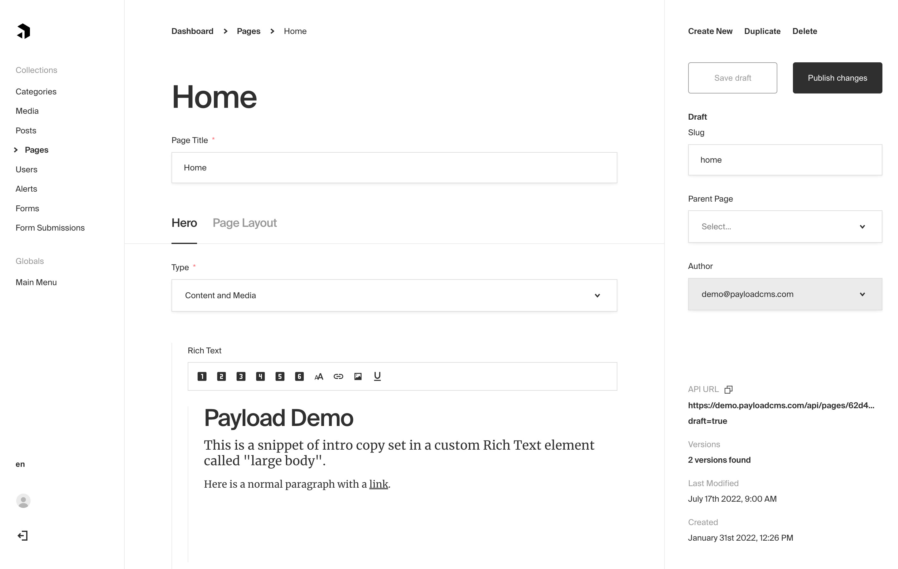
_Tabs field type used to separate Hero fields from Page Layout_
|
|
|
|
### Config
|
|
|
|
| Option | Description |
|
|
| ------------- | ------------------------------------------------------------------------------------------------------------------------ |
|
|
| **`tabs`** \* | Array of tabs to render within this Tabs field. |
|
|
| **`admin`** | Admin-specific configuration. See the [default field admin config](/docs/fields/overview#admin-config) for more details. |
|
|
| **`custom`** | Extension point for adding custom data (e.g. for plugins) |
|
|
|
|
#### Tab-specific Config
|
|
|
|
Each tab has its own required `label` and `fields` array. You can also optionally pass a `description` to render within each individual tab.
|
|
|
|
| Option | Description |
|
|
| ------------------- | ------------------------------------------------------------------------------------------------------------------------------------------------------------------------------------------------------------ |
|
|
| **`name`** | An optional property name to be used when stored and retrieved from the database. [More](/docs/fields/overview#field-names) |
|
|
| **`label`** \* | The label to render on the tab itself. |
|
|
| **`fields`** \* | The fields to render within this tab. |
|
|
| **`description`** | Optionally render a description within this tab to describe the contents of the tab itself. |
|
|
| **`interfaceName`** | Create a top level, reusable [Typescript interface](/docs/typescript/generating-types#custom-field-interfaces) & [GraphQL type](/docs/graphql/graphql-schema#custom-field-schemas). (`name` must be present) |
|
|
|
|
_\* An asterisk denotes that a property is required._
|
|
|
|
### Example
|
|
|
|
`collections/ExampleCollection.ts`
|
|
|
|
```ts
|
|
import { CollectionConfig } from "payload/types";
|
|
|
|
export const ExampleCollection: CollectionConfig = {
|
|
slug: "example-collection",
|
|
fields: [
|
|
{
|
|
type: "tabs", // required
|
|
tabs: [
|
|
// required
|
|
{
|
|
label: "Tab One Label", // required
|
|
description: "This will appear within the tab above the fields.",
|
|
fields: [
|
|
// required
|
|
{
|
|
name: "someTextField",
|
|
type: "text",
|
|
required: true,
|
|
},
|
|
],
|
|
},
|
|
{
|
|
name: "tabTwo",
|
|
label: "Tab Two Label", // required
|
|
interfaceName: "TabTwo", // optional (`name` must be present)
|
|
fields: [
|
|
// required
|
|
{
|
|
name: "numberField", // accessible via tabTwo.numberField
|
|
type: "number",
|
|
required: true,
|
|
},
|
|
],
|
|
},
|
|
],
|
|
},
|
|
],
|
|
};
|
|
```
|